Gaia Agro Branding
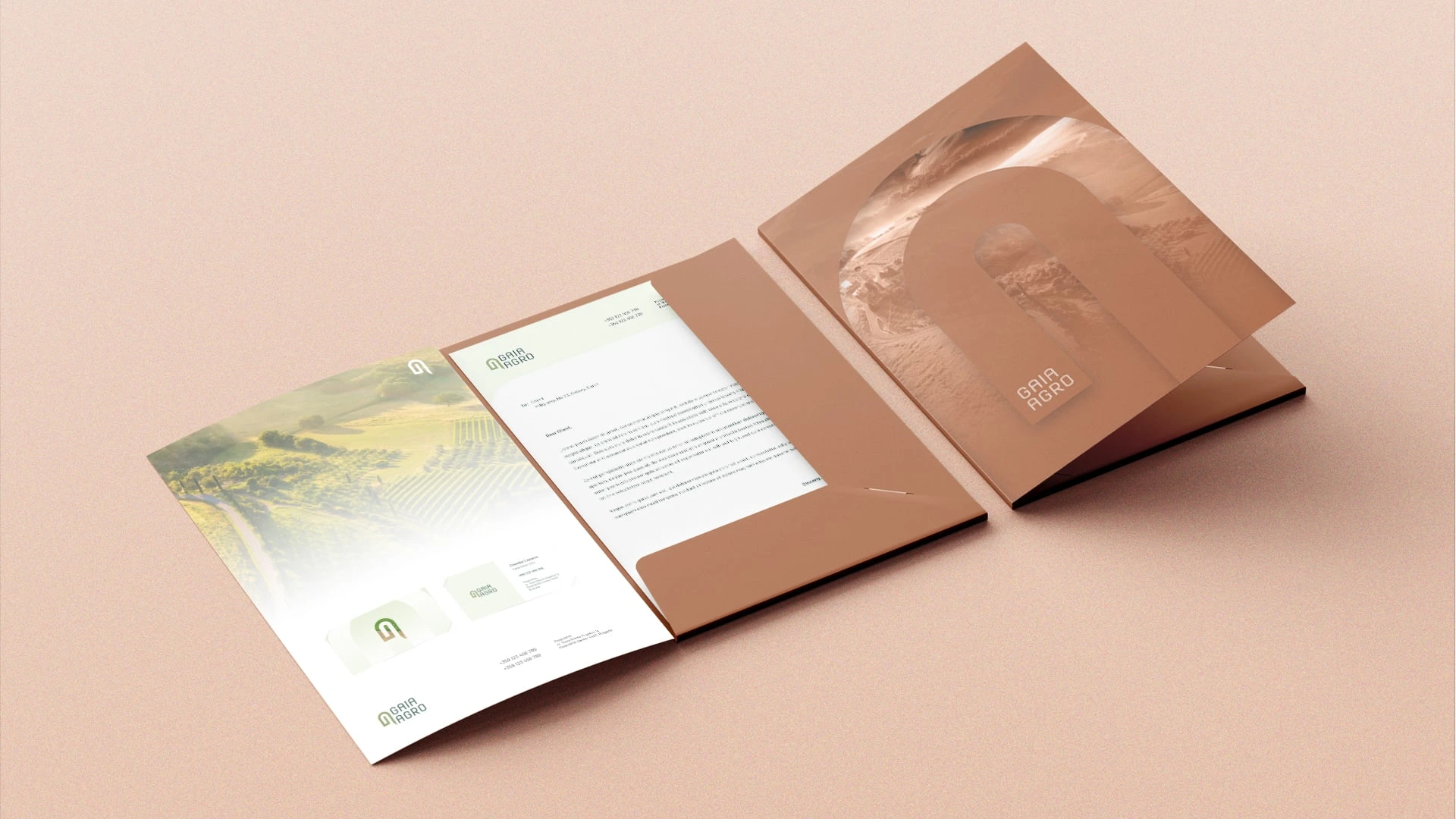
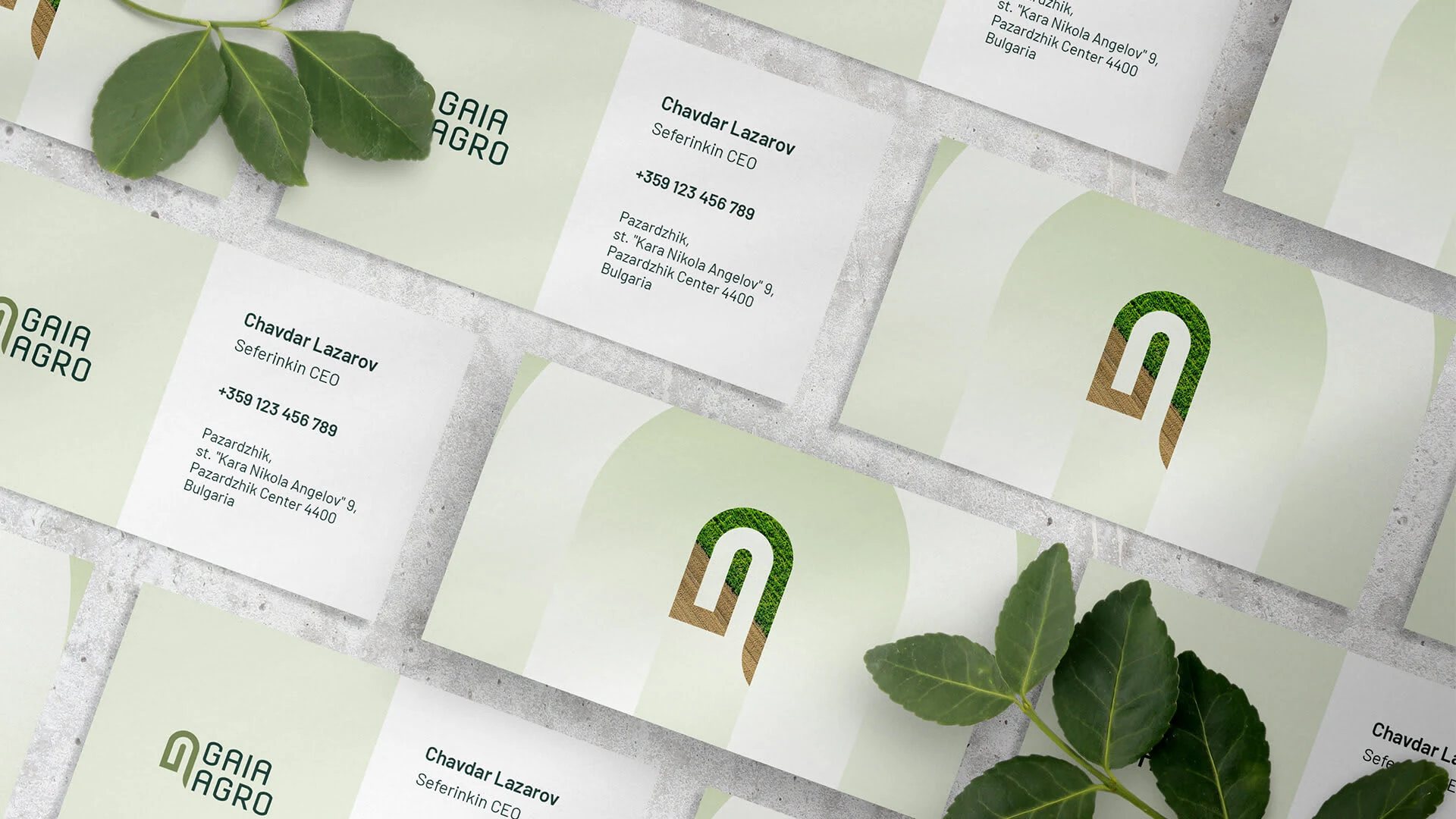
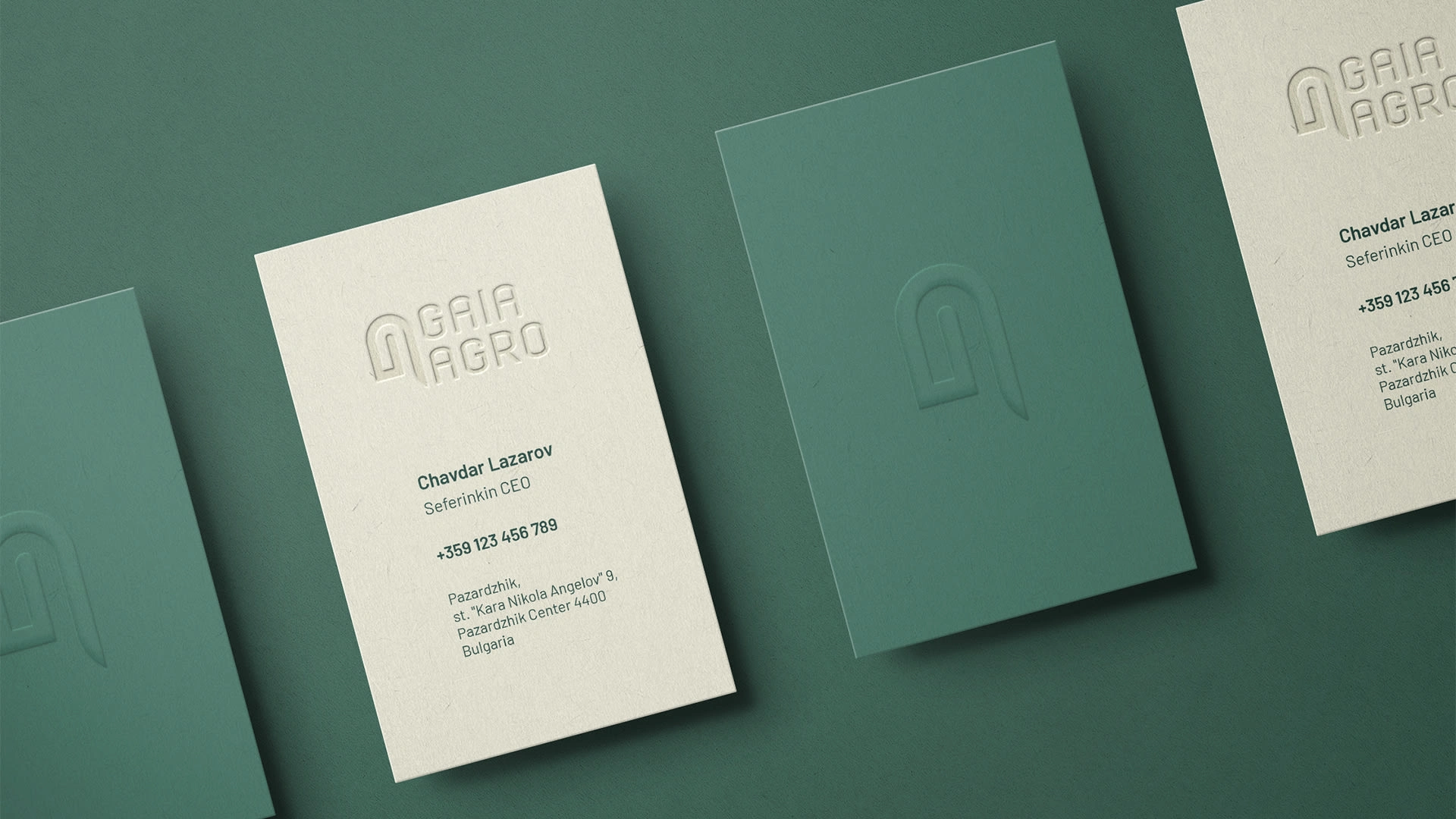
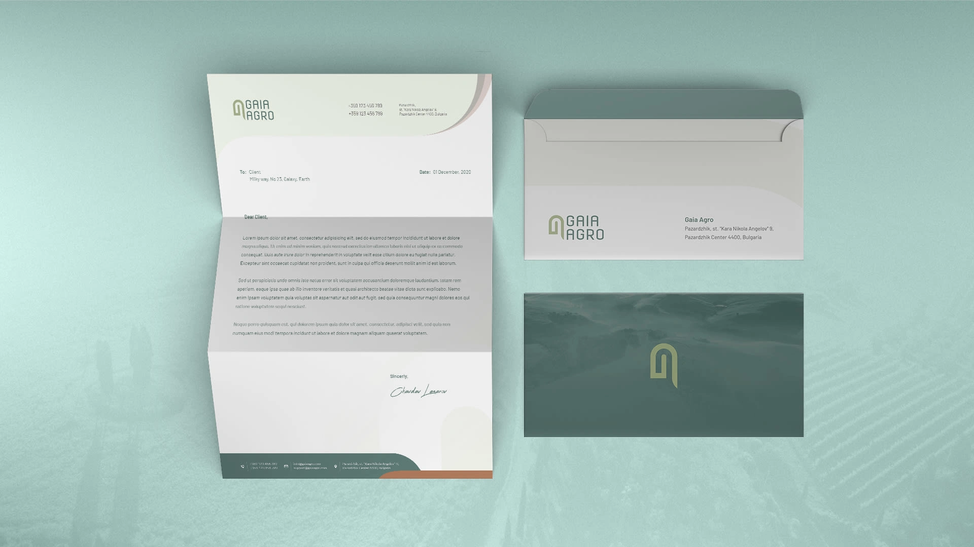
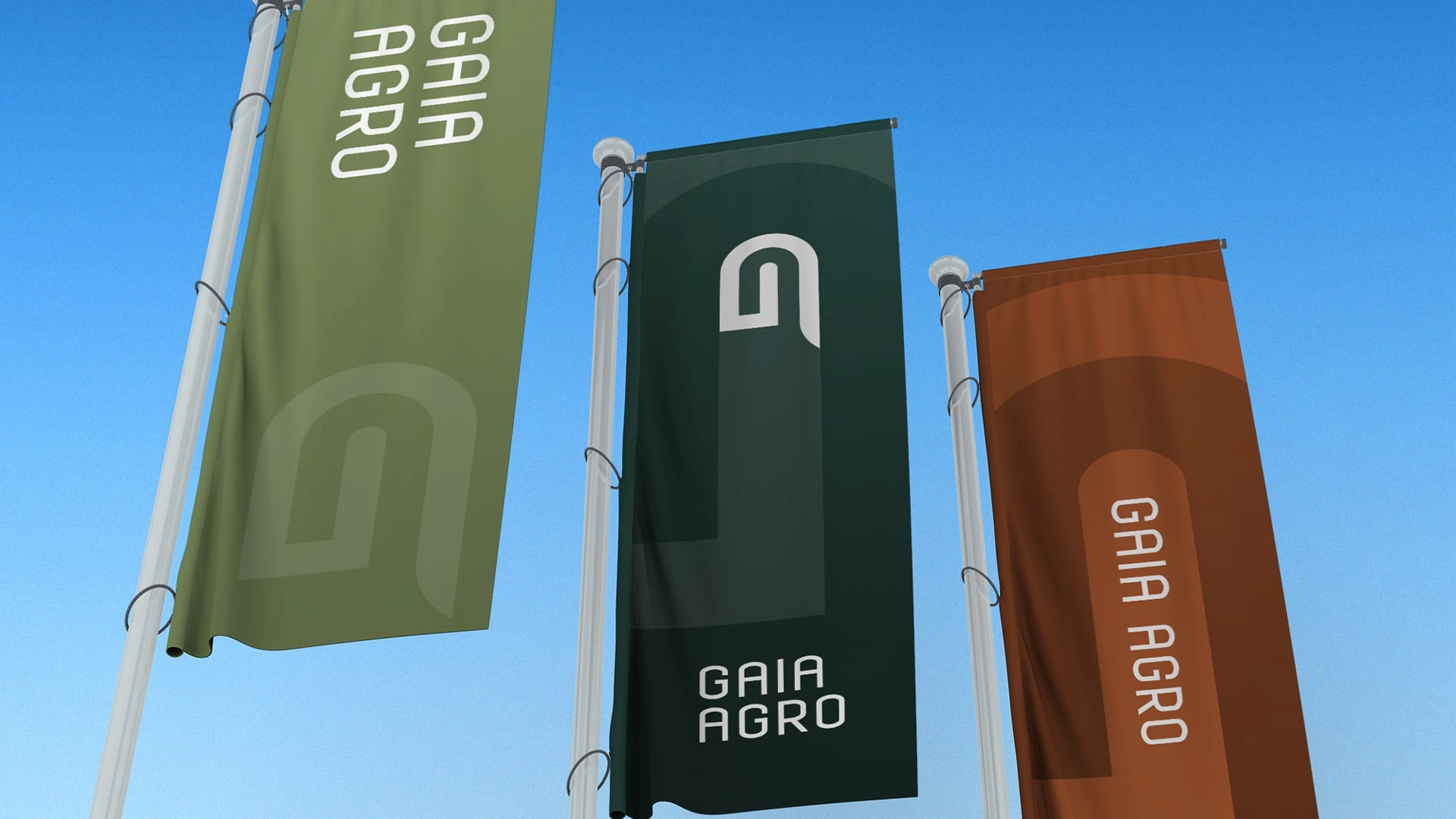
Creating a logo for Gaia Agro, a business with a focus on agriculture and its connection to the Earth, requires a design that reflects nature, growth, and modernity while keeping it minimal.
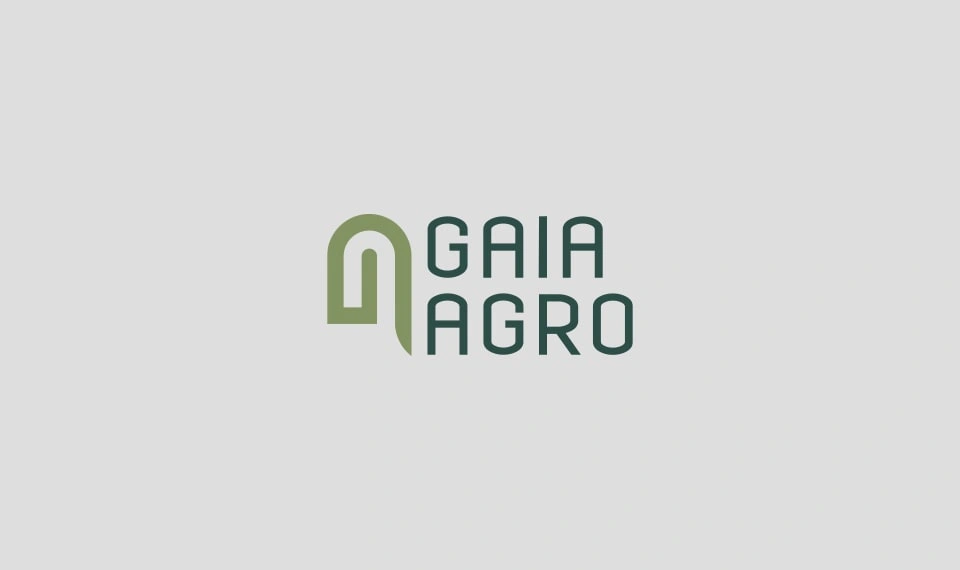
Gaia Agro Logo
Logo Concept
Imagine a simple, elegant logo that combines the essence of the Earth, growth, and modernity.
Logo Meaning
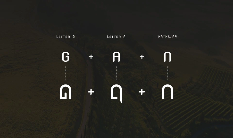
This logo embodies the connection between agriculture and the Earth (Gaia). The Earth symbolizes the foundation of agriculture, while the growing plant represents the growth, sustainability, and vitality that Gaia Agro brings to the industry. The modern design emphasizes the company's contemporary approach to agriculture and its commitment to nurturing the Earth.
Design Elements
Geometric Earth Shape: At the center of the logo, depict a minimalist representation of the Earth, symbolizing Gaia, the Earth Goddess. This shape should be in soft, earthy colors to convey the connection to nature.
Growing Plant: Growing from the Earth shape, have a single, sleek plant stem with a few leaves. This represents agriculture, growth, and sustainability.
Modern Typography: Use modern, clean, and minimalistic typography for the business name "Gaia Agro." The font should be simple and legible to balance the complexity of the icon.
Color Palette
Earth Tones: Incorporate natural earth tones such as deep greens and browns for the Earth element.
Growth: Use a vibrant green for the plant to symbolize growth and vitality.
Background: Consider a neutral, earthy background to make the logo stand out.





Like this project
Posted Sep 3, 2023
The logo for Gaia Agro, a business with a focus on agriculture and its connection to the Earth, requires a design that reflects nature, growth, and modernity.


