Verimoto (Branding + Website + UI/UX)
Gus Design
— About the Client
Company: Verimoto
Industry: Service / Fintech
Since: 2018
Headquarters: Sydney / Australia
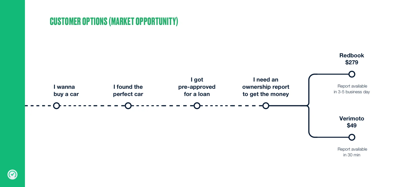
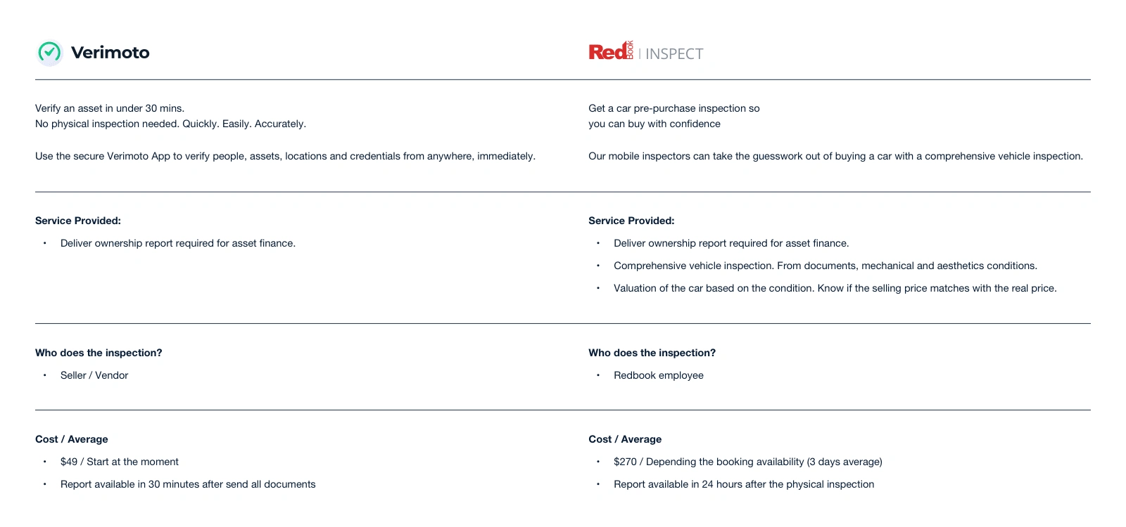
Verimoto is an asset Identity Verification System. Verimoto revolutionises the private vehicle financing process. Using a mobile application and cutting edge digital technology to validate the asset and seller quickly and efficiently, Verimoto delivers a fantastic customer experience whilst streamlining back-office processes.
Features:
ID Check with document verification services, facial recognition, funds destination verification (FDV), plate optical recognition, VIN scan and reader, seller and driver Licence OCR and Biometrics, PPSR check, owner verification, location & timestamp flags, prevent GPS spoofing.
Highlights:
Which-50 awards Verimoto with Best in Digital Commerce Award on his first year of operation.
The AFR and Inventium acknowledged Lakeba’s Verimoto as one of the most innovative businesses in the technology category.
— The challenge
Rebrand
Website redesign
New consumer experience
Operations portal redesign
Broker portal redesign
— The Strategy
Understand the service, the product and the goals
Discovering & competition analyses
What we do well (enhance) and what we do worse (improve)
Design thinking and Design sprint as a method
Marvel as User testing and feedback platform
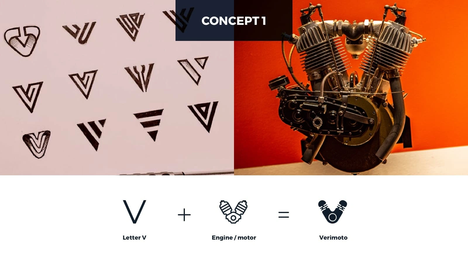
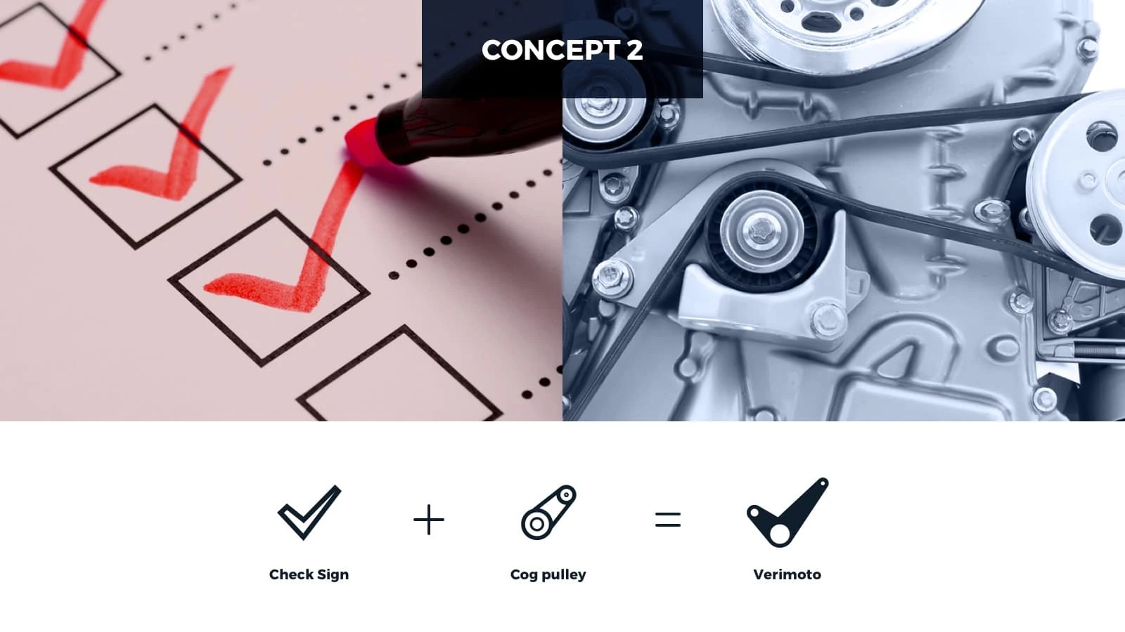
Rebranding
Why do they need a new Brand?
When the first logo had been designed, Verimoto verifies ownership of cars. However, In a short time, they expand the technology to verify other types of vehicles such as tractors, boats, tractors, heavy vehicles, and motorbikes.
The current symbol (steering wheel) no longer makes sense since Verimoto verifies vehicles and not just cars.
The new logo should cover these new types of vehicles.
In the initial discussion, the red colour should remain, but after a few interactions, they understand that red is not the best colour for the “verification” platform.
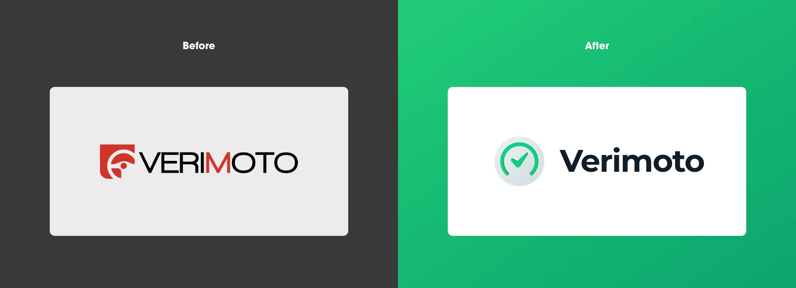
Brand presented
UX + UI
Why do they need a new CX?
The look & feel had to match with the new brand.
The messaging & copy changed and had to be updates
Additional sections such as “Testimonials” and “contact support” had to be added and highlighted.
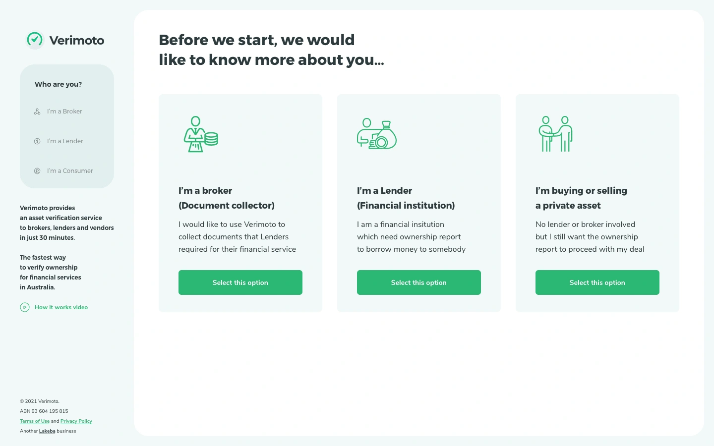
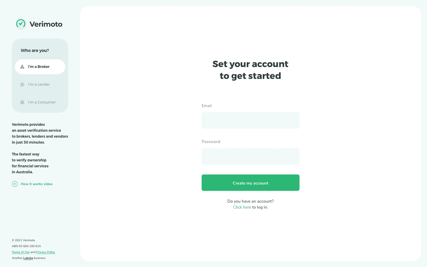
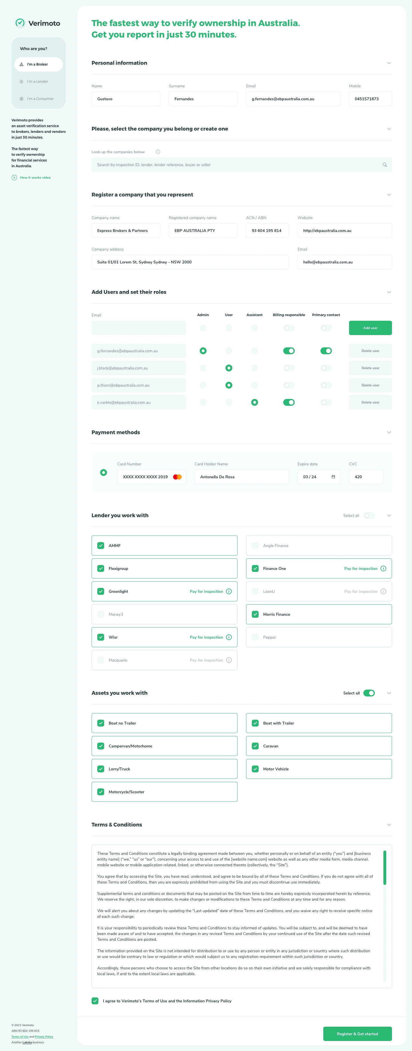
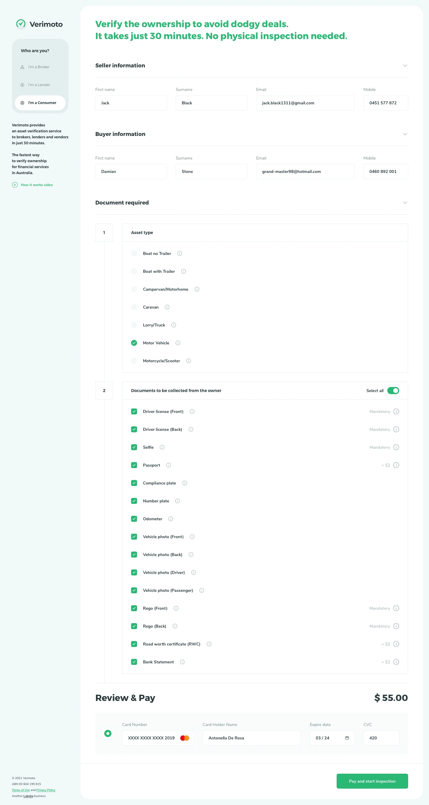
Why do they need a new UI + UX?
The interface is a legacy of ezidox - A document collection platform.
Verimoto had been built as a customization of other software.
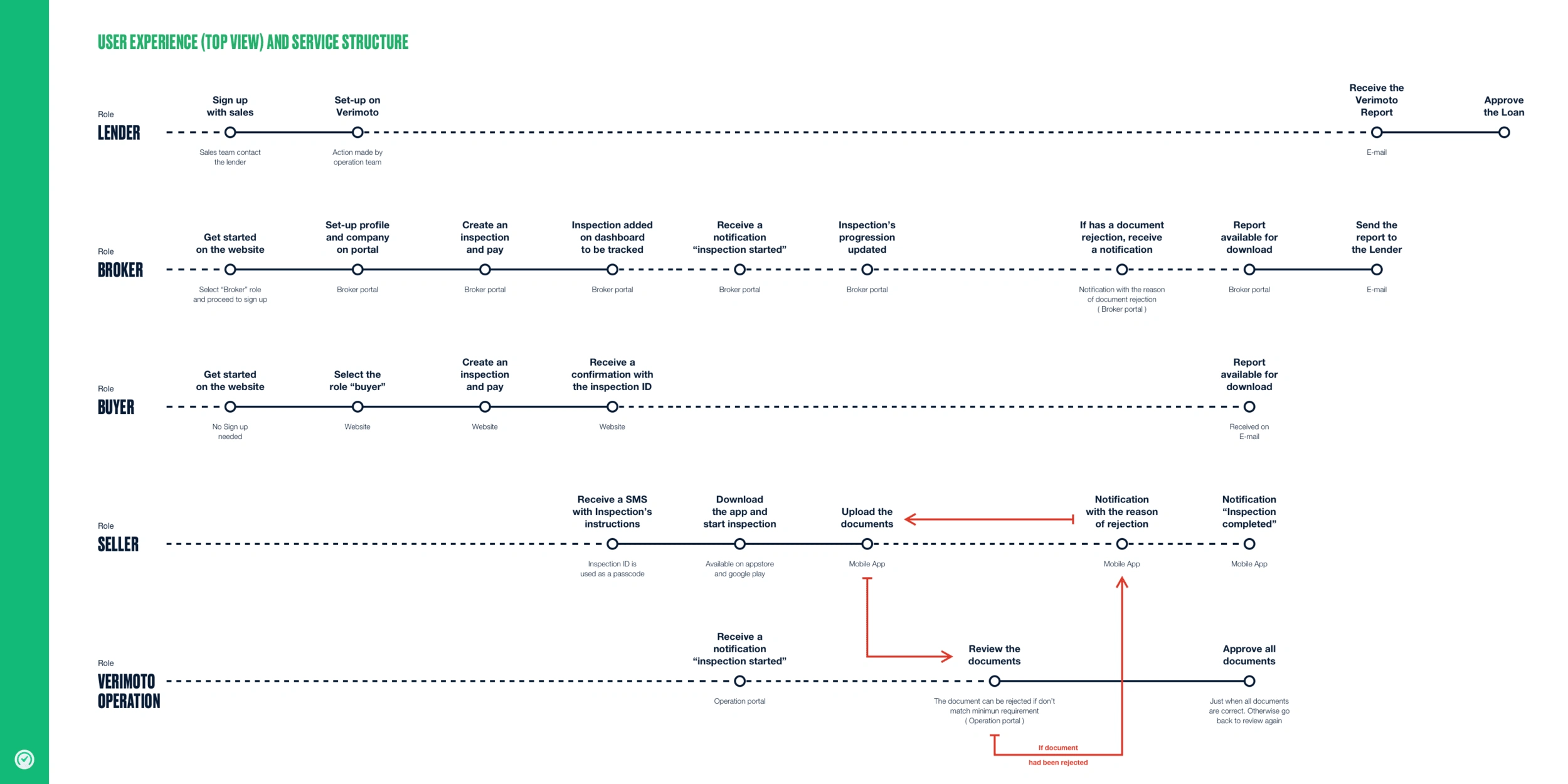
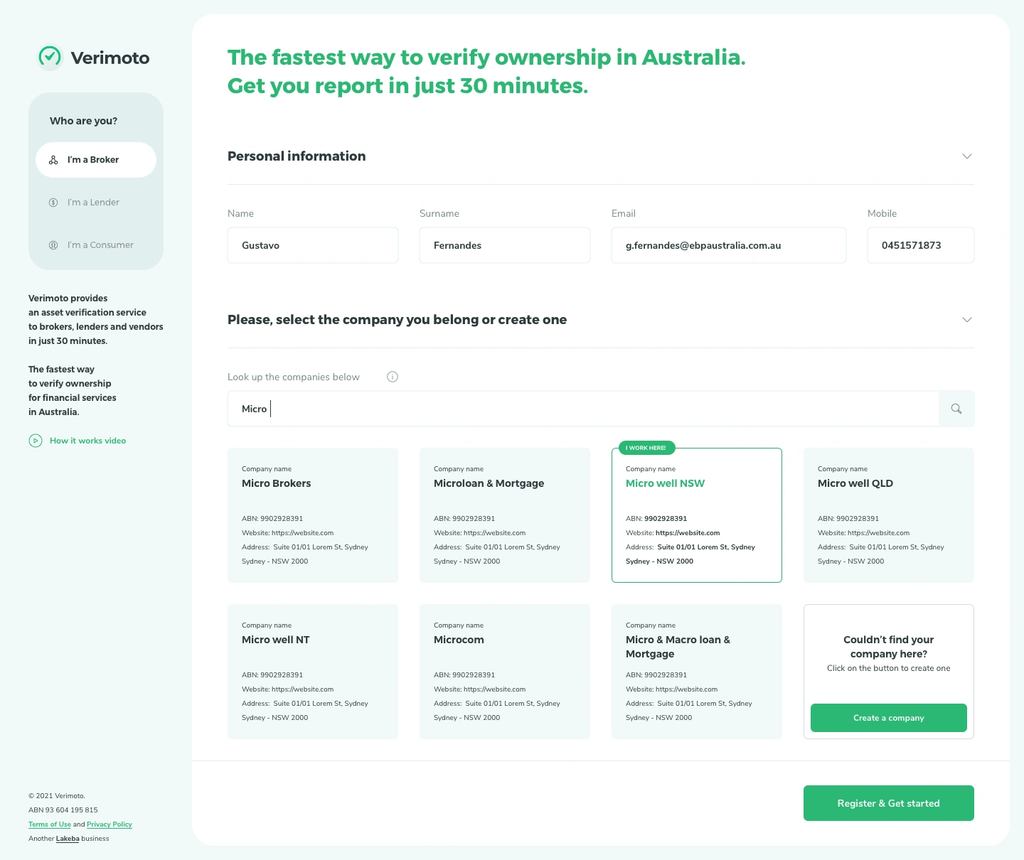
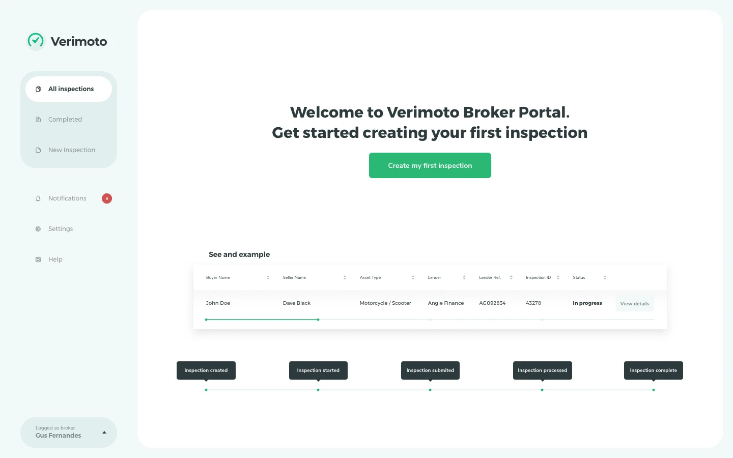
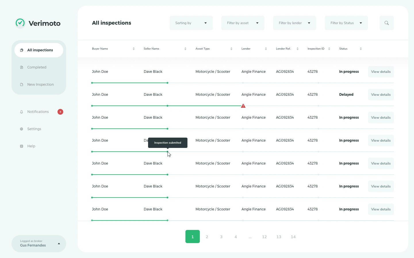
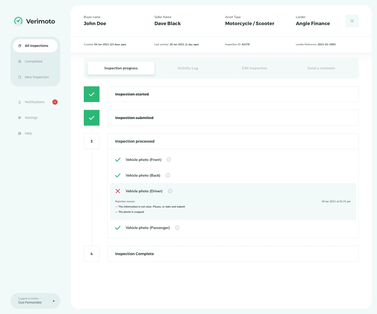
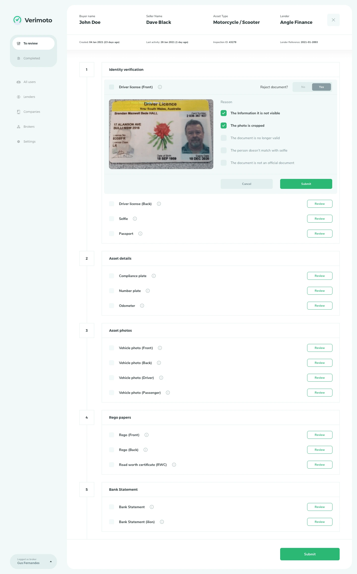
Brokers were having a hard time creating, tracking and manage inspections.
Review documents were really bureaucratic. Impacting the productivity of the operational team.
Like this project
Posted Oct 30, 2024
Rebrand, Website, UI + UX of the portal.