A few months ago, I

Kelvin Ogbujiagba


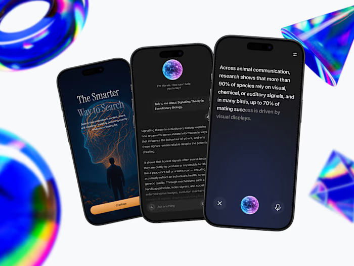
A few months ago, I worked directly with the founder of Qura.ai to redesign their website with one clear goal: improve conversions.
The value proposition wasn’t immediately clear, the messaging focused more on features than outcomes, and the call-to-action lacked direction. For AI startups especially, clarity is everything — if users don’t understand what your product does in seconds, they bounce.
I refined the positioning, clarified the messaging, strengthened the visual hierarchy, and made every section conversion-focused. This led to higher engagement and improved conversion rates, not because we added more features, but because we made the experience clearer.
That’s the difference between designing merely for aesthetics and designing for growth.
Like this project
Posted May 1, 2026
A few months ago, I worked directly with the founder of Qura.ai (http://Qura.ai) to redesign their website with one clear goal: improve conversions. The val...