
pro
Kelvin Ogbujiagba
Product + Interaction Designer & Framer Expert
- 5.00
- Rating
- 12
- Followers
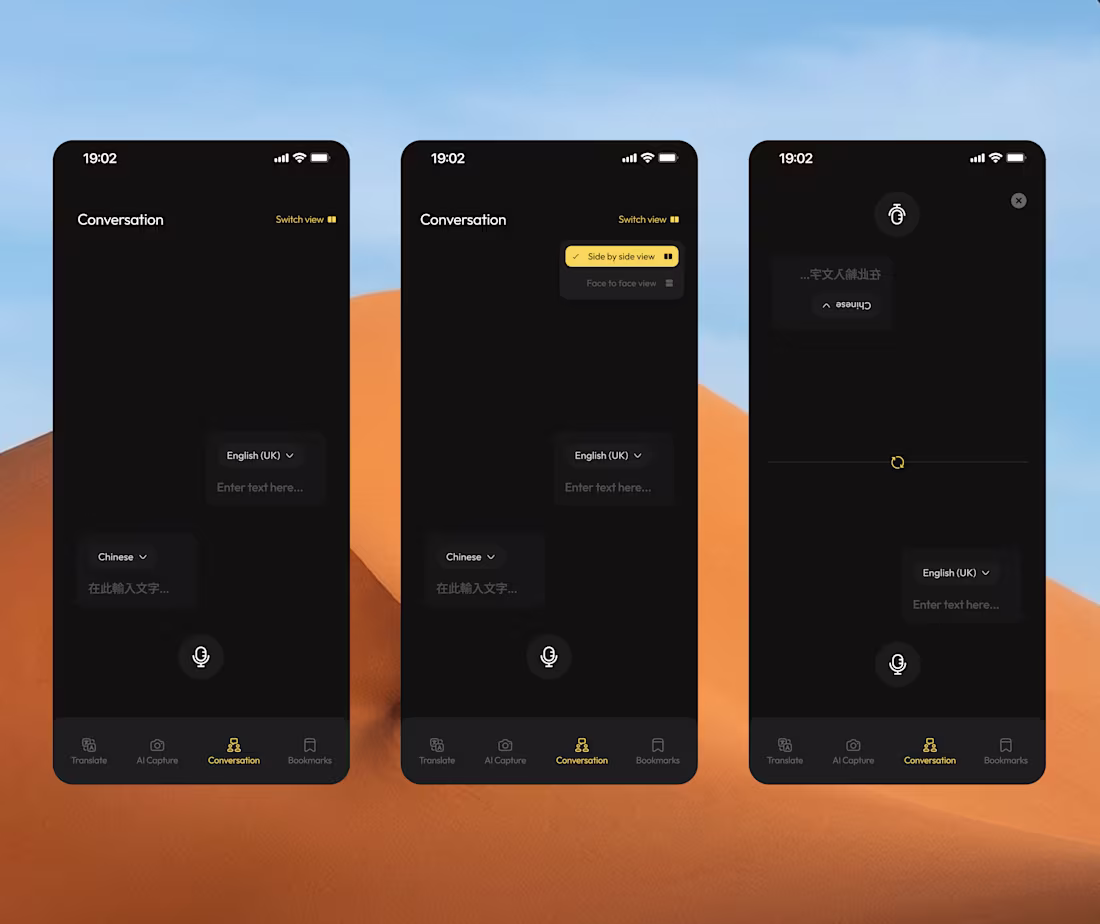
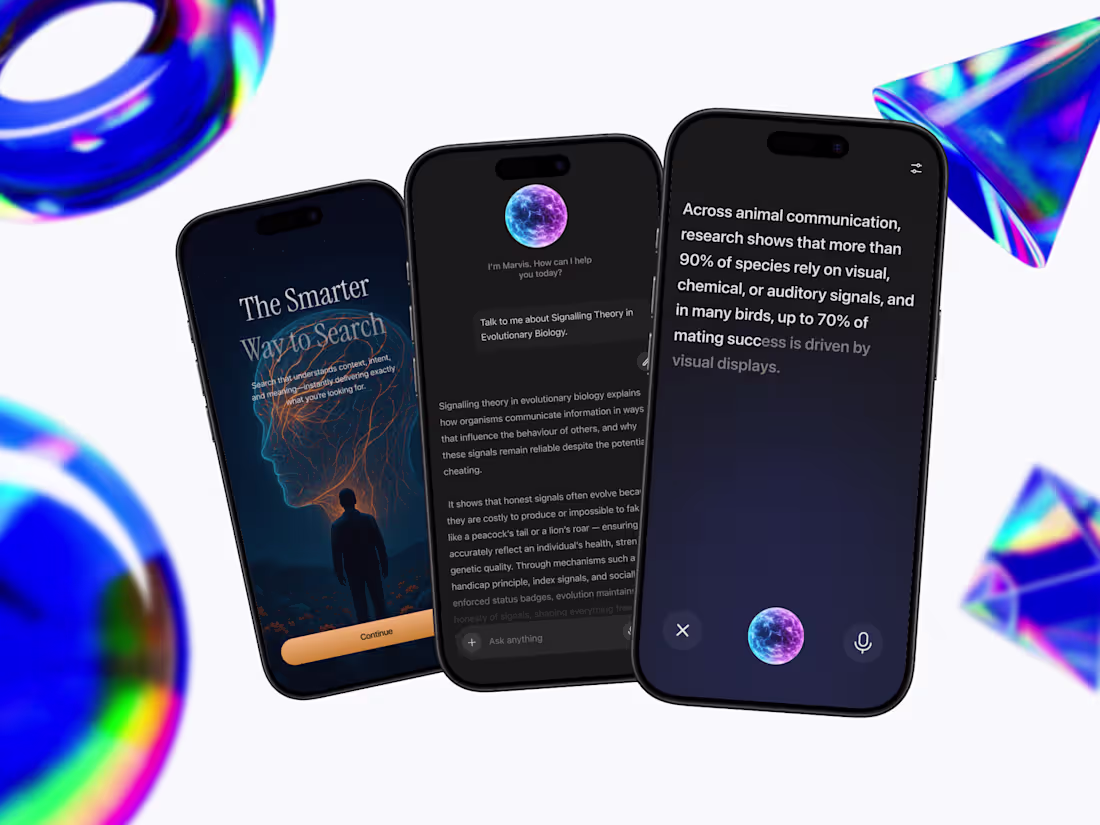
I designed Conversation Mode to focus on natural, real-time interaction between people who speak different languages.
The experience supports both side-by-side and face-to-face views, allowing two users to speak freely while AI listens, translates, and displays responses instantly.
0
76
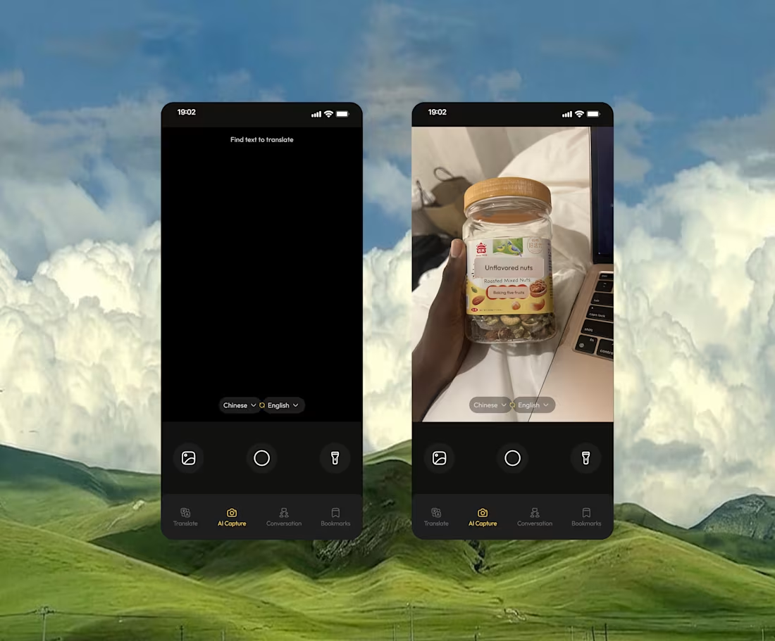
Instead of typing or pasting text,users can simply point their camera at any object and instantly understand what it says.
Designing this feature was about making advanced AI (computer vision, text detection, and language processing) feel invisible and effortless in everyday use
2
2
208
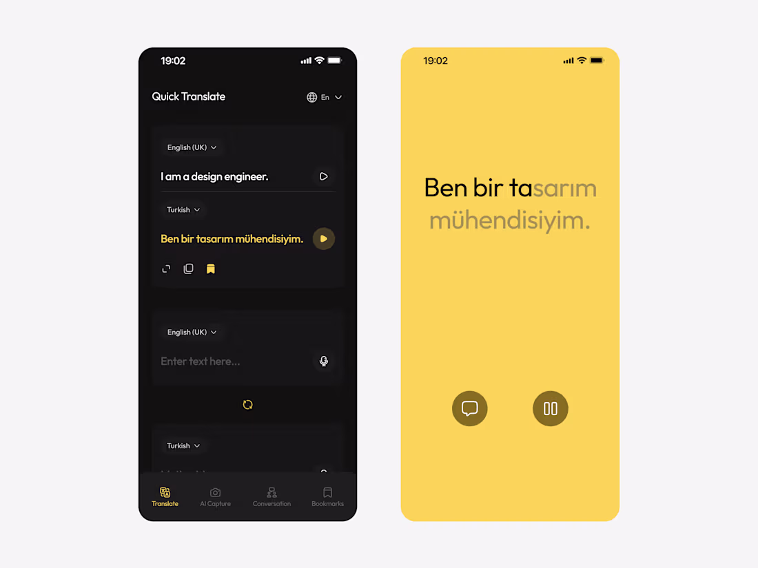
More screens from the translation app I'm working on.
1
98
UI Screens from a translation app i'm working on
2
1
91
I’ve been designing and building this AI-powered translation experience, not just for translating text, but for understanding context across voice, images, and real conversations.
For me, designing AI experiences and building experiences with AI are about turning complex intelligence into simple, intuitive products people can actually use.
If you’re building an AI product and your UX still feels like a standard SaaS tool, there’s a gap, and that gap is where great products win.
I work directly with founders to design AI experiences that people actually understand and enjoy using.
If that’s what you’re trying to build, let’s talk.
1
70
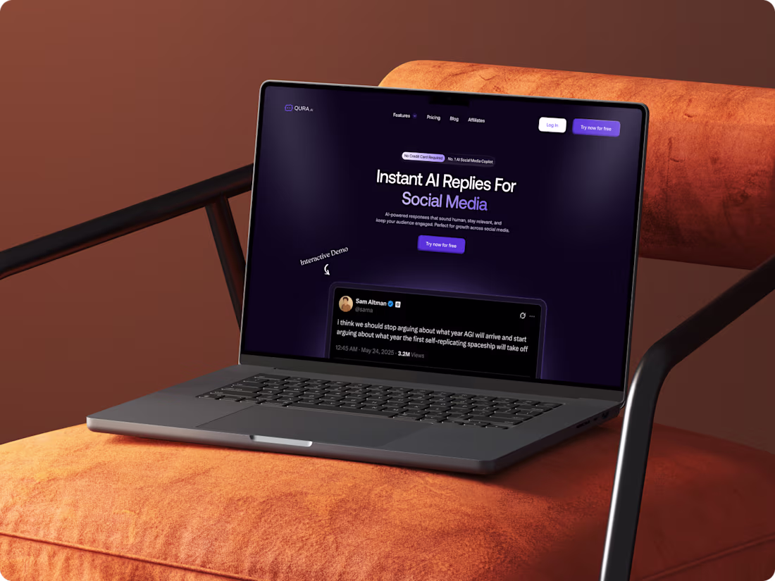
Qura AI Website Redesign
0
7
A few months ago, I worked directly with the founder of Qura.ai (http://Qura.ai) to redesign their website with one clear goal: improve conversions.
The value proposition wasn’t immediately clear, the messaging focused more on features than outcomes, and the call-to-action lacked direction. For AI startups especially, clarity is everything — if users don’t understand what your product does in seconds, they bounce.
I refined the positioning, clarified the messaging, strengthened the visual hierarchy, and made every section conversion-focused. This led to higher engagement and improved conversion rates, not because we added more features, but because we made the experience clearer.
That’s the difference between designing merely for aesthetics and designing for growth.
5
3
93
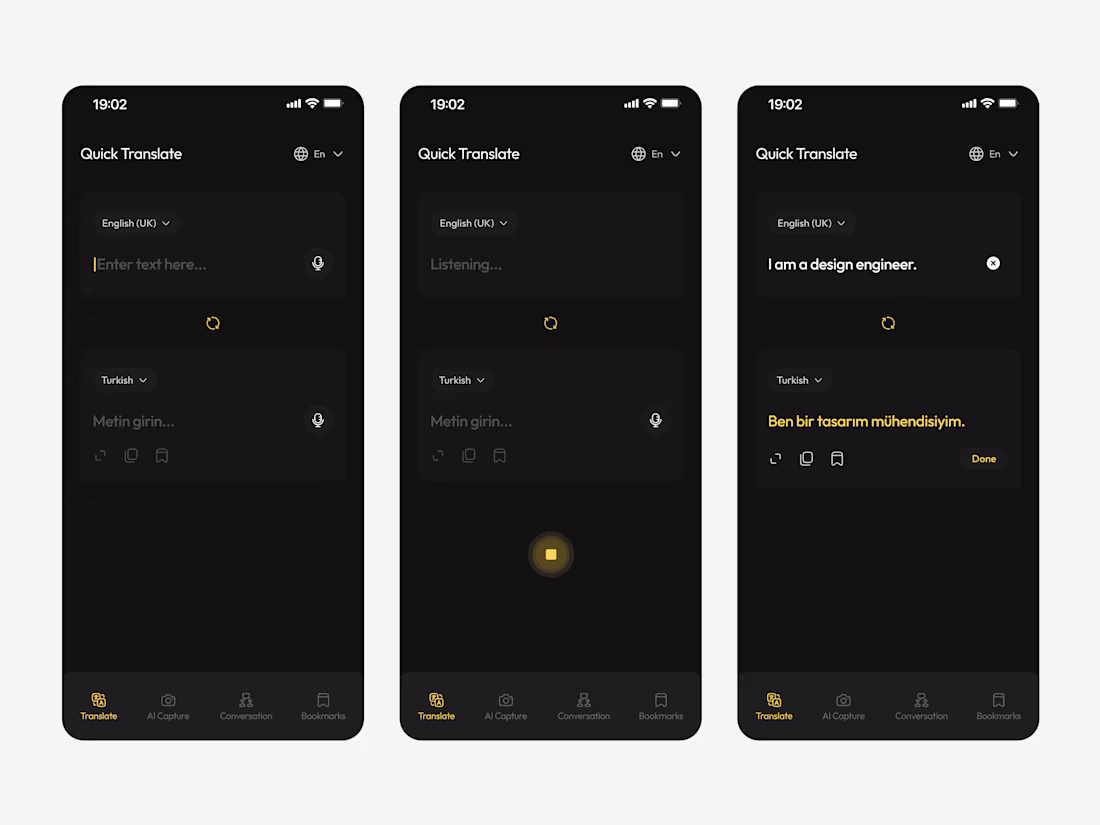
Never forget to design for transparency.
As the user types, the interface updates their credit usage in real time.
It’s a simple interaction, but it gives people clarity and control, two things that are often missing in AI-powered experiences.
Also worked on the text input area; as the text increases, the input field expands to accommodate it.
2
100
Designing AI chatbots looks easy, but it’s more than building a simple message-in, message-out interface.
The real work happens in intent design, error handling, and designing the pathways that prevent users from getting stuck.
GM friends😃
1
90
Exploring some micro-interactions using Jitter on the benefits section of a landing page design for an AI startup✨
1
94
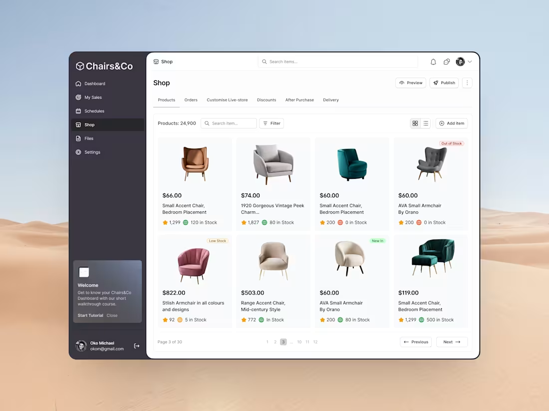
Product Dashboard.png
0
76
I made this gravity component using Figma and Jitter for a client project I worked on last year.
Micro-interactions matter.
26
34
262
Many times, we're tempted to jump into building or designing stuff without asking questions.
👉What problem are we solving?
👉Why should the user care?
👉Why does/should this flow exist in the first place?
Before you drag that first frame, find out what you're solving and who you're solving for. Nothing should ever replace the fundamentals:
1. Understanding the problem
2. Defining the user’s motivation
3. Clarifying the business goal
4. Deciding the simplest path from A → B
So next time you open Figma… ask 'why' before you begin to draw that new frame.
5
9
150
I’ve been experimenting intentionally with interaction design to make interfaces more intuitive and emotionally expressive.
Here’s a recent micro-interaction I created in Jitter.
What I’m exploring here👉:
1. How motion directs attention
2. Timing curves that make movement feel natural
3. Using animation to reinforce hierarchy
4. Creating delight without distraction
It’s crazy how a few milliseconds of motion can completely change how a product feels.
2
127
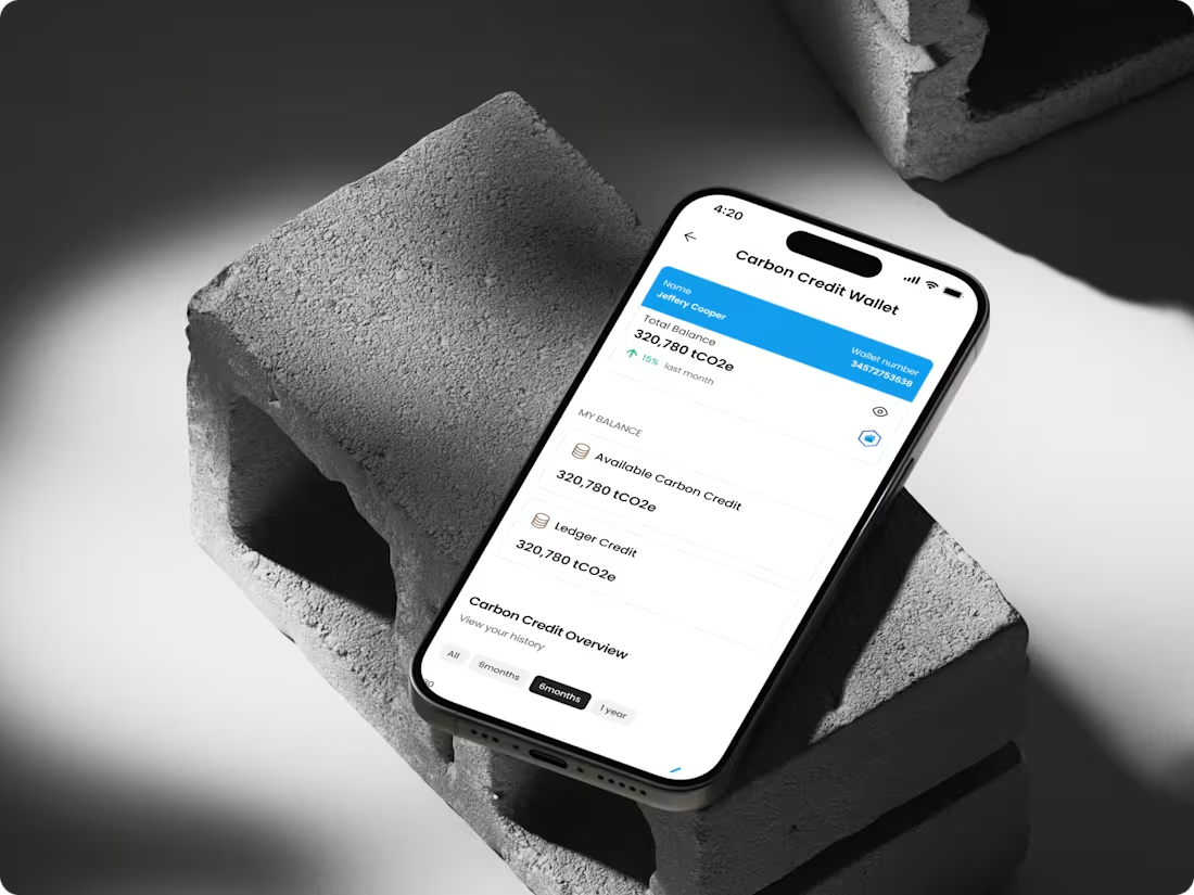
Carbon-Adjust All-in-One Energy Efficiency Platform
0
2
Co-relate App | Mobile App Design
0
3
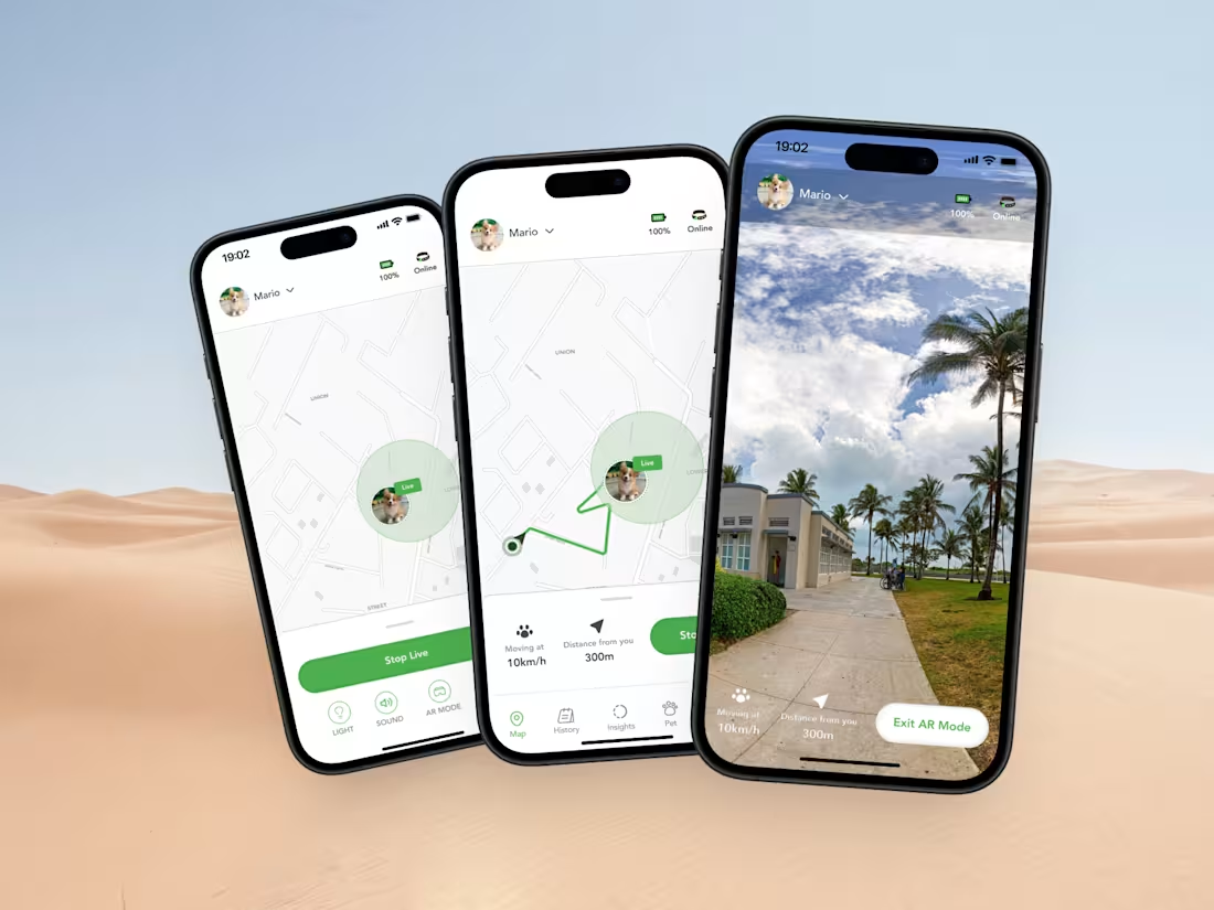
PawPath- Pet Tracker App | Mobile App Design
0
4