Brand Refresh for Global IT Services Company
Sarah Bayzon
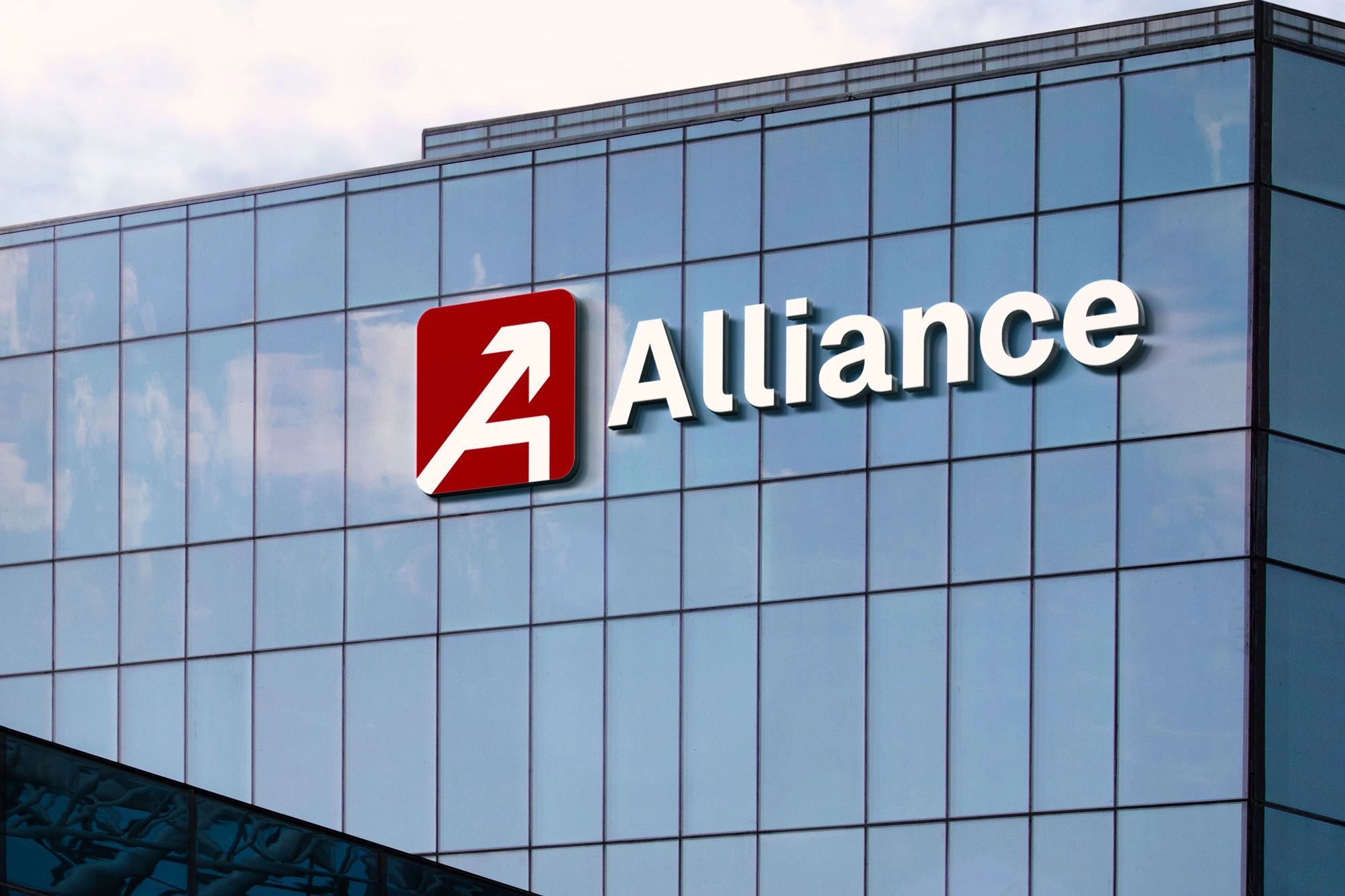
Logo Modernization for Global IT Services Firm
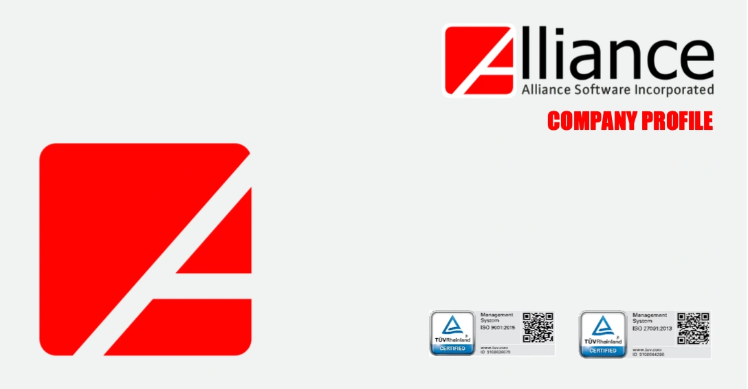
Refreshed the identity of Alliance Software, Inc., an ISO-certified global IT company founded in 2000, modernizing its logo while preserving 20+ years of brand equity.
Challenge
The existing logo felt dated across digital platforms, but a full rebrand risked losing recognition and enterprise trust. The goal was evolution — not disruption.
Concept
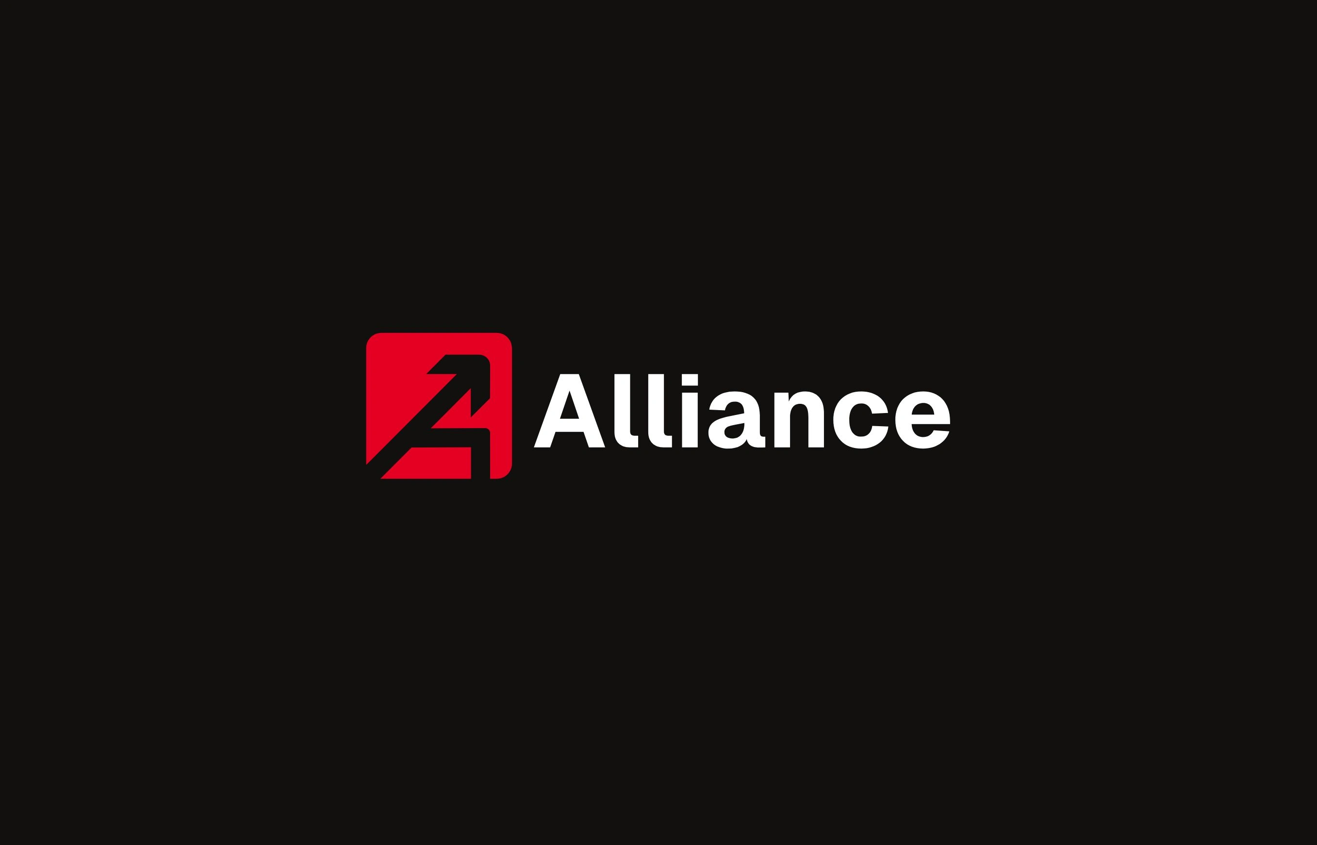
The refined mark features a tilted “A” integrated with an upward arrow, symbolizing progress, innovation, and client growth. The tilt introduces dynamism and forward momentum, reflecting agility in a fast-paced IT landscape.
Result
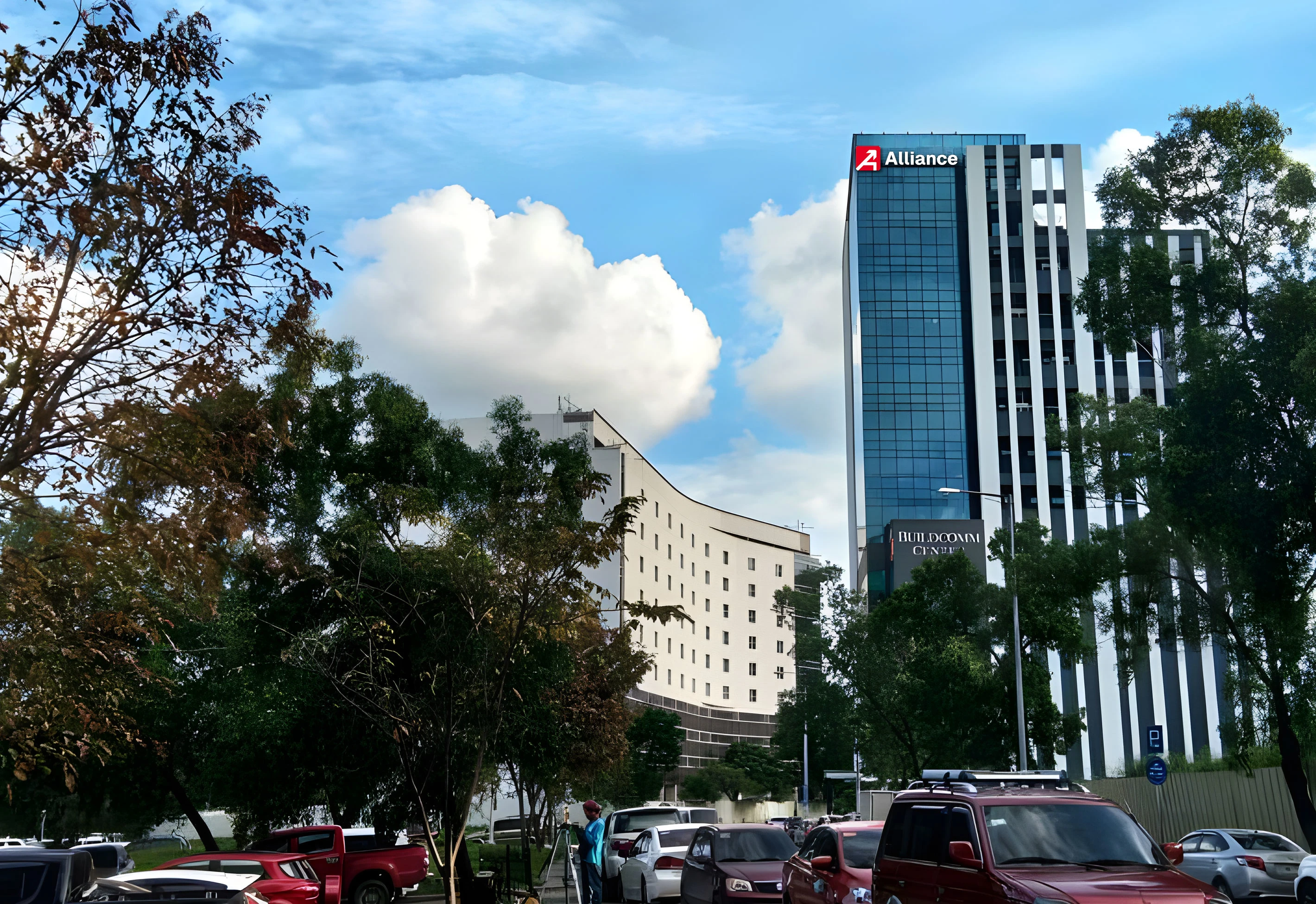
A modernized, scalable identity that strengthens enterprise credibility while maintaining legacy recognition and brand continuity.
Like this project
Posted Feb 20, 2026
Modernized a 20-year-old global IT brand to improve digital scalability and strengthen enterprise credibility—without disrupting legacy recognition.