stål Brand Identity
Mariana Matos
stål
From Swedish for stainless steel, stål is a jewellery brand
focused solely on the material it is named after.
Based on a single metal, the brand thus represents
the simplicity but also the strength of the material.
The logo is quite simple in its form and composition.
However, it is its final finish imitating chrome that brings it
to life and lives up to its meaning. To further express this
powerful simplicity, the colour palette is quite minimalist
but striking, relying on just 3 colours.
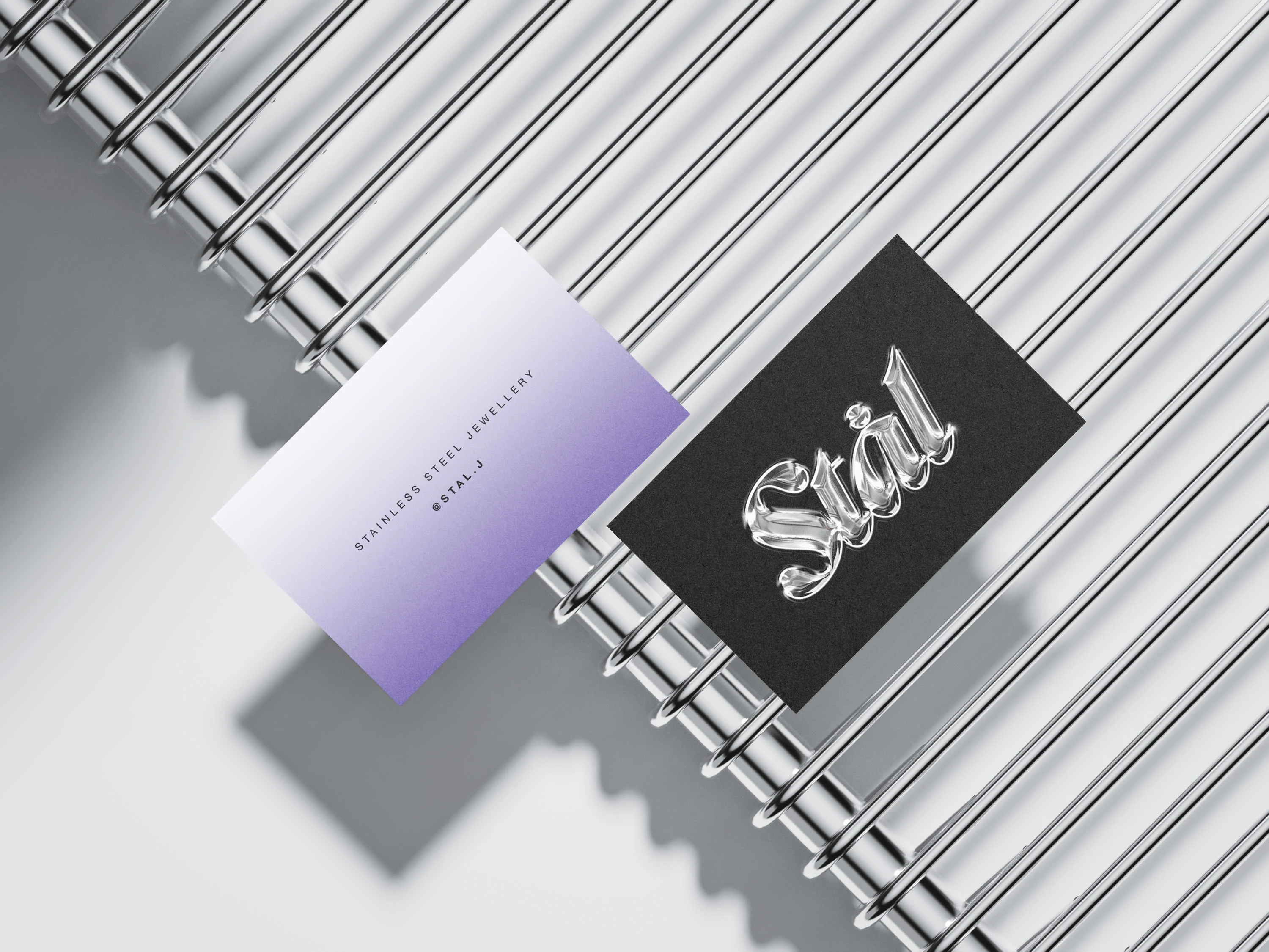
Business cards.
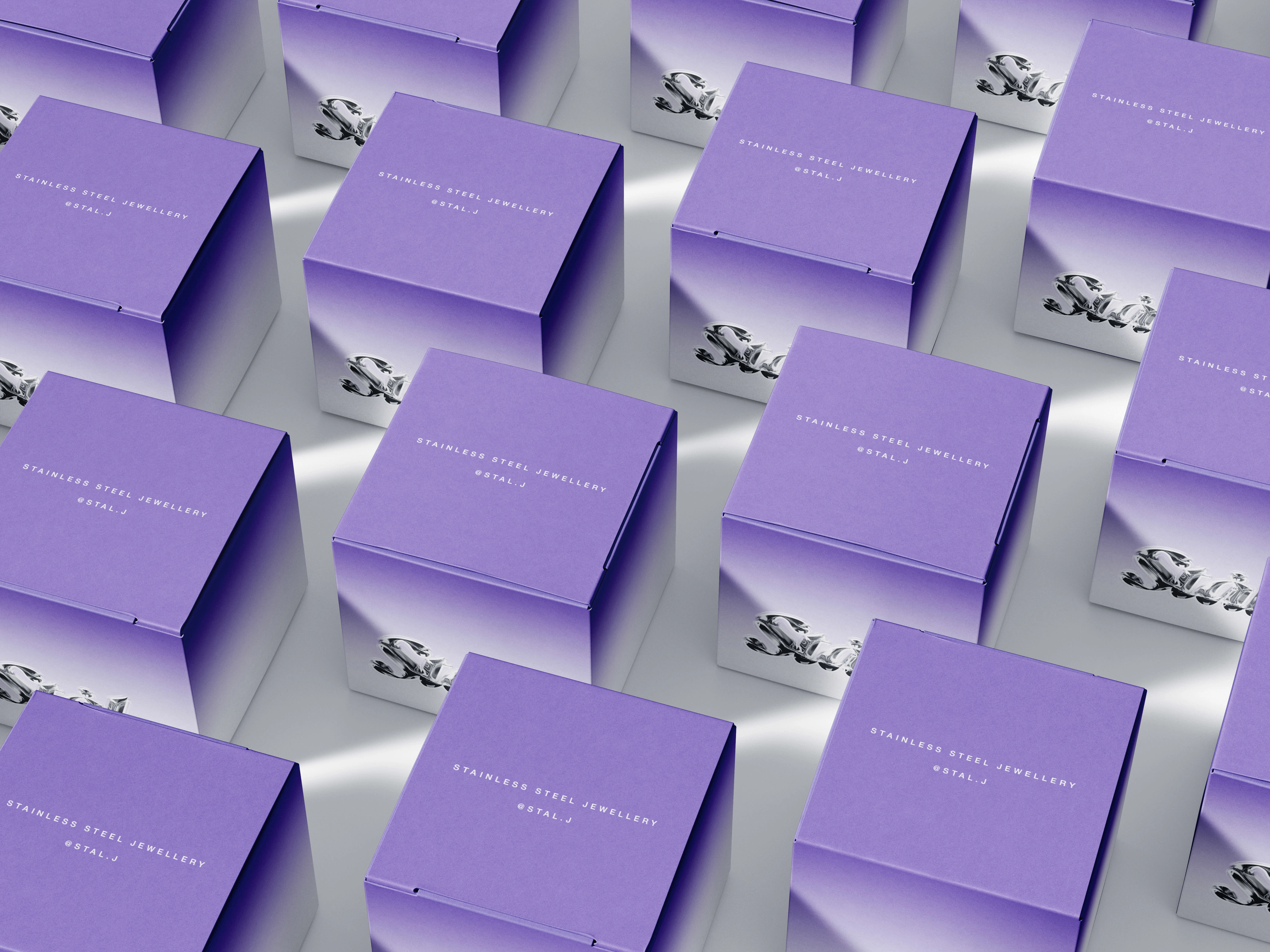
Packaging of the pieces themselves. As they are delicate pieces they must be properly packaged.
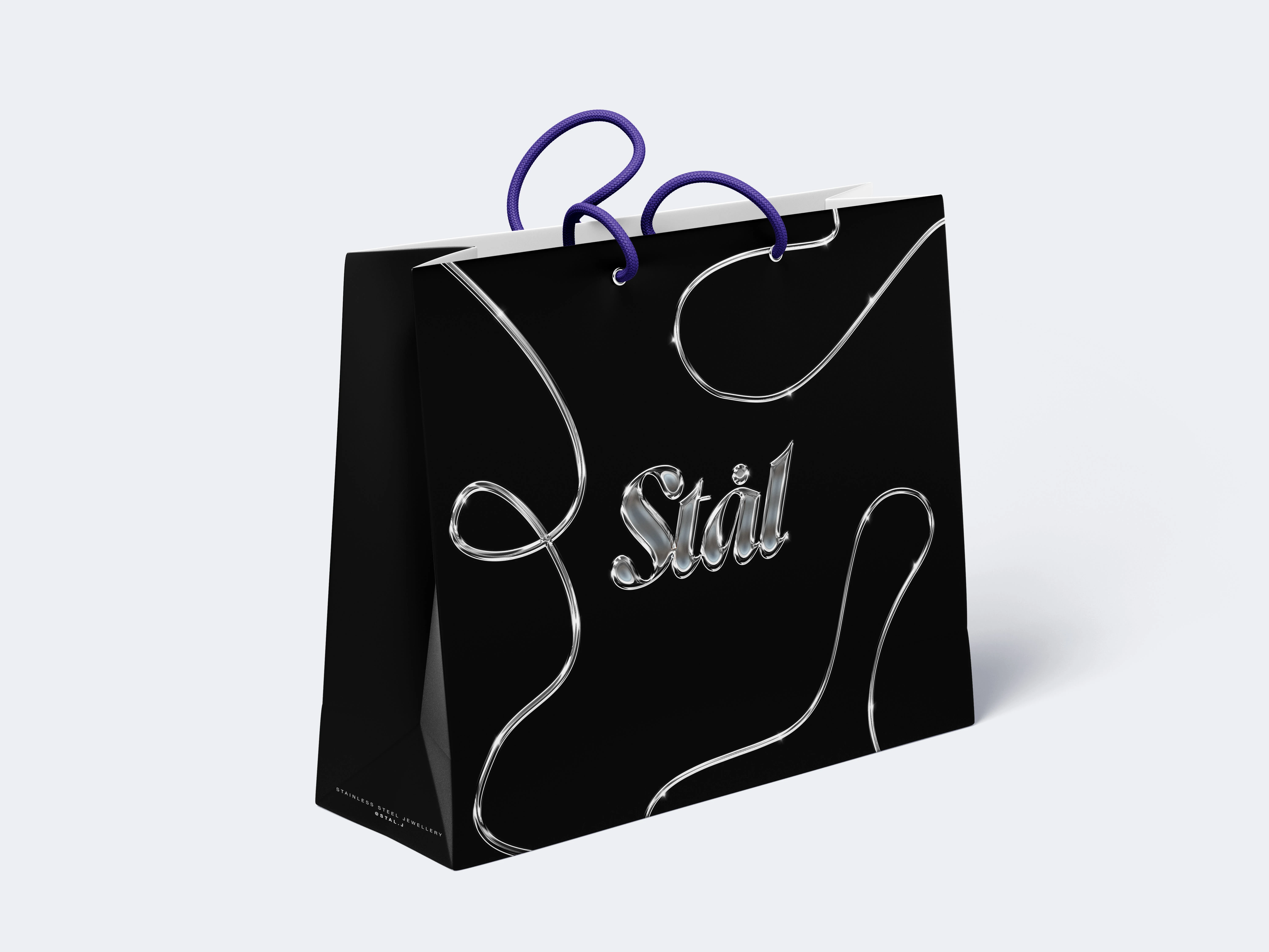
Bag with handle for multiple purchases, for easier transportation.
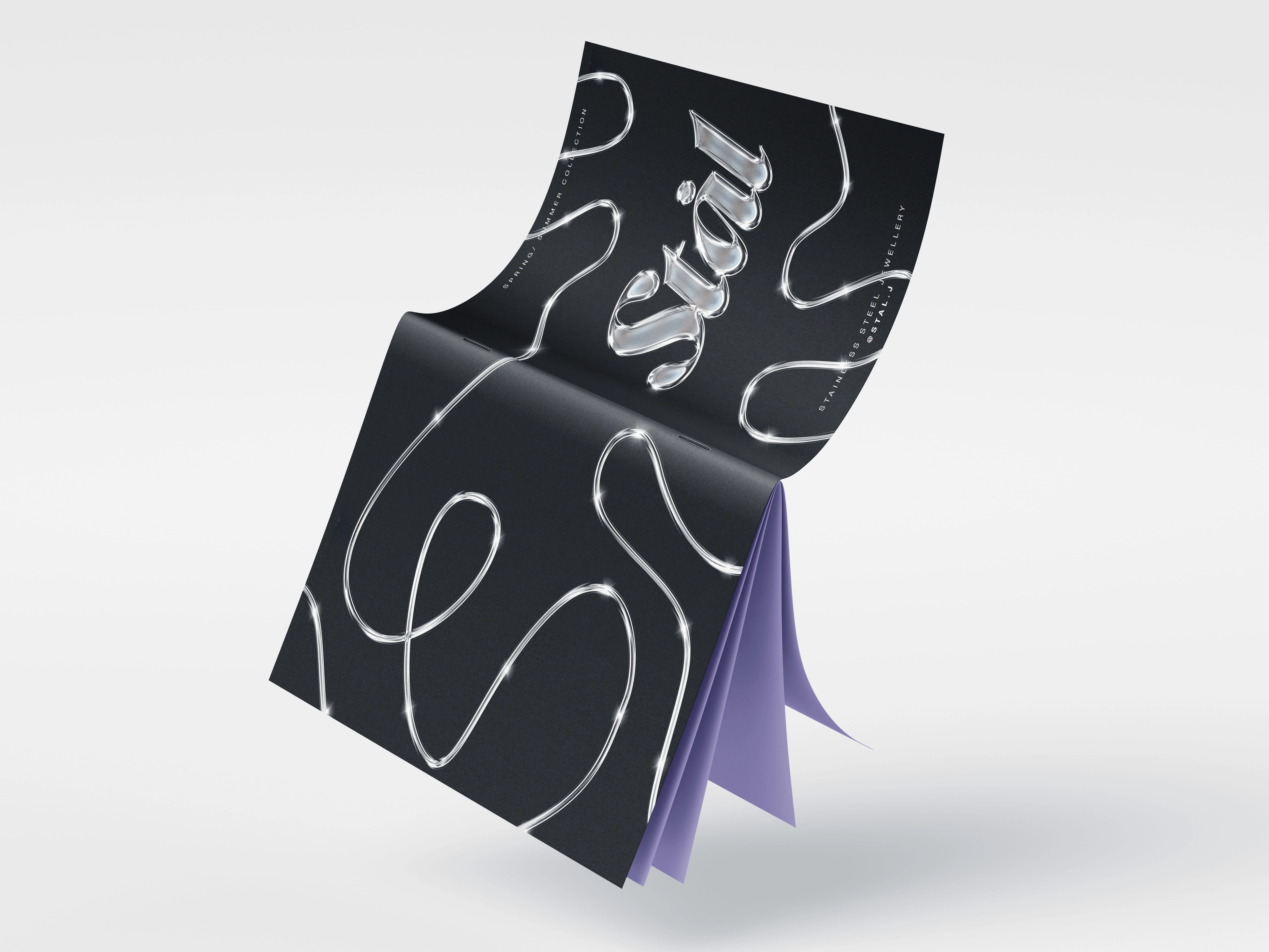
Example of how a brand catalog for the new season could look like.
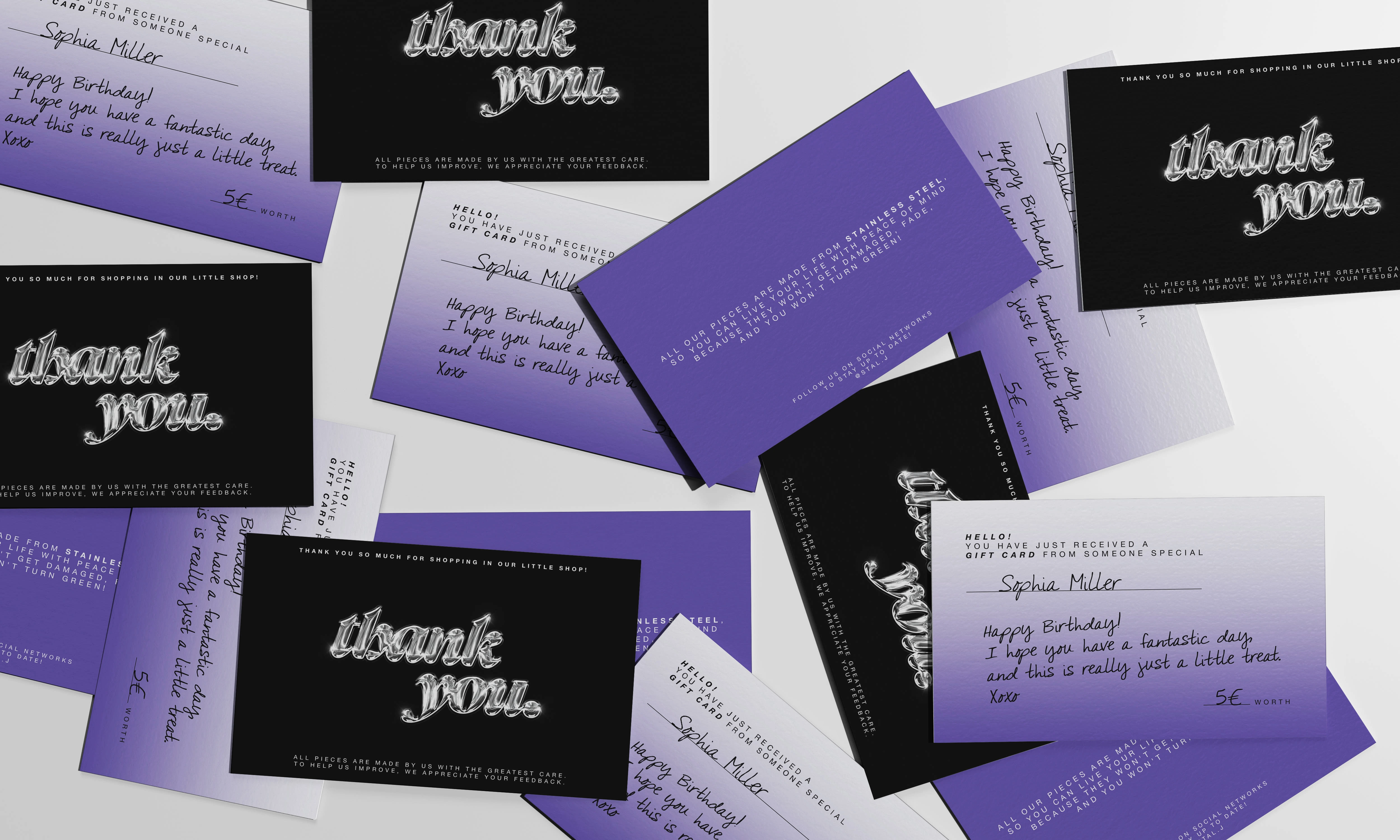
Gift cards + thank you cards for the purchase + Cards with the brands' information, plus products.
Like this project
Posted Feb 10, 2023
Graphic identity for a jewellery brand focused solely on stainless steel.