MIK Festival | Rebranding
Mariana Matos
New logo.
MIK FESTIVAL
The redesign of the visual identity of this Korean music festival is a recreational conceptual project. As a k-pop fan I didn't feel that the current identity of the festival was the most appealing, so I made the decision to experiment creating a visual identity for it.
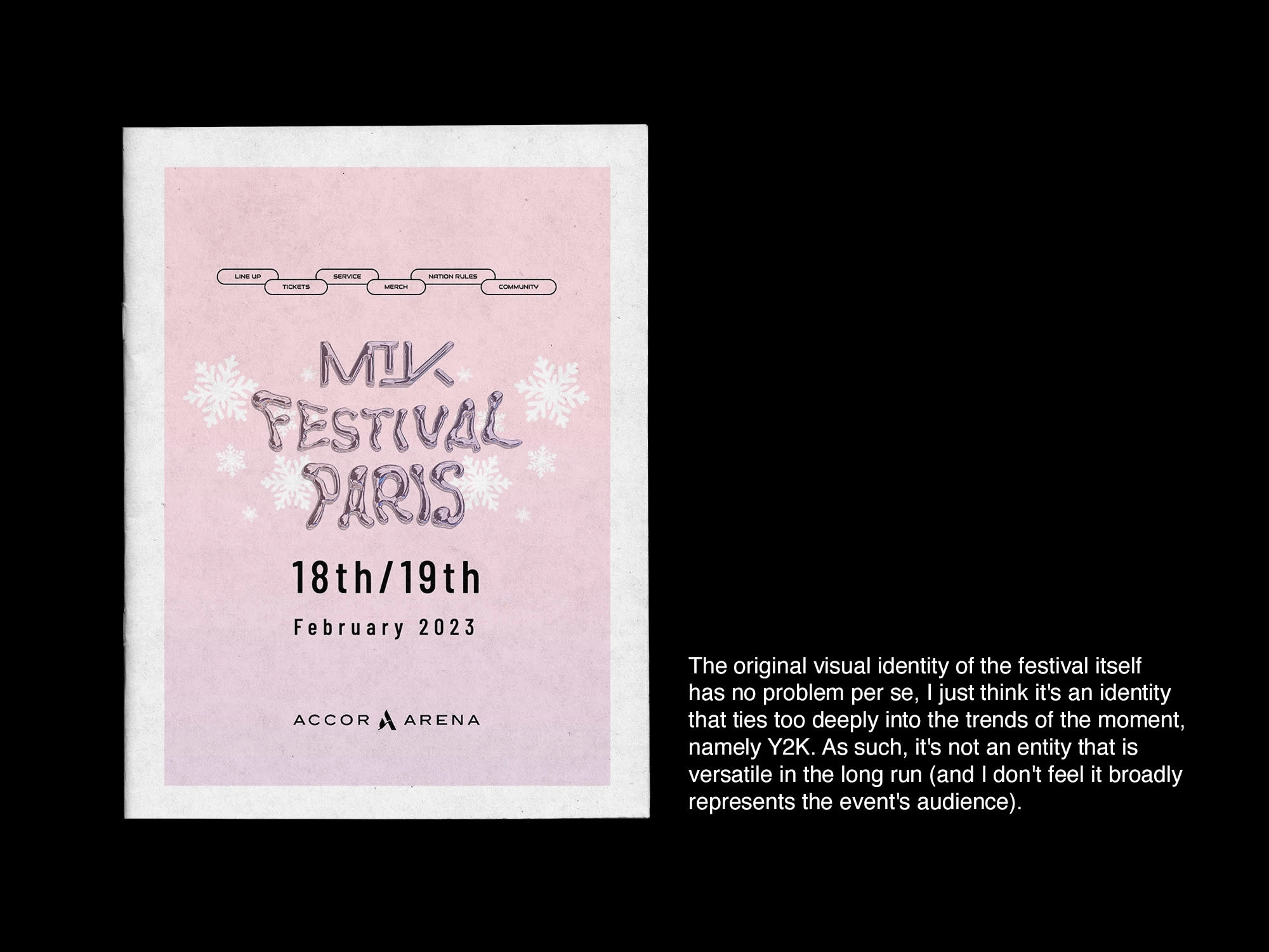
Original identity for the event of this year.
I opted for a more modern approach, clean but at the same time quite versatile.
The logo is composed by the letters of the name of the event, as well as the symbol (which represents the i). This symbol throughout the pieces will also serve as a graphic element that will maintain consistency across the project.
The typographic choice was for a san serif to be minimalist and contemporary, where we could play with its size and thickness to create hierarchies.
For the chromatic palette I followed the colours that the event already used, but much more saturated and with the detail of the gradient that gives it some dynamism.Website on a phone.
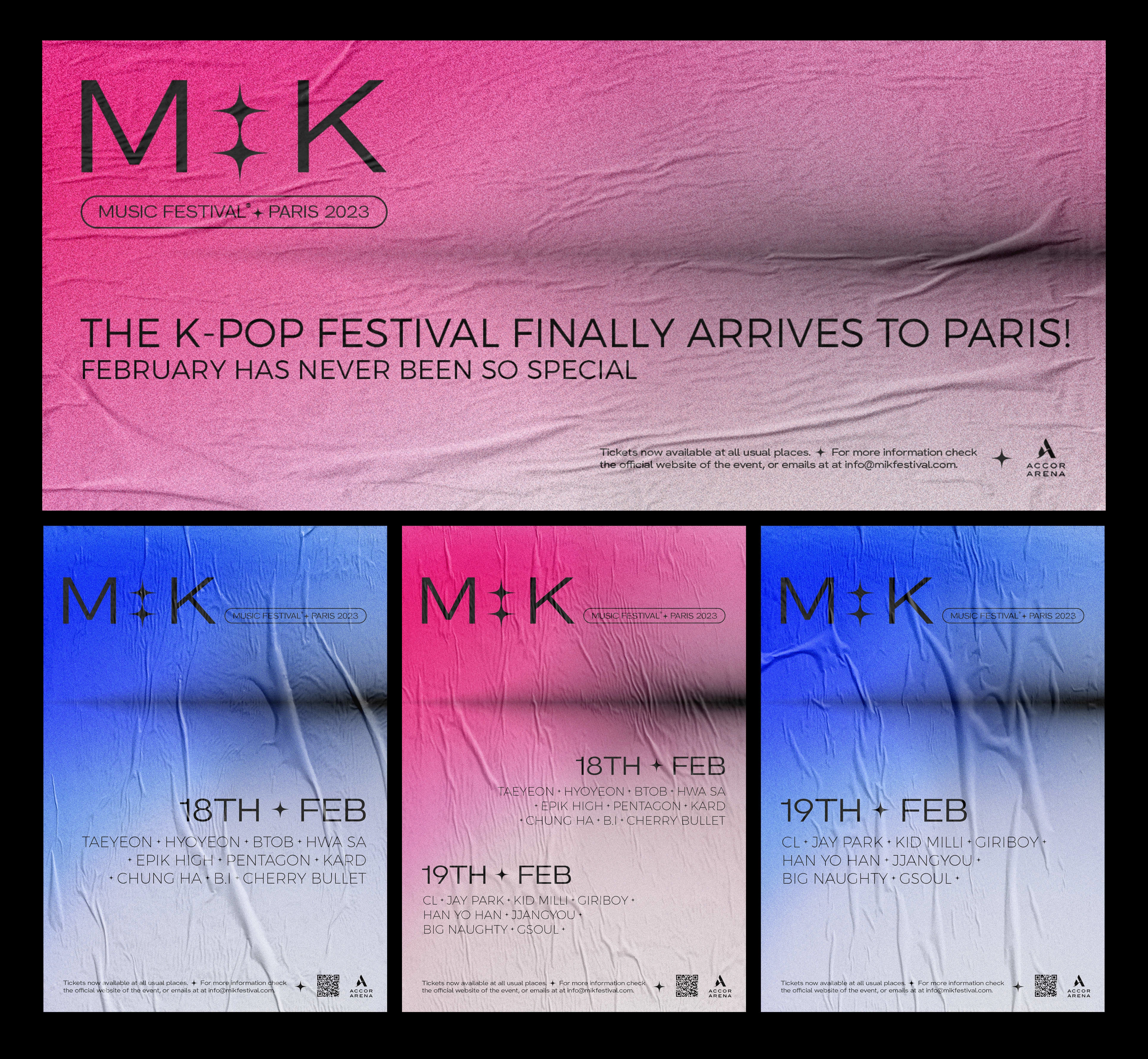
Poster of the event.
Site.
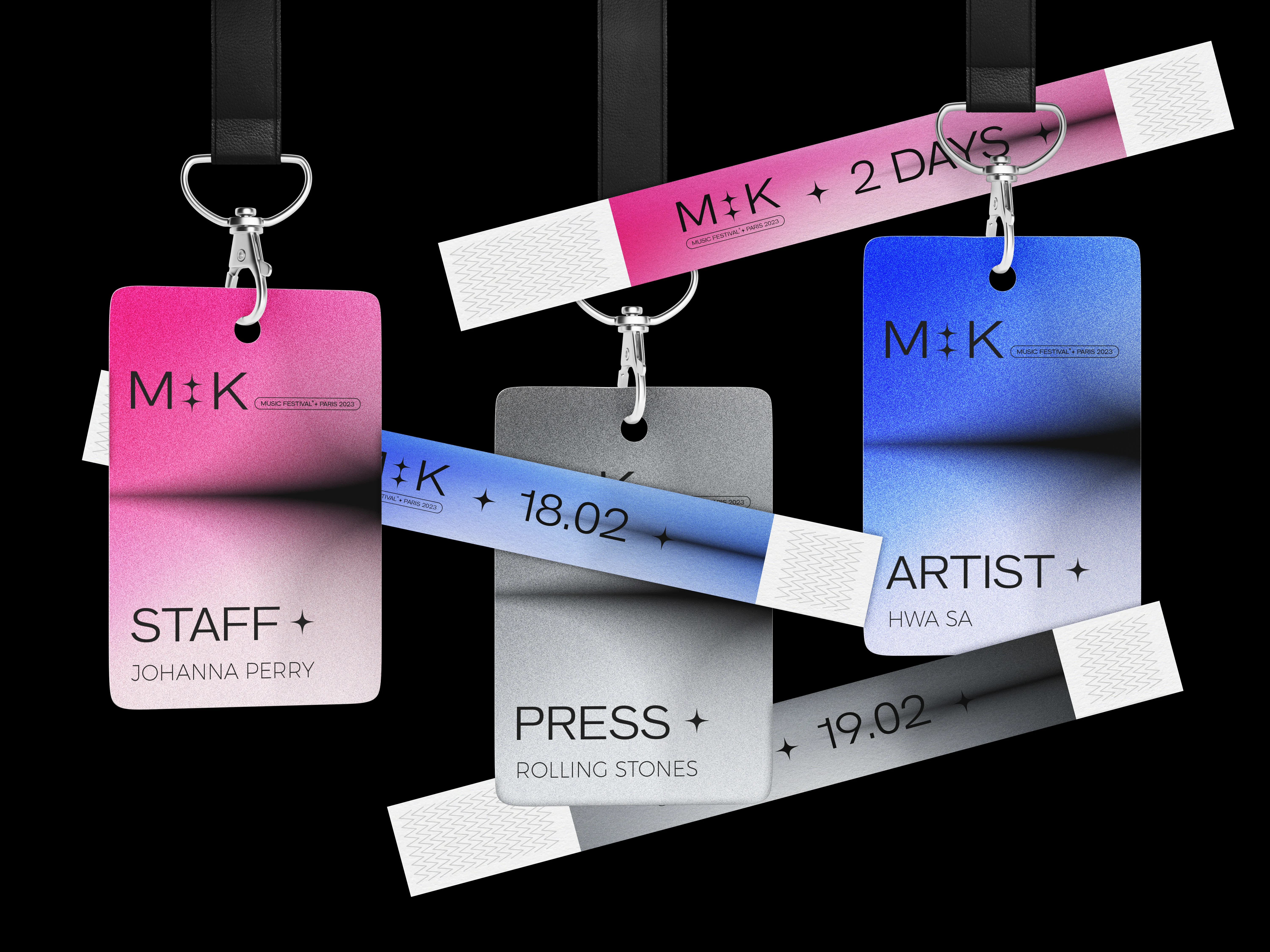
Entrance wristbands for spectators corresponding to the days purchased & identification cards of people involved in the event.
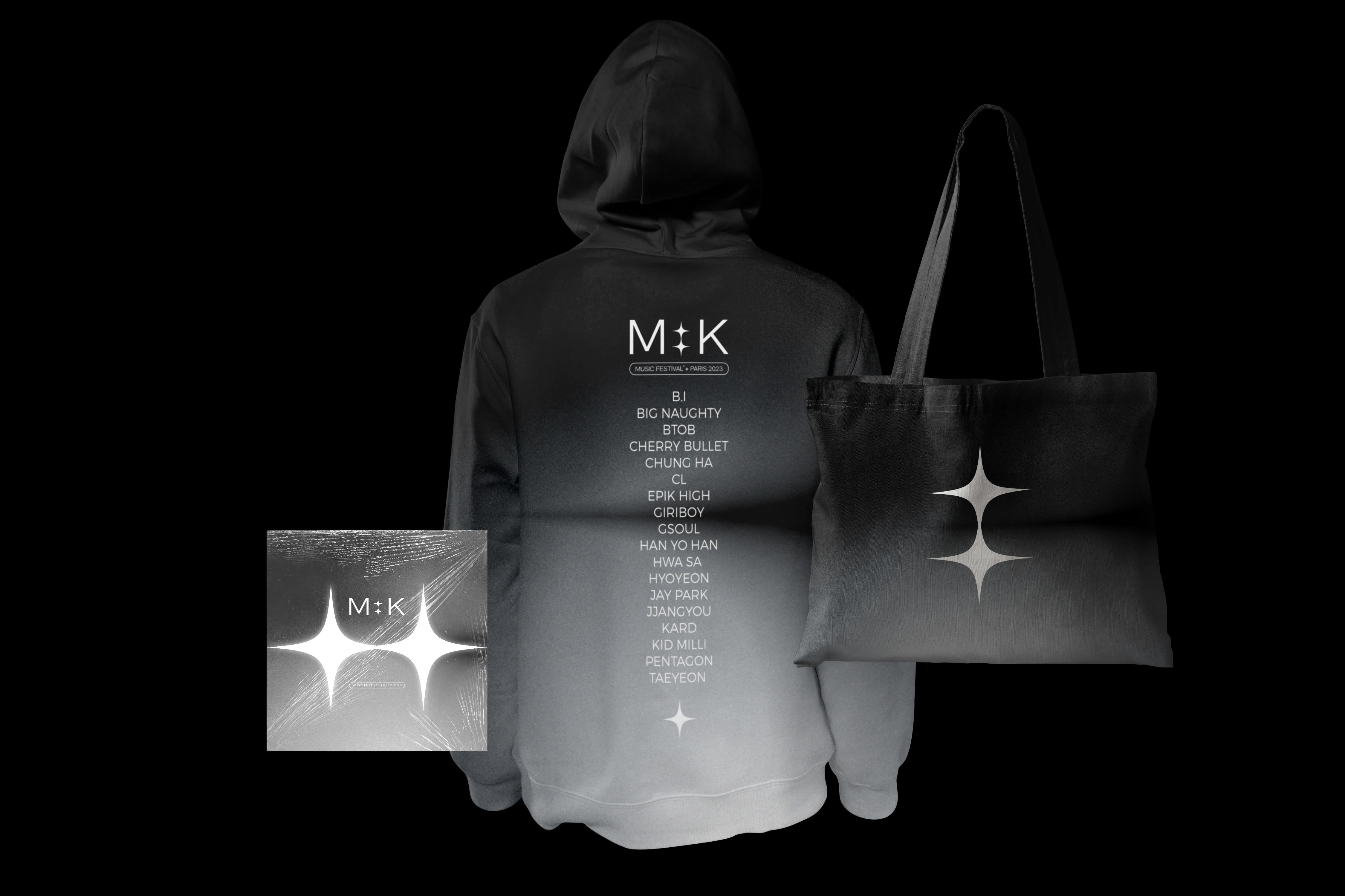
Merchandising of the event: hoodie; tote bag & DVD with the live performances of the artists.
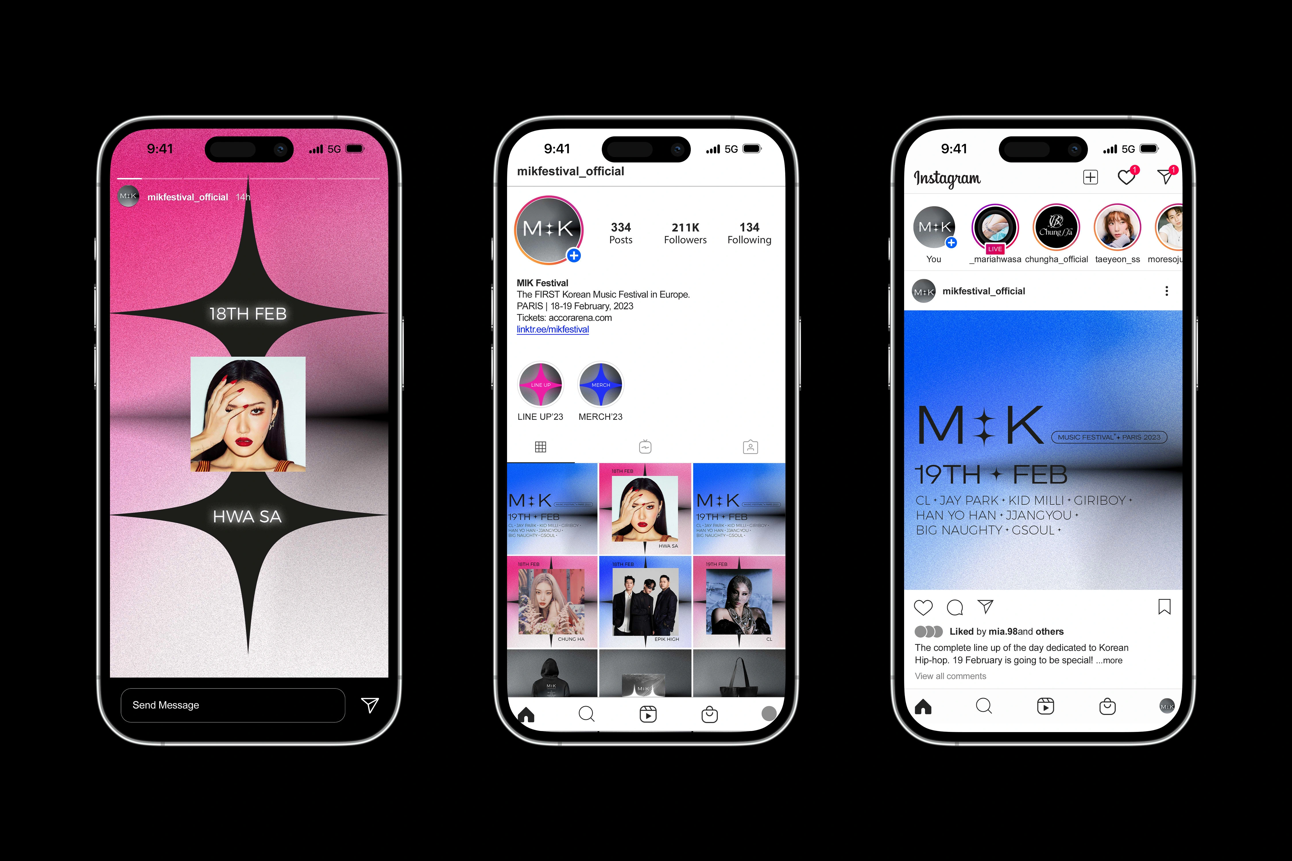
Social media.
Like this project
Posted Feb 15, 2023
Rebranding of the visual identity of the K-pop music festival MIK.