
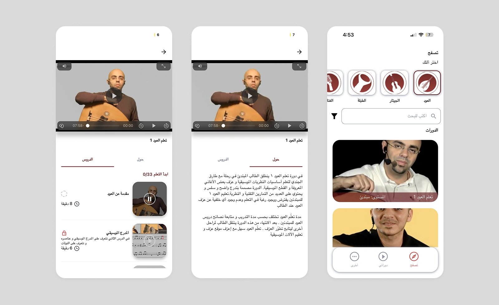
Old Design
The old design buried key lesson details under tabs and lacked clear visual hierarchy. Its cluttered layout made lessons harder to navigate and focus on.
Design System
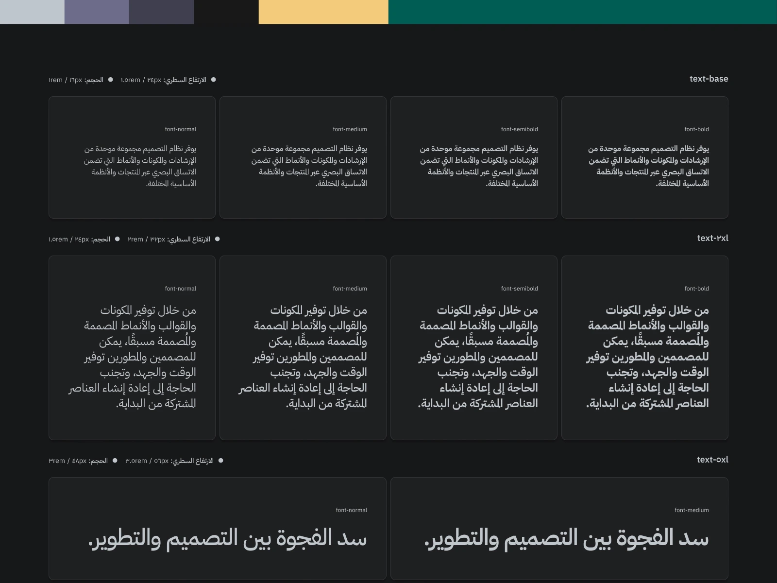
To make Izif consistent and easy to grow, I created a flexible design system with clear typography, colors, icons, and reusable components. It helped keep the app cohesive and made future design updates faster.
Onboarding
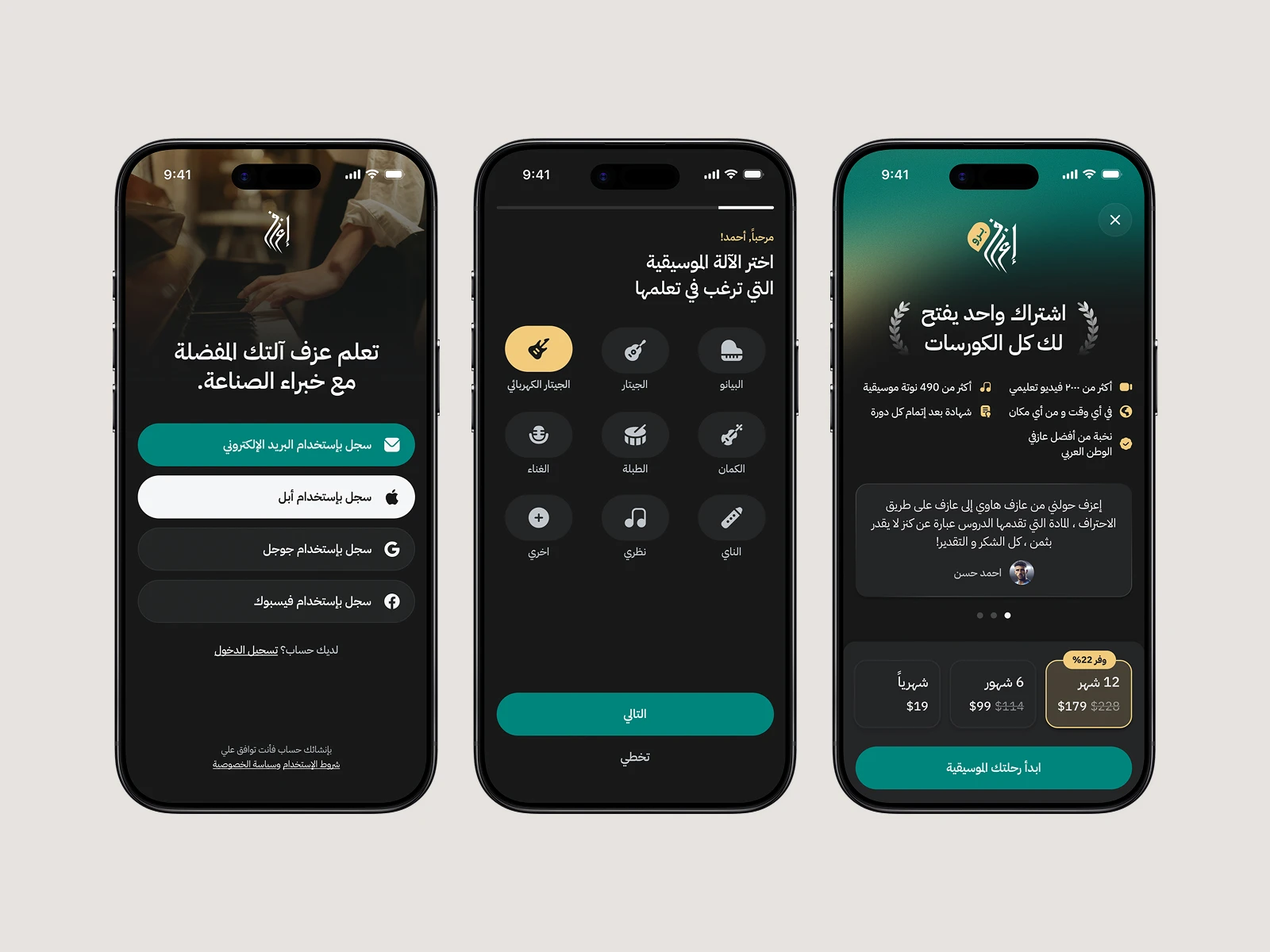
From sign-up to subscription, the streamlined flow helps new learners get started quickly. Personalized instrument choices and clear plan details make each step easy to follow.
Home That Adapts
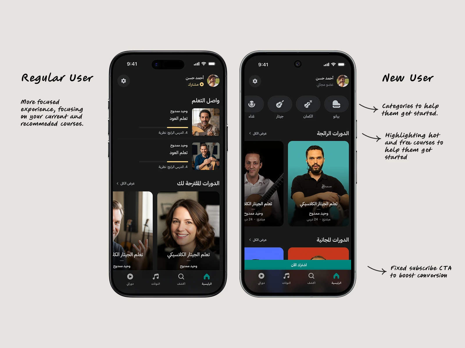
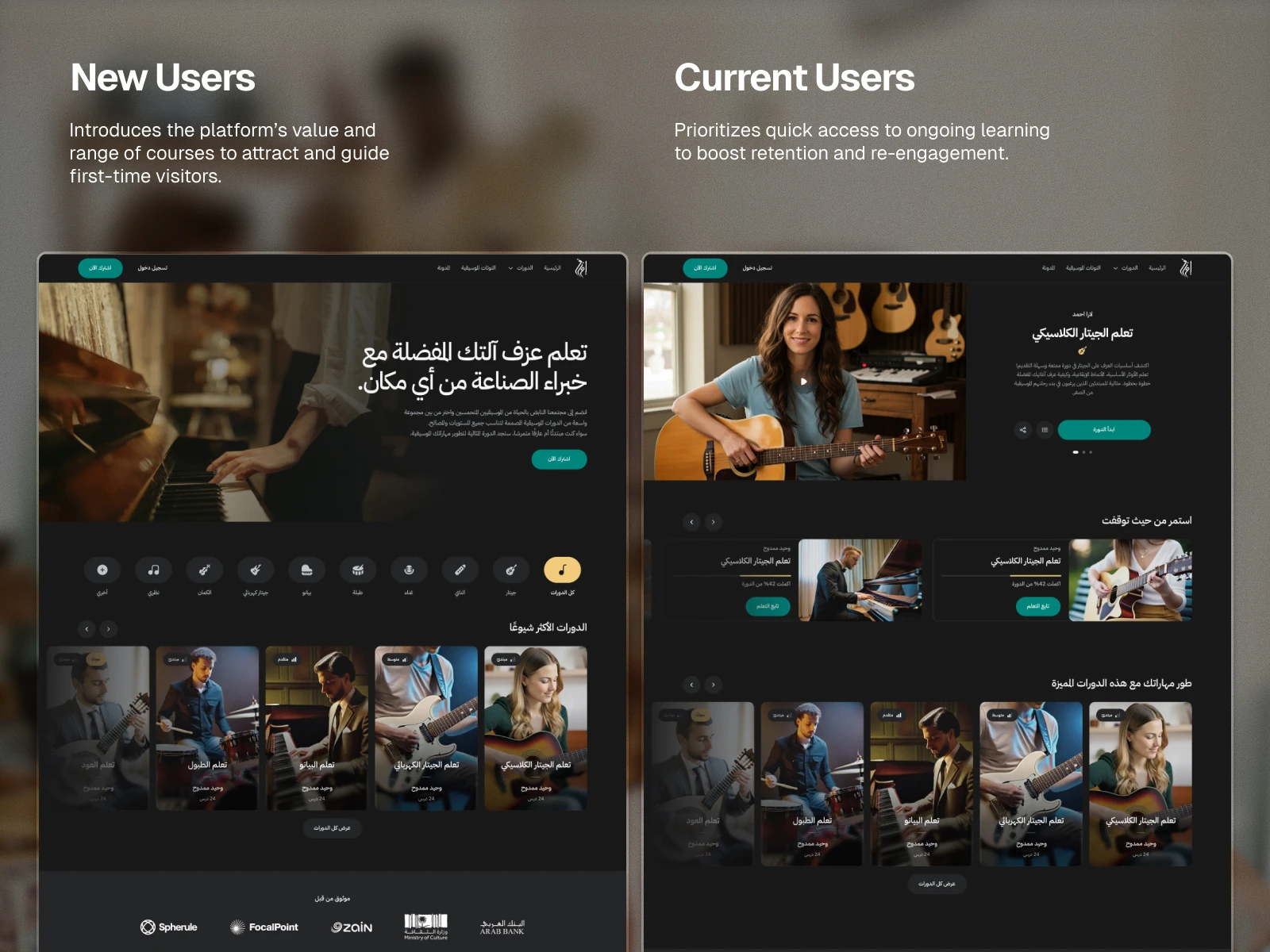
The redesigned home screen helps returning users pick up their active courses, while guiding new learners to curated categories and featured lessons.
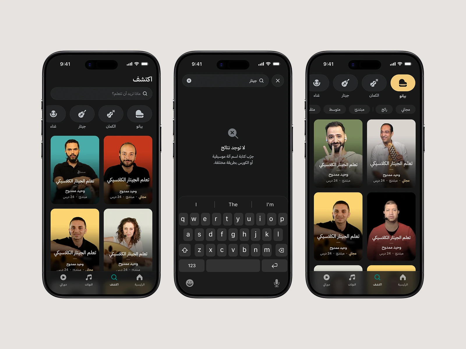
Explore & Search
The new Explore flow makes course discovery easy, with filters for instrument and skill level and clear feedback when there are no matches.
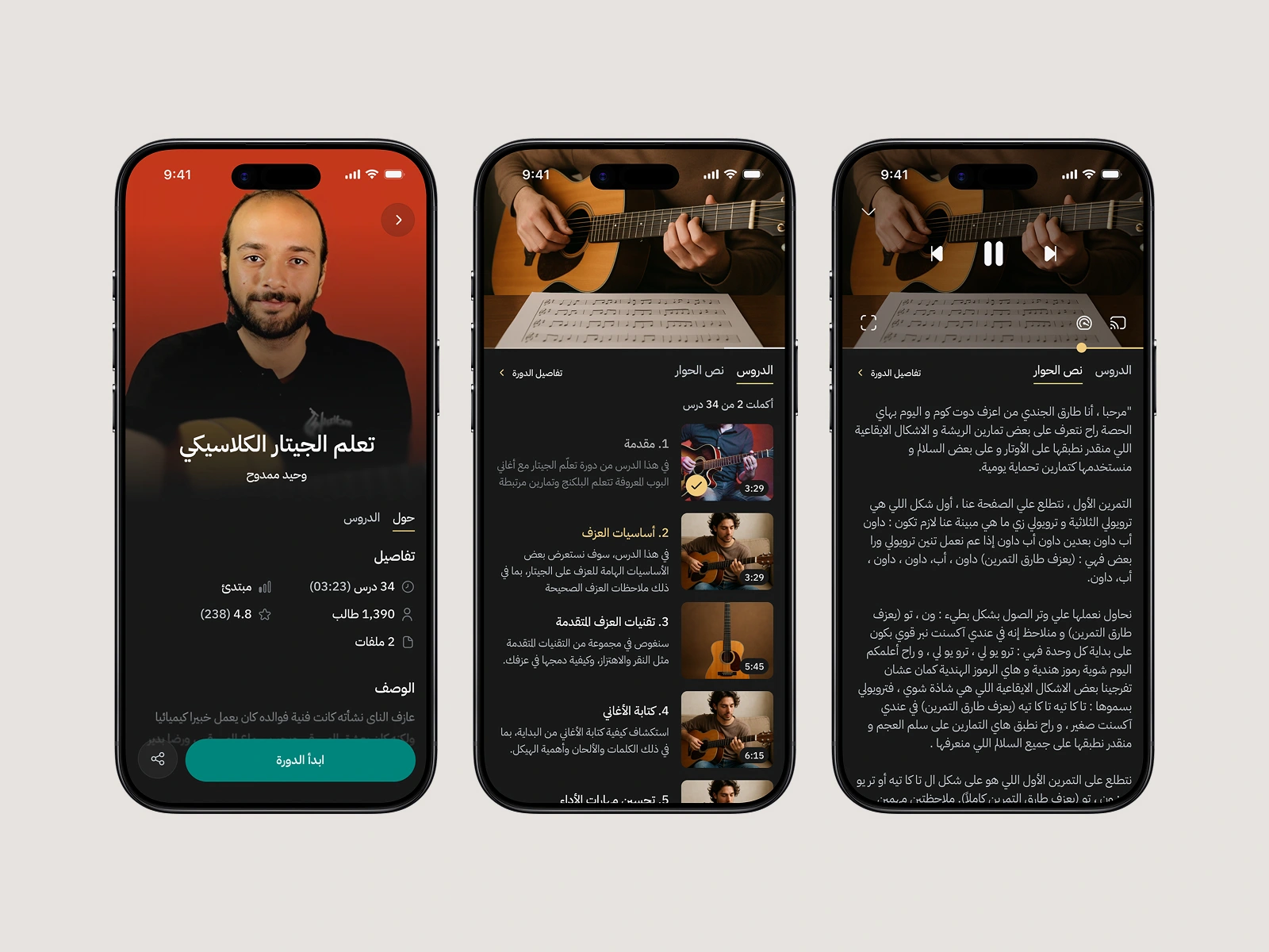
Course Playback and Details
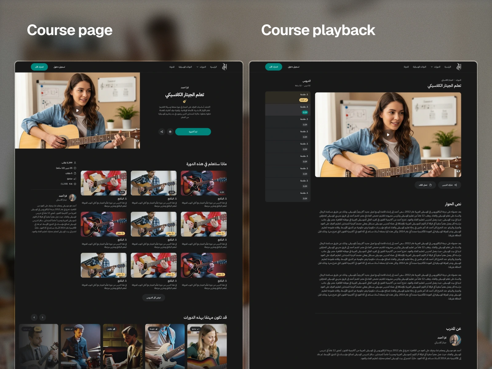
Course details and playback are designed for focus, with clear lesson structure, visible progress, and distraction-free video.
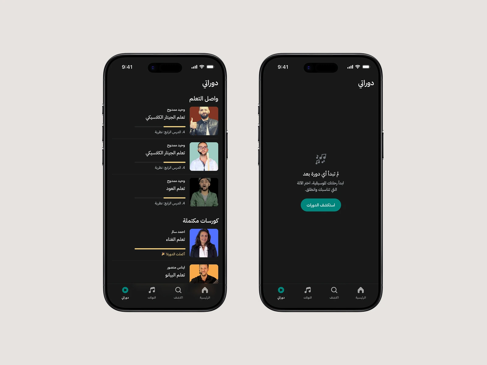
My Courses
The My Courses page keeps learning progress visible, making it easy to resume lessons, see what’s complete, and stay on track.
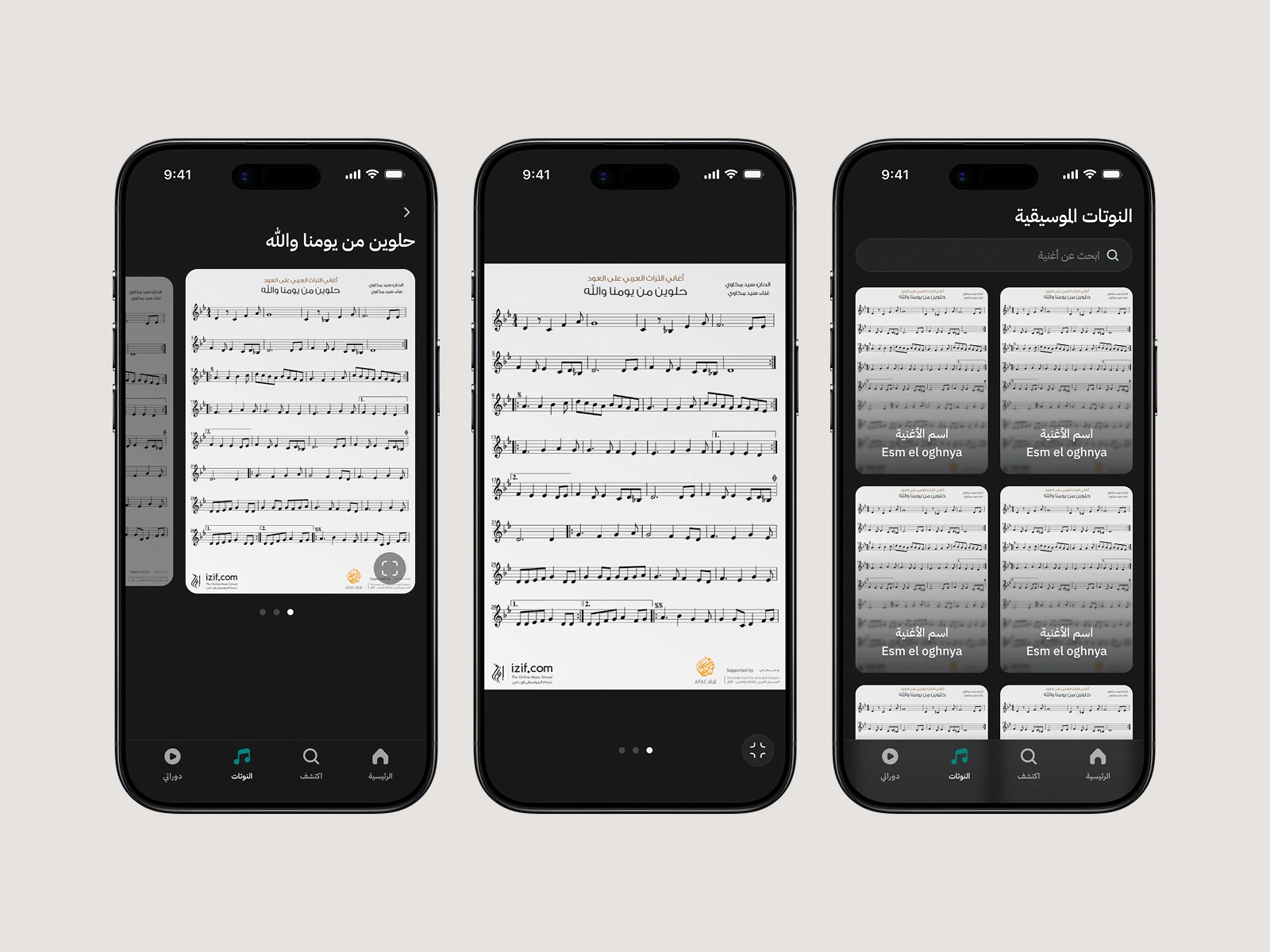
Musical Notes
The redesigned sheet viewer lets users follow along with precision. Clean layouts, easy zoom.
Desktop Web app
0 likes · 25 views · Nov 24, 2024
Izif.com needed a web app and mobile app redesign to make learning music more engaging.
