Creating Dark Mode for iOS app

Sina Ranjbar


Artupia’s iOS 13 Dark Mode Launch
The Challenge: Building the First Dark Experience
When iOS 13 launched in September 2019, it introduced the first-ever system-wide Dark Mode. This was a massive change for mobile design, and as the UX/UI designer for Artupia, adapting our app was an immediate and exciting challenge, particularly because, unlike today where Dark Mode is standard, it was brand new back then! We knew we couldn't just invert the colors; the goal was to craft a beautiful, comfortable dark theme that was perfectly integrated with iOS, ensuring we retained the vibrancy and focus on the artwork in our marketplace.
Key things we focused on:
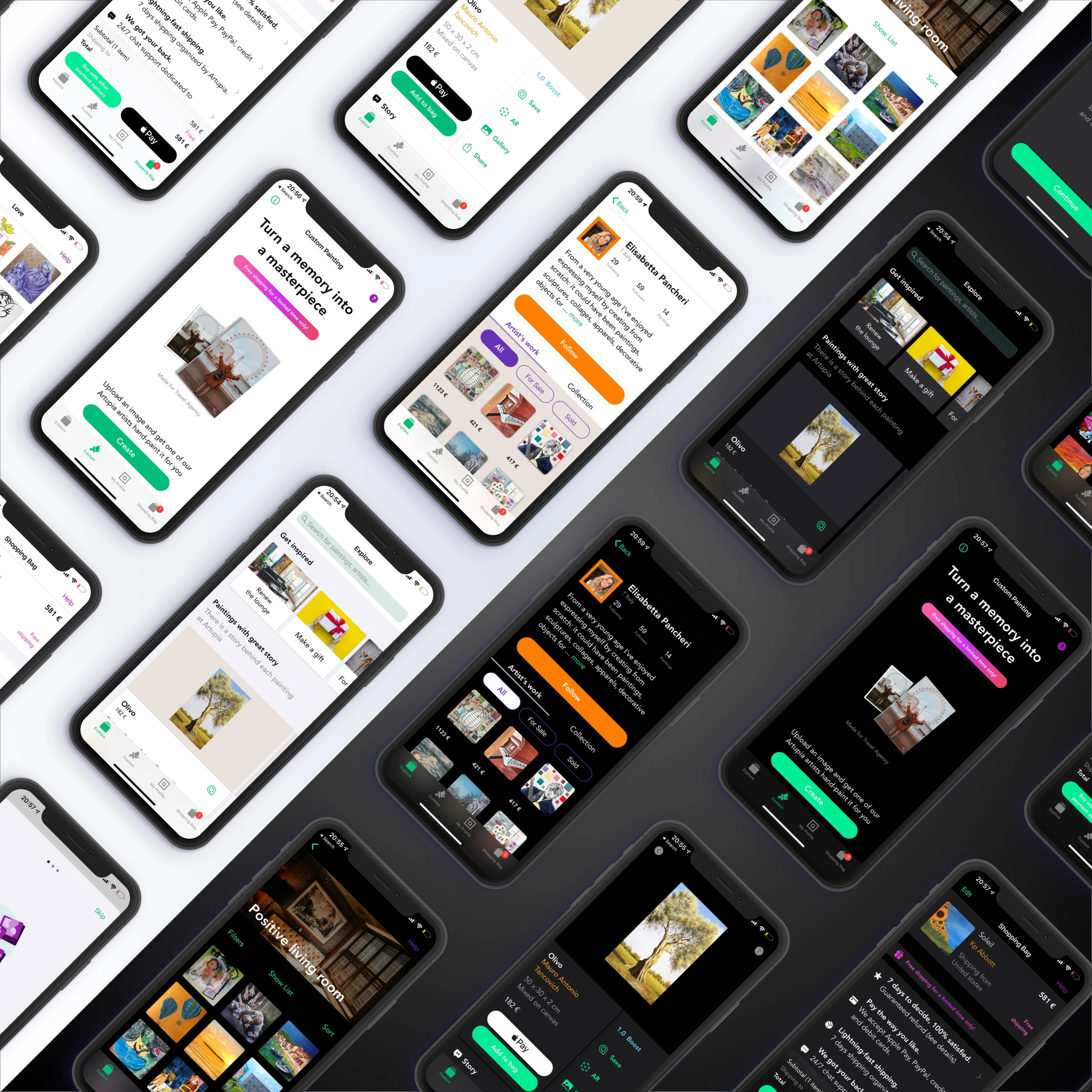
👓 Readability First: Swapping out the pure white background for a softer dark gray (to prevent eye strain) and using off-white text for clarity.
🎨 Making Art Shine: The dark canvas naturally makes the colorful artwork pop, giving every painting a premium, gallery-like presentation.
📐 Clarity and Depth: We used different shades of dark gray instead of shadows to clearly separate elements like product cards and navigation bars, keeping the interface easy to navigate.
This implementation successfully delivered a seamless, comfortable, and modern viewing experience that delighted our early adopters and set a new standard for the Artupia app.
Like this project