Triple R Camping Resort: Branding
Skilline Design Co.
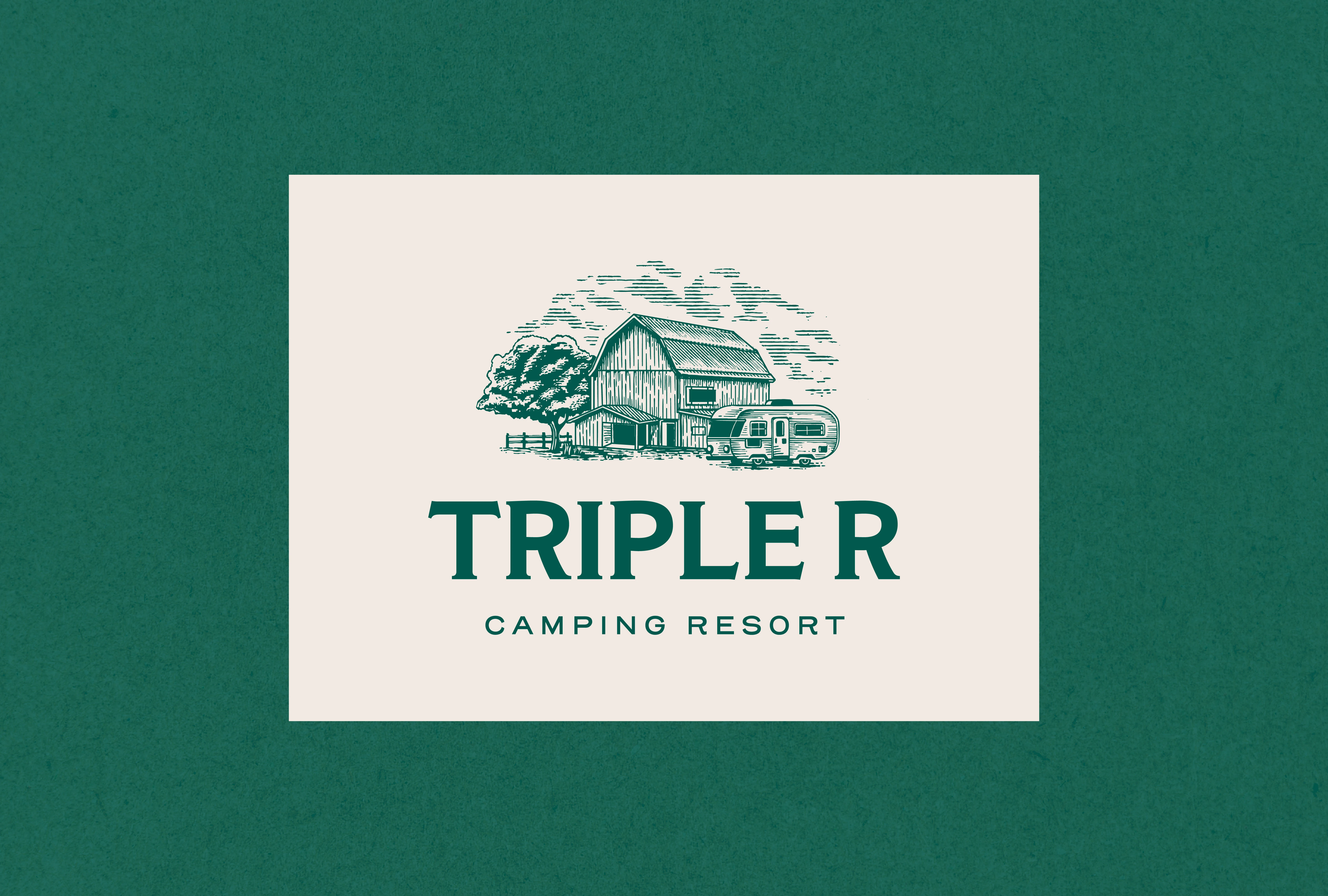
Retro meets the great outdoors.
We crafted a fresh brand identity for Triple R Camping Resort that captures the nostalgia of vintage campgrounds with a modern twist. From a custom badge-style logo to versatile graphic assets, this branding system evokes adventure,comfort, and rustic charm—designed to resonate with both lifelong campers and weekend wanderers.
Lockup
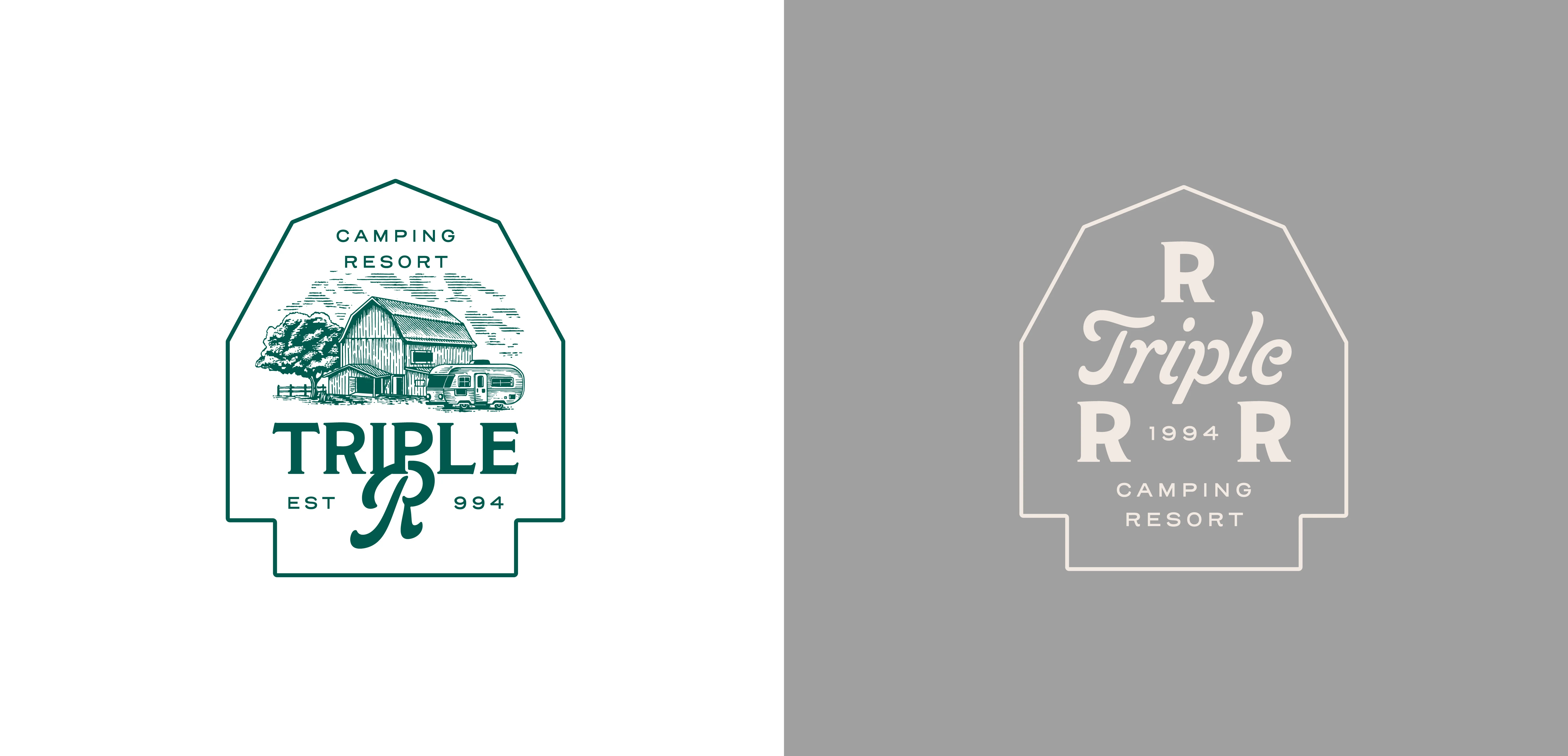
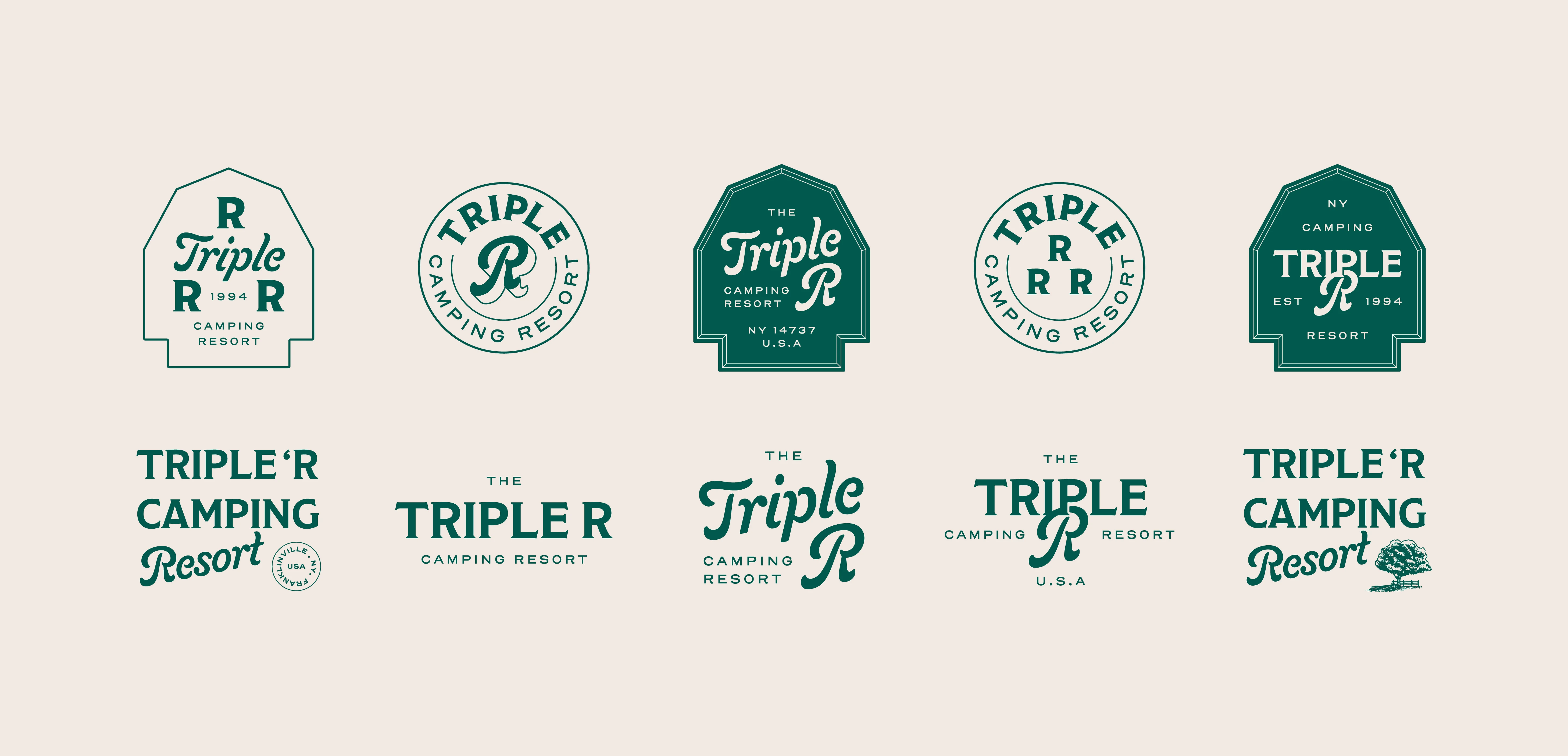
Alt. Logo
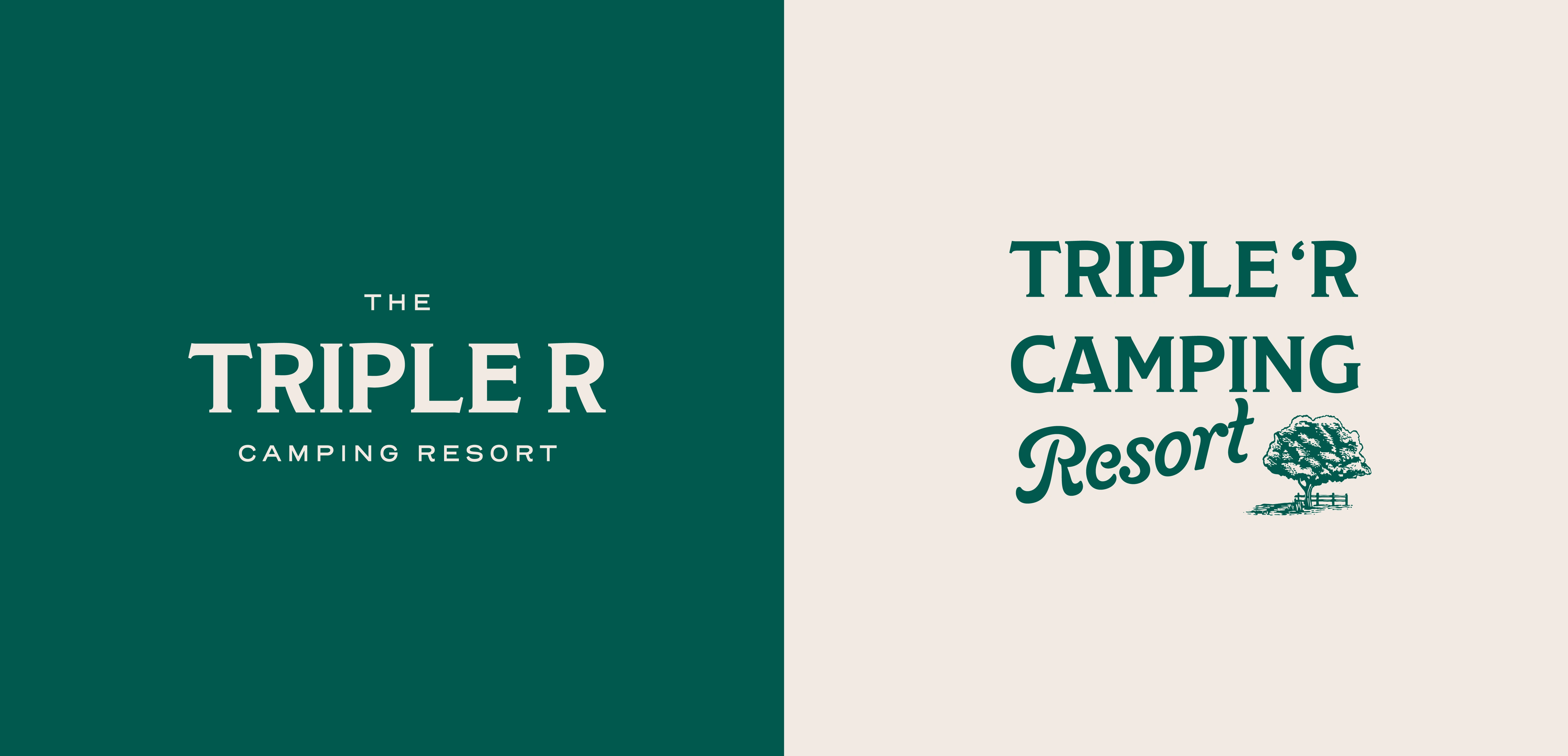
Alt. Logo
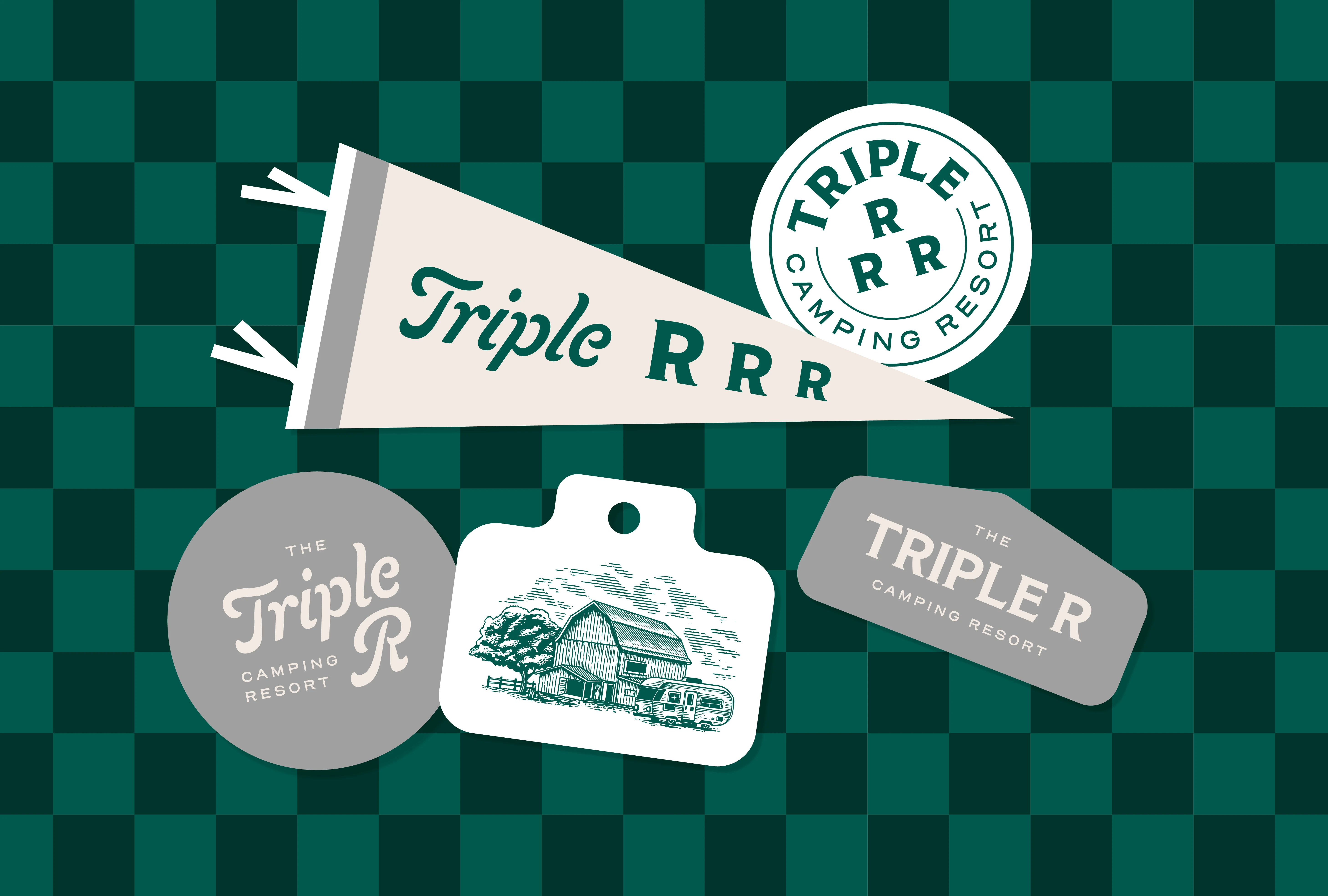
Sticker
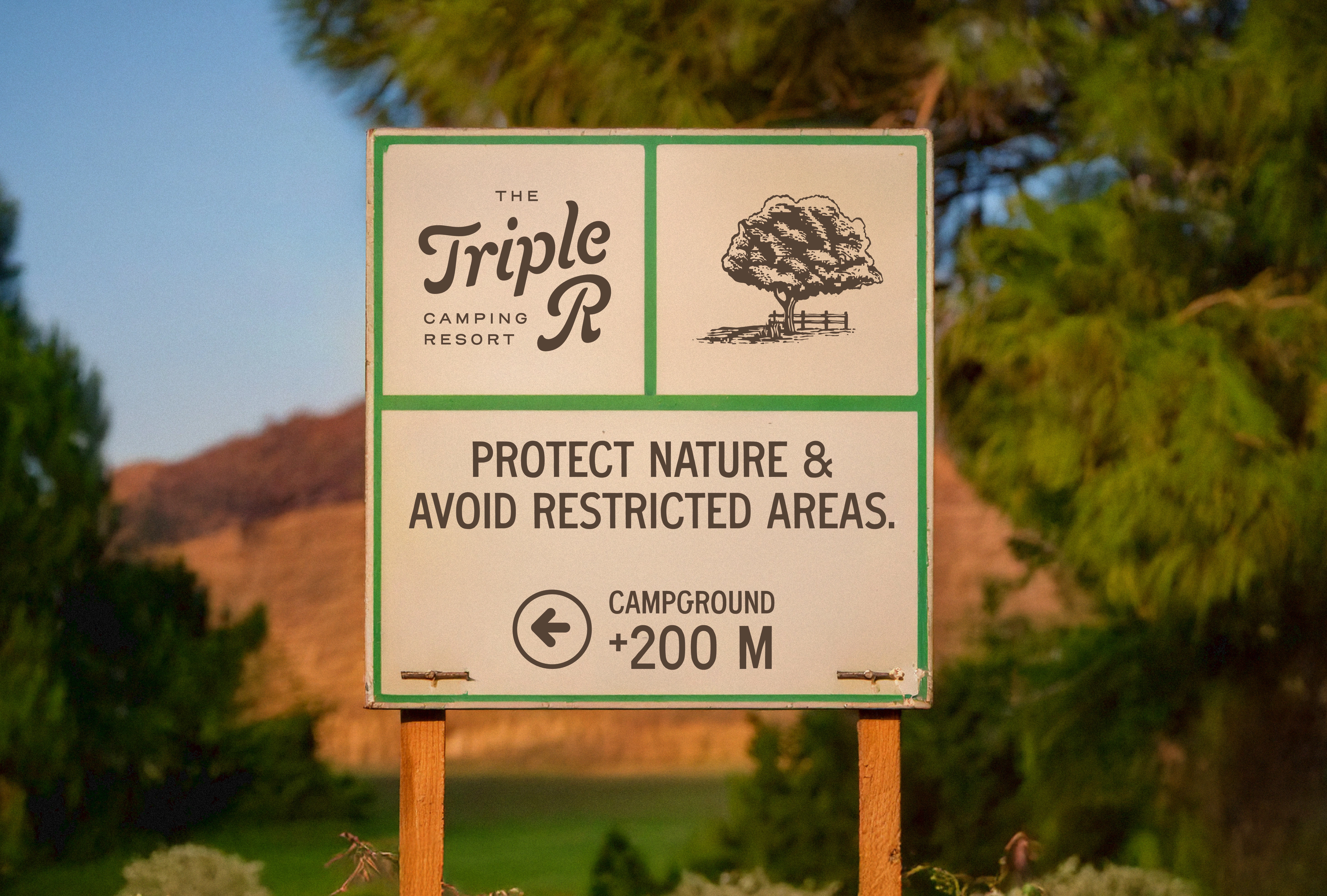
Signage
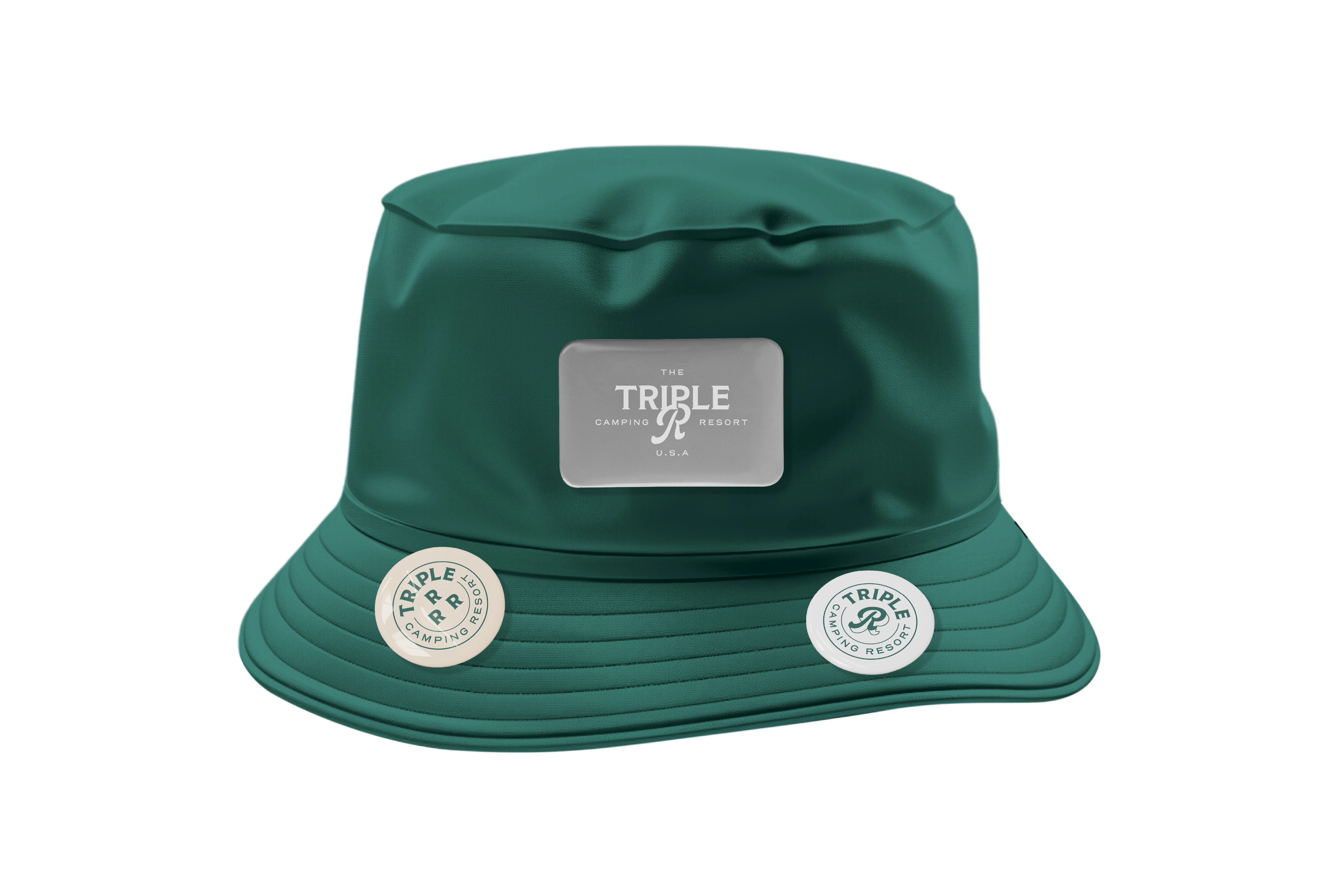
Hat
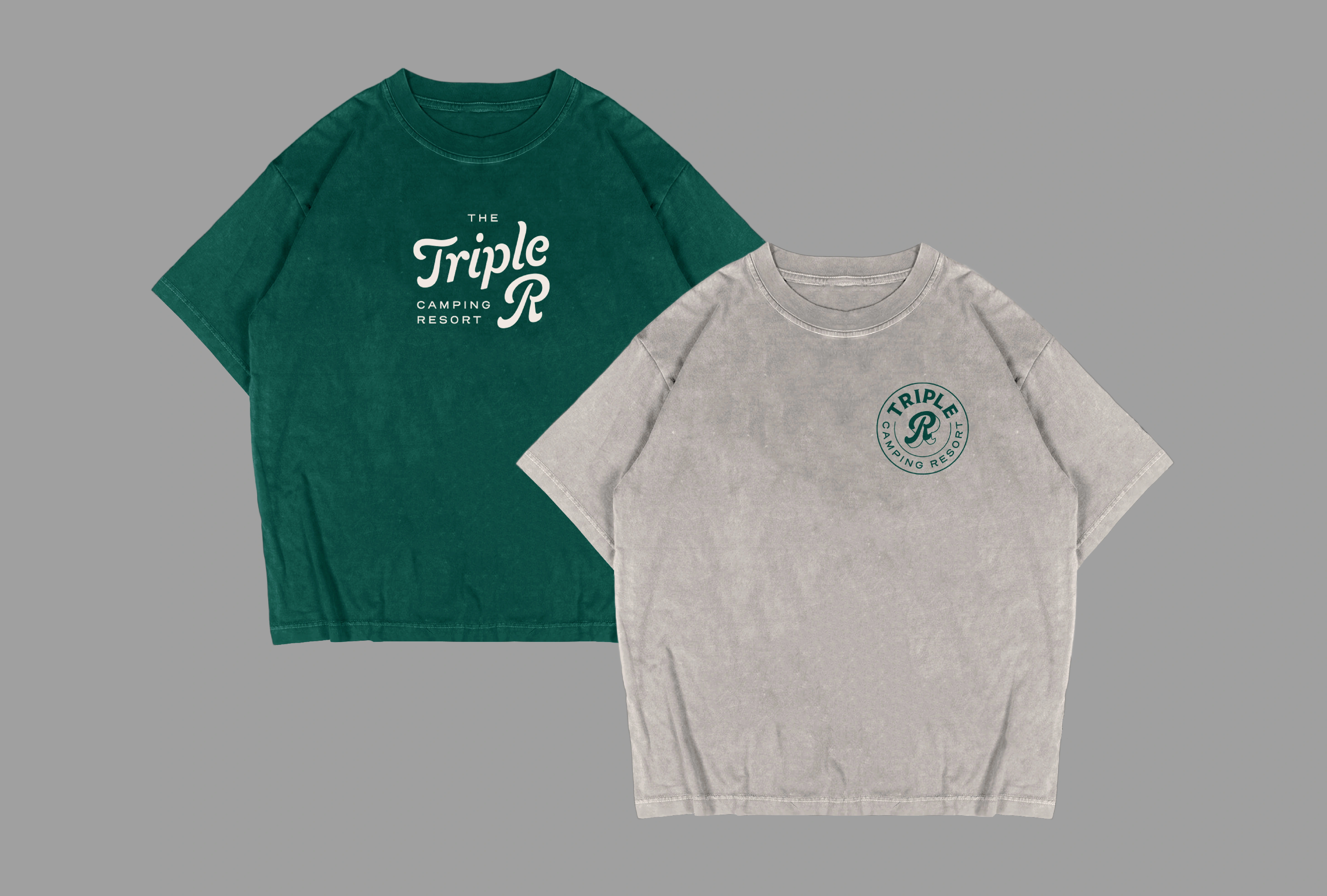
T-shirt
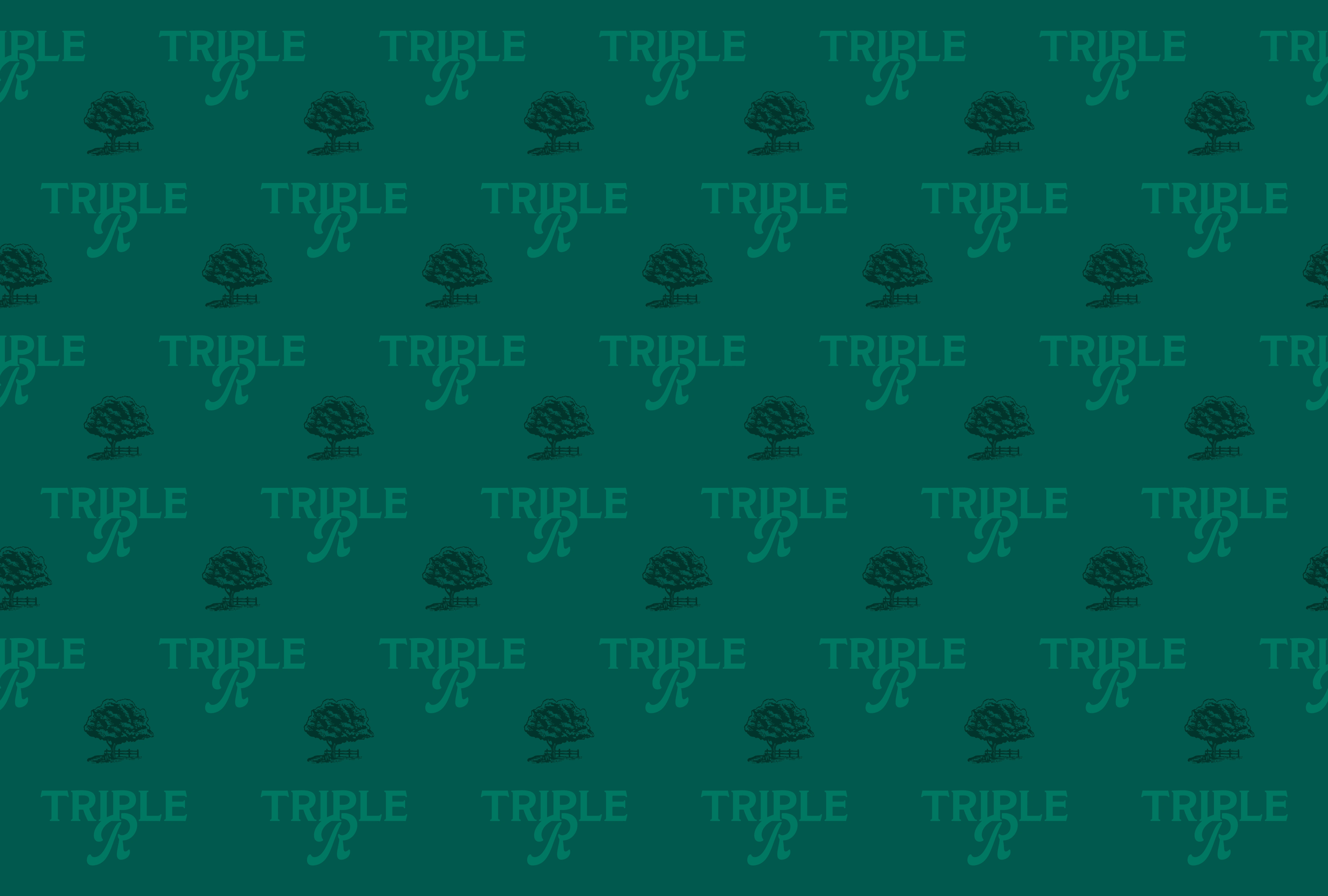
Pattern
Like this project
Posted Apr 23, 2025
Developed retro-inspired branding for Triple R Camping Resort.