Motoculture | Product Card Redesign | UI UX Design

Artur Kovelskyi

Motoculture is a French affiliate site – buying guides for robot lawn mowers. The whole business depends on one click: "see the offer".
On the old card, that click was buried.
This is how I dug it out – without changing the content.
Role
UI/UX design – audit, structure, final UI. The site is live and in French, so these are the real screens, not a mockup.
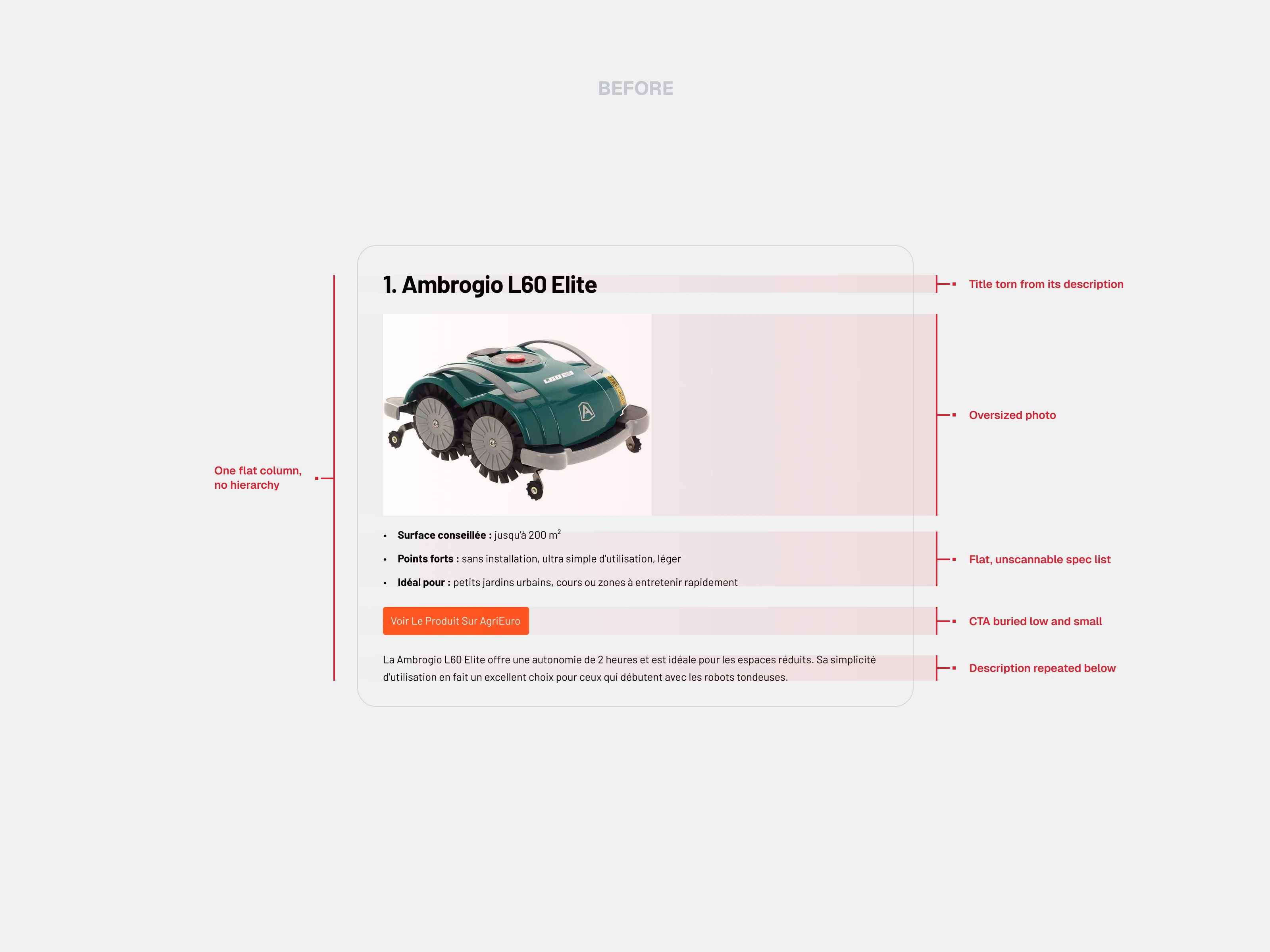
1. Audit the old card
The problem was structure, not visuals. Stacked headings pushed the product below the fold, the CTA sat at the very bottom, specs ran as a flat inline list, and the description repeated itself under the button. The title was torn from the text describing it.
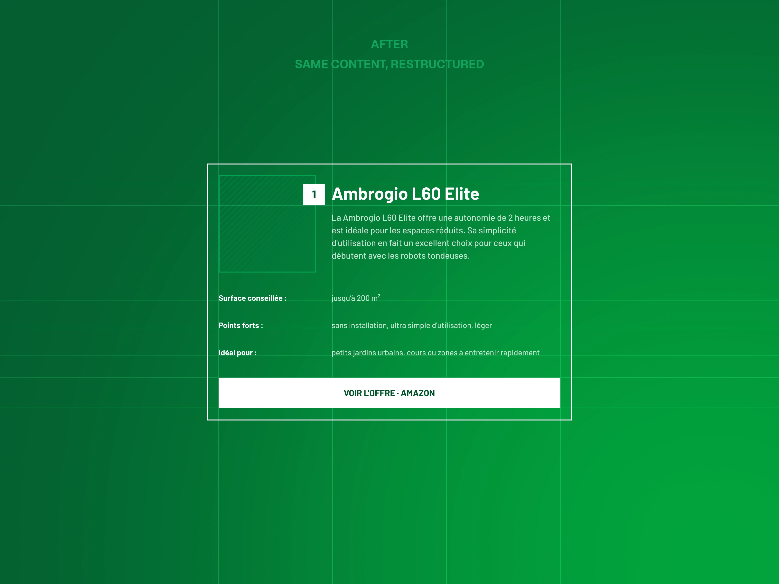
2. Restructure before styling
I rebuilt the card in one flat tone, no styling yet – so the layout had to work on structure alone. Product and CTA above the fold, specs into a scannable table, one clear path down the card, no repeats.
Same content. Restructured.
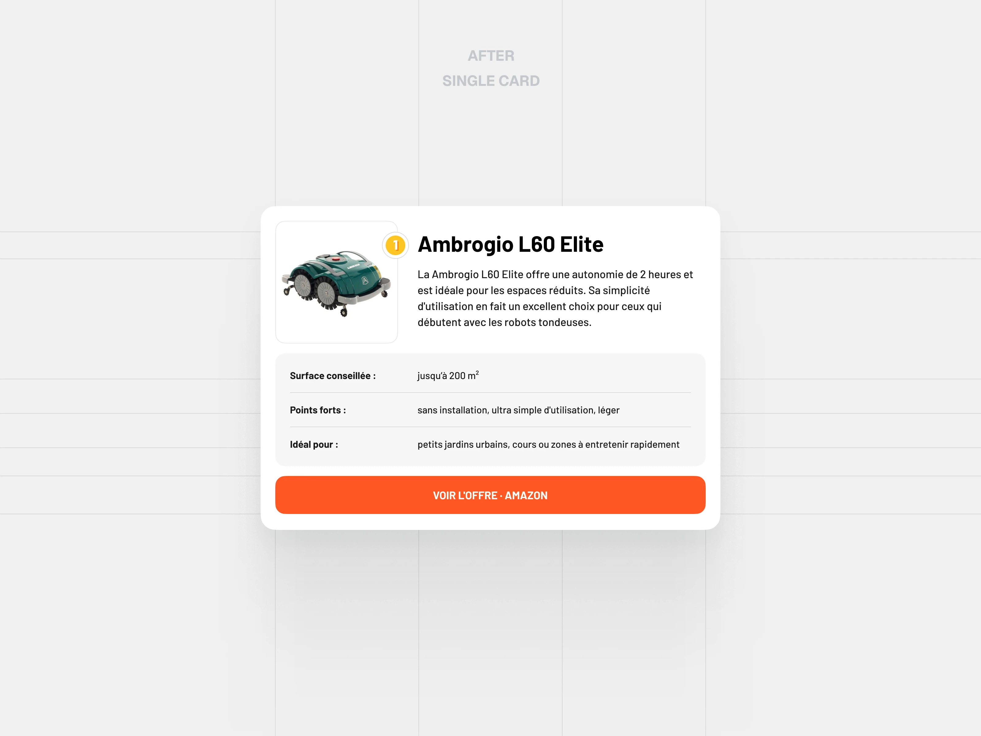
3. Give the reader a reason to click
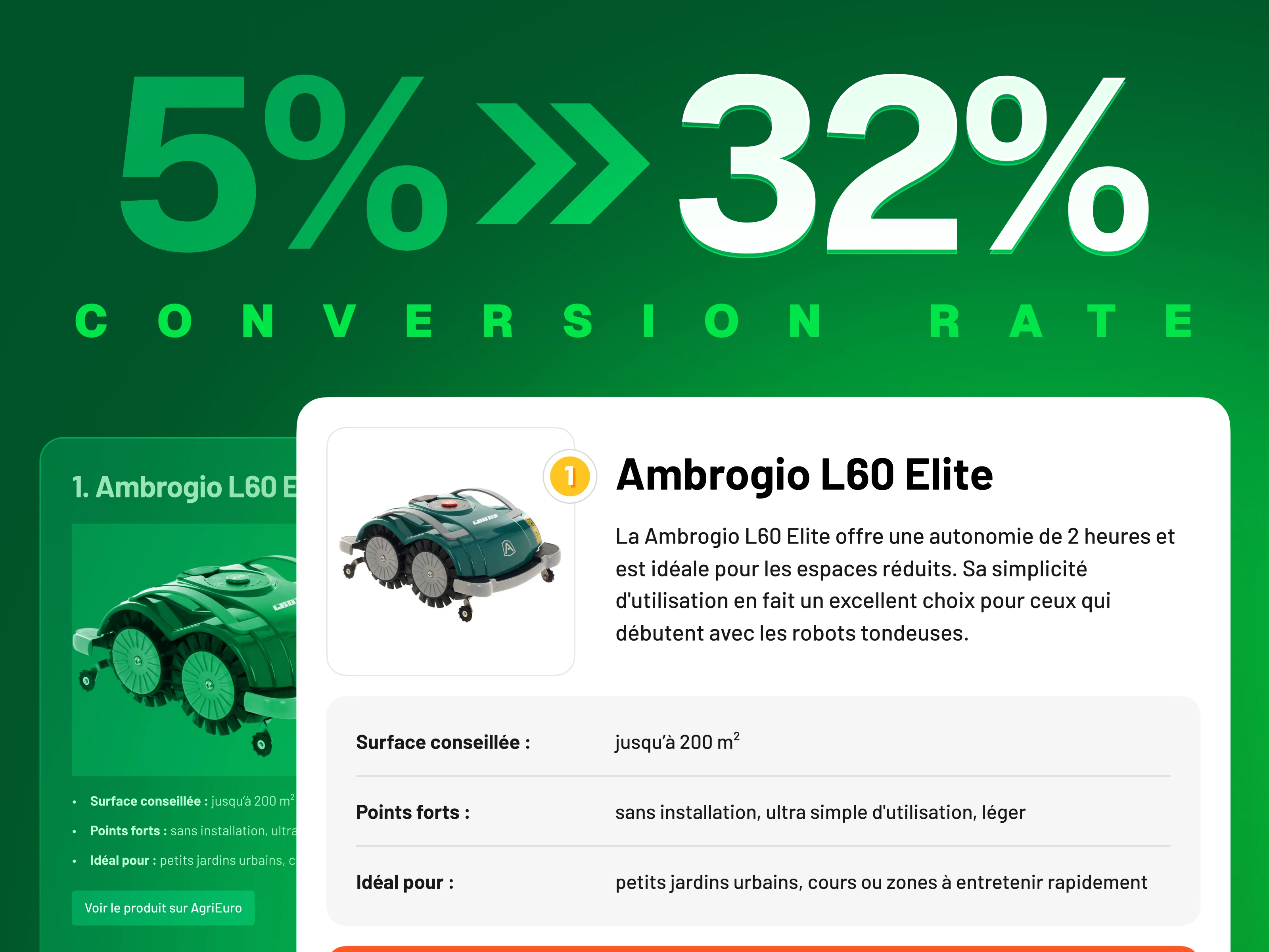
A visible button is not enough – people need to know why this one. So the card carries a score and a "best choice" badge. A rating is the cheapest trust you can add to a page.
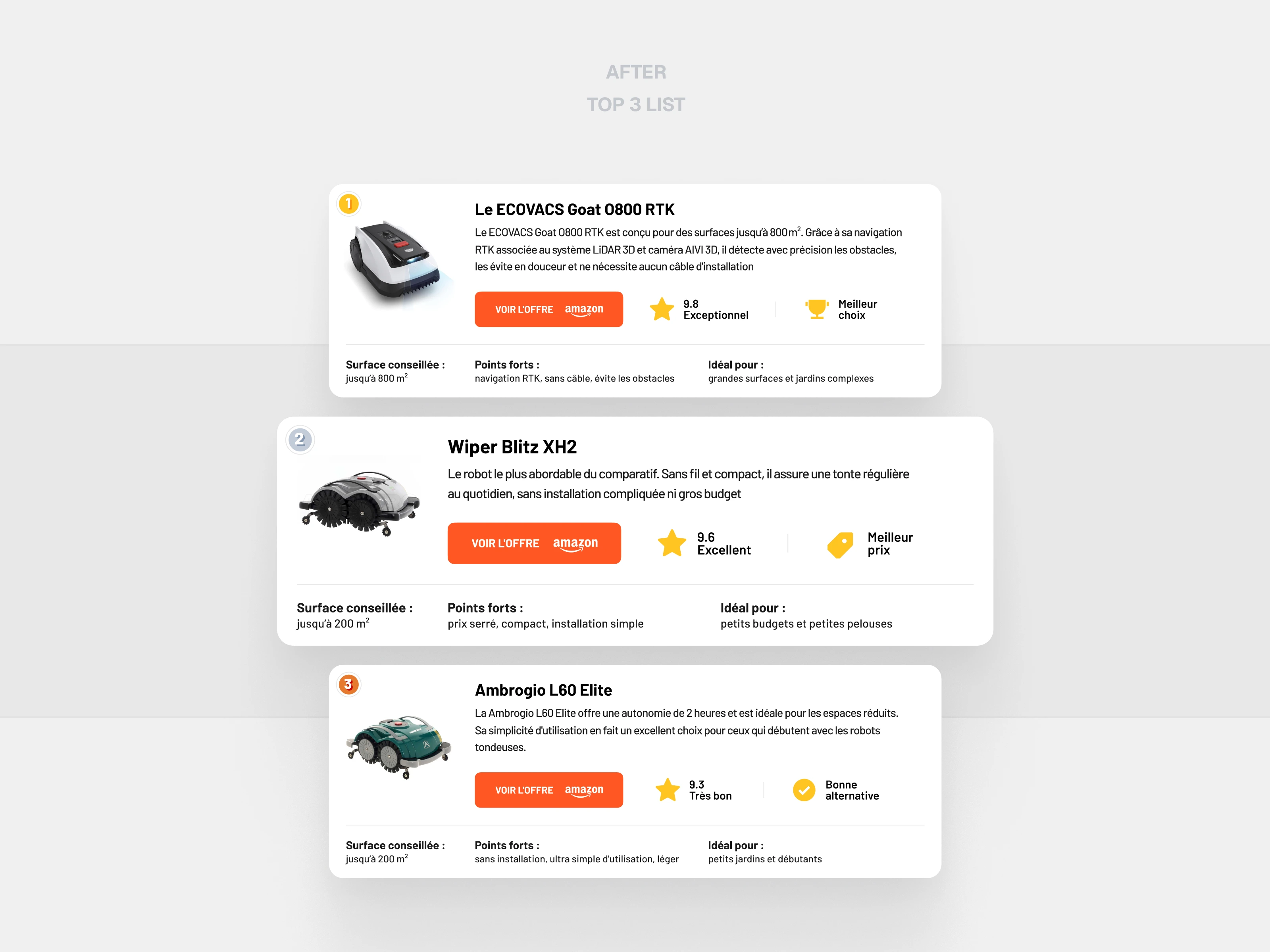
4. Two layouts, one system
A single product card for the detail view, and a ranked Top 3 for the buying guides – each mower with its own score, badge and offer, so the reader can pick without reading everything.
5. Result
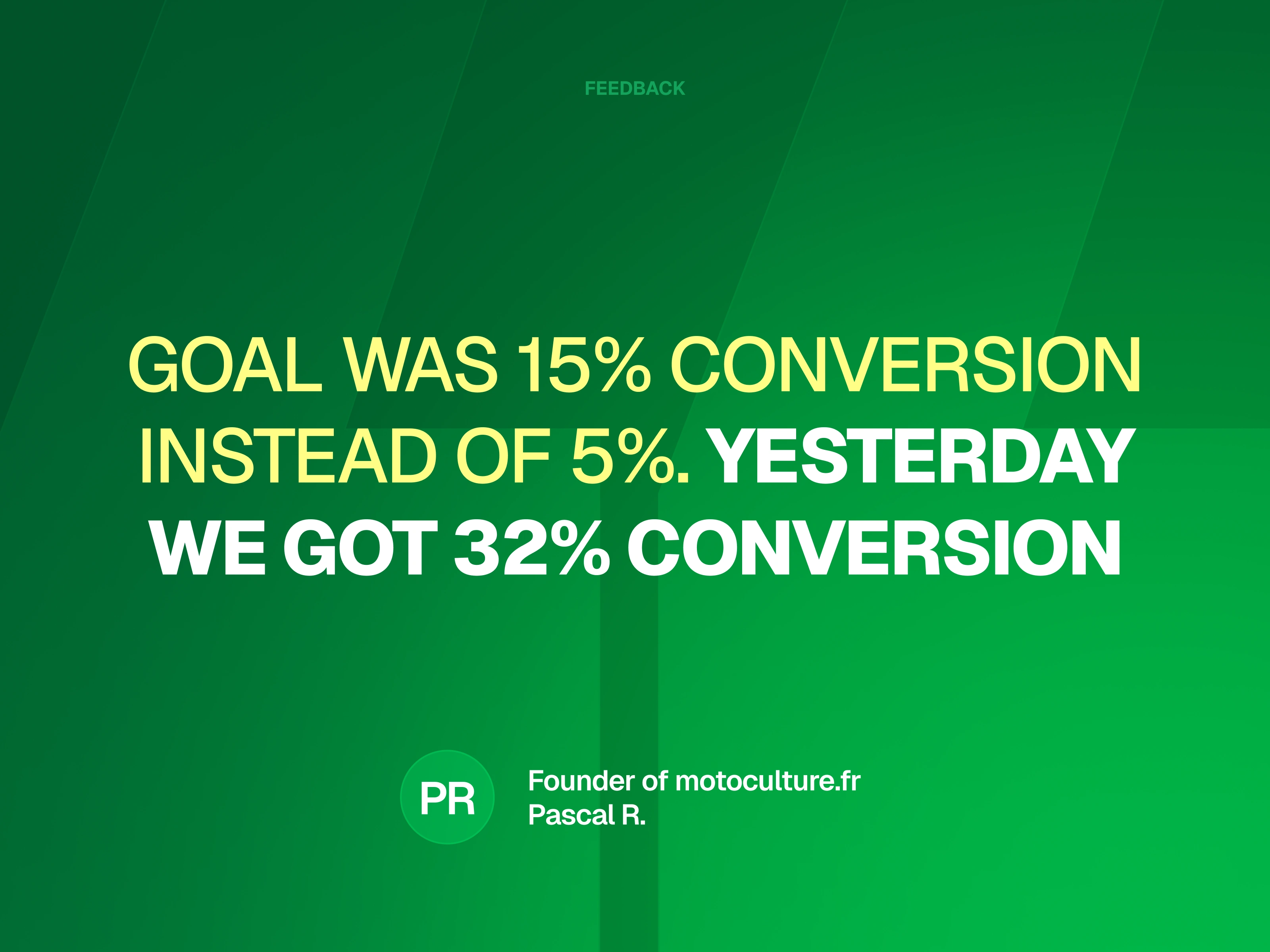
The client reported affiliate click-through went from 5% to 32%. In his words:
Goal was 15% instead of 5%. Yesterday we got 32%.
Like this project
Posted Jul 16, 2026
Redesigned the product cards on a French robot-mower buying guide. The client reported affiliate click-through went from 5% to 32%
Likes
0
Views
2
Timeline
Jun 16, 2025 - Jul 24, 2025