Design System Foundations for Scalable SaaS
David Carreón
Design System Foundations in a Rapidly Scaling SaaS
Established design system foundations to bring structure, consistency, and scalability to an enterprise SaaS platform.
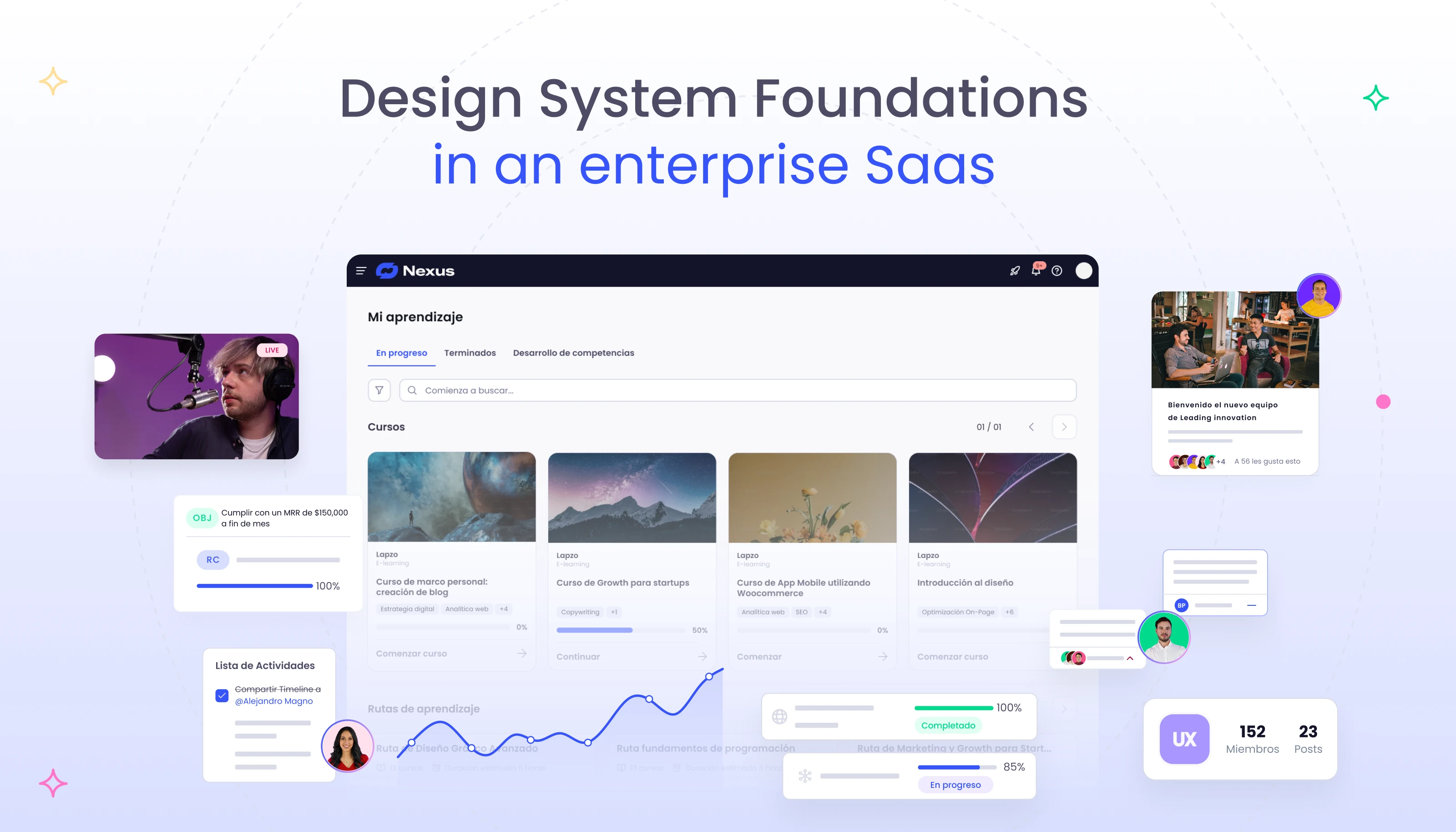
Client: The Enterprise SaaS Platform (pseudonym: Nexus)
Role: Product Designer — Design Governance & System Foundations
Focus: Platform overhaul · Design systems · Enterprise scale
Status: Fully anonymized (NDA-safe)
Overview
Nexus is a rapidly scaling enterprise SaaS platform composed of multiple product modules.
As the platform grew, the lack of centralized design governance began to slow velocity, increase inconsistencies, and create friction between Product, Design, and Engineering.
This project focused on establishing design system foundations—not visual polish—to enable teams to scale the product sustainably.
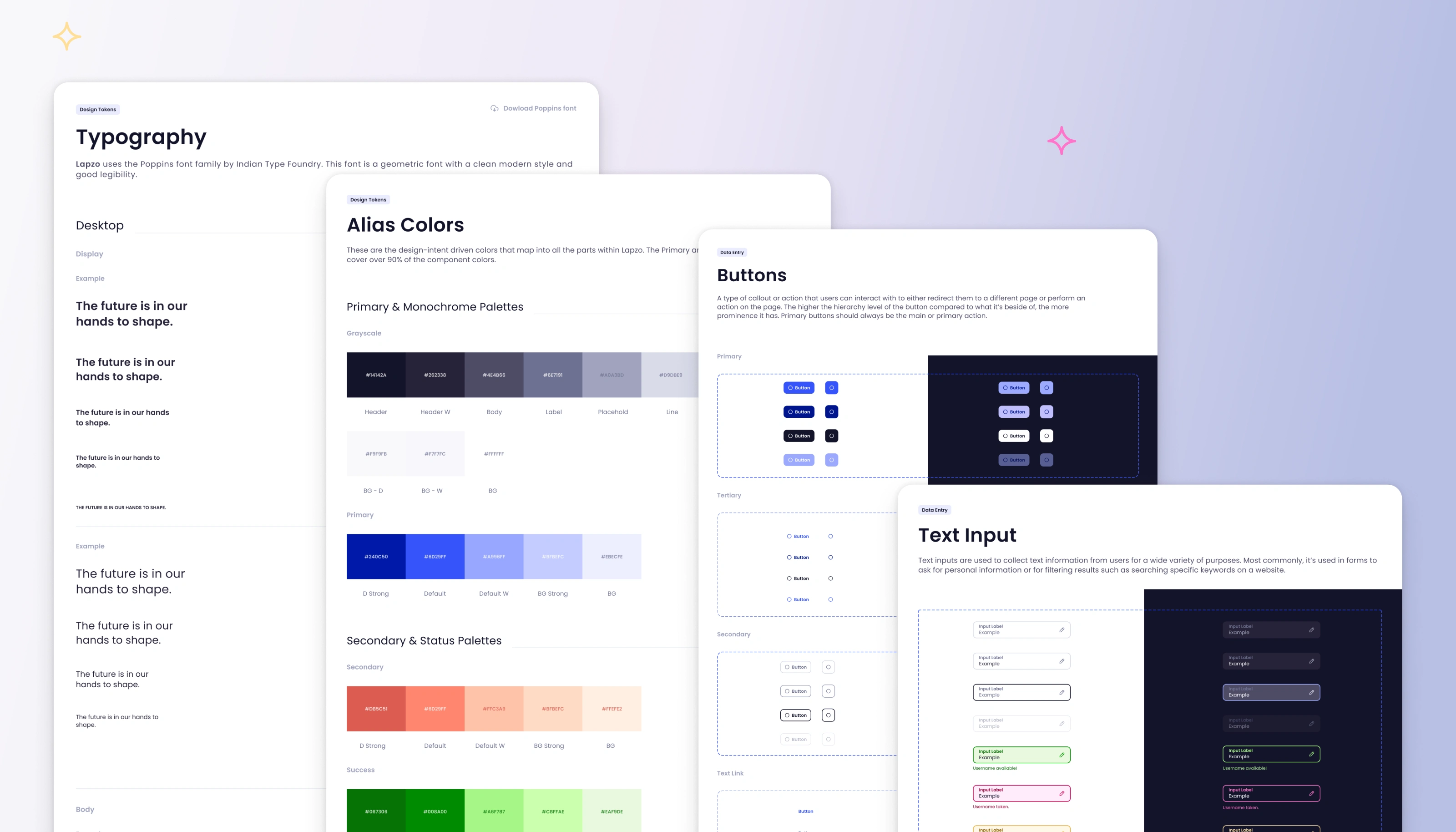
Design System documentation snapshot: typography scale, alias color system, and core component specs (buttons and text inputs) across light/dark modes.
Context — Scaling Without Design Governance
The platform evolved quickly under delivery pressure. Engineering relied on an existing component library to ship features, but UI decisions were made reactively and inconsistently.
Design artifacts were fragmented across Figma files, built on top of an unstructured third-party UI kit, and lacked shared patterns or naming conventions. As new modules were introduced, inconsistencies multiplied.
What initially enabled speed became a blocker for scale.
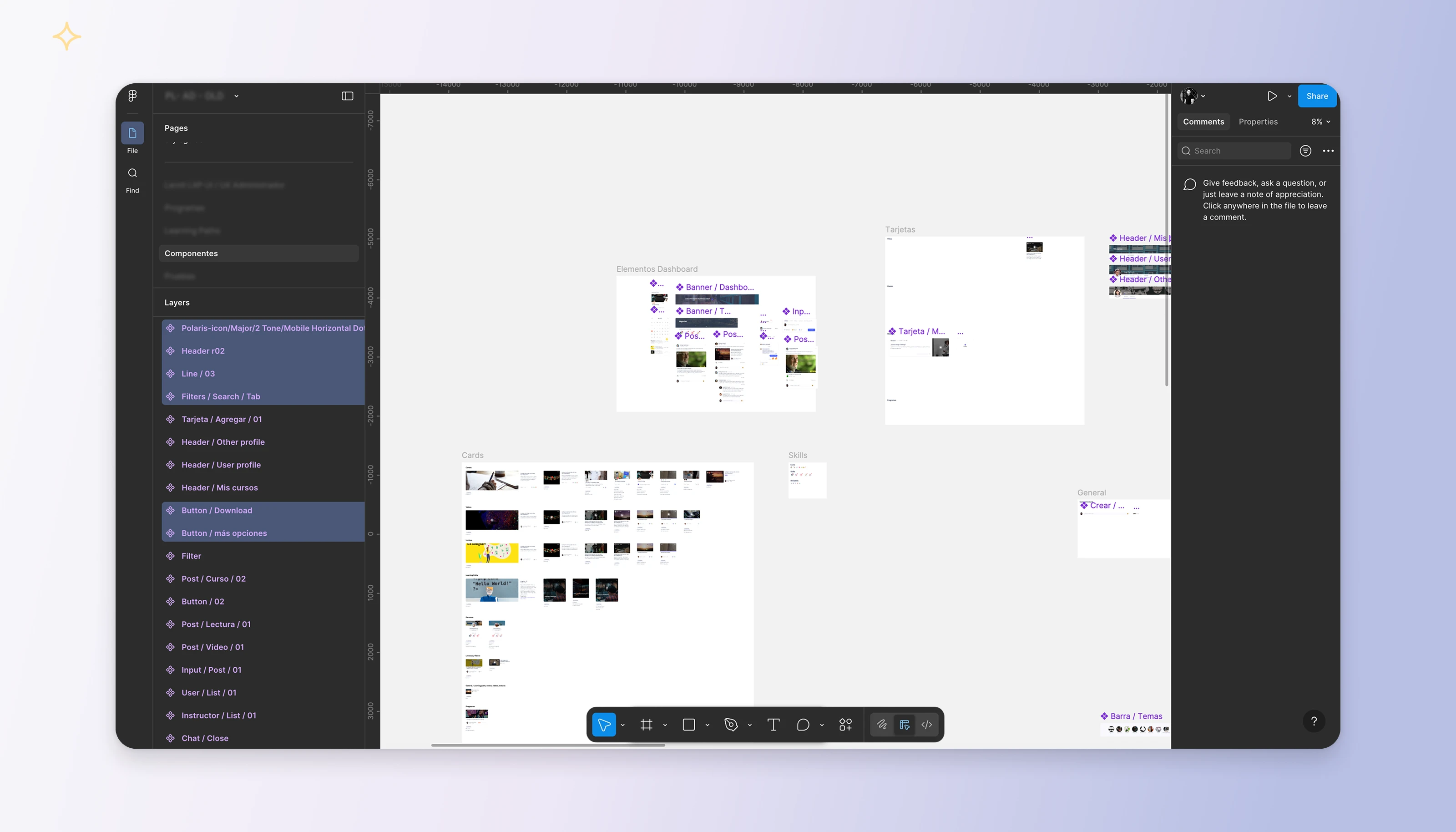
Early state of the design library inside Figma, showing fragmented components, inconsistent naming, and lack of structural hierarchy as the product scaled.
My Role & Scope
I was brought in to help bring structure to the Product Design area.
My responsibility was not to refactor the organization or replace the existing engineering stack, but to:
Establish structured design workflows
Define reusable patterns and system foundations
Align design decisions with engineering constraints
Collaborate with other designers to evolve a centralized system
The system shown in this case study represents its most mature state, developed iteratively and collaboratively.
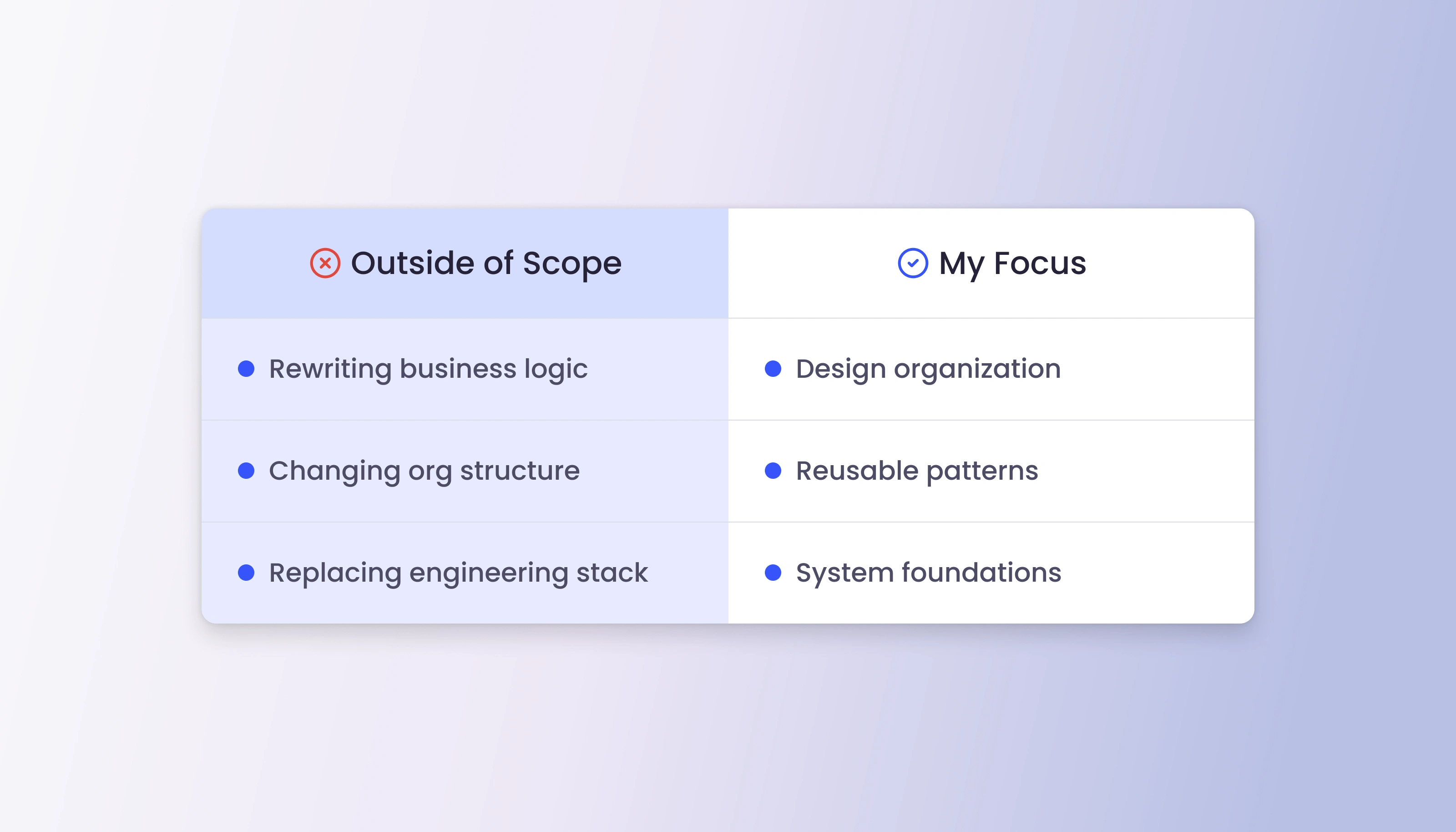
Clear definition of responsibilities, explicitly separating out-of-scope technical decisions from my focus on design organization, reusable patterns, and system foundations.
The Problem — Inconsistency at Scale
As the platform expanded, the lack of a shared source of truth created visible issues across products.
Identical components behaved and appeared differently depending on where they were implemented. Each new feature required rethinking basic UI decisions, and visual regressions became frequent.
The challenge was no longer aesthetic—it was systemic.
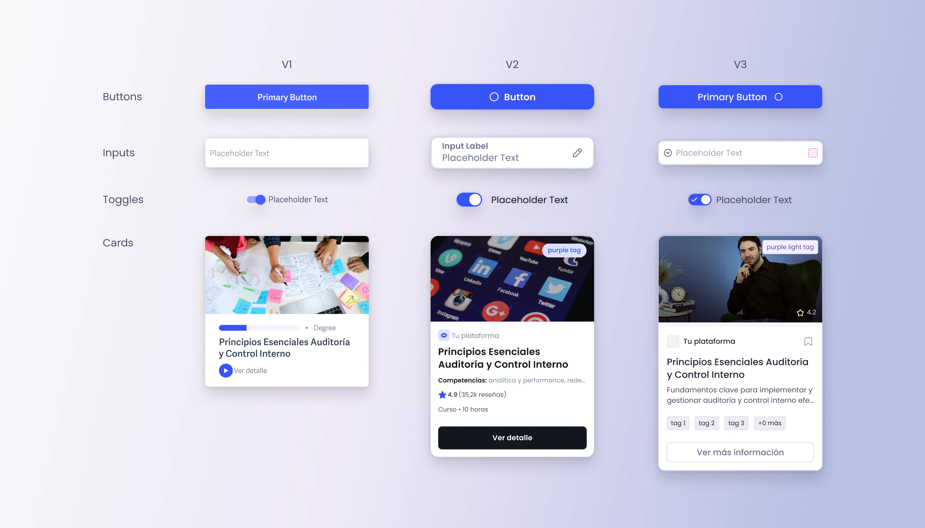
Illustrative comparison of the same abstract UI components evolving independently across versions, highlighting how the absence of a shared design system led to visual and behavioral inconsistencies at scale.
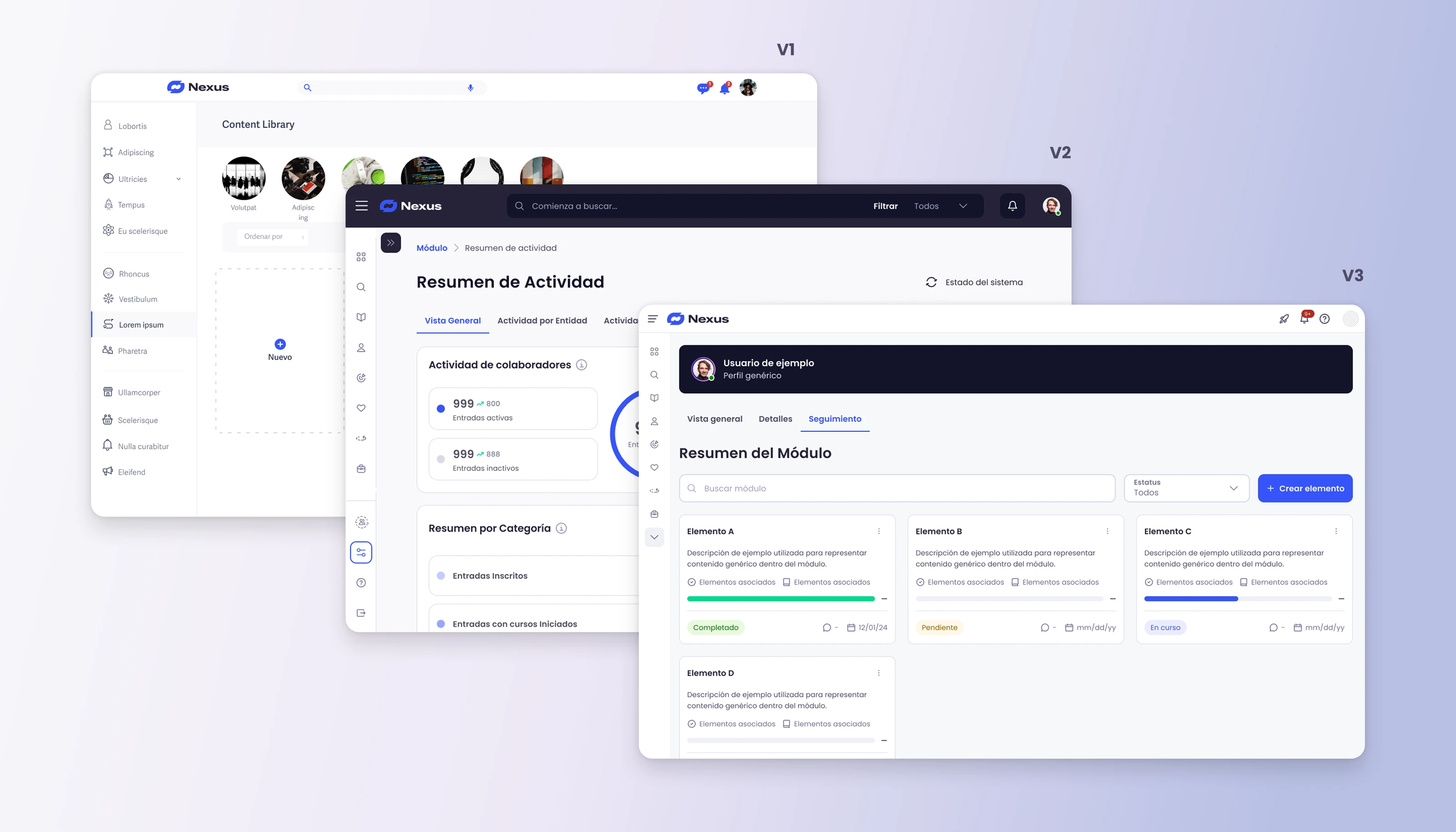
Progression of the same product surfaces across multiple iterations, illustrating how layouts, navigation patterns, and component usage diverged over time in the absence of a centralized design system or governance model.
The Intervention — Establishing Design Foundations
The first step was restoring order and clarity in the design process.
I focused on organizing Figma files, defining clear hierarchies, and introducing consistent naming conventions for components and patterns. Ad-hoc design decisions were replaced with reusable foundations and shared standards.
This work created a common language across teams, reduced ambiguity during implementation, and laid the groundwork for a scalable design system.
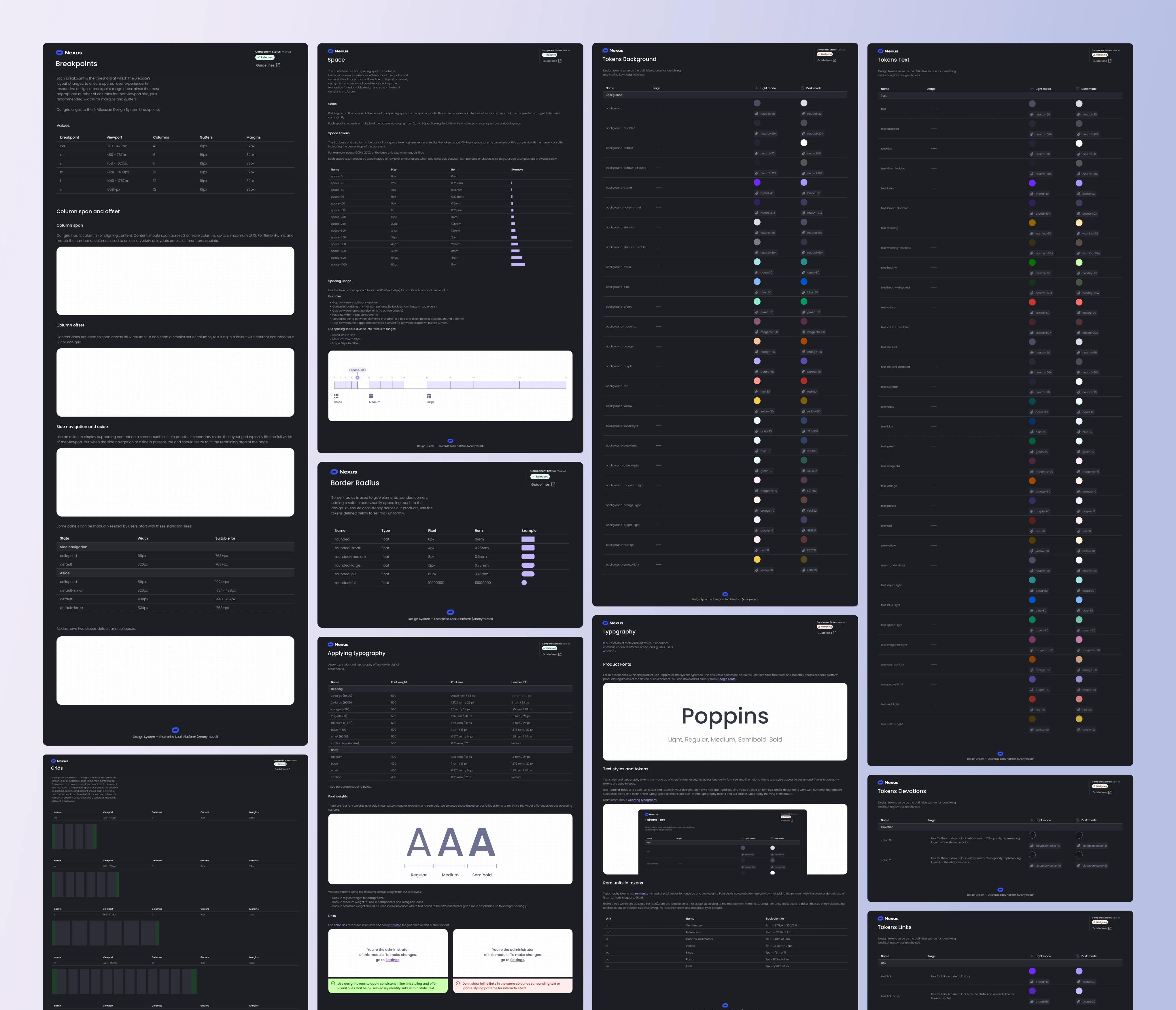
Foundational design decisions were formalized through documented grids, spacing, typography, color, and token systems. These foundations replaced ad-hoc choices with a consistent, system-driven baseline that could scale across products and teams.
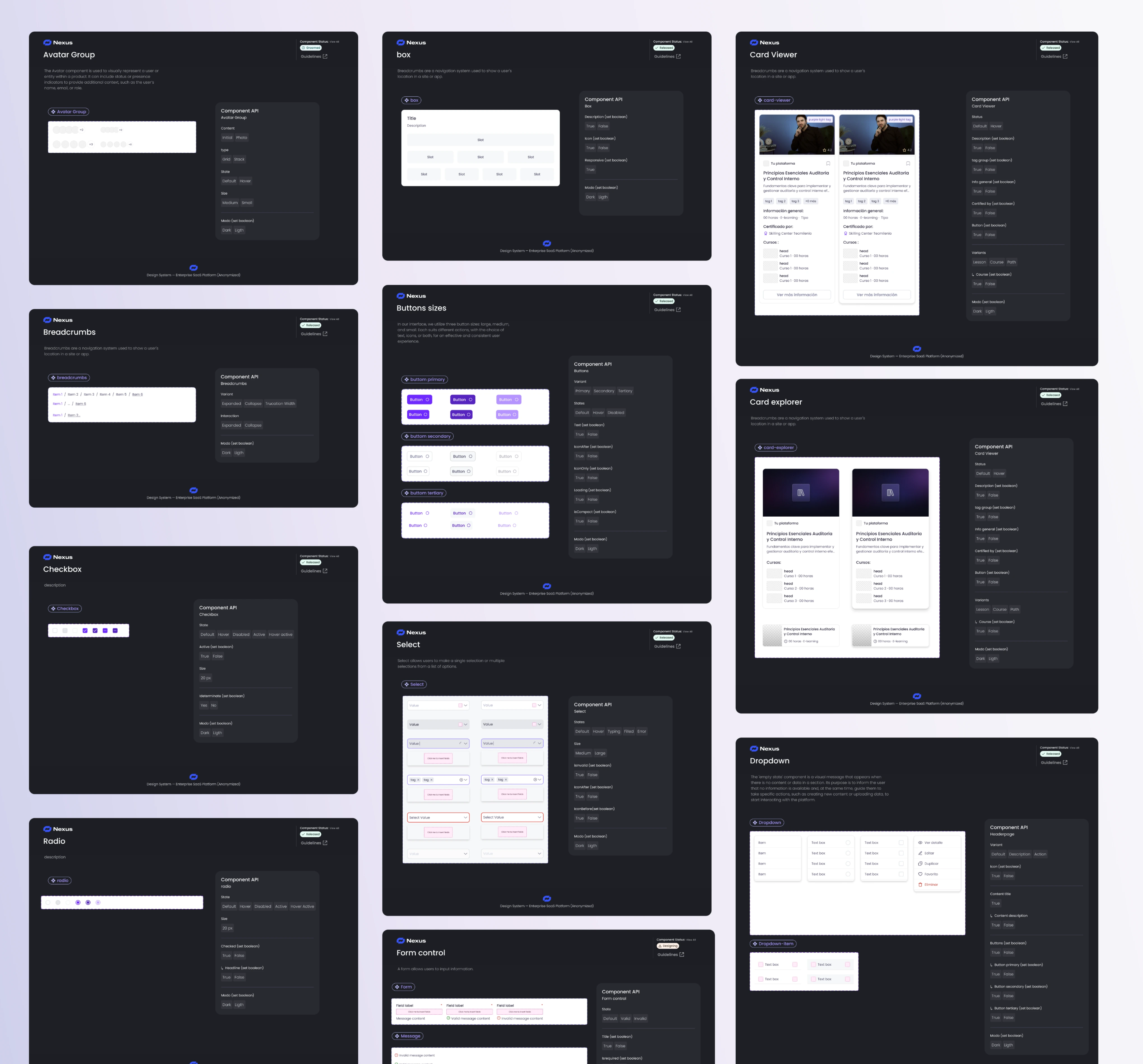
Core UI components were standardized, documented, and connected to clear APIs and usage guidelines. This enabled consistent implementation, reduced duplication, and allowed teams to assemble interfaces using shared, predictable building blocks.
The Design System — Token-Based Architecture
With the foundations in place, the work evolved into a token-driven Design System.
Instead of relying on local overrides, the system introduced semantic design tokens for color, spacing, typography, and component states. This approach aligned design and engineering workflows while continuing to leverage the existing component library.
The system also supported multiple themes (e.g. Light and Dark), enabling future scalability without rework or duplication.
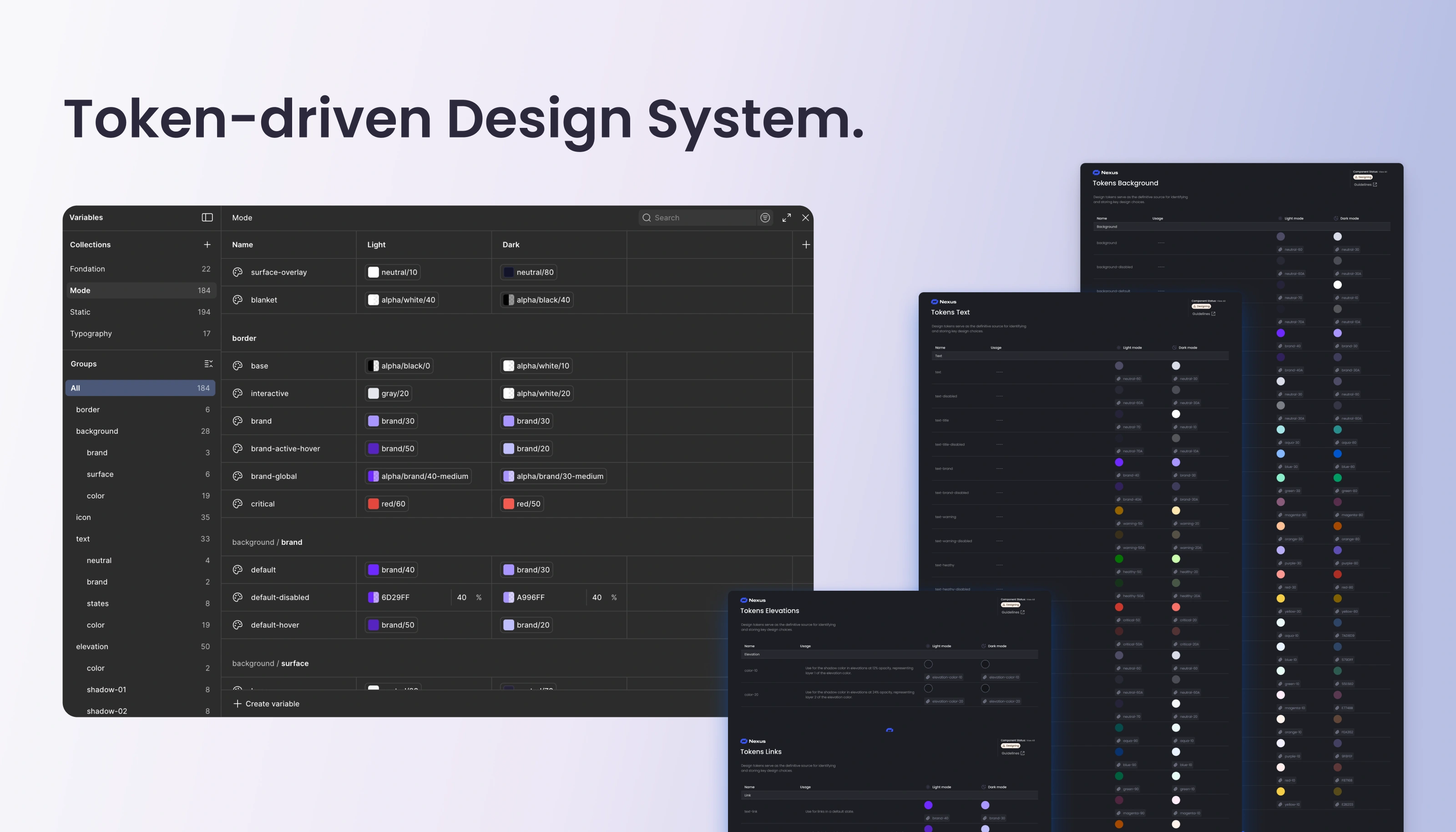
Design tokens served as the single source of truth for color, typography, spacing, and states—enabling consistency, theming, and long-term scalability without duplication.
Unified Across Modules
The Design System was built to support multiple enterprise modules under a shared visual language.
While each module addressed different use cases, they now shared core components, interaction patterns, and design principles. This balance allowed teams to move faster without reinventing fundamental UI decisions.
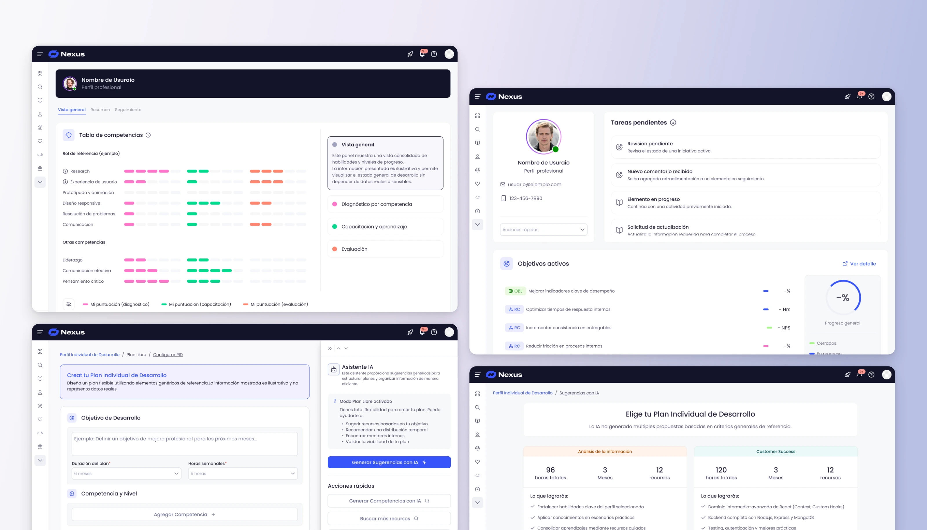
A shared design language applied consistently across multiple enterprise modules, ensuring visual and behavioral coherence while supporting different functional use cases.
Impact
Although the focus was on foundations rather than surface-level redesigns, the impact was clear.
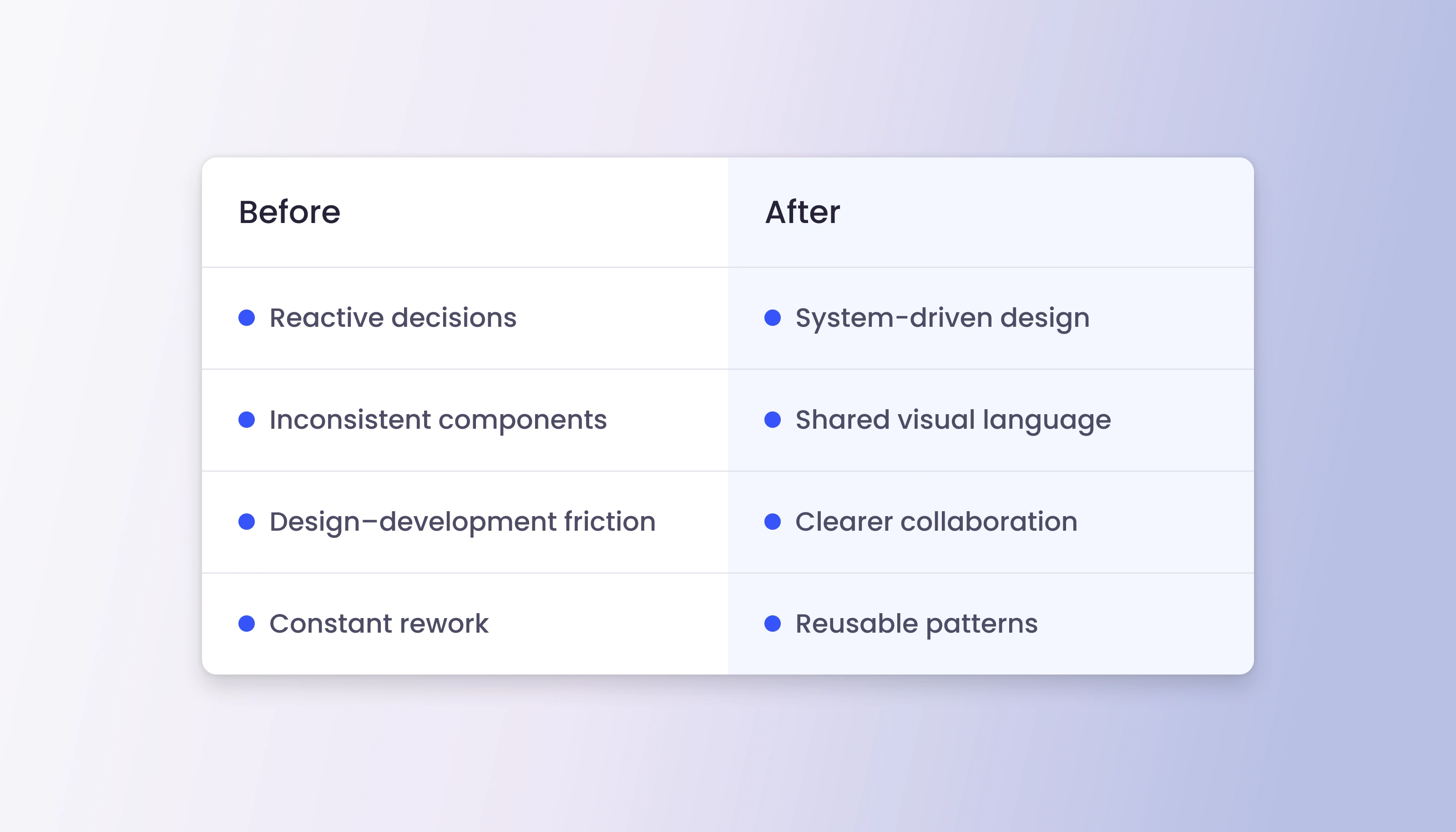
A clear shift from reactive, fragmented UI decisions to a system-driven approach that reduced rework, improved collaboration, and enabled reusable patterns.
Reflection — Why This Matters
This project wasn’t about perfect screens—it was about enabling teams to work effectively at scale.
By prioritizing governance, structure, and system thinking, the Design System became a tool for alignment and long-term product health rather than a static UI kit.
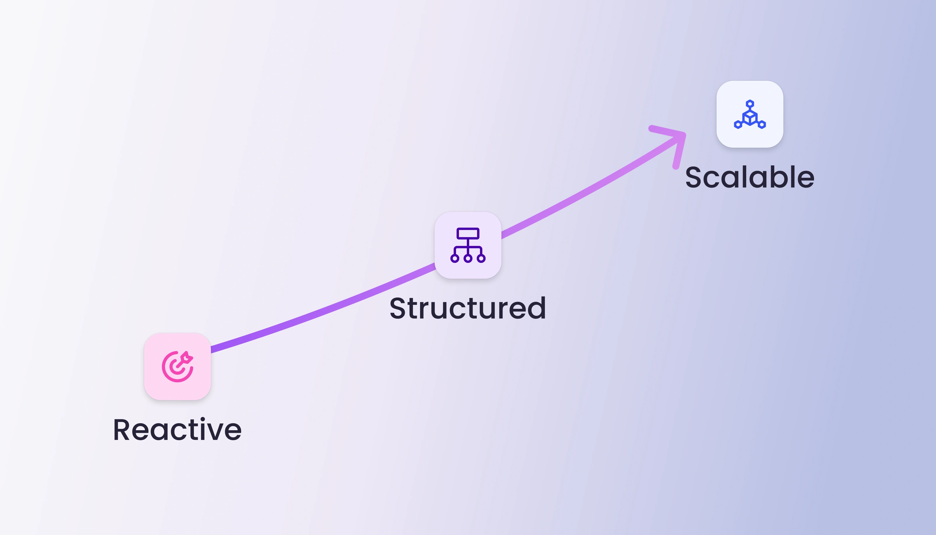
A progression from reactive design practices to a structured system, ultimately supporting scalable product development through governance and shared foundations.
Like this project
Posted Jan 9, 2026
Established a scalable design system for Nexus' growing SaaS platform.
Likes
0
Views
23