BiteNChuckle Chocolate Co | Brand identity design

Victor Abayomi
4


BiteNChuckle Chocolate Co | Brand identity design
Project Overview:
BiteNChuckle is a playful chocolate brand that wanted a quirky yet premium visual identity for its artisan chocolate line.
My Approach:
I developed a bold, colorful system using vibrant hues and humorous illustrations to reflect the brand’s joyful tone. The logo combines retro typography with modern simplicity, creating a fun and engaging vibe.
Outcome:
The brand now stands out on shelves and digital platforms with a visual identity that reflects both indulgence and humor. It helped the company position itself as both premium and relatable to younger audiences.
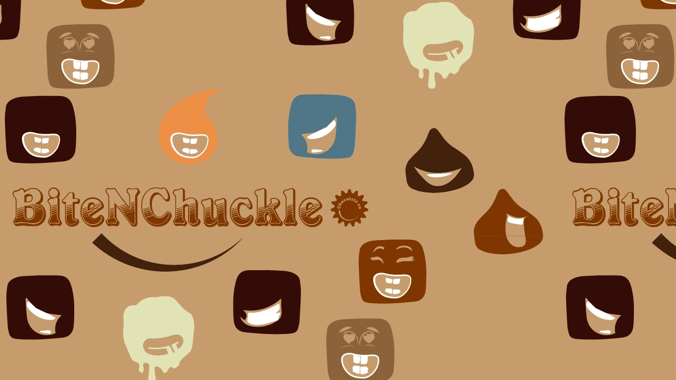
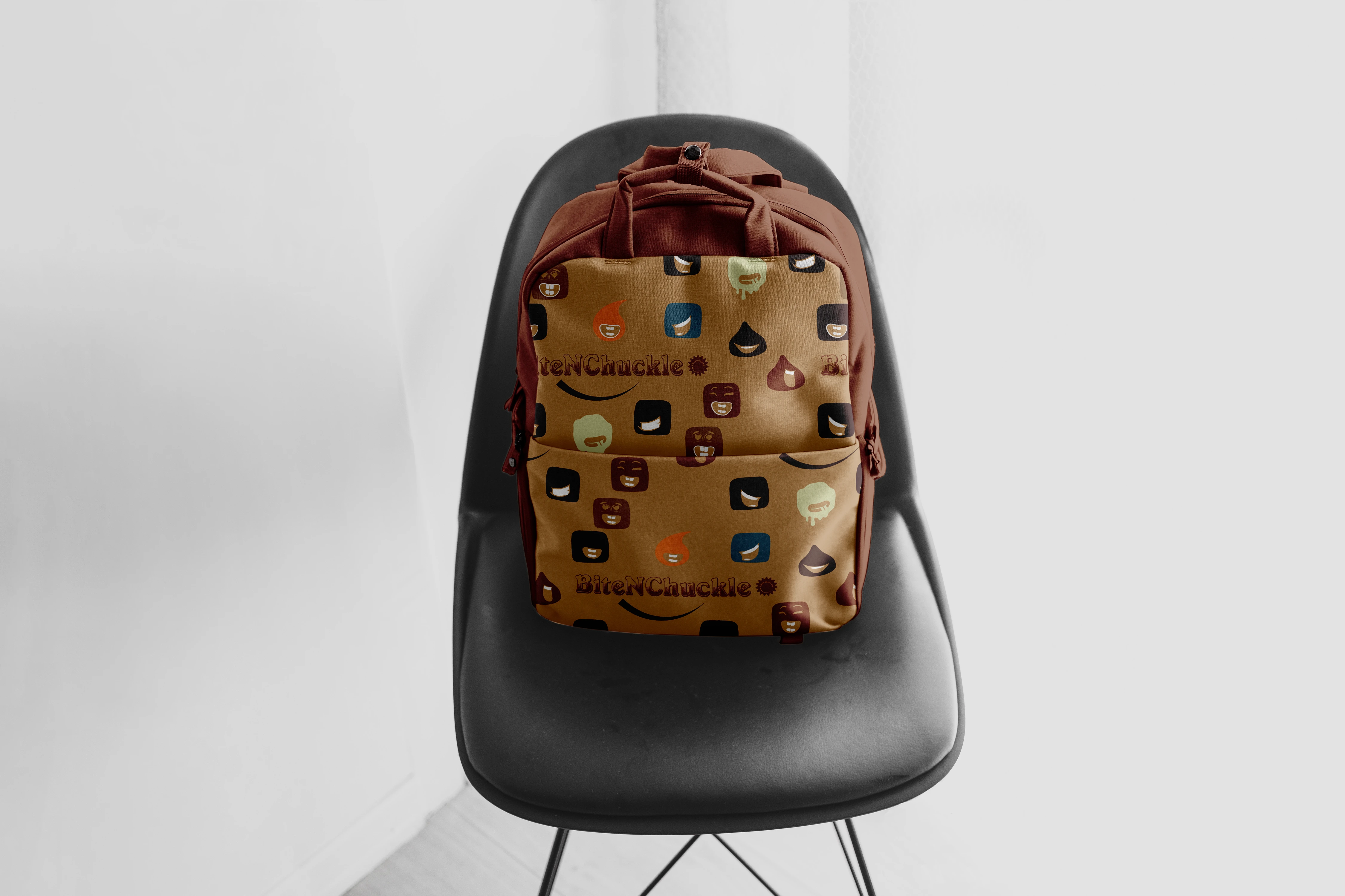
Brand Pattern/illustration
A playful, custom font to represent the fun behind making the delicious goods. Brand characters designed to look like brownie pieces showcasing the fun and flavour in every bite.
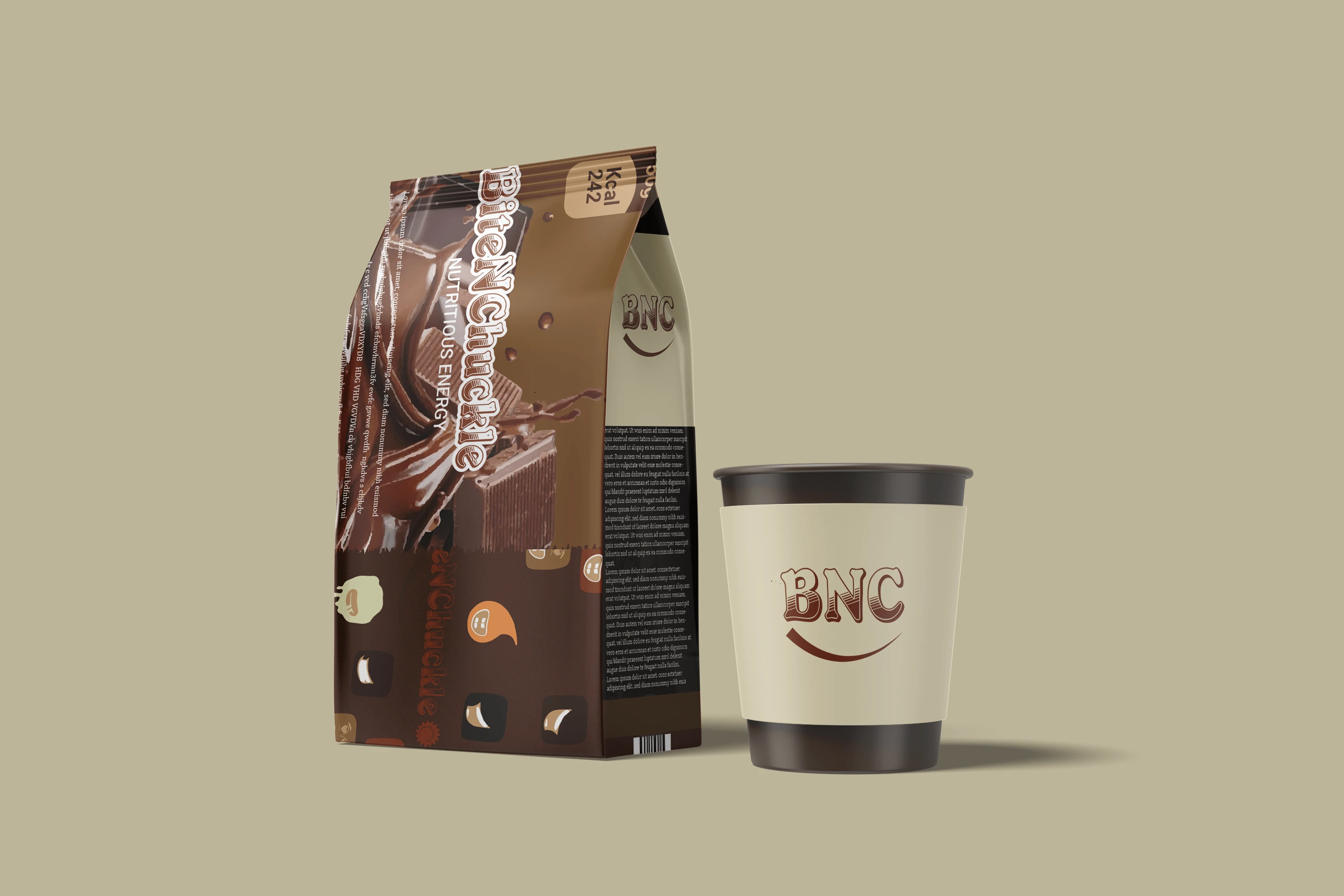
Packaging design
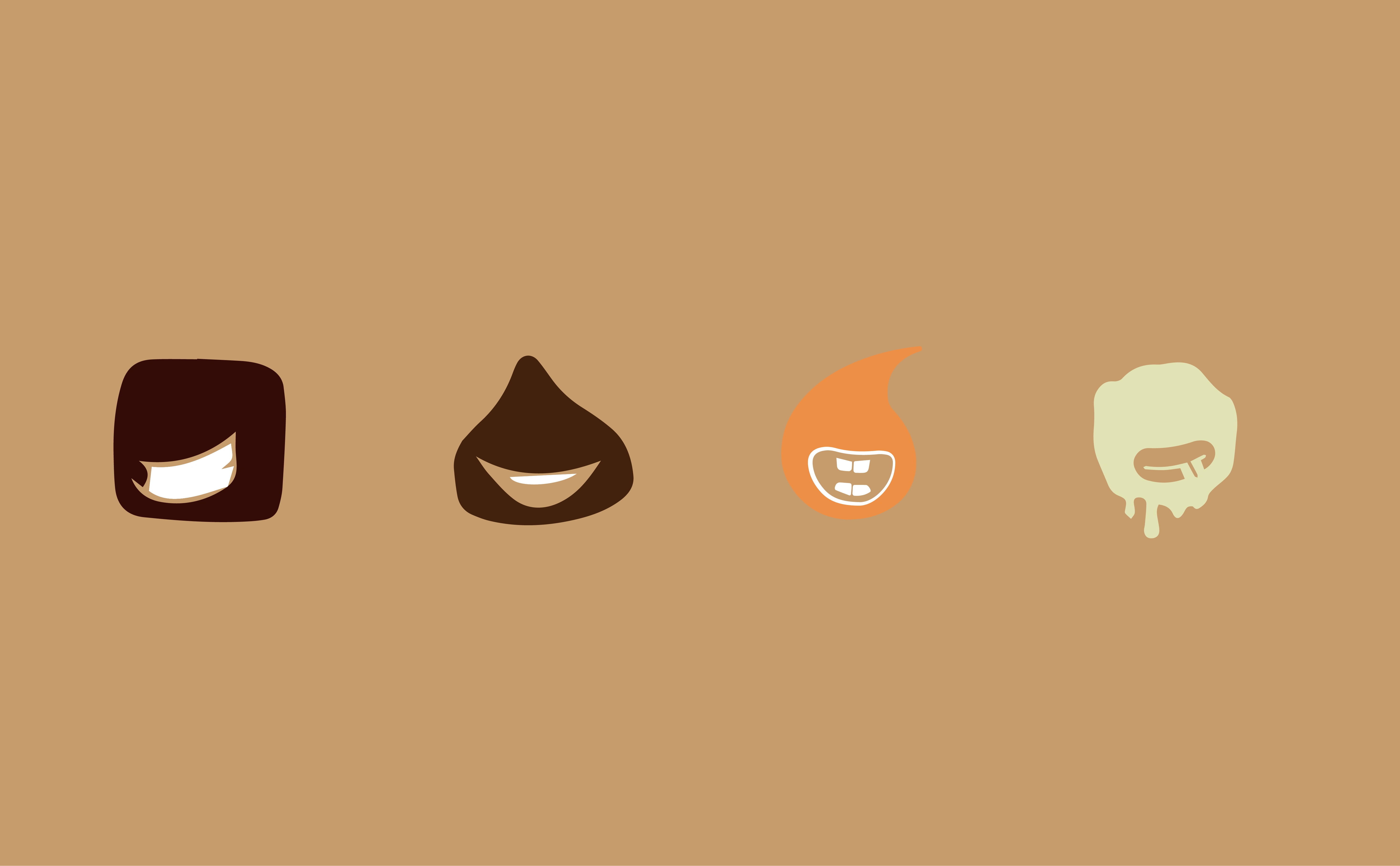
Brand illustration element
Challenges & Solutions
Challenge: Designing a brand identity that conveys excitement and indulgence without appearing overly childish.
Solution: Developed a bold and playful logo with a rich color palette inspired by chocolate tones and vibrant pops of color to reflect the brand’s energy and creativity.
Photography
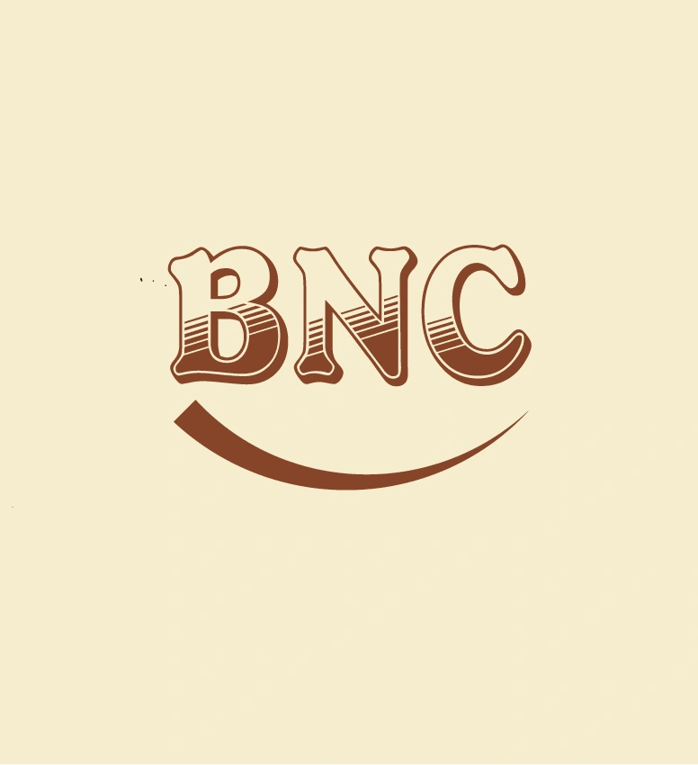
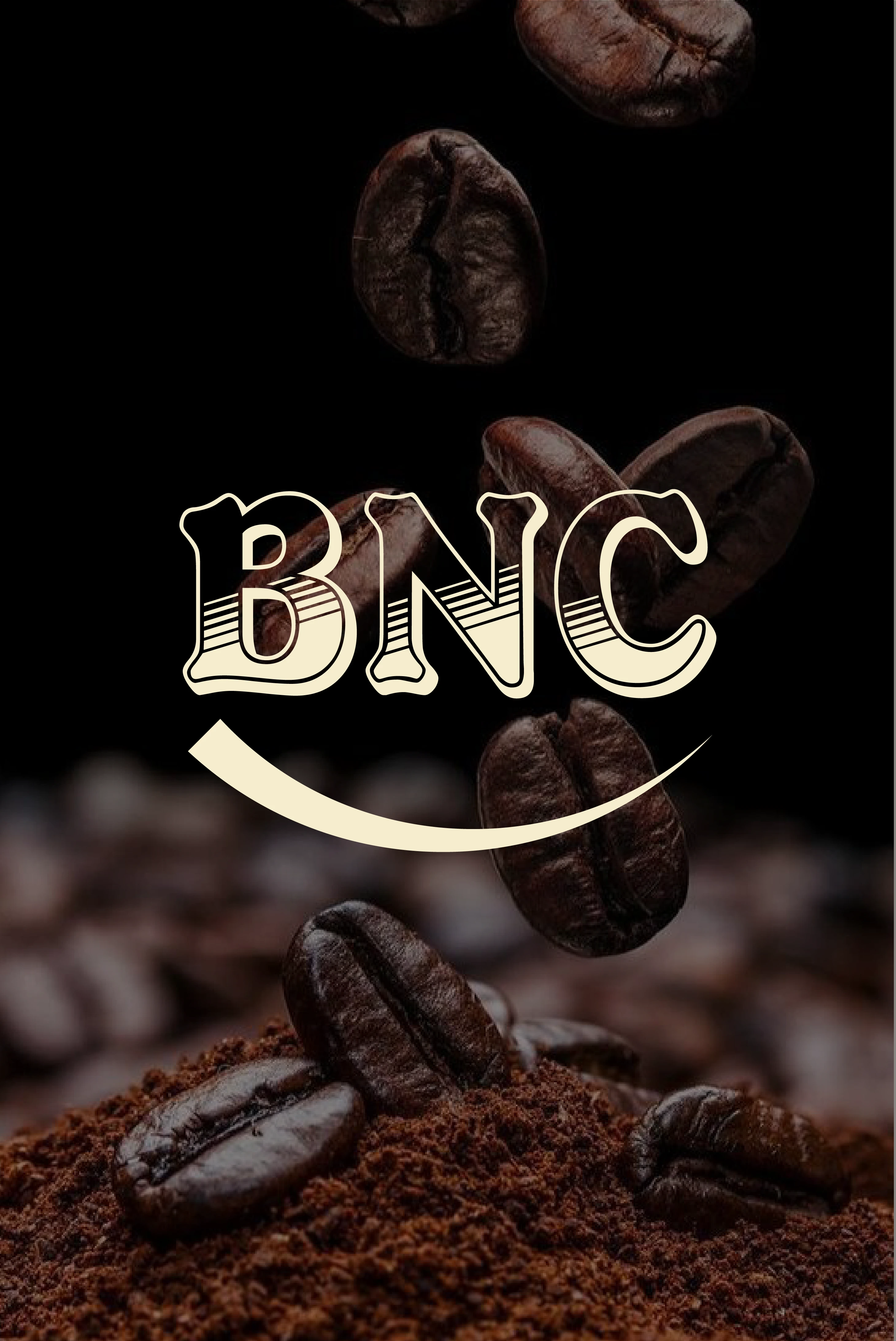
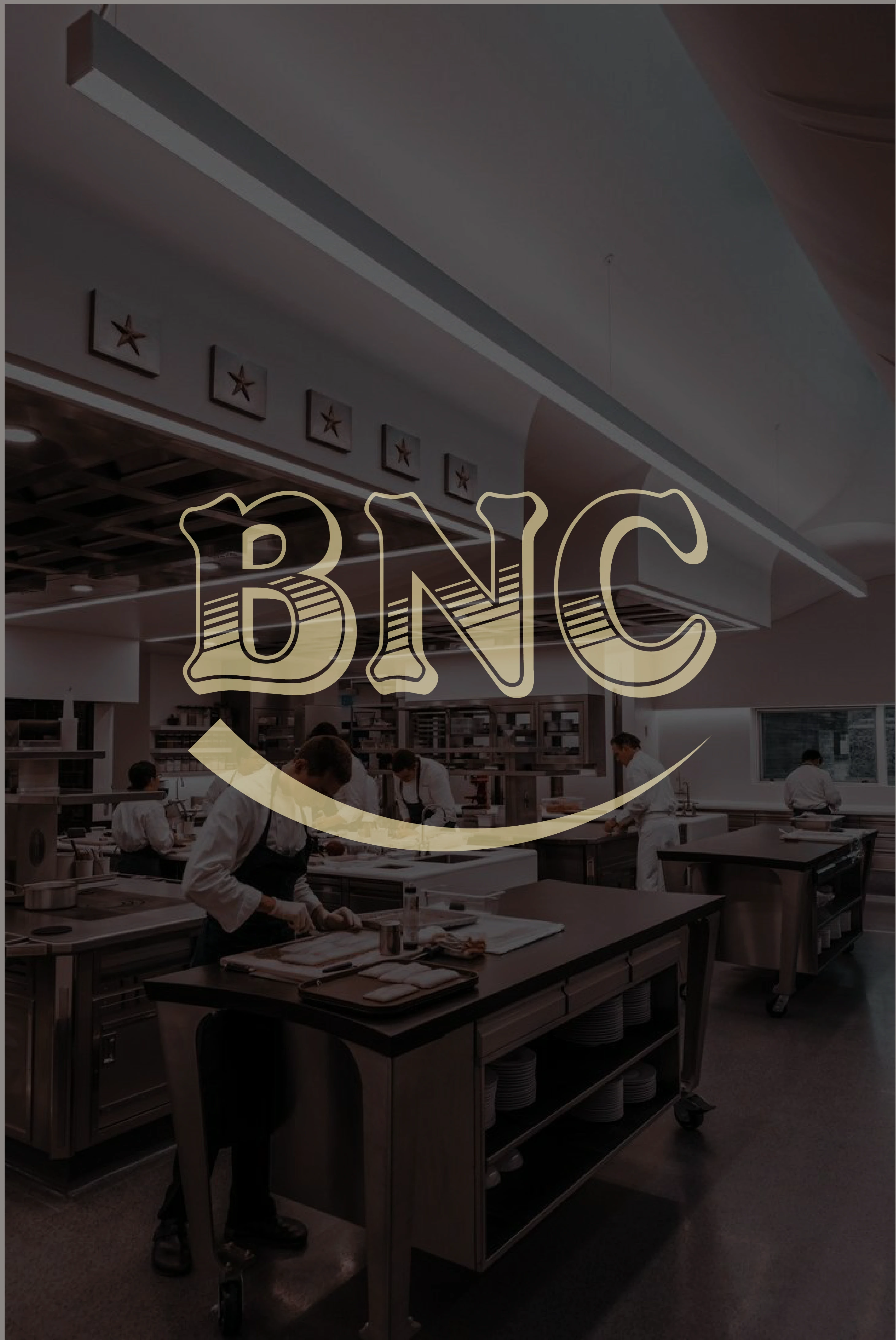
Logo design
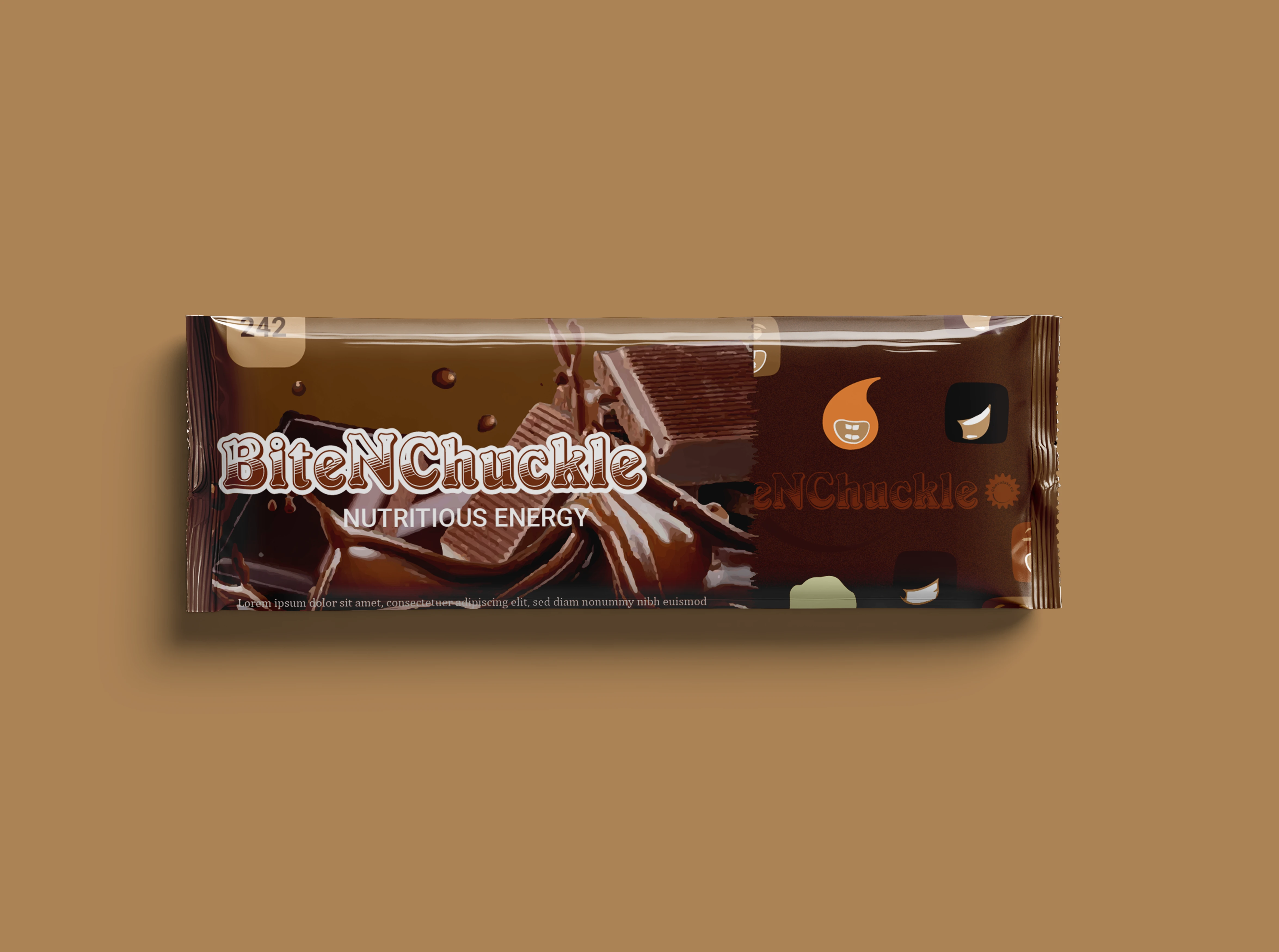
Packaging design
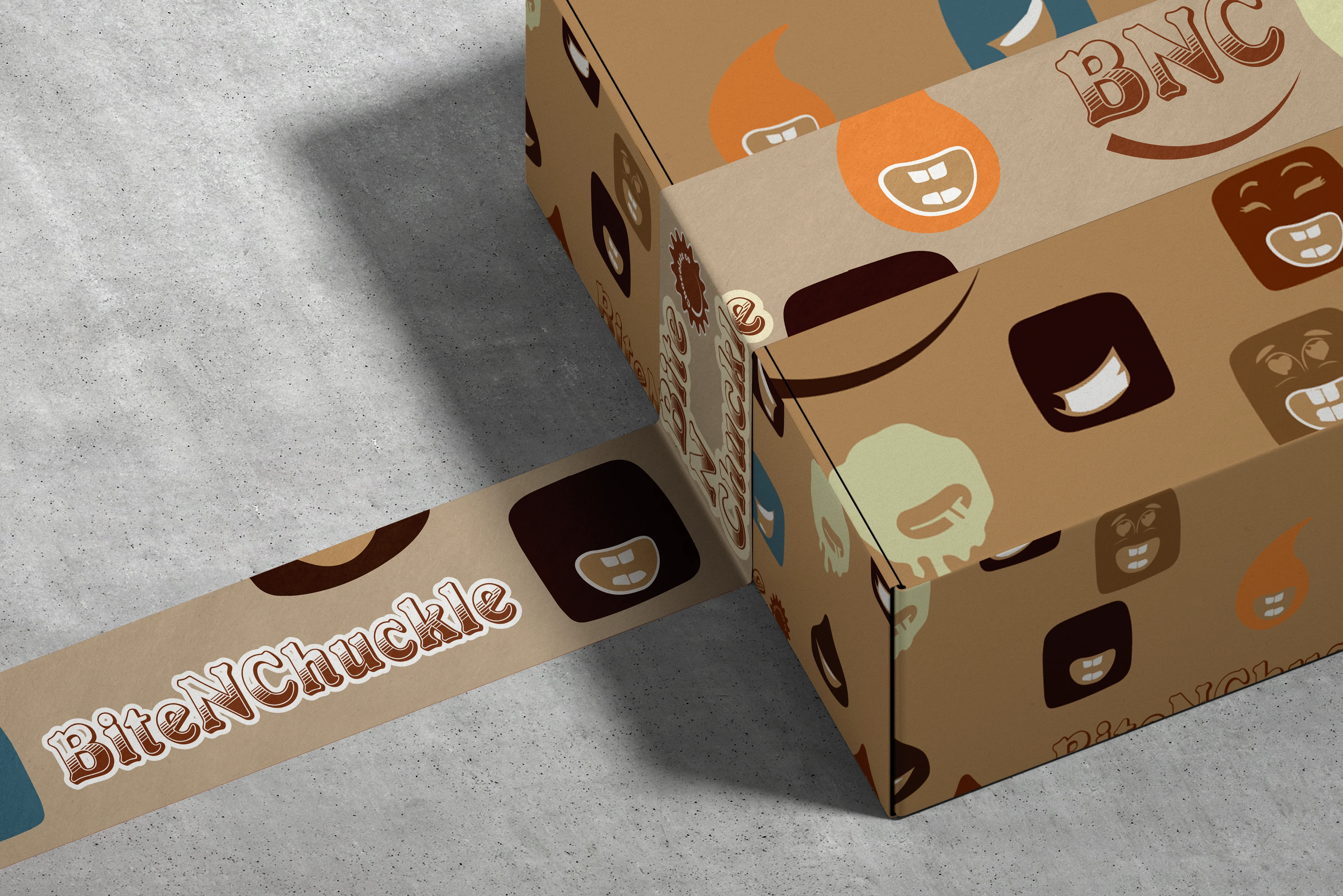
Box packaging design
Key Takeaways
Successfully balanced playfulness with a professional brand image.
Crafted a visual identity that enhances brand recall and emotional connection with customers.
Strengthened expertise in designing for the food and confectionery industry.
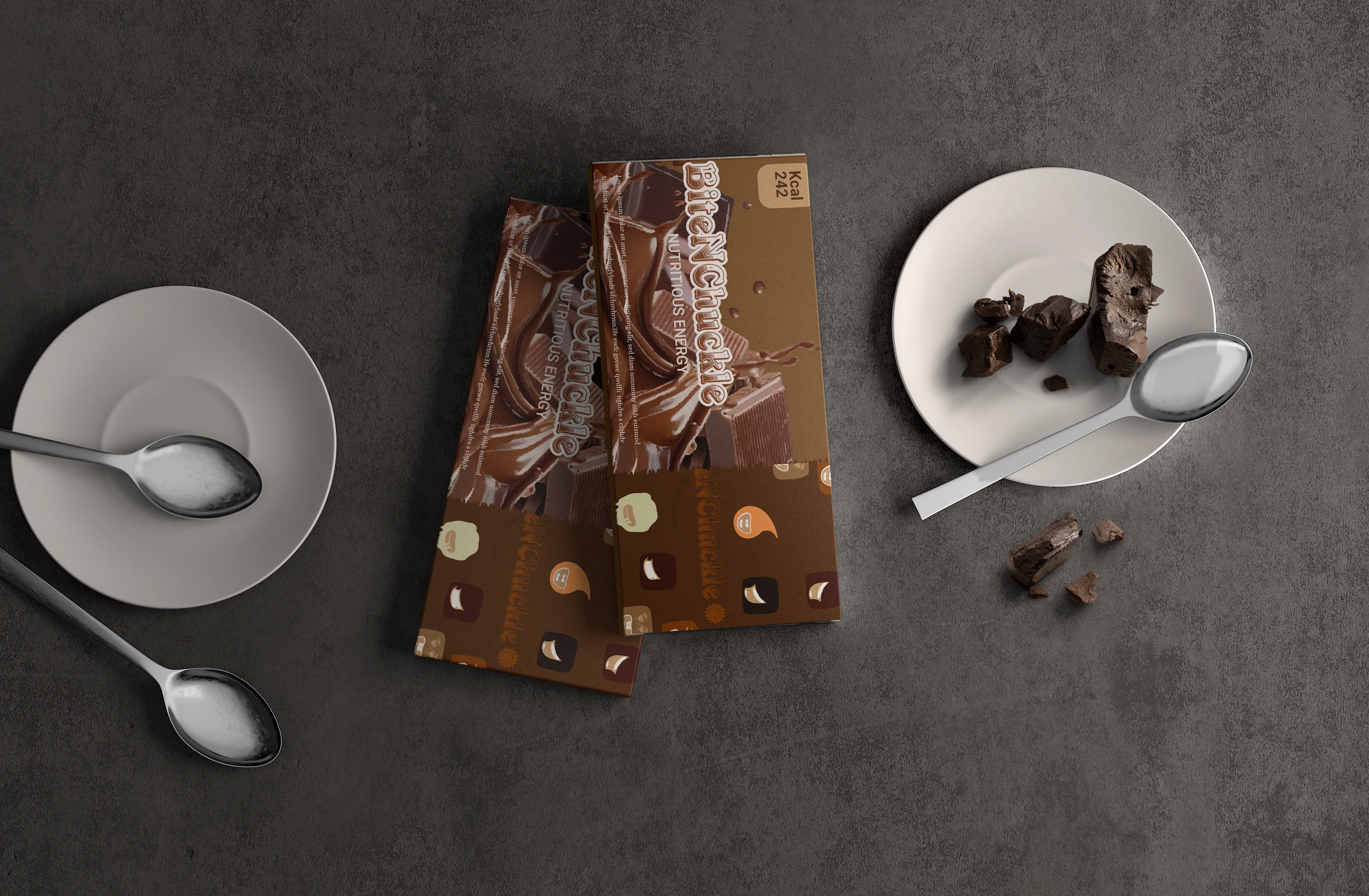
packaging design
Photography
Brand in Action
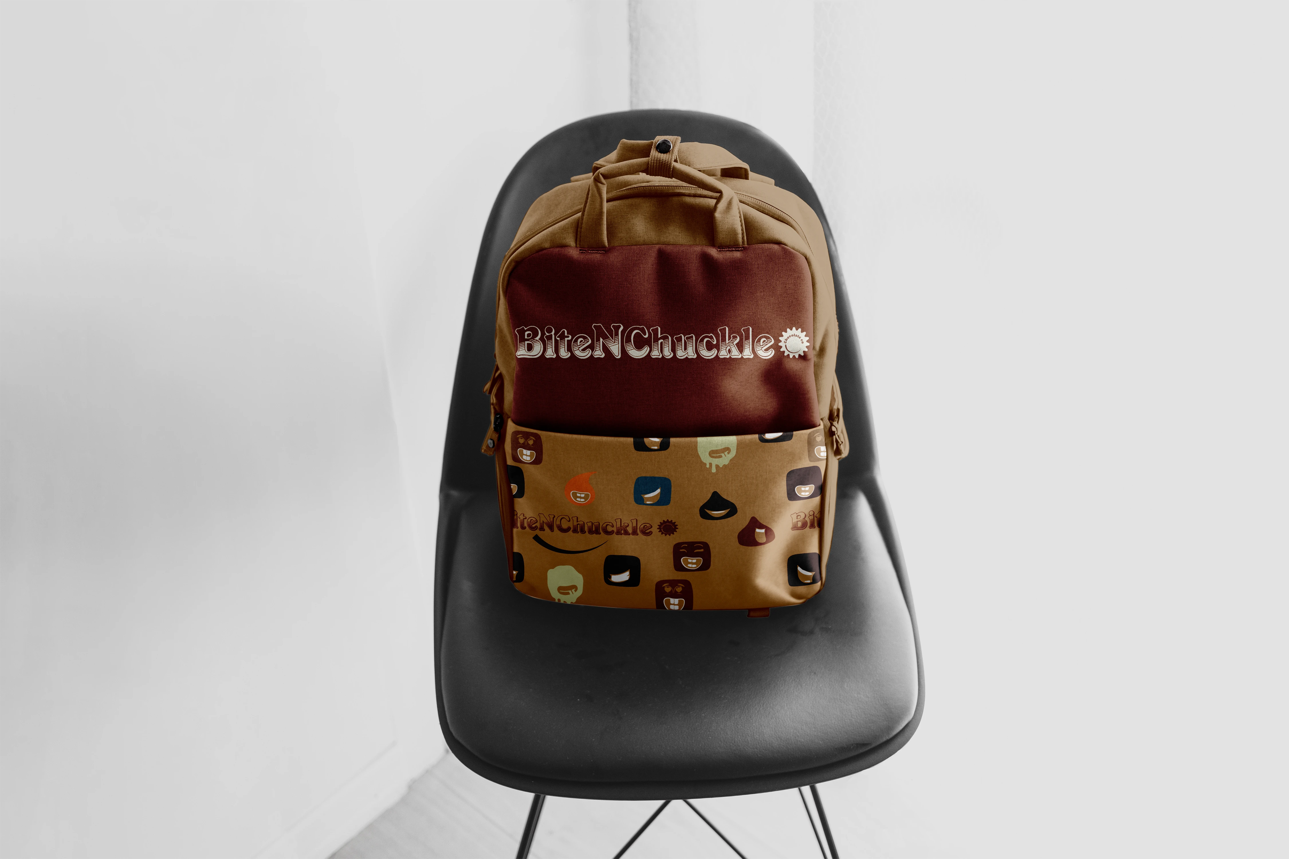
Mockupp
Client & Results
BiteNChuckle Chocolate Co.’s new brand identity helped establish a memorable and exciting presence in the dessert market. The playful yet premium design increased brand engagement, making every delivery a delightful experience for customers.
Like this project
4
Posted Oct 3, 2024
Created a bold, playful brand with vibrant colors, retro type, and quirky illustrations. Boosting brand recall and increasing social engagement by 20%.


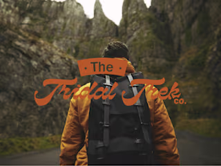
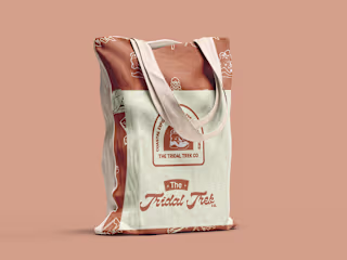
The Tridal Trek | Brand identity design

Brew Haven / Food & Beverage Visual Identity Design
Packaging & Marketing Assets for Brand Consistency
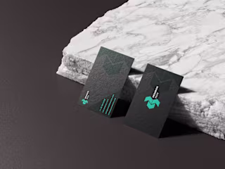
Nexarion Tech | Visual Identity design