Re-Imagining the Brand Identity for an e-Commerce Company
Bryce Gonzales
Client: Creatable
Project attributes: Logo design | Branding | Style systems | Visual design | Web design
By updating brand attributes such as color, font, and logo, how can I transform Creatable into a modern marketing brand that appeals to their customers and user base?
-
Introduction
About Creatable
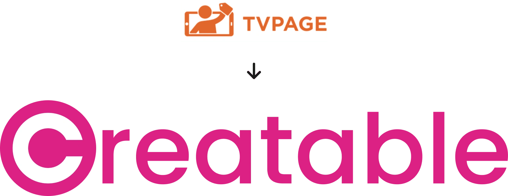
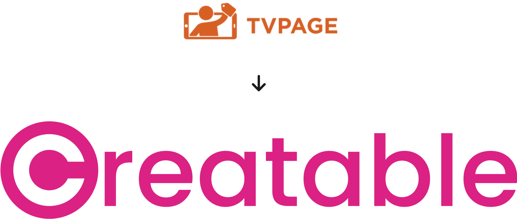
Creatable (formerly TV Page) is a marketing company that connects influencers with brands, allowing both parties to work with each other.
The problem
Creatable was in the middle of a rebrand. They had decided on the new name “Creatable” and needed a new logo. They also wanted to change their brand colors and fonts to reflect this new era of their company.
My role
Along with rebranding, I was tasked with creating 5 new web pages that would act as selling points for their software product. Before web design could even take place, I needed to create a style system using Figma and basic website elements such as main navigation and footer.
Logo design
Pulling inspiration from TV Page’s logo design
Initial designs focused around trying to combine the word Creatable with a phone (drawing inspiration from the TV Page logo). This transformed into using squares to symbolize posts from social media brand mobile applications, such as Instagram and Facebook.
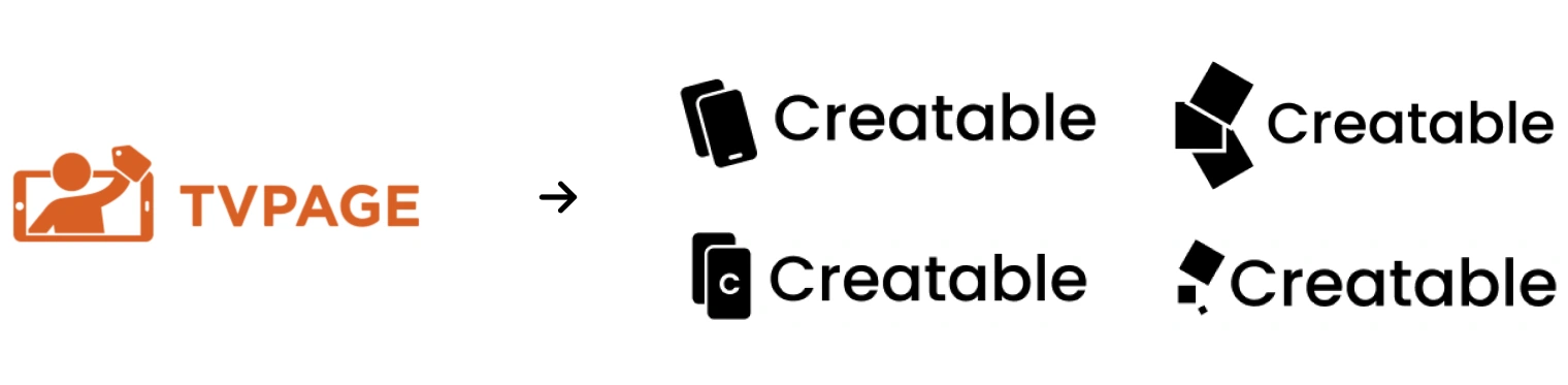
Re-starting with a new vision
We decided against following the original trend set forth by TV Page’s logo, and instead started from scratch. We knew we wanted the logo to be reminiscent of major social media brands. The logo had to cater to brands and influencers alike.

Ideating toward the final design
Using the C from the word Creatable really stood out to us. It was abstract, modern, and very much followed the same pattern as a lot of major brands we were using for inspiration (i.e. Using letters as brand marks instead of disconnected icons)

Final logo
We decided on this logo because of the simplicity and playfulness of it. The “C” could be used as an icon for the brand, as well as the app icon.
Unlike the original logo, it was abstract. It did limit itself by identifying with one type of device or any singular platform.
The final logo defines Creatable as a modern brand that captures people’s attention with professionalism and boldness.
Colors
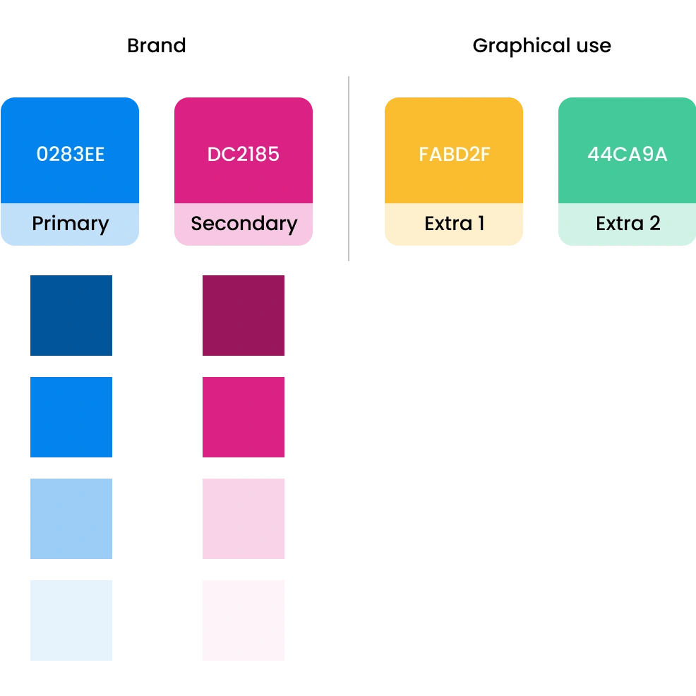
Building a new color palette to match the new brand identity
We wanted the brand to stand out, but making the main color pink was too bright and the brand lost its professional edge. By exploring with color, we were able to find a blue that conveyed trust and stability that complimented the bright pink we wanted to use for the logo.
Across the website, the pink is used very sparingly. We wanted the pink to draw in the viewers attention to only the most important elements i.e. logo and buttons.
Fonts
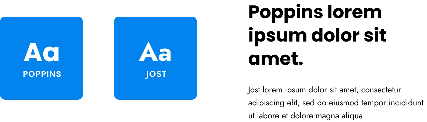
A font combination that is bold and playful
In keeping with the idea of playful and bold, yet professional, we decided on Poppins as the header font, and Jost as the body font. Poppins is a very balanced font geometrically, thus conveying a feeling of stability. The softness of the font also played into feelings of comfort and modernity.
Jost paired wonderfully with Poppins. Both are very geometric Sans Serif fonts with similar attributes. Jost maintains legibility and the same playfulness conveyed by Poppins. Jost being a lighter font contrasts nicely with the heaviness of Poppins, creating a unique and visually pleasing pair.
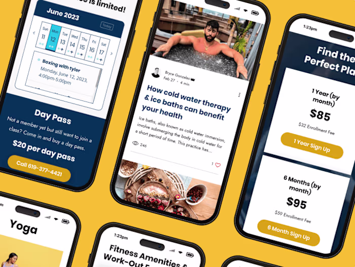
Imagery
Billboard imagery
We wanted to use powerful imagery that resonated with our audience (mainly influencers). We wanted our billboards (the top section of each web page) to represent each page accurately and connect with our users right away.
Note: Drop shadows were added on top of all billboard photos. Original source files could not be accessed.

Vector graphics
Utilizing vectors to keep the mood light
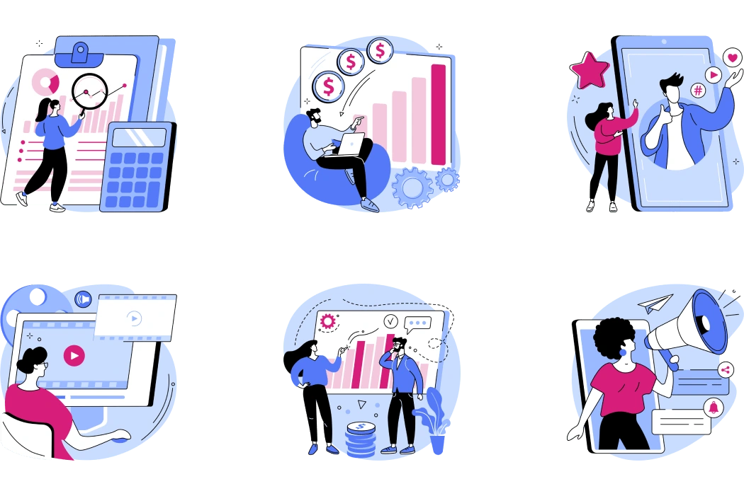
Early in planning, we decided that real-life imagery should be limited, and instead playful graphics be used to compliment information.
I researched vectors on Shutterstock, and found a contributor named Visual Generation who’s vector graphics were exactly what we were looking for. While we outsourced the vector graphics, I edited each graphic to match the color scheme of the Creatable brand.
Our primary blue color is used as the foundation for the graphics, while our secondary pink acts as a strategic highlight. We were able to find graphics that visually conveyed every section of information we wished to share.
Here are some of the graphics:
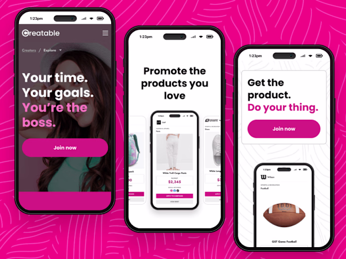
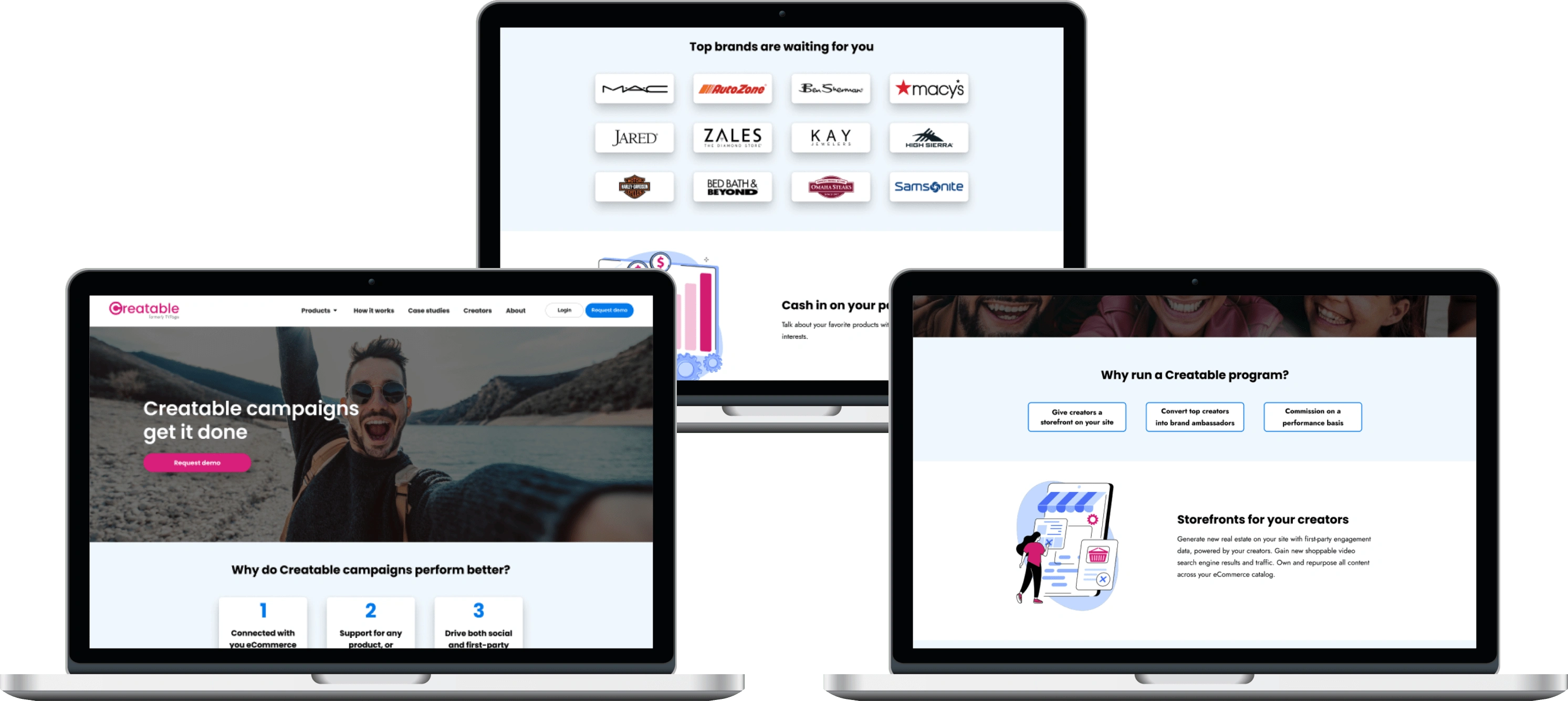
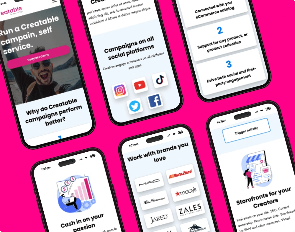
Final website
Snapshots of the Final Web Pages
Each page communicates different aspects of the Creatable software and what working with Creatable looks like.
I broke the information up strategically, yet uniformly. Certain sections required card callouts to highlight multiple thoughts in an idea. Other sections relied heavily on the use of vector graphics to visualize the information.
Here are some snapshots of the final pages:
Like this project
Posted Sep 21, 2023
TV Page re-brands to Creatable and receives a modern logo, strategic color palette, and bold new fonts. A fresh brand slate re-invigorates the company’s vision.
Likes
0
Views
63