Unveiling dark mode.

Maria S

Led the design system effort in introducing dark mode to DataCamp.
Assessing what we have
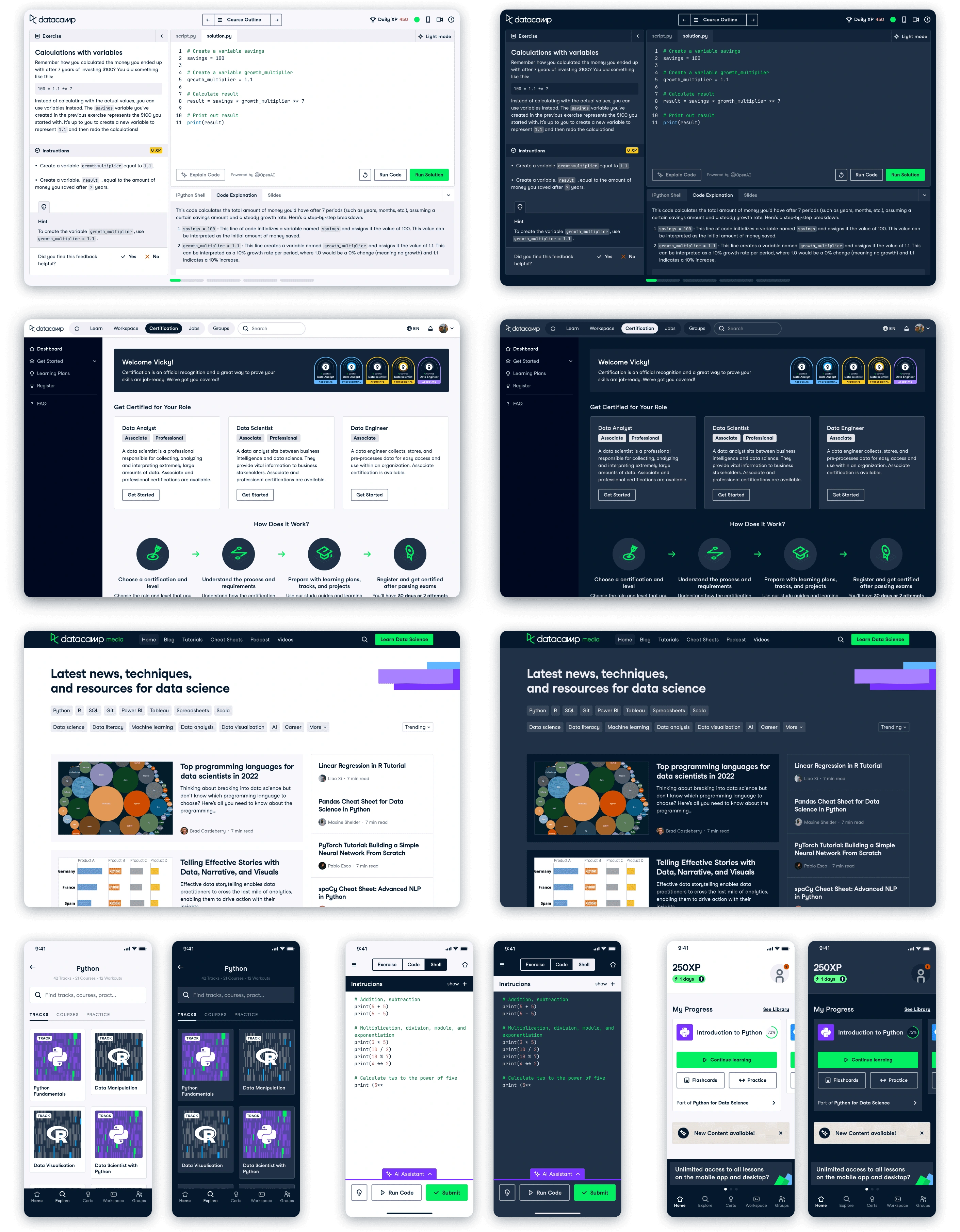
We started with an entirely blank slate. None of our Design System components had been designed with dark mode variants, and there had been no thoughts concerning how we want to approach theming the website in general. Our website was entirely made up of screens with white or grey backgrounds, and considering the majority of our users are learners, we wanted to optimise our website to accommodate learning at all hours of the day without straining the eyes.
Research on what we could have
The perfect way to start a project like this, where we have no internal basis to start from, is to get inspired. I took a look at several competitors that I thought had a really effective dark mode. I wanted to find examples of websites and design systems that handled dark mode well, so that I could consider both going forward.
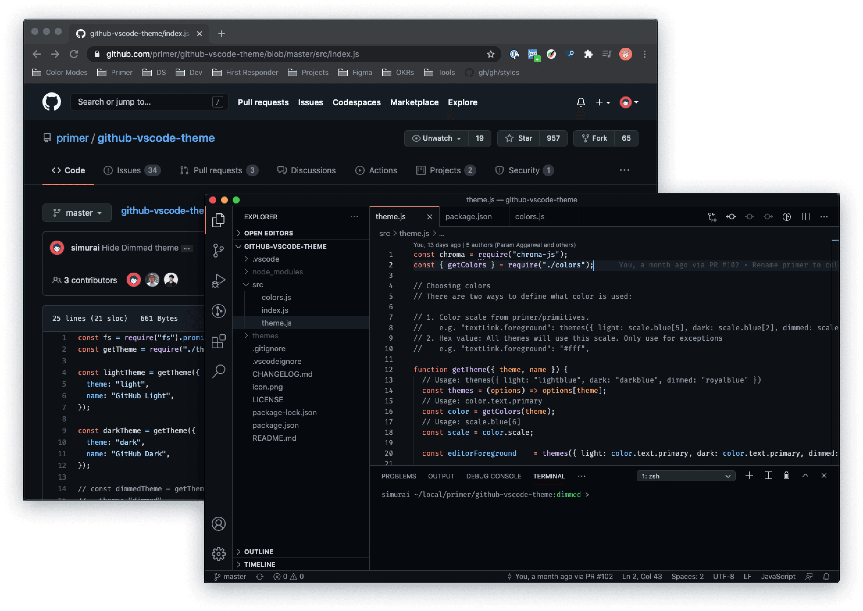
I really liked GitHub and Atlassian. Their websites and design systems were almost perfect examples of what I envisioned DataCamp having.
Final decision
My final approach ended up being a mix of all three of the above. I wanted to go with a method that required minimal new colours being introduced, and thought we could achieve the look we wanted this way. The below approach depicts our colours (we typically have four colour shades for each main accent colour) mapped 1:1 light to dark, with the exception of our colour text accents, which had to map differently for accessibility.
Figuring out an approach to colours
I started by thinking of different ways we could structure our approach to translating our existing colours to handle theming. Since we already had a defined and extensive colour palette for our brand, it was important to find a way to best utilise what we had as opposed to jumping straight in to creating a whole set of new colours.
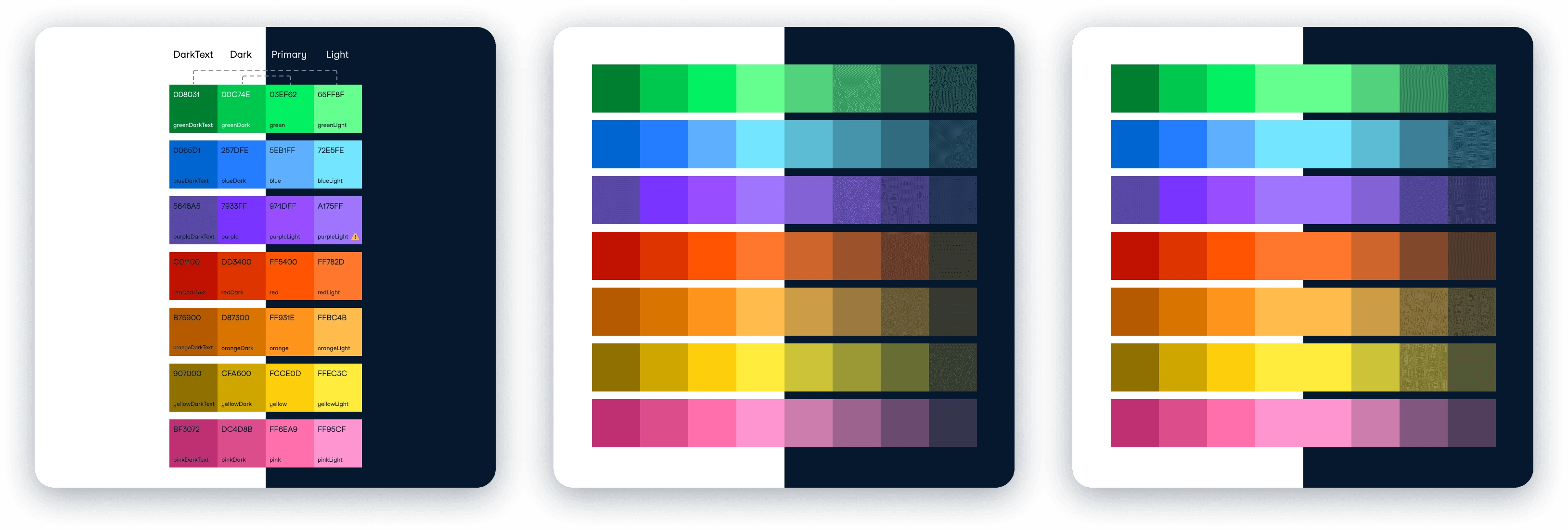
The first image in the picture above depicts a symmetrical approach, where our existing swatches are divided in half, each half becoming a mirror. The ones on the left (light mode) were our darkest colours, and the right (dark mode) were our brightest. The second and third approaches were similar: in this approach we would retain our entire set of colours for use in light mode, and create a new set of desaturated colours for dark mode. This was the approach MUI (Material UI) took, and it made sense as the desaturated colours are easy on the eyes. The only difference between no.2 & 3 is that in no.3 I kept the middle colour in both light & dark modes.
Experimenting with how it could look at DataCamp
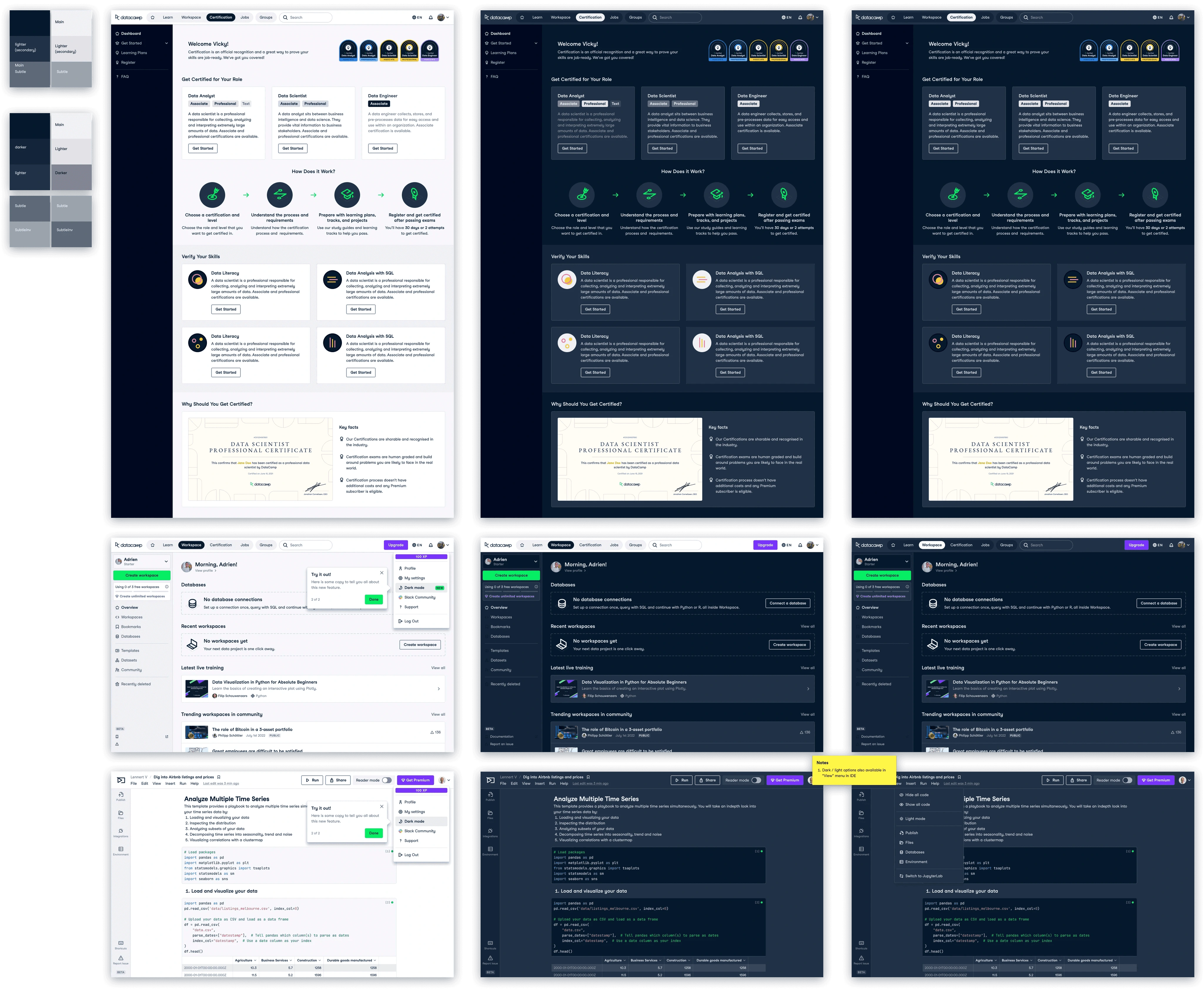
Post settling on a way to handle accent colours, I spent some time trying to figure out how dark mode to look as a whole, taking into account things like whether I wanted cards to look like they were a top-level surface (aka lightest colours), with the background being the darkest, or deepest. I also needed to consider how bright I wanted text to look on screens, wanting to avoid using pure white as our main text colour.
My initial experimentation with how dark mode would look.
The first image in the picture above depicts a symmetrical approach, where our existing swatches are divided in half, each half becoming a mirror. The ones on the left (light mode) were our darkest colours, and the right (dark mode) were our brightest. The second and third approaches were similar: in this approach we would retain our entire set of colours for use in light mode, and create a new set of desaturated colours for dark mode. This was the approach MUI (Material UI) took, and it made sense as the desaturated colours are easy on the eyes. The only difference between no.2 & 3 is that in no.3 I kept the middle colour in both light & dark modes.
Alongside the look of the final theme, I also needed to consider how this would be activated in-product. I spoke with the product owners across DataCamp, and we agreed that it would be best placed in the top navigation drop down menu as this would work across the entire site. On top of this, having theming configuration there is a common UX pattern, which would mean we wouldn't hide it away out of reach of the user.
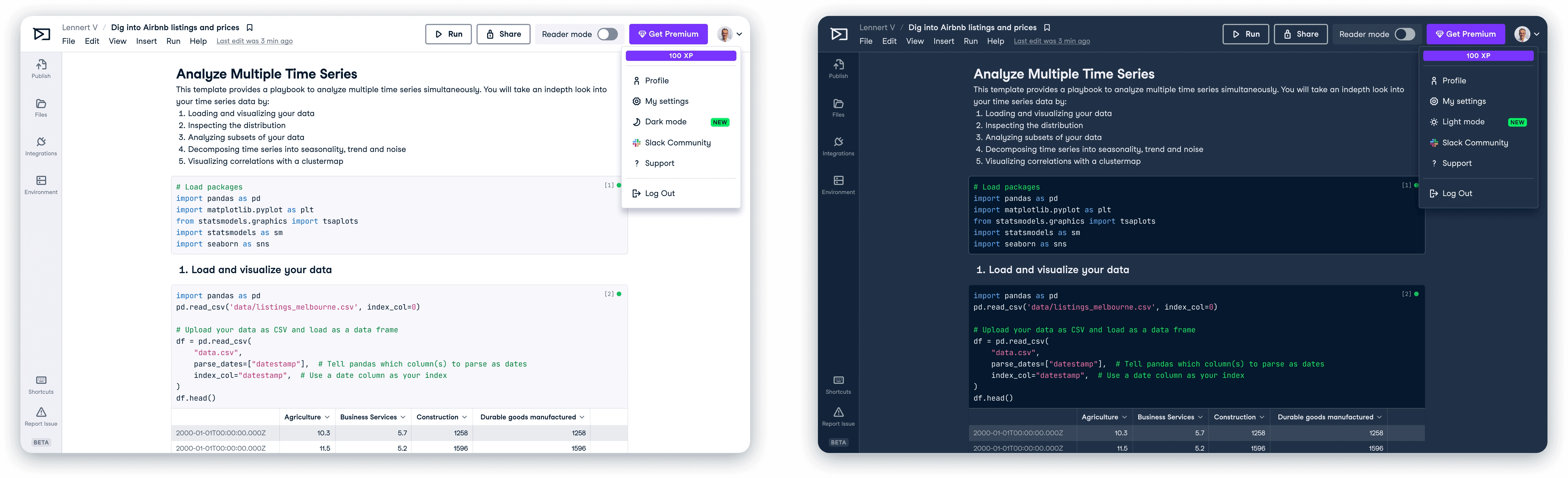
The dark / light mode theme options we proposed.
Design proposal
After a long period of experimentation, it was time to propose my ideas to the design team for feedback. I received a lot of valuable feedback, most of which was regarding the background colours, and how they would be organised so that the needs of all our products would be met. This was a challenge, as since we had not been designing with any rules for colour application, imposing a structure now was quite challenging...
…but a challenge worth facing. I addressed their concerns, and through this started on the next challenge.
Tokens and semantic naming
With theming came a set of problems and terminology that were new to me. One of which was Semantic naming - a type of naming that involves giving meaningful and descriptive names to design elements based on their function or purpose. What this meant in practice was that I worked alongside our design system engineer to organise our tokens into groups, renaming them to have semantic names. This was a long process that involved a lot of thought, as we wanted to end up with a solid structure for our tokens, where each light mode colour had a dark mode alternative.
The nerdy stuff
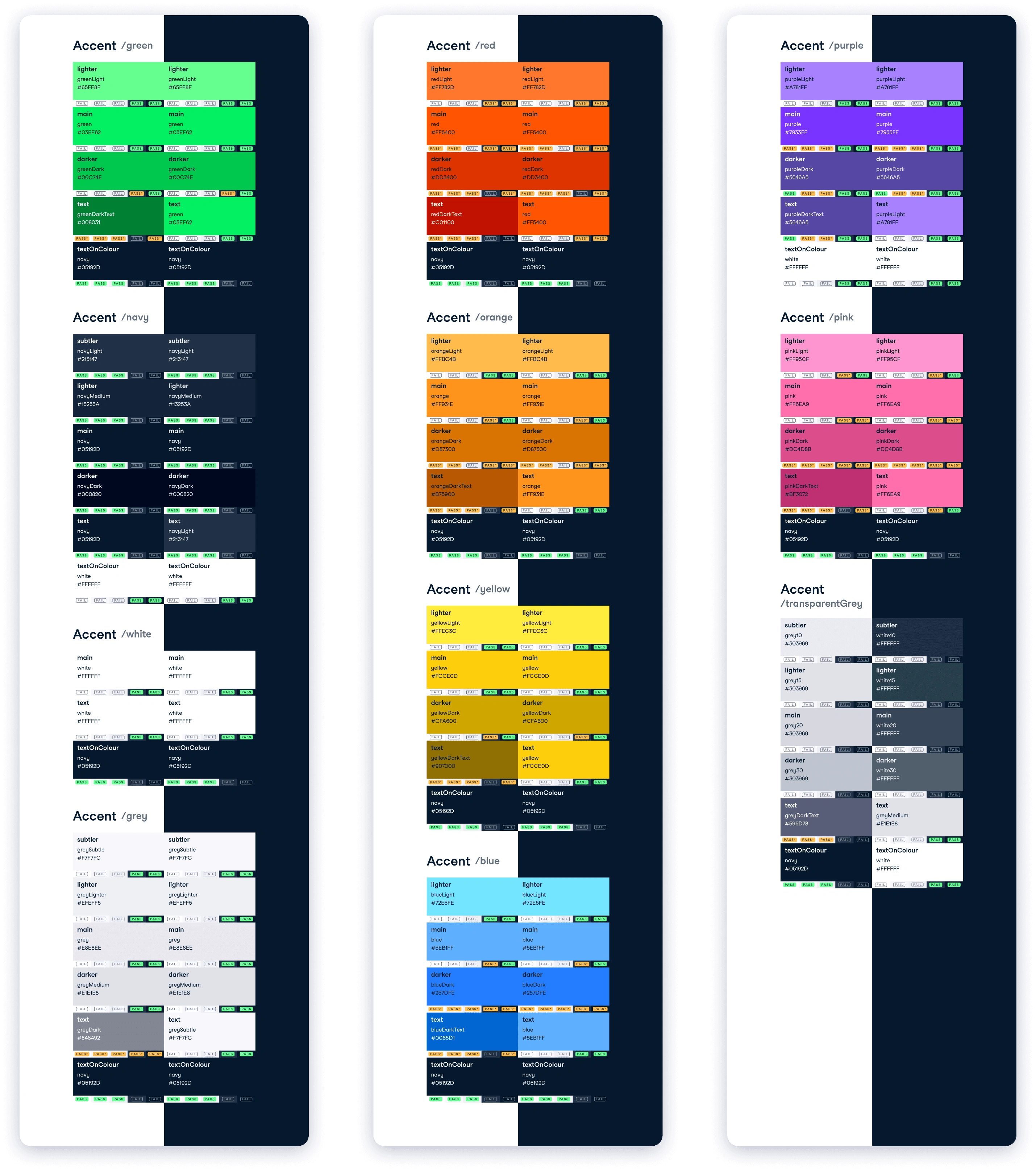
Colours were split up into three sections: function / sub-function / variant
Functions include the following: Text, Background, Border, Accent, Status and Brand. These groups describe the function of the colour you will use e.g. will it be used as a background, or as an accent colour?
Sub-functions include: Interaction, Green, Navy, White, Grey, Red, Orange, Yellow, Blue, Purple, Pink, TransparentGrey, Success, Error, Warning, Info, and Upgrade. These go one level deeper, letting you be a bit more specific once you have decided where you are applying the colour e.g. I want to use a status colour, and I want it to show a Success state, so I will navigate to status/success.
Variants include names such as Main, Primary, Secondary, Tertiary, Lighter, Darker etc. These are the final level of specificity, and dictate how dark, or subtle a colour is according to how you want it to be consumed e.g. If you are writing the main text on a page, you would use text/main. Similarly, if you want a light green accent, you would use accent/green/lighter.
Like this project
Posted Feb 25, 2024
Led the design effort in introducing dark mode to DataCamp