Fresh new look for London-based creative agency
Maria S
I took the lead in branding and illustration design for a vibrant London-based creative agency.
Company: Galan & Co
I was asked to establish the foundational branding for Galan & Co. Collaborating closely with the founder, we opted for a lively, youthful style that mirrors the agency's modern approach.
Vibrant colours and striking graphics played a pivotal role, with illustrations adding a playful and fun element to the overall design.
Research
I spent some time gathering information to get to know the business, industry, competitors, target audience for the project, so that I could help the client reach this goal. After discussion with the client I came up with two potential stylistic directions, exploring colours, typography, photography, and illustration.
The option on the left is clean and modern, with a good balance of intricate illustrations and bright, saturated imagery. The second approach was more minimal, with a palette limited two main colours. I played around with stylised line-art illustrations, to keep things young and playful.
After some discussion we decided to go with the first option as it matched the vision they had with being a creative lab the best.
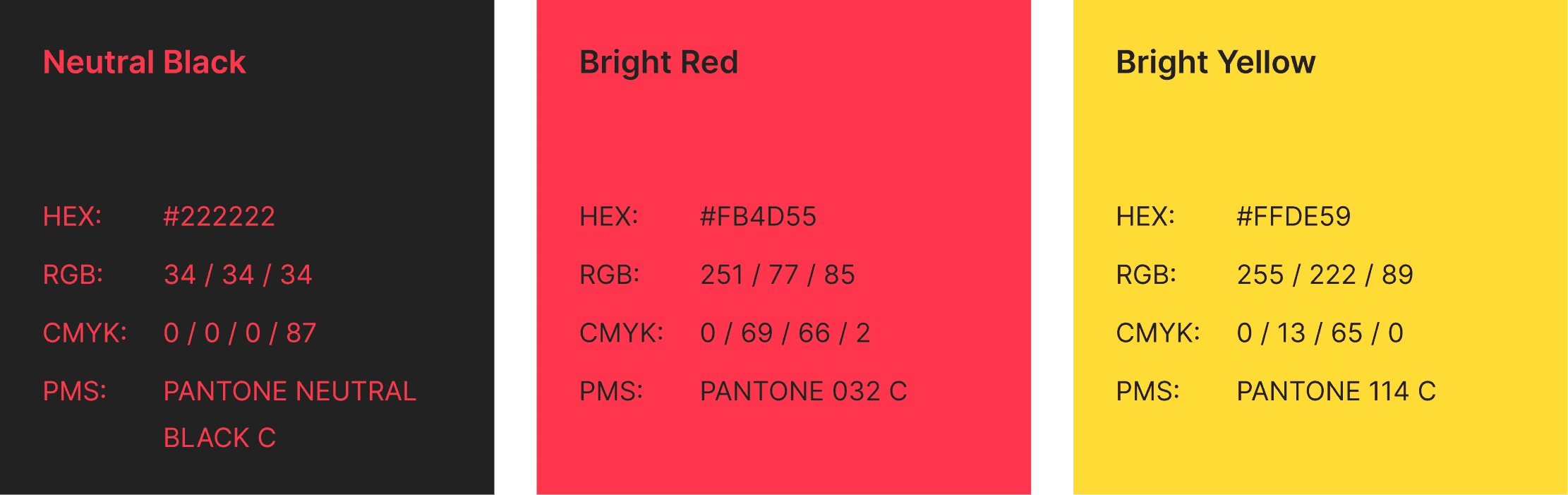
Colours
Colour picking was pretty intuitive for this client, as they already had their yellow picked out. I chose the following red and off-black to help balance the palette, while also making sure it's not dull and maintains an energetic feel.
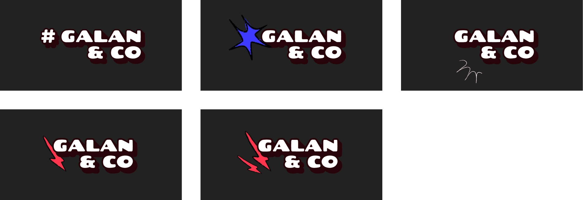
Art direction - Initial concepts
The client gave me full freedom in the design of the logo. He originally had a hashtag as his main logo shape, which he told me he was happy to leave behind. I took advantage of this and brought in some more experimental concepts, that invoked fun and experimentation, with the loud, bright and energetic nature.
Concept development
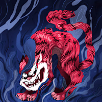
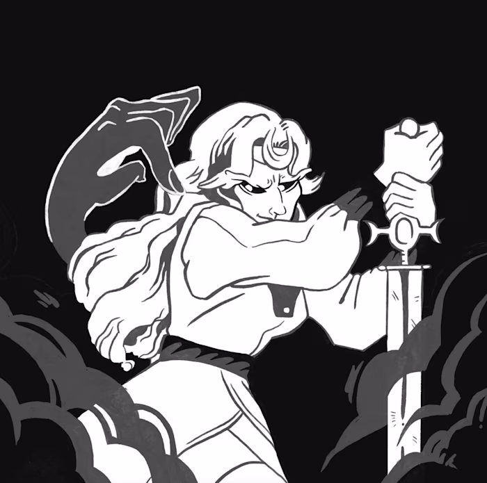
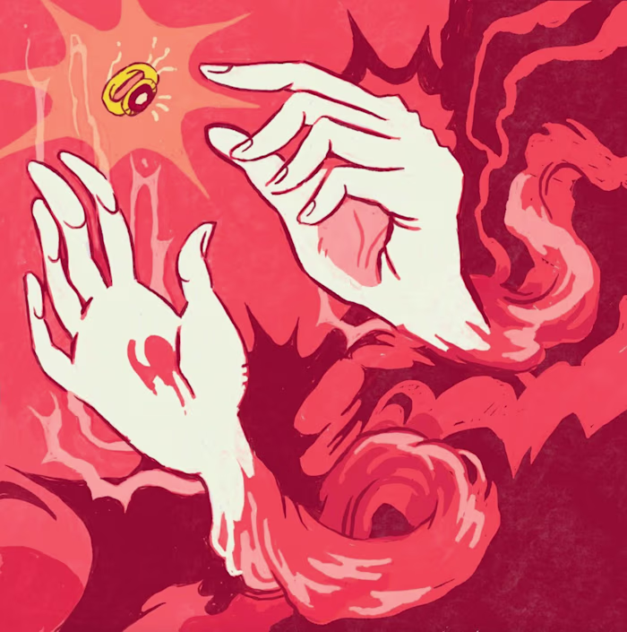
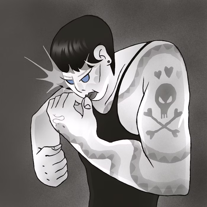
This is where things started to get really fun. We had some initial ideas for the logo, now it was time to explore the combination of illustration, typography and photography all put together. These concepts gradually evolved but I'm really happy with how a lot of these came out.
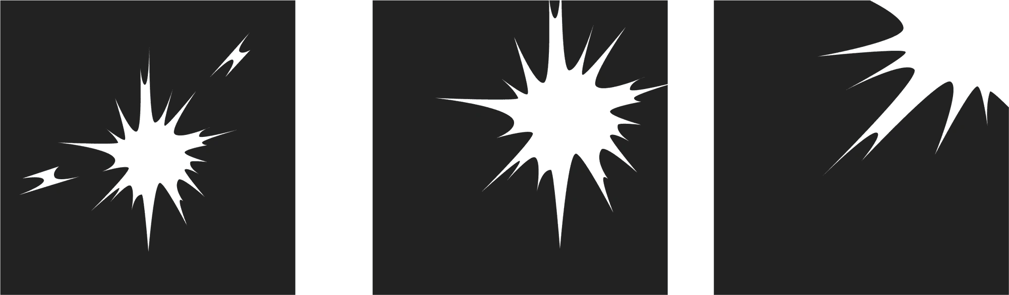
I was a big fan of the electricity and explosion concept, and so was the client. We decided to take this further, and I developed some shapes we could re-use and overlay on top of images. I thought that this, mixed with some hand-drawn illustration elements could work really well.
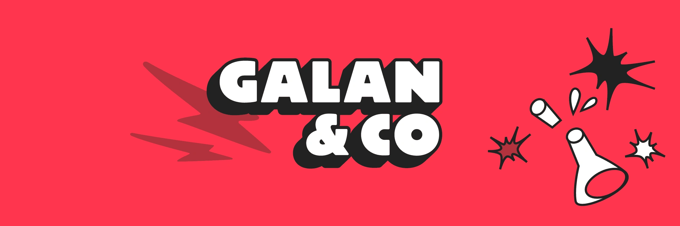
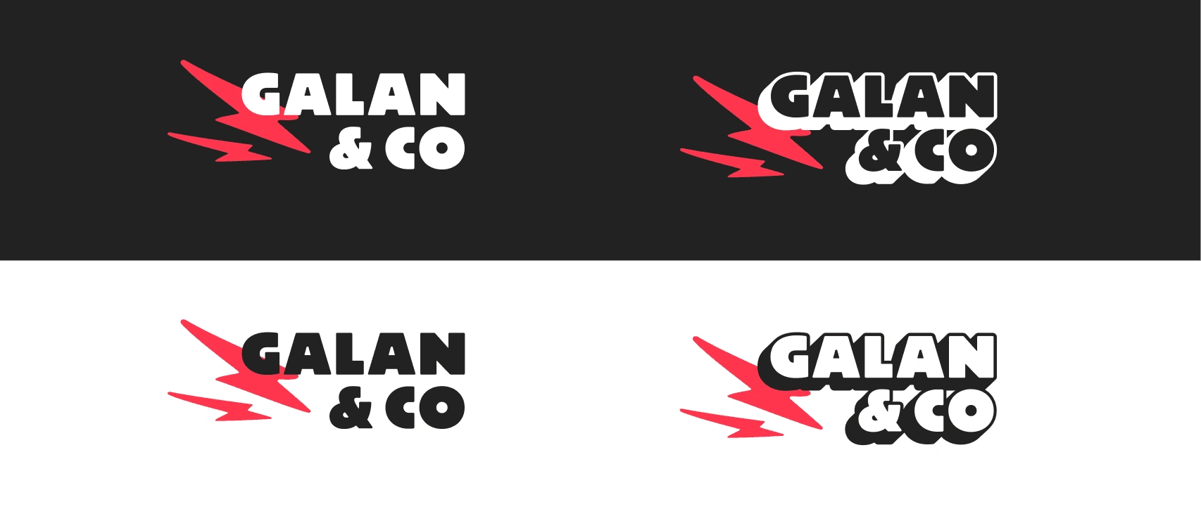
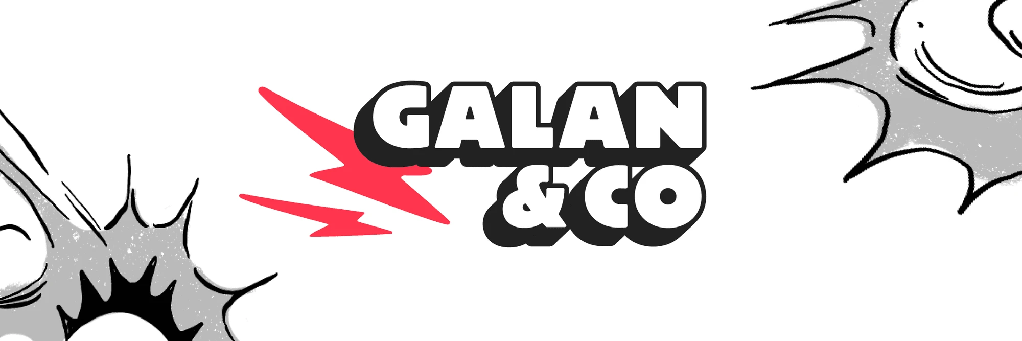
Logo design - Final design
The final logo design conveyed the electric sense of fun we were chasing after. There were two variations of the logo, one flat, more subtle version, and another outlined, more cartoony, more bold one.
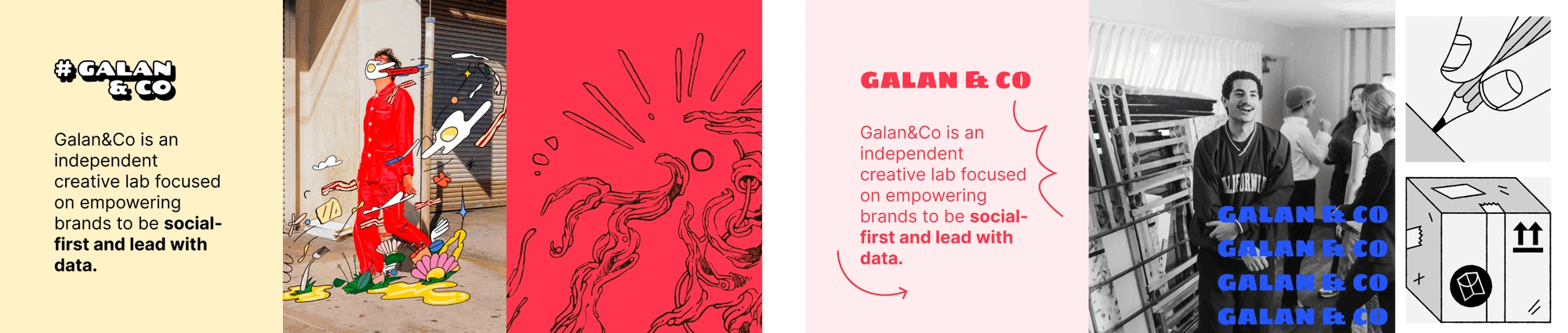
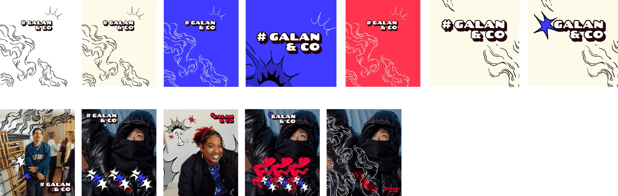
The final look
I created the three examples below to show how to use the logo, custom illustrations, and colours. The client was very happy with the final outcome, and you can see the branding live in their website, and social media pages.

Like this project
Posted Feb 25, 2024
I was asked to establish the foundational branding for Galan & Co. Collaborating closely with the founder, we opted for a lively, youthful style that mirrors th