Zenith Product Packaging Design

Seth D'Creator


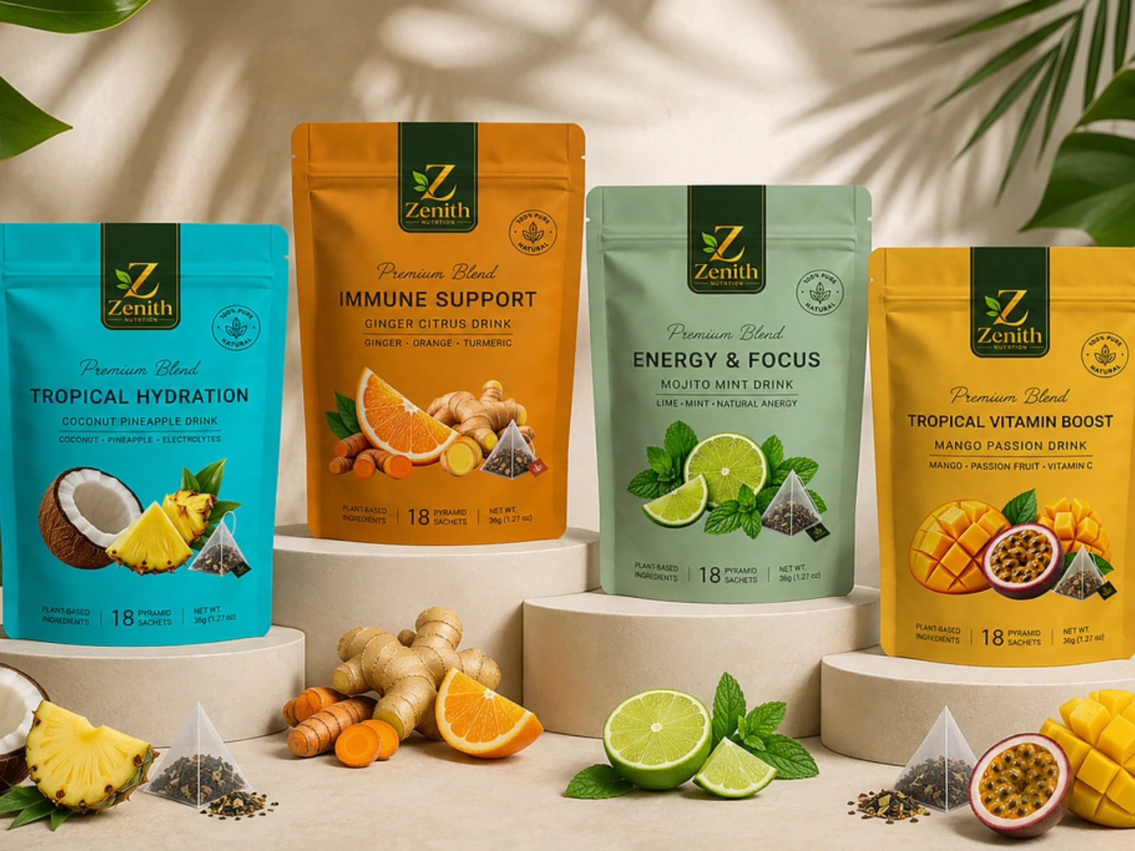
Zenith — Immune & Energy Blend
Project Period: August 2026 – September 2026
Industry: Health & Wellness / Supplements
Project Scope: Product Packaging Design, Visual Identity, Label Design & Brand Direction
Project Overview
Zenith is an immune and energy blend created for health-conscious consumers looking for a simple, functional addition to their daily wellness routine.
The goal of the project was to develop packaging that communicated energy, vitality, trust, and wellness while giving Zenith a distinctive presence on the shelf and across digital platforms.
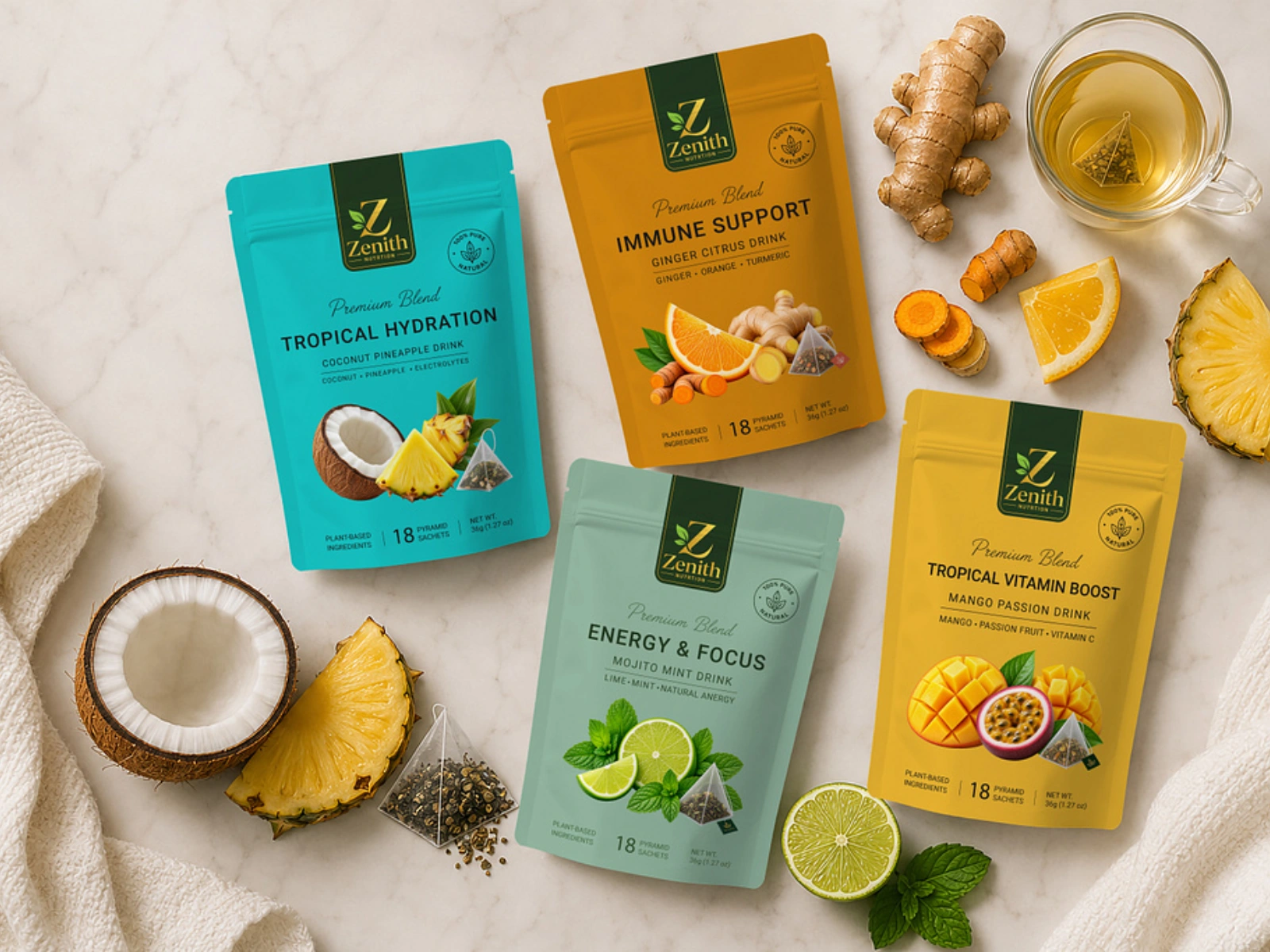
Zenith — Immune & Energy Blend
The Problem
The product needed a visual identity that could stand out in the crowded health and wellness market without relying on overly clinical or generic supplement aesthetics.
The key challenge was creating packaging that felt modern, premium, energetic, and trustworthy, while clearly communicating the product's purpose.
Discovery & Research
I explored the visual language of competing immune and energy products, looking at:
Competitor packaging and shelf presence
Health-conscious consumer preferences
Typography and color trends within the wellness space
How energy and immunity are communicated visually
Opportunities for Zenith to develop a more distinctive identity
This research informed a design direction focused on clarity, confidence, and modern wellness.
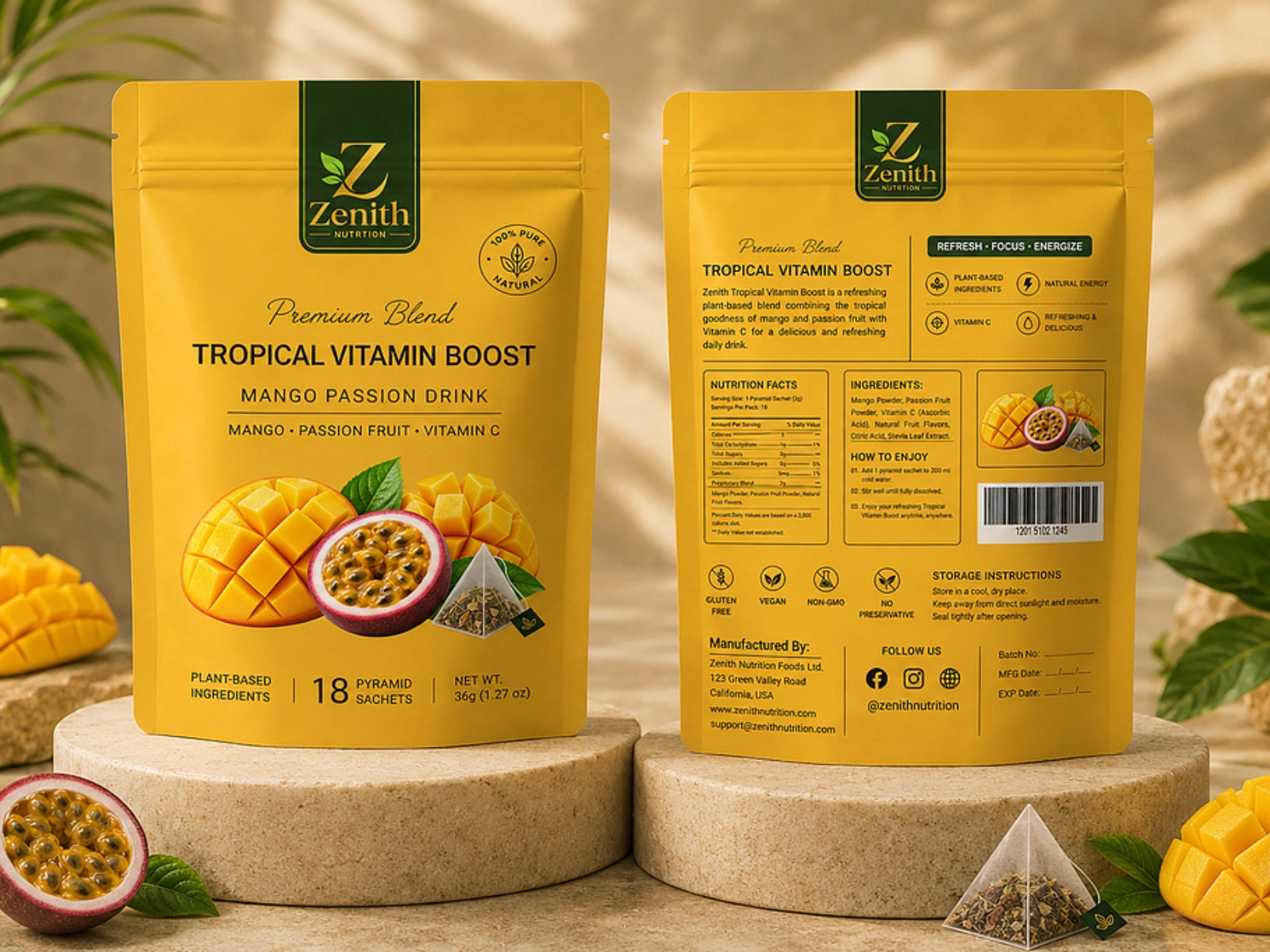
Zenith — Immune & Energy Blend
Design Strategy
Brand Personality:
Energetic, confident, clean, trustworthy, and contemporary.
Visual Direction:
A modern wellness aesthetic combining strong typography, clean composition, and visual elements that communicate vitality and functionality.
Creative Rationale:
The packaging was designed to make Zenith immediately recognizable while keeping the product information clear and easy to understand. The hierarchy prioritizes the Zenith brand name, product benefit, and key information so consumers can quickly understand what the product is and what it offers.
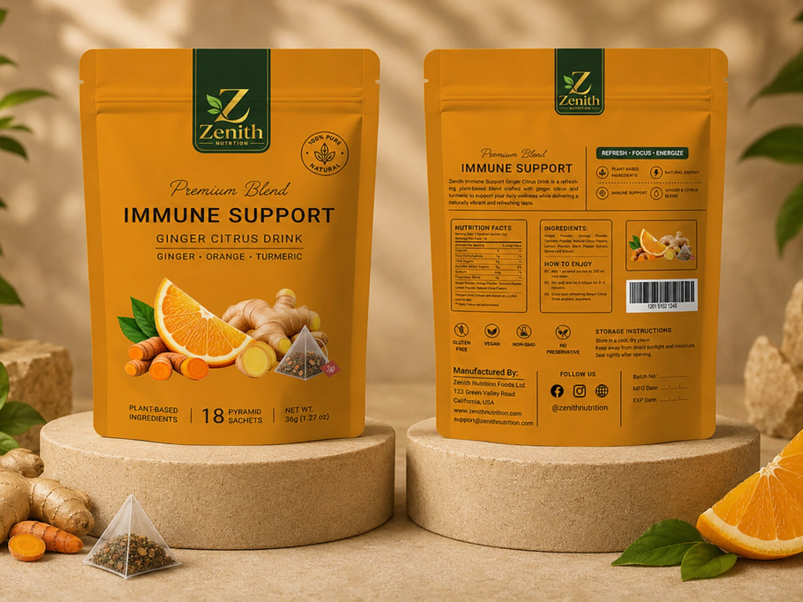
Zenith — Immune & Energy Blend
Packaging Development
I developed the product packaging with attention to:
Typography: Clean, modern type choices designed for readability and shelf visibility.
Color Palette: A wellness-focused palette selected to create a balance between energy and trust.
Layout: Structured information hierarchy to prevent the packaging from feeling cluttered.
Brand Elements: Supporting graphic elements used to reinforce Zenith's identity and create visual consistency.
Product Presentation: A premium packaging direction designed to work across physical retail and digital product photography.
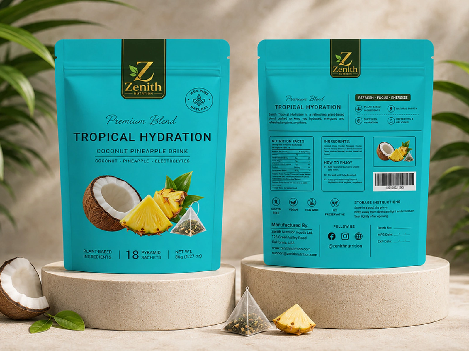
Zenith — Immune & Energy Blend
Final Deliverables
Zenith product packaging/label design
Front and back packaging layouts
Typography system
Color direction
Supporting brand elements
Product mockups
Digital-ready product visuals
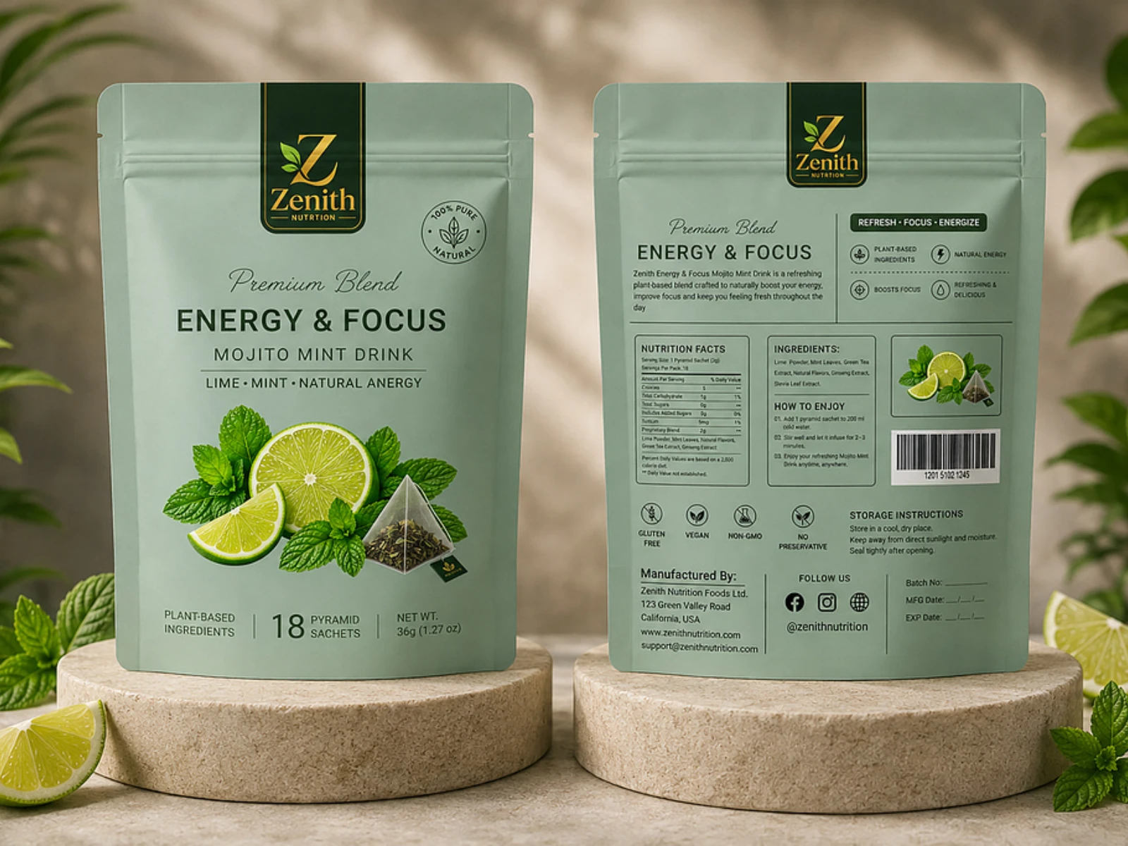
Zenith — Immune & Energy Blend
Outcome
The final direction positioned Zenith as a modern, confident wellness product with packaging designed to improve visual recognition, communicate its purpose quickly, and create a stronger sense of trust and product value.
The system also provides a foundation that can be extended across future Zenith products and marketing materials.
Like this project
Posted Sep 24, 2026
Developed modern, distinctive packaging for Zenith's immune and energy blend.
Likes
2
Views
9
Timeline
Jul 31, 2026 - Sep 29, 2026
Clients
Zenith