Shovkovo E-commerce Website
Kateryna Kravchenko
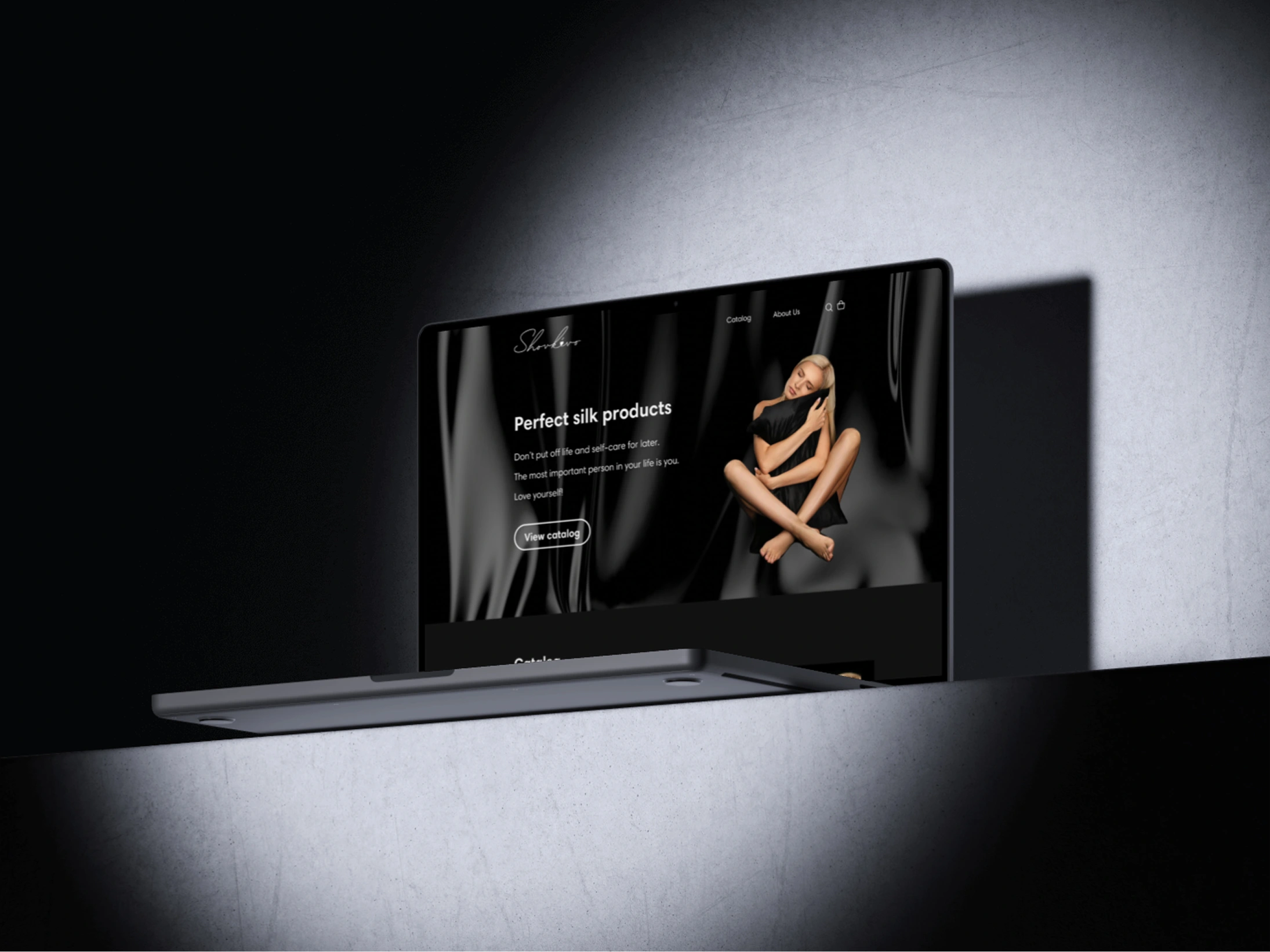
Shovkovo
E-commerce Website
From concept to launch: designed and developed a dark‑mode e‑commerce site with streamlined catalog and checkout—25% sales lift.
Client
Creating a seamless and luxurious online shopping experience ✨
Shovkovo, a Ukrainian brand specializing in 100% silk accessories, built a loyal customer base on Instagram. However, the absence of a dedicated website limited product discoverability and complicated the purchasing process.
I designed and developed an elegant, user-friendly e-commerce platform to enhance navigation, streamline transactions, and reflect the brand’s commitment to quality and self-care. This project combined thoughtful UX strategy, intuitive design, and custom WordPress development to elevate the online shopping experience.
Info
Role
UX/UI Designer, Low-Code Developer
Timeline
20 weeks
Tools
Figma, WordPress, CSS
Team
Solo Project
Challenge
The brand's reliance on Instagram does not provide the optimal platform for streamlined sales and user navigation.
Users struggled to find detailed product information.
The absence of categorization made it challenging to explore product options.
Solution
A user-friendly website with clear navigation, a seamless ordering process, and a streamlined payment experience.
Detailed product pages with high-resolution images.
Strategic categorization to facilitate efficient product exploration.
Challenge Statement
Shovkovo primarily relied on Instagram for product sales. While this approach fostered a loyal customer base, it posed several limitations, including a lack of streamlined sales processes, limited product discoverability, and inefficient navigation.
How might we design Shovkovo’s website from scratch to create a seamless, luxurious, and engaging online shopping experience that enhances usability, improves conversion rates, and effectively showcases its premium silk accessories?
The solution needed to establish a strong brand identity, introduce clear product categorization, and provide a smooth purchasing journey that reflected Shovkovo’s dedication to quality and self-care.
User Research
To understand user experiences, pain points, and valued features, I conducted interviews and created two personas based on the data received.
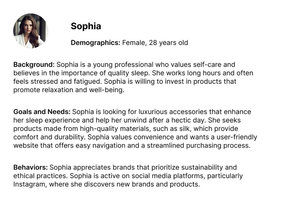
Persona 1: Sophia
Problem Statement: Sophia is a young businesswoman who struggles to find high-quality silk accessories that align with her values of sustainability and ethical sourcing.
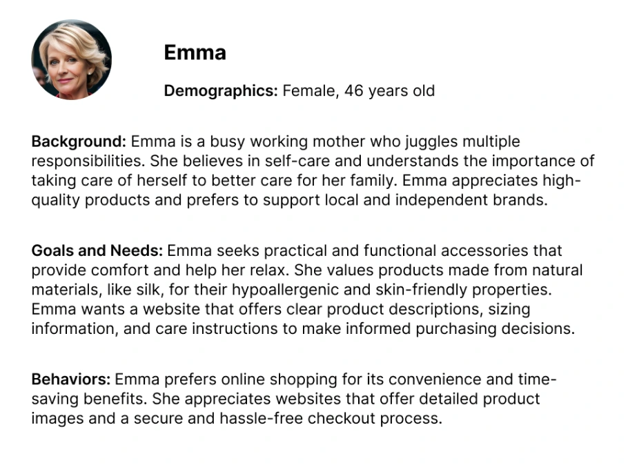
Persona 2: Emma
Problem Statement: Emma is a busy working mother who finds it challenging to navigate the online shopping process for sleep accessories.
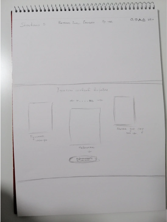
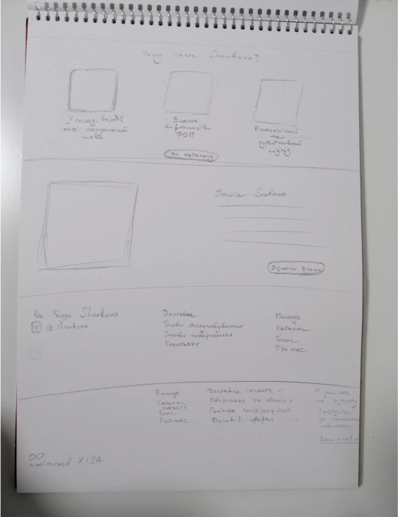
IDEATION
During the ideation phase, I created several sketches to explore different layout options and visualize initial concepts. These preliminary sketches were essential in developing a clear direction for the website's structure and design, ensuring that user needs and brand aesthetics were effectively addressed before moving on to more detailed wireframes and prototypes.
DESIGN
First Iteration
Taking into account the client’s brand identity and user pain points, I developed a design that prioritized usability and aesthetics:
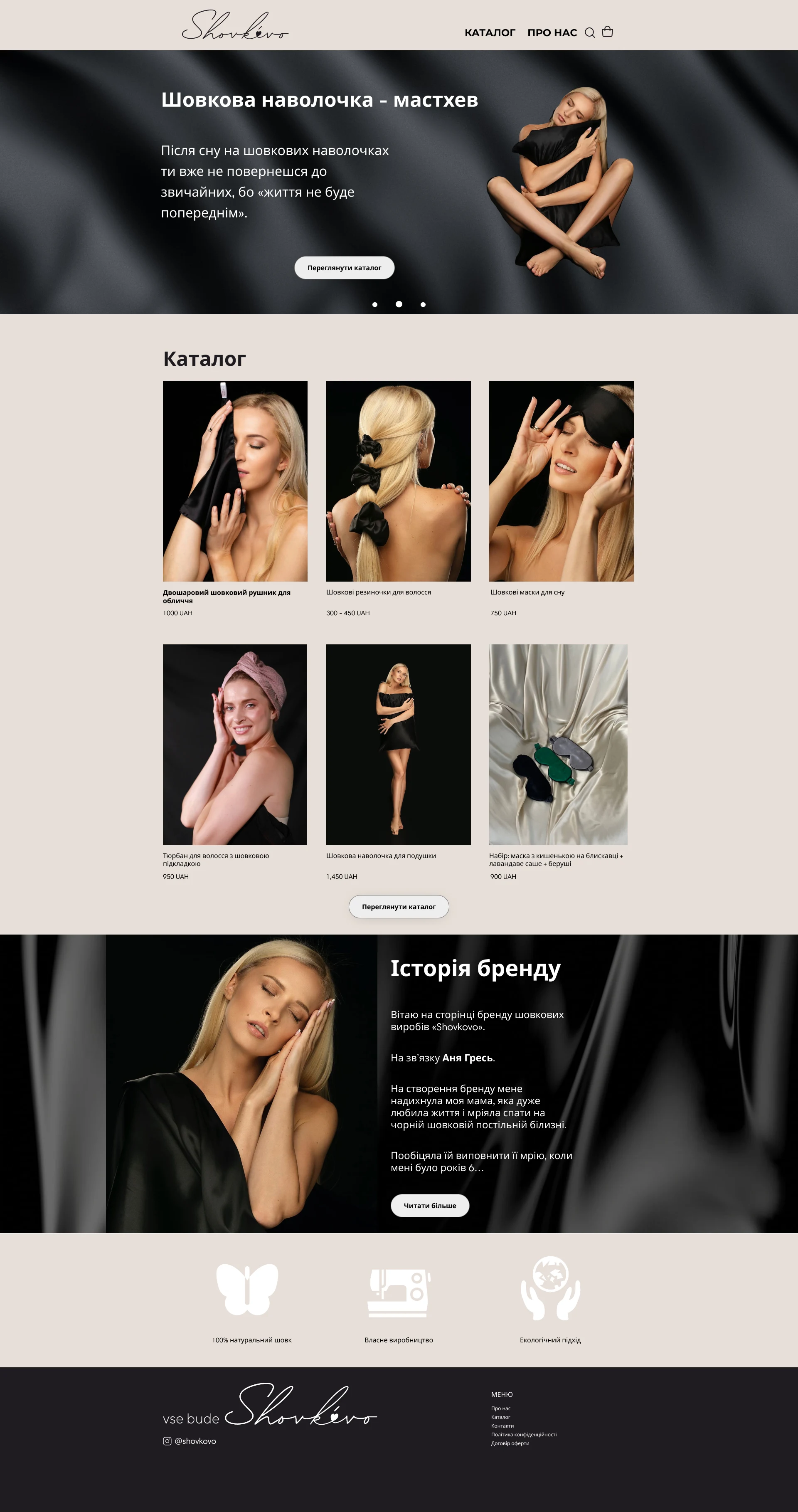
Sophisticated Homepage: Featuring a prominent carousel showcasing best-selling products and promotions.
Streamlined Catalog Section: Displaying three popular items with essential details for quick browsing.
Brand Story Integration: An "About Us" section to connect users with the brand’s story and values.
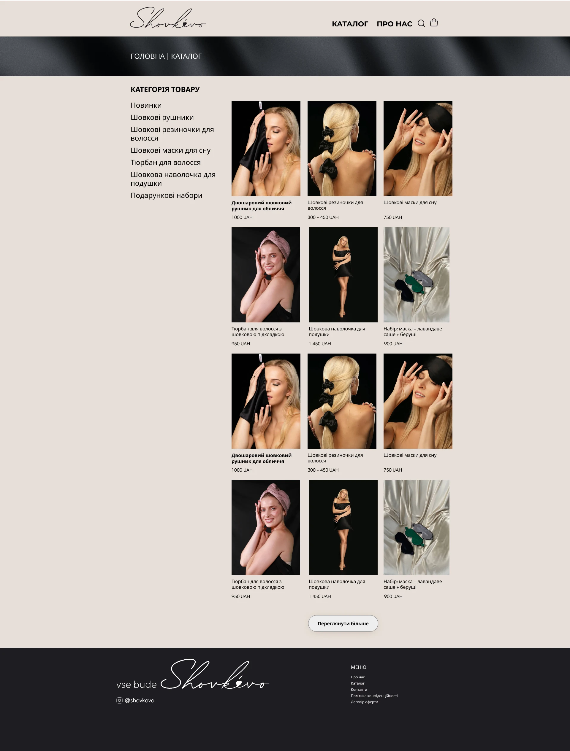
Intuitive Navigation System: Categorized product listings for an intuitive shopping experience.
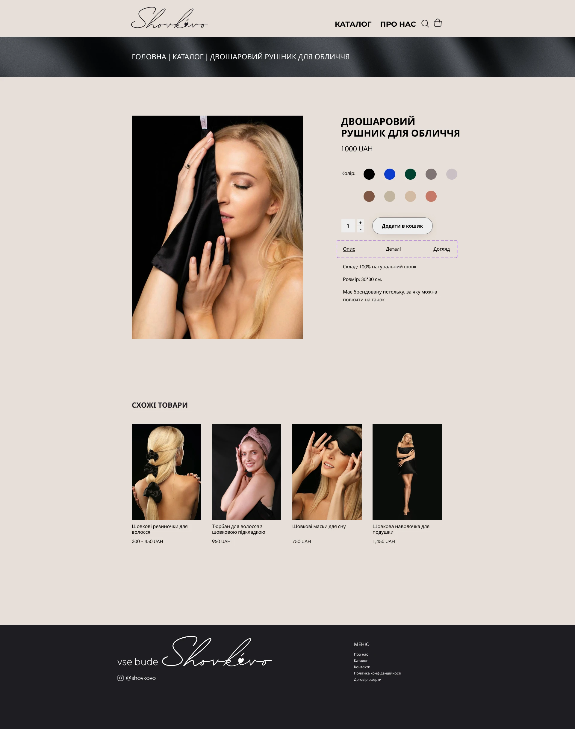
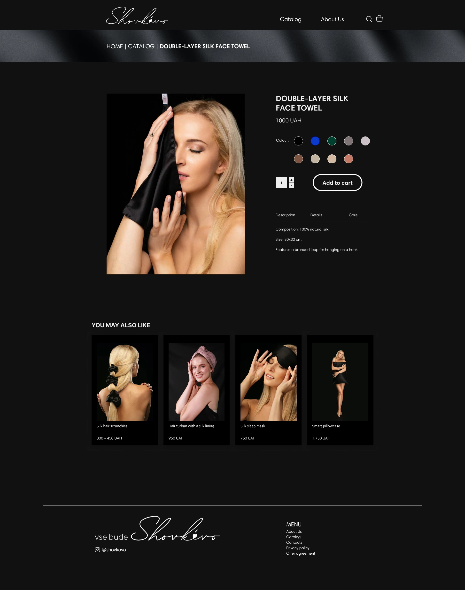
Product Page: Clear customization options (colour, quantity) and structured product details (description, care, and specifications).
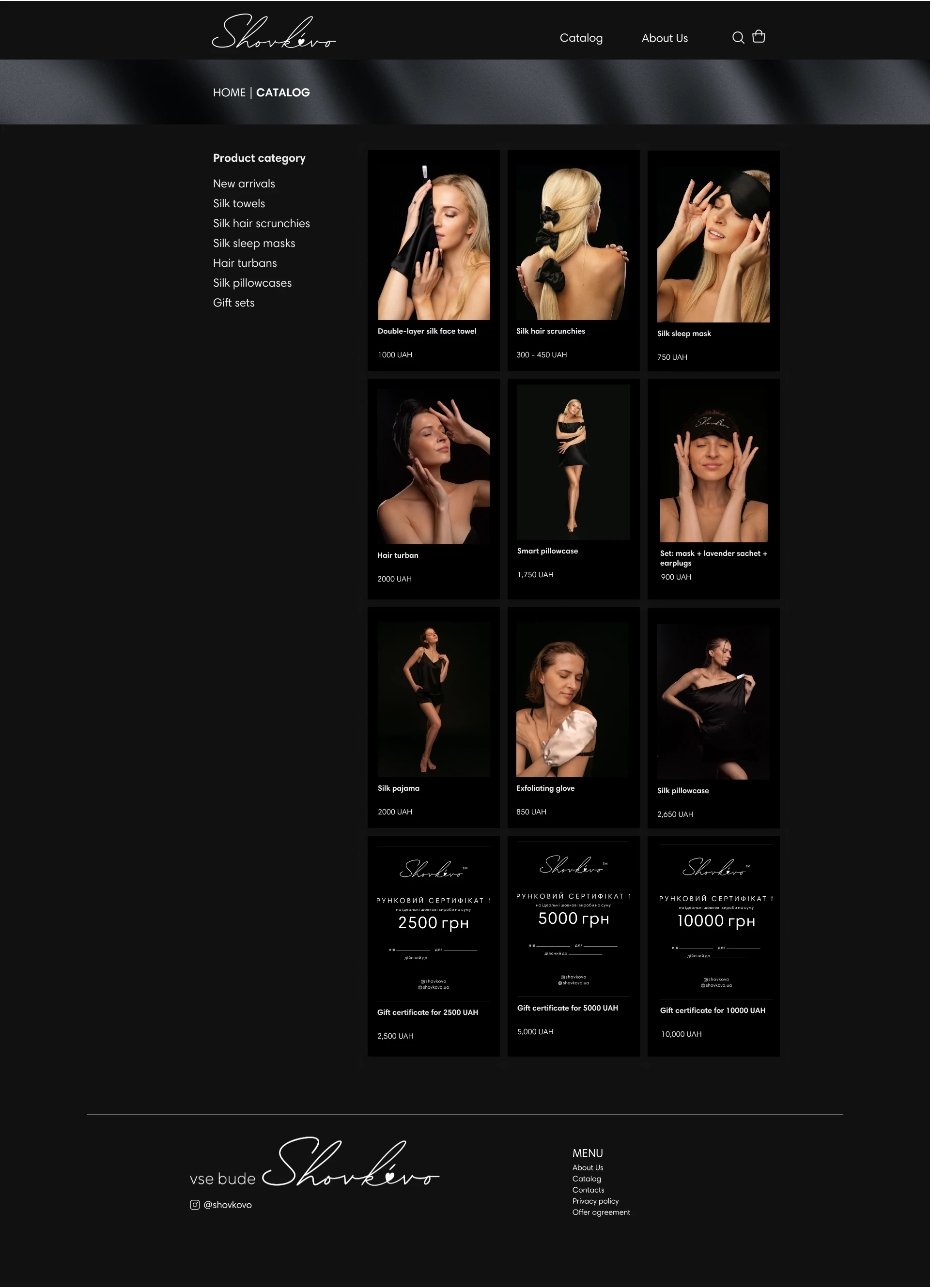
After presenting the high-fidelity prototype, the client requested a dark mode version. To enhance readability and reduce eye strain, I used #121212 for black and #EEEEEE for white, ensuring a soft contrast.
SOLUTION
Final result
IMPLEMENTATION
Once the design was approved, I proceeded with development using WordPress and the Flatsome (WooCommerce) theme. Custom CSS refinements ensured alignment with the original design vision. The implementation phase included:
Performance testing across devices and browsers.
Plugin integrations for CRM and payment systems.
Final optimizations for a seamless shopping experience.
NEXT STEPS
Improving website navigation
To enhance navigation, the catalogue in the header should be divided into subcategories, allowing users quicker access to products.
Adding product filters
The Catalogue page should include filters that enable users to sort products by price and popularity, streamlining the browsing experience.
Displaying multiple product photos
To provide users with a comprehensive view of products, the Product page needs to feature multiple high-quality photos from various angles, showcasing the product's features effectively.
Like this project
Posted Jun 19, 2026
Designed and developed a dark-mode e-commerce site, enhancing sales by 25%.