Aurum

Akintayo David


//Project overview
Banking shouldn't feel complicated.
Most financial platforms are built around functionality first and experience second.
Aurum explores a different direction: a banking interface where information, movement and interaction work together to make complex financial activity feel simple.
The experience was designed around clarity, control and product storytelling rather than filling the interface with unnecessary dashboards and visual noise.
Industry
Fintech
Type
Interactive Product Website
Year
2026
Status
Concept Work
Role
UI/UX DesignCreative DirectionFront-end DevelopmentMotion Design
Built With
LovableReactGSAP / Scroll-based MotionResponsive Web Technologies
//Design direction
Financial technology without the visual noise.
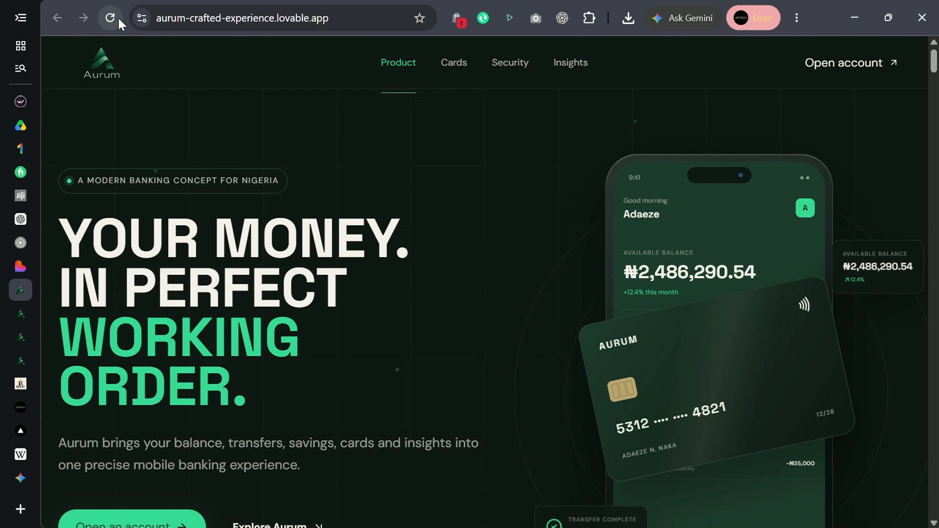
Aurum uses a restrained dark-green visual system, oversized editorial typography and realistic banking interfaces to create a financial product that feels premium without relying on excessive gradients, glassmorphism or generic fintech imagery.
01Clarity over decoration
02Product UI as the visual language
03Motion that explains functionality
04Premium typography and spacing
05Responsive experiences designed separately for desktop and mobile
//Desktop experience
Designed to move with the user.
The desktop experience turns scrolling into product storytelling. Financial information reorganizes itself, banking interfaces respond to interaction, cards react, payments complete and data visualizations evolve as the visitor moves through the experience. Motion is not used simply for decoration. It helps explain the product.
//Mobile experience
Not a smaller desktop. A mobile experience.
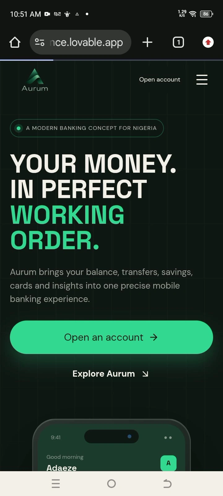
Aurum's mobile experience was restructured around touch, shorter interactions, swipeable product demonstrations and simplified motion. Instead of compressing the desktop website, the interface adapts its hierarchy and interaction model specifically for smaller screens.
//Product experience
Six interactions. One coherent system.
01
Financial Overview
Scattered financial information transforms into a unified banking view.
02
Transfers
A complete transfer experience demonstrates recipient selection, processing and payment confirmation.
03
Smart Savings
Animated savings goals make financial progress understandable at a glance.
04
Card Controls
Users can interact with card states, spending controls and payment settings.
05
Security
Transaction verification becomes a visible sequence instead of a generic security claim.
06
Analytics
Cash-flow information is transformed into readable financial insights.
//Motion philosophy
Motion with a reason.
Every major interaction in Aurum was designed to communicate something.
Money moves.Balances change.Savings grow.Cards respond.Payments complete.Security checks pass.Charts evolve.
The goal was to make the product understandable through motion rather than simply making the website move.
//The challenge
The challenge
The challenge was creating a visually sophisticated fintech experience without allowing the interface to become overwhelming. The final system balances cinematic product storytelling with clear financial information, restrained visual effects and responsive performance.
//The result
The result
A banking experience that behaves like a product, not a template.
Aurum became an exploration of what a modern financial website can feel like when product design, brand direction, interface design and creative development are treated as one connected system.
Like this project
Posted Sep 28, 2026
Hired to design an interactive landing page for Aurum, a fintech company, with scroll-driven animations that bring the brand to life.