
Typography System: “Bold Contrast, One Typeface”
Title: Brand Typography System: Kinetic Type Specification Board
Short description (for project cards):
A one-page typography system built on a single typeface family, with a clear four-level hierarchy and a six-color accent palette, used in two motion graphics.
Full description:
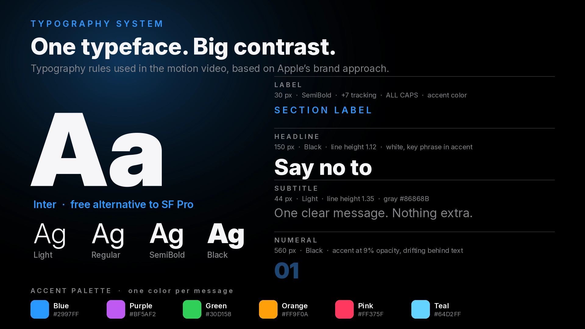
This board documents the typography system behind my two brand-strategy motion graphics. It follows a principle strong brands use: one typeface family, with contrast created by weight and size instead of many different fonts. The result is clean, confident and easy to read, even at video speed.
The system:
Typeface: Inter, a clean sans-serif with weights from Light to Black. It is a free, open-source alternative to SF Pro, so it is easy to use commercially.
Label: 30 px, SemiBold, wide letter spacing, all caps, accent color. It tells the viewer which section they are in.
Headline: large Black weight, tight line height of 1.12, white, with the key phrase highlighted in the accent color. It carries the main message in one or two lines.
Subtitle: 44 px, Light weight, line height 1.35, soft gray. It supports the headline without competing with it.
Numeral: very large Black numerals at 9% opacity behind the text. They add depth and a sense of progress without distracting.
Color: one accent per message (blue, purple, green, orange, pink, teal) on a near-black background, with white and gray for text.
What I handled:
Choosing the typeface and building the weight and size hierarchy
Defining spacing, line height, tracking and color rules
Creating a specimen board that can be handed to a client or developer
Applying the system in motion: word-by-word reveals, eased movement and consistent entrances and exits
Deliverable: 1920×1080 PNG specification board, plus the same system applied in two videos
Best for: startups building a brand, agencies needing a motion style guide, YouTube and social channels that want a consistent look, pitch decks and explainer videos
Typography notes for each video (add to the video descriptions)
Video 1: “The Apple Brand Playbook”
Typography is the main visual. Each message is a large headline that appears word by word, with the key phrase in the accent color and a lighter subtitle beneath. Strong weight contrast guides the eye, and a thin progress bar shows how far the viewer is in the story.
Video 2: “From Unknown to Iconic”
Typography works with the graphics. A small spaced label names the step, a bold headline states the lesson, and two short lines with pill tags (“Apple did” and “You do”) compare the Apple approach with what a new brand can do. Each step’s text color matches its icon and the glow behind it, so text and graphics read as one system.
0 likes · 0 views · Oct 25, 2026
Typography System: “Bold Contrast, One Typeface” Title: Brand Typography System: Kinetic Type Specification Board Short description (for project cards): A o...
