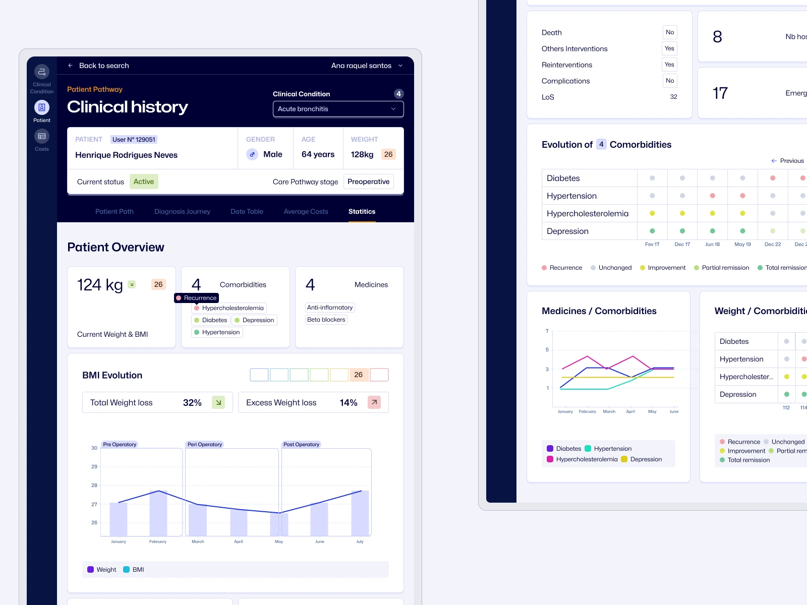
Patient pathway application
Adrien Gervaix
The Brief
The client built a working prototype for analyzing patient data. But it had problems that made it impossible to use in real hospitals.
❌ Unusable technical prototype
Despite being functionally correct at retrieving hospital data, the initial prototype was completely unreadable and unusable by healthcare professionals, serving only as a technical proof of concept.
❌ Information density overload
The interface suffered from excessive information density without proper hierarchy, making it impossible for medical staff to quickly identify critical patient data or evolution patterns.
❌ Inadequate data visualization
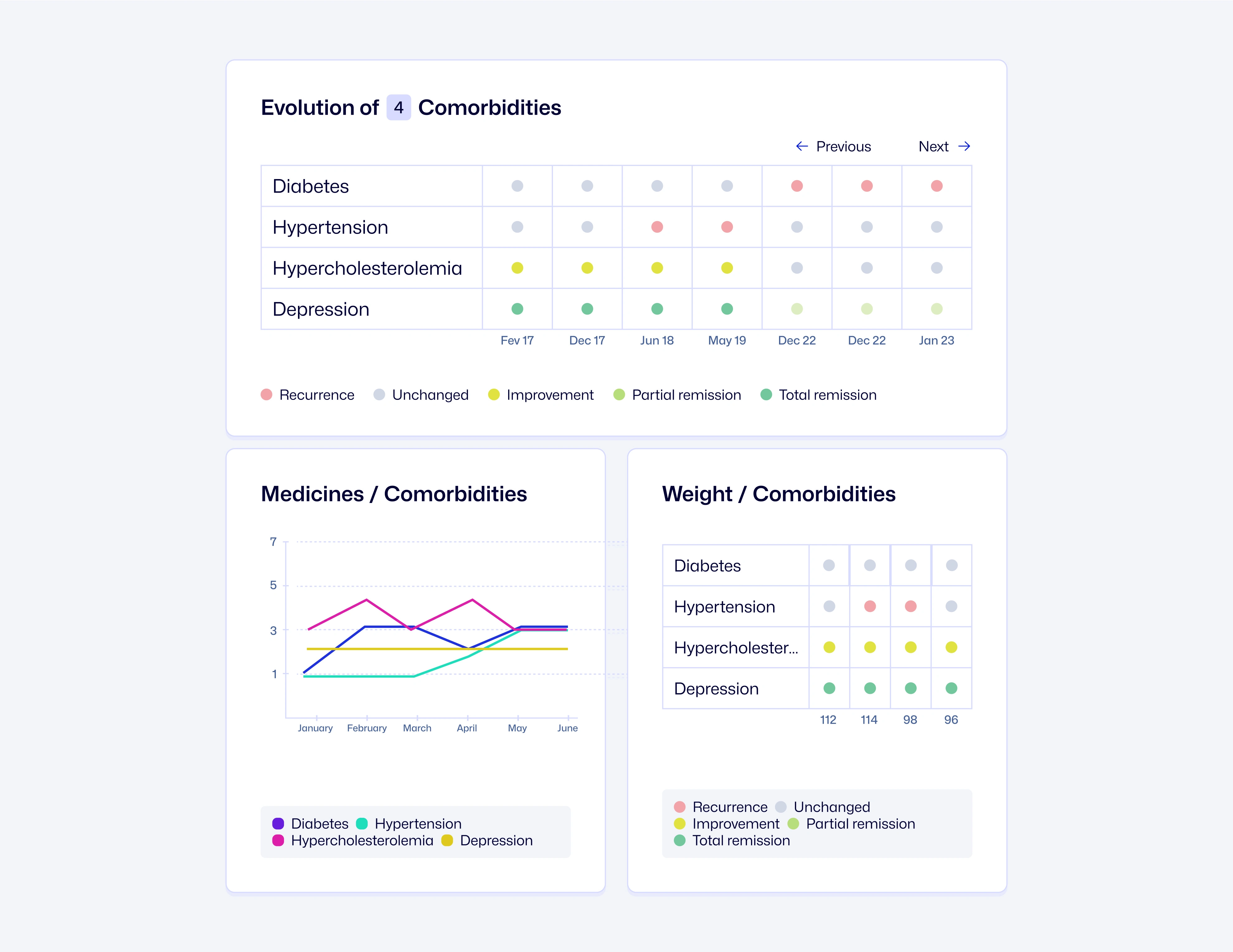
Poor choice of charts and redundant information created confusion, while the linear organization prevented efficient scanning of complex medical data.
The Approach
I needed to completely redesign how users interact with the system while keeping all the data features working.
✅ Clear information structure
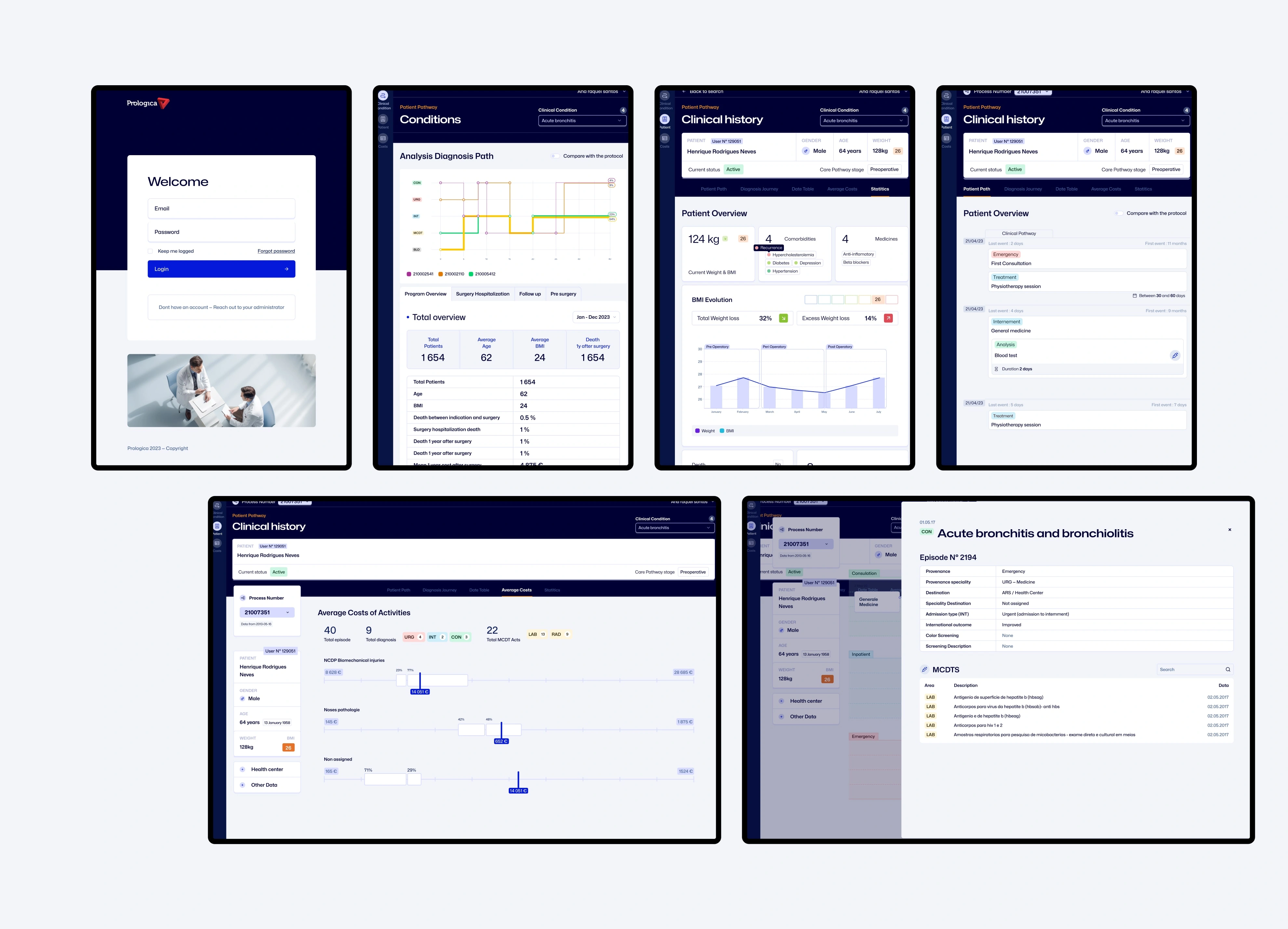
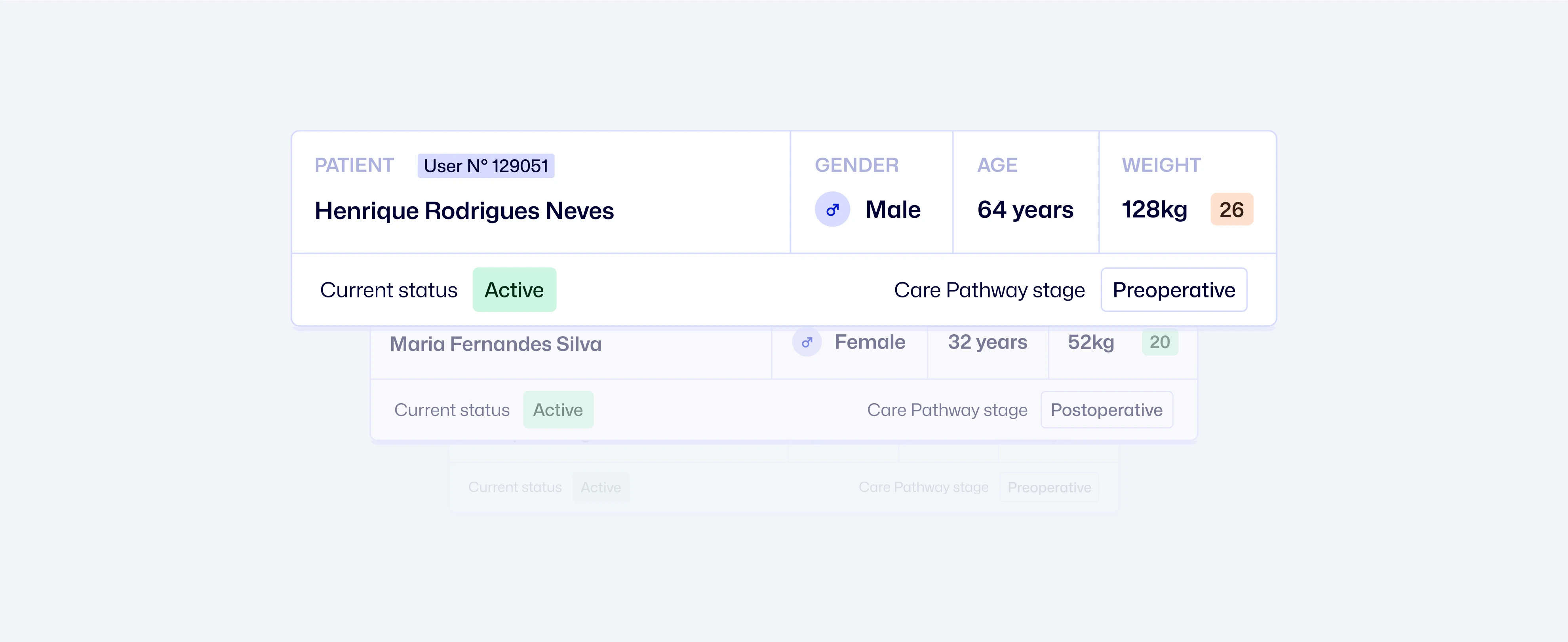
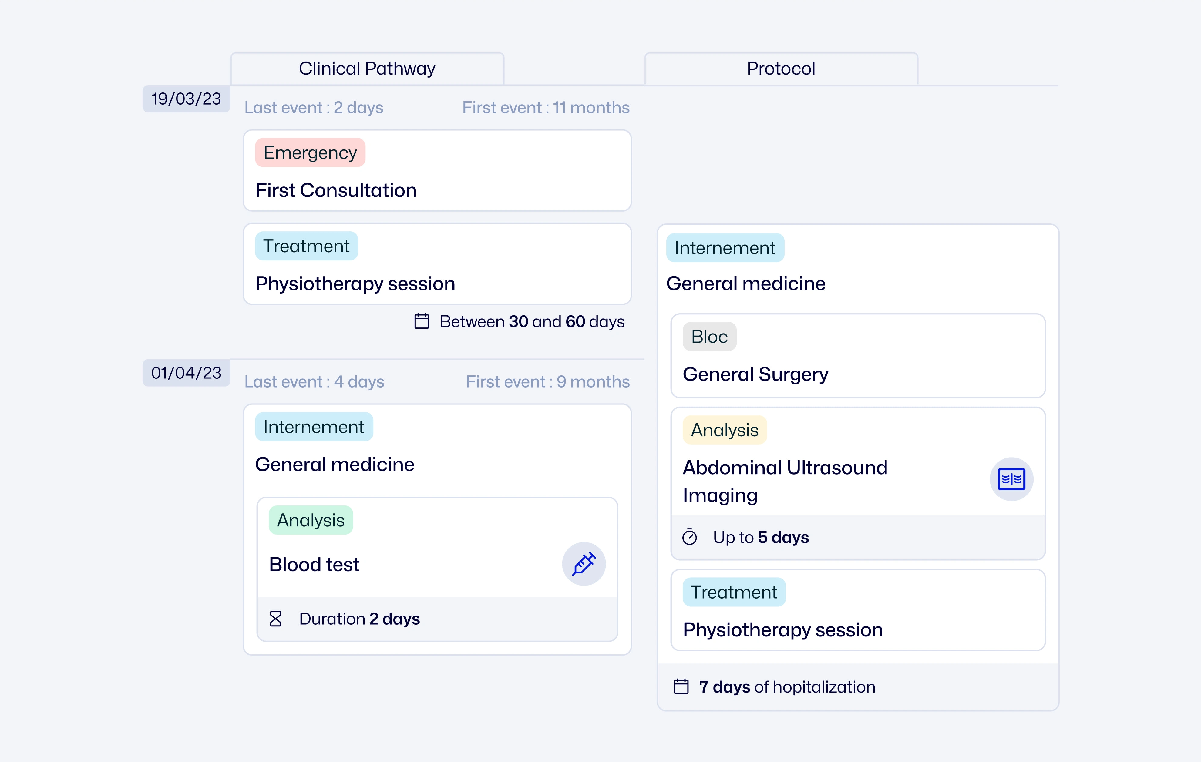
I reorganized how information appears on each page. Now each page has a clear purpose and doctors can find the right info quickly when they need it.
✅ Interface built for healthcare workers
I designed screens that are easy to scan, even with complex medical data. The most important information stands out so medical staff can make decisions faster.
✅ Flexible design system
I created a simple set of reusable components with clear instructions. This lets the development team build new features independently while keeping everything consistent.
Like this project
Posted Oct 13, 2025
Redesign of a clinical tool focused on usability, helping medical professionals deliver better care through intuitive design
Likes
0
Views
2