Campaign Content Design | Women's Health

Giovanna Braz

Content Design for an Integrative Medicine Campaign
Context
A content design project developed for a professional specializing in Chinese medicine and women’s health, with a focus on fertility, hormonal balance, and integrative practices. The communication needed to convey care, trust, and warmth without sacrificing clarity and professionalism.
My Role
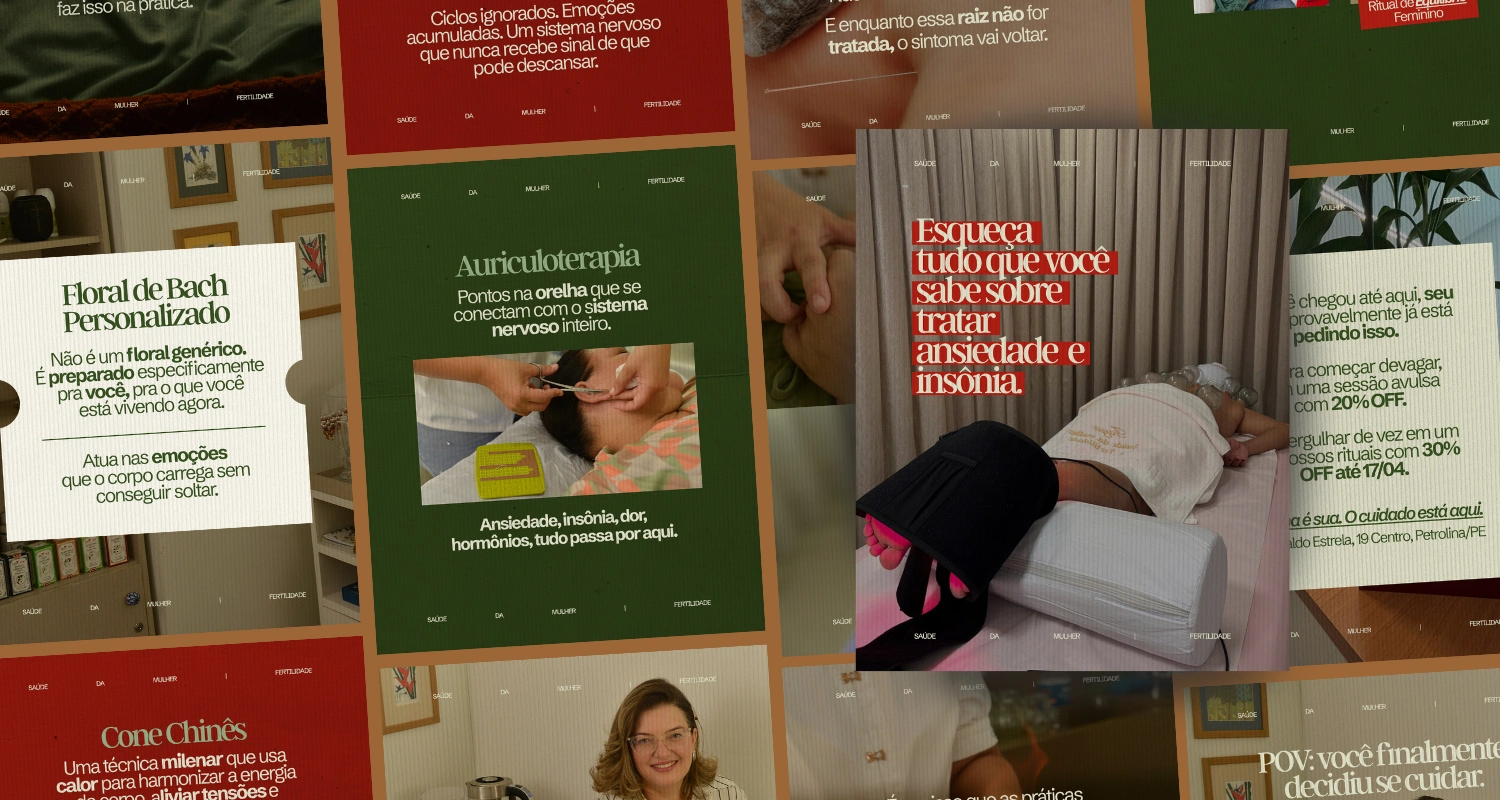
I worked on the visual development of the campaign’s content, organizing the graphic language and transforming the professional’s information into consistent pieces for the feed. The visual direction focused on a natural and welcoming aesthetic, using green, deep red, and original photographs of the sessions and the therapeutic space to bring the communication closer to the professional’s actual experience.
Process
The project was developed to support a specific campaign within the profile. The content layout prioritized information hierarchy, readability, and visual variety, while maintaining a sense of unity across the different pieces. Photographs of the professional herself, the procedures, and the environment were incorporated into the compositions to reinforce trust and a human touch, while the colors and typography helped maintain a recognizable visual identity throughout the campaign. Pages 2 through 5 showcase this approach in different formats and themes, while maintaining the same visual system.
Result
Five complete carousels were developed for the feed, designed to reinforce the professional’s campaign and strengthen the communication of her services within the profile. The result was a coherent, sensitive, and functional set of content, capable of communicating topics related to women’s health in a more accessible and visually consistent manner.
Project developed for a professional in Brazil.
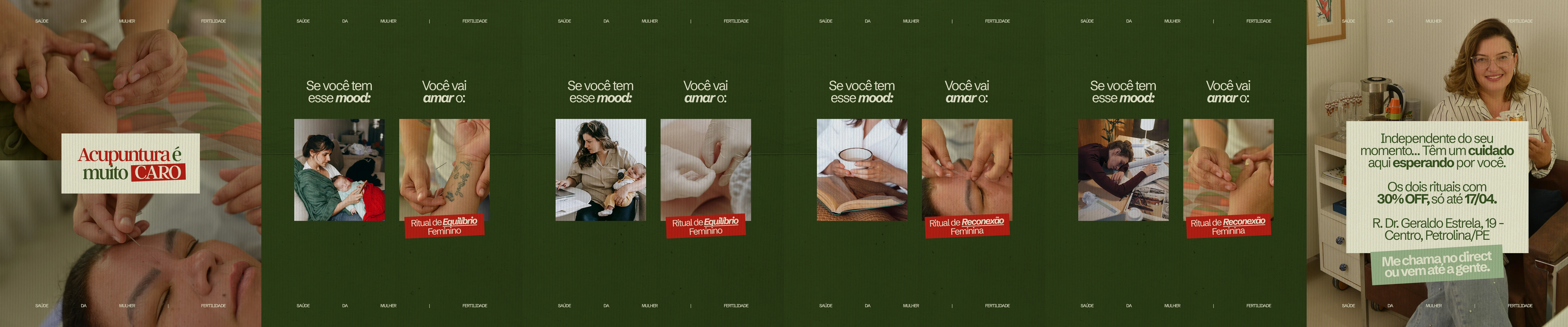
first carousel
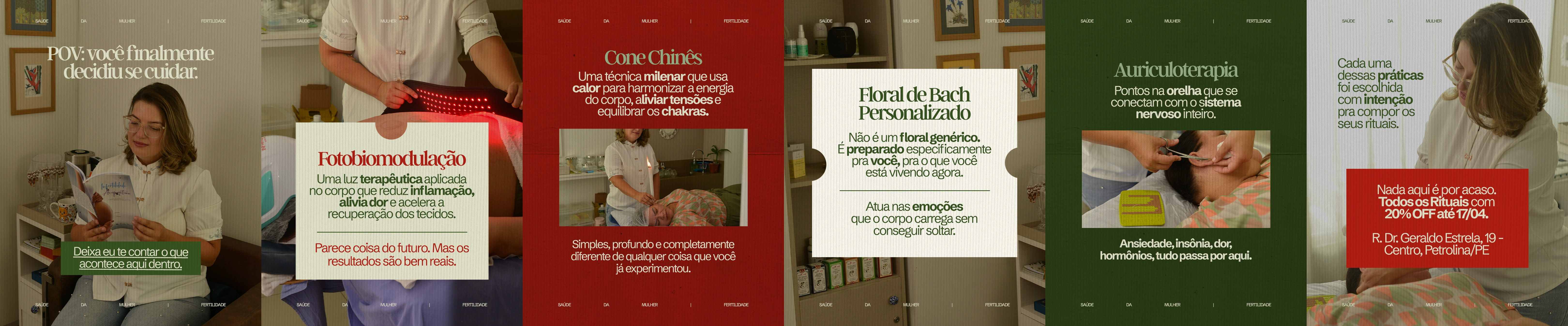
second carousel
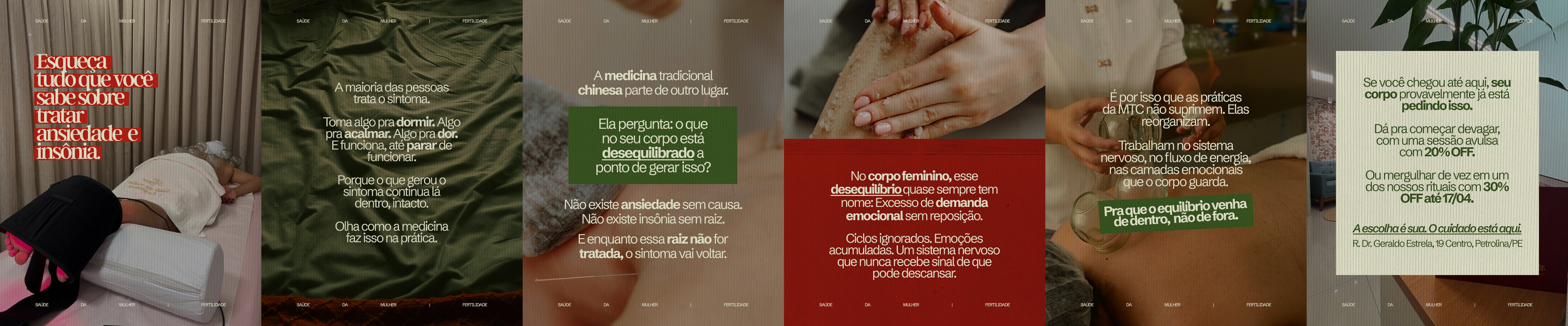
third carousel
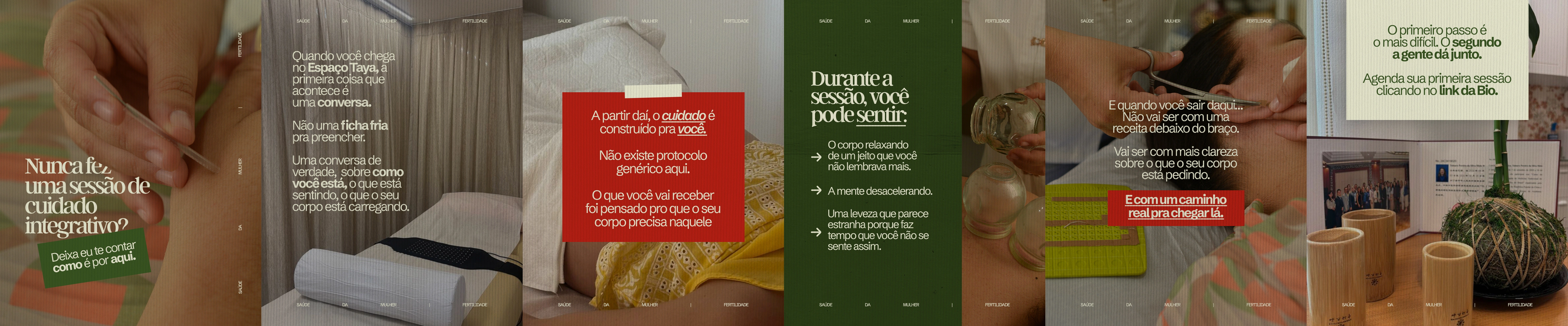
fourth carousel
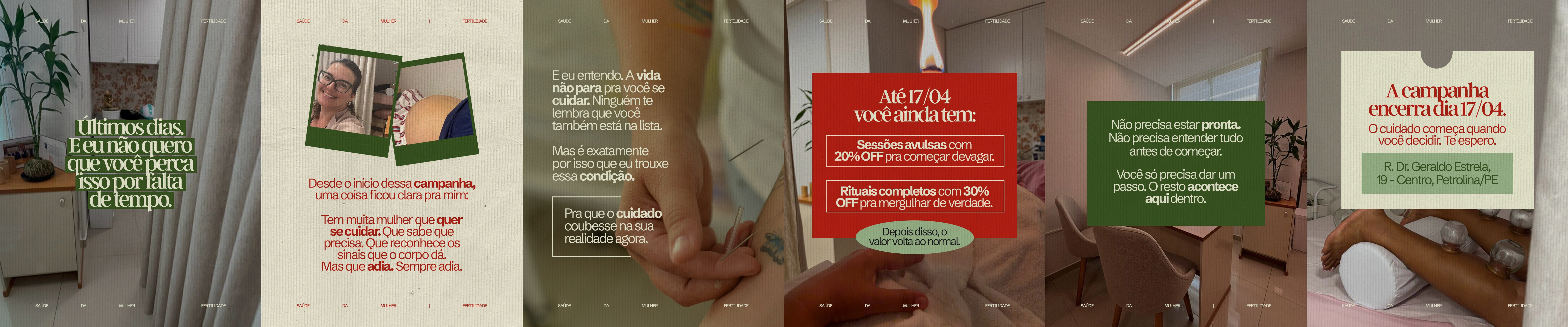
fifth carousel
Like this project
Posted Oct 8, 2026
Content direction for a Chinese medicine practitioner, featuring a welcoming and distinctive visual style to strengthen their presence and services.
Likes
0
Views
1