Content Design for a Wellness Club and Women's Community

Giovanna Braz

Content Design for a Wellness Club and Women's Community
Context
A content design project developed for a wellness brand aimed at women seeking physical and mental well-being without pressure, with a focus on movement, consistency, enjoyment, and a sense of community.
The brand’s goal was to transform self-care into a lighter, more achievable routine that women could share with one another.
My Role
I worked on creating visual content for the profile, translating the brand’s vision into a more vibrant, welcoming, and dynamic communication style.
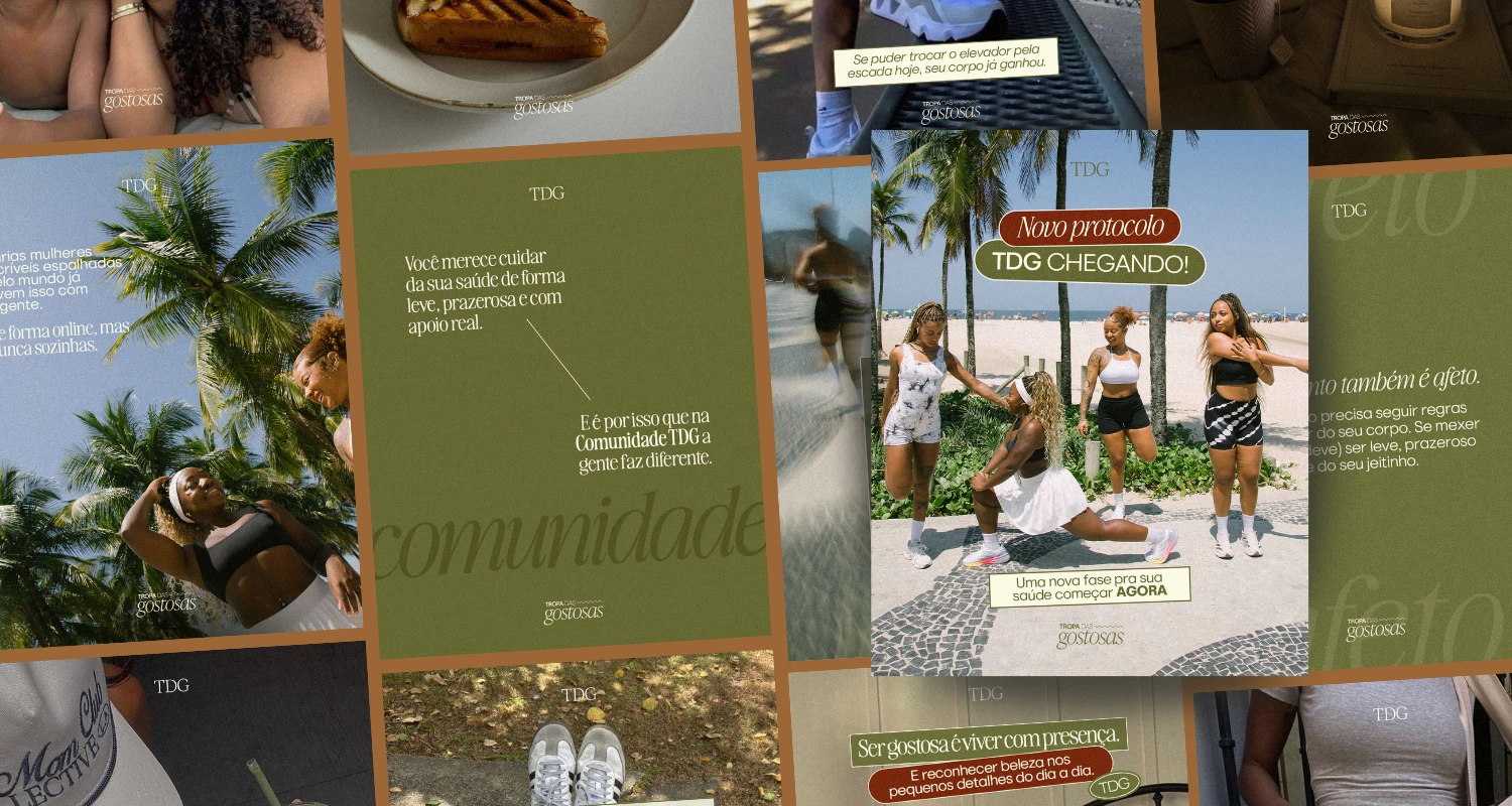
The visual direction utilized a palette of green, red, and off-white, combined with typographic contrasts and photographs capturing movement, daily routines, and social interaction to balance energy, discipline, and lightness.
Process
The challenge was to create varied pieces without losing the profile’s visual unity. We developed compositions featuring photographs as the focal point, text blocks, overlays, scale contrasts, and typographic elements that allowed us to alternate between educational, motivational, and institutional content while maintaining the same visual personality. In the project’s carousels, you can see this very variation: content on protocol, movement, self-care, nutrition, routine, and community appears in different layouts but still clearly belongs to the same brand.
Result
We developed five content pieces: three carousels, one static feed post, and one vertical-format/Reels post. Together, these helped build a more consistent and energetic visual presence, primarily reinforcing the feelings of motivation, belonging, and warmth that were central to the brand’s vision.
Project developed for a professional in Brazil.

caption: about the club
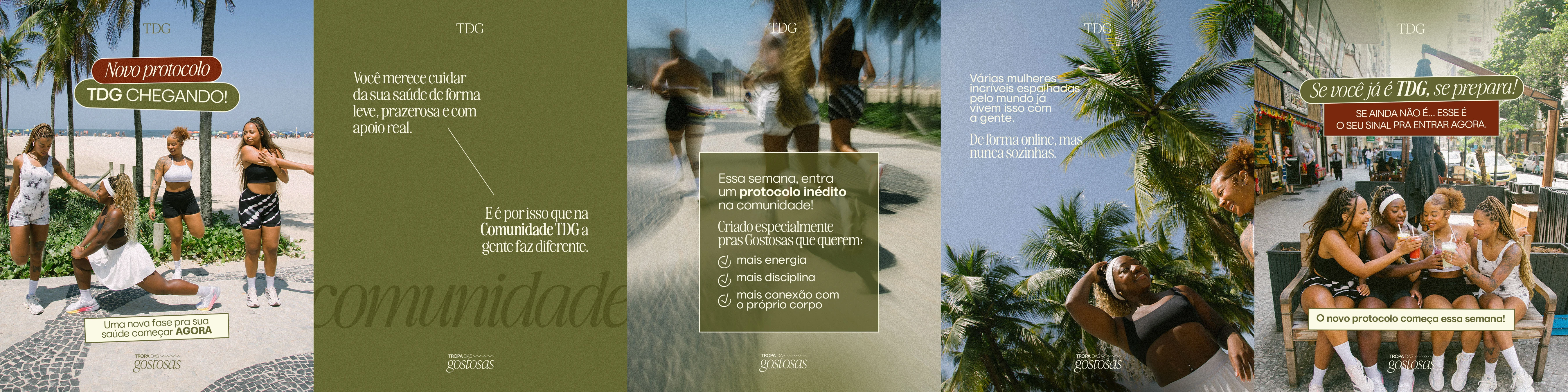
first carousel

second carousel

third carousel

fourth piece (static)
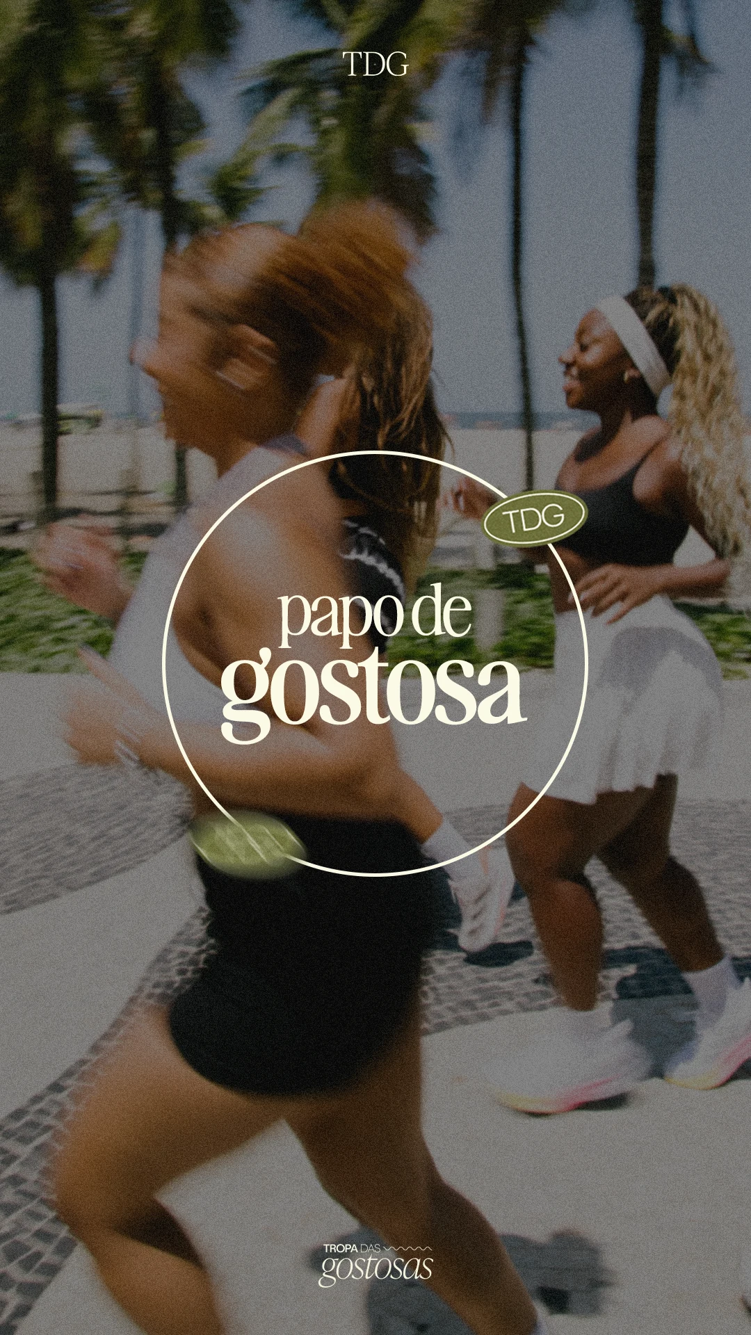
fourth asset (Reels cover)
Like this project
Posted Oct 8, 2026
Content direction for a collective self-care movement, featuring a vibrant visual style that fosters motivation, a sense of belonging, and consistency.
Likes
0
Views
1