Visual Alignment for Strategic Communication

Giovanna Braz

Visual Alignment for Personal Branding and Strategic Communication
Context
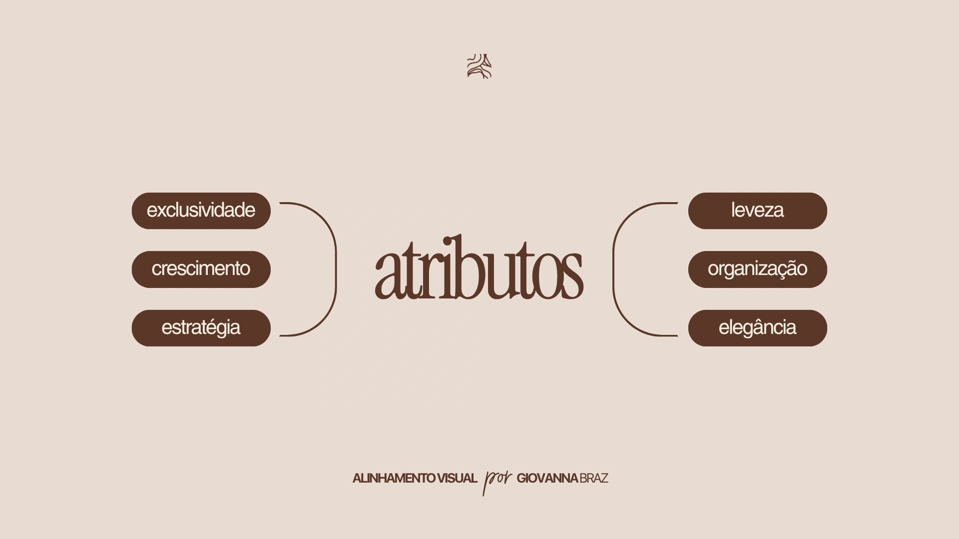
A visual alignment project developed for a professional who needed to organize and strengthen her brand's visual presentation. The goal was to establish a direction that better aligned with attributes such as exclusivity, growth, strategy, lightness, organization, and elegance, creating a more refined and consistent presence without turning the assignment into a full-scale visual identity project.
My Role
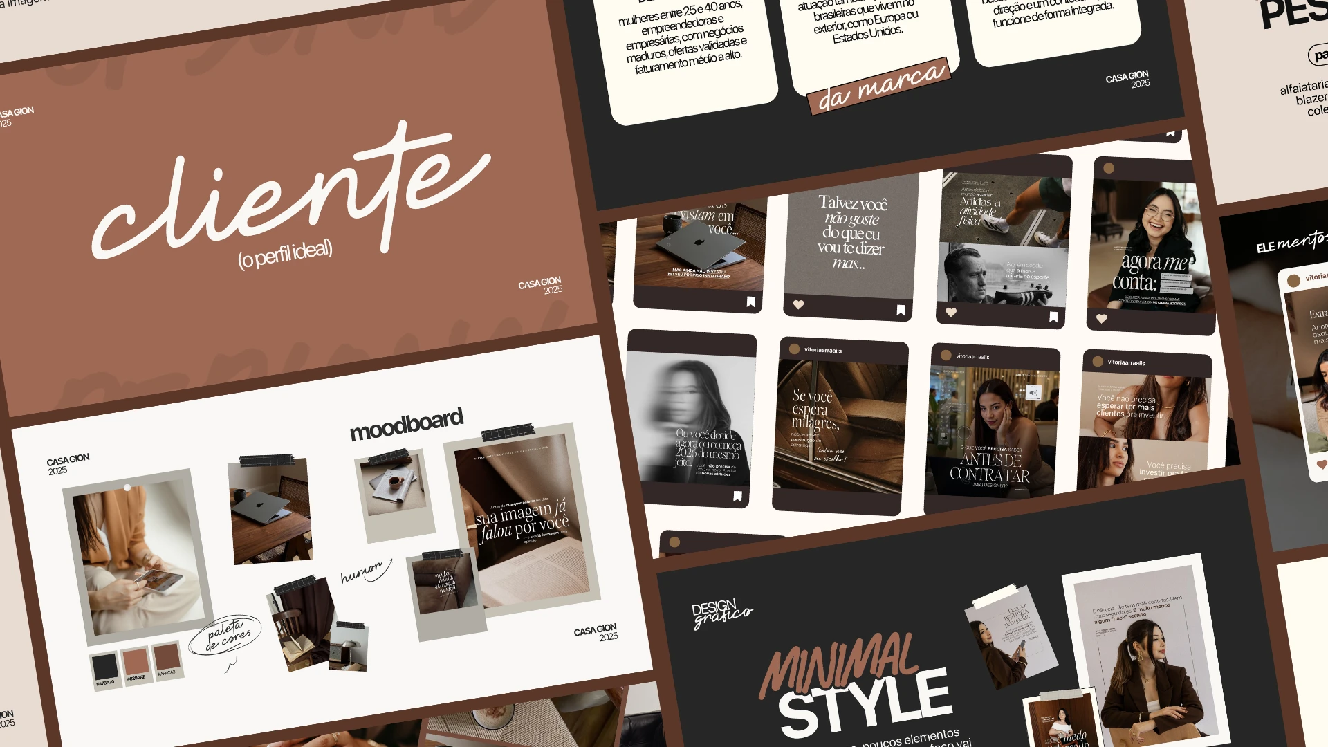
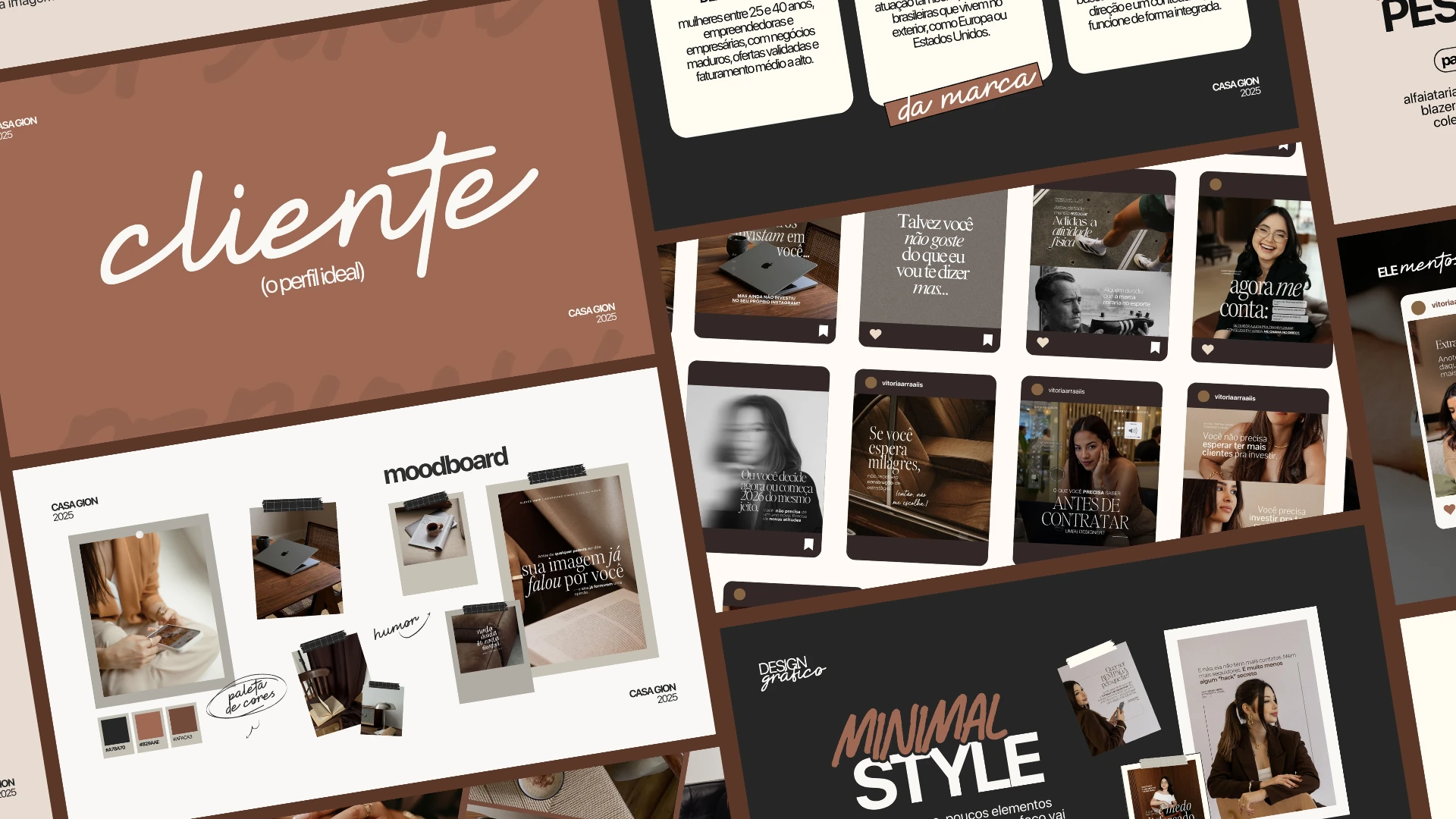
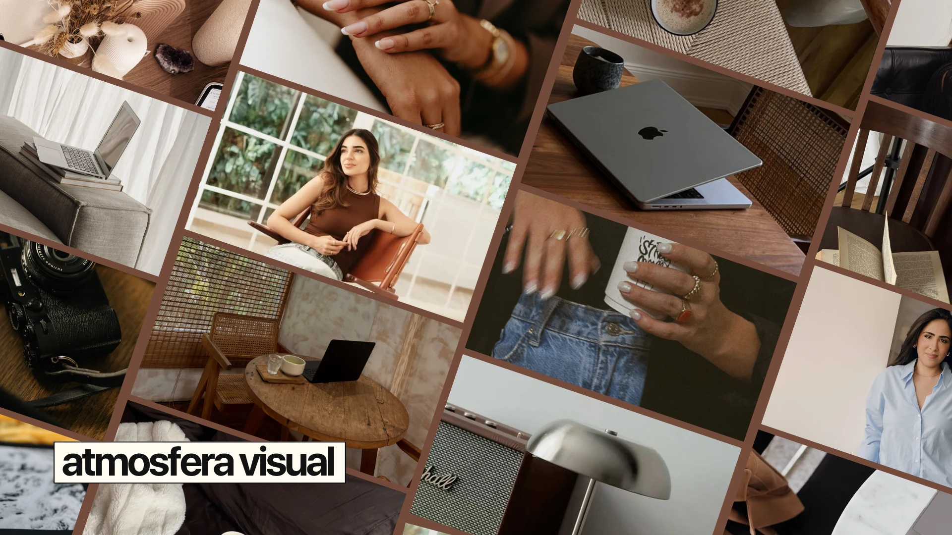
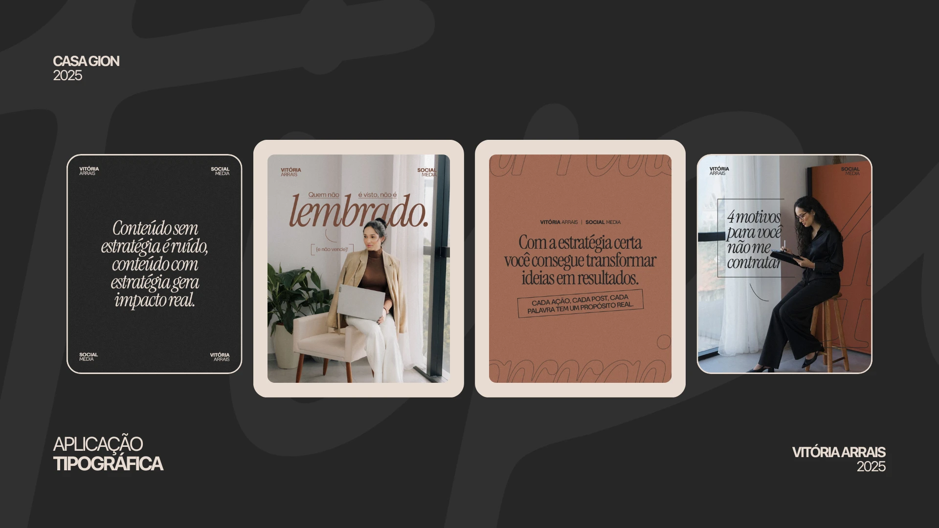
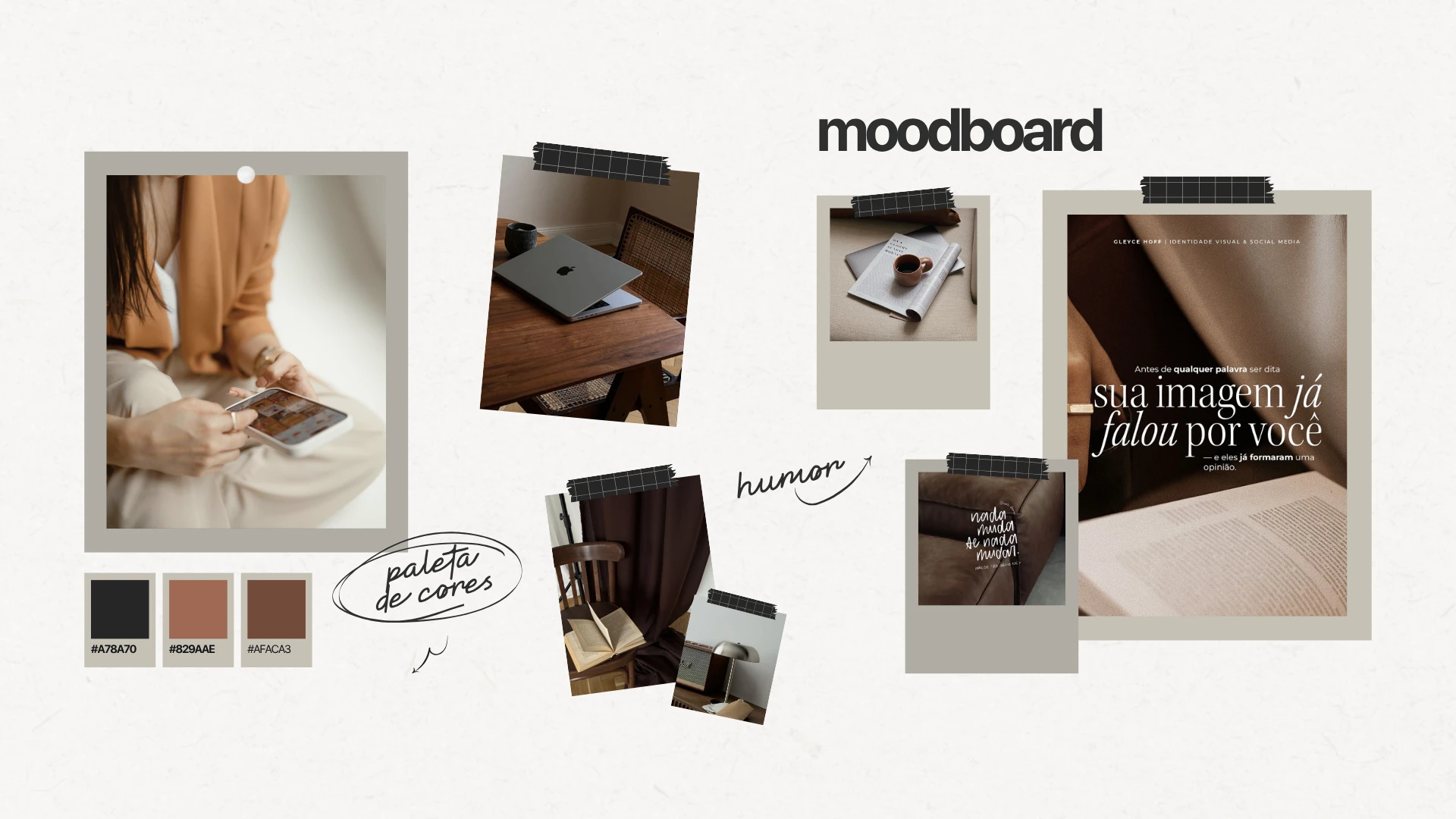
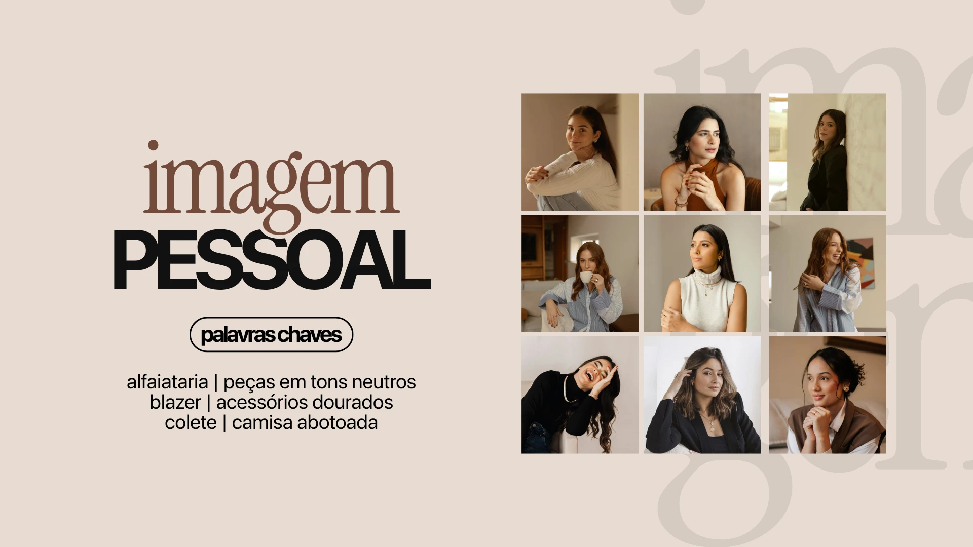
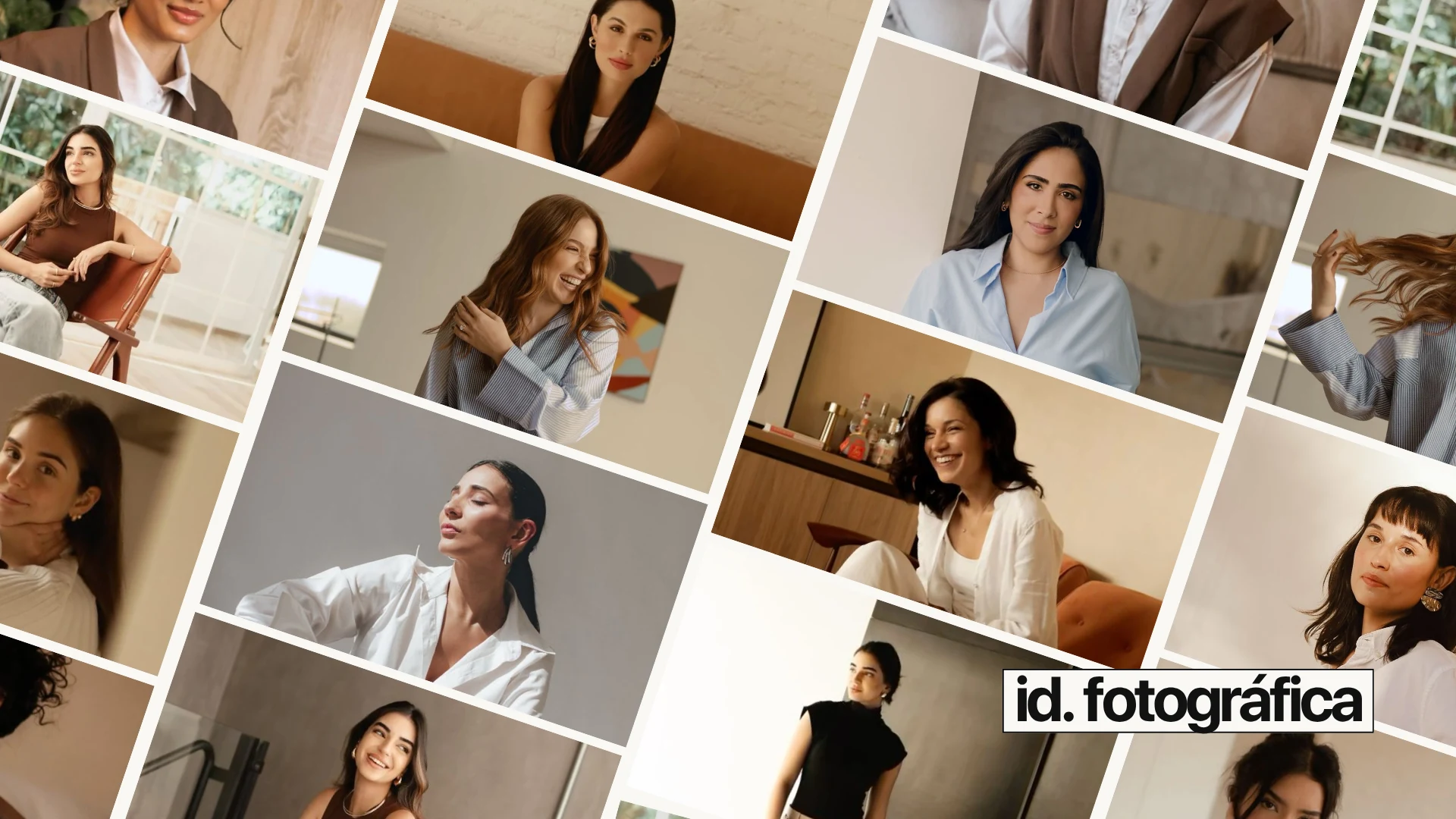
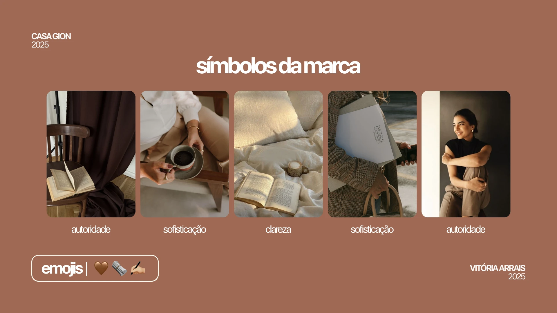
I was responsible for defining and organizing the brand's visual direction, establishing references and criteria to guide its communication across various touchpoints. The work involved creating the visual atmosphere and defining the color palette, typographic system, typography application, mood boards, graphic styles, art direction for photography, personal image, photographic identity, and visual references to ensure communication consistency.
Process
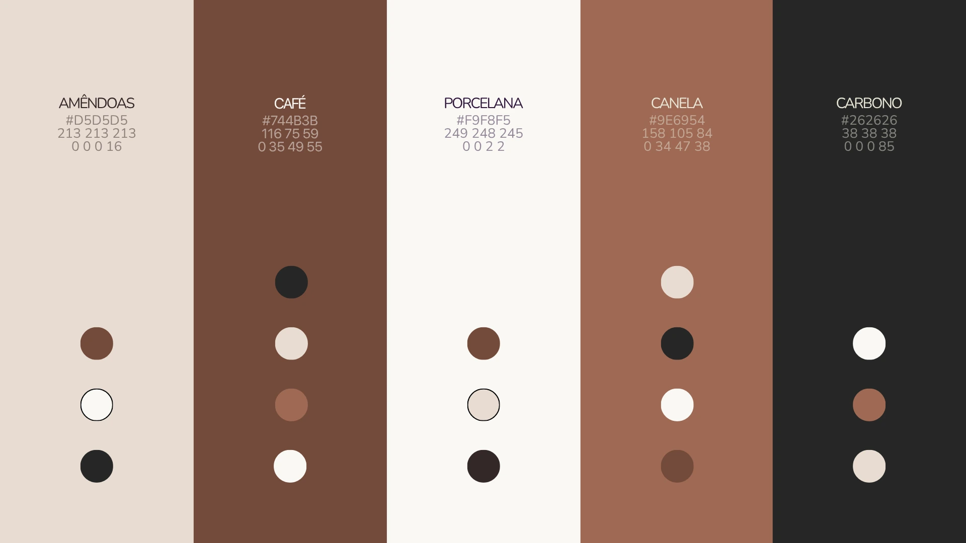
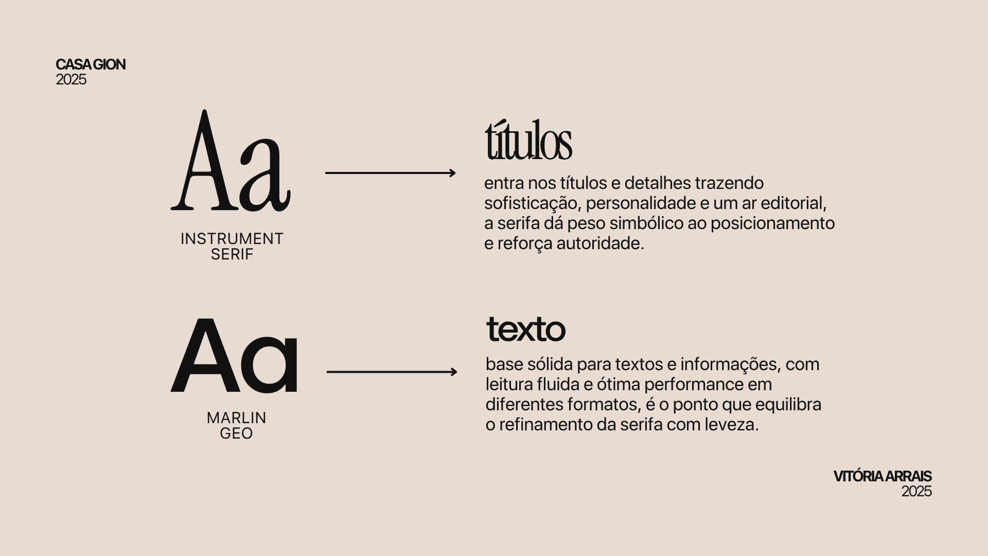
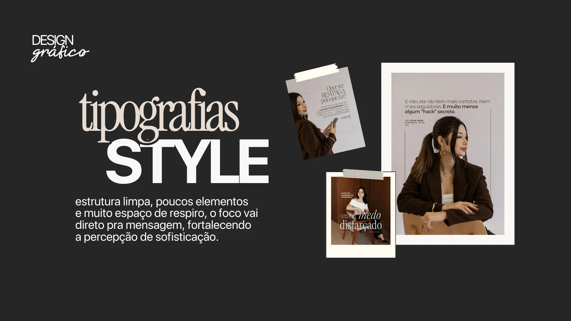
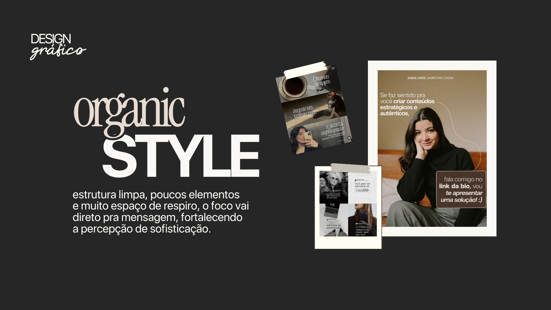
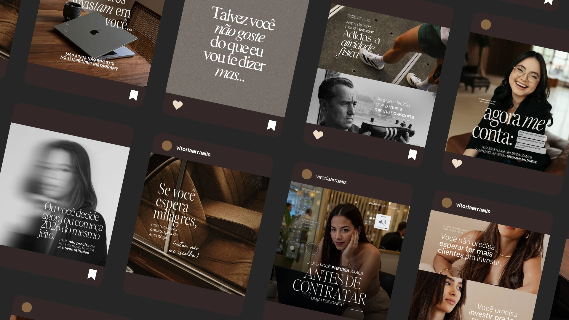
The creative direction is built upon a sophisticated, airy, and editorial aesthetic. The palette blends neutral and earthy tones—such as carbon, cinnamon, porcelain, coffee, and almond—creating a more mature and elegant visual foundation. Regarding typography, Instrument Serif is used for headlines and details, lending personality, sophistication, and authority, while Marlin Geo serves as the base typeface for body text, ensuring fluid readability and visual balance.
The project also employs two complementary graphic styles: a cleaner typographic approach and an organic visual language, both supported by ample negative space and a minimalist use of elements to keep the focus on the message. The photographic direction complements this system with refined personal style references, featuring tailored pieces, neutral tones, blazers, vests, button-down shirts, and gold accessories.
Result
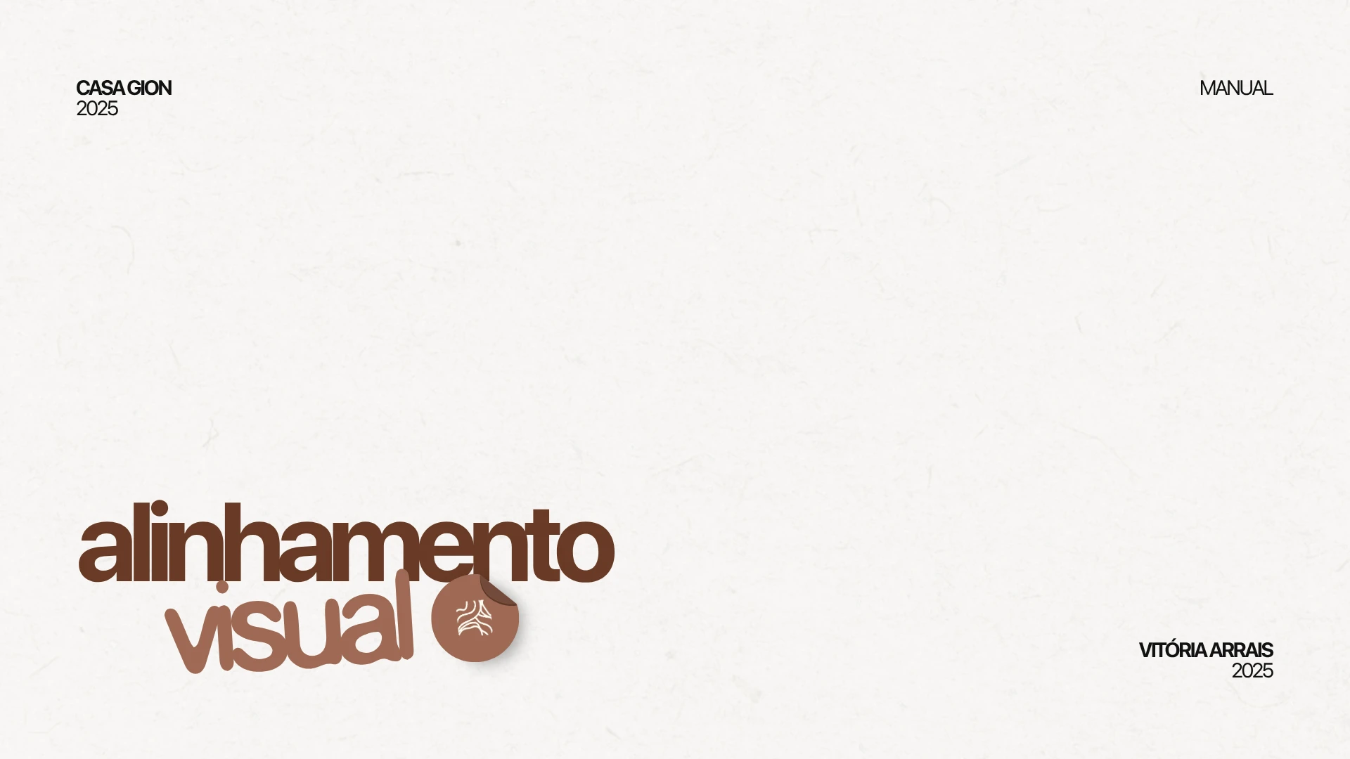
The result was a 20-page visual alignment manual, compiling practical guidelines to help the brand maintain a more consistent, sophisticated, and recognizable presence.
The material organizes key visual communication elements and establishes a clear foundation to guide future content, photography, and applications, without replacing a full visual identity. I would stick to this specific terminology: "visual alignment"—not "branding" or "visual identity." This case study makes it clear that the work focuses on how the brand presents and communicates itself, rather than on creating a logo, symbol, or complete identity system.
Project developed for a professional in Brazil.

Like this project
Posted Oct 7, 2026
Strategic visual direction and minimalist aesthetics for beauty professionals looking to scale their digital presence with authority.
Likes
0
Views
1