SaaS website completion and UI consistency pass

Vincent L. Anderson


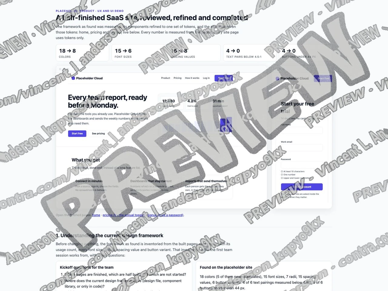
A demo built for a specific brief. Not client work: the material shown is sample data, so what is on display is the mechanism.
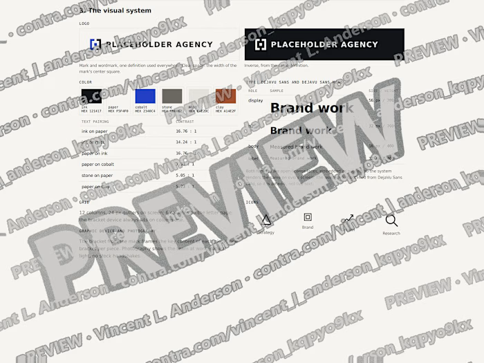
I completed a half-finished SaaS website for a fictional product, Orvale. The work starts from an inventory of the framework as found: 18 colors with usage counts, 15 font sizes, 7 radii, 15 spacing values and 6 button variants. It merges colors by Lab distance into 8 tokens, snaps type to a 7 step 1.25 ratio scale and spacing to a 4 px based scale, and consolidates buttons into 3 variants, all 44 px tall. Contrast is measured before and after: 4 of 6 text pairings failed 4.5:1 before, all 10 pass after. On those tokens it finishes three working pages: a homepage with one primary action, a pricing page whose annual toggle computes the saving per plan, and a 3 field sign-up form with live password rules and specific error messages. Twelve feedback notes name the heuristic, severity and the page where each was applied. Every site page draws its colors from the tokens, with no literal color values.
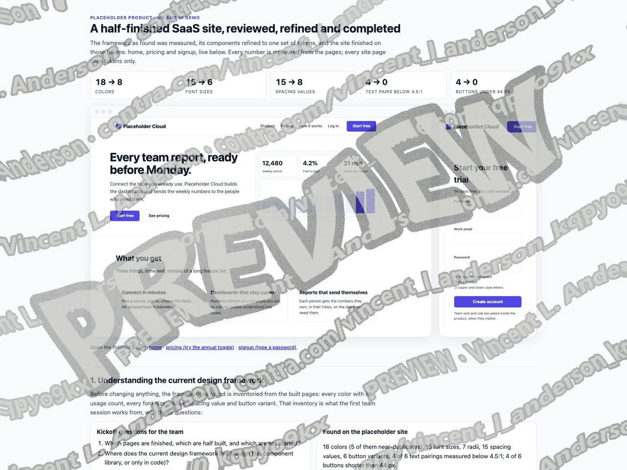
SaaS website completion and UI consistency pass 1
Like this project
Posted Sep 23, 2026
I built a UX and UI demo that completes a half-finished SaaS website for a placeholder product.
Likes
0
Views
1