Agency rebrand from concept to system

Vincent L. Anderson



A demo built for a specific brief. Not client work: the material shown is sample data, so what is on display is the mechanism.
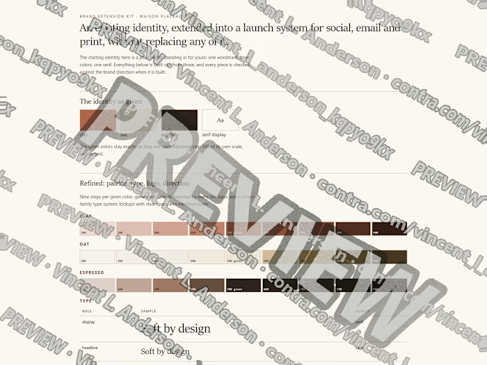
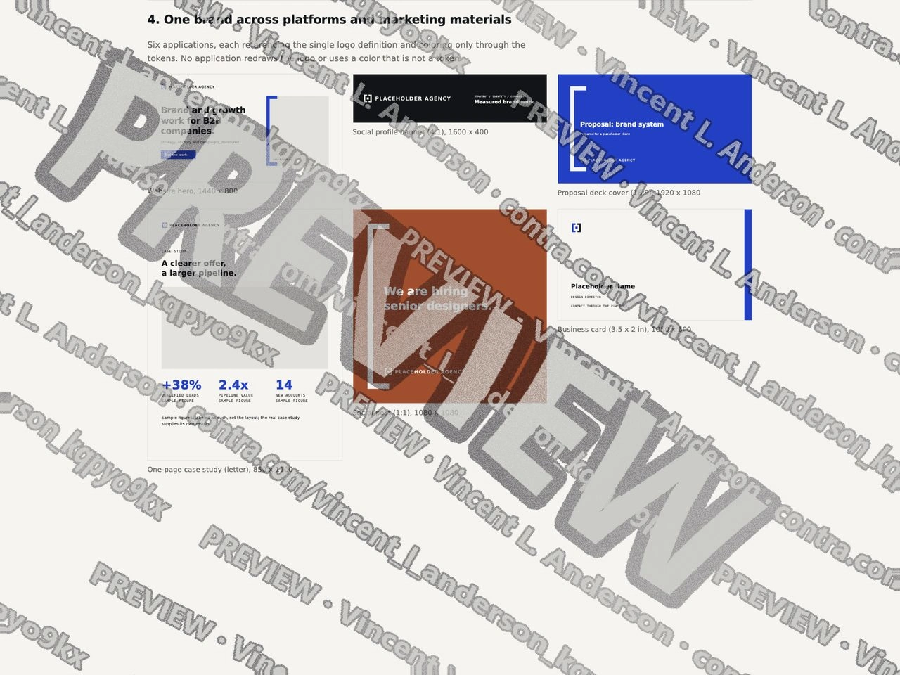
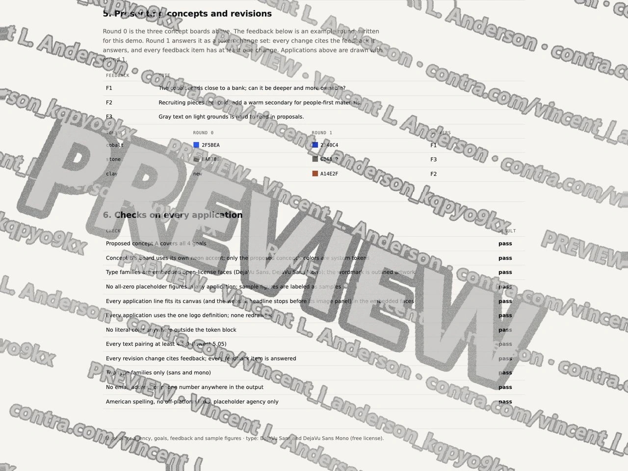
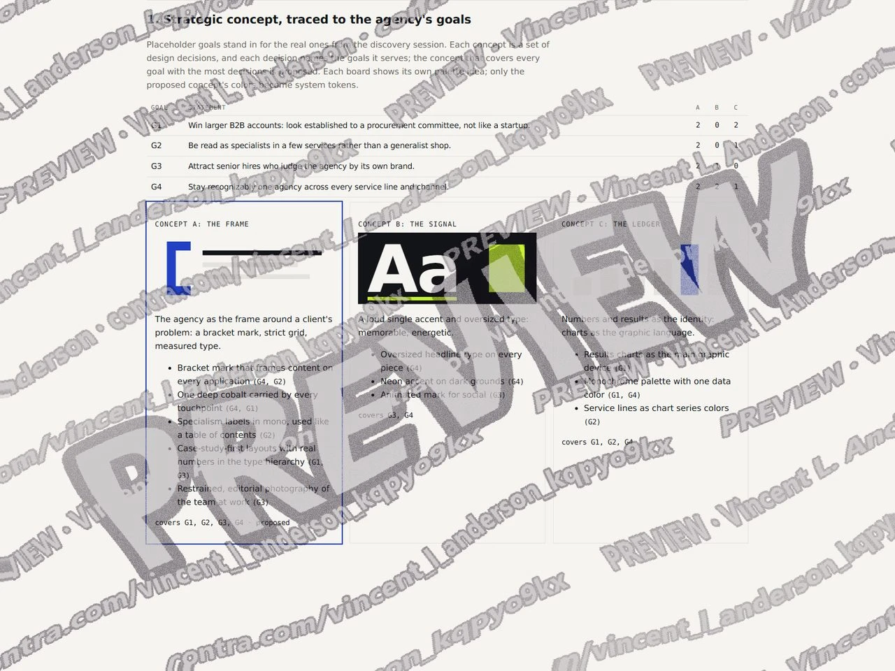
I built a rebrand for a fictional B2B agency, Brackwell Partners. Four goals; three concepts, each a list of design decisions that name the goals they serve, with a traceability matrix; concept A is proposed because it is the one that covers every goal. The visual system: a constructed bracket mark and wordmark defined once, 6 color tokens with 6 text pairings checked (lowest 5.05:1), a sans and a monospace type family, a 12-column grid, four icons and a bracket device. Six applications (website hero, social banner, deck cover, one-page case study, social post, business card) reference the single logo definition and take color only from the tokens; the build fails if any piece redraws the logo or uses a literal color. The revision round: a set of 3 feedback notes answered by 3 token changes, each change citing its feedback and each note answered.
Agency rebrand from concept to system 1
Agency rebrand from concept to system 2
Agency rebrand from concept to system 3
Like this project
Posted Sep 23, 2026
A B2B agency rebrand taken from goals to three traced concepts, a complete visual system (outlined wordmark, 6 color tokens, DejaVu Sans and Mono), six on-brand applications and a revision round answered token by token.
Likes
0
Views
1