Horizone: Car Rental Booking Website by Devansh PrakashHorizone: Car Rental Booking Website by Devansh Prakash

Horizone: Car Rental Booking Website

Devansh Prakash

Devansh Prakash

The brief

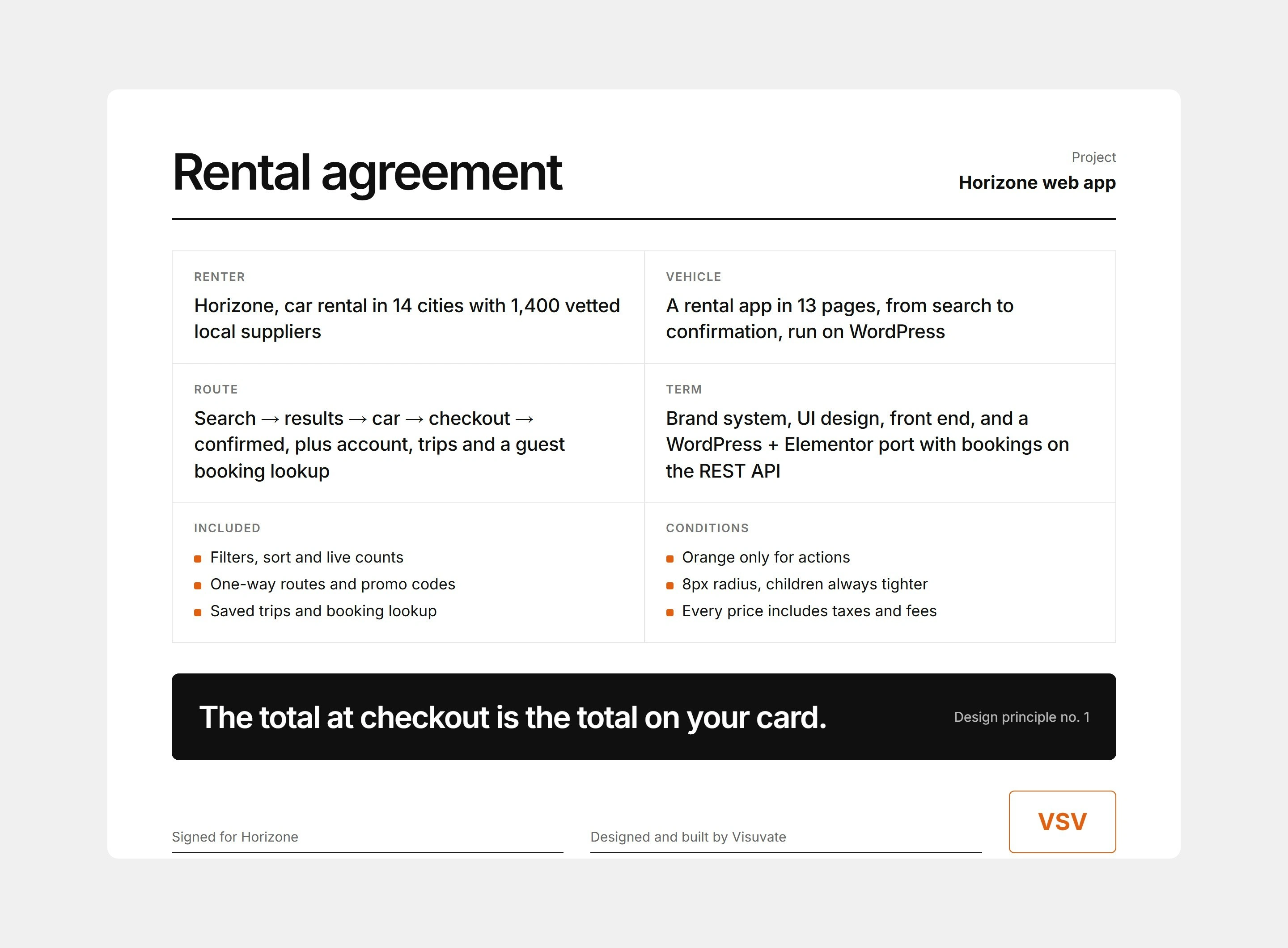
Car-rental sites bury the real price under fees and filters. Horizone needed to feel calm and trustworthy, and to let a visitor search, compare and reserve a car without ever losing track of the total.

The goal and the challenge

Horizone is a car-rental brand for travellers who book online and want to know exactly what they will pay before they commit. The goal was a complete booking product rather than a single landing page: search a city and dates, compare 26 cars, understand cover and extras, reserve, and land on a confirmation, all on one site. The challenge was to keep a long, form-heavy journey feeling light, and to make cost the most visible thing on every screen instead of the last.
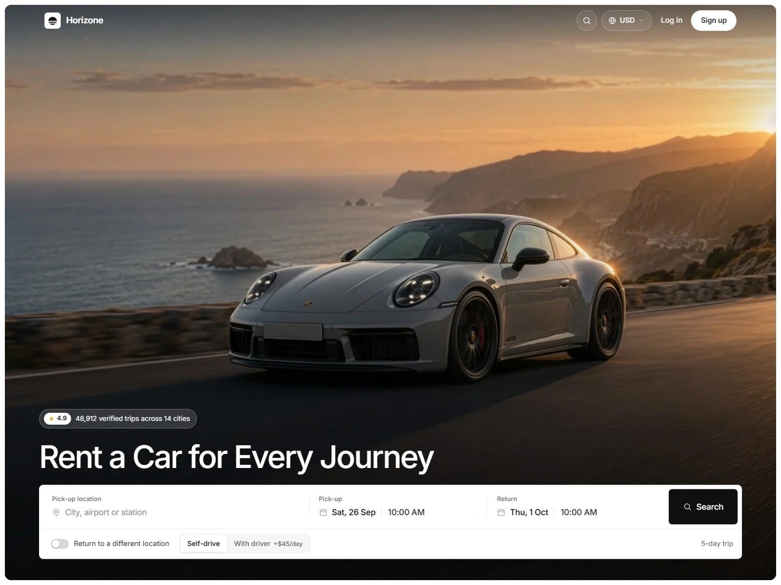
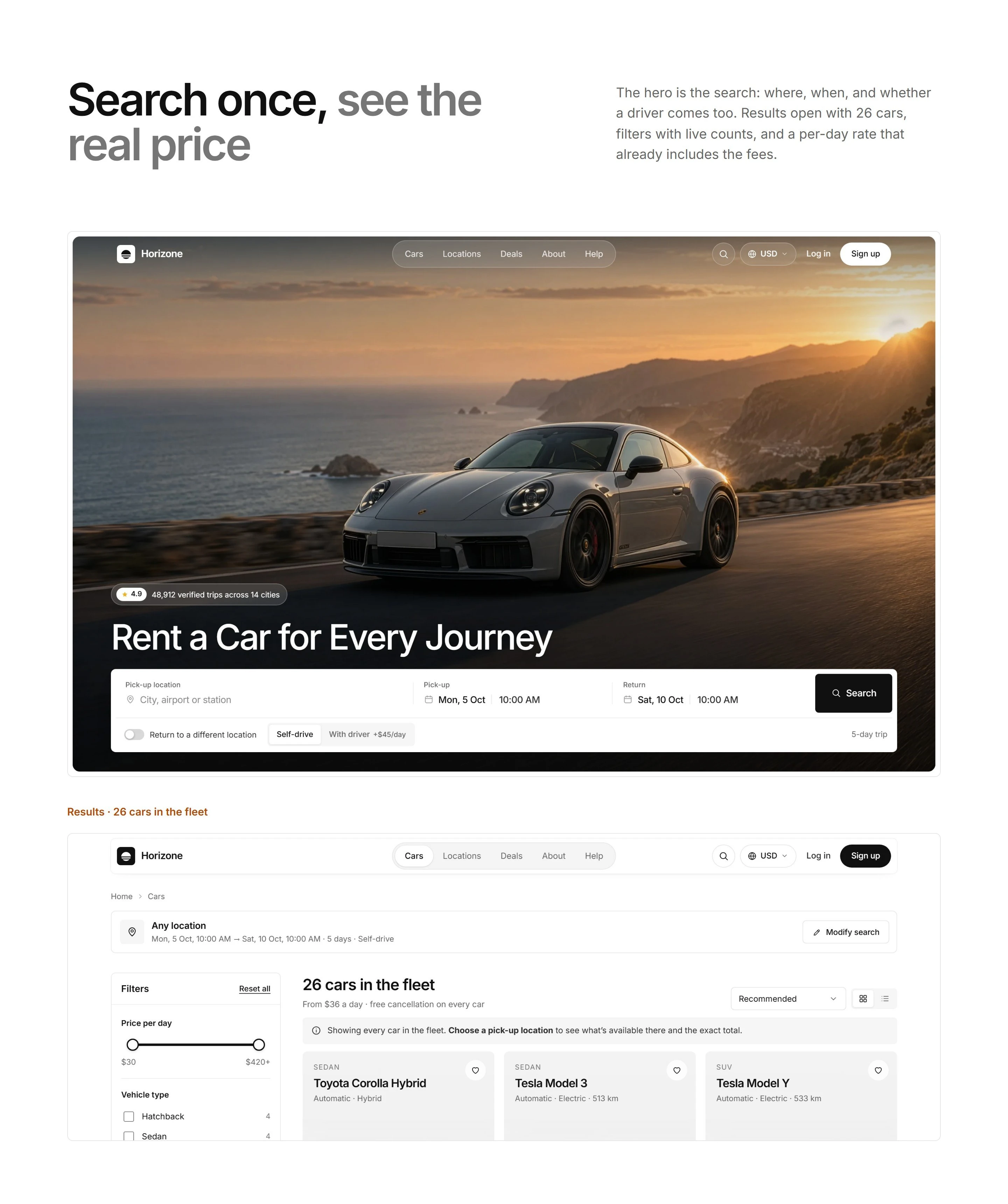
We built the whole journey, not a landing page: a full-screen search hero, a filterable fleet, a car page with a live price panel, then checkout and confirmation, all in one consistent system of light and type.

The approach

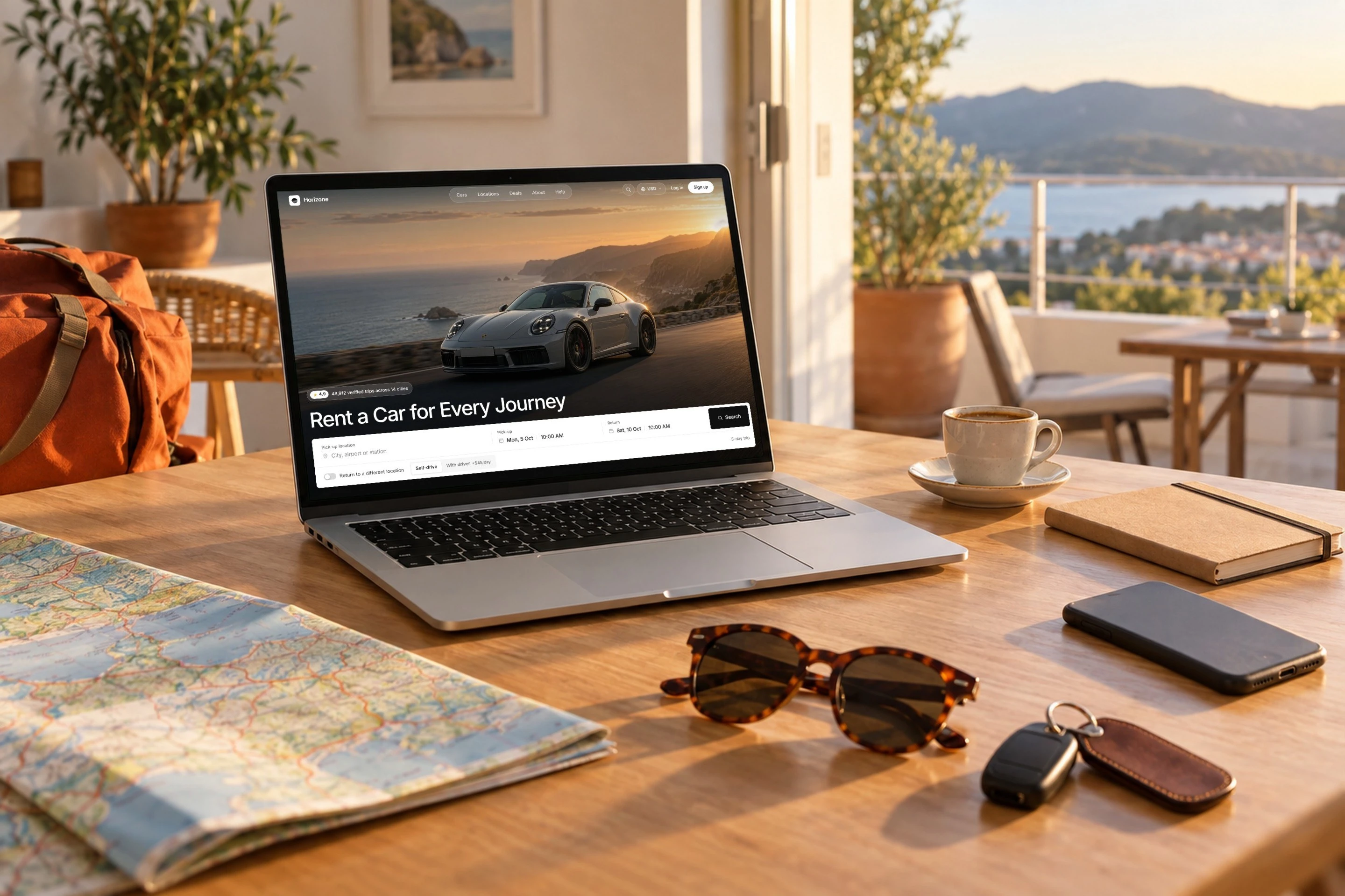
Every page starts from the same question: what does the customer need to decide here, and what could make them hesitate? The home page puts the booking bar inside a full-screen photograph, so the first action is the search itself. The fleet page turns the choice into a scannable grid with filters. The car page answers the last doubts, with a gallery, what is included and a price panel that recalculates as options change. Checkout asks for as little as possible and shows the total at every step.
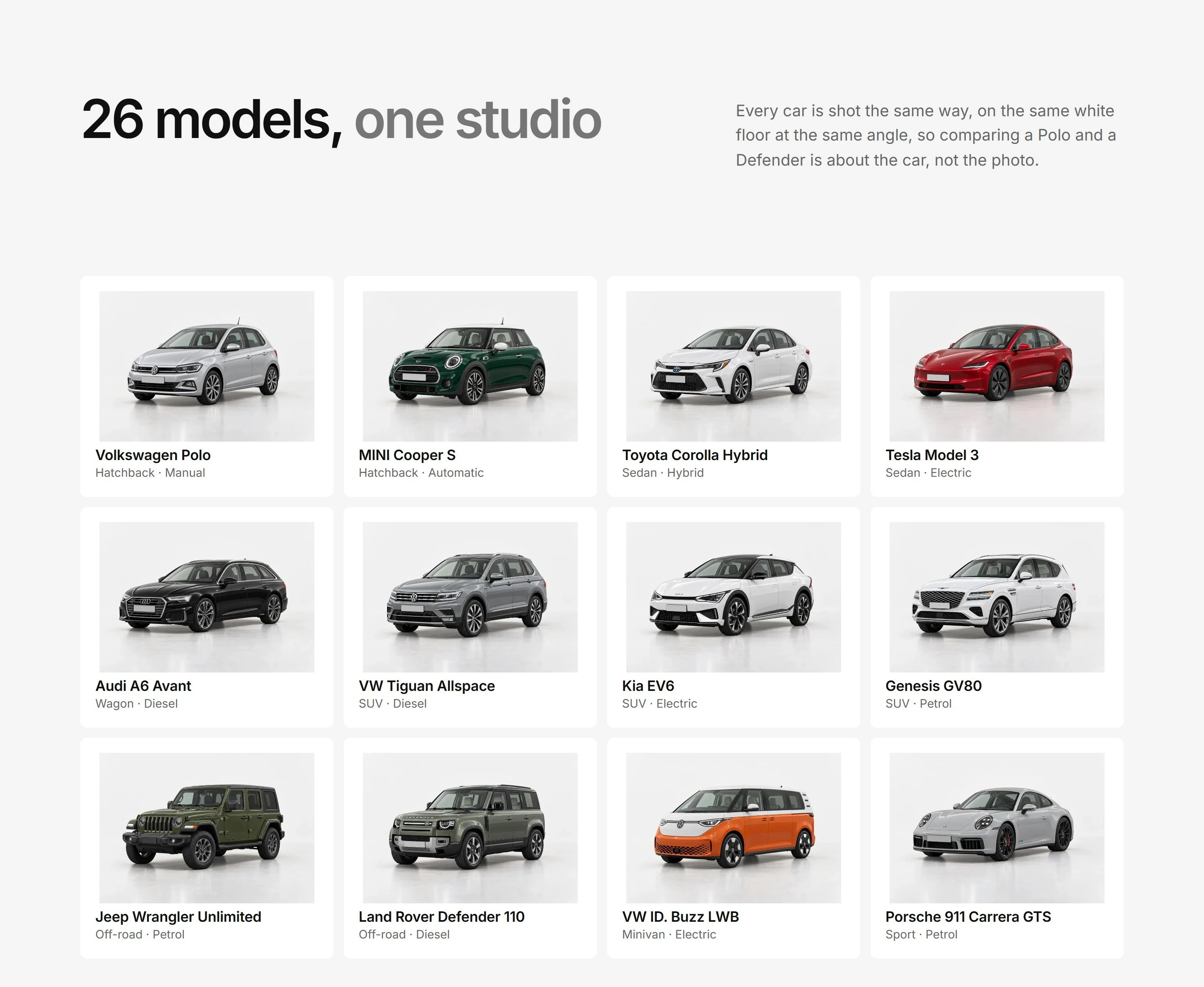
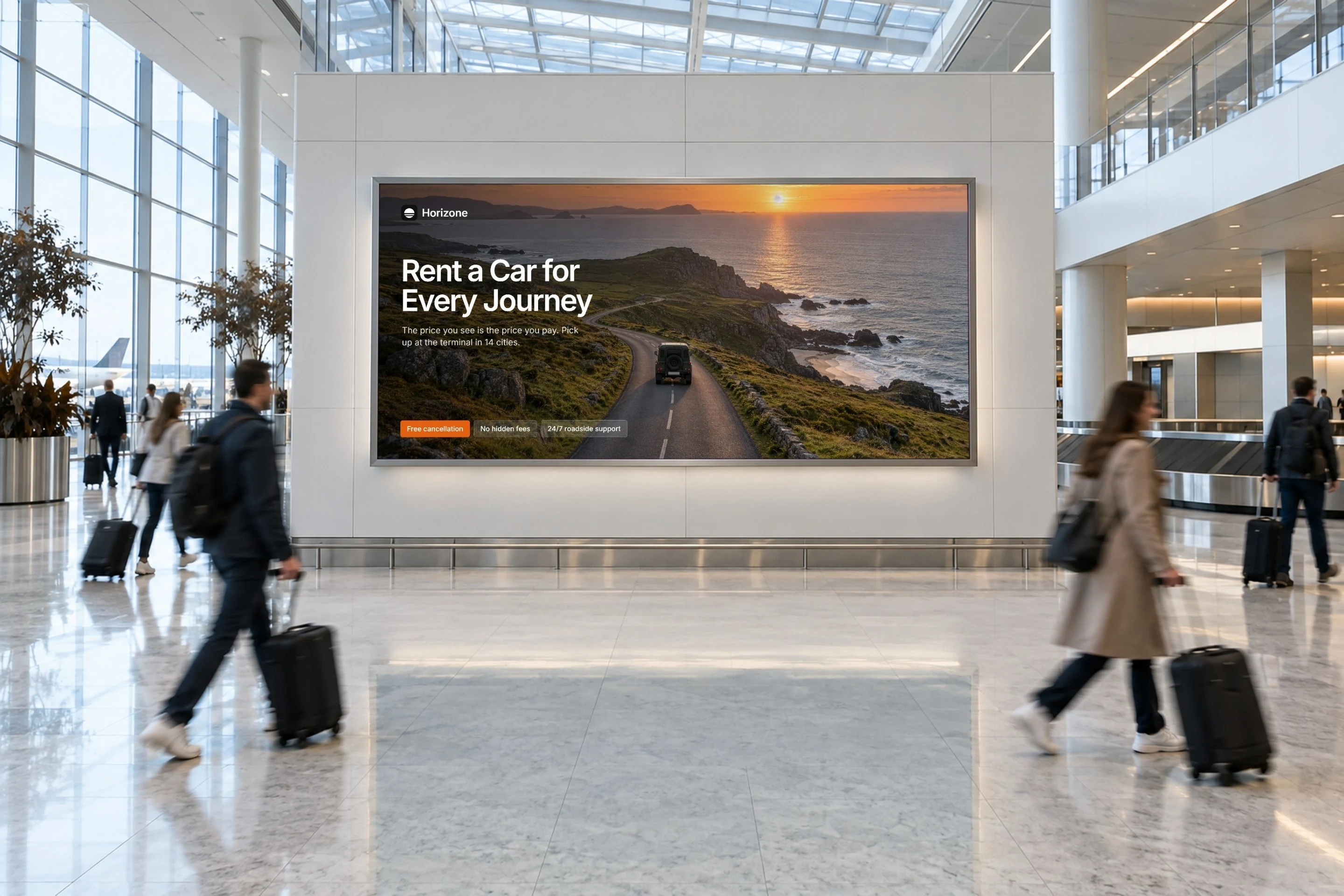
The imagery matters as much as the layout. Each of the 26 cars was rendered in the same soft studio, at the same angle and scale, so the fleet reads as one collection and a comparison between two cars is a comparison of the cars rather than of the photographs. The hero and page banners use wide, calm scenes with the subject kept small and centred, so nothing important is cropped on a phone.

What we built

A full-screen search hero with the booking bar
A filterable fleet of 26 cars
Car pages with a gallery and a live price panel
Checkout with pay-now or pay-at-pick-up, then a confirmation page
An account area for bookings, saved cars and profile
Locations, deals, help, about and legal pages

The outcome

The site now behaves like a product. Visitors reach a price they trust in a few taps, the fleet looks consistent car to car, and each of the thirteen pages feels like part of one booking experience.
Because the price is visible from the fleet page to the receipt, the booking no longer has a moment where the customer is surprised. Free cancellation up to 48 hours before pick-up, support around the clock and the refundable deposit are stated in plain words next to the decision they affect, which is what makes a rental site feel trustworthy rather than clever. The screens below walk through the journey in the order a customer meets it.
The fleet: 26 cars with live filters
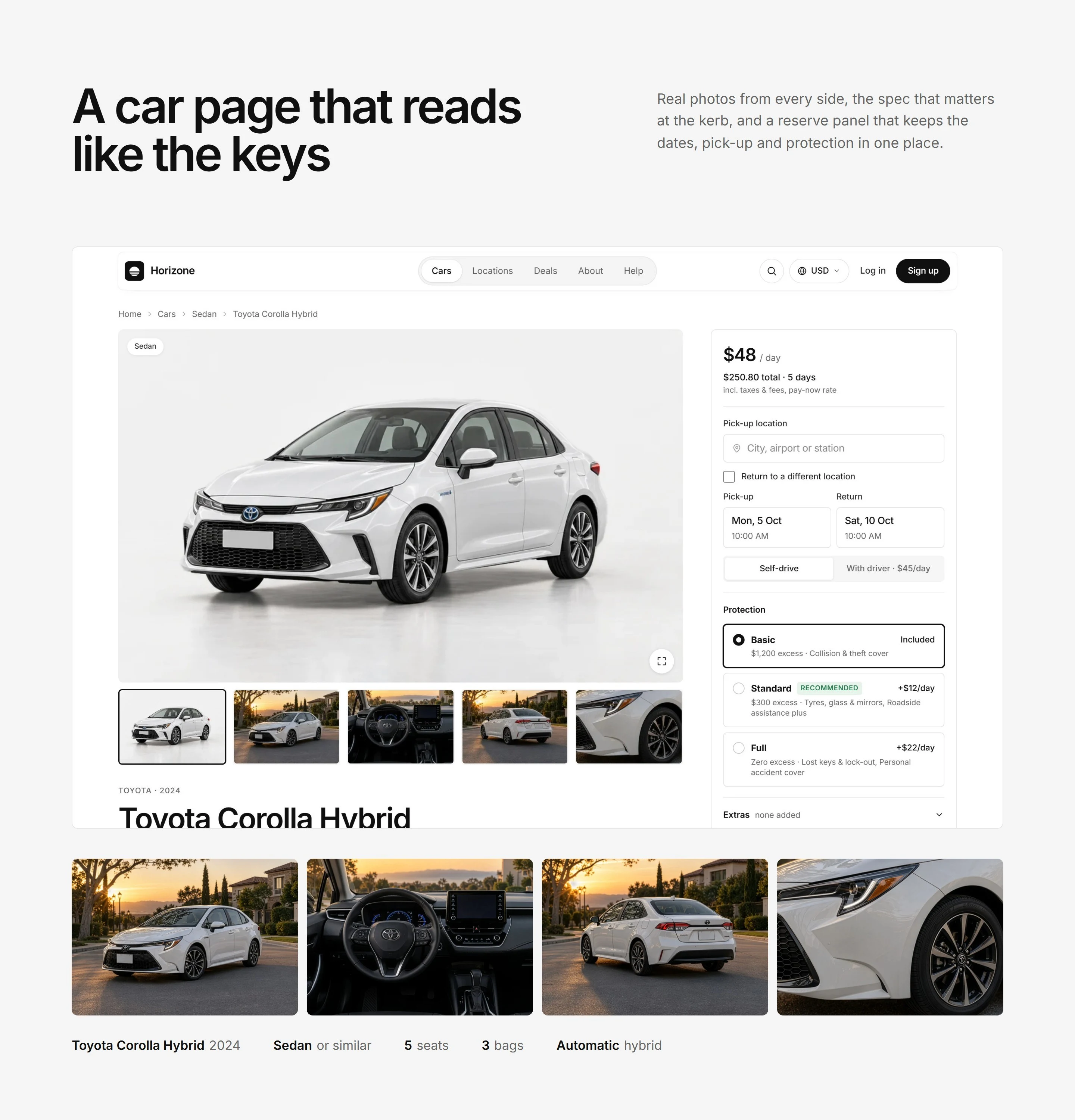
Car page with gallery and live price panel

Choosing a car, with the price in view

The fleet page shows all 26 models in one grid, with filters for price, vehicle type and transmission, so a visitor narrows the choice without leaving the page. Every car is shot in the same soft studio light, so the range reads as one collection rather than 26 separate photos. The car page keeps a live price panel beside the gallery: change the dates, protection level or extras and the total updates in place, with taxes and fees already included.
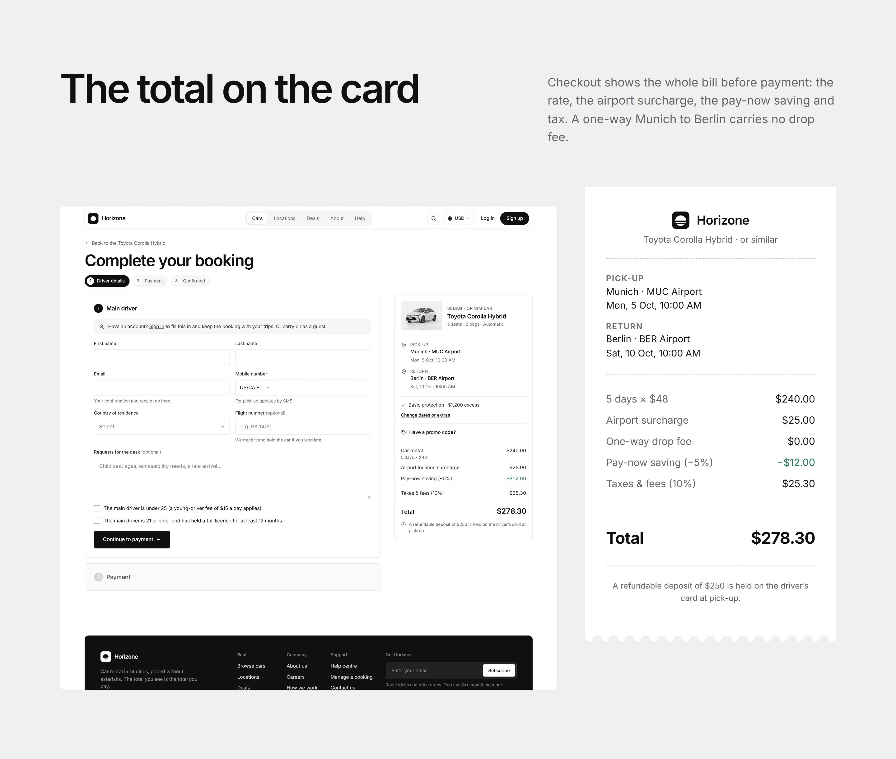
Checkout: driver details in one step
Payment: pay now or at pick-up

One calm checkout, pay now or at pick-up

Checkout is a single page in two steps. Driver details come first and are pre-filled from the account, so a returning customer only confirms them. The order summary stays beside the form the whole time, listing the car rental, the airport surcharge, taxes and the total, plus the refundable deposit held at pick-up, so nothing appears for the first time at the last click.
The payment step then offers two plain options. Paying now applies a 5% saving. Paying at pick-up charges nothing today and asks the driver to bring a card to the desk. The rental terms, the privacy policy and free cancellation up to 48 hours before pick-up sit right beside the confirm button.
Booking confirmed with reference and next steps
Account: upcoming bookings

A confirmation that answers what happens next, and an account that remembers

The confirmation page opens with the booking reference, then sets out the pick-up and return points, the driver, the cover and extras, and a short timeline of what happens next: the confirmation email, pick-up at the airport desk, and the return of the car. The customer never has to wonder what to bring or where to go.
Signed-in customers get an account area with their bookings in upcoming, past and cancelled tabs, a grid of saved cars, and a profile that pre-fills checkout. Each booking shows its reference, dates, pick-up point and how it will be paid, with details, calendar and cancel actions inline.
Sign up: create an account in one screen
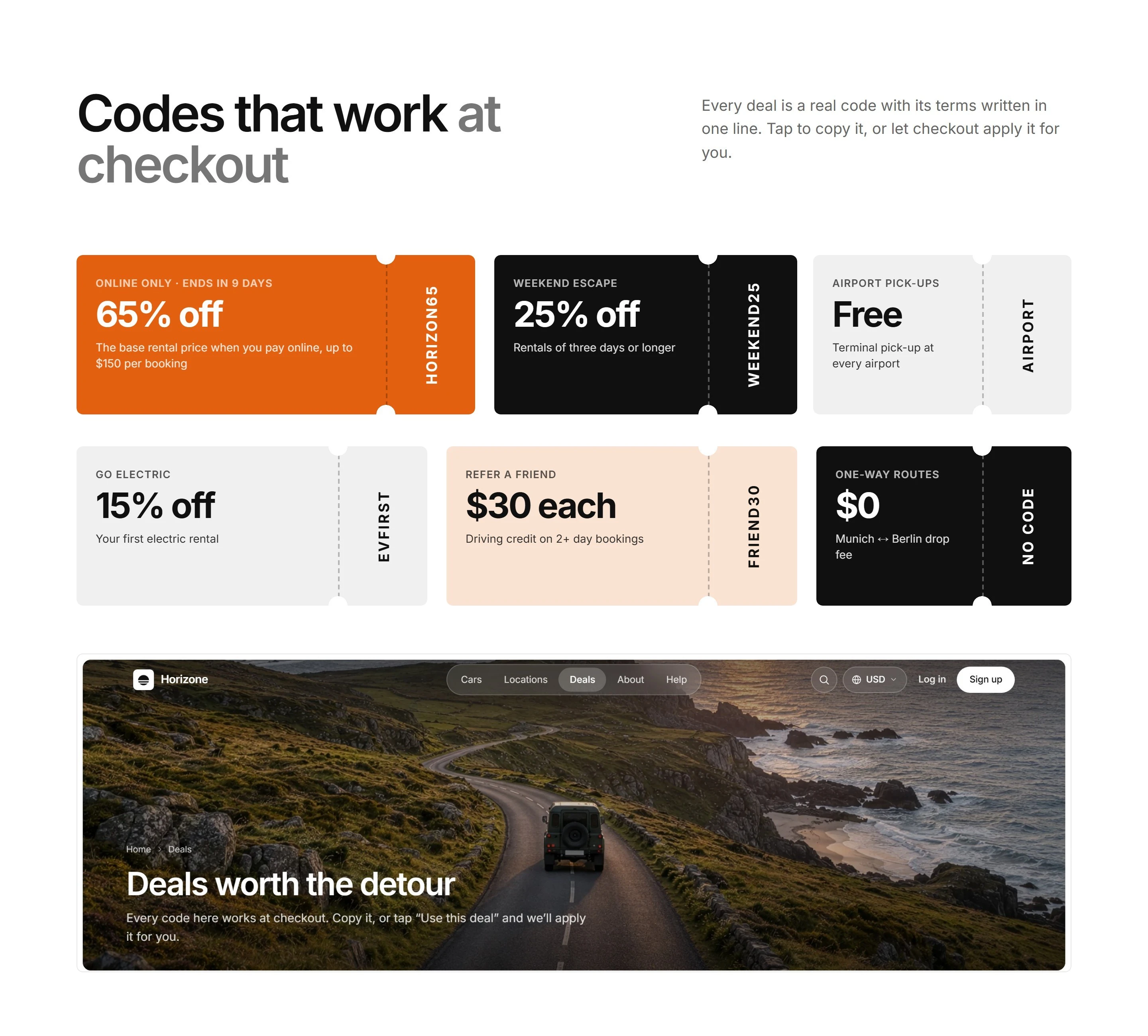
Deals and offers
Deals and offers
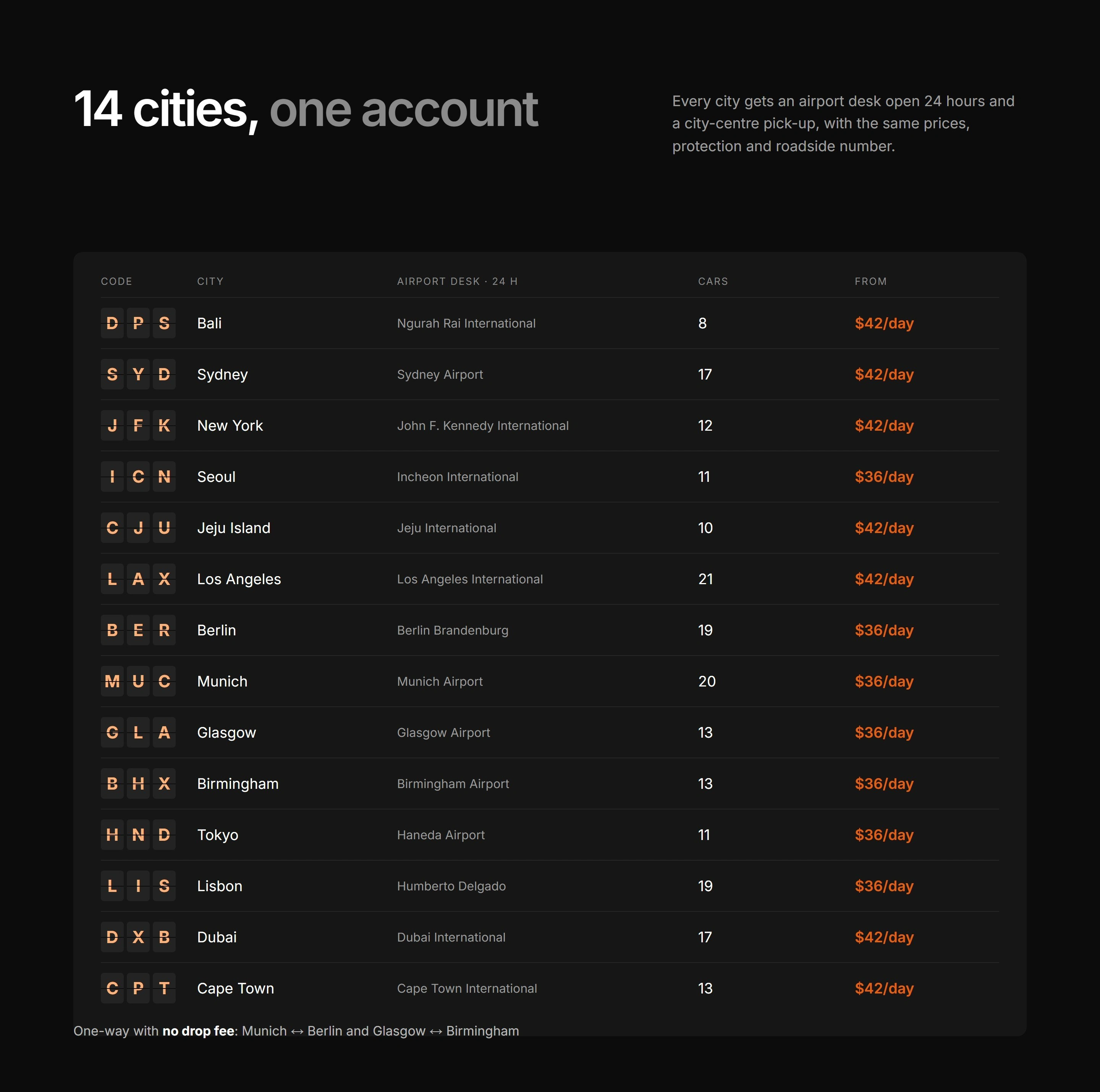
Locations across 14 cities

Beyond the booking: sign-up, deals and locations

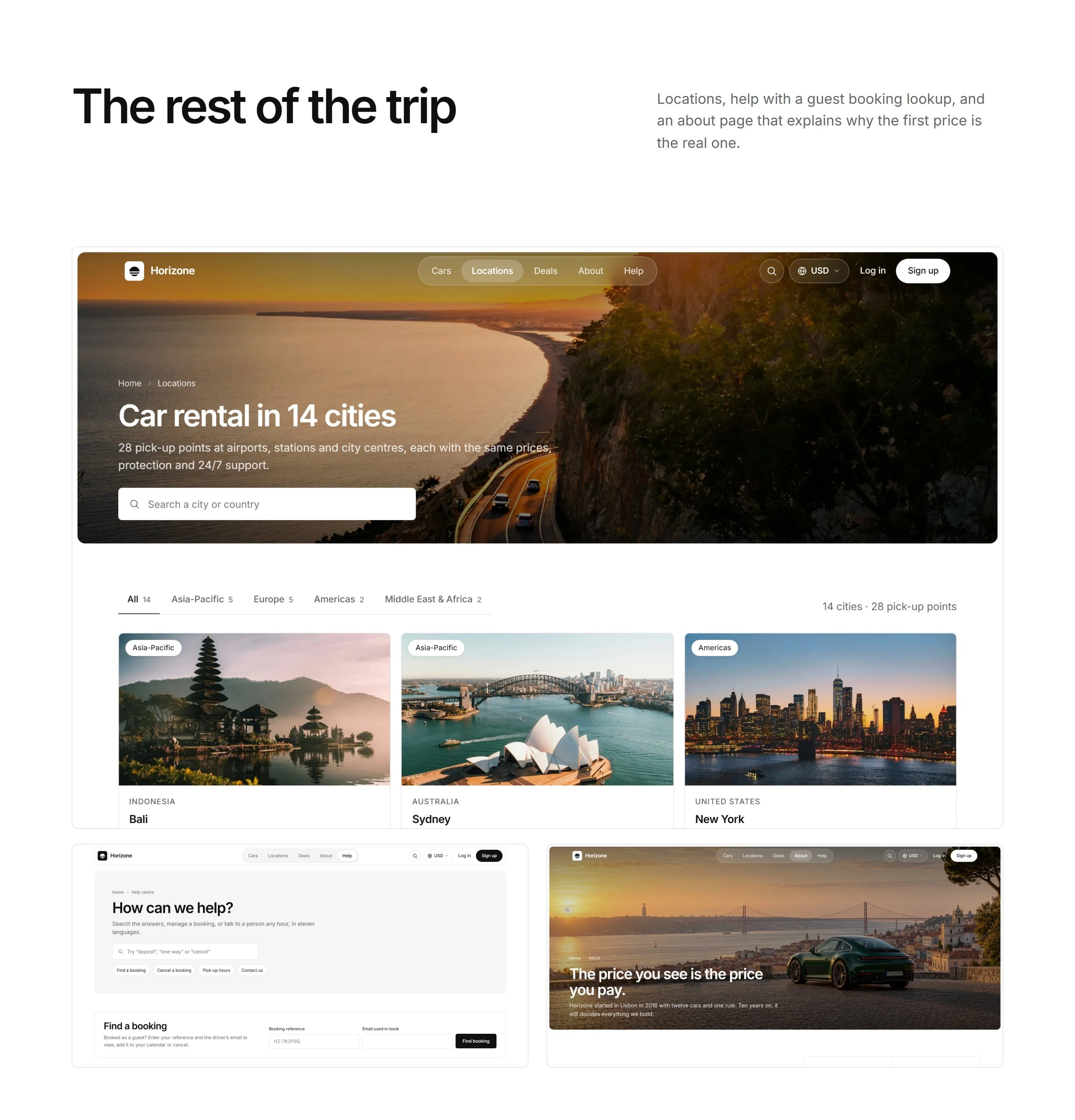
Signing up is one short form beside a photograph and a customer line, and guest bookings made with the same email are added to the new account automatically. The Deals page lists each offer with its promo code, its conditions and a button that applies the code at checkout. The Locations page covers 14 cities and 28 pick-up points across Asia-Pacific, Europe, the Americas and the Middle East and Africa, with a search box and region tabs, so a visitor can find a pick-up point before choosing a car.

A consistent design system

The interface is deliberately quiet so the cars and the prices carry the page. A light, neutral palette sits behind every car, one type family sets both headings and body, and a strict radius ladder keeps cards, panels, buttons and inputs visibly related: larger surfaces are always rounder than what sits inside them. The header is a centred capsule with a sliding pill that follows the current page, and the hero and footer are inset panels that line up with the same column as the content.

Motion, phones and accessibility

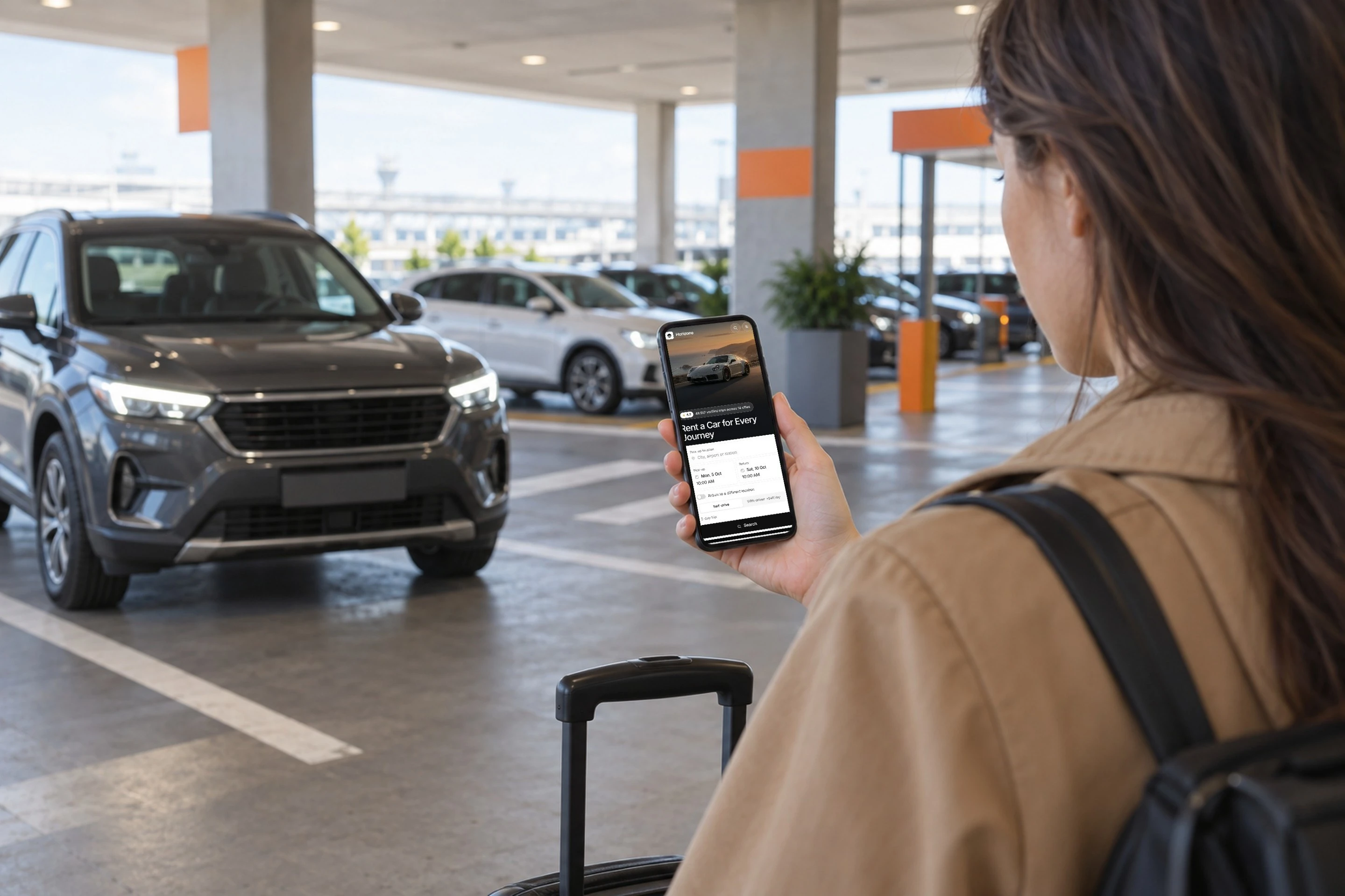
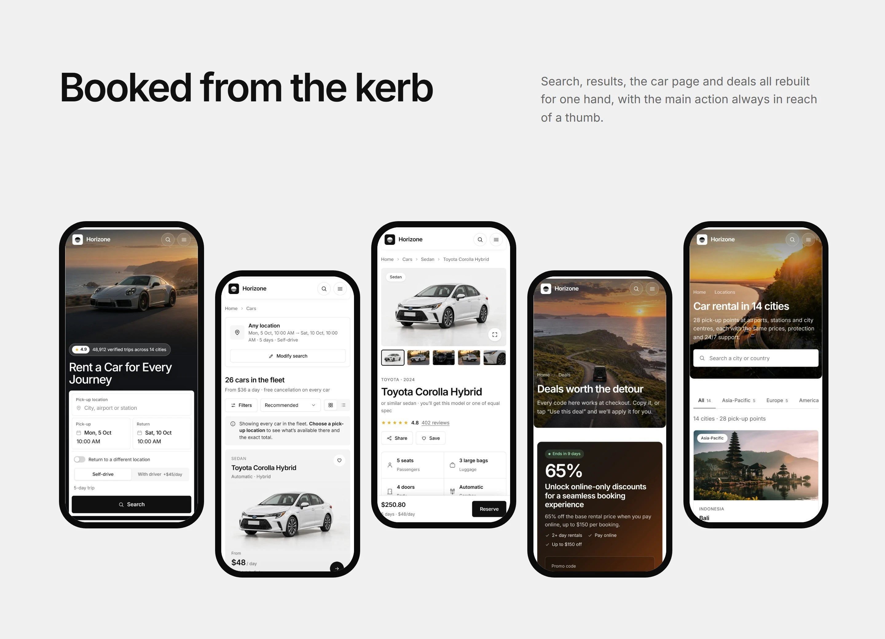
Motion stays quiet and purposeful: gentle entrances as sections scroll into view and the sliding pill in the navigation, never anything that slows a booking down. On phones, the fleet and similar-car lists become swipe rows, the filters move into a drawer and the date and location pickers open as sheets. Pages were checked for contrast and keyboard use, and the layout holds from a narrow phone to a wide desktop.

Project details

Role: design and build, end to end
Scope: 13 pages, 26 car models, 14 cities, 28 pick-up points
Platform: WordPress
Delivered: 2026
Live site: horizone.visuvate.com
Like this project

Posted Sep 24, 2026

A car-rental booking site: full-screen search hero, filterable 26-car fleet, live-priced car pages, checkout and an account area.