Short Video Health Learning

Doreen Ma

Short Video Experience in Health Education
B2B2C
Cross-platform
Role
Product Designer
Timeline
Q3 2023–Q1 2024
Platform
Web, IOS/Android
Team
1 PM, 2 engineers, engineering lead, Content
Project Theme
Behavior design, rewards, engagement
Summary
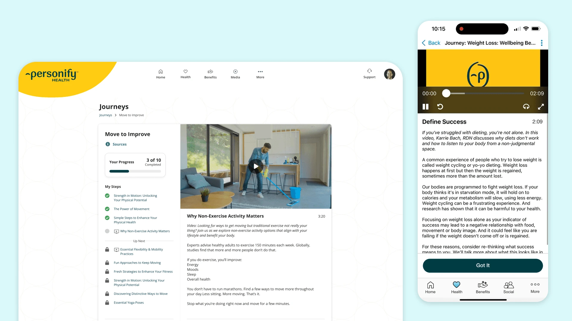
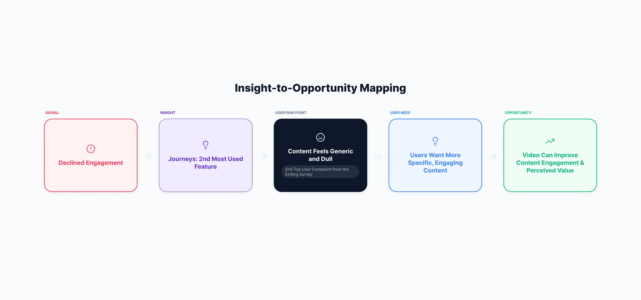
I led the product design for a new short-video experience in Journeys, Personify Health’s self-guided health learning program. Journeys helped members build healthier habits through daily content steps, but engagement had been declining and research showed that members often perceived the content as dull, generic, or hard to connect with.
To make Journeys feel more engaging and actionable, I designed a cross-platform video experience for web and mobile, validated key interaction decisions through user testing, and partnered with Product, Engineering, and Content to launch an MVP that balanced engagement, usability, and implementation constraints.
Problem
Engagement was declining
Personify Health wanted to increase engagement across its well-being platform after seeing a decline in platform usage since 2021. Journeys became a strong candidate because it was one of the most-used features and already had meaningful member traffic.
However, member feedback revealed a content engagement problem. In end-of-Journey survey responses and discovery interviews, members often described the experience as too generic, too basic, or not engaging enough to sustain motivation. Several participants also expressed a desire for more visual and demonstrative content, especially for exercises, stretches, and meditation guidance.
This created the opportunity: instead of simply adding video in a separated Media feature, we needed to understand how video could improve the value of Journeys without adding friction to an already light learning flow.
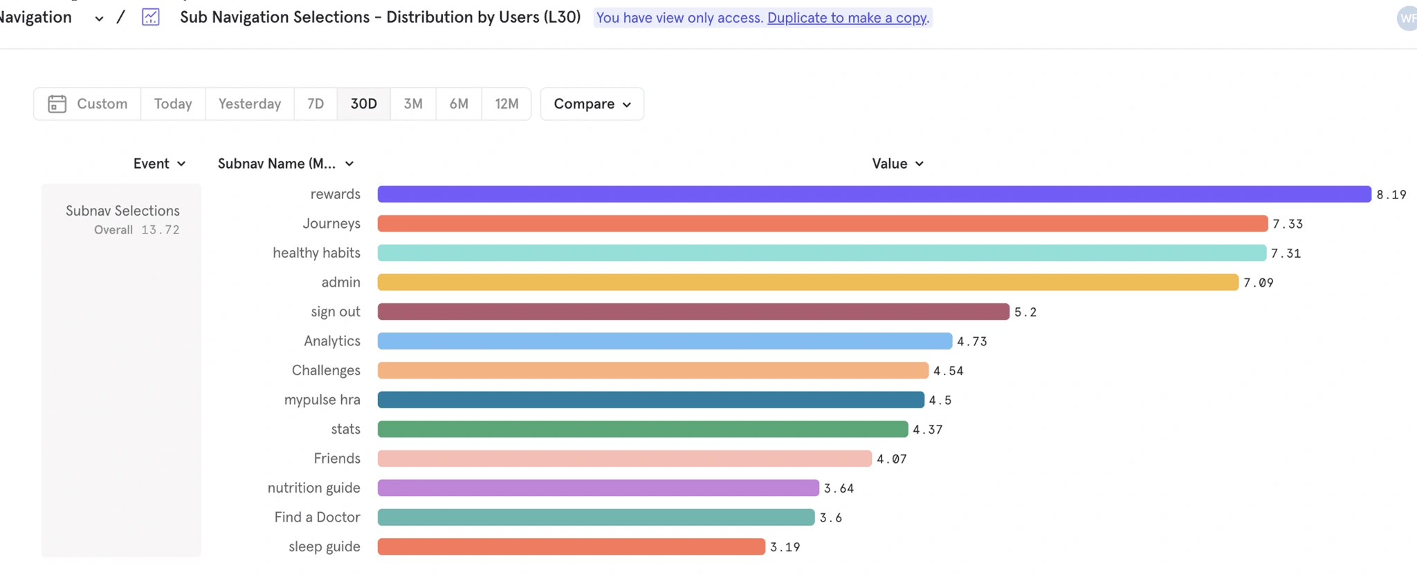
Journeys was one of the top-clicked features, making it a high-impact place to improve engagement
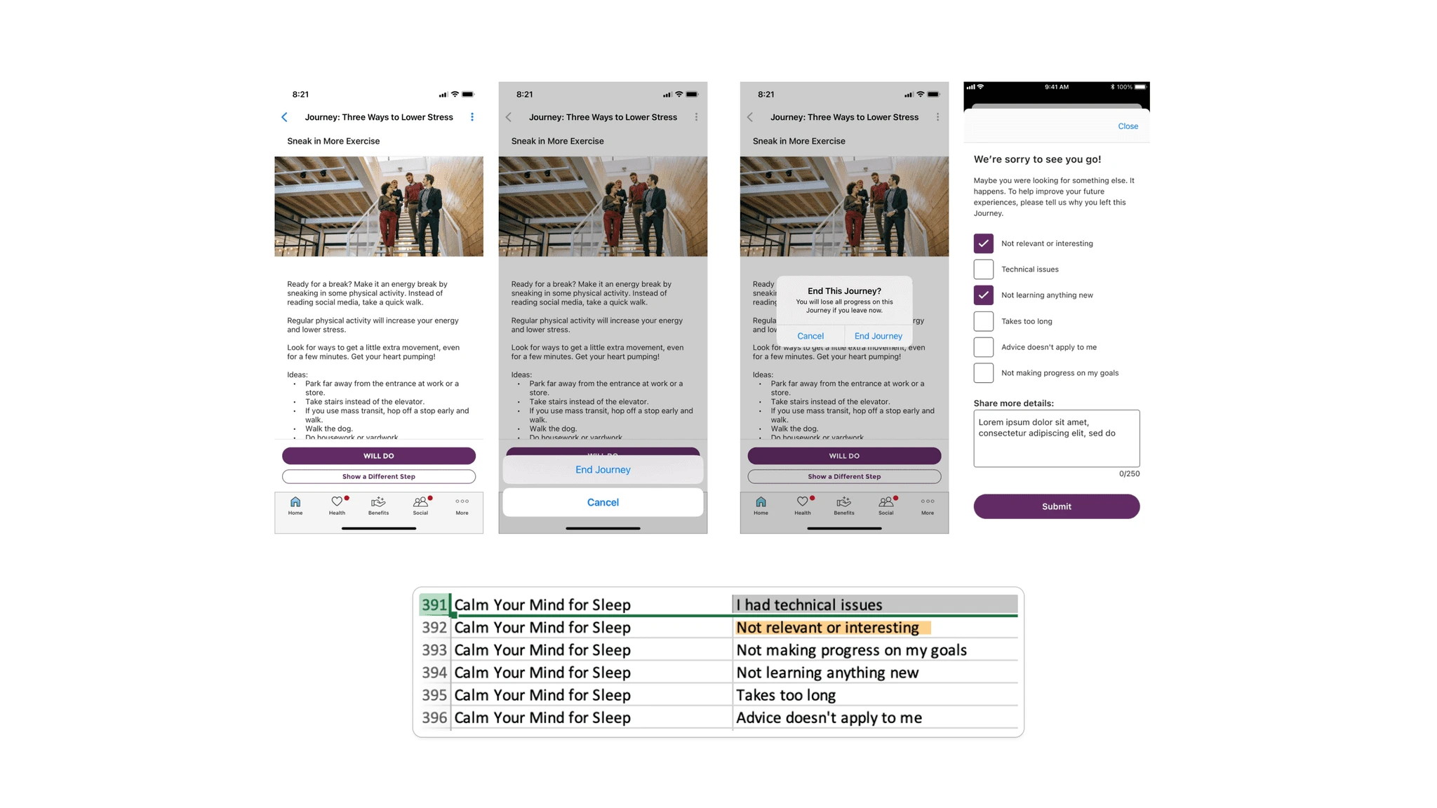
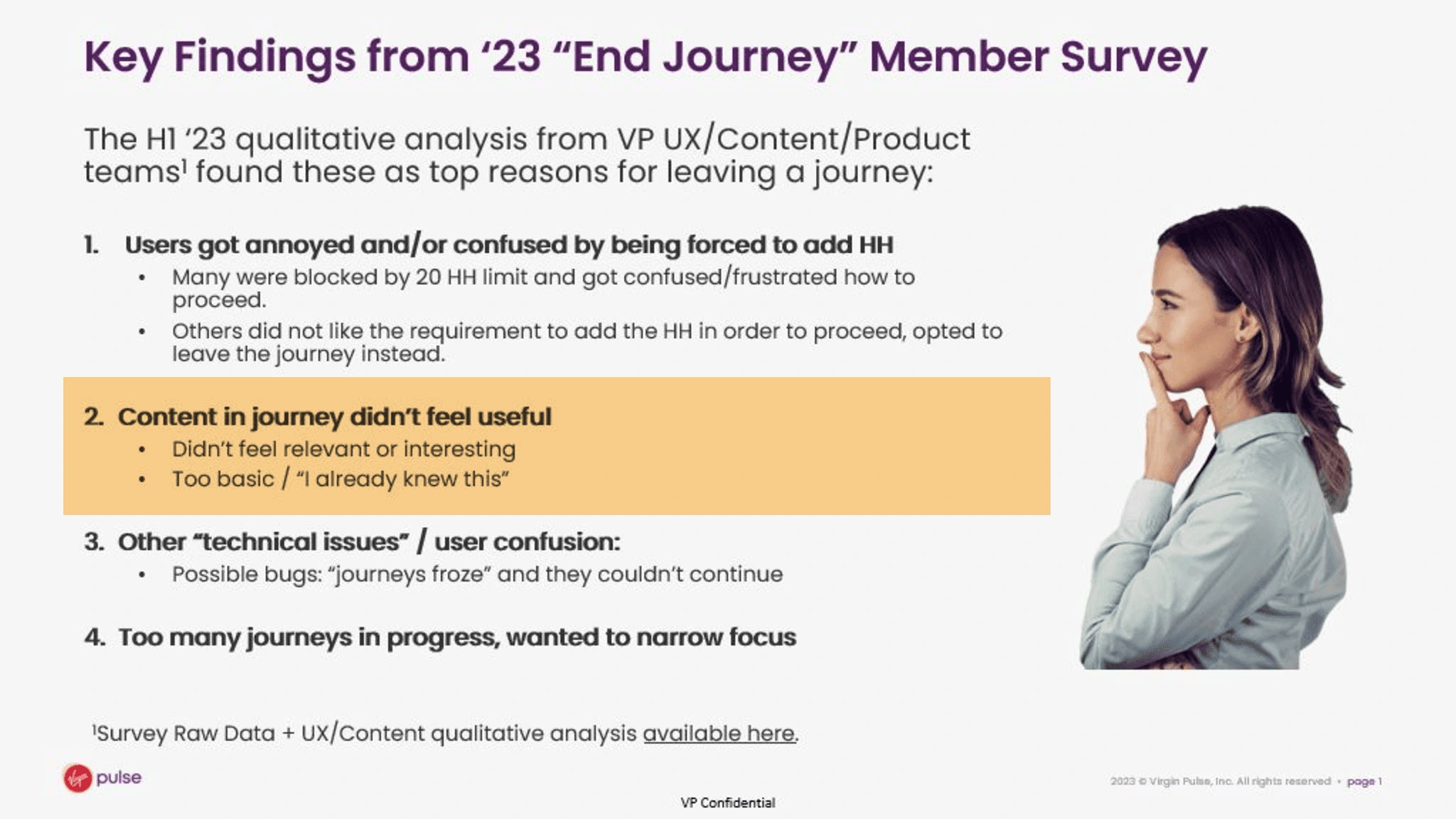
Research showed that members often found Journeys content too generic or dull
Exiting Journeys survey - Members frequently left Journeys due to content as not relevant or interesting - second highest reason
Journey's discovery user interviews for 12 PH participants.
Content format: “Provide more specific exercises vs general tips (actual examples of stretches and meditation).”Content format: “Video would be nice because I can watch how to do an exercise instead of reading it.”Content value: “I don’t like Journeys mostly because the info feels very basic.”.
Several participants expressed interest in video because it could make exercises and wellness practices easier to follow.”
Discover content opportunity
After getting sentiments on videos, I conducted a verbal survey to understand user preferences for content formats and to hear how people prefer to consume wellbeing content.
I recruited 12 participants who were either PH users or had consumed health content recently. Afterward, I create a mapping on Miro to synthesize themes
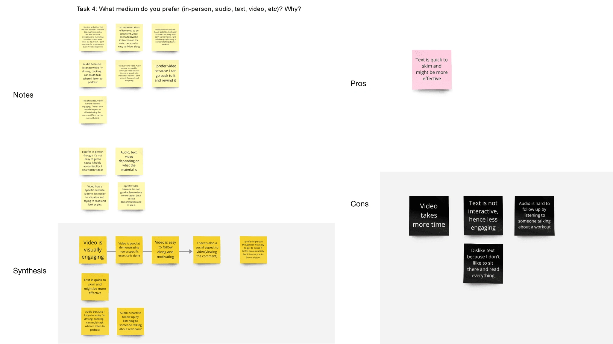
Survey responses and interviews pointed to a content engagement gap: members wanted more specific, visual, and actionable guidance.
There are some real advantages to video. Participants demonstrate more pros than cons to video. Video is visually engaging, easy to follow, and better at demonstrating specific exercises. The con is that it requires more time commitment.
We saw an opportunity to use video to make health content more visual, specific, and actionable.
Define Product Success
After we run a risk/impact matrix, we prioritized 1. building the usability issue2. engaging feature - Video Service for Journeys3. Journey completion rating. *all 3 items were launched
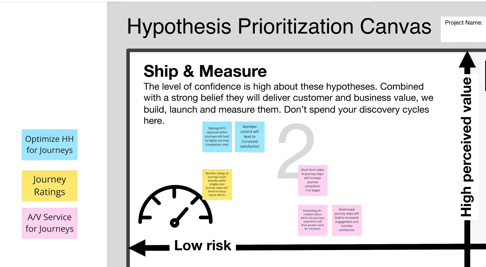
We defined success as more users on Journeys, higher video click rate, and higher journey completion.
Primary success metrics
Journeys usage rate
Video click/play rate
Secondary metrics
Video completion rate
Learning metrics
Qualitative feedback on video
User demographic
Very diverse58% in age 30-5030% in age 20-30
User goals
I want to view relevant, engaging content, so that it can help me improve health.
I want to watch videos because they provide clearer explanations and offer a more engaging alternative to text format.
Design investigation
The initial assumption was that adding video required minimal UX exploration, but I pushed to investigate how video behavior affected engagement and interaction given the existing flow.
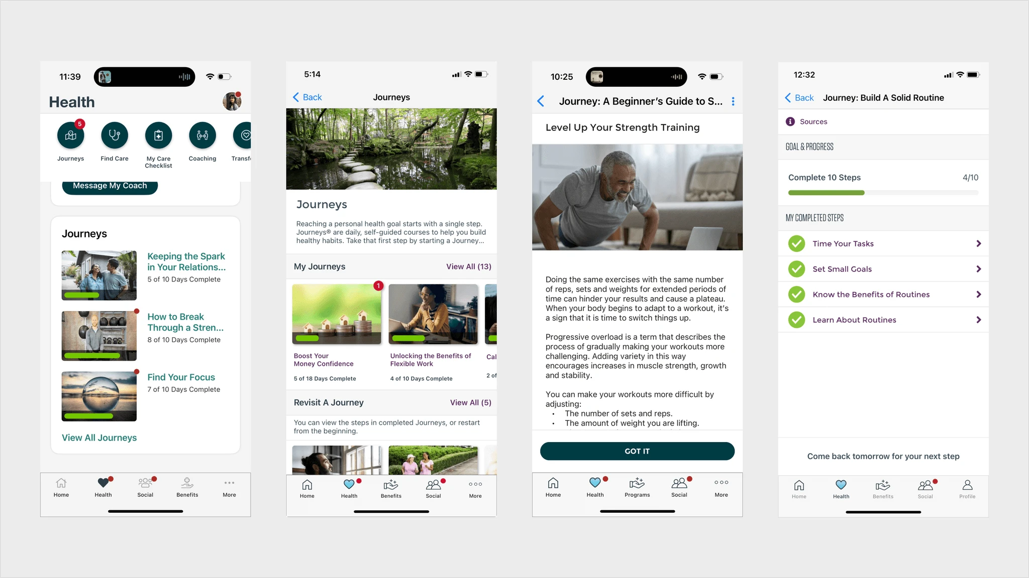
Existing Design
Web
Mobile
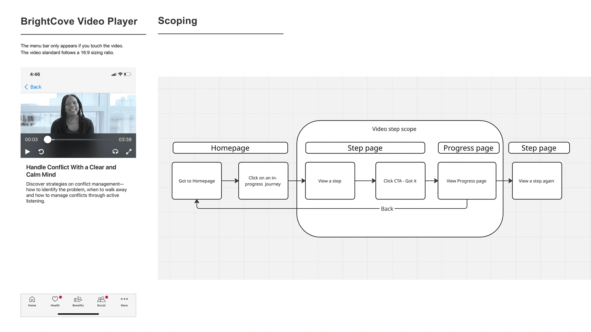
We considered homepage discovery improvements, but scoped them out because the homepage was undergoing a broader modular redesign. For the MVP, I focused on the step page and progress surfaces where video engagement would happen directly.
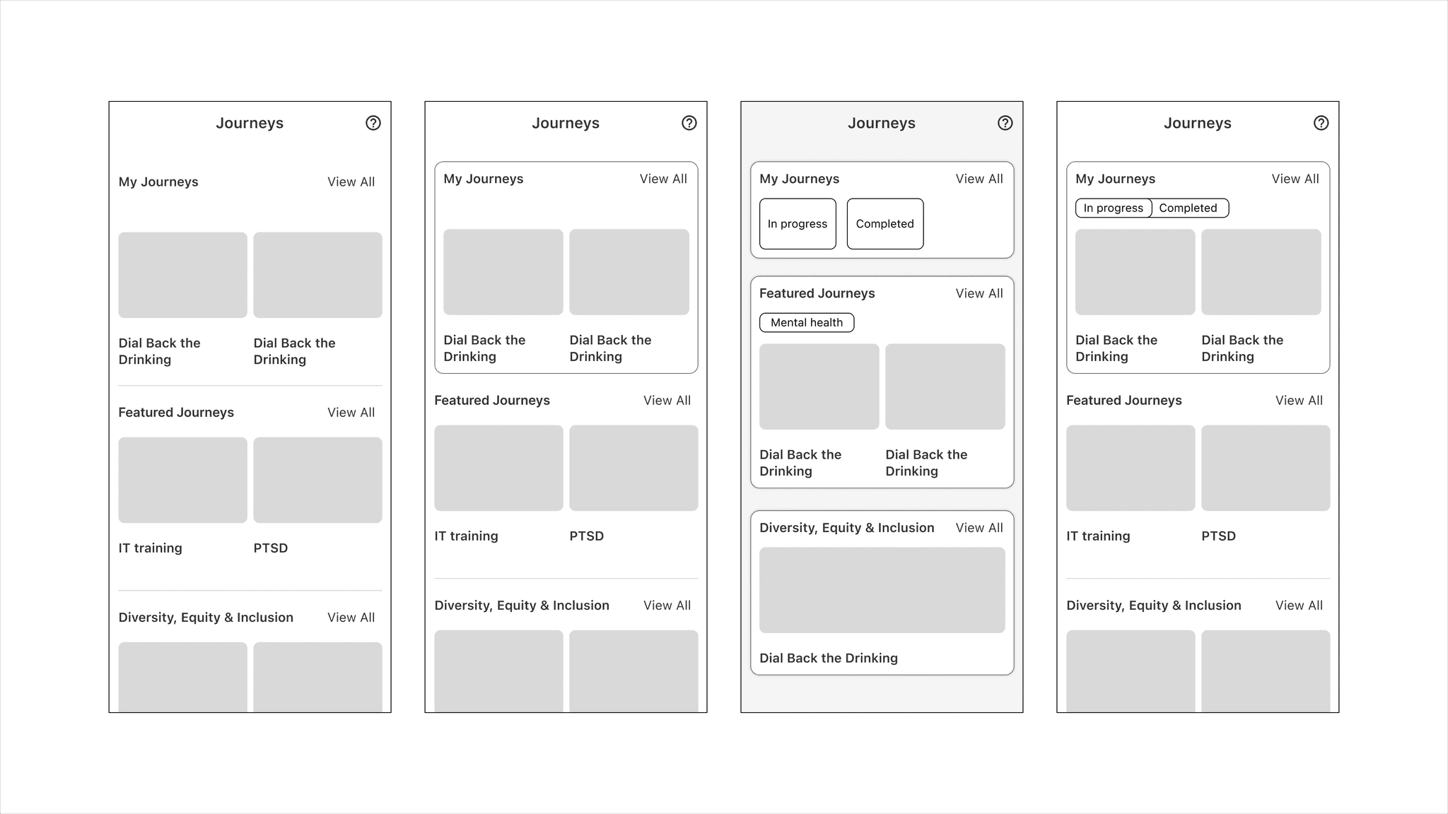
My homepage layout explorations. The previous design was using a flat header; the new UI direction is leaning toward a modular UI.
Rather than creating a new heavy flow, this project focused on making a few high-impact interactions work well within an existing product experience.
Because more users preferred using the mobile app when completing journeys, so I designed it mobile-first. Once the interaction was clear on mobile, I adapted the experience across the web.
A/B Testing
I tested how different initial playback behaviors affected user control, focus, and willingness to engage. I created two high-fidelity prototypes, wrote the test plan, reviewed it with UXR and Content, and tested with 12 participants across existing Journeys users and wellness-content consumers.
Left: full screen video;Right: inline video
💫 Users wanted video, but not all of them wanted video to take over the experience.
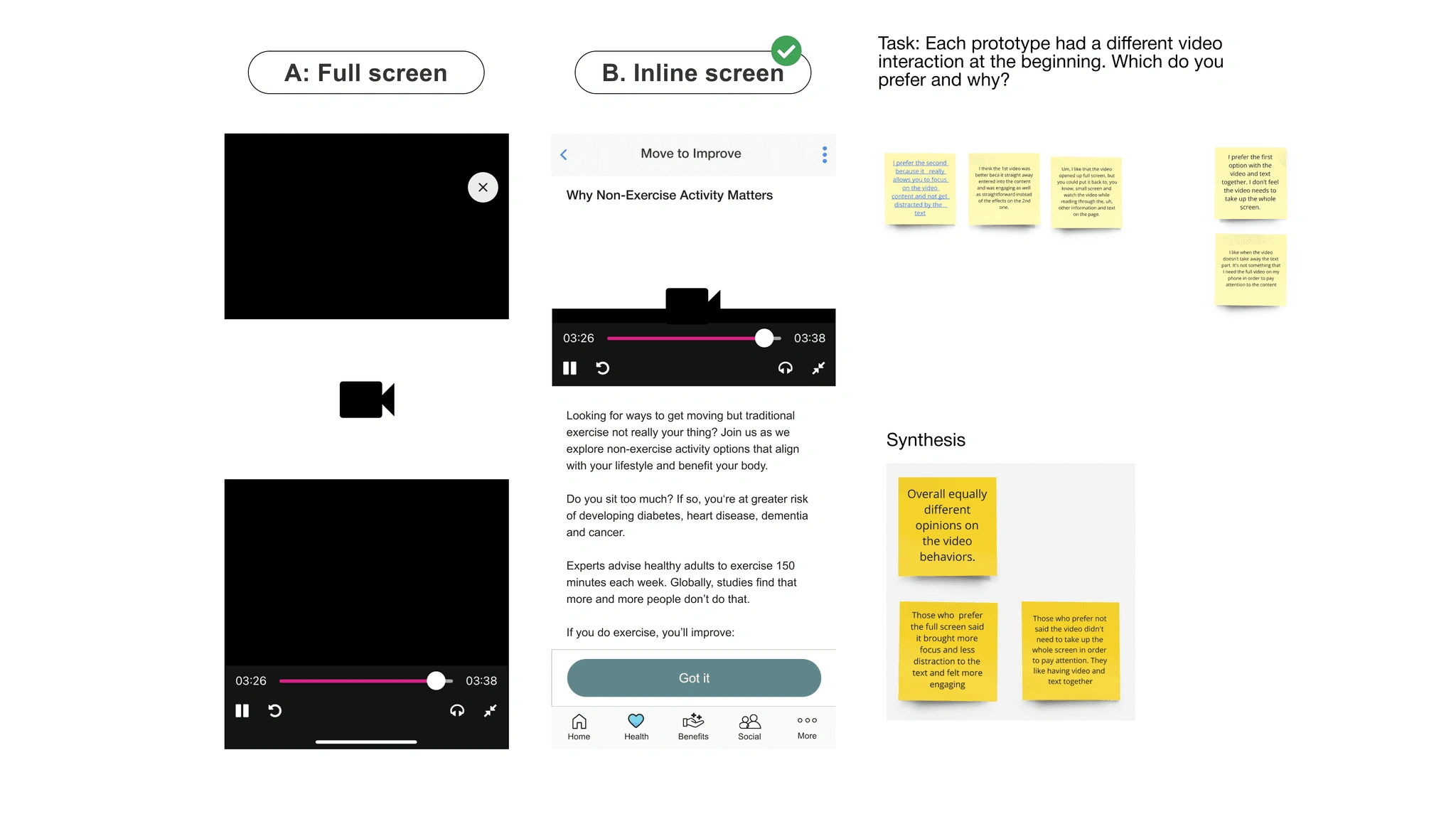
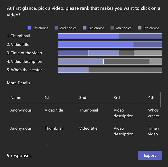
Users wanted control over engagement, leading us to prioritize intentional engagement to preserve user agency
s
Decision
What research showed
Final design choice
Autoplay vs manual play
Autoplay felt distracting and reduced user control
Removed autoplay
Fullscreen vs inline player
Some participants found the full-screen behavior interrupted the navigation and prefer the control to navigate videos independently.
Used inline playback with fullscreen as optional
What drives clicks
Users looked for title, thumbnail, and time as key info
Added clearer hierarchy around title, duration, and video list cues
Step page
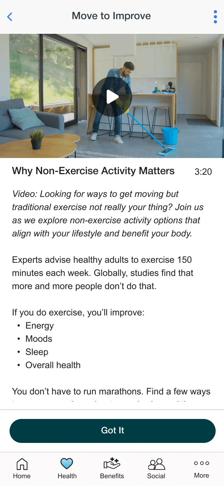
After several design reviews, we determined the must-haves as follows
Design requirements
Video time near the title
No auto-play
Video and text placement, following industry video layout
Distinguished video description vs text content
Video indicator for revisiting steps
Progress page
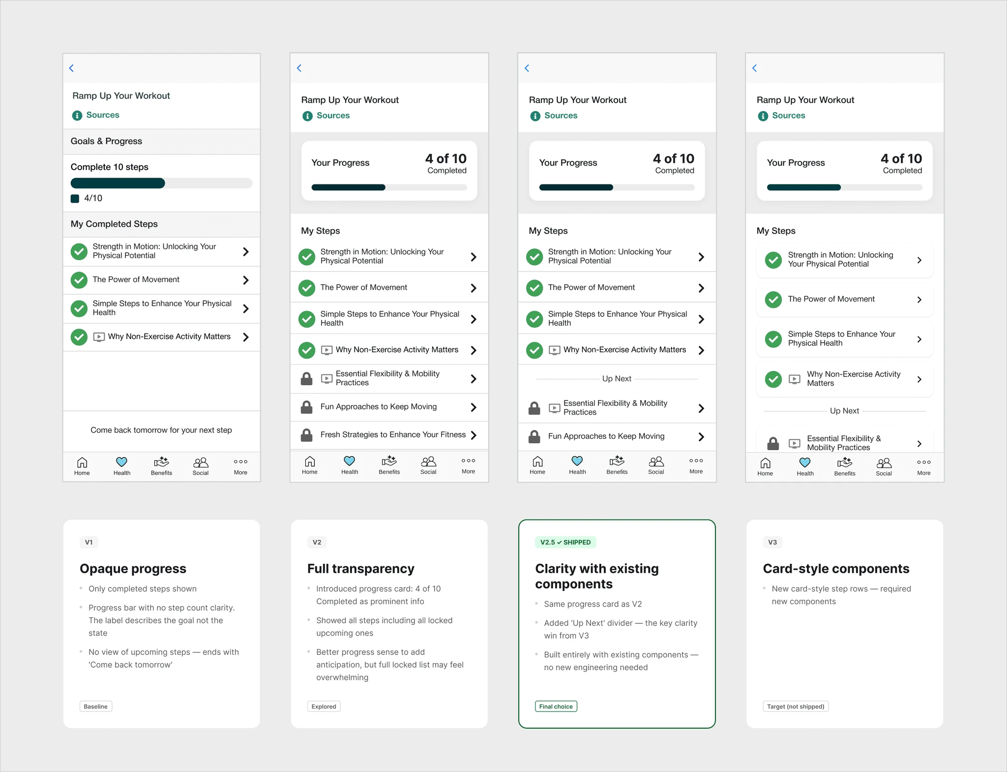
User problems
For a long time, users were frequently confused about what this progress page represented
"Wait, I completed this without setting any goals or accountability?"
Some users didn't realize Journeys is a curated set of steps to read at their own pace, where progress simply reflects how many steps they've completed.
Decision
Make the progress page clearly communicate progress and status.
We chose V2.5 because it delivers that clarity using existing components, avoiding the engineering cost of building the new ones V3 would have required.
Design Explorations
I also explored more engagement patterns, including content tags, progressive disclosure, and watch-to-unlock accountability.
These were not shipped for the MVP because they introduced additional behavior change and reward-system dependencies that required broader validation.
Content readability improvements
Accountability / watch-to-unlock concept
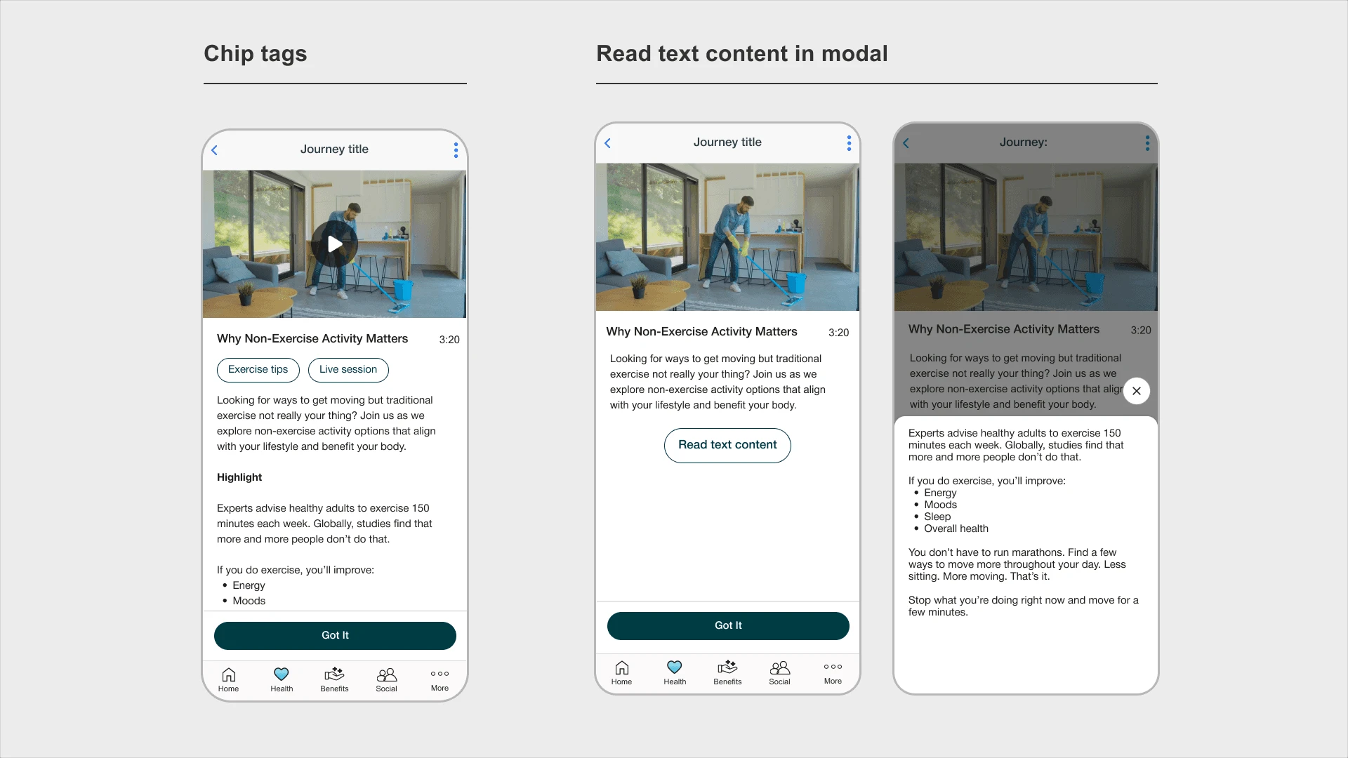
Chip tags - Help users quickly see what the video is about beyond current info on the page
Text content on modal - Reduce info clutter and bring focus on different content types
Watch-to-unlock concept to add more accountability for behavior change
Final Design
Constraint
"Friction vs. Flow" trade-off on CTA and the reward system
One key trade-off was whether video completion should be required before a member could complete the step. From a behavior-design perspective, requiring video completion could increase accountability. However, from a product-engagement and a PM perspective, it risked adding friction for members who were short on time, uninterested in that specific video, or using Journeys as a lightweight daily habit.
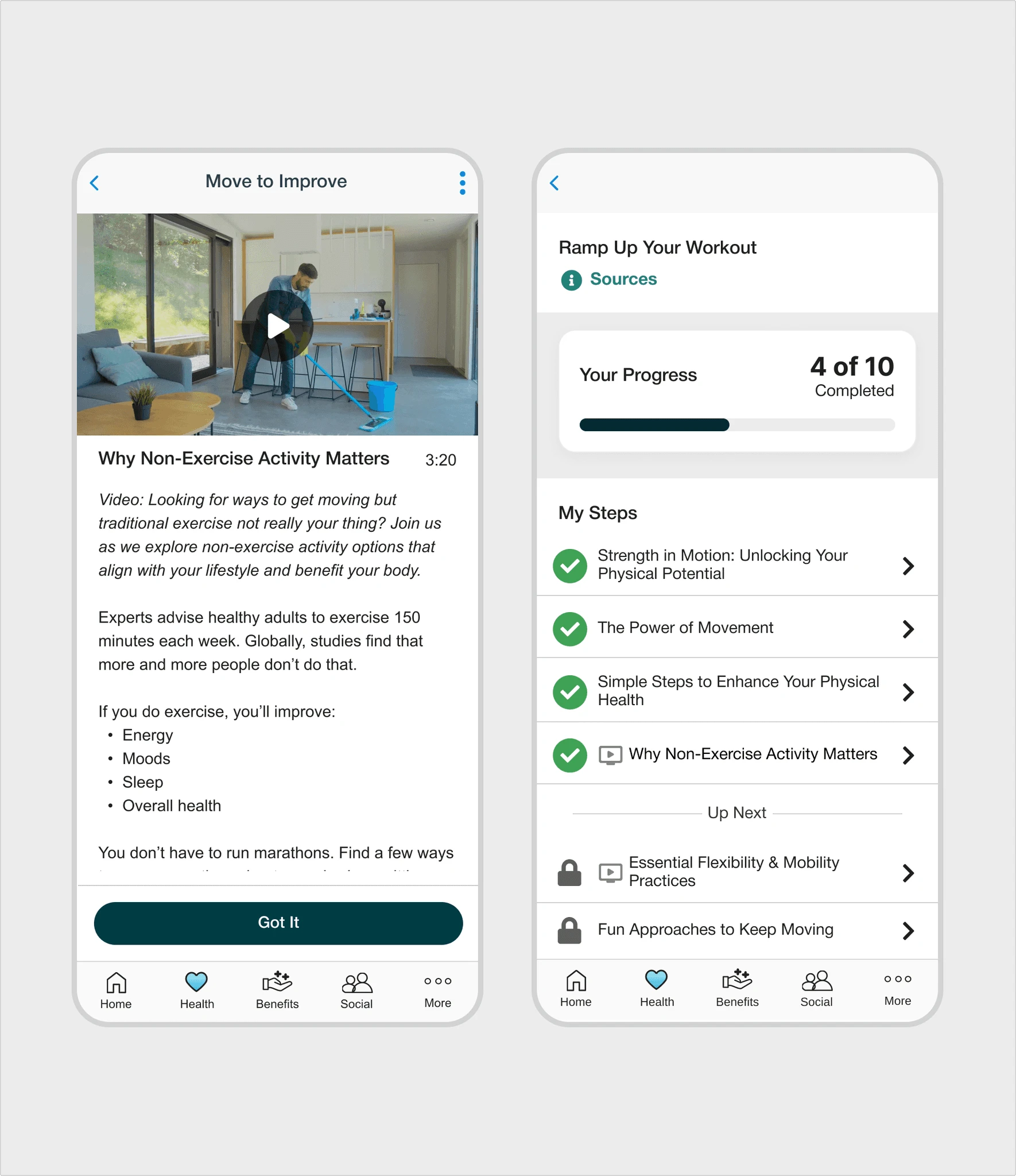
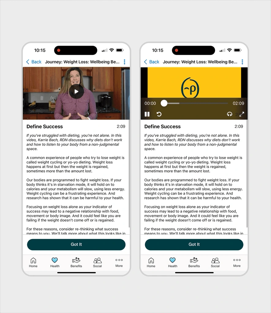
For the MVP, we kept the “Got it” action available at all times. This preserved the low-friction nature of Journeys while still making video more visible, useful, and inviting. It also protected Journeys completion rate, which was an important business metric for the feature.
Web
Mobile
Impact
Business Impact
Engagement increased for Journeys
Journeys usage rate increased by 10%
*measured as monthly active Journeys users divided by engaged platform users.
72% video click rate
67% video completion rate
Business Impact
Successfully launched for the admin and member platforms
Team Impact
Influenced the content strategy by securing stakeholder buy-in for proposed content recommendations.
Reflection
Ideal design vs. MVP
This project taught me that a simple feature request “add video” can have meaningful implications for behavior, motivation, and flow. For an MVP, the strongest design decision was not to add more engagement mechanics, but to define which interactions were necessary and which ones introduced uncertain value or unnecessary friction
If I stayed longer and had the opportunity to expand on the MVP
New design
Designing a better homepage module to funnel more users to Journeys
Quant Research
Monitor video completion rate, video clicking rate, and average drop-off time.
Qual Research
Get qualitative feedback on the video content from in-app survey and user interviews
Post-launch AI Exploration
Later, I explored how bonus rewards and micro-interactions could make video completion feel more motivating.
I kept this separate from the shipped MVP because reward behavior required broader system alignment. With Google AI Studio, I was able to quickly prototype in hi-fi.
First row: Bonus card reward, CTA bonus reward
Second row: Toast and bottom sheet interaction
Doreen Ma Portfolio
Like this project
Posted Sep 26, 2026
We increased engagement for a health learning program and successfully launched for the admin and member platforms
Likes
0
Views
0