Modernizing a Legacy Health Analytics Platform

Doreen Ma

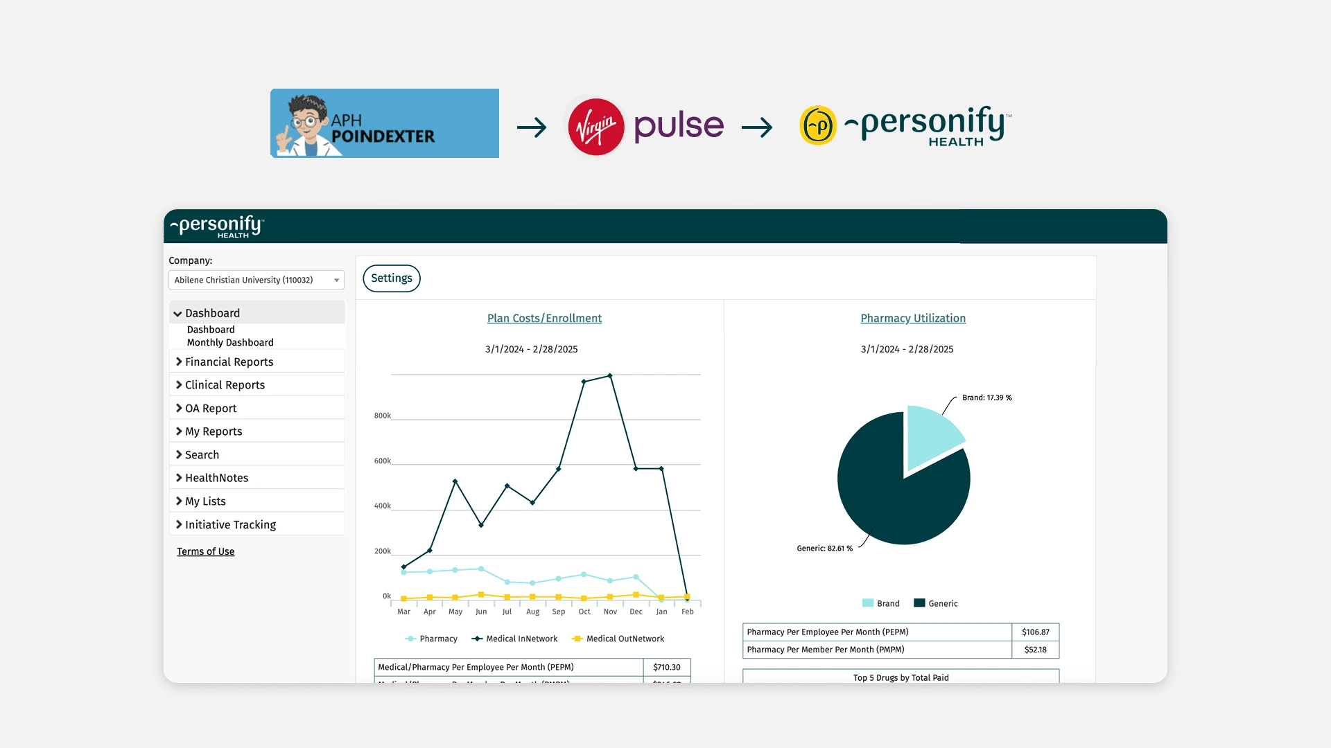
Modernizing a Legacy Health Analytics Platform - 2 rebrands, Scalable Design System
Design system
Data visualization
B2B
Role
Product Designer
Timeline
Q3 2022
Platform
Web
Team
1 PM, 2 Engineers
Project Theme
HR tool, dashboards, usability audit
Summary
This case study describes a 2-month redesign/rebrand of a legacy healthcare analytics dashboard platform after an acquisition, including a 30+ page design audit, a design system for scalable UI, and multiple before/after UI improvements. The work emphasizes modernizing UI, improving clarity and hierarchy, making layouts responsive, and ensuring accessibility - reporting a 93% customer renewal rate as an outcome.
Problem
Ambiguous ask - "can we update the branding and improve the design?"
The legacy UI lacked a consistent visual hierarchy across charts, tables, filters, and navigation.
The new brand direction had not yet been translated into product-level components for this analytics platform. This platform contained dense health analytics data, so visual changes needed to improve clarity rather than just apply new colors.
The timeline was short, which meant I had to make practical UX improvements through audit-based design decisions.
Goal
Business goal
Keep customer retention high for the existing customers from APH
Design goal
Create visual alignment and modern interface based on new branding while improving UX for usability.
Clients: Hospitals and employers User roles: Claims Manager, Health Counselor, Benefit Manager, HR
User goal
Analyze large medical datasets to identify patients/employees patterns, therapeutic targets, health cost, and risk factors
Design Audit
Constraint
Proactively identified UX improvements
Due to the short timeline, I was not able to run formal user research. Therefore, I conducted a UI/UX audit of the existing platform, focusing on consistency, hierarchy, clarity, and dashboard usability.
Step 1: Audited 30+ pages to identify UI/usability issues
Identified usability issues using heuristic evaluation
Clustered them into patterns (navigation confusion, inconsistency, etc.)
Informed team to address inconsistencies, improve UX, and develop a design system
Step 2: Design system + redesign
Set up my design system to 60% completion and started redesigning for each page.
Used company branding guide; established basic components and guidelines.
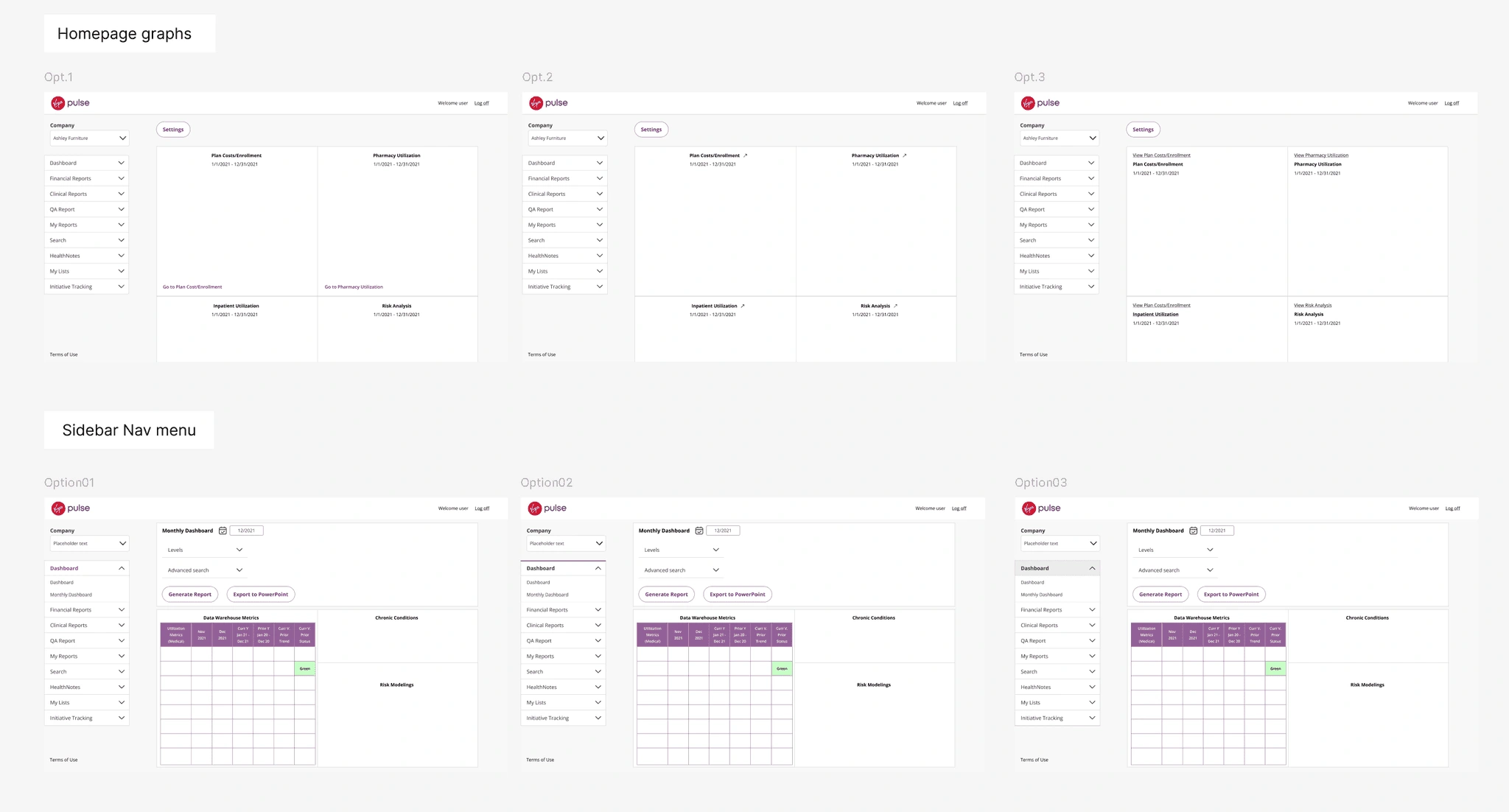
Example of iterations on UI and layout
Findings
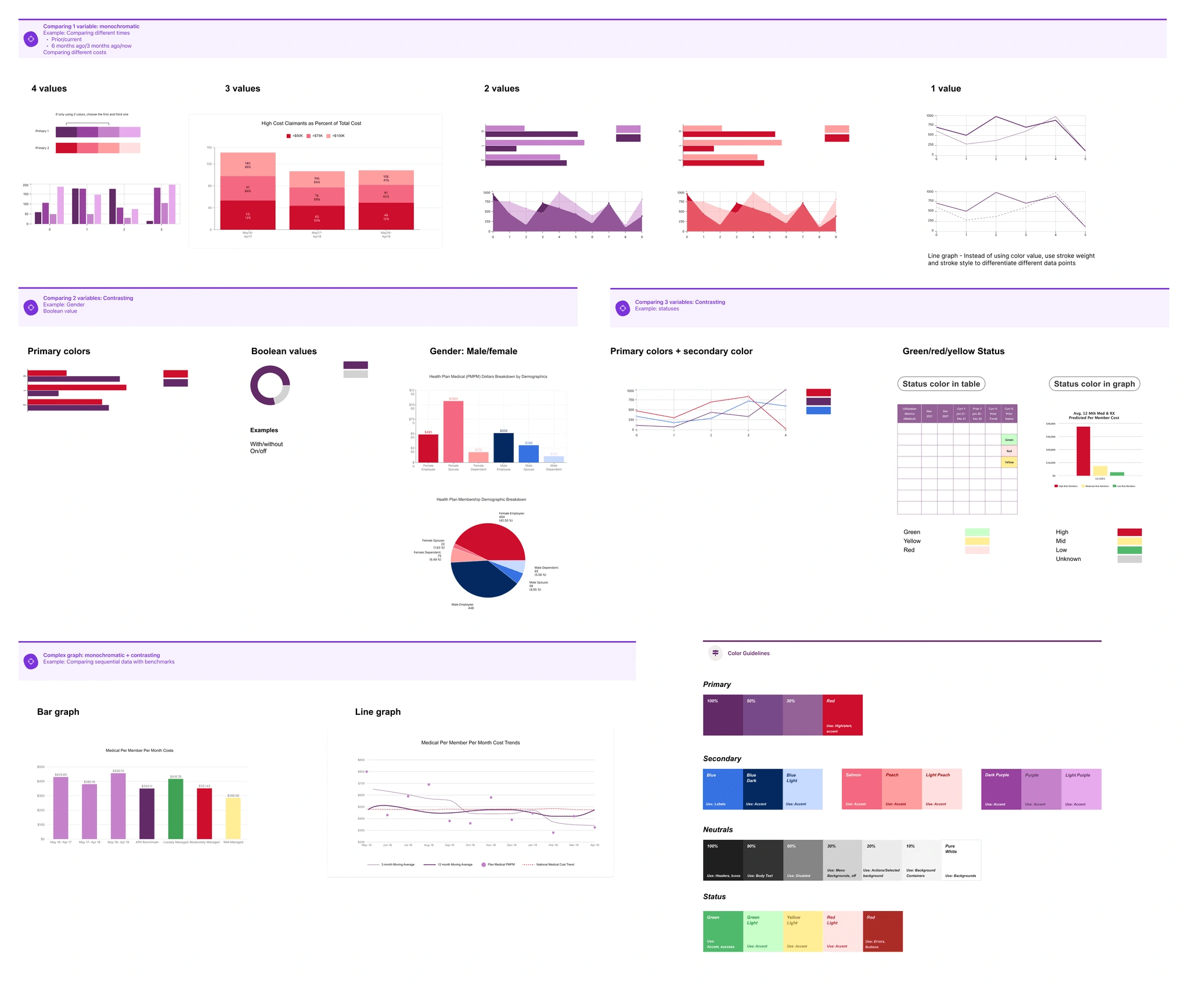
1: Data visualizations lacked consistent stylingCharts used inconsistent colors, labels, spacing, and emphasis, making it harder to compare information across screens.
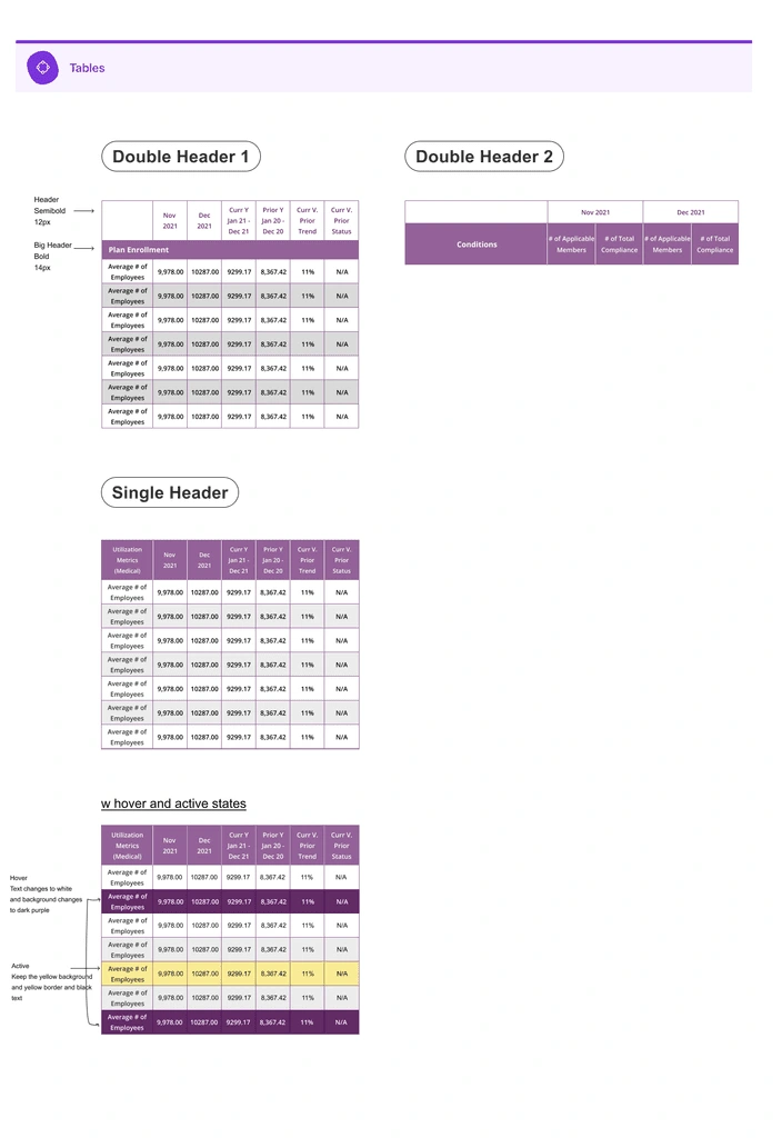
2: Tables were dense and visually heavyThe table UI made it difficult to scan rows, compare values, and understand selected states.
3: Navigation and page hierarchy were visually outdatedThe old layout did not clearly distinguish global navigation, page-level controls, and dashboard content.
4: Form and filter patterns lacked consistencyInputs, dropdowns, buttons, and filter areas needed standardized styles to support future dashboard workflows.
Design
BEFOREAFTER
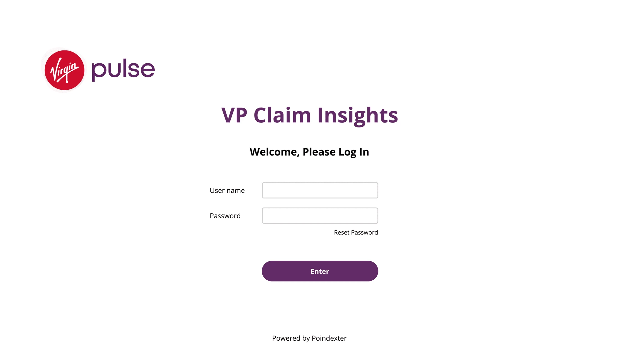
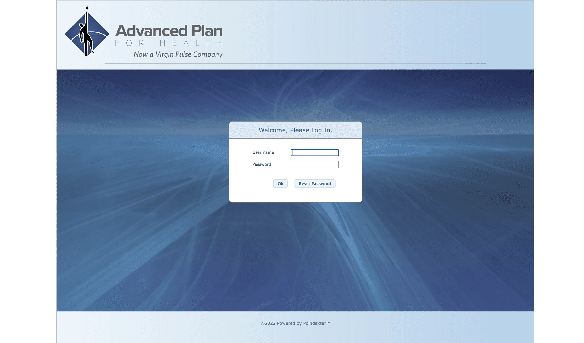
Log-in Screen
Before
Weak visual hierarchy and inconsistent alignment.
Competing actions made the login flow unclear.
“Reset Password” felt disconnected from the password field.
After
Centered the content to create a clearer visual focus.
Positioned “Reset Password” closer to the relevant field.
Replaced “OK” with “Enter” and styled it as the primary action.
BEFOREAFTER
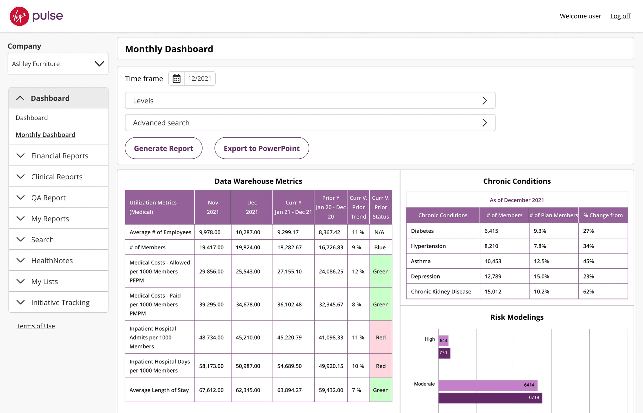
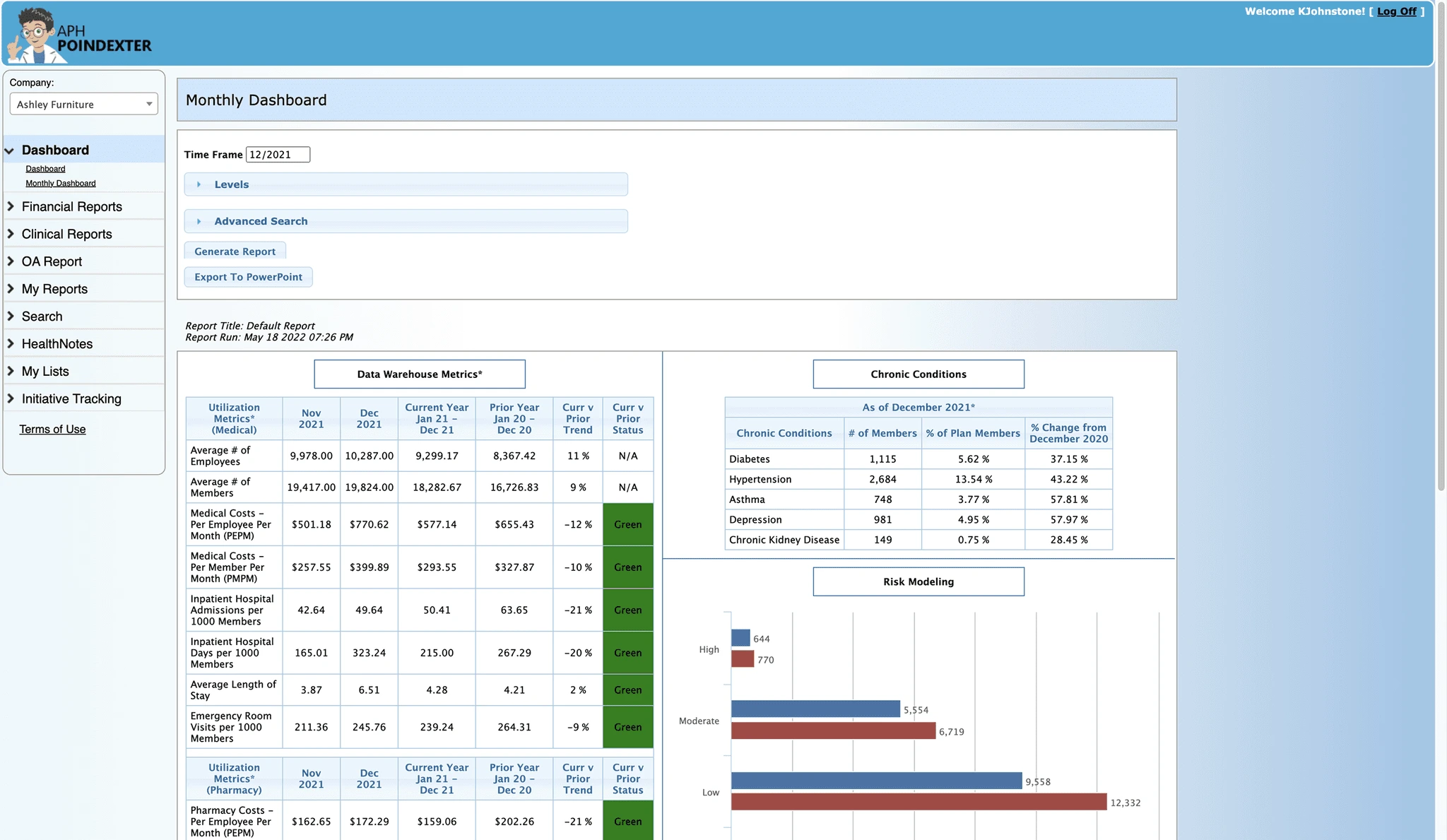
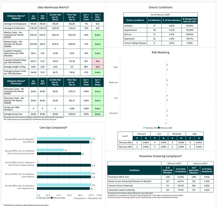
Monthly Dashboard
Before
Dense navigation made the dashboard difficult to scan.
Status relied heavily on color, which has accessibility issue.
Bordered section titles appeared interactive.
After
Simplified the navigation and improved content organization.
Added a calendar icon to clarify the date-picker interaction.
Improved status colors for accessibility.
Removed unnecessary title borders to create a clearer visual hierarchy.
BEFOREAFTER
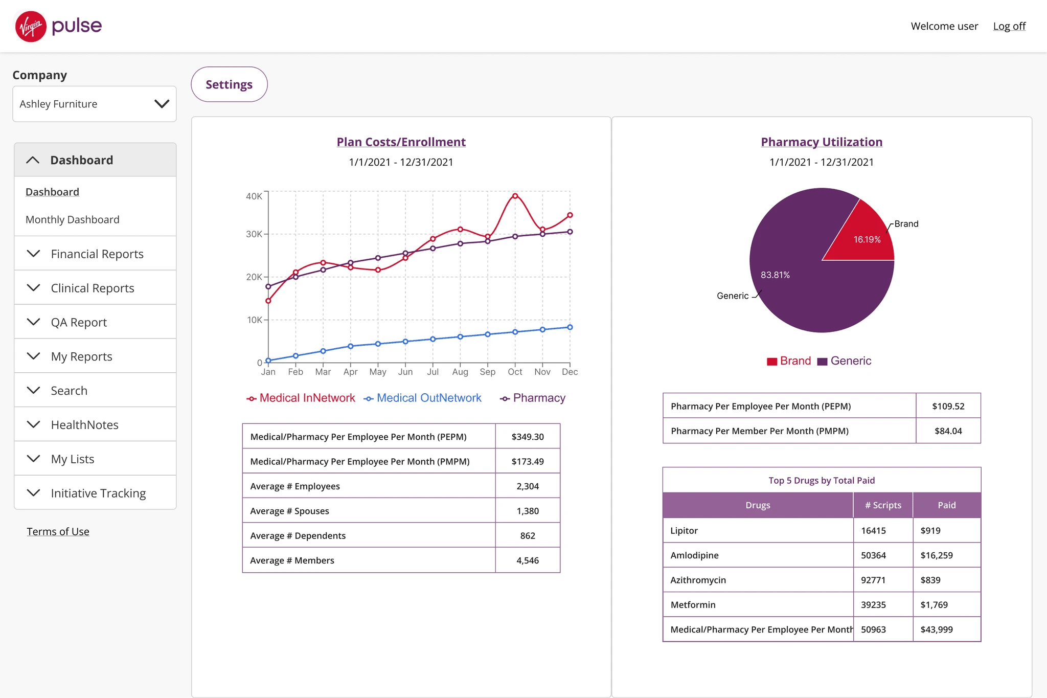
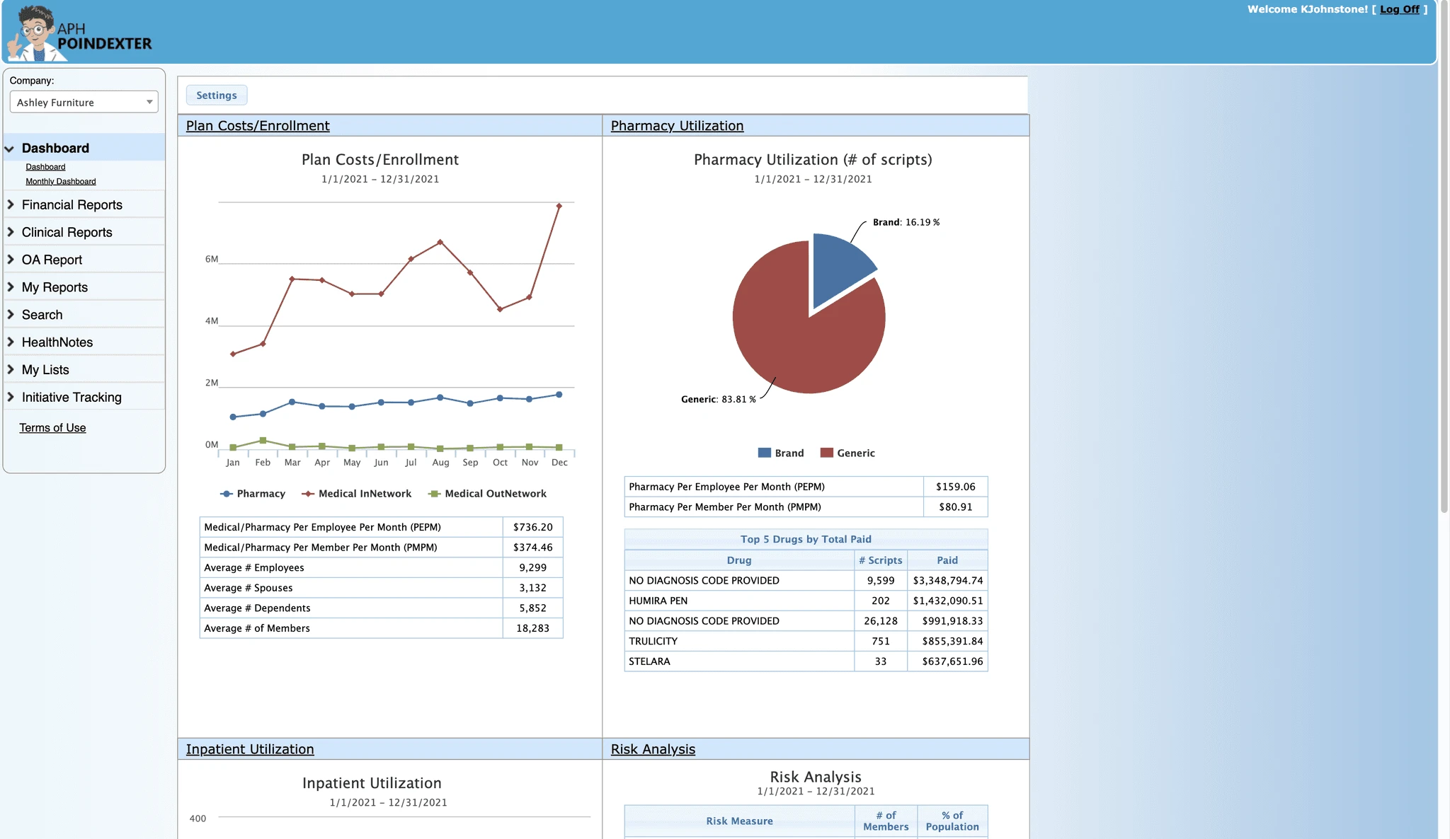
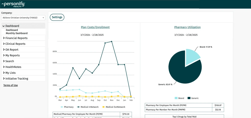
Main Dashboard
Before
Underlined navigation made the active page unclear.
Fixed-width content created excessive empty space on larger screens.
Repeated chart titles added unnecessary visual clutter.
Small text and inconsistent spacing, borders, and corner styles reduced readability.
Gradients and outdated styling weakened visual consistency.
After
Added distinct default and active navigation states.
Introduced a responsive layout with a fixed sidebar and flexible content area.
Set a minimum chart width to maintain readability across screen sizes.
Consolidated repeated headings into clear, linked chart titles.
Increased the base text size and standardized spacing, borders, and corner radius.
Simplified the visual style for a cleaner, more modern interface.
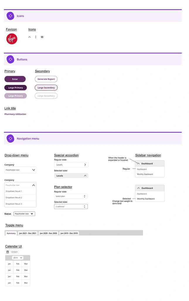
3. Design System
Core UI foundations Typography, color, spacing, buttons, form inputs.
Dashboard components Cards, tables, filters, navigation, modals.
Data visualization system Bar charts, line charts, pie charts, legends, chart colors, empty/error states.
Design Decision
The data visualization system
I avoided using brand colors decoratively and instead assigned colors based on chart function, contrast, and repeated usage across dashboards.
For tables:
I reduced heavy borders and used spacing, row treatment, and typography to improve scanability.
For navigation:
I clarified the hierarchy between global navigation, filters, and dashboard content.
Impact
Second rebrand
Product Impact
Improved readability of complex data
Translated the new brand direction into scalable product visual system and UI patterns
Ramped up a second rebrand with the design system
Business Impact
A boost in customer satisfaction that ended with a 93% customer renewal rate
"They love it! They found it easy to use and were excited about the new brand."
Collaboration Impact
Clear design documentation helped the team move efficiently and brought clarity
Reflection
A fragmented UI can slow comprehension and create uncertainty.
Like this project
Posted Sep 8, 2026
2-month redesign and two rebrands of a legacy health analytics dashboard with a scalable design system to improve data clarity and usability.
Likes
0
Views
1