Student Essentials Productivity Web App
Mustofa Al-Ameen Mustafa
Live Link:
Student Essentials — All-in-One Student Productivity Web App
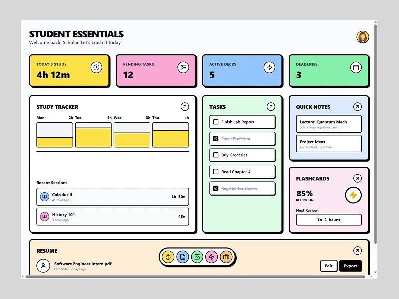
Student Essentials is a clean, modular productivity web app designed to help students manage study hours, tasks, notes, flashcards, and resume building—all in one unified dashboard.
What I Built:
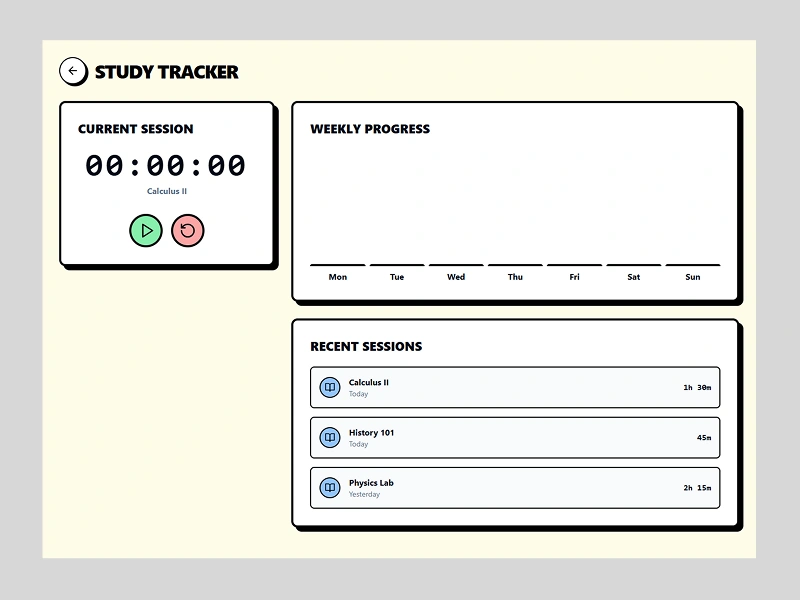
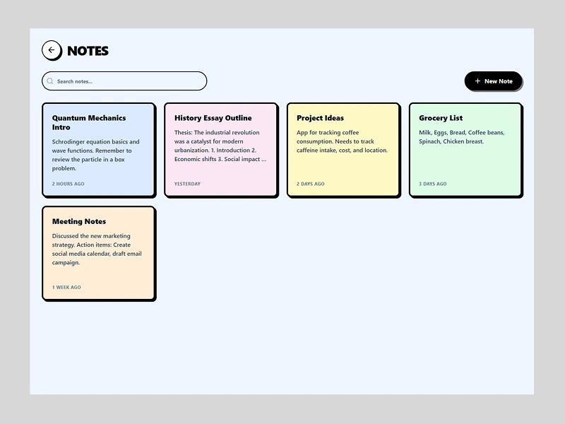
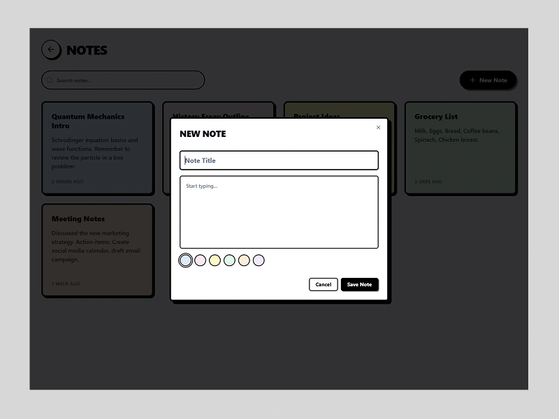
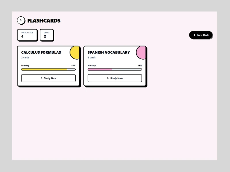
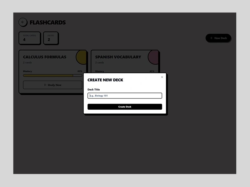
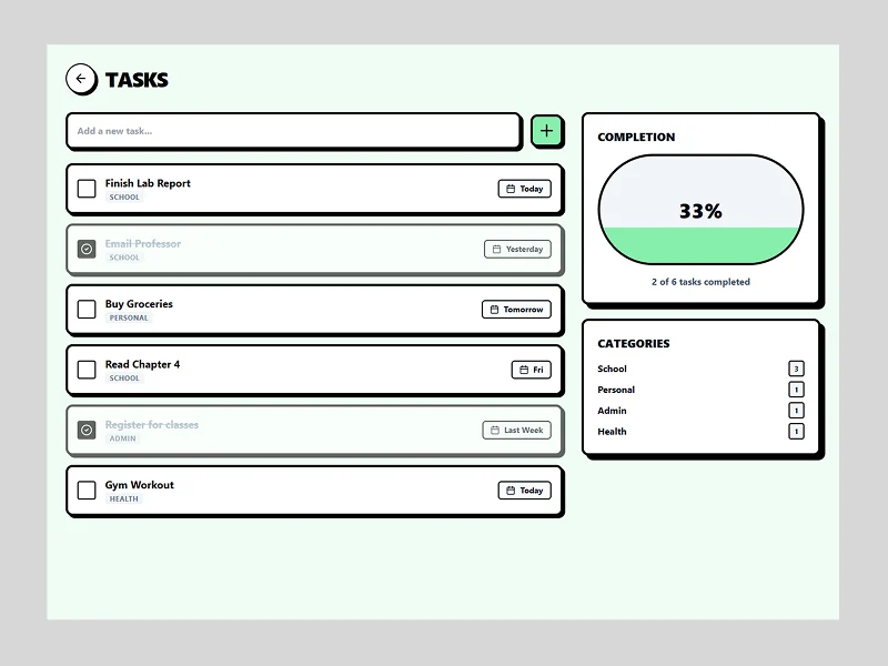
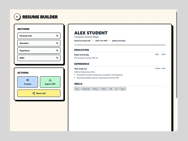
A fully designed end-to-end student productivity experience inside Tempo. The app brings together the most important academic tools into one interface: a study tracker, task manager, notes board, flashcards, and a resume editor. The focus is simplicity, clarity, and fast access to everything students use daily.
Who It’s For:
High-school and university students, online learners, and anyone looking for a single workspace instead of juggling multiple apps like Notion, Quizlet, and calendars.
Design Thought Process:
The goal was to solve tool-fragmentation by creating a focused hub with a strong visual hierarchy.
I used a neo-brutalist / bento-grid UI: bold outlines, soft color blocks, and high-readability cards. Each section is built to reduce friction—quick tasks, lightweight notes, simple study tracking, and a modal-based resume builder.
The design emphasizes clarity, usability, and a commercial-ready structure that could scale into a real product.
Like this project
Posted Dec 8, 2025
Designed a student productivity app integrating various academic tools.
Likes
0
Views
7