Modern Analytics Dashboard - Marketing & Sales UI
Mustofa Al-Ameen Mustafa
Modern Analytics Dashboard - Marketing & Sales UI
Description:
Hello everyone!
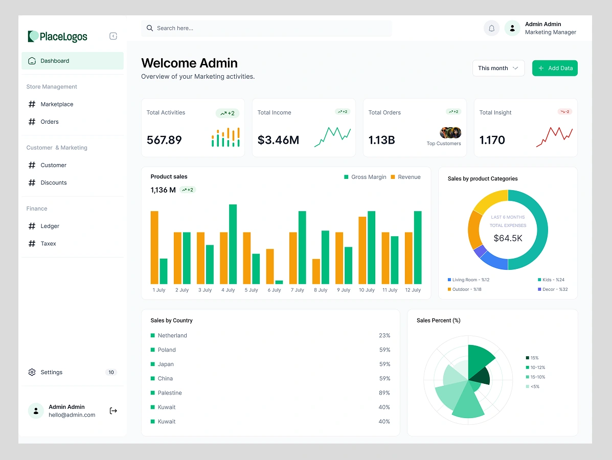
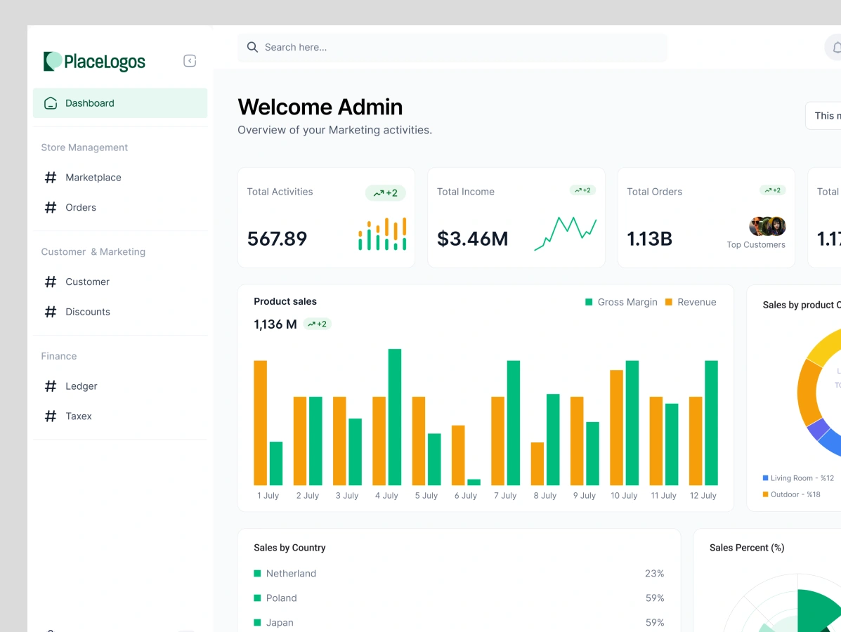
Here's a concept for a clean and intuitive admin dashboard designed for a SaaS platform. The goal was to create a user-friendly interface that empowers marketing managers and administrators to track key business metrics at a glance.
Key Features:
At-a-Glance KPIs: The top section features clear, concise cards for essential metrics like Total Income, Orders, and Activities, complete with mini trend graphs for quick insights.
In-Depth Sales Analysis: A detailed bar chart visualizes daily revenue against gross margin, allowing for easy comparison and performance tracking.
Category Breakdown: A donut chart provides a simple, visual breakdown of sales by product category over the last six months, helping to identify top-performing segments.
Global View: The dashboard includes sections for sales by country and sales percentage, offering a clear view of performance across different regions.
The design uses a clean, grid-based layout and a refreshing color palette (primarily green for growth and finance) to make complex data easy to understand and act upon.
Tools Used: Figma
Like this project
Posted Aug 16, 2025
Designed a clean admin dashboard for a SaaS platform to track business metrics.
Likes
4
Views
22