Modern organic milk, but make it luxury. 🥛 I recently wrapp...
Shakya Vaughn
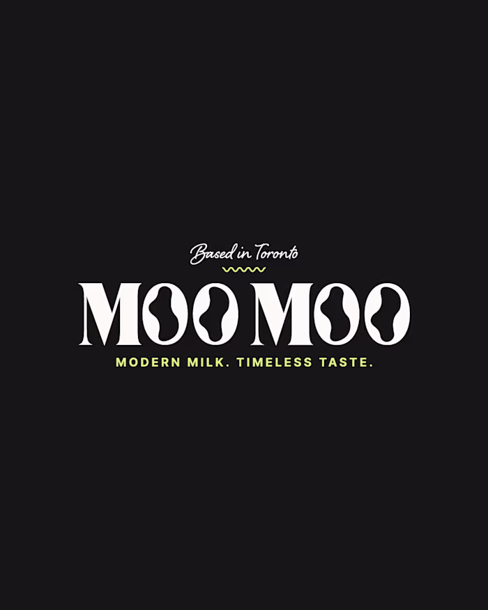
Modern organic milk, but make it luxury. 🥛
I recently wrapped the brand identity and packaging design for Moo Moo, a modern high-end milk brand based in Toronto.
Packaging mockup was made with AI and I added my final design and edits in Photoshop.
This project was a great reminder of why cohesive brand systems matter so much:
-Custom wordmark with “O” counters inspired by cow spots + the flow of milk
-Pattern system built from those same organic shapes
-Collateral (cartons, billboards, thank-you cards)
When every touchpoint is aligned, a brand stops feeling generic and starts feeling instantly recognizable.
Whether it's on the shelf, a billboard, or in a customer’s hands.
👉 If you’re building a beverage brand and want your visual identity, packaging, and collateral to work together (not against each other), let’s connect.
Like this project
Posted Dec 4, 2025
Modern organic milk, but make it luxury. 🥛 I recently wrapped the brand identity and packaging design for Moo Moo, a modern high-end milk brand based in Tor...