WorkFocus - Brand Identity & Creative Direction

Eric Jordan


Creative Direction, Brand Strategy & Identity, Style Guide, 3D, Motion Graphics, Web Design, Event & Booth Design, Mascot & Merchandise Design
Client: WorkFocus · Partner tier: Adobe Gold Solution Partner · 2025-2026
Chief Architect: Mike Kollen / WorkFocus · Creative Director, Board of Directors: Eric Jordan

WorkFocus logo
Overview
WorkFocus builds Centers of Excellence for enterprise teams running Adobe's content supply chain: Workfront, Workfront Fusion, Workfront Planning, Firefly, and AEM Assets. Chief Architect Mike Kollen spent years inside Adobe before founding the company, and by early 2025 WorkFocus was climbing Adobe's partner tiers faster than its identity could follow. It was a Bronze partner with Gold in its sights, and almost no brand to carry it there.
Mike had followed my work since the 2Advanced years, and when he came back in February 2025 the conversation started as a branding package and grew quickly. On 13 March 2025 WorkFocus announced my appointment to its Board of Directors as Creative Director, with a remit to guide the evolution of the visual identity and the company's user-facing storytelling. Over the next year and a half that covered the identity and style guide, a 3D imagery library, the website and a run of microsites, product branding and motion for the WorkFocus Center of Excellence, and the company's booth at Adobe Summit 2026 in Las Vegas.
Brand Identity
Goal: Give a fast-growing Adobe partner an identity that looked like the company it was becoming, one that could sit beside Adobe's own marks in front of enterprise buyers and make a dense, technical offer legible at a glance.
Strategy: I began with an audit of the existing site in March 2025. It named the problem directly: messaging that was hard to follow, little cohesion between content and design, and a user journey that lost people before they reached the point. The identity work that followed was aimed at that problem first. Whatever the mark looked like, it had to explain what WorkFocus does, which is connect a client's systems and point all of them at one goal.
Five Directions
I opened with five complete directions, each built out as a full stylescape with mark, type, palette, Cinema 4D imagery, stationery, screens, and an infographic treatment, so Mike could judge every option as a working brand with the logo already in context. Each was named for the claim it made about the company, and each mark was drawn from the same idea, a content supply chain with a single point of control at its center.
01 / Ignite
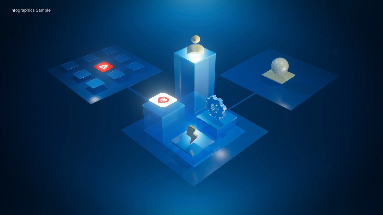
01 / Ignite imagery
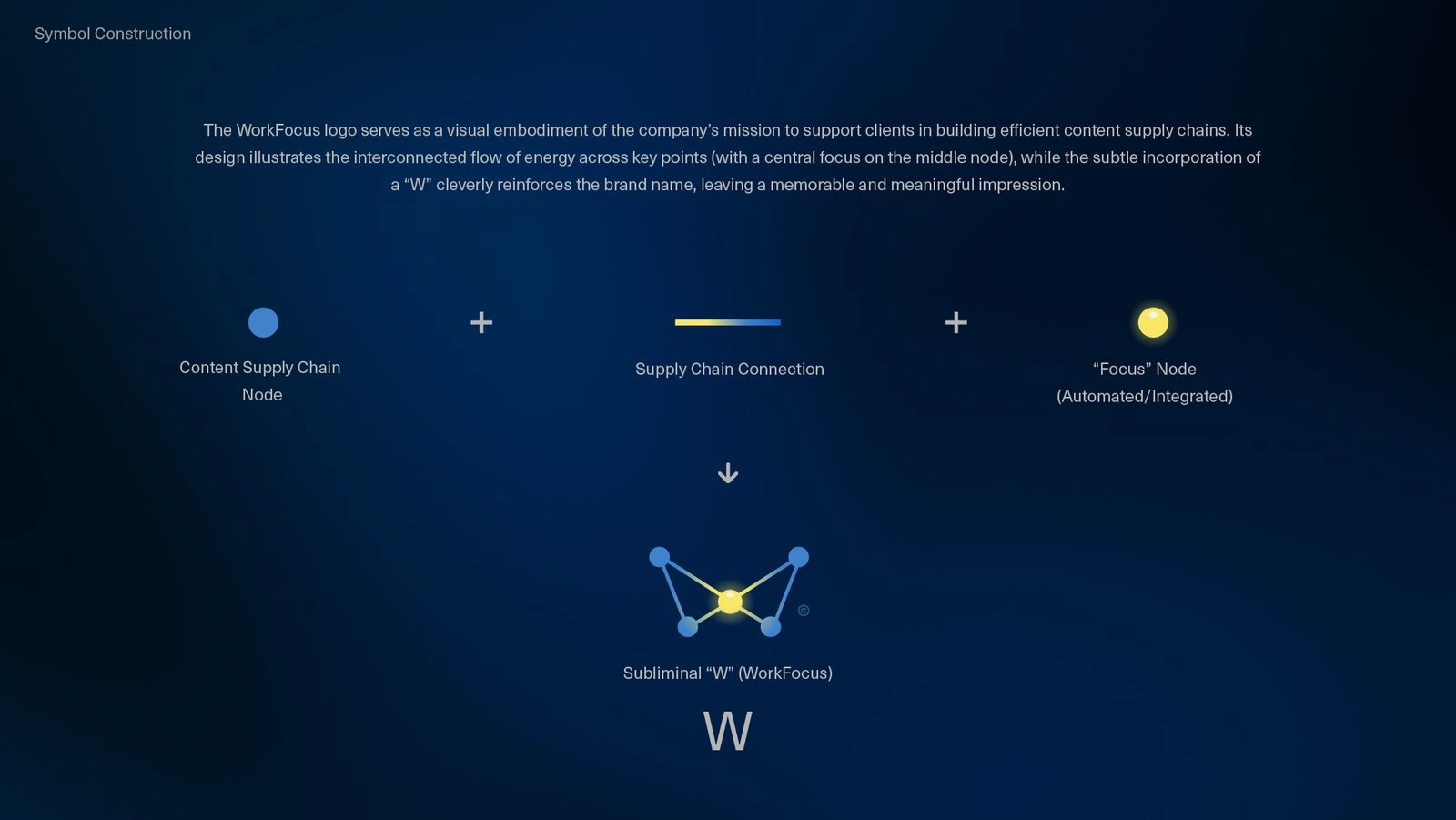
01 / Ignite: four supply chain nodes form a subliminal W around one lit focus node
02 / Nodes
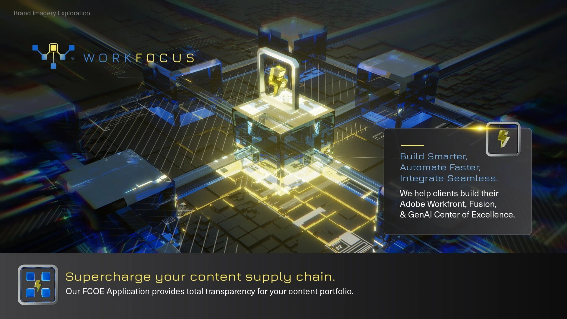
02 / Nodes imagery
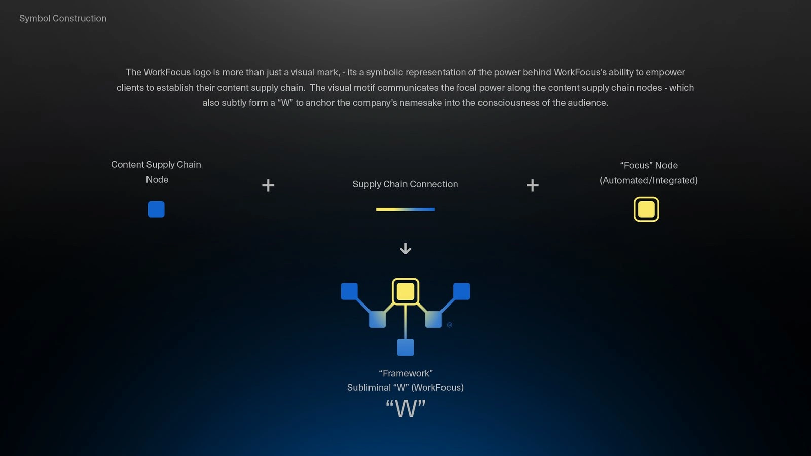
02 / Nodes: a branching container network that builds, automates, and integrates
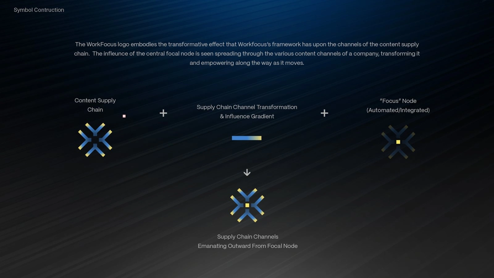
03 / Transformation
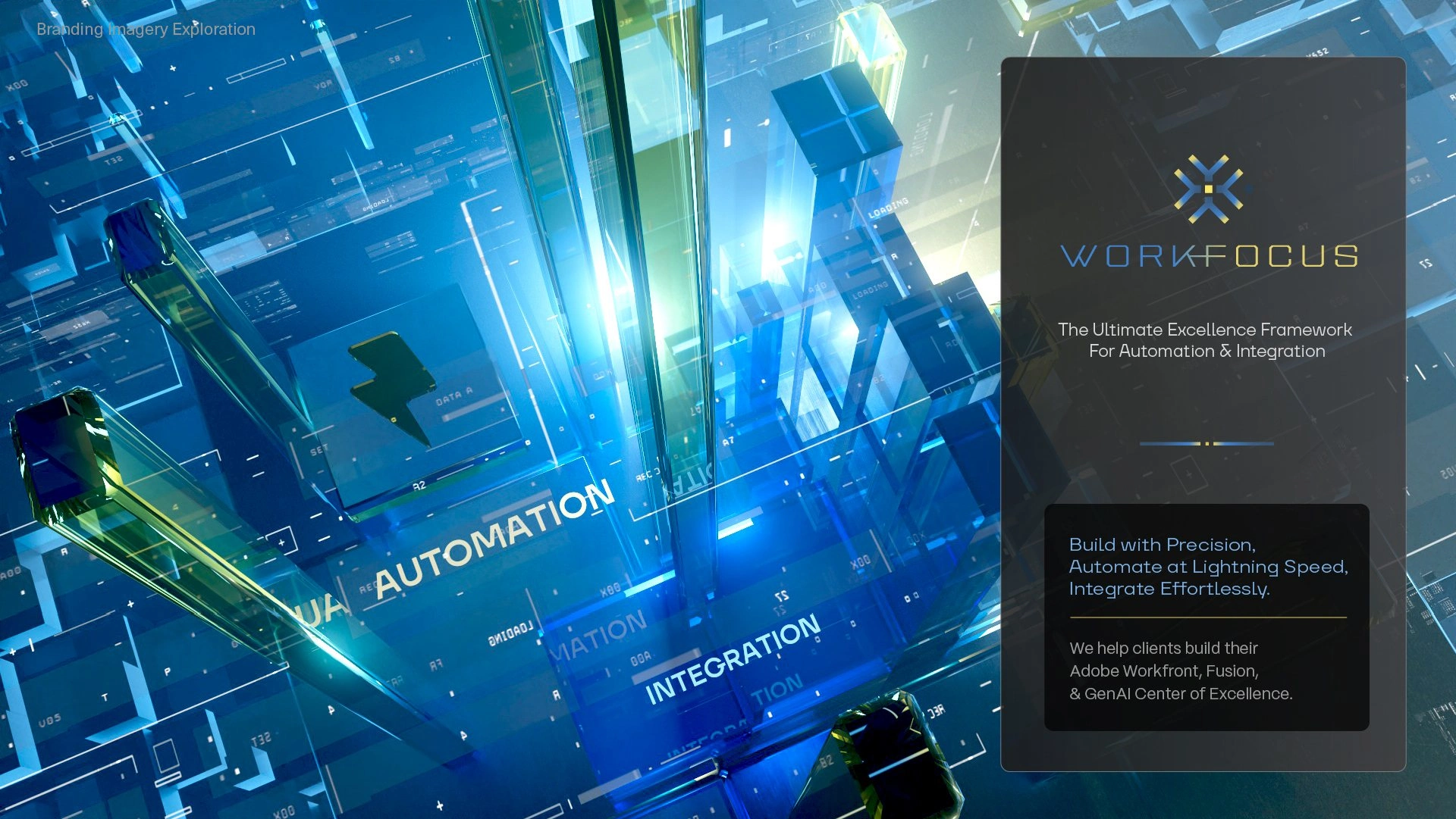
03 / Transformation imagery
03 / Transformation: four channels converging into an automation core
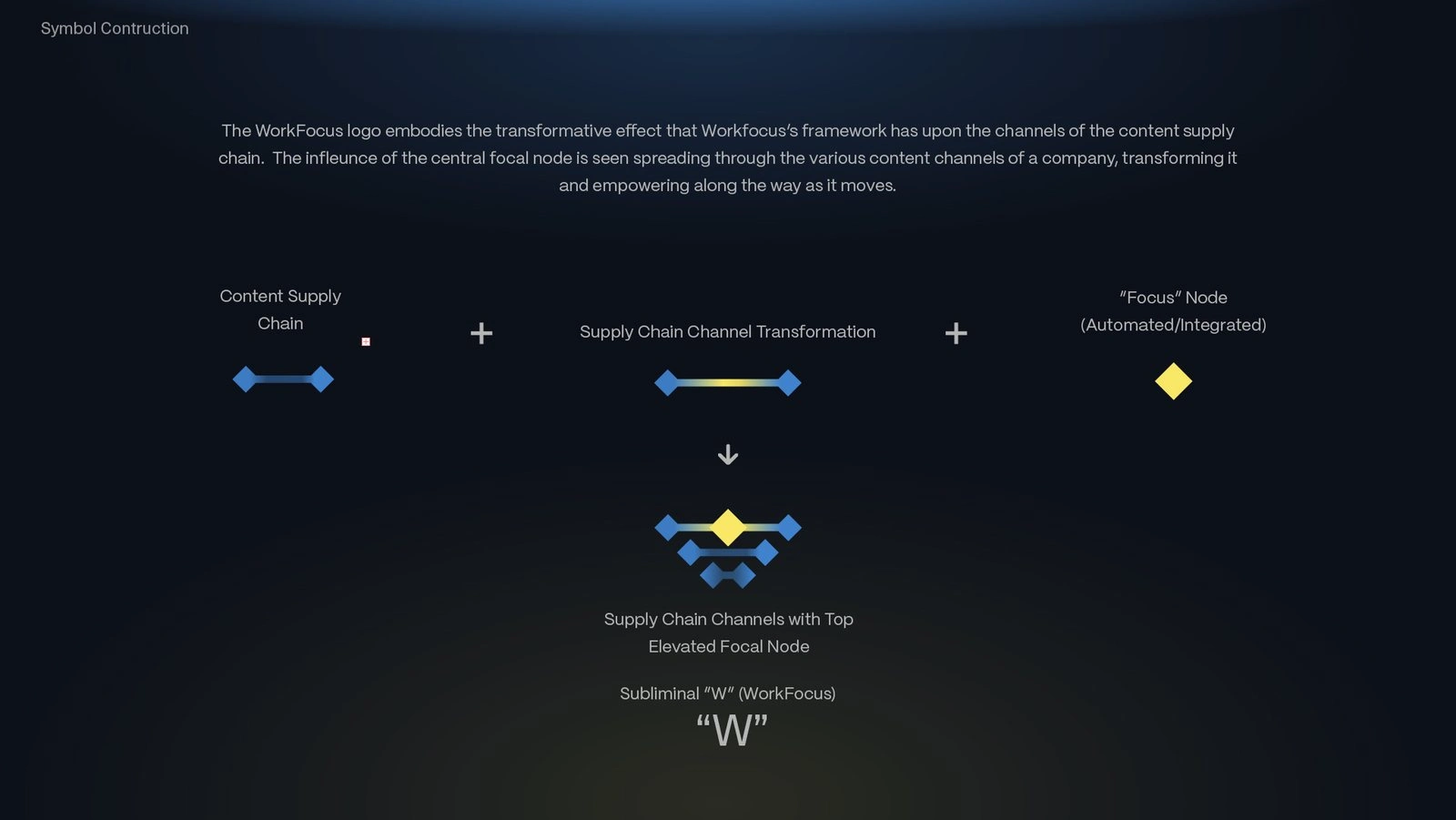
04 / Illuminate
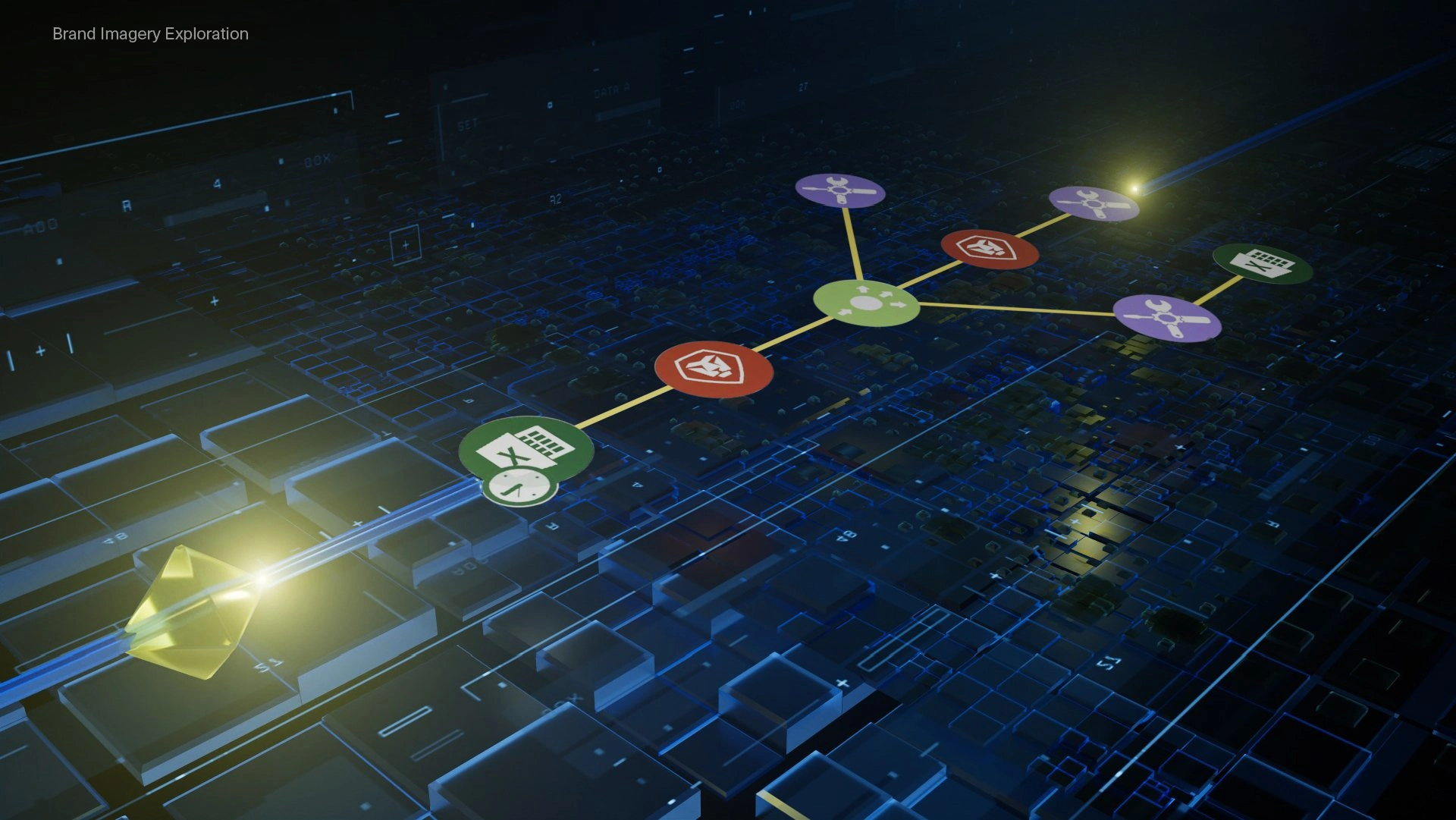
04 / Illuminate imagery
04 / Illuminate: a lit diamond tracing the path a campaign takes
05 / Spark

05 / Spark infographic
05 / Spark: data points drawn inward to a single focus
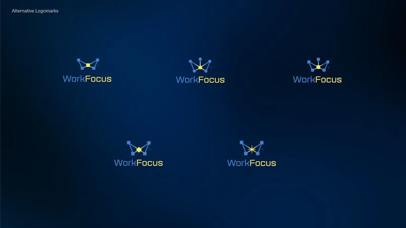
Ignite alternate lockups
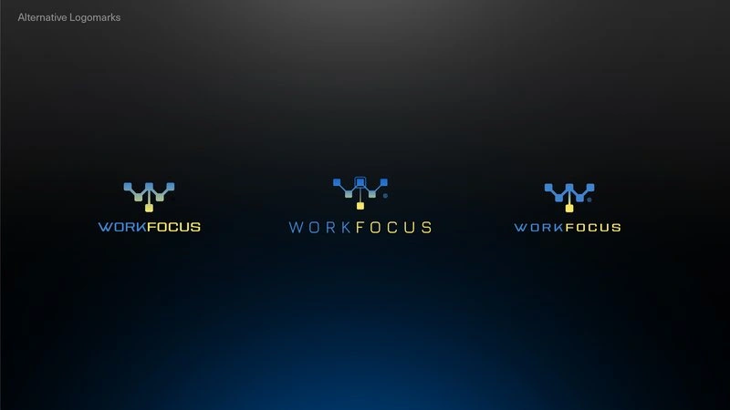
Nodes alternate lockups
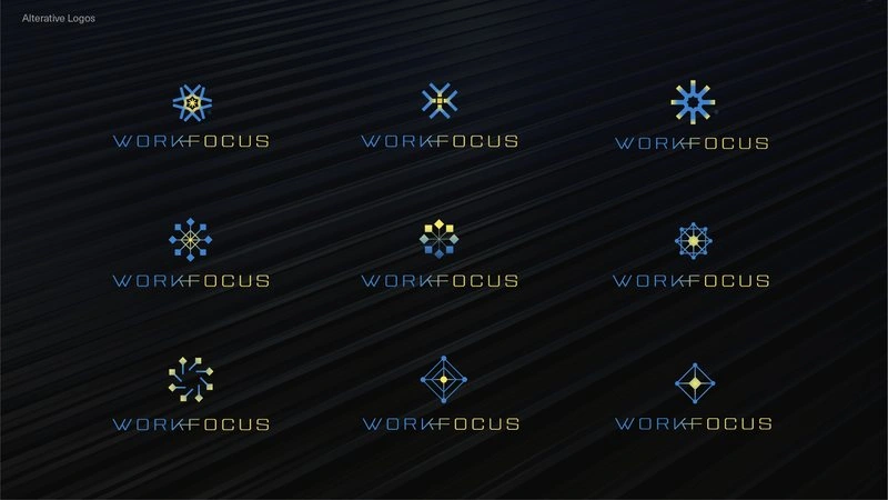
Transformation alternate lockups
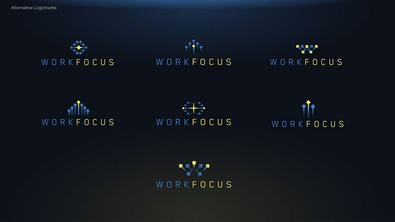
Illuminate alternate lockups
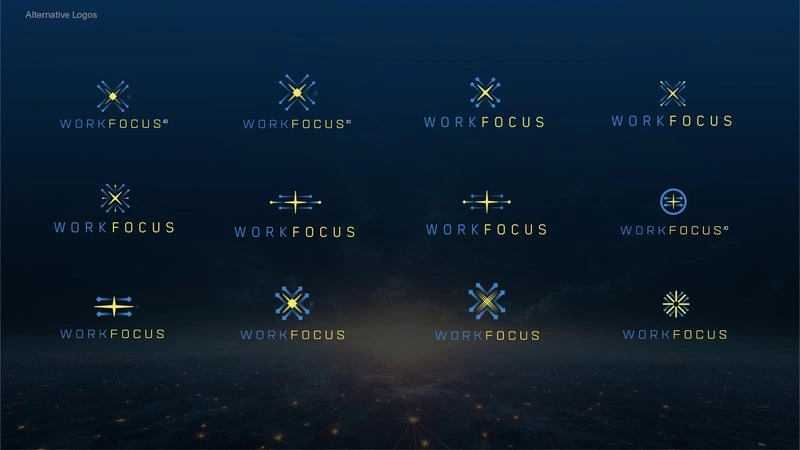
Spark alternate lockups
Alternate lockups explored inside each direction
Refinement
Ignite won, and six rounds of refinement took it from first concepts on 25 March to the final mark on 14 April 2025. The outer nodes became squares, and the yellow sphere stayed the one lit element in the mark.
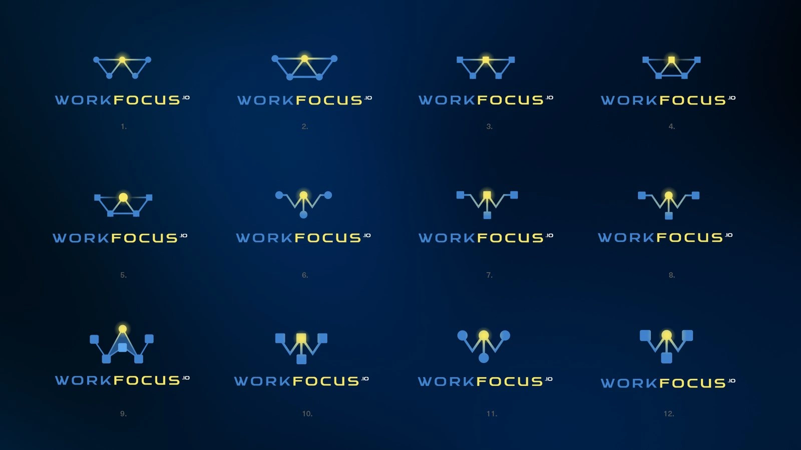
Round 3 variants
The Identity
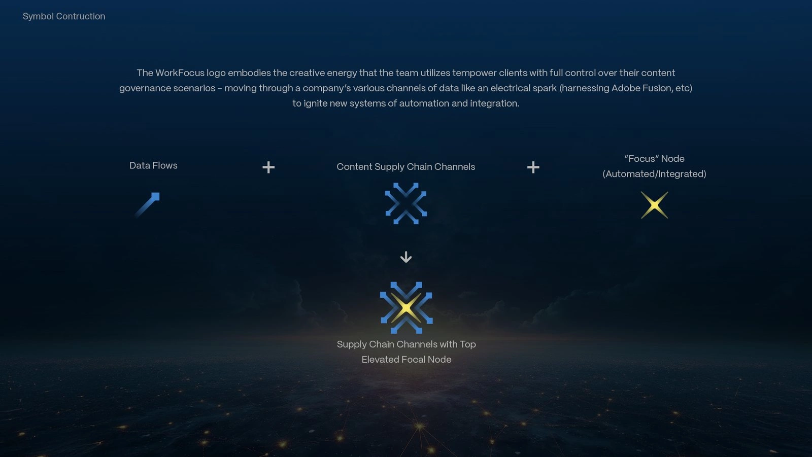
Four blue nodes form a W around a single yellow sphere. The nodes stand for the containers in a content supply chain, the systems and asset stores a campaign has to pass through, and the sphere is the master control node where focus originates. Information travels both ways along the connections, with work dispatched outward from the campaign and performance metrics flowing back to it.
Color carries the same logic. Blue holds the trust a client places in automated workflows, and yellow holds the energy WorkFocus brings to transforming them, used sparingly enough that it always marks where attention should go. Typography was split by job. Aguda, a modular technical face, is reserved for short hero lines; TT Firs Neue carries enterprise headlines; Inter handles long reading; and an all-caps Bardig Bold wordmark is weighted to balance the symbol in vertical and horizontal lockups.
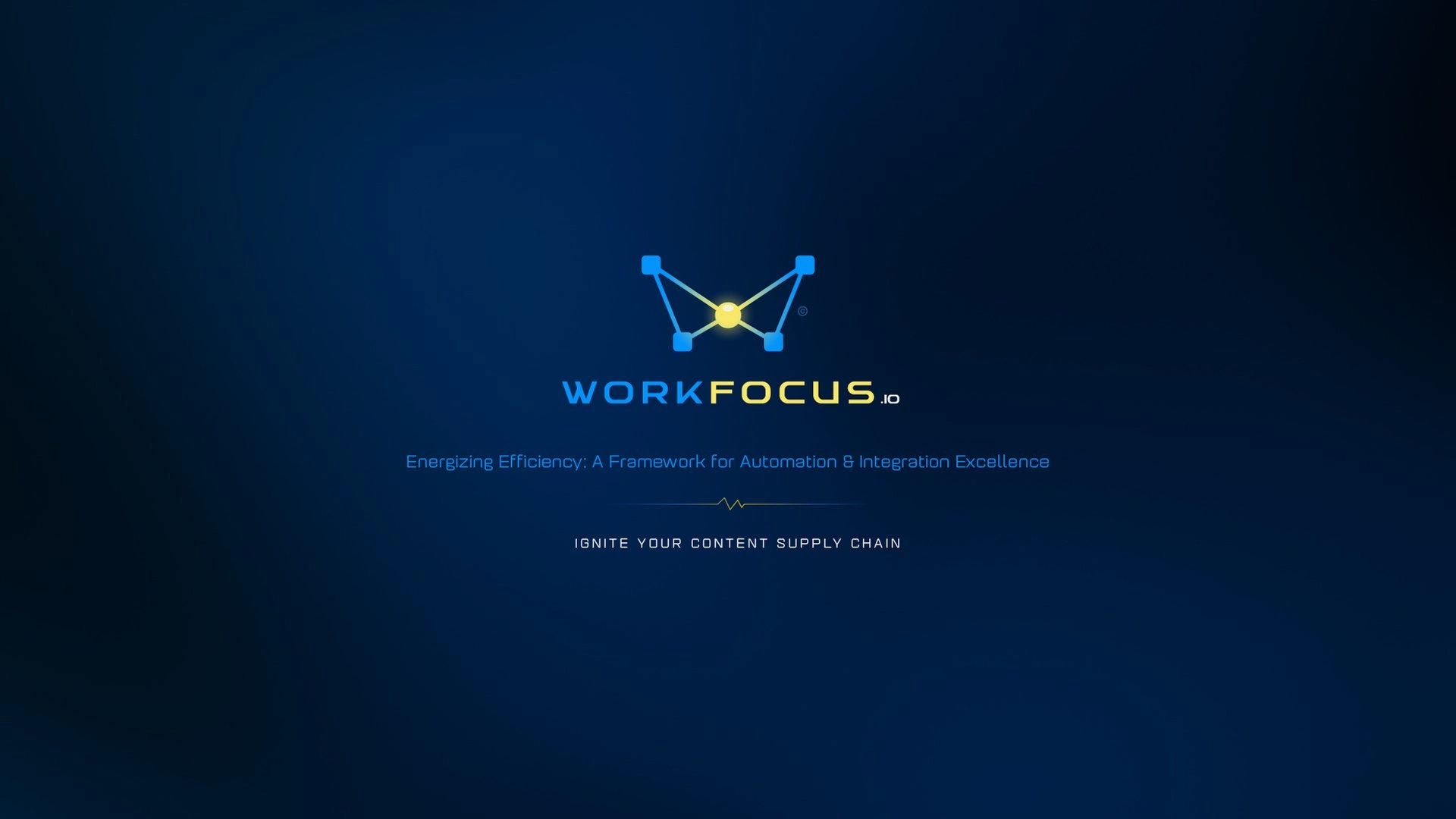
WorkFocus identity, April 2025
WorkFocus identity, April 2025
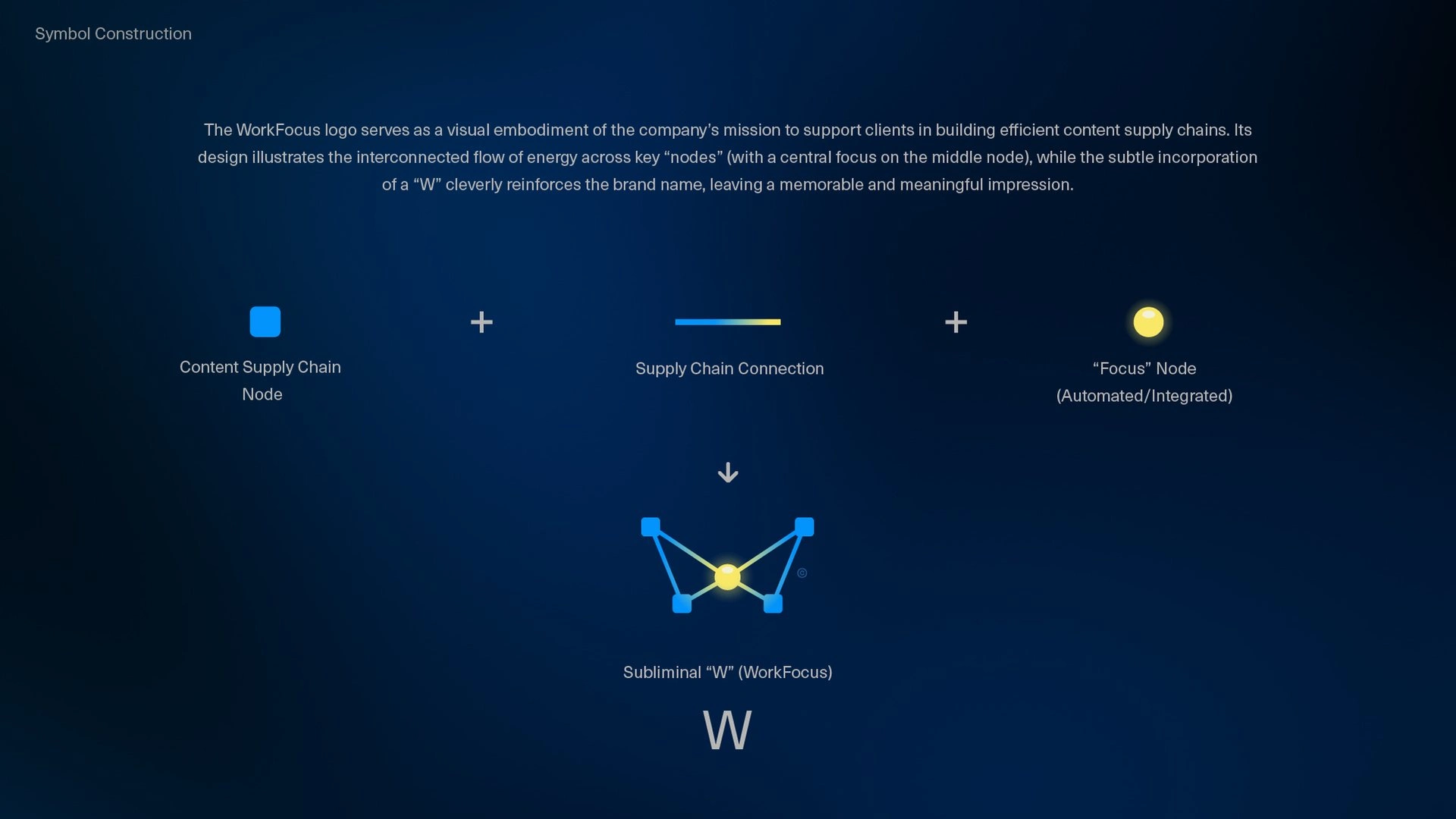
Symbol construction
Symbol construction: supply chain nodes, connections, and the focus node
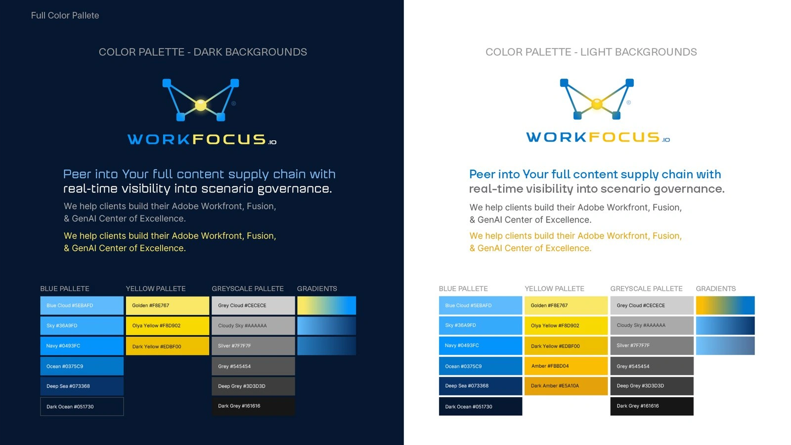
Color
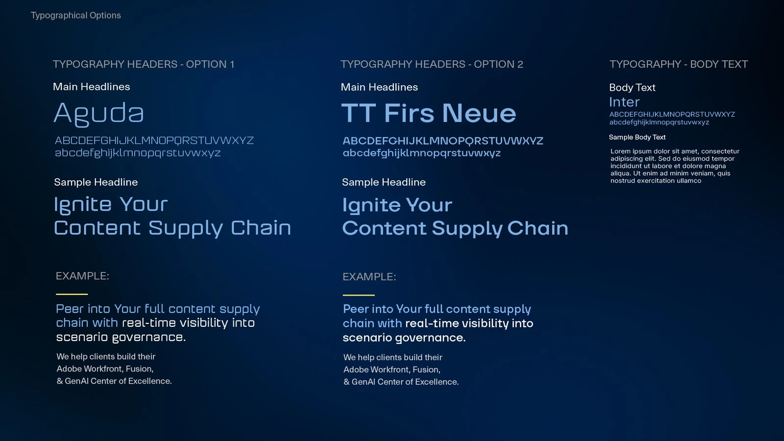
Type system
Color for dark and light grounds / type system
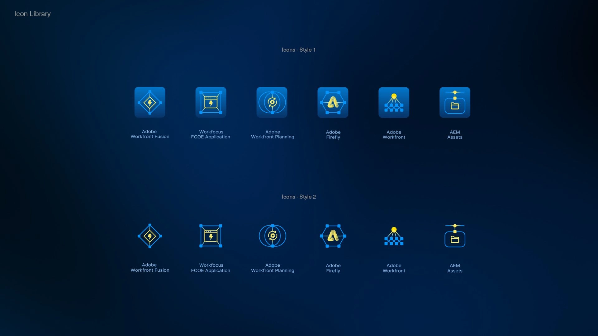
Icon set
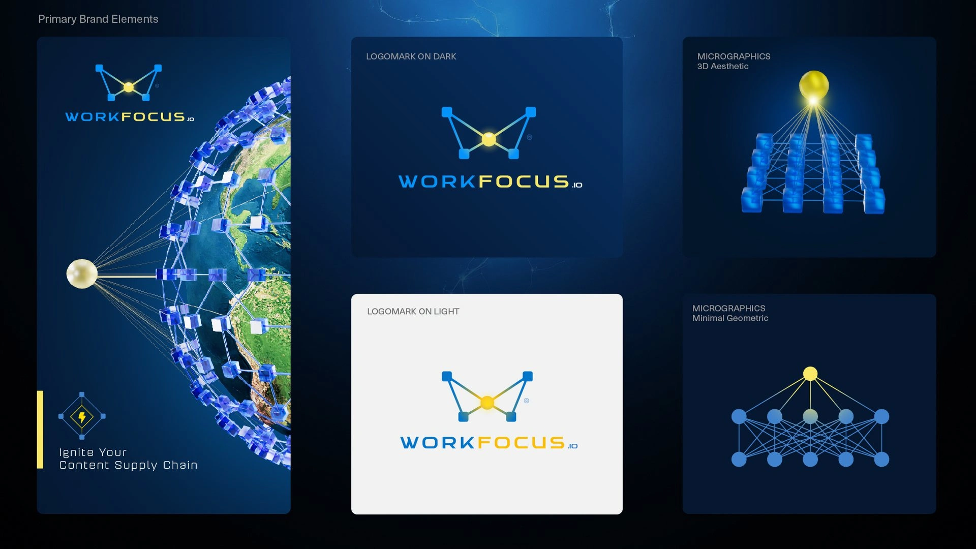
Primary brand elements
Service-platform icon set / primary brand elements
Imagery Library & Style Guide
Goal: Build a visual language the WorkFocus team could use without a designer in the room, and one that could explain an abstract workflow to an executive in a single frame.
Strategy: The library has three registers, each with its own job. Rich 3D, built in Cinema 4D, carries the large metaphors, with the content supply chain rendered as topographic terrain and the planning sphere wired out to asset nodes spread across it, the logo's own logic scaled up to a world. Minimal geometric forms carry hierarchy and relationships with nothing but circles, squares, and lines, which keeps a diagram readable on a phone or on a slide at the back of a room. Isometric infographics carry the step-by-step views a sales lead needs when walking a client through a rollout. The 38-page Identity Style Guide documents the reasoning behind every element along with the rules, so the logic travels with the assets when someone else picks them up.
Role: Identity Style Guide, rich 3D and geometric imagery libraries, isometric infographic system, PowerPoint template, Teams backgrounds, Slack and Jira workspace icons, LinkedIn graphics, and the 2025 holiday e-card.

Rich 3D

Rich 3D
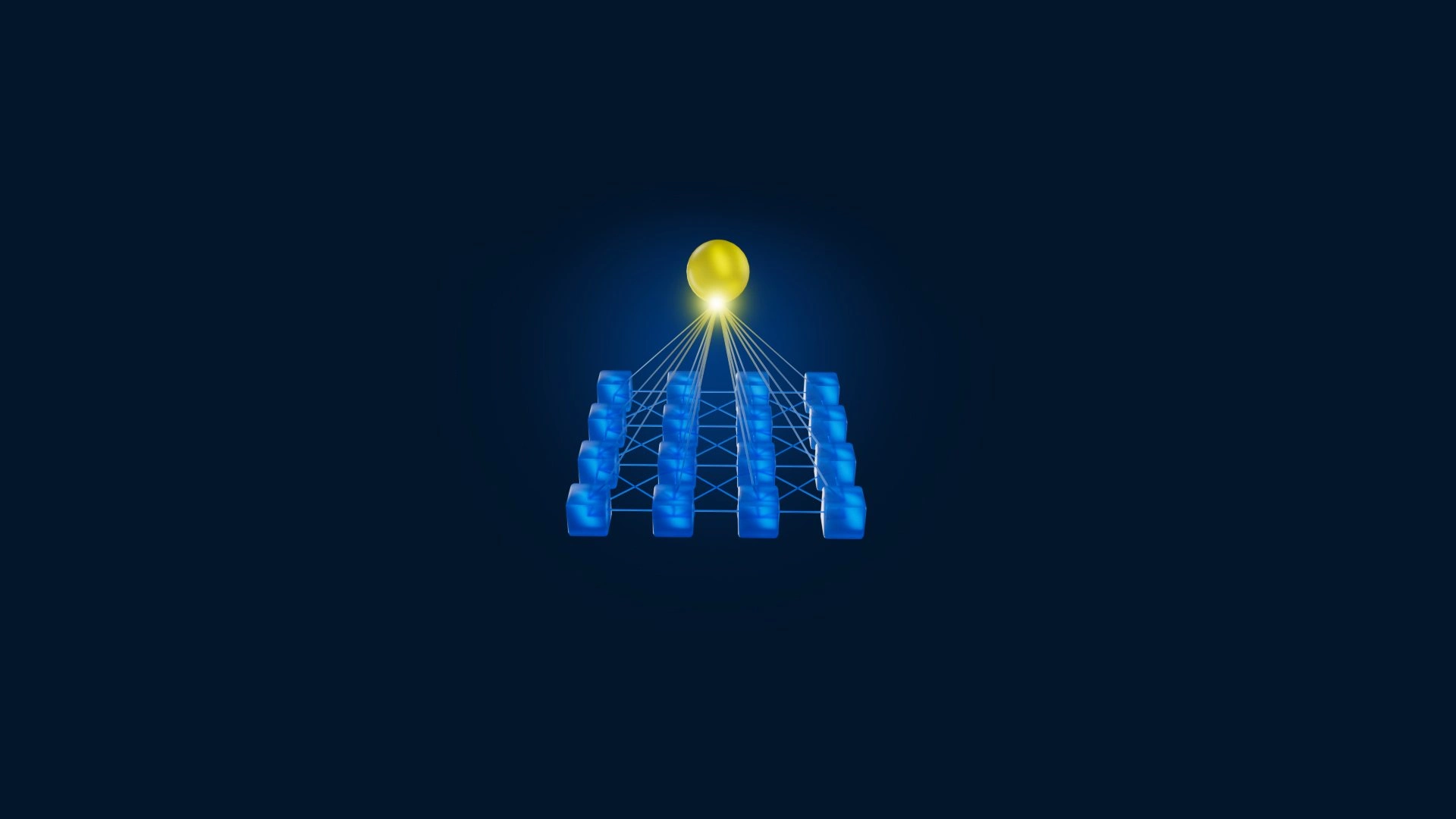
Rich 3D
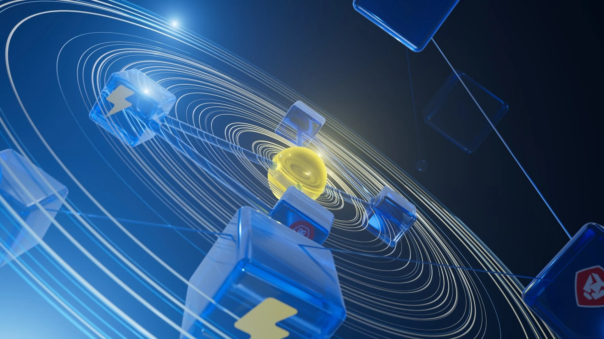
Rich 3D

Rich 3D

Rich 3D
Rich 3D

Minimal geometric forms
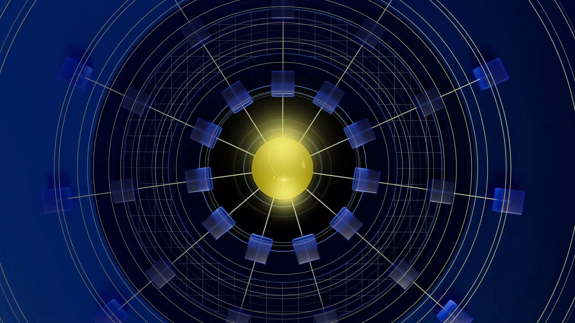
Minimal geometric forms

Minimal geometric forms

Minimal geometric forms
Minimal geometric forms

Isometric infographic
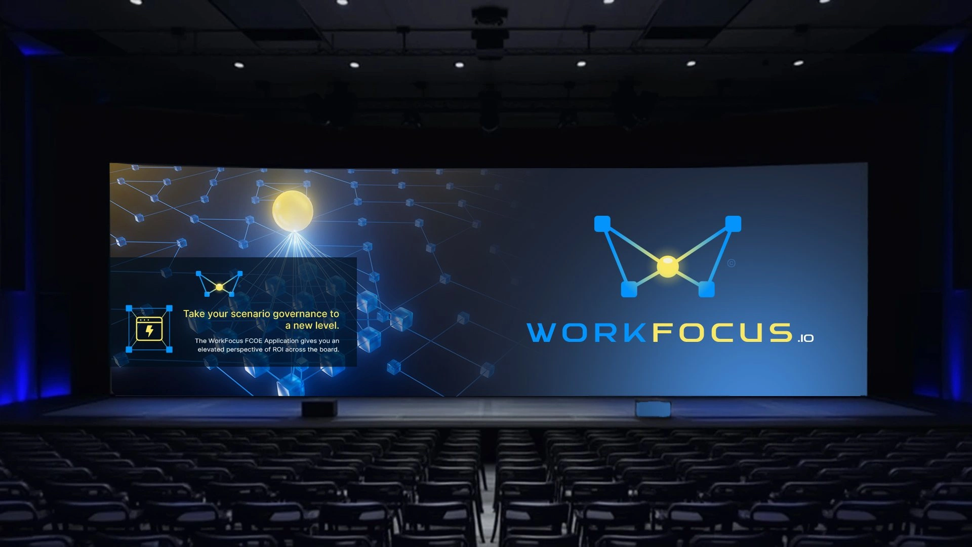
Conference stage
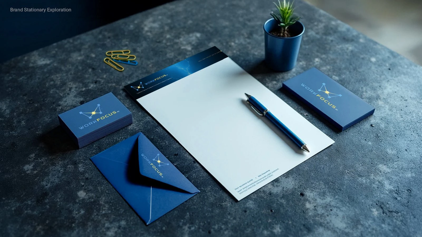
Stationery
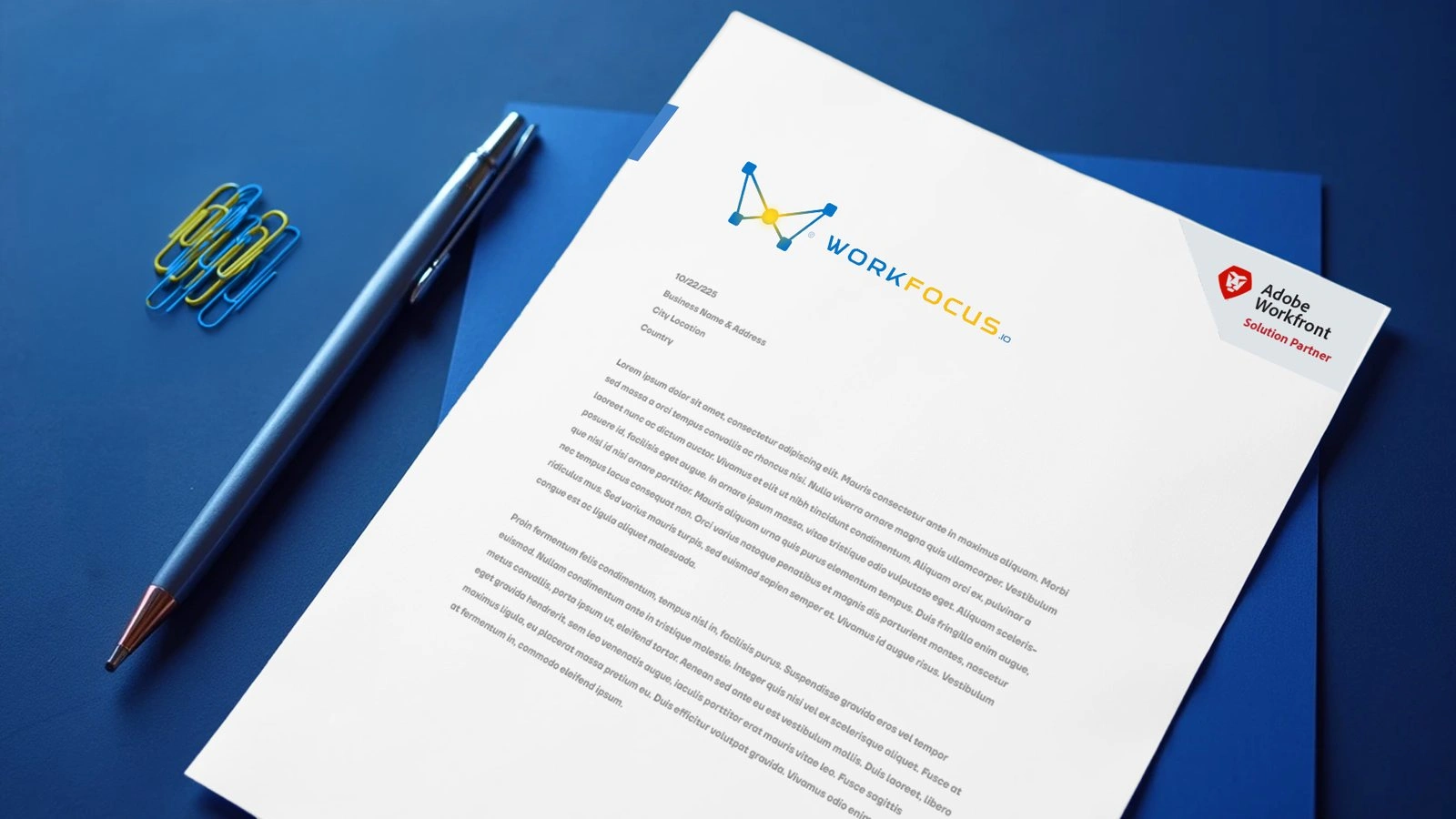
Letterhead
Conference stage, stationery, and letterhead
Website & Microsites
Goal: Move workfocus.io from a wall of service descriptions toward a site that explains the company quickly and gives every visitor an obvious next step, then give each launch and event a destination of its own.
Strategy: The relaunch grew directly out of the audit: lead with one clear value proposition, group services into categories that explain why and how instead of listing every product, write calls to action around outcomes, and hold navigation and spacing consistent from page to page. I designed the new site in May 2025, with the 3D and geometric imagery doing the explanatory work paragraphs had been doing before, and WorkFocus launched it on 18 June 2025 as the CSC Ignite reskin. As the company moved into product launches, the web work shifted to microsites built for a single job each: fox.workfocus.io for the mascot and trial offer, a Summit session page, a free trial page and demo booking page for the Center of Excellence, and a feature clips library.
Role: Site audit, information architecture, page designs for the CSC Ignite relaunch, fox.workfocus.io, Summit session landing page, CoE free trial and demo booking pages, feature clips page, and campaign touts.
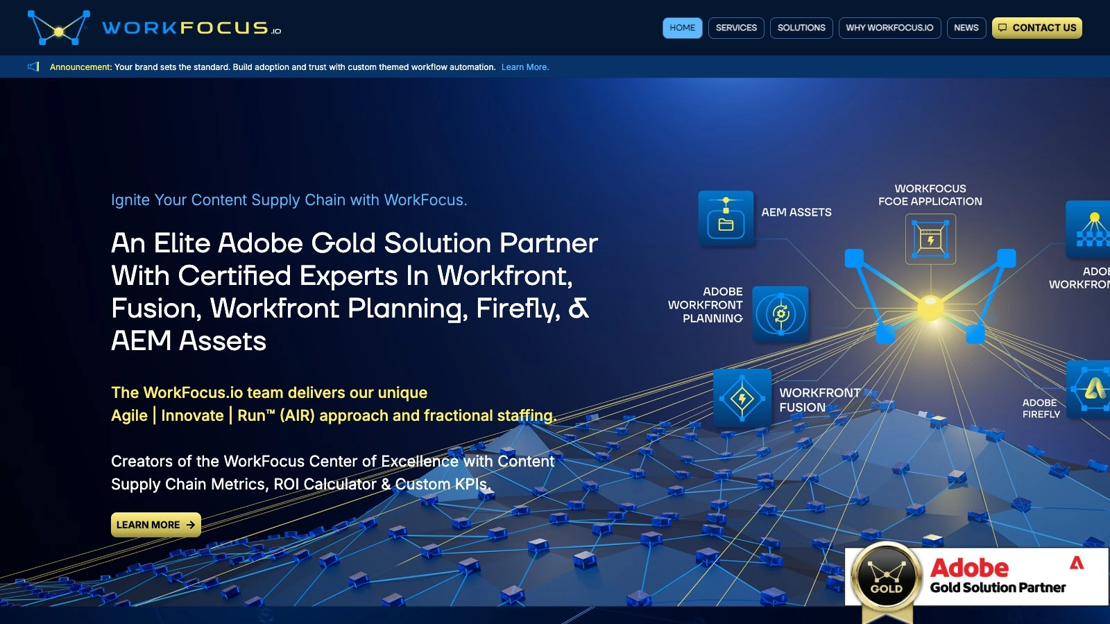
workfocus.io home
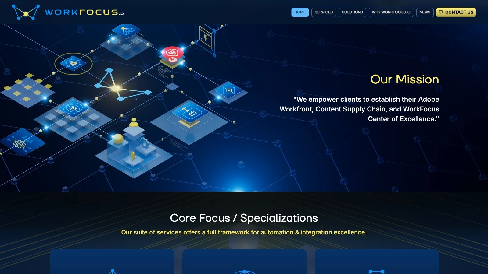
Mission section
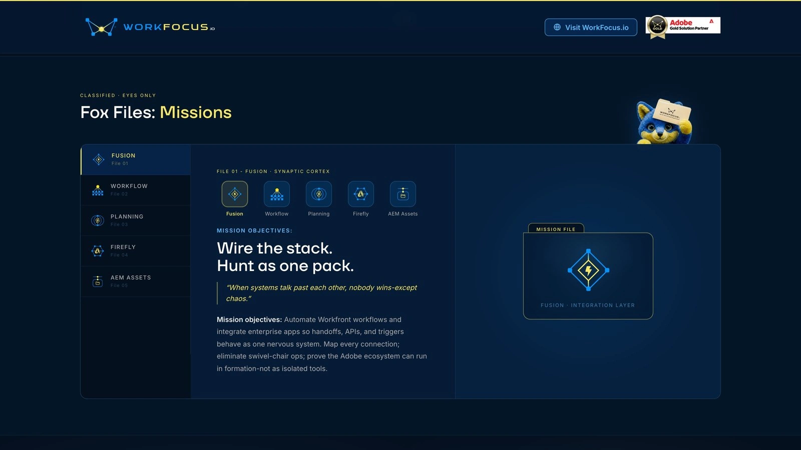
fox.workfocus.io mission files
workfocus.io home / mission section / fox.workfocus.io mission files
Center of Excellence
Goal: Brand WorkFocus's own software so it could grow across Adobe's product line and still belong to every client who ran it, and give it a motion language that could launch a feature a week.
Strategy: The product began life as the Fusion Center of Excellence, tied to a single Adobe product, and became the WorkFocus Center of Excellence so Planning, Firefly, AEM Assets, and whatever came next could join without a rebrand. Its custom theming feature lets a client upload its own logo so the app renders as that client's Center of Excellence, and the identity was built to be recognizable enough to sell the product and disciplined enough to step aside once a client owned it.
The motion work used the same 3D world as the imagery library. The 30-second trailer in July 2025 flew through the terrain into the product. In the five weeks before Summit, WorkFocus shipped one feature a week, and each went out with its own clip: the Gantt++ chart, the Planning ER diagram, the Fusion ROI dashboard, Fusion KPIs, auto-documentation, and the slide library. Those chapters were then cut together into the two-and-a-half-minute Center of Excellence film that looped on the booth screens in Las Vegas.
Role: Product naming input, splash screen and theming system, 30-second trailer, feature focus clips, Center of Excellence Summit film, launch graphics, and Adobe Exchange app icons.
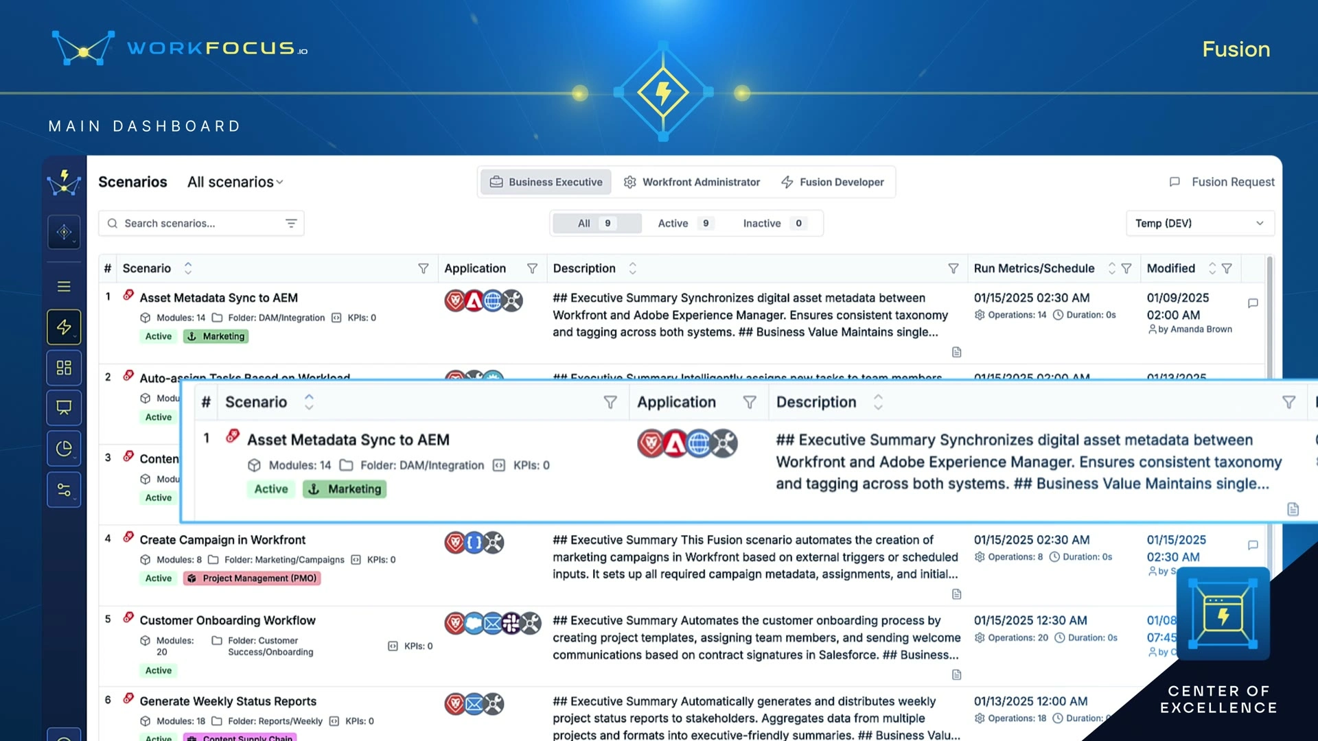
Center of Excellence, Fusion
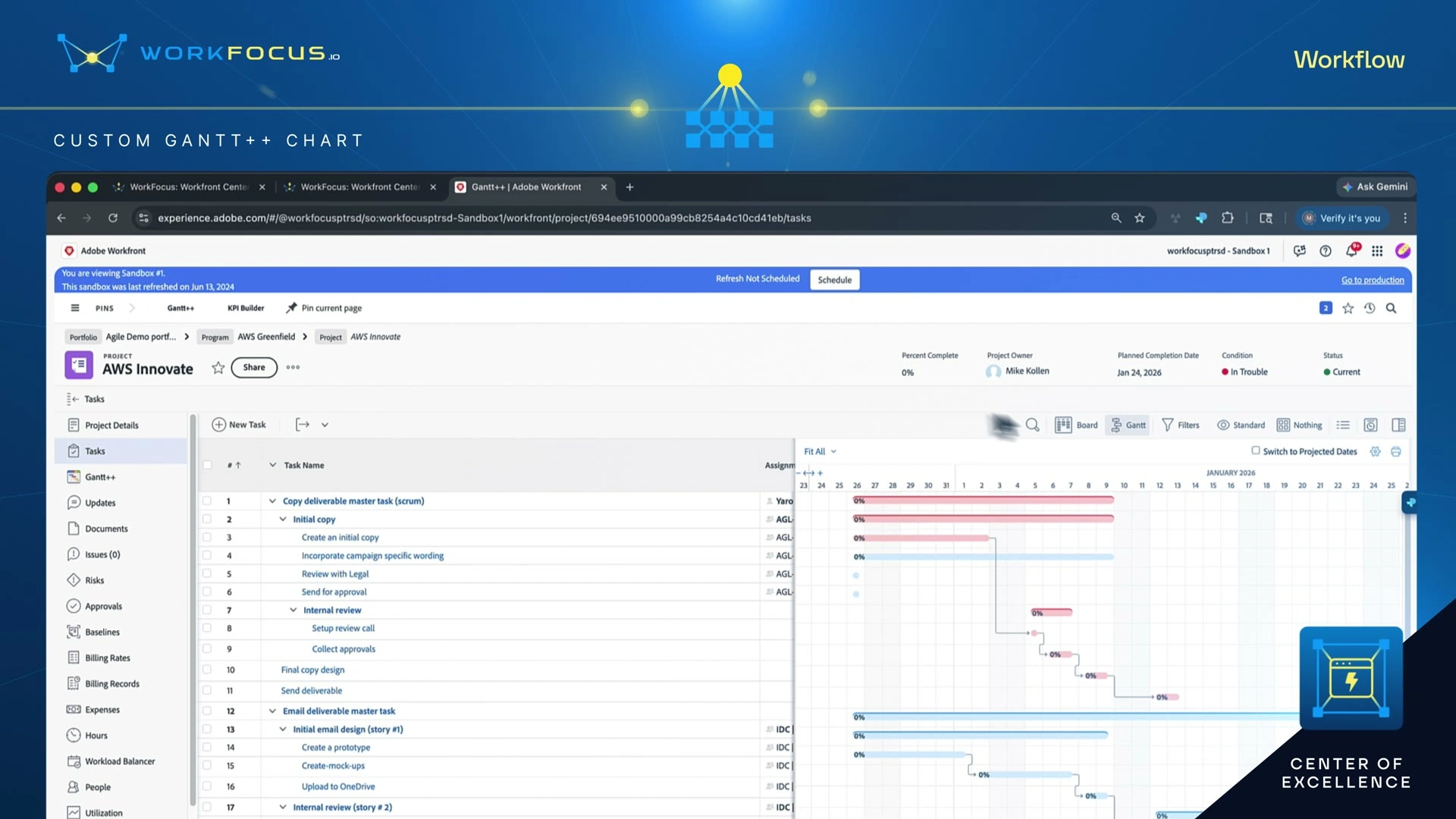
Center of Excellence, Gantt++
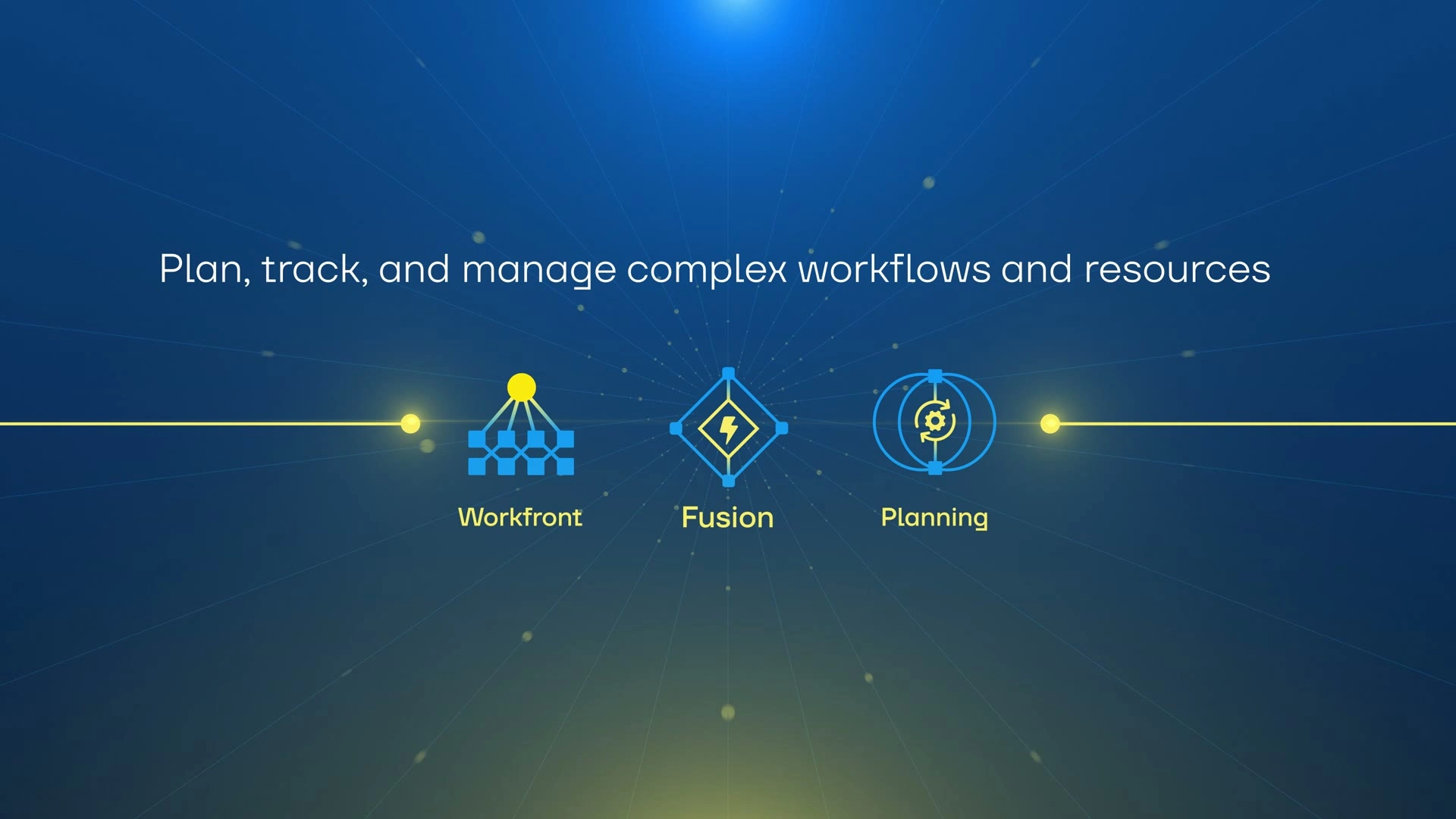
Center of Excellence, Connect
Center of Excellence film, Adobe Summit 2026
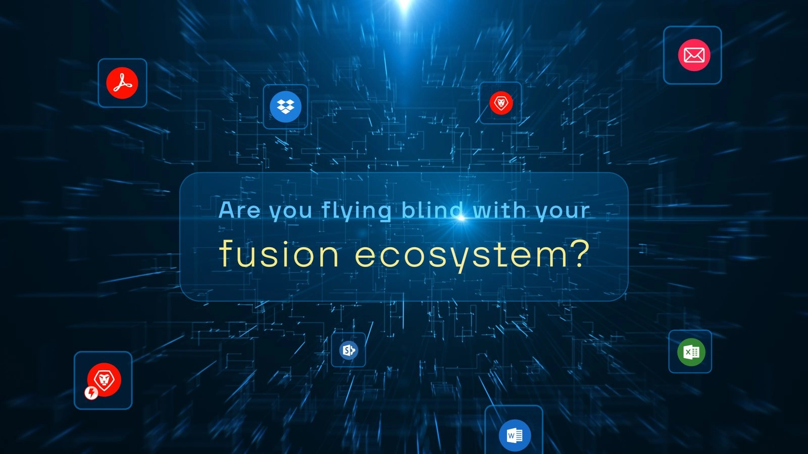
Trailer styleframe
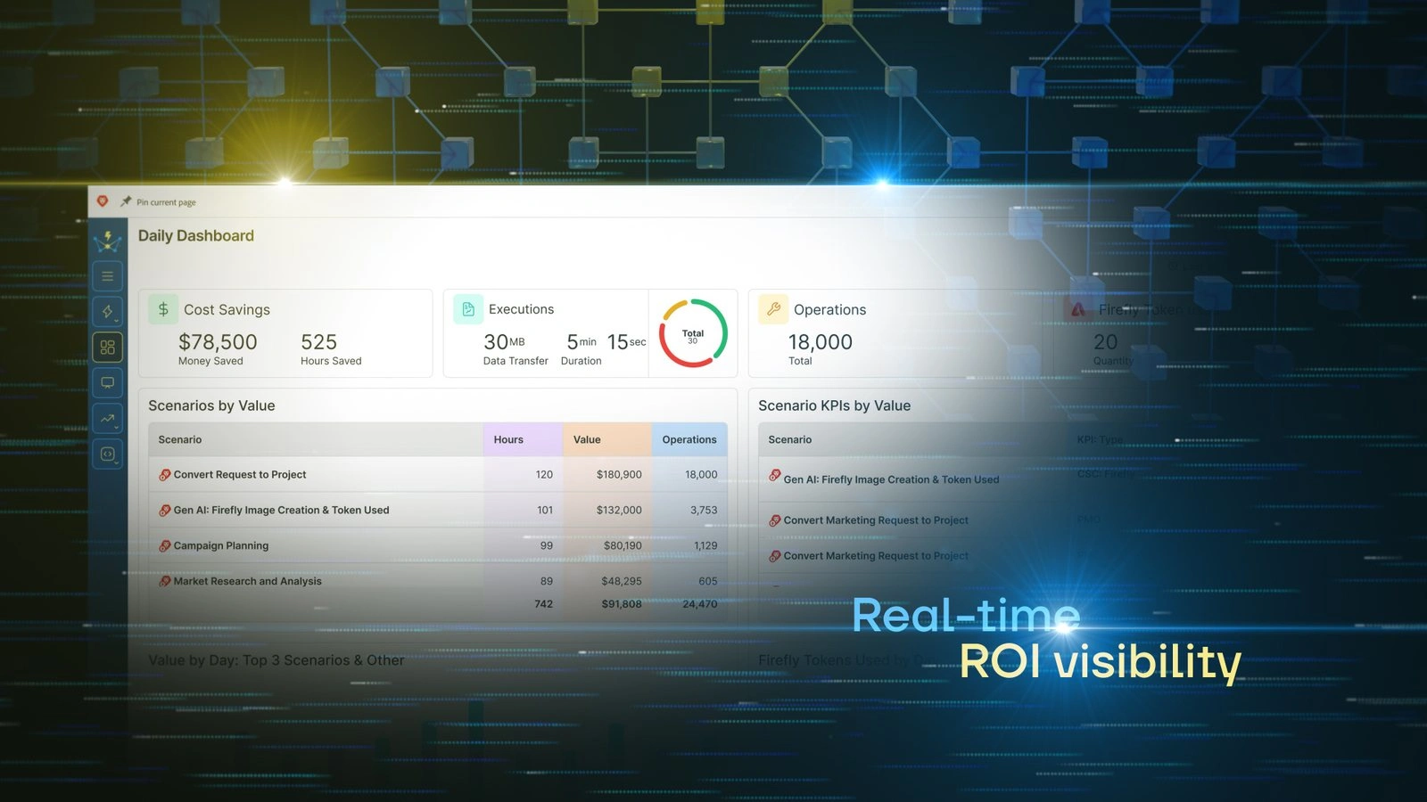
Trailer styleframe

Trailer styleframe
30-second trailer and styleframes, July 2025
Adobe Summit 2026 Booth
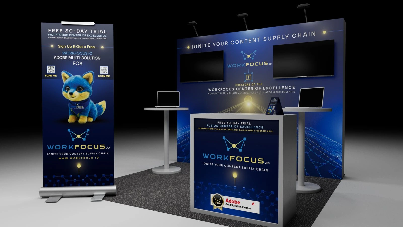
Goal: Make a 10 by 10 foot booth at Adobe's largest event read from the aisle, carry three stories at once (the Center of Excellence launch, WorkFocus's multi-solution services, and a customer session on the main program), and turn foot traffic into named leads.
Strategy: I worked the booth out in Cinema 4D before anything went to print, so every decision could be judged at full scale from the aisle. The first round compared a single 65-inch screen against a pair of 50-inch screens. Later rounds tested where the counter, the roll-up banners, and the fox giveaway should live, and the final renders, elevations, and top-down plan became the reference for production.
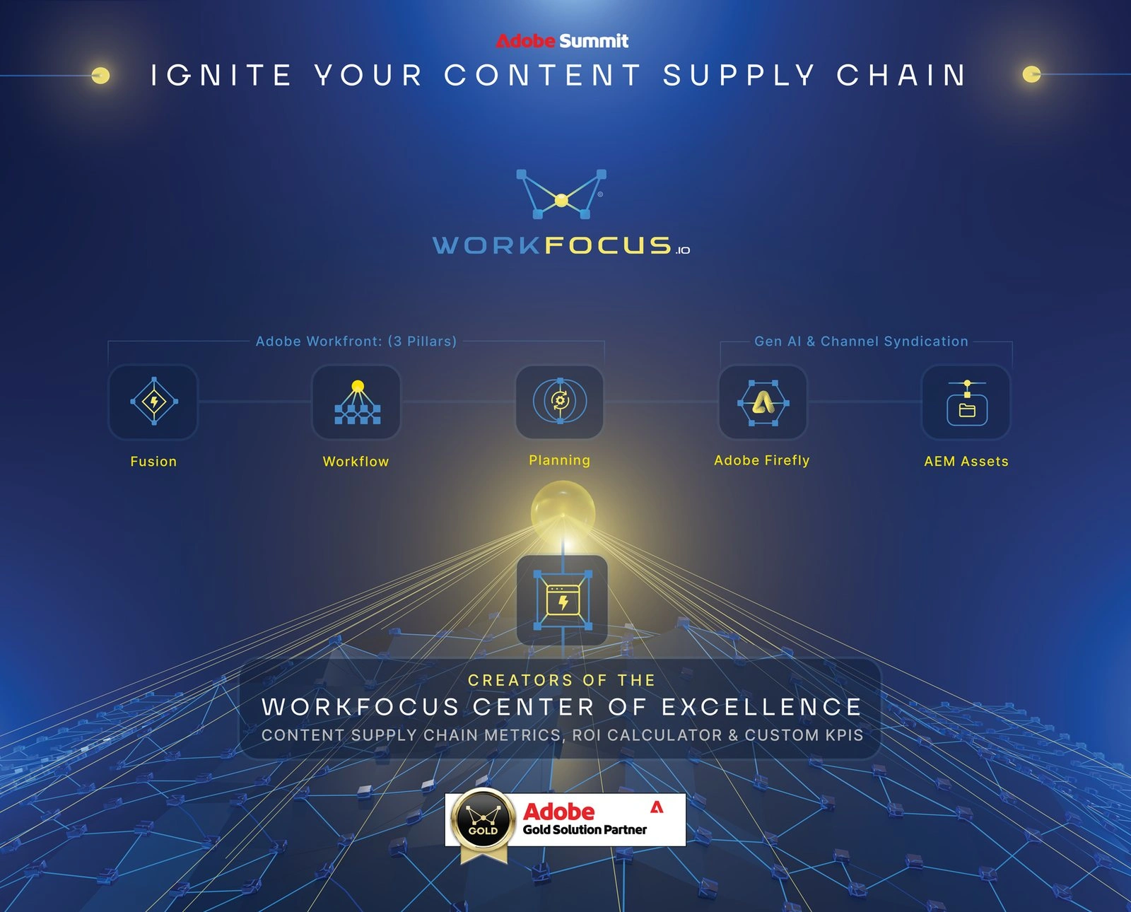
The back wall was kept to brand, product, and the five service icons, with Ignite Your Content Supply Chain across the top where it reads from a distance. Everything time-sensitive moved off the wall onto two freestanding floor boards, which protected the booth against a late shipment or an early sellout: if the foxes ran out, a board came down and the booth still made complete sense. Each board carried two QR codes, one per side, so a crowd would spread across both, and the codes led to a reservation flow that captured the lead whether or not a fox was still on the table.
Role: 3D booth previz, layout and back wall graphics, floor board and counter graphics, QR reservation flow, Center of Excellence booth film, walk-up session clip, apparel and swag, and on-site support during the show.
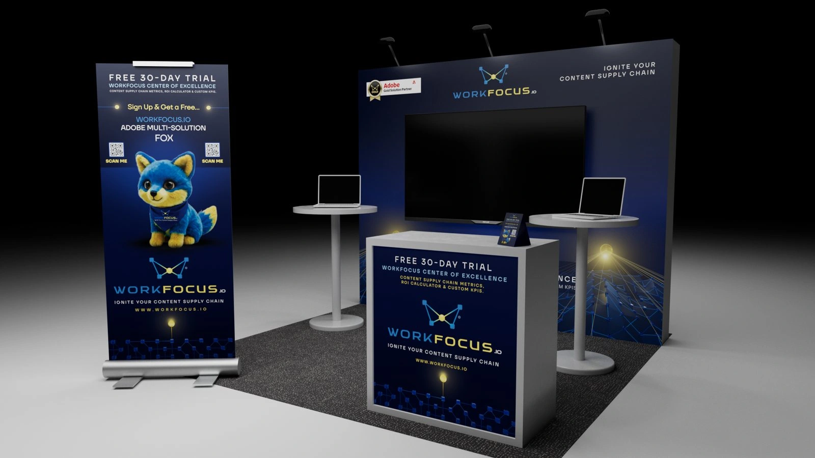
Concept 1, single screen
Concept 2, dual screens
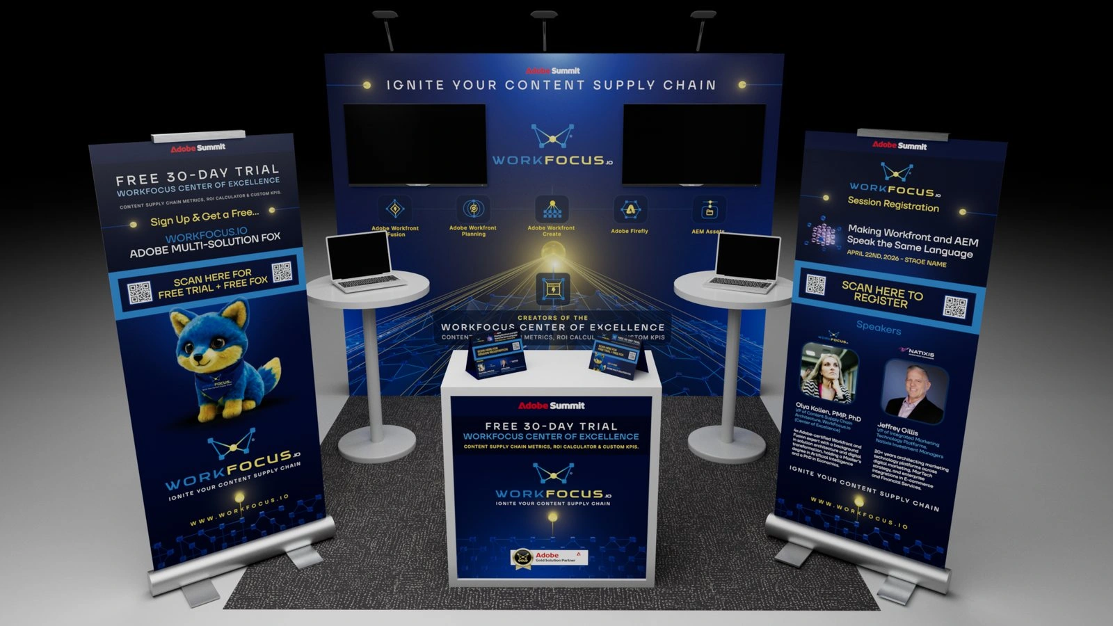
Revised concept
Concept 1, single screen / Concept 2, dual screens / Revised concept
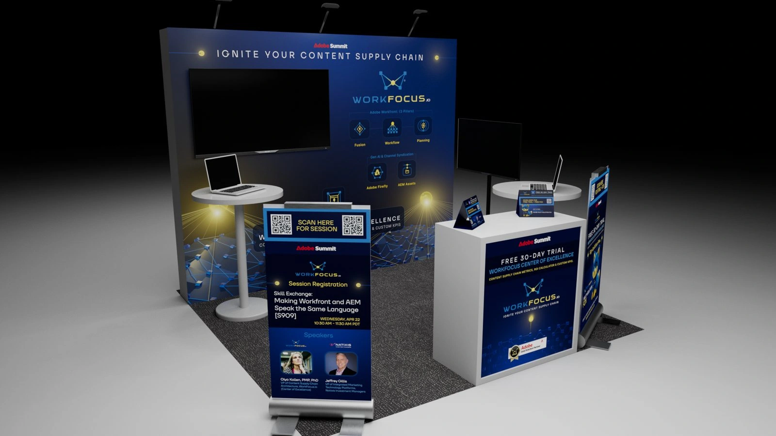
Round 3
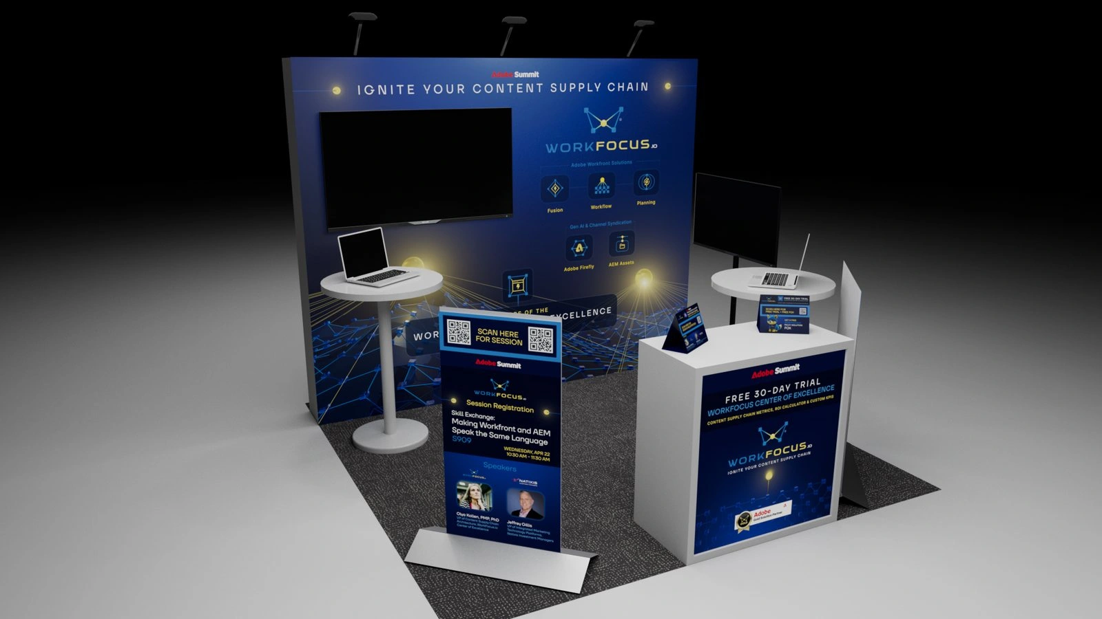
Round 4
Round 3 / Round 4
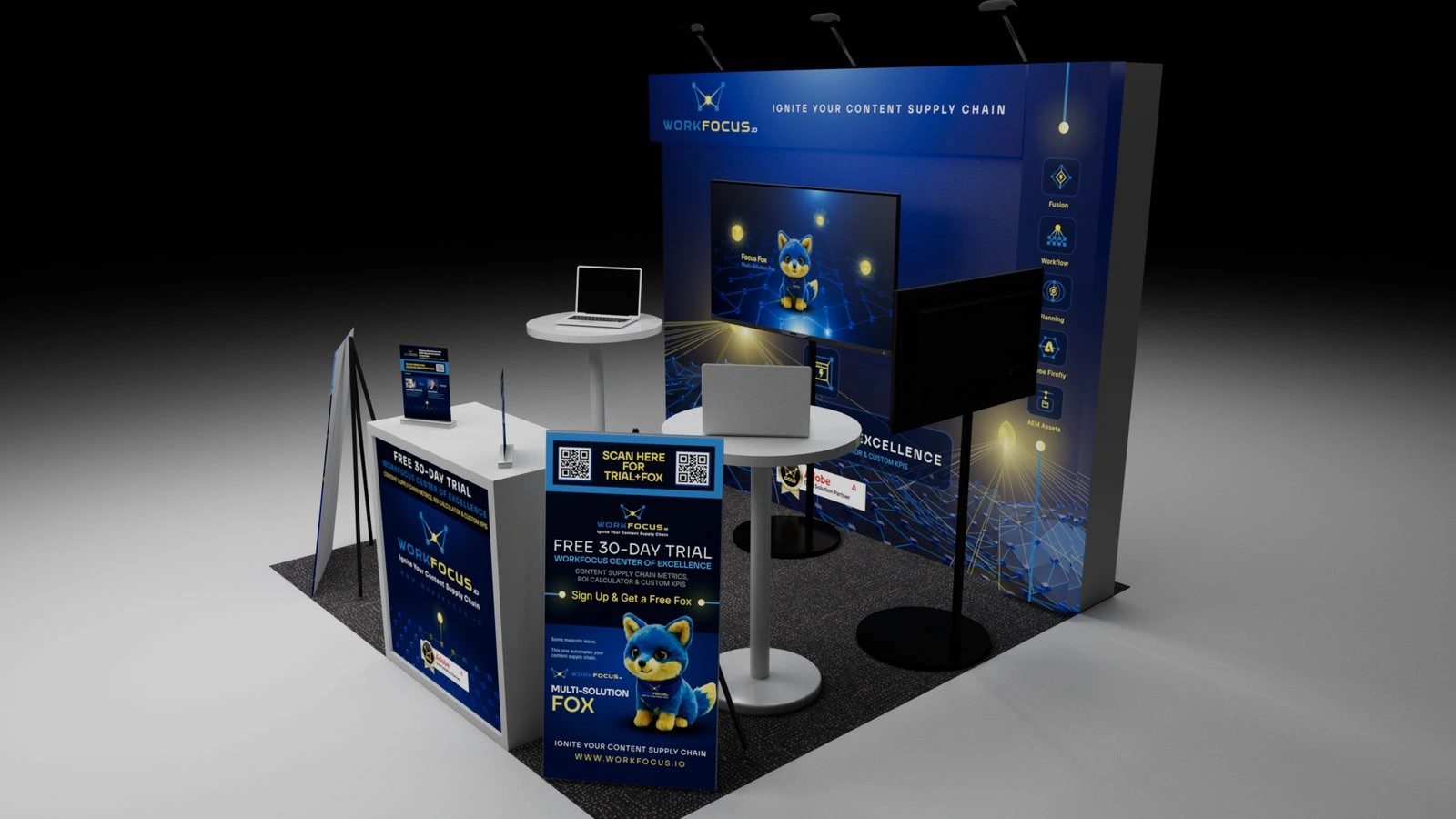
Final booth previz
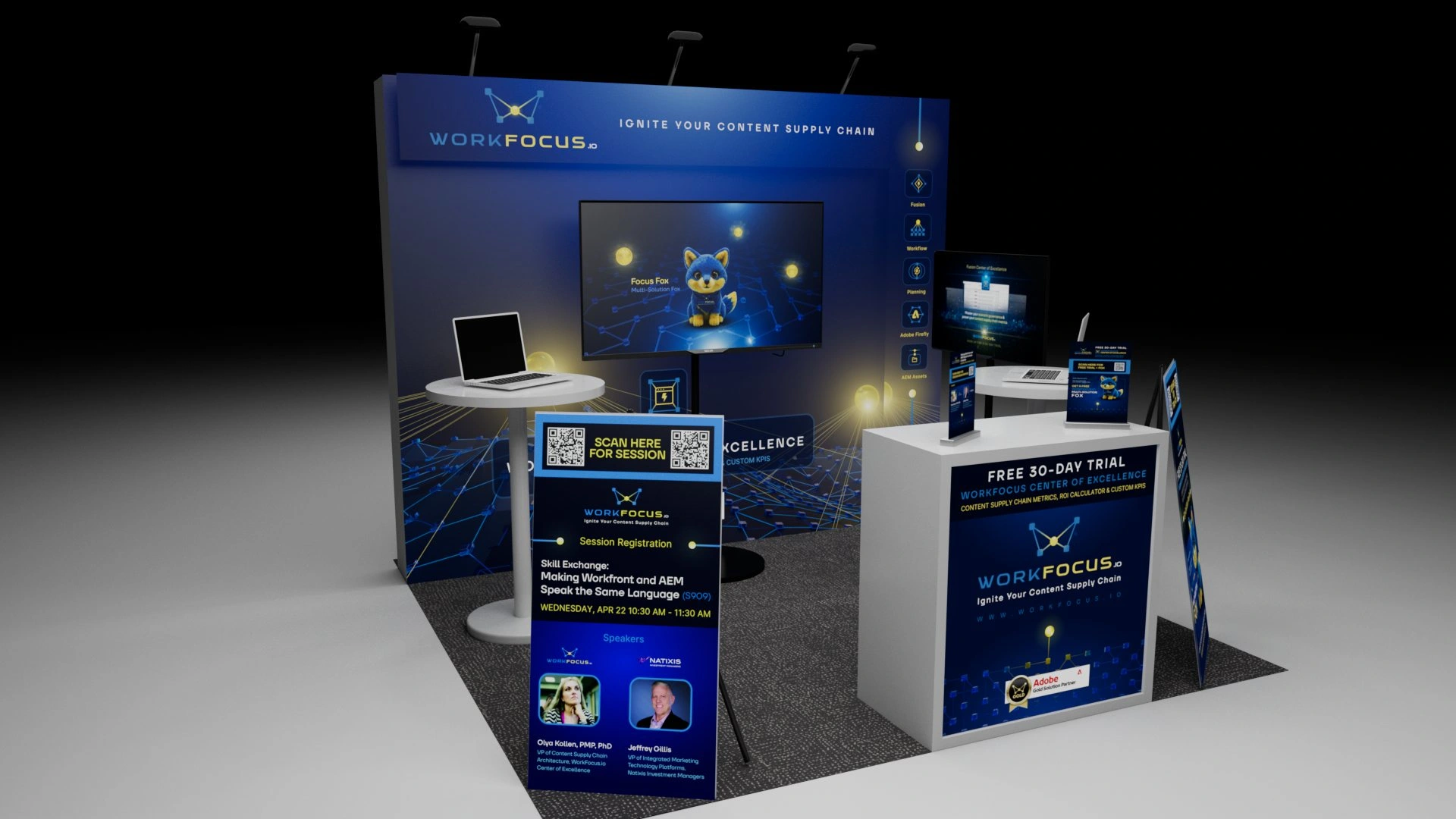
Final booth previz
Final booth previz
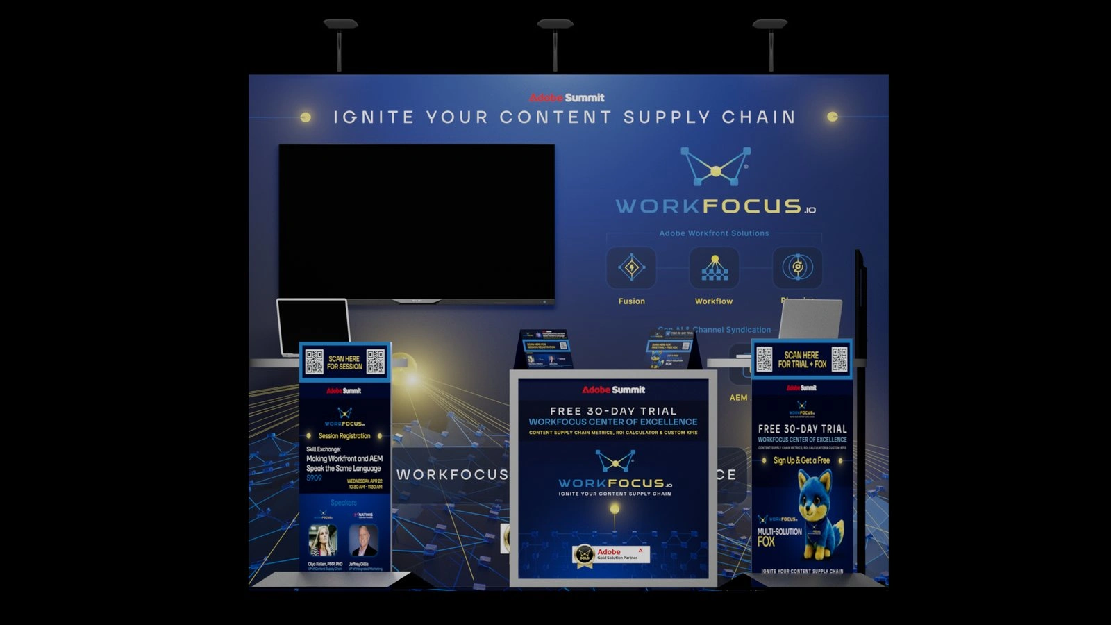
Front elevation
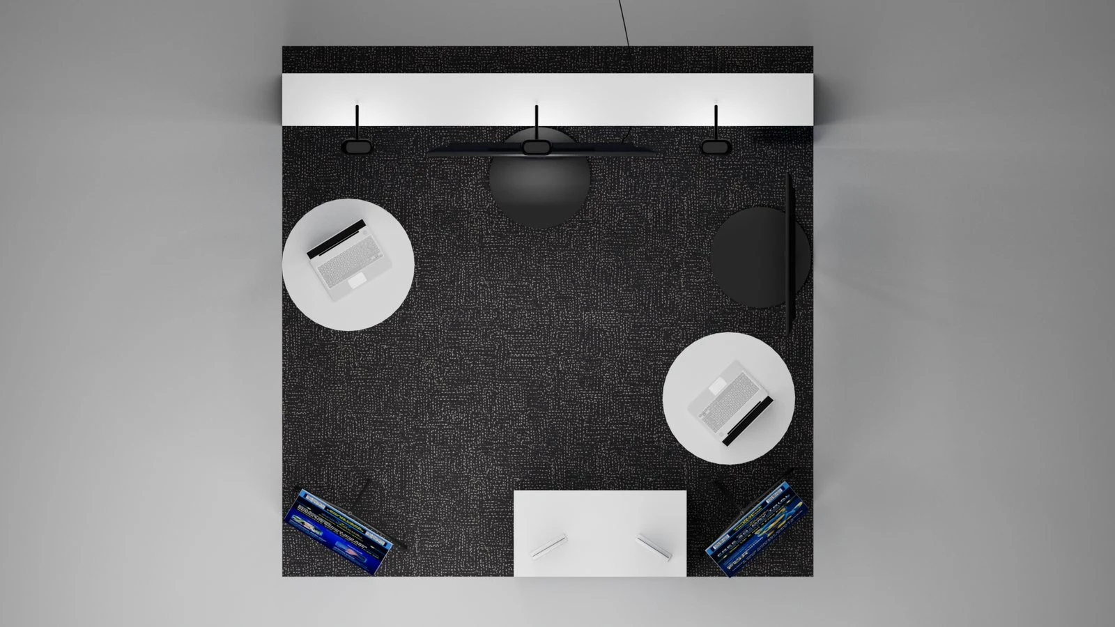
Top-down plan
Front elevation / top-down plan
Back wall graphic
Back wall graphic, 10 x 8 ft
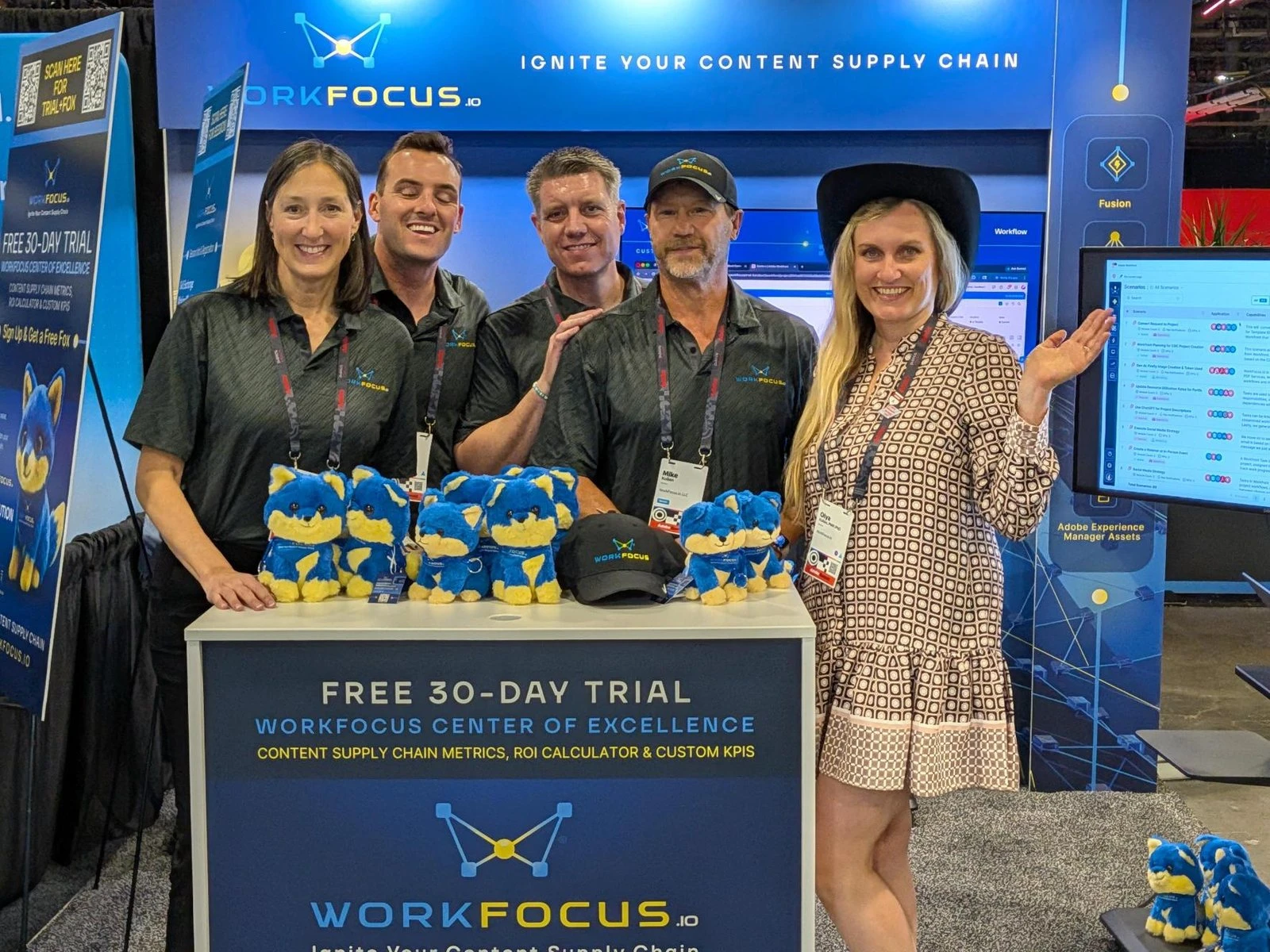
The booth live at Adobe Summit 2026
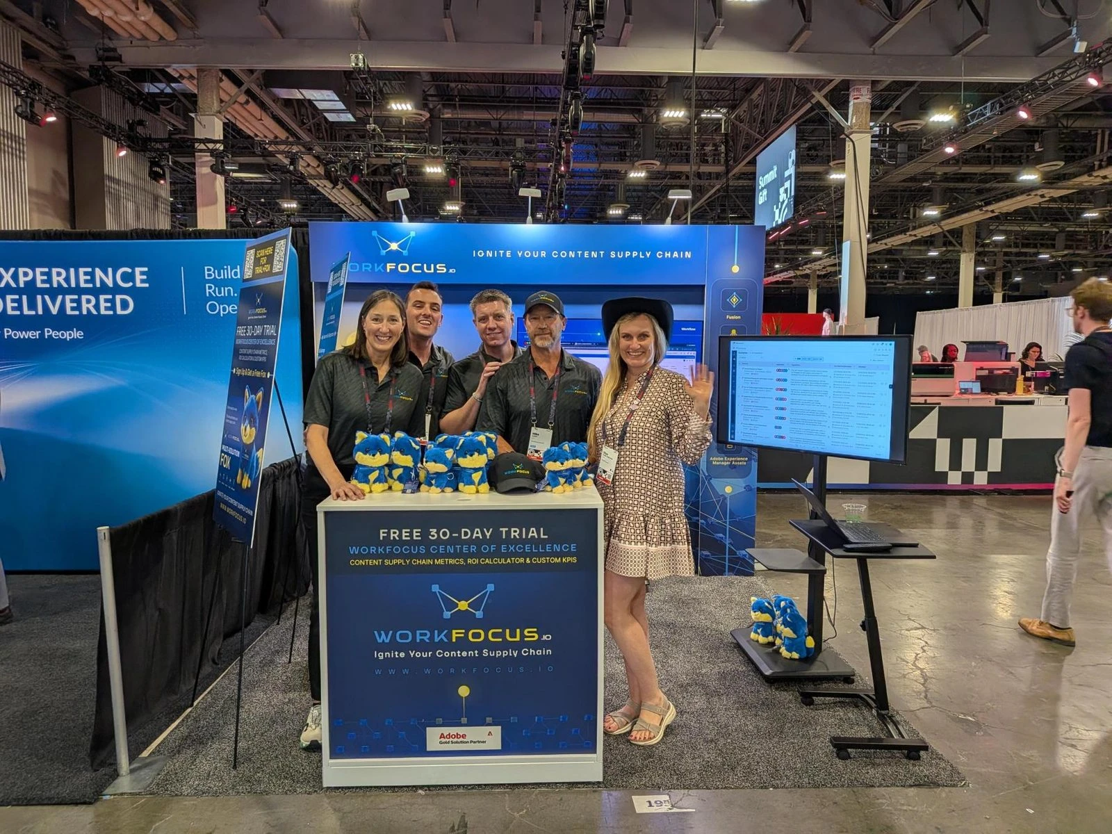
The booth from the aisle
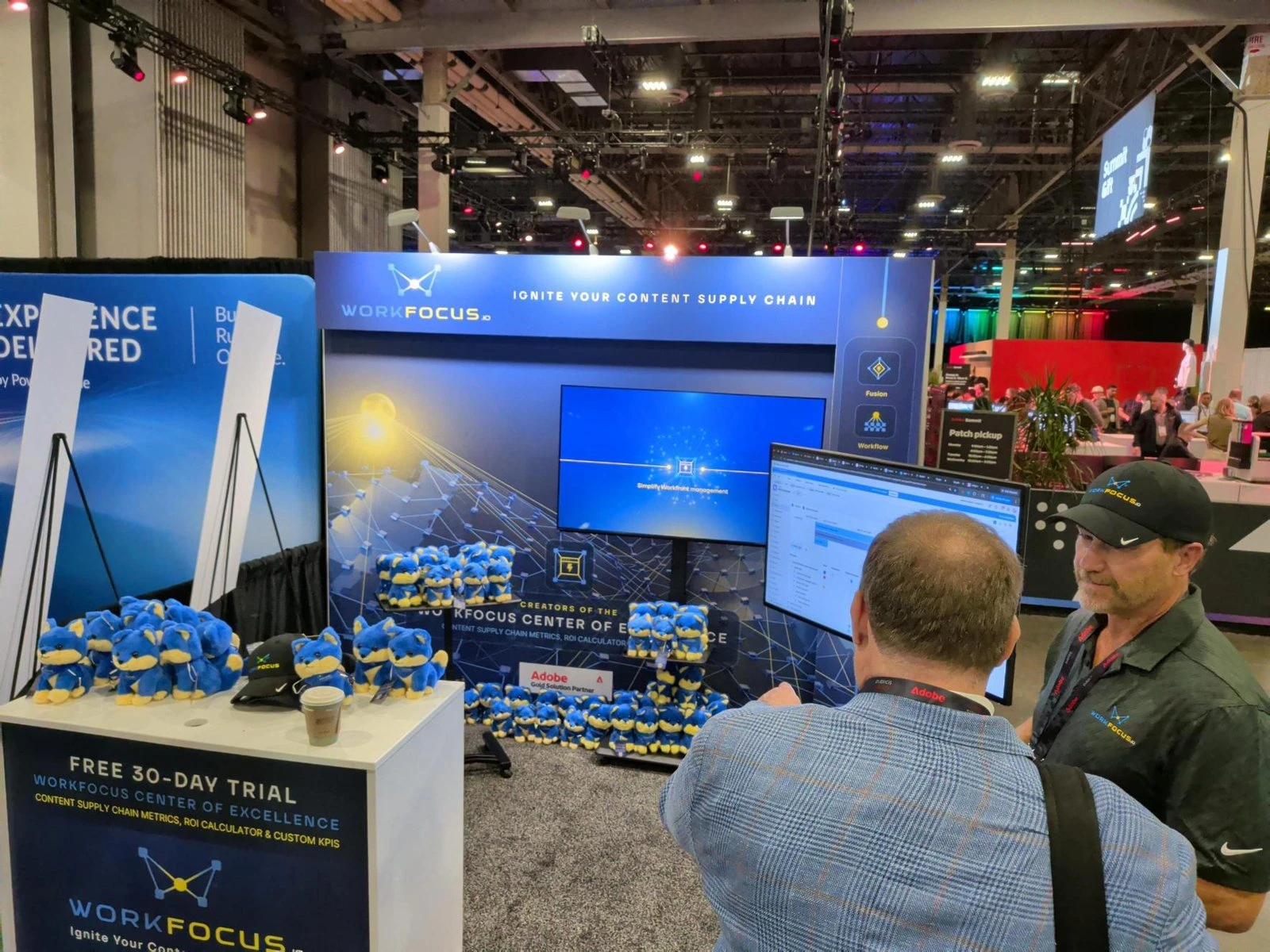
Booth front
The booth live at Adobe Summit 2026, Las Vegas
Focus Fox
Goal: Give WorkFocus a character that could stand beside Adobe's own mascot, carry the message attendees most needed to remember (one partner across all five products), and arrive at Summit as a plush good enough that people would line up for it.
Strategy: Adobe kept adding products to the Workfront family, attendees were struggling to keep track of how they fit together, and the person who turns five products into one working solution is the multi-solution architect. My giveaway memo weighed five companion animals against Adobe's lion and first recommended an owl. The team chose the fox, and the multi-solution idea gave the character an anatomy: Focus Fox has a five-lobe brain, one lobe each for Workfront, Fusion, Planning, Firefly, and AEM Assets, which became the interactive explorer on fox.workfocus.io and the row of five product icons on the hang tag.
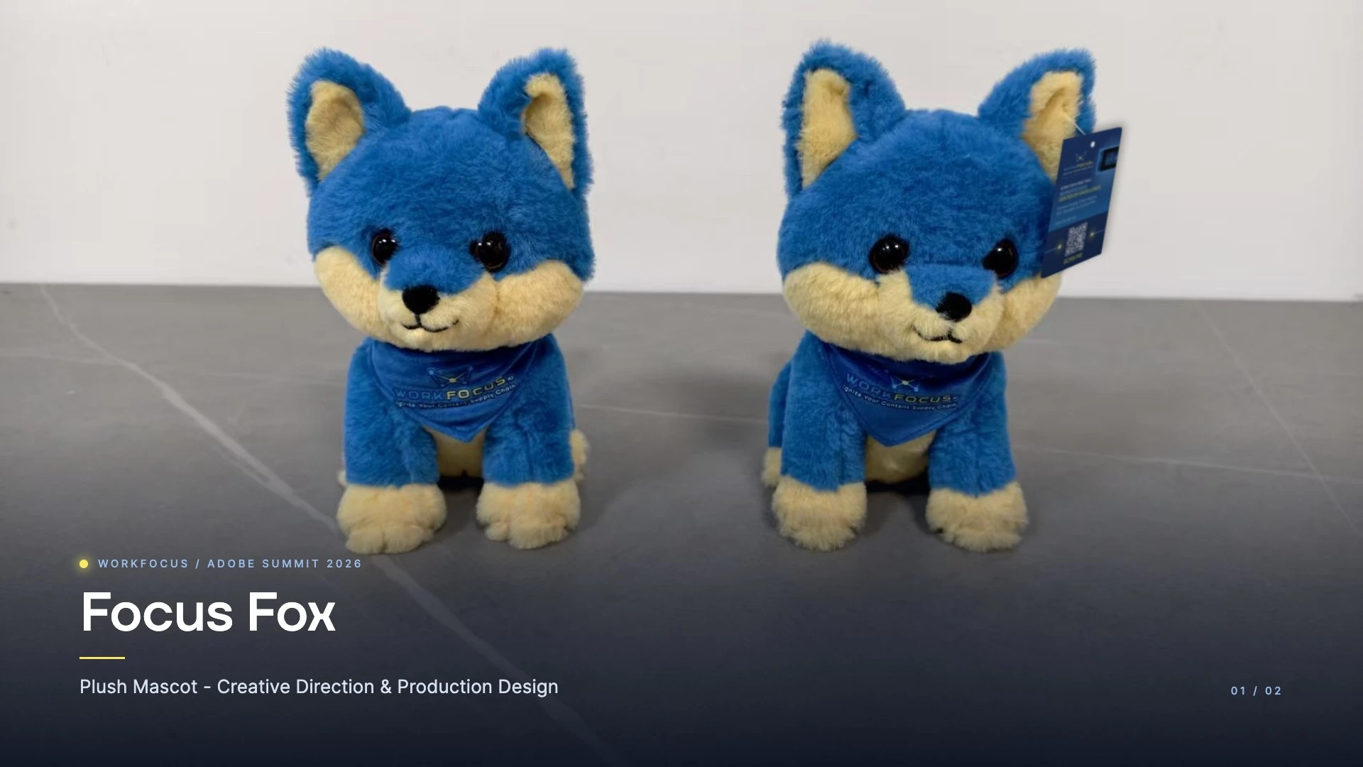
The factory spec was written to remove guesswork. It fixed the brand palette to the fabric (an Ocean Blue body, Golden Yellow muzzle, ears, and tail tip, and a Deep Sea Blue bandana), asked for two body styles to be sampled, a rigid standing fox and a floppy beanie version, and called for the wordmark to be printed on the bandana instead of embroidered so the tagline would stay legible at small size.
Samples were run at two factories in parallel so a missed deadline at one would not cost the booth its giveaway. One factory's first attempt missed on material, with crimped wool that read as a teddy bear, a neon yellow, and eyes that sat on the surface like stickers. The other came back with a softer, denser fur and a muted golden yellow, and became the reference for the rest of the process. My twelve-point markup covered ears, face width, eye size and depth, cheeks, snout, neck, bandana print, tail, rear legs, paws, color, and fabric, and the fur spec moved to straight-pile velboa at 8 to 10 millimeters, dense enough to hold a shape and soft enough to have a slight sheen.
The second sample, reviewed on 23 March, was broken down into fur, face, eyes, nose and mouth, feet, rear legs, and scarf: eyes set into the face instead of on top of it, a smaller snout, cleaner mouth stitching, and fuller rear legs. On 30 March the standing fox was approved for production with a few side-profile details still open, because another round would have missed the show. The finished foxes shipped with a printed hang tag and a QR pin that linked into the same reservation flow as the booth floor boards.
Role: Character concept and naming, giveaway strategy memo, factory spec and color matching, two rounds of sample feedback across two manufacturers, hang tag and QR pin design, the Focus Fox character video, and the fox.workfocus.io mission files.
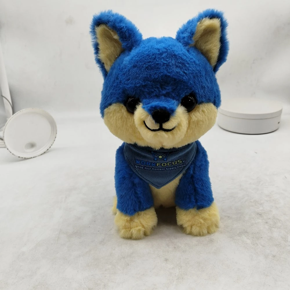
First sample, front
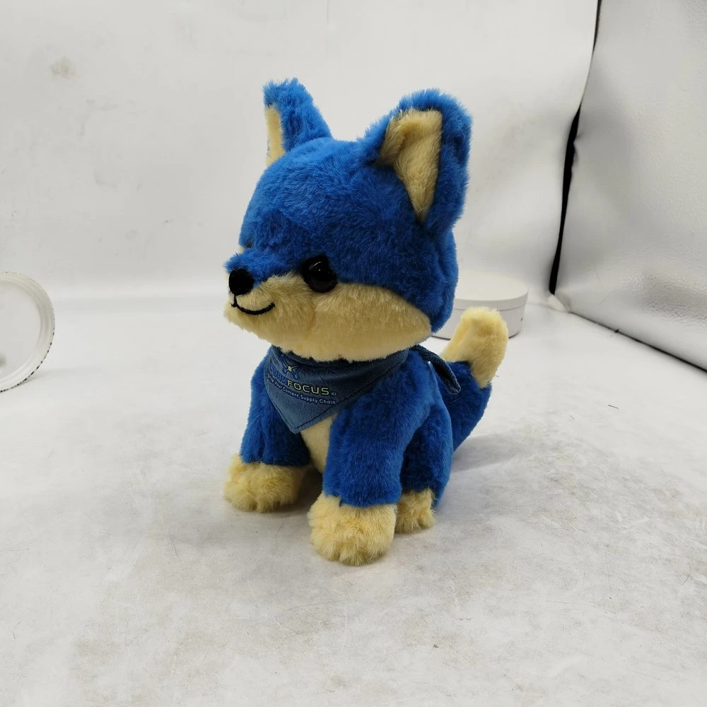
First sample, three-quarter
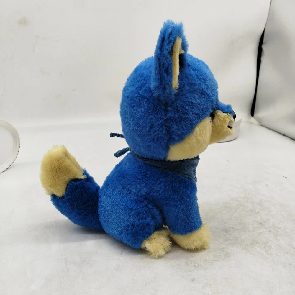
First sample, side
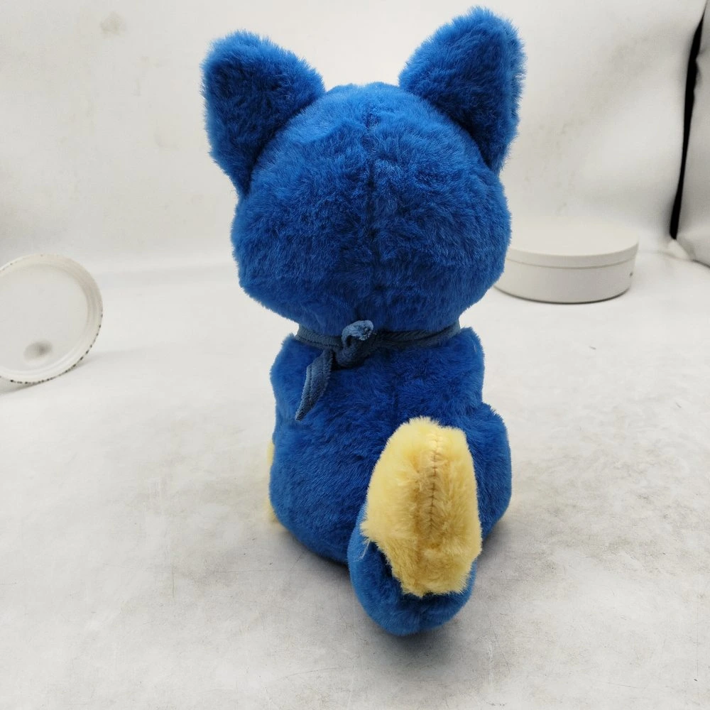
First sample, back
First sample: front / three-quarter / side / back
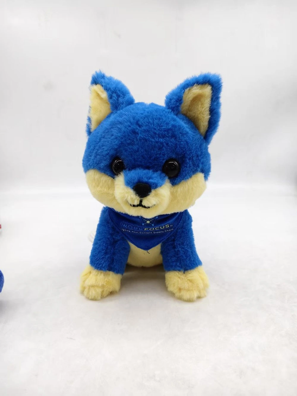
Second sample, front
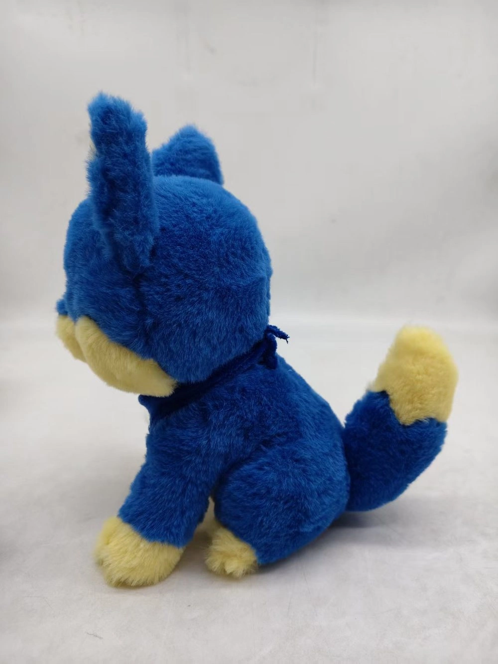
Second sample, side
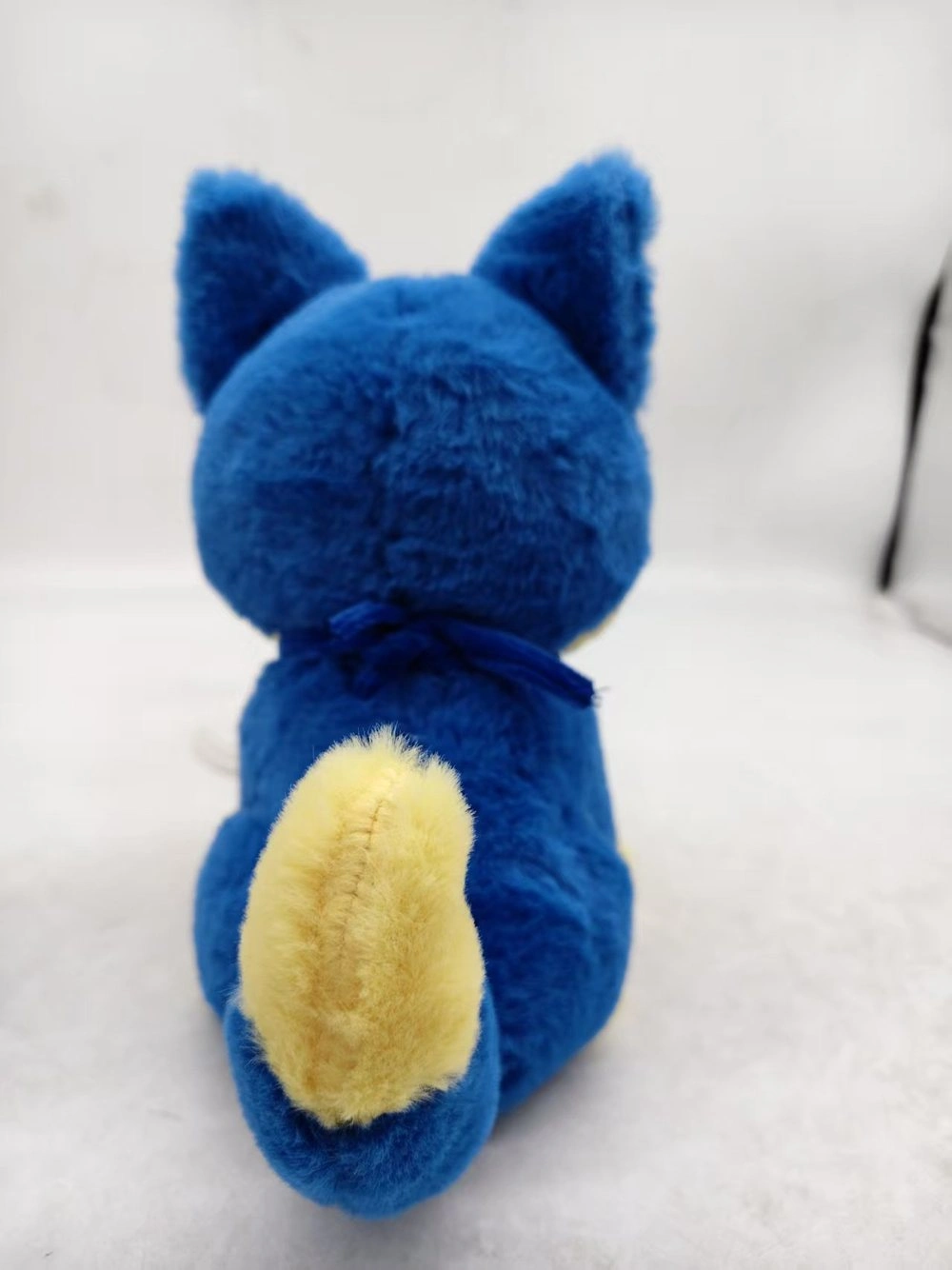
Second sample, back
Second sample: front / side / back
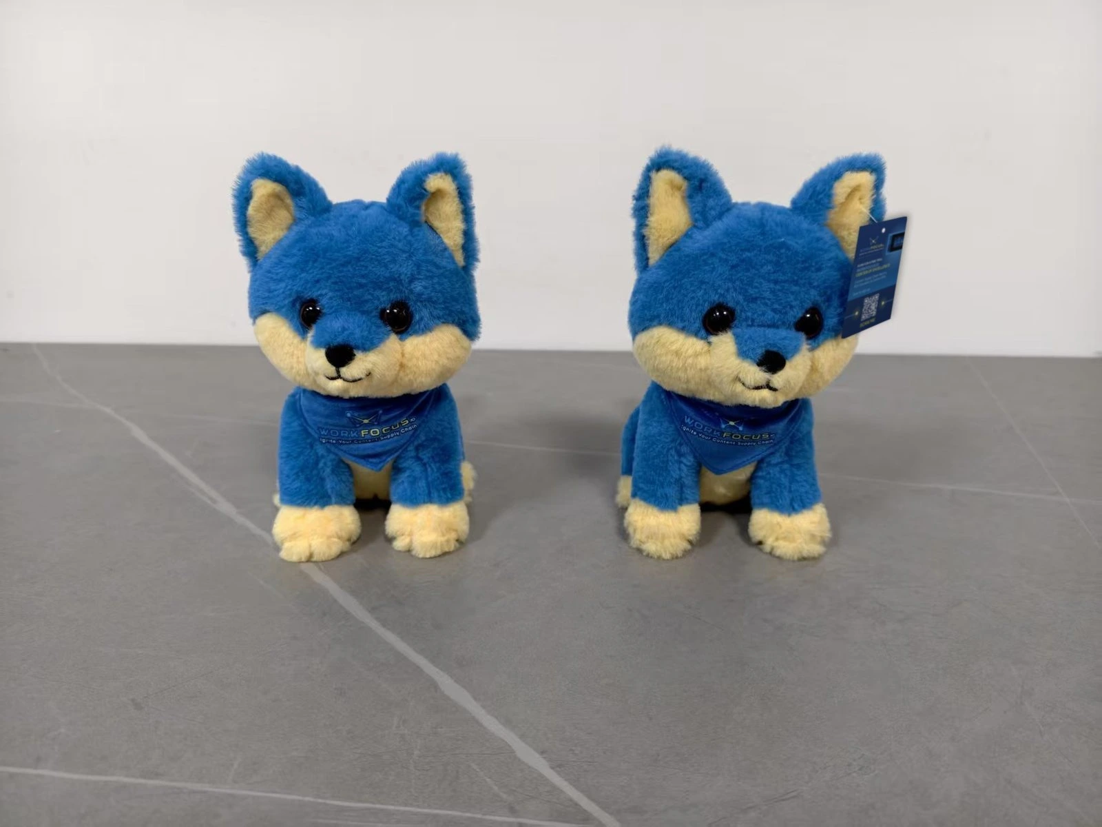
Approved sample
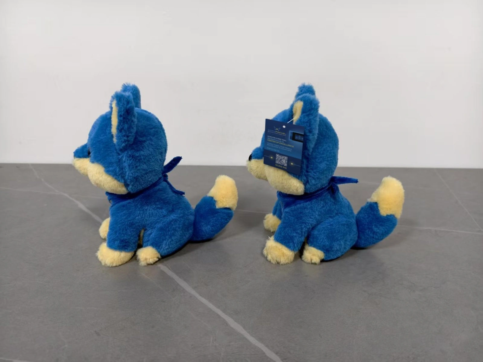
Approved sample, with hang tag
Approved sample, with hang tag
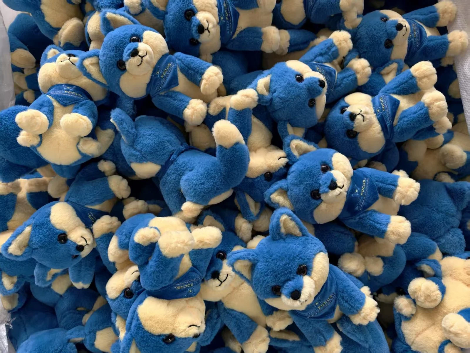
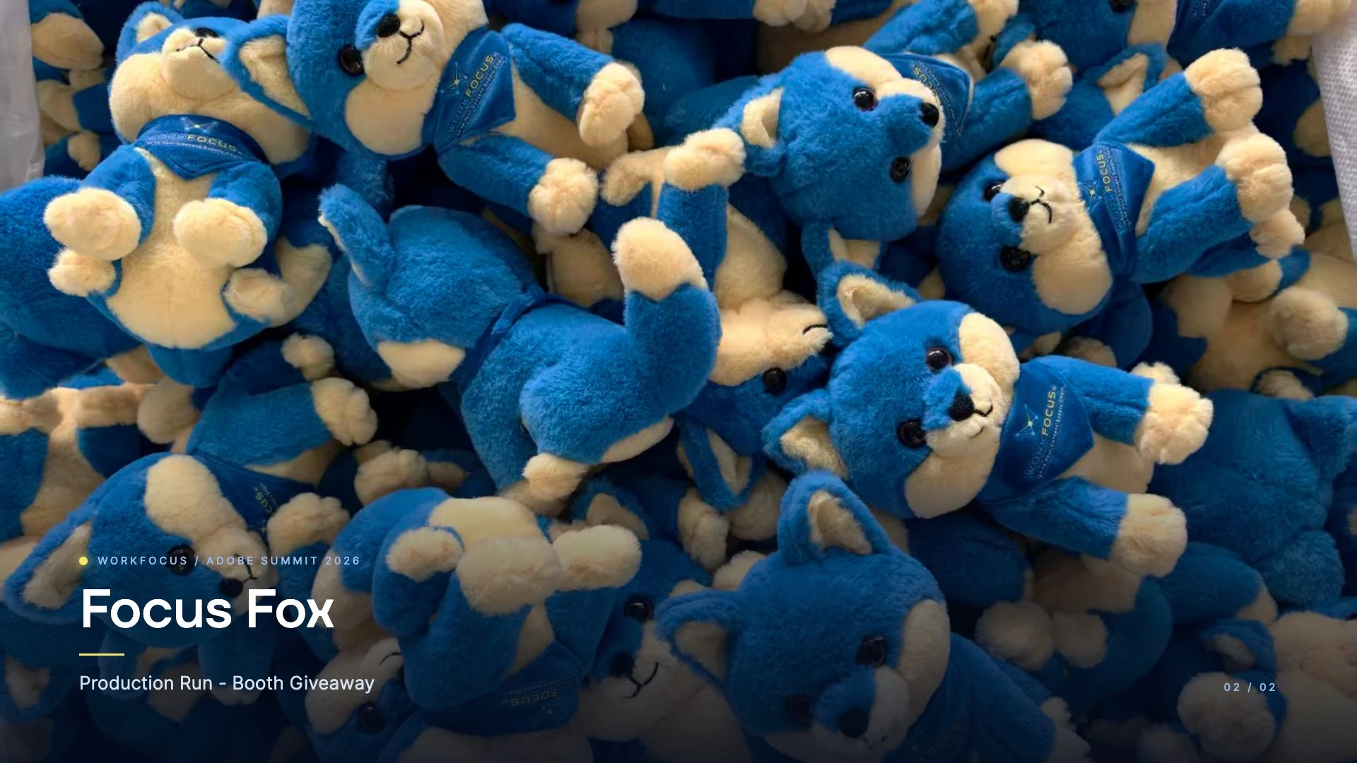
Production run
Production run
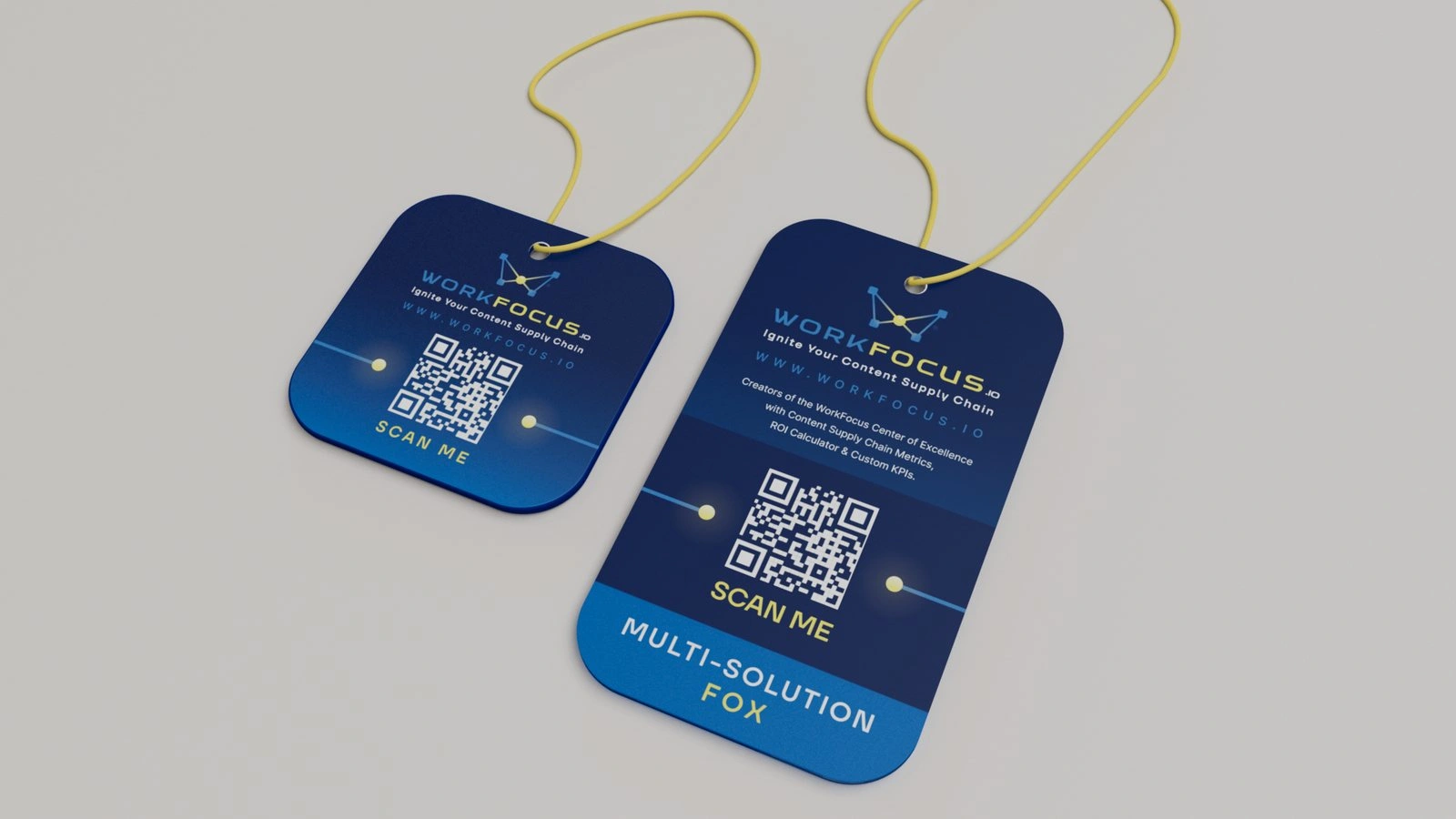
Hang tag
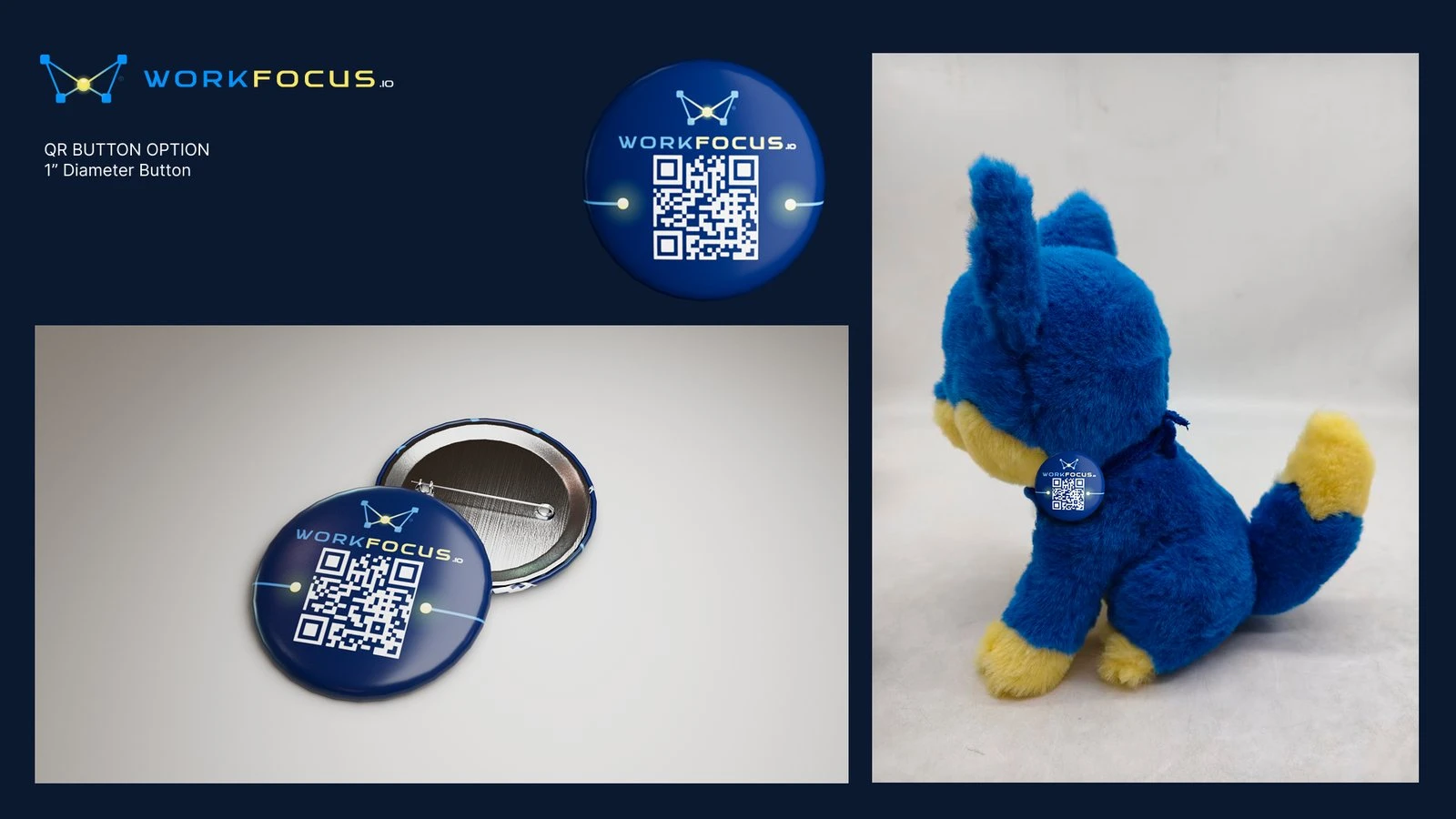
QR pin
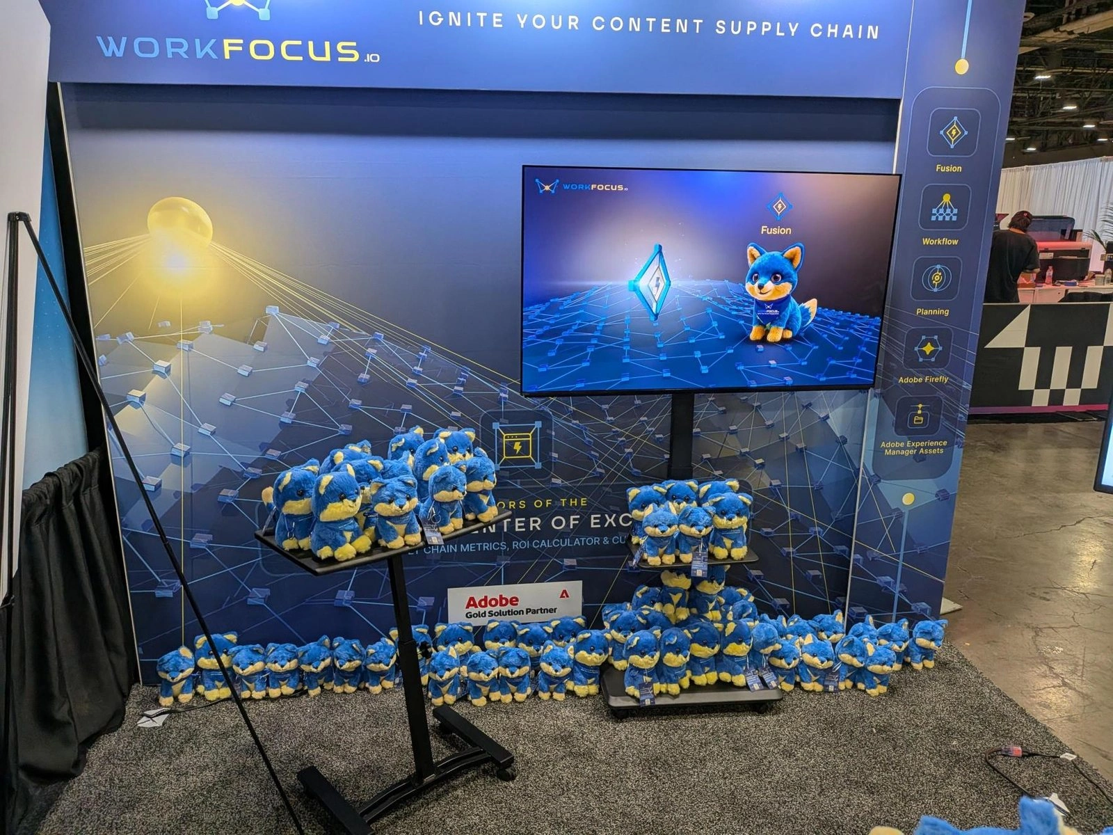
Focus Fox at the booth
Focus Fox at the booth
The Focus Fox Film
Once the plush was locked, the character needed a way to introduce himself to the people walking the Summit floor. The team planned a short animated film in March as part of the fox launch, made to play at the booth, and I directed and produced it from the Focus Fox character design. The fox introduces himself, walks through his five-lobe brain one Adobe product at a time, and closes by asking whether the viewer signed up for the Center of Excellence trial, since he would very much like to go home with them. It gave attendees an easy way into five products before any demo started, and turned the plush giveaway into a reason to stop and talk.
Focus Fox film still
Focus Fox film still
Creative Direction from the Board
My position was closer to an in-house creative director than an outside studio. I worked in the team's Slack, Teams, SharePoint, and Workfront, sat in standing calls with Mike, sales, and product, and carried the recurring brand work that comes with a board seat: the annual brand story, quarterly fact sheets, and updates to the Center of Excellence materials. Over the same stretch the company moved quickly through Adobe's partner tiers, reaching Silver in May 2025 and Gold in September 2025.
Through all of it the yellow sphere kept doing the job it was drawn for. Over a year and a half the work grew from a logo into a product, a mascot, a film, and a booth on the Summit floor, and all of it still traces back to that one lit node.

Adobe Gold Solution Partner
Creative Director, Board of Directors: Eric Jordan
With thanks to: Mike Kollen · Olya Kollen · Zander Muir · Blake Howell · the WorkFocus team
Full case study: https://www.ericjordan.com/portfolios/workfocus/
Like this project
Posted Oct 9, 2026
Identity, 3D imagery, web, product motion, mascot, and an Adobe Summit 2026 booth for WorkFocus, an Adobe Gold Solution Partner. Creative direction from the Board of Directors, 2025-2026.
Likes
0
Views
0
Clients
WorkFocus