Quite Remarkable Agency Website
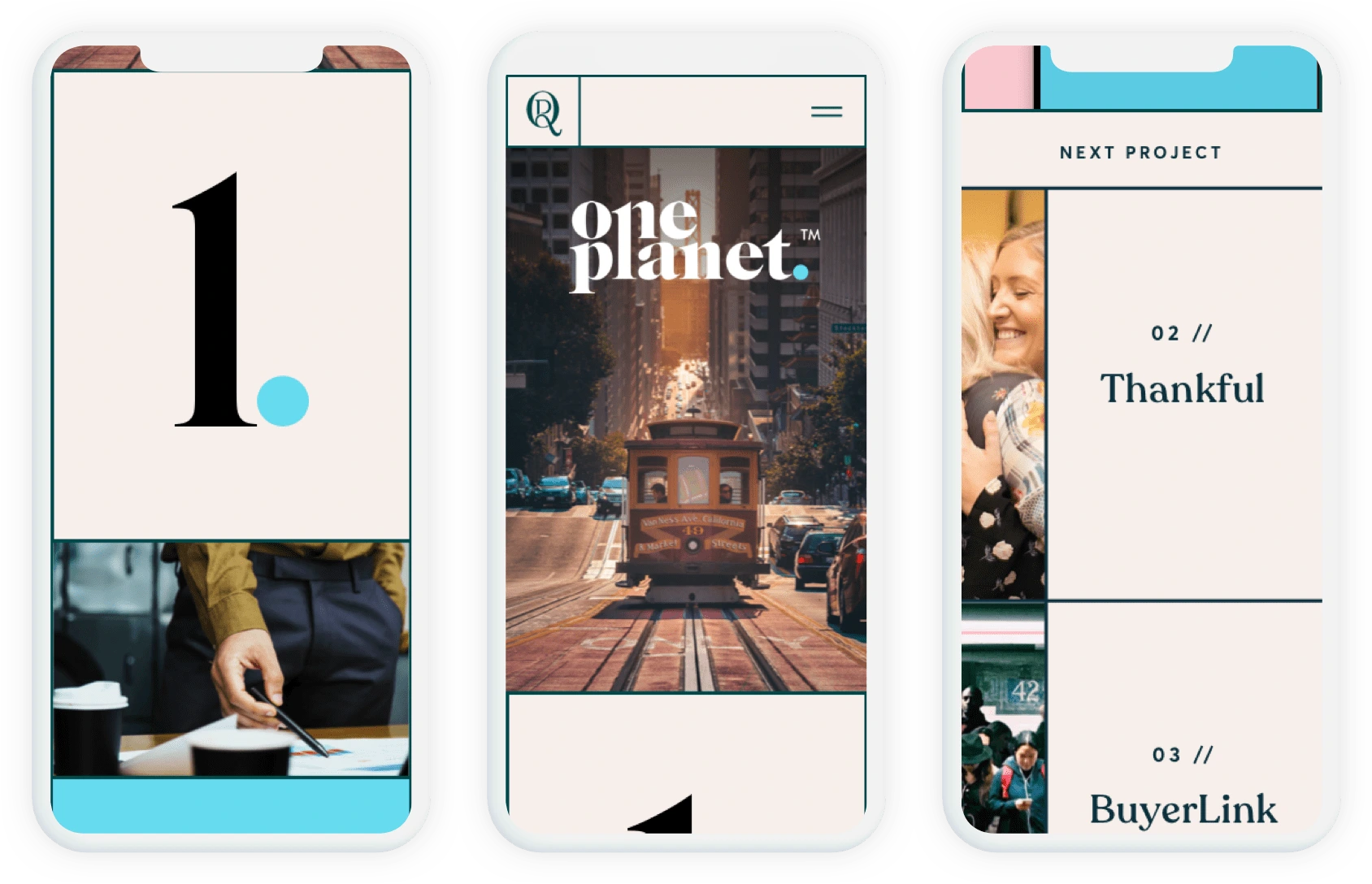
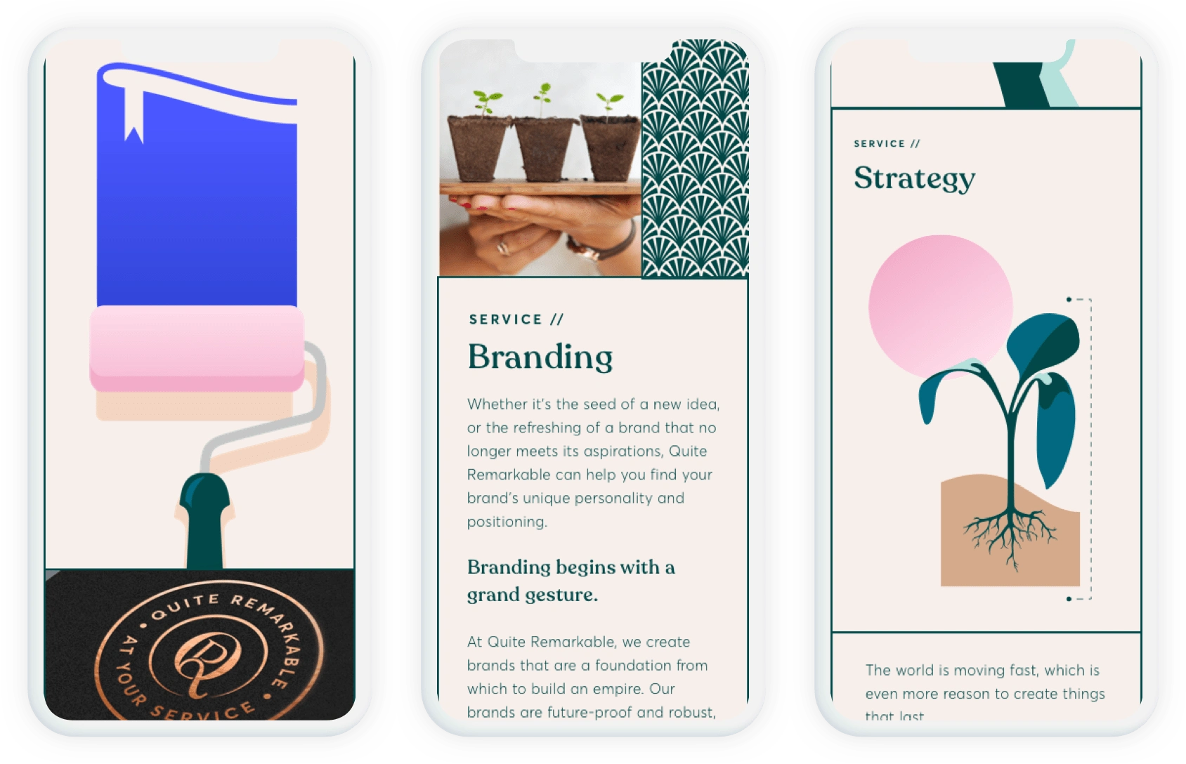
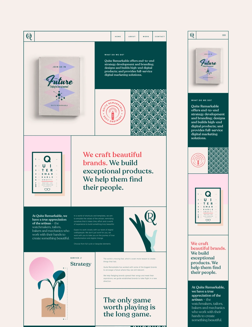
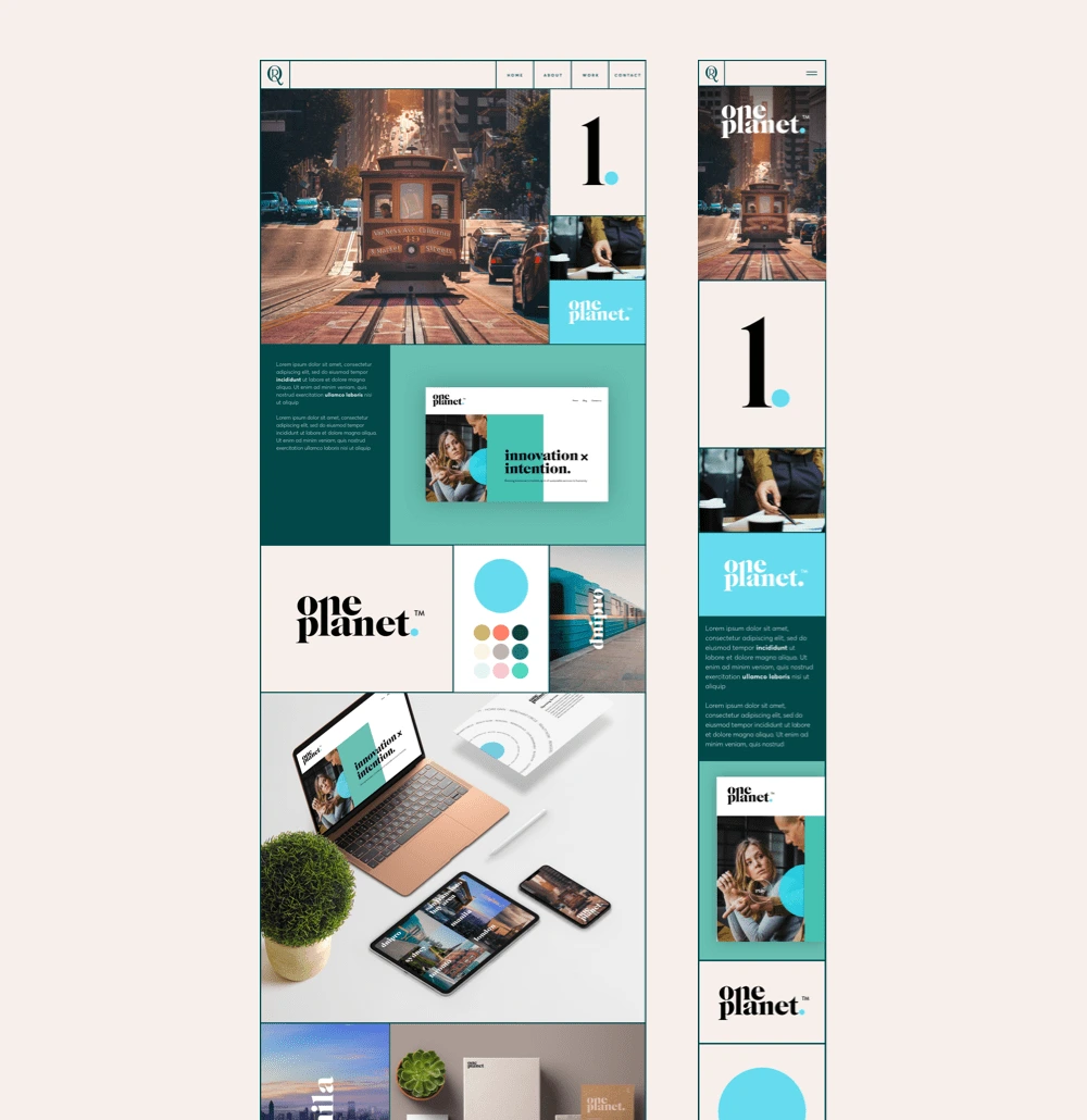
I designed the brand new website for start-up creative agency Quite Remarkable. I was brought in to take their newly created brand identity and apply it across a beautiful responsive website.
The idea was to use a grid structure that followed the golden ratio to box all the content down the page. With the help of the strong graphic imagery which was created by the Creative Director, i was able to produce some very intricate layouts.
Responsive Web Design
Branding
Icons



Like this project
Posted Mar 2, 2023
I designed the brand new website for start-up creative agency Quite Remarkable. I was brought in to take their newly created brand identity and apply it across
Likes
0
Views
49


