GroupsApp — ONLINE GROUPS & COMMUNITIES FOR ALL

Sangitaa K. Bhanderi


GroupsApp
— ONLINE GROUPS & COMMUNITIES FOR ALL
The app was not losing users because the UI was bad. It was asking for full commitment before giving anyone a reason to stay.
01 · CONTEXT
Stage — FIX.
Redesigning the first-time experience, discovery feed, and navigation architecture.
WHERE THINGS STOOD
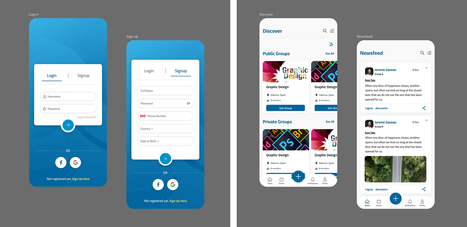
GroupsApp was already live, and its feed depends on what the community posts. The first minute decided whether someone stayed, and it was losing people. A name, phone number, country, date of birth, and a verification code stood in front of the first group, and Discover showed everything at once, based on nothing a person had chosen.
The brief began as a visual update. A closer look showed the real problem was the order of things. This case study explains how that order was changed.
TIMELINE: 6-Week Sprint, from audit to developer-ready design
INDUSTRY: Community & Social Networking
PLATFORM: iOS and Android
SERVICES: Product strategy, UX architecture, interaction design, and a design system that works on both platforms
02 · THE CHALLENGES
The product was already there. The problem was the road to it.
SIGN-UP BEFORE VALUE
Personal details were asked for before a single group was visible.
A FEED WITH NO DIRECTION
Discover showed everything at once, so people did not know where to go.
03 · THE PICTURE IN THE HEAD
A person walks up to a new community club in their town. They are curious about what is happening inside. The windows are blacked out. A board at the door asks for their personal details before they can look in.
They walk away.
That was GroupsApp. In a community app, trust comes from seeing the community. People do not hand over personal details to a room they cannot see into.
04 · THE CALL
Let people look inside first. Ask for details later.
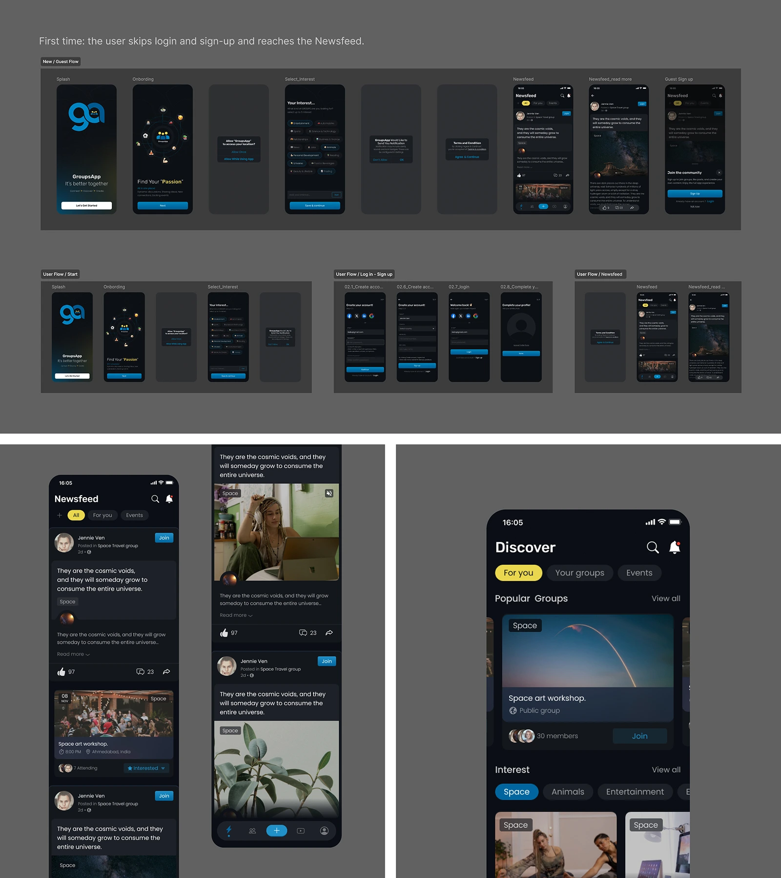
It starts with the intro. It says what GroupsApp is for.
Login and sign-up are skipped. The next screen asks what the user cares about, because without interests the feed looks messy and people do not know where to go.
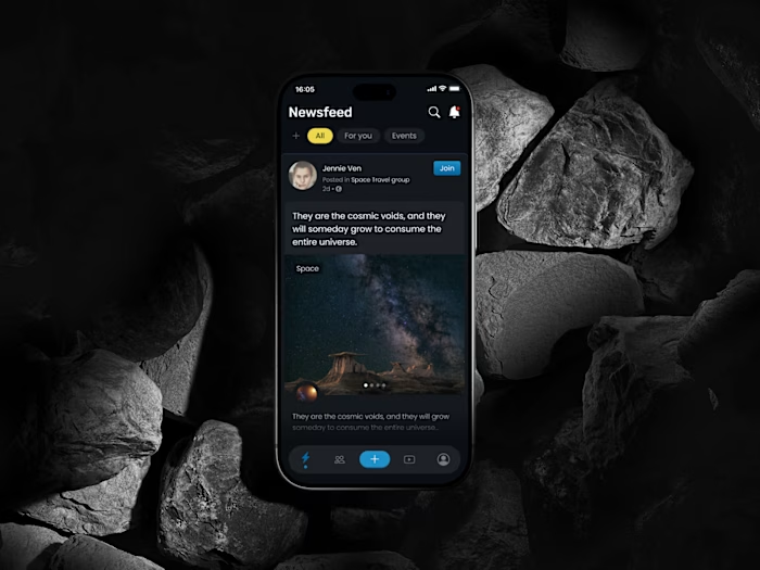
Then the feed opens. It is built around those interests. An account is asked for only when they join, post, or create.
05 · INSIDE THE APP
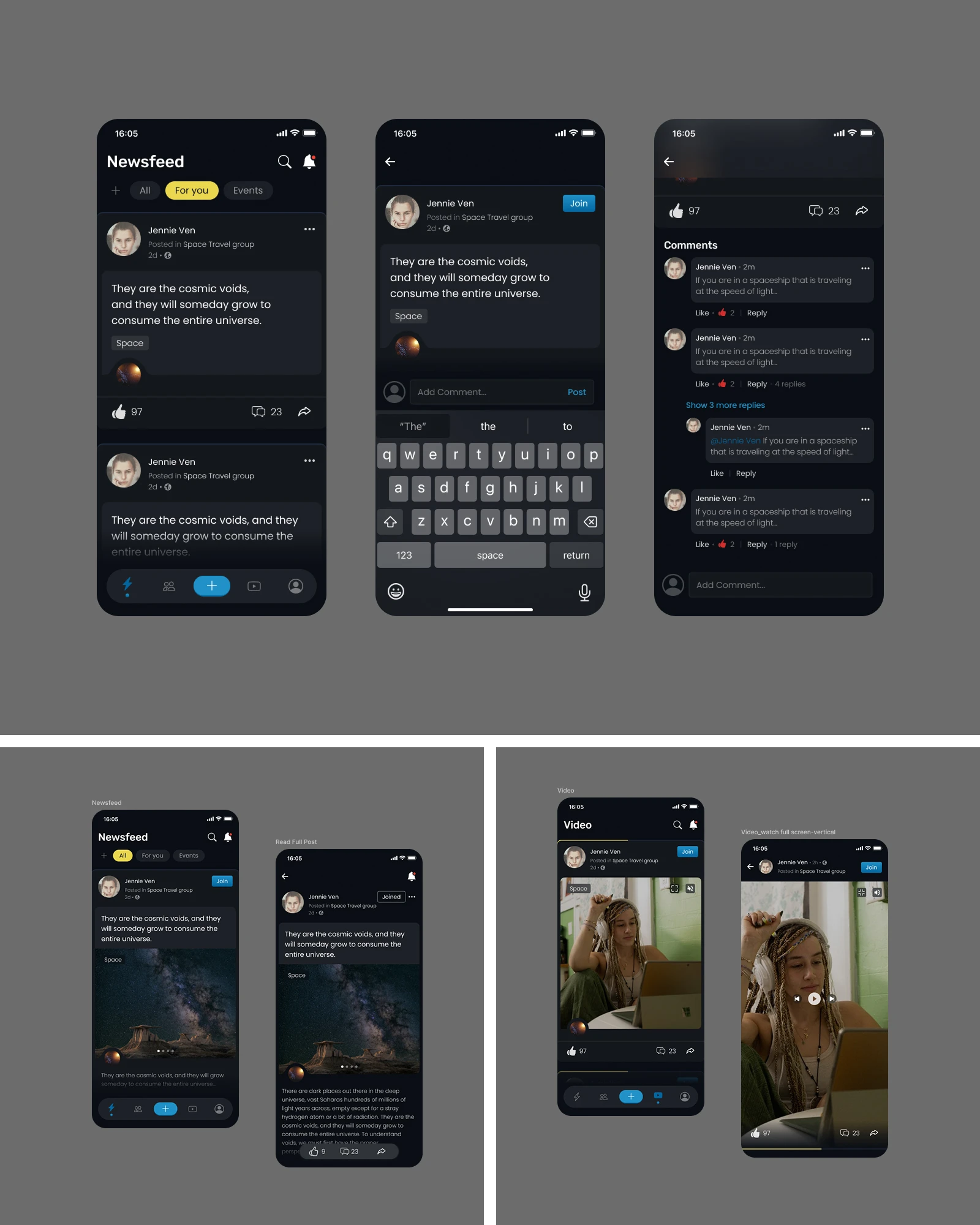
5.1 EVERY POST IS A WAY IN
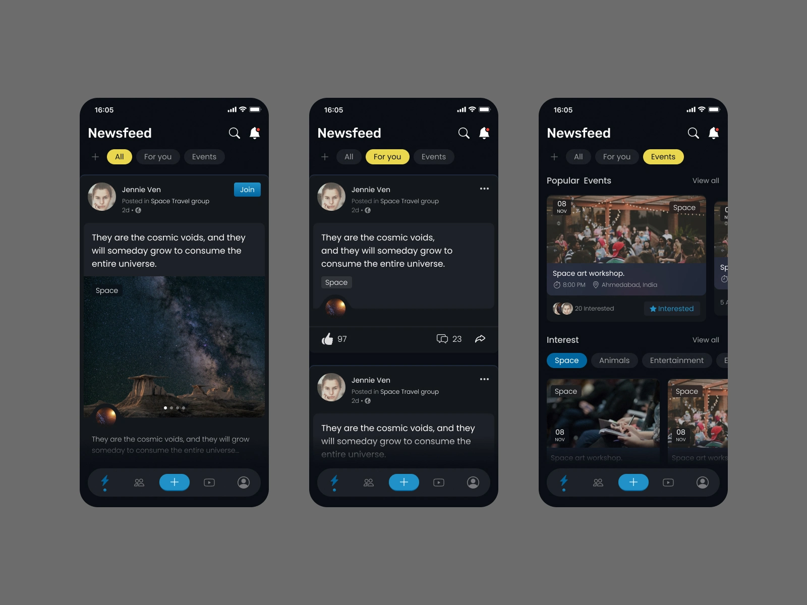
One feed, three ways to read it.
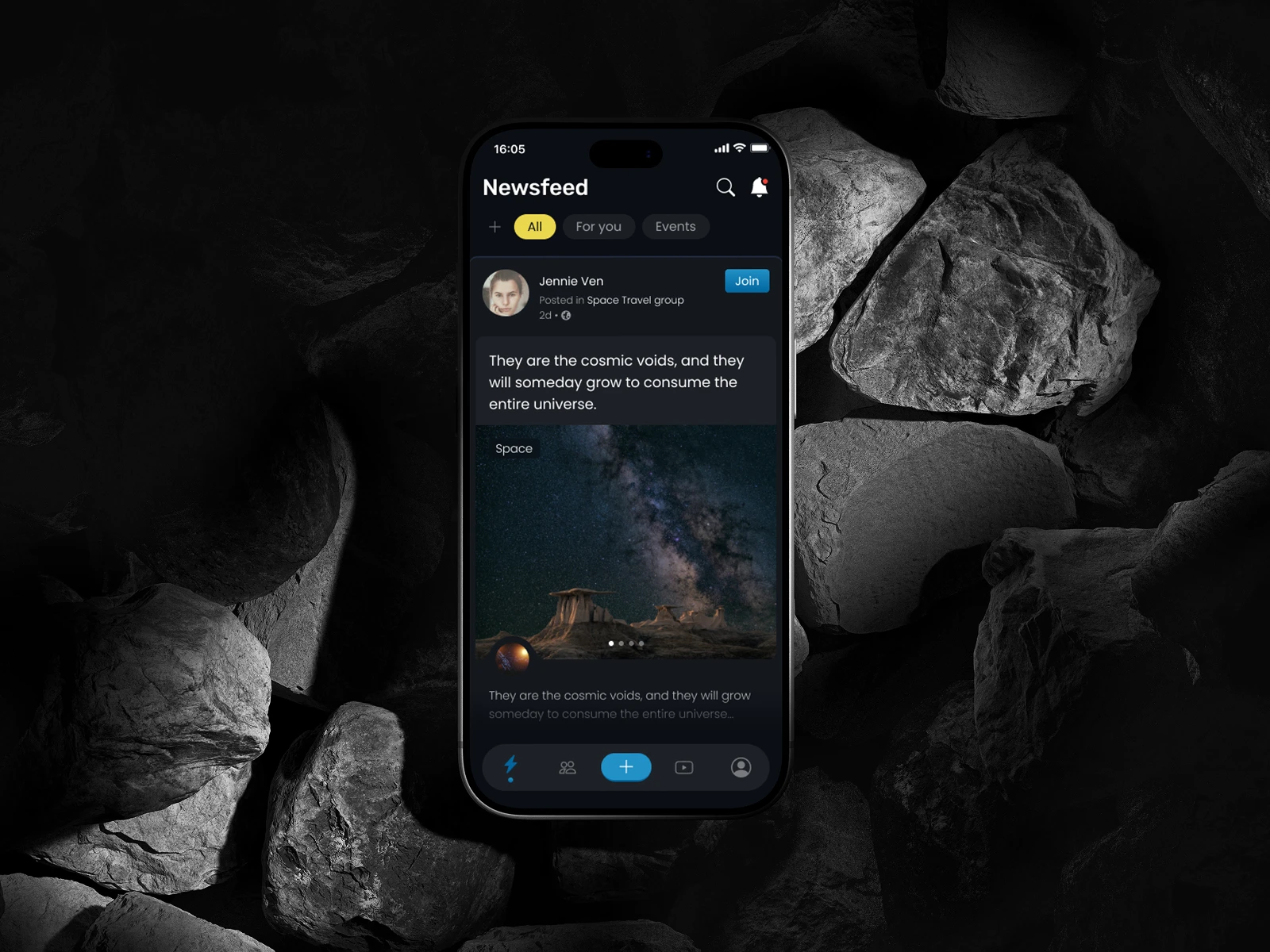
The Newsfeed opens on All, with For you and Events one tap away. Every post shows its group, a topic tag, a Join button, and its likes, comments, and shares.
5.2 RECOMMENDATIONS THE USER CONTROLS
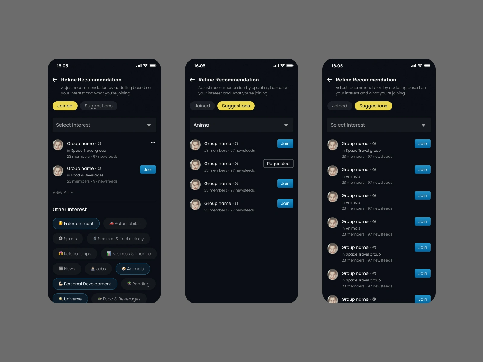
The feed changes as the user's interests do.
The + beside the tabs opens Refine Recommendation. A user manages the groups they have joined and the ones suggested to them, and edits or selects their interests.
5.3 FROM A GLANCE TO A CONVERSATION
A post opens into the whole discussion.
Replies sit under each comment, and a video opens full screen.
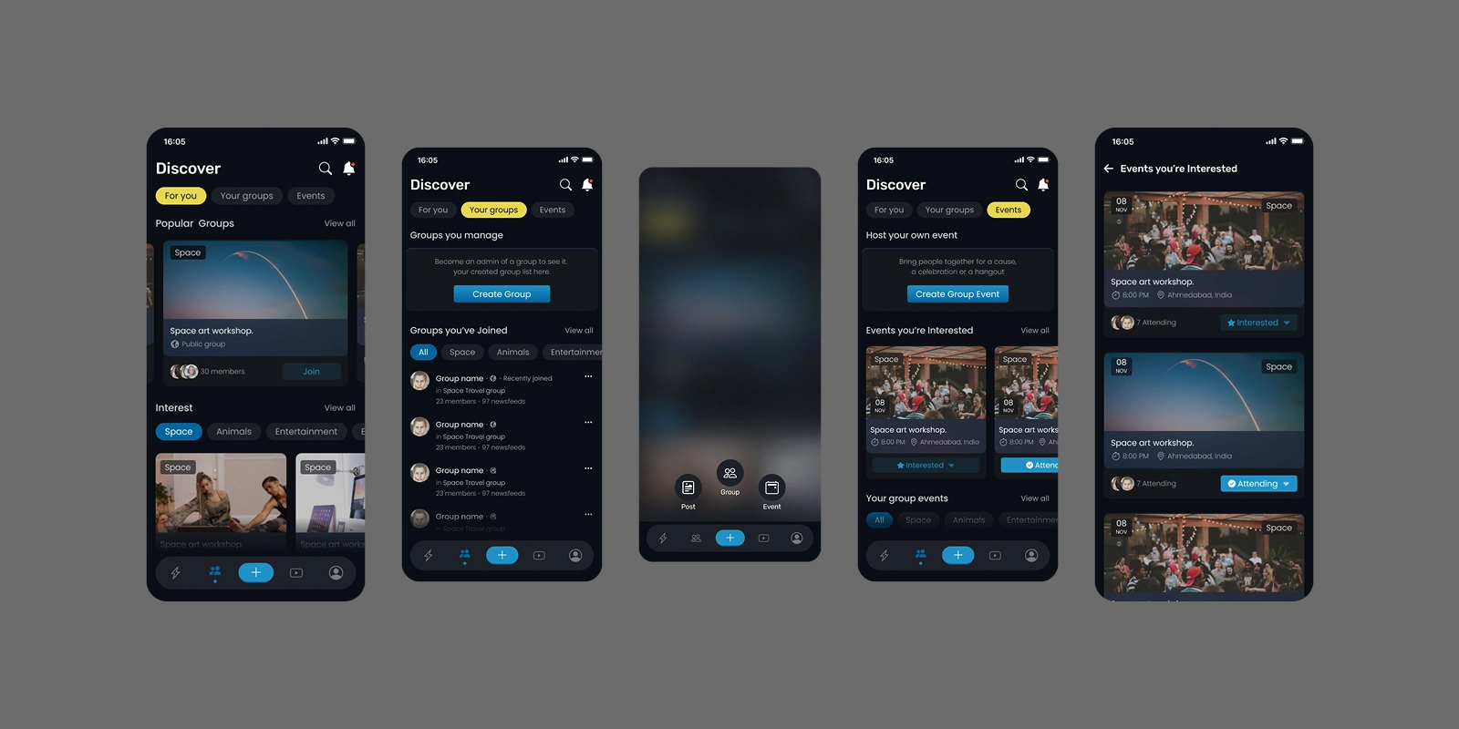
5.4 FIND THE NEXT THING TO JOIN
Groups, events, and a user's own communities sit under one Discover.
Discover has three views: For you, Your groups, and Events. Groups a user manages are kept apart from the ones they joined, events can be marked Interested or Attending, and the + opens one sheet to create a post, a group, or an event.
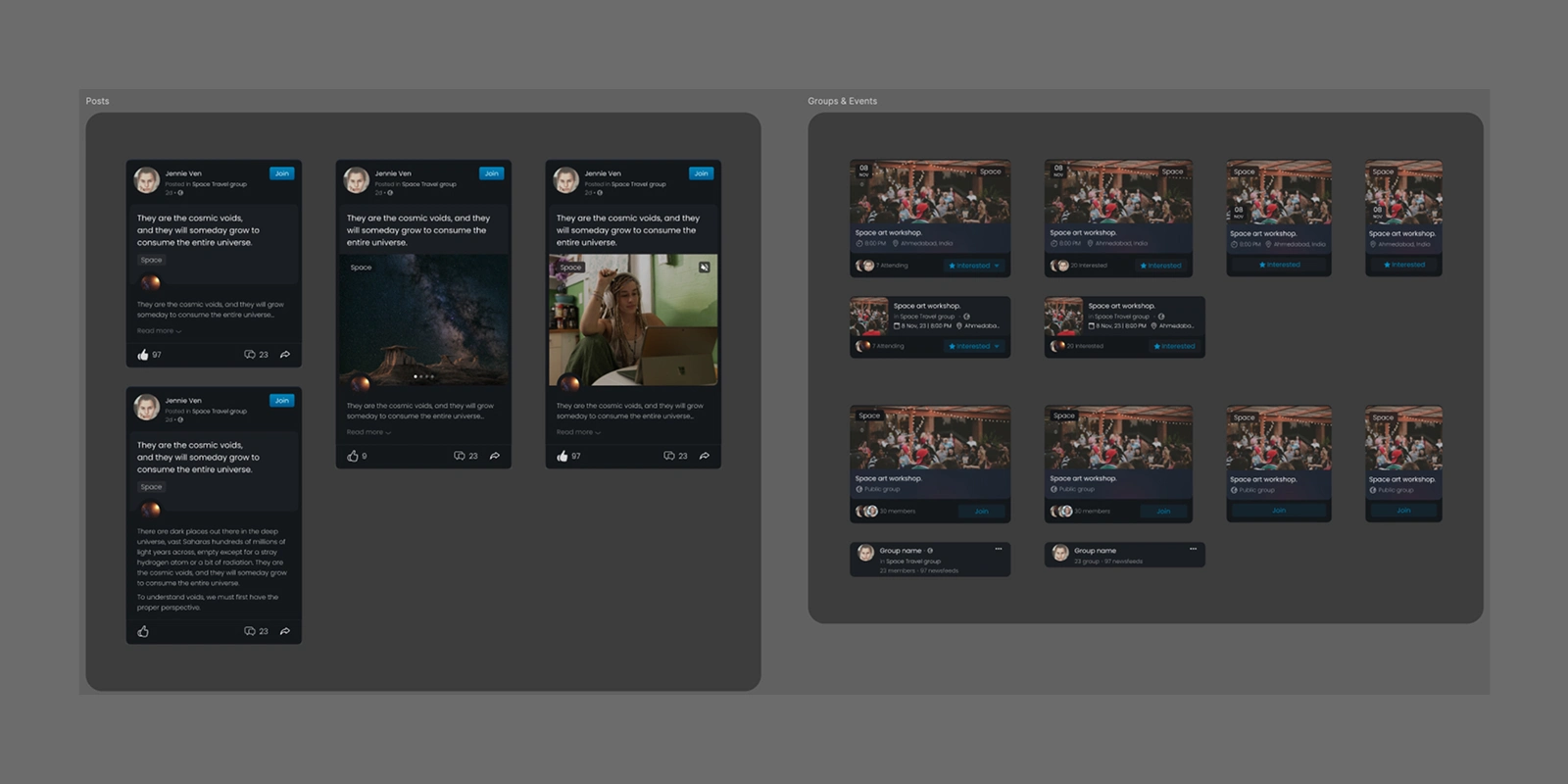
5.5 ONE SET OF COMPONENTS
The final design was handed over with a Flow | Prototype and a design system, so developers had one set of components to build from.
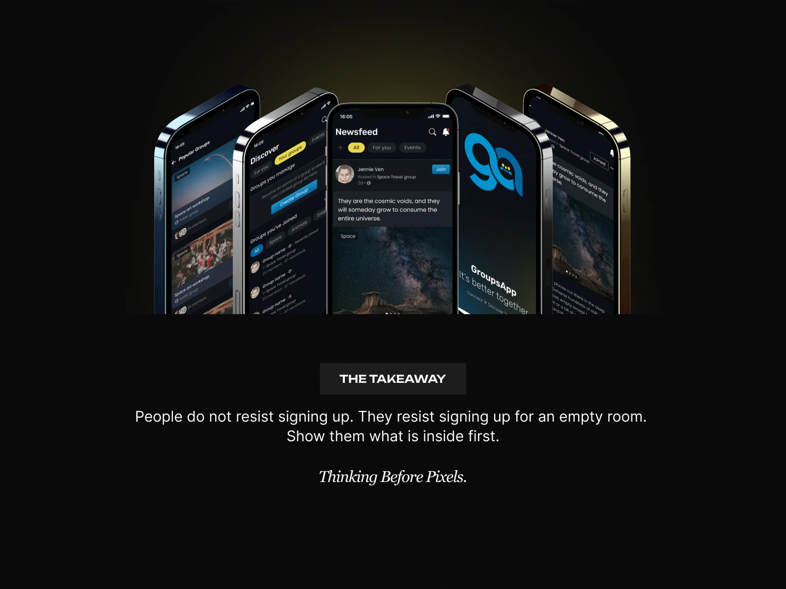
06 · WHAT CHANGED
Users no longer need an account to see groups.
Sign-up now comes when they join, post, or create.
BEFORE → AFTER
REGISTRATION FIRST → Community first
SETUP BEFORE VALUE → Value before commitment
EVERYTHING SHOWN TO EVERYONE → A feed built around interests
ONE-OFF LAYOUTS → Reusable design system
Like this project
Posted Oct 28, 2026
GroupsApp asked for personal details before showing a single group. Redesigned so sign-up comes only when users join, post, or create.