Gamified Employee Training App Design for ST (Skilled Team)

Gurkan Mihci


Case Study
A gamified employee training app that cut onboarding time in half and boosted first-week completion by 32 percentage points.
Remote onboarding leaves people behind
Training existed, but completion rates dropped fast — especially after day one. Remote hires felt isolated, and managers had no visibility into who was struggling.
02 — RESEARCH PROCESS
02 - App Logo Design & Animation
St (Skilled Team) — bold, minimal, memorable. The logo uses a vibrant gradient to signal energy and growth, with a floating animation that brings warmth to the digital training experience.
The animation adds a sense of progression and momentum
Tiny-task loop: 5-minute micro-wins
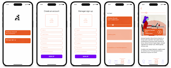
Ring-based dashboard (like Apple Watch), streak-flame nudges (encouraging, not punitive), and a manager heat-map for coaching visibility.
04 — In-Course Animation
Micro lesson intro animations
Employees complete scenario-based conversations — practicing real situations, getting instant feedback, demonstrating knowledge through natural dialogue. Employees can tap a mic or chat and ask questions — the AI coach responds with personalized guidance, scenario practice, and instant feedback.
87% first-week completion (vs 55% legacy LMS), 68% 7-day streak retention (goal: 60%), and 30% faster manager feedback via heat-map dashboard.
The Brand — Bold, Minimal, Built to Travel
With the app proven, the work expanded into something more tangible: how does ST feel when it exists in the physical world? The logo— bold and minimal—had already established a visual language built on energy and momentum. The challenge was carrying that into spaces and objects without losing the warmth that made the digital experience work.
Web Design
Merchandise started with a tote bag and t-shirt: practical, everyday, a quiet brand ambassador. The design kept it clean.
Wayfinding rolled out across three offices and their meeting rooms. Rather than generic signage, the system drew on the app's visual DNA — purposeful typography, restraint in the brand palette, and a sense of direction that felt intuitive rather than institutional. Employees moving between spaces encountered the same design intelligence that greeted them on their phones every morning.
Infographics brought the brand into print. Designed in a brochure format, these pieces distilled complex learning data and onboarding journeys into visuals that were clear without being cold. The same gradient energy from the app translated into illustrated charts and frameworks that felt like they belonged to the same world — because they did (I used ChatGPT, Midjourney, Runway, Figma Make, and other AI tools as part of my creative process — not to replace my authorship, but to support research, visual exploration, iteration, prototyping, and refinement while I shaped the concept, design direction, and final visual system myself).
The Whole Picture: What started as a UX problem became a full ecosystem. ST now exists as a cohesive brand experience — one that employees encounter on their first day, carry home, walk past in the corridor, and flip through in a brochure.Every touchpoint is designed to say the same thing: learning here feels different. That consistency isn't accidental. It's the work.
Here is the LinkedIn Article
Like this project
Posted Jul 2, 2026
Designed a gamified app enhancing employee onboarding and branding, using AI tools for creative processes.
Likes
0
Views
2
Timeline
Dec 29, 2025 - May 27, 2026