Animated Hero

Pedro Costa


A portfolio case study for the Launch landing page: a credibility-first homepage for a private network of independent educational consultants, tutors, and mentors.
Project Overview
Launch is a private community and business infrastructure platform for independent educational consultants (IECs), the tutors they work with, and the students they guide. The landing page had one job: make a new visitor feel trust, warmth, and aspiration in the first three seconds. The design answer was a single, full-screen cinematic moment that feels more like an editorial magazine cover than a typical SaaS homepage.
Visual Identity
The brand is intentionally warm and academic rather than cold-corporate. The palette is built around three custom tokens:
Cream (
#FDF8F0 / oklch(0.973 0.012 90)) — the primary background, evoking paper, old libraries, and study desks.Ink (
#1E293B / oklch(0.29 0.06 250)) — deep navy-grey for text and the frosted overlay, giving it seriousness without black's harshness.Ember (
#D97706 / oklch(0.63 0.17 44)) — a single warm accent used sparingly for the most important action and proof point.Typography pairs Fraunces for display headlines (a soft, modern serif with an academic voice) with Inter for body and navigation (clean, readable, and neutral). This contrast lets the page feel human and premium at the same time.
The Hero Experience
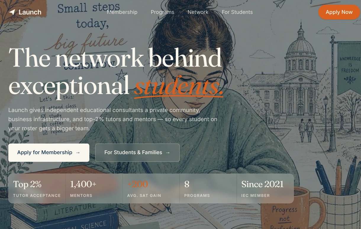
The hero is a full-bleed cinematic scene rather than a standard center-column layout. A 21:9 looping video sits behind everything, showing a student working at her desk with a broader campus scene behind her. The goal was atmosphere, not a literal demo of the product. The video is muted, loops infinitely, and has a poster image fallback.
A semi-transparent ink overlay (
bg-ink/55) darkens the video just enough to make cream text readable without losing the illustration's warmth. The headline is short and declarative:"The network behind exceptional students."
The word "students" is emphasized in ember and underlined with a hand-drawn SVG stroke, focusing the emotional promise on the people the platform serves rather than the consultants themselves.
Two CTAs sit below the headline:
"Apply for Membership" — cream-filled primary button for consultants.
"For Students & Families" — glass-outlined secondary button for the other audience.
This dual-track CTA keeps both target visitors from bouncing before they find their path.
Glassmorphism Metrics Strip
Credibility was moved up into the hero itself, not pushed below the fold. A five-cell metrics strip sits at the bottom of the viewport:
Top 2% Tutor acceptance
1,400+ Mentors
+200 Avg. SAT gain (ember accent)
8 Programs
Since 2021 IEC Member
Each cell sits on a frosted glass panel (
bg-cream/20 with backdrop-blur-sm). The strip is compact and left-aligned (max-w-5xl) so it feels like editorial captioning rather than a generic dashboard. By keeping it inside the hero, the first viewport communicates both the emotional promise and the proof points simultaneously.Adaptive Navbar
The navbar is fully transparent over the hero so the background video feels uninterrupted. On scroll, it transitions to a frosted cream background (
bg-background/95 with backdrop-blur-sm) and the link colors shift from cream to ink. This keeps the header usable on the rest of the page without permanently boxing the hero behind a colored bar. The header itself spans the full viewport width, while the inner content stays constrained for readability.Responsive and Fit-to-Screen Thinking
A common landing-page mistake is a hero that grows taller than the screen, forcing the user to scroll through a section that was meant to be a single first impression. I used
h-svh (small viewport height) to lock the hero to exactly one viewport height, with tighter vertical spacing (py-16 / py-20 instead of oversized padding) so the headline, CTAs, and metrics strip all fit without overflow.The headline uses a responsive type scale (
text-4xl sm:text-5xl lg:text-[4.4rem]) to stay readable from mobile to desktop without reflowing awkwardly. The metrics grid collapses from five columns on desktop to two rows on mobile, keeping the numbers scannable.Accessibility and Performance Notes
The background video has
aria-label, muted, loop, playsInline, and a poster fallback for reduced-motion users and slower connections.All color contrast is handled through the overlay layer rather than by lightening the video itself, so readability is robust regardless of the frame being displayed.
The ember accent is used only on the highest-priority proof point (
+200 Avg. SAT gain), keeping the color language disciplined.The entire design system lives in semantic tokens in
src/styles.css, so dark mode, future pages, and component variants can be scaled without hardcoding colors.Outcome
The result is a landing page that feels less like a startup signup screen and more like a trusted editorial institution: warm, spacious, and intentionally confident. The full-bleed hero, the glassmorphism metrics strip, and the adaptive navbar all serve one goal — making the visitor believe, immediately, that Launch is a serious network behind exceptional students.
Built with: TanStack Start, React 19, Tailwind CSS v4, custom
oklch color tokens, and a generated cinematic hero video.Like this project
Posted Jul 31, 2026
A portfolio case study for the Launch landing page: a credibility-first homepage for a private network of independent educational consultants, tutors.
Likes
2
Views
13
Clients
Launch