Earnz Rebranding
Alex Foxley
When Earnz PLC approached us for a complete rebrand, they were looking for a fresh new identity that would reflect their position as an innovative force in the energy sector.
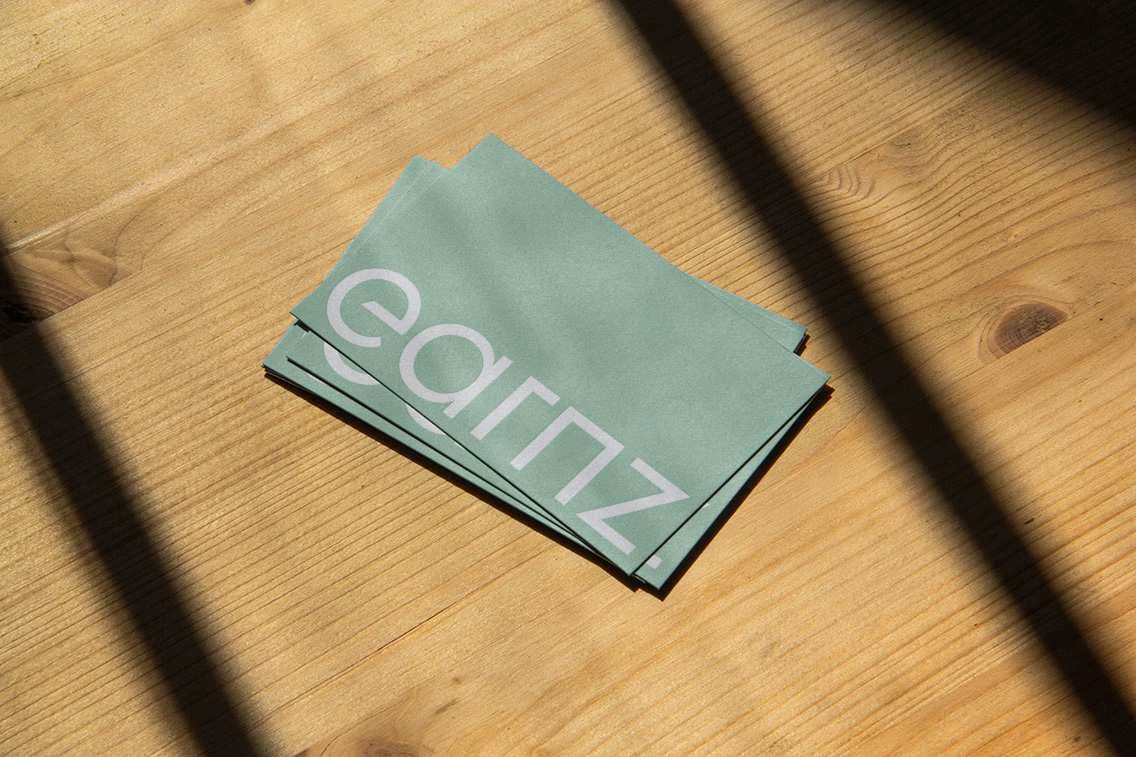
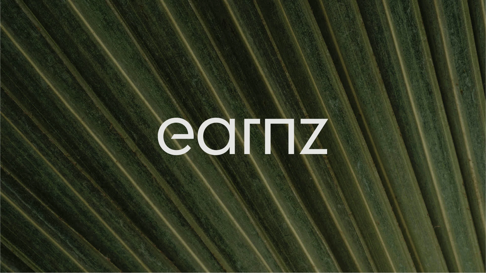
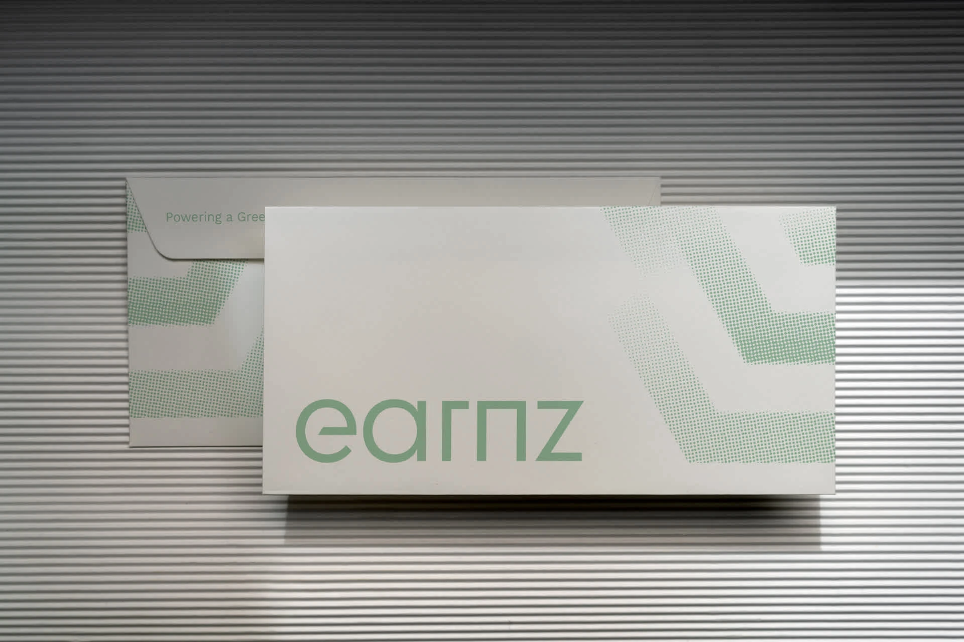
The project involved a full visual overhaul, including a new logo, updated color palette, modern typography, and a redesigned website. Our goal was to create a brand that not only looked professional but also felt dynamic and forward-thinking—something that could grow with the company as it expanded.

The challenge here was to develop a visual identity that conveyed Earnz’s authority in the energy sector while also capturing the company’s modern, progressive spirit. We needed to create a brand that felt both reliable and fresh, with a visual language that would work across various platforms and evolve as the company grows.
This meant rethinking every element of the brand—from the logo to the color choices and fonts—ensuring that each piece felt cohesive and adaptable to future needs. The end result had to strike the perfect balance: bold, memorable, and future-proof.

Like this project
Posted Jun 3, 2025
Complete rebrand for Earnz, a renewable energy acquisitions company based in the UK.
Likes
7
Views
39
Clients
Earnz