Clarity in digital banking: CaixaBank case study
Ines Ivorra Harrison
Context
As part of CaixaBank’s rebranding, it became clear that many product pages had a dense, unclear structure that didn’t reflect the new brand voice.
The content was technical, overly legal, and created friction in both user comprehension and conversions.
Challenge
Clarify and restructure key product pages to improve the user experience, increase conversions, and reinforce the new verbal identity of the brand.
My contribution
- Redesigned content across multiple product pages (cards, loans, insurance, accounts, etc.) with a strategic and accessible content approach.
- Proposed new ways to structure information, highlight key benefits, and reduce the weight of legal content while ensuring compliance.
- Aligned the tone of voice with the new brand guidelines, applying it consistently across navigation and key touchpoints.
- Partnered with design and legal teams to transform dense text into experiences that were easy to read and visually balanced.
- Laid the foundations for a modular content system, enabling reusability across future product pages.
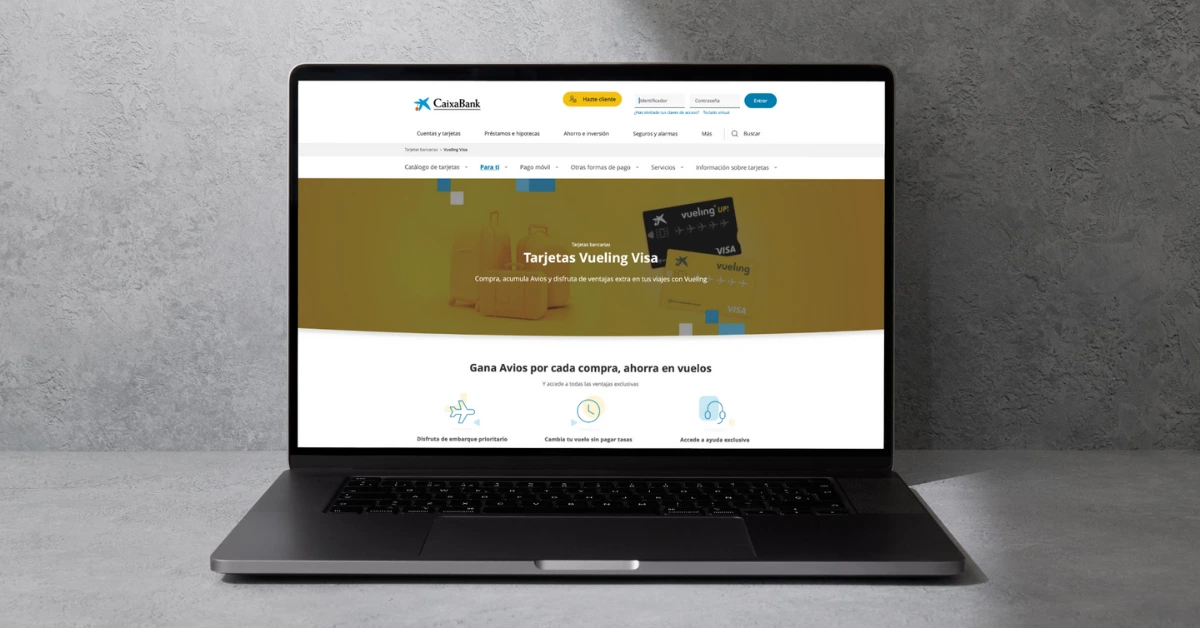
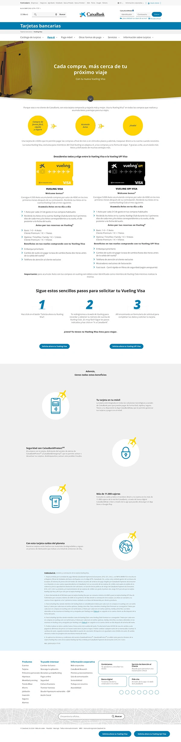
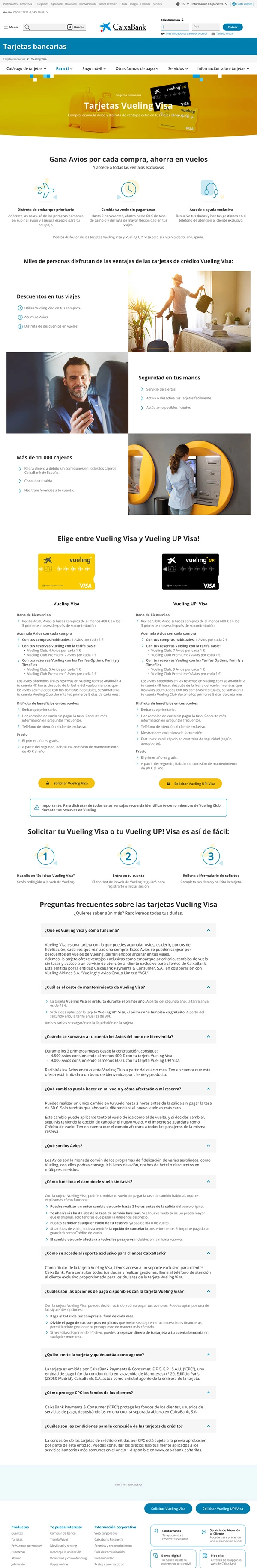
Featured example – Vueling Visa Card
Objective
Improve the conversion rate of the landing page by creating a clearer, more persuasive experience aligned with the new brand voice.
Problems detected
- Excessive content with no clear hierarchy
- Key benefits hidden under technical and legal jargon
- CTA not visible or guiding the user to action
- Confusing application instructions
- High workload for customer service due to recurring user questions
Solution implemented
Prioritized key benefits at the top of the page
Added a stepper to explain the process step by step
Rewrote financial terms in accessible language
Turned legal notes into a collapsible FAQ section
Introduced a clear, well-placed CTA at the right moment in the flow
Estimated impact
1–2% increase in conversion (benchmark KPI for similar products)
Reduction in customer service queries
Stronger alignment between visual design and written content
Examples
Before
Overall outcome
- Stronger consistency between product, experience, and brand across digital touchpoints
- Content positioned as a strategic pillar within the design system
- Improved user experience on key pages, supporting the digital positioning of the new CaixaBank
Key learnings
- Balanced legal and technical language with accessibility and clarity for diverse audiences.
- Connected brand storytelling with conversion and usability goals in complex financial environments.
- Built the foundations for reusable, coherent, and scalable content within the company’s design system.
- Delivered strategic content solutions as part of a large-scale corporate rebranding process.
Like this project
Posted Sep 13, 2025
Redesigned landing pages for CaixaBank, simplifying complex information into clear, accessible content that improved user comprehension and conversion.
Likes
0
Views
4
Timeline
Jun 1, 2024 - Jul 31, 2024
Clients
CaixaBank