RAWTH - Grow as you are — naturally.
Didem Dönmez
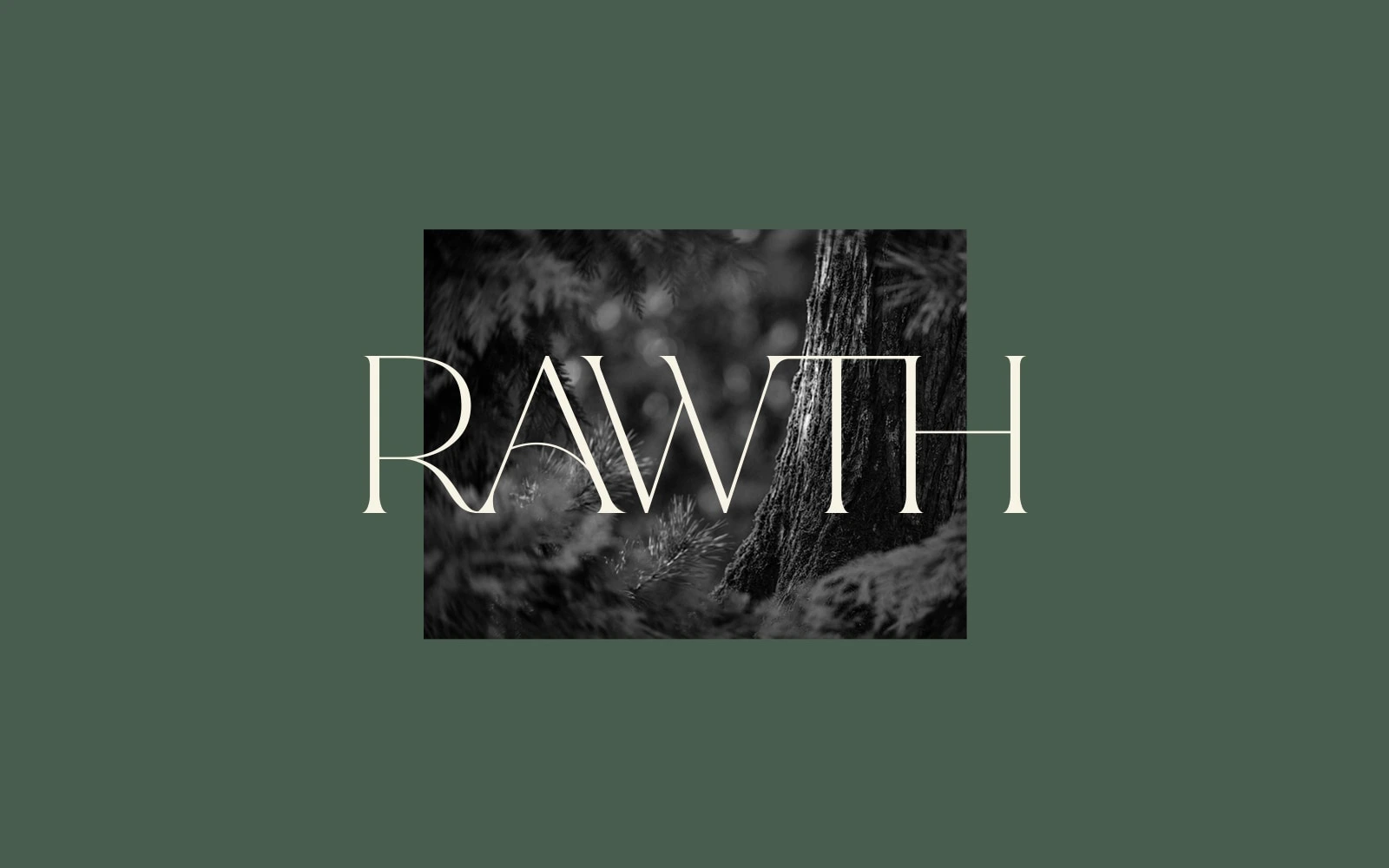
RAWTH - Grow as you are — naturally.
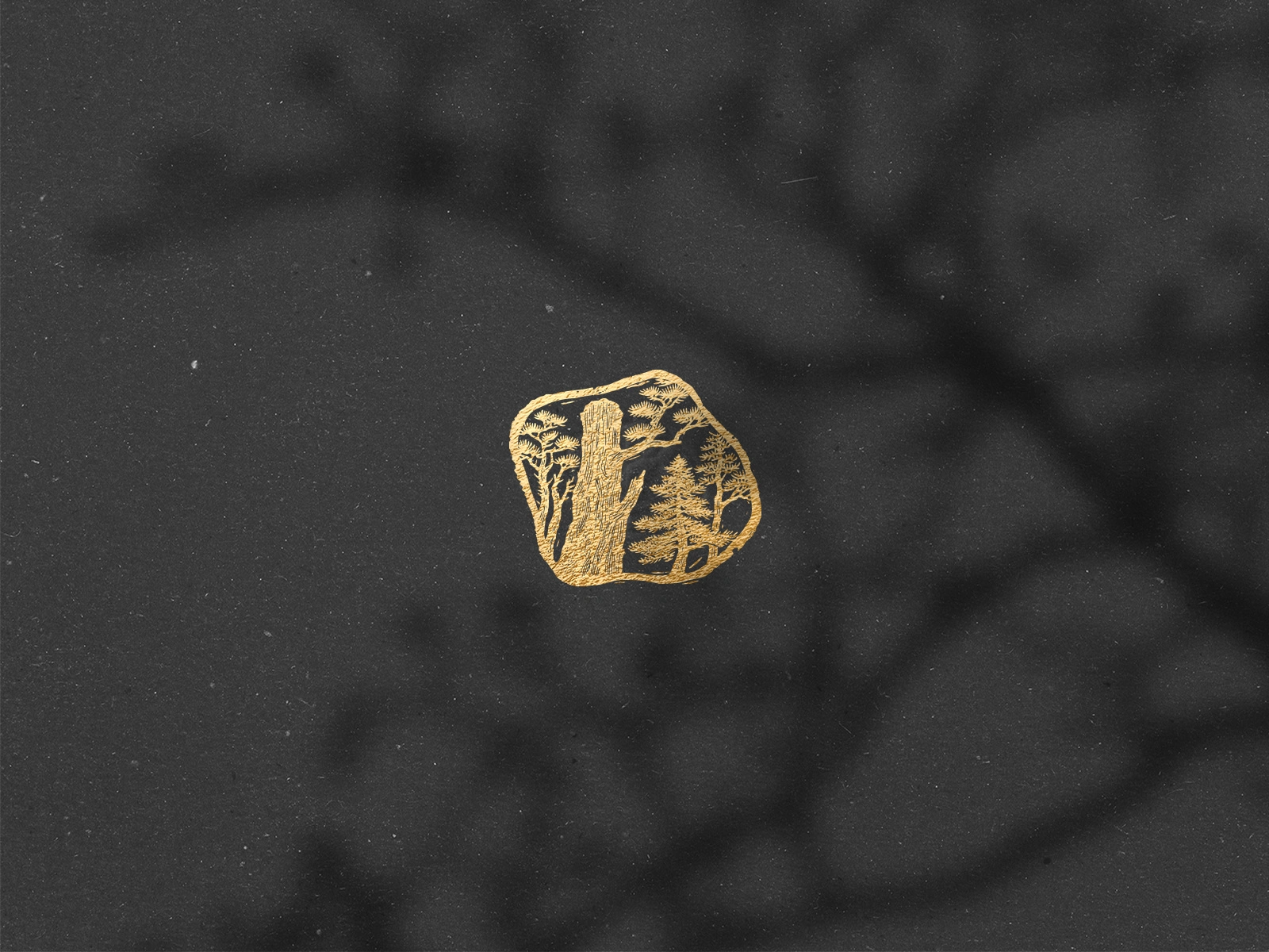
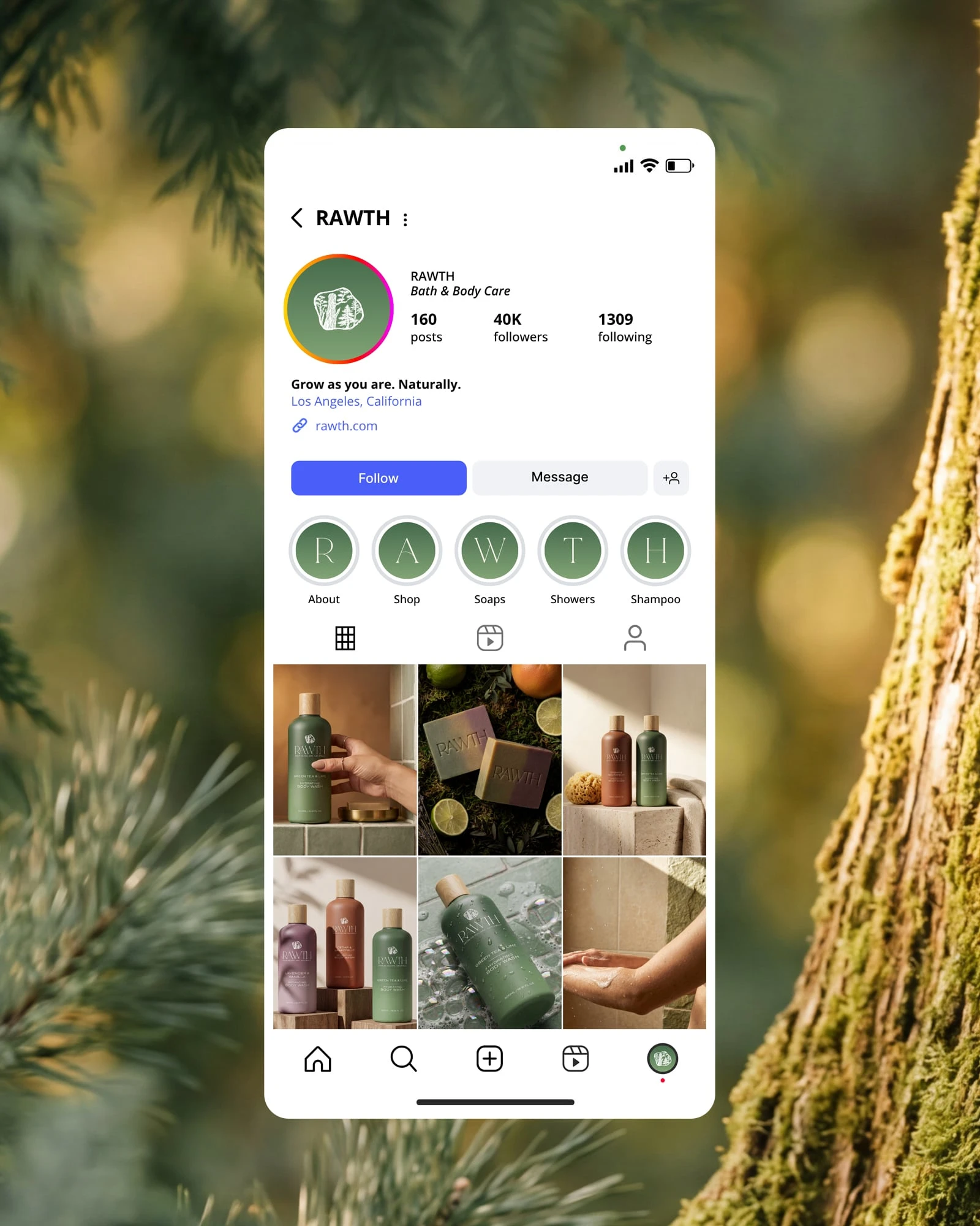
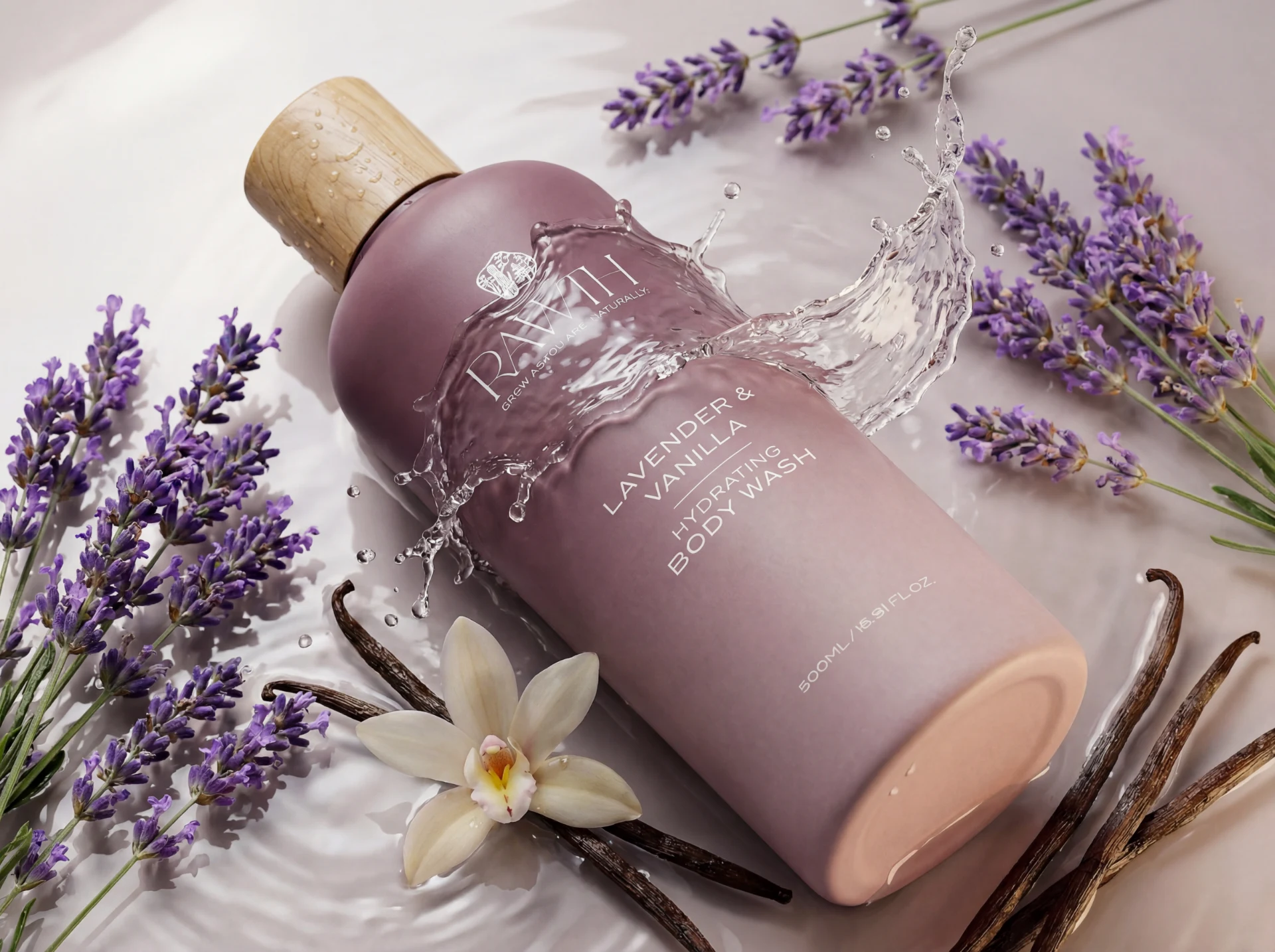
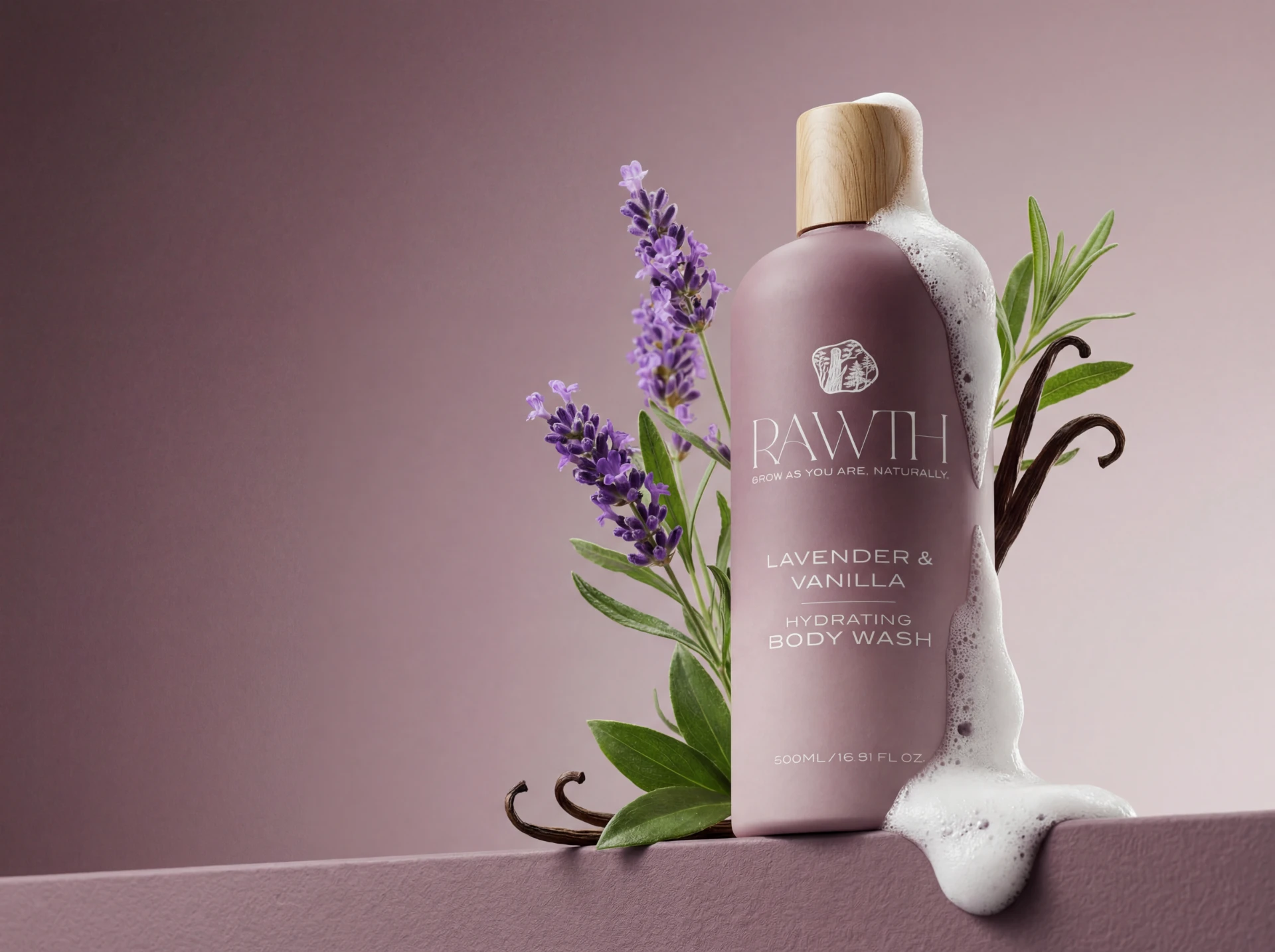
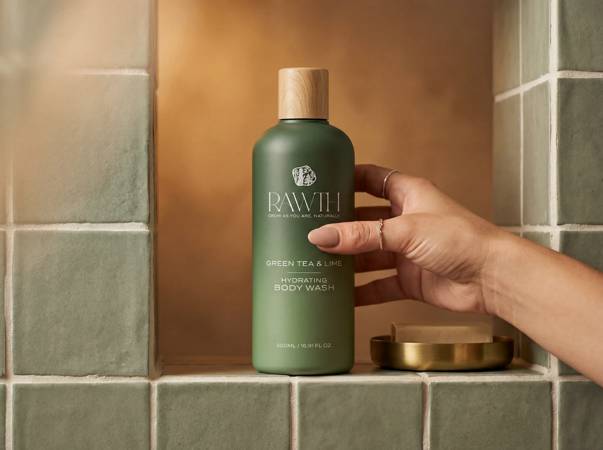
RAWTH, a premium body care brand, was inspired by the fusion of “raw” and “earth,” representing natural purity and organic wellness. Its logo features a
hand-painted Sumi-e ink tree, reflecting traditional Japanese brush techniques and reinforcing the brand’s authentic, nature-rooted identity.
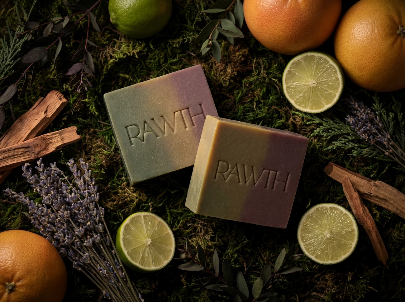
The product line consists of 500 ml cylindrical body wash bottles, each with a thoughtfully selected gradient to express its scent profile. The wood-grain cap emphasizes tactile and visual natural qualities, connecting the packaging to the earth-inspired concept.
Botanical storytelling guides the design:
Green Tea & Lime through layered fresh greens, Cedar & Grapefruit through warm orange-to-brown earthy tones, and Lavender & Vanilla through soft muted shades. Clean typography and minimal layouts ensure the ingredient story remains central.
The resulting brand system is cohesive, scalable, and visually compelling, bridging natural inspiration with modern clean beauty aesthetics for packaging, photography, and campaign applications.
Look at the trees and you will find yourself. – DOGEN ZENJI
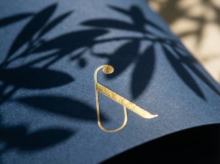
LOGO
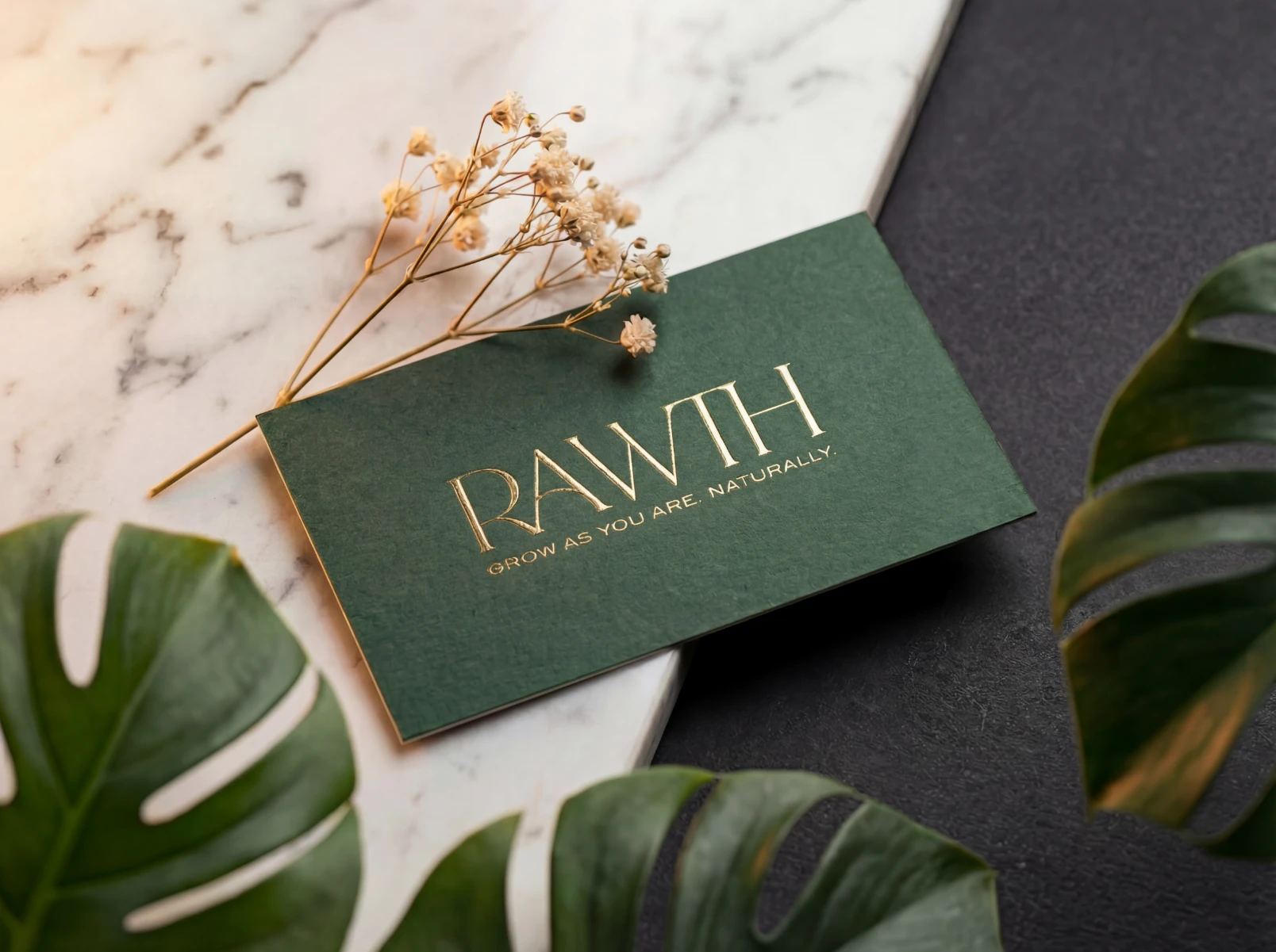
Business Card
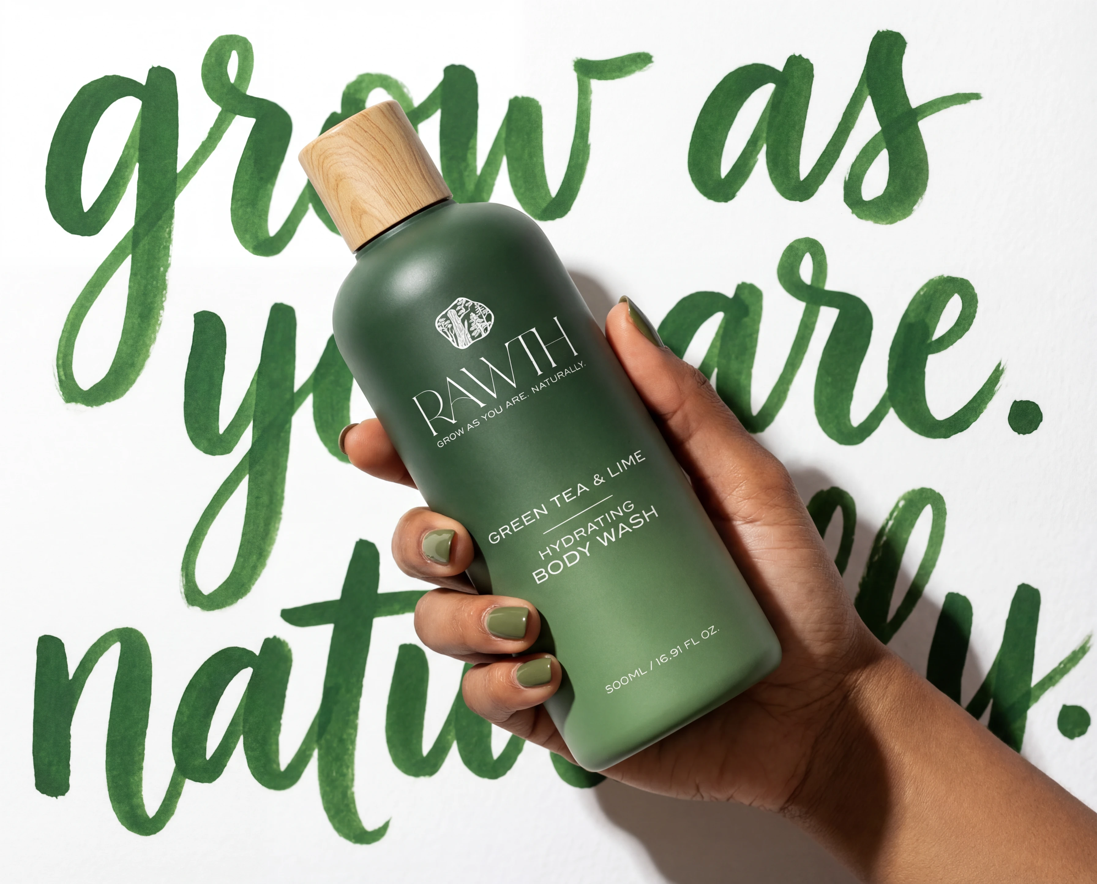
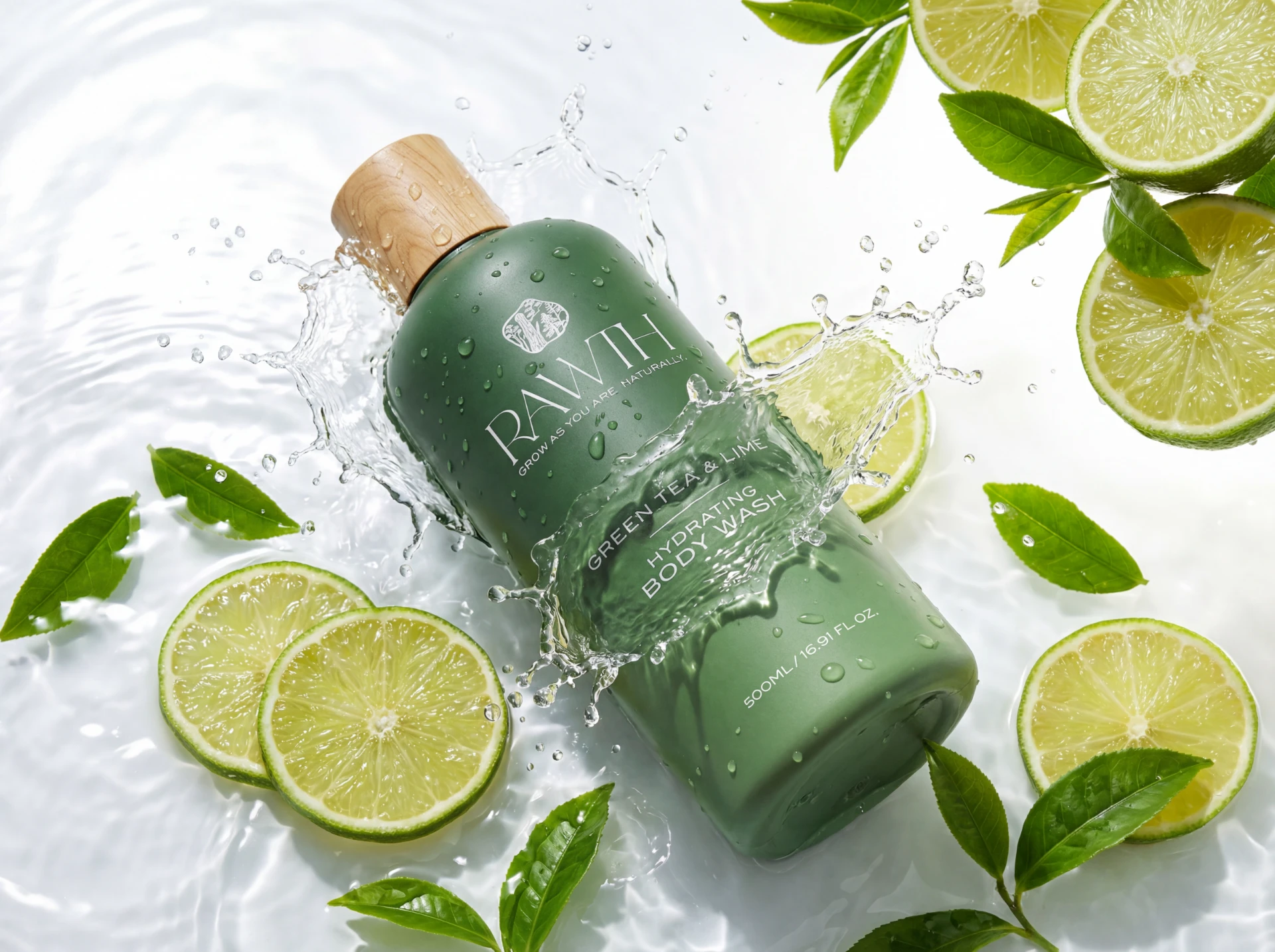
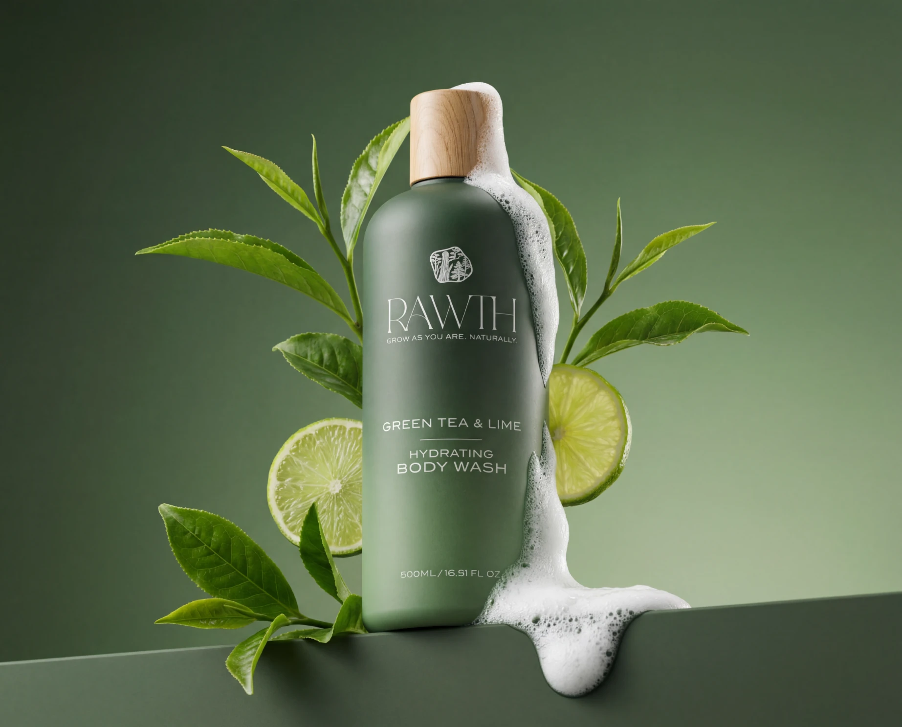
Green Tea & Lime
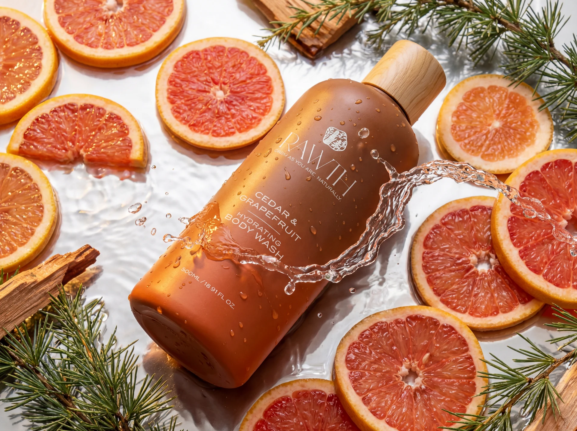
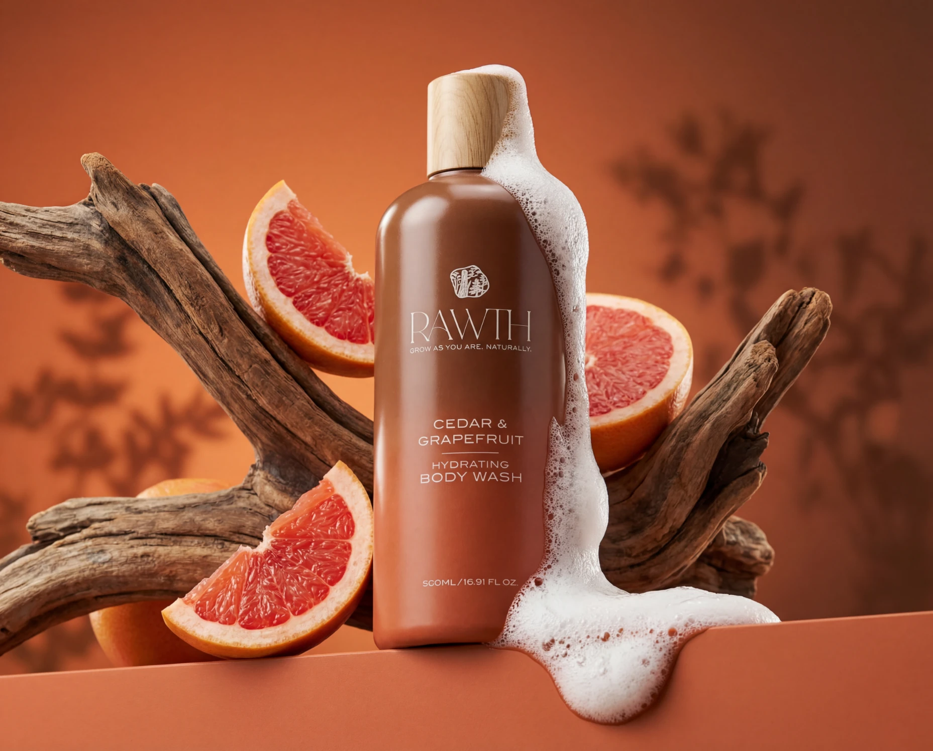
Cedar & Grapefruit
Lavender & Vanilla
Like this project
Posted Mar 25, 2026
RAWTH is a nature-inspired body wash line combining earthy gradients, clean design, and botanical storytelling into a cohesive, premium visual identity.