efémera Candles
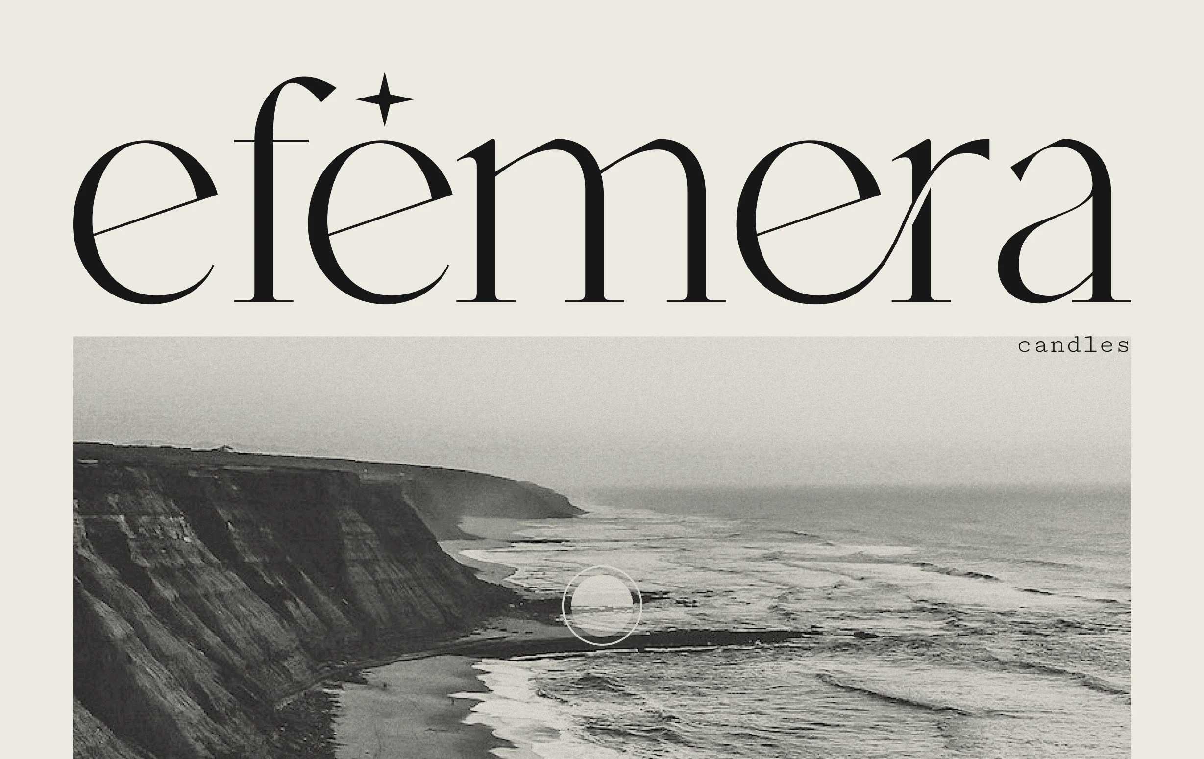
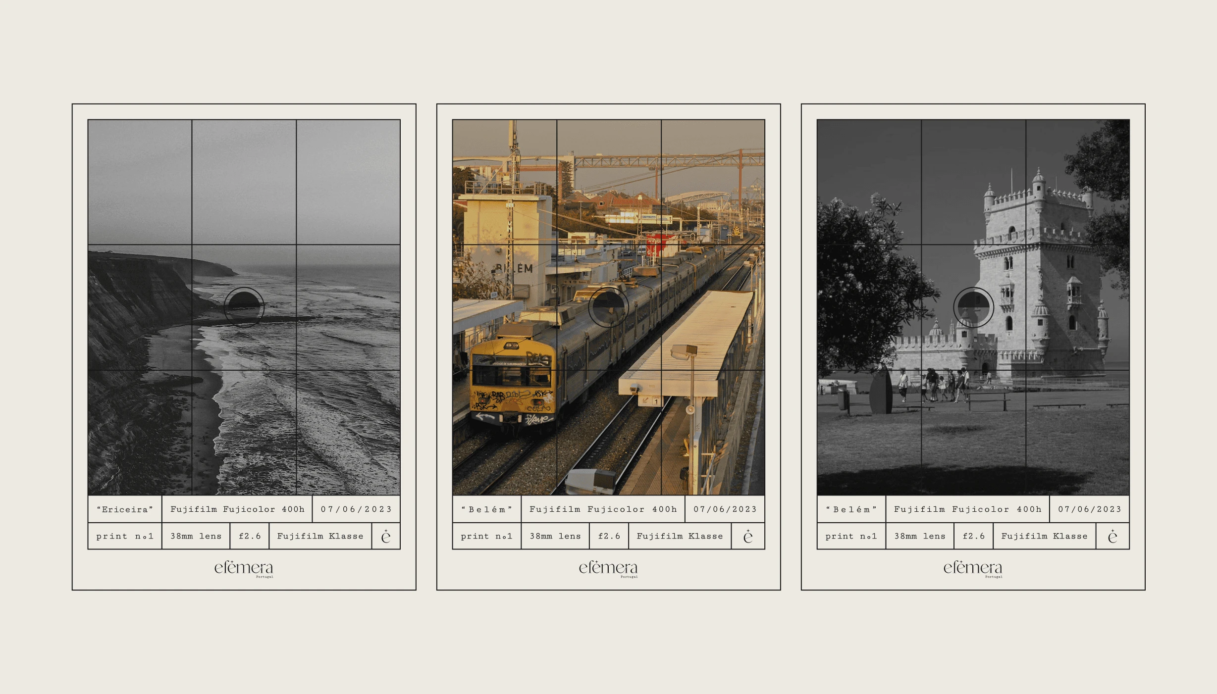
Inspired by the iconic streets and vibrant places of Portugal, efémera is a project born out of a desire to preserve and share the unique essence of these locations. The streets of Lisbon, the forests of Sintra, and the beaches of Ericeira—all hold a special place in my heart.
To maintain the Portuguese spirit, efémera uses beeswax sourced from Alexandre, a local beekeeper in Alcacér. This collaboration ensures that every candle is authentically Portuguese, built from the ground up with the support of my cherished friends.
efêmera is an artisanal candle brand inspired by the captivating scents of Portugal. With a commitment to sustainability and using locally sourced ingredients, efêmera candles are meticulously handcrafted to transport you to the streets, beaches, forests, fields, and all the other amazing places that are a part of this beautiful country.
Branding & Candle-Making
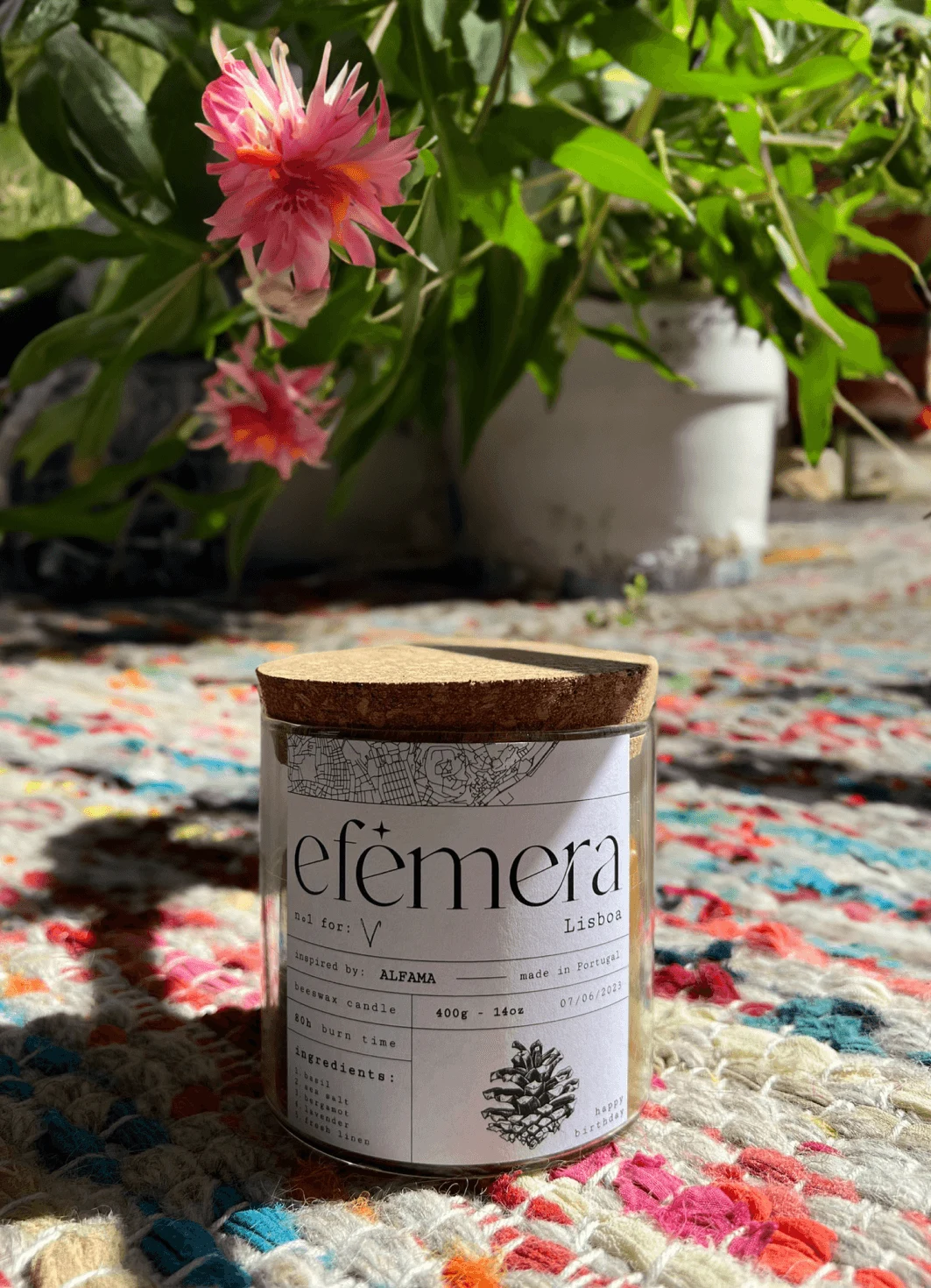
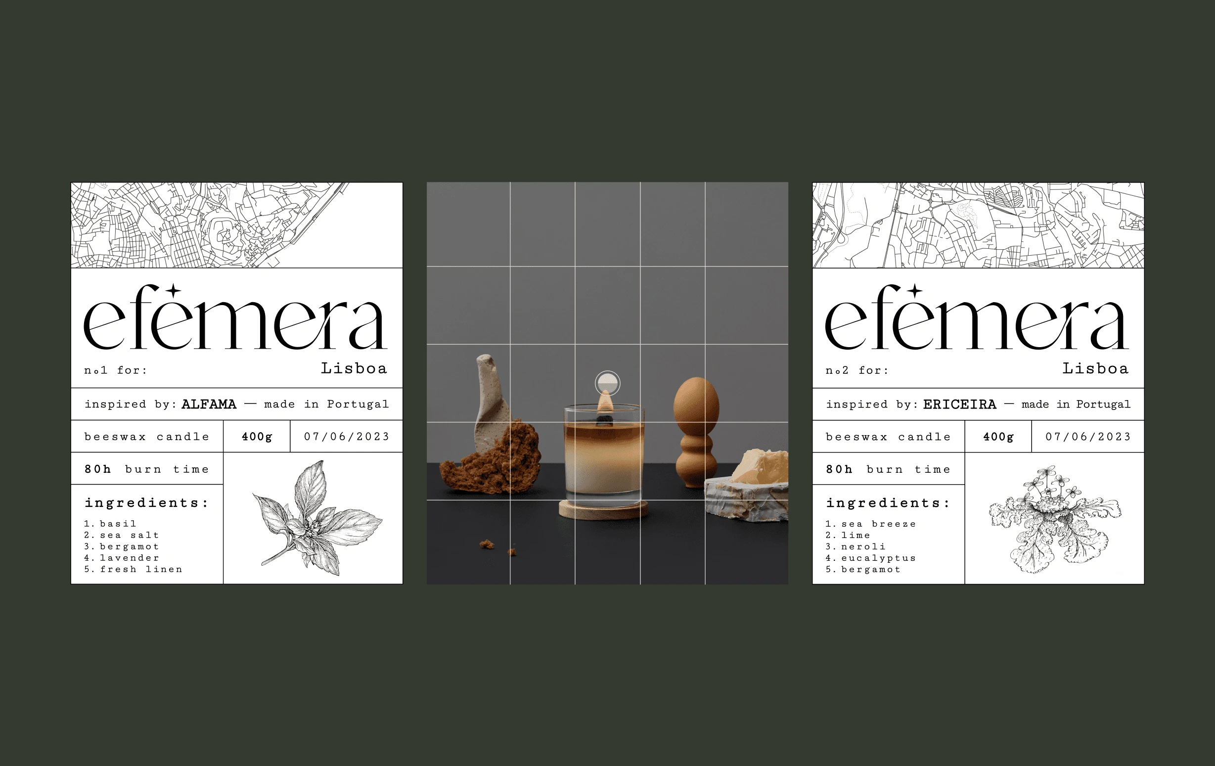
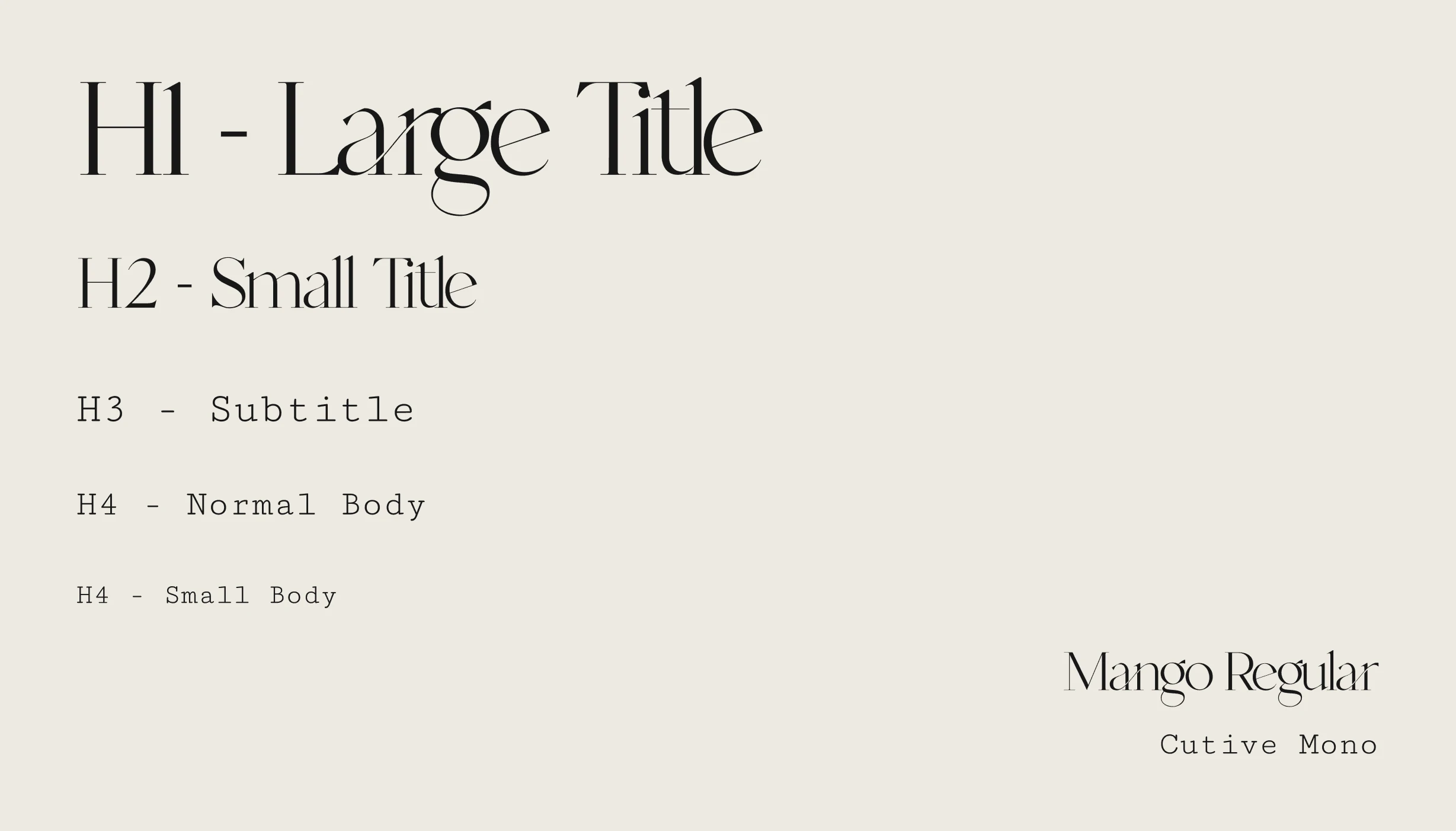
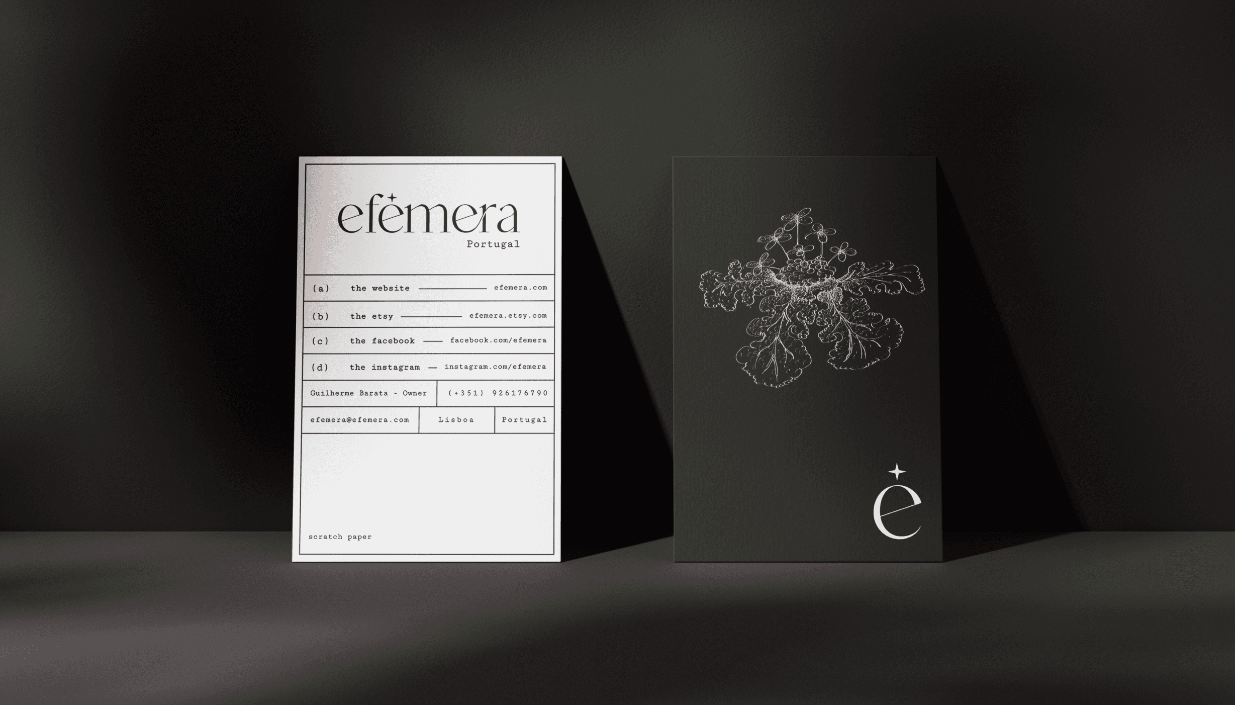
For this brand, I tried to encapsulate an apothecary meets old-timey newspaper vibe with a touch of Lisbon's very palpable atmosphere. Using a monotype font for the main text coupled with a pretty intricate serif font for the logo allowed me to explore this monochromatic aesthetic that I believe fits very well with the purpose of this brand and its environment.
Actually making the candles was hands down the most fun I’ve ever had with a project. Learning about scent blends, wax throws, compositions, and putting it all together with my friends in my grandma’s very Portuguese kitchen (she swears it still smells like pine but eh... could be worse) whilst listening to the Breaking Bad soundtrack. I really couldn’t have asked for a better project.
The final product is something I’m really proud of, it’s the culmination of a lot of design research and candle science which turned out to be a lot more complex than I thought.
Colors
I chose a monochromatic color palette because I want the focus of each candle to be on their smell. The only visually distinguishing elements on the labels are the maps that represent the place that the candle embodies, and an illustration of the main note of the candle.
This is a project that I hope to one day turn into something bigger. A store called “A vida portuguesa” just closed, this store that focused on Portuguese vintage products like Couto toothpaste, canned goods, ceramics and other objects that are a big part of our culture, and it will now give space to a luxury local accommodation. You can’t make this up I swear. All of this to say that I’d love to open a store with products that remind people of the country we have, its beauty that’s not always apparent.Development optimizes the website's performance by optimizing code, reducing file sizes, and improving loading times. A fast-loading website enhances user experience, reduces bounce rates, and improves search engine rankings
Like this project
Posted Apr 26, 2024
Inspired by the iconic streets and vibrant places of Portugal.


