Boosting Adoption: Milestone-Driven Rewards for Kirana Stores
Radhika Mehta
Boosting adoption rate by 35%: A UX case study on milestone-driven rewards for kirana stores
How transparent milestones and behavioural nudges increased Ninjacart’s order tonnage by 8% and adoption rate by 35%
8 min read
Apr 3, 2025
Reported by:
Radhika Mehta, Product Designer — Sales & Distribution, Ninjacart
Role: User Research, UX Design, UI Design
Ninjacart is a leading B2B agri-commerce company in India, transforming the fresh produce supply chain by directly linking farmers with Kirana Stores. Kirana Stores in India are corner shops in local neighborhoods, typically selling groceries and daily household goods. The app currently has 8000+ daily active users.
The Challenge: Revamp the Rewards Experience
Despite an existing rewards program, order tonnage — a key metric for supply chain efficiency — had plateaued well below the target. Initial assumptions pointed to a potential misalignment between business and user goals. The following specific areas of divergence were considered:
Order Volume vs. Cash Flow Management:
The business goal was to boost order tonnage by incentivising bulk purchases, but kirana owners might prioritise maintaining a healthy cash flow over increasing order sizes. This could lead to hesitation in adding more quantities of SKUs to the cart.
Supply Chain Efficiency vs. Daily Convenience:
From a business perspective, Ninjacart’s higher order volumes could enhance supply chain efficiency, but the daily operations of a kirana store demand simplicity. Complex rewards mechanisms could clash with the demand based procurement decision making of busy retailers.
These potential misalignments initially raised concerns that the rewards program might be missing the mark. However, subsequent user research revealed that the core issue wasn’t a misalignment of priorities at all — it was a matter of discoverability and education. Kirana owners simply weren’t aware of the rewards or how to earn them because the system was hidden behind multiple screens and lacked real-time, user-friendly feedback and failed to educate users on the tangible benefits of collecting coins and redeeming rewards. This resulted in rewards being underutilised.
Research: Uncovering why rewards went unnoticed
Heuristic Violations
Visibility of System Status: Severity Score 4
No progress indicators or nudges about how many coins a user should collect to claim rewards.
User Control: Severity Score 4
No way for the user to adjust cart to claim more coins.
Qualitative Analysis
Sample Set:
15 kirana owners in Bengaluru.
Methodology:
Semi-structured user interviews
Key Insights:
Awareness of Rewards: Only 20% (3/15) could correctly explain where to find rewards and how to earn them.
Trust in System: 80% (12/15) couldn’t associate to the purpose of collecting coins and how it will benefit them.
Key Pain Points:
86.67% (13/15): Didn’t know rewards existed
Behavioural Triggers:
60% (9/15) said ordering larger quantities in certain SKU’s felt risky due to perishability fears.
Tech Literacy Barriers:
75% relied on family/helpers for tasks like updating apps or redeeming rewards.
Navigation Habits:
93% relied on muscle memory for app navigation. Example: They used only the “Fruits & Vegetables” button for ordering, skipping homepage scrolls and exploring other offerings.
93% didn’t find banners to be clickable. They perceived it more as bulletin boards for updates.
The Persona
Meet Selvan, a 47-year-old kirana owner from Bengaluru. He runs a small grocery store, ordering 3–4 times a week from Ninjacart. Despite being tech-savvy enough to navigate the app, he never engaged with rewards. Why?
“I didn’t know why coins existed & that I had to claim them.”
Even when he added extra Kg, he saw the earned coins only after paying — too late to adjust his order.
Selvan’s story echoed across all user interviews: rewards were invisible, intangible, and untrustworthy.

Framing the core challenge
If we make rewards tangible, discoverable and easy to understand — with real-time feedback on how close users are to earning them, kirana owners will be motivated to place larger orders.
Design Pillars
Early on, it was important for me to understand the primary factors that were influencing the user’s experience with rewards. The following factors directly informed my design strategy:
Prominent Placement: Embedding rewards in primary user flows (homepage, product listings, checkout) so they’re immediately visible.
Simplicity in Navigation: Ensuring that users can quickly understand how rewards work with minimal clicks, keeping the experience frictionless.
Real-Time Feedback: Updating progress dynamically as users add or remove items, reducing uncertainty and encouraging incremental steps.
Personalisation: Tailor reward suggestions and milestones based on individual ordering patterns and store needs, ensuring that rewards feel relevant.
Contextual Prompts: Provide timely nudges and alerts at critical points in the ordering journey to guide decision-making.
The Solution: Why Fogg’s Behaviour Model Mattered
To solve for the challenge, I turned to BJ Fogg’s Behaviour Model, which states “Behaviour happens when Motivation, Ability, and a Prompt come together at the same time. When a behaviour does not occur, at least one of those three elements is missing.”
Here’s how I applied it to Selva’s world:
Motivation:
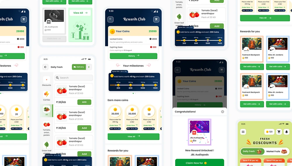
Problem: “Show me the rewards”
Users were merely collecting coins without feeling a strong, immediate sense of reward. The abstract nature of coin accumulation lacked a clear, tangible payoff, leaving users less motivated to engage deeply with the rewards program.
Proposed Solutions:
•Introduction of an upfront visual element featuring a coins counter with a reward at the end of it, so users could immediately see the coins being added based on any action they take.
• Displaying rewards upfront on a banner for users to associate coins to rewards.
Ability:
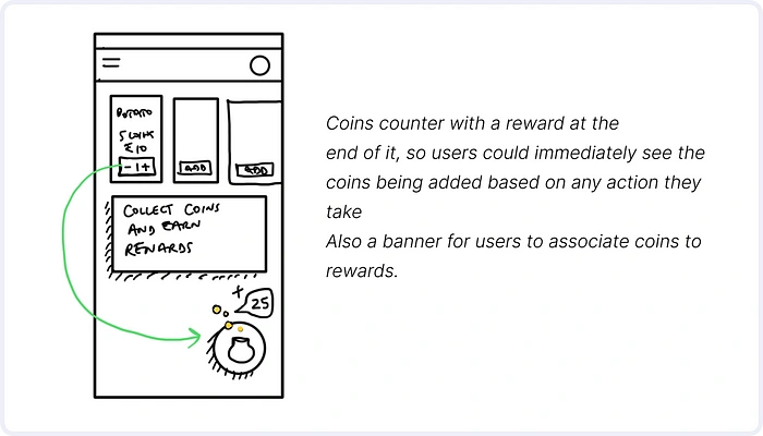
Problem: “Don’t make me think”
The rewards system previously required multiple taps to access, which was a significant barrier for users with low digital proficiency.
Proposed Solutions:
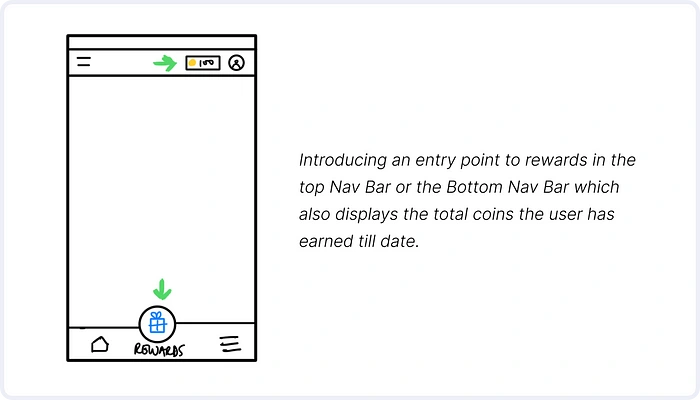
• Introducing an entry point to rewards in the top Nav Bar or the Bottom Nav Bar which also displays the total coins the user has earned till date. The bottom Nav Bar has very less CTR <5% on a weekly basis and hence it was decided to not go ahead with that entry point.
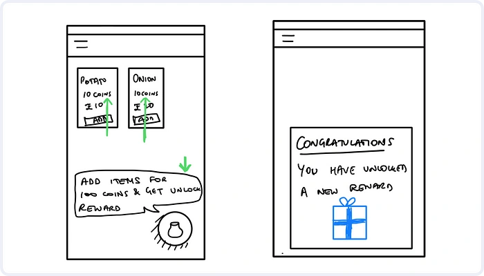
Prompt:
Problem: “Remind me at the right time”
Updates related to rewards and progress were confined to a dedicated rewards page. This meant users only saw their progress when they actively navigated away from their primary order placement journey. As a result, critical cues to drive behaviour change were missing at key decision making moments.
Proposed Solutions:
• Displaying amount of coins that that could be earned for every SKU upfront.
• Implementation of proactive, time-sensitive nudges (e.g., “Add 10kg more to unlock 100 Coins!” and “You have unlocked a new reward.”) within the cart and at other pivotal moments, ensuring that reward information is upfront when the users are making purchasing decisions.
• Using striking icons and animations to draw attention to reward progress, making the information hard to miss at any step of the ordering process.
Endowment Effect: “I’ve Earned This, I Need to Finish!”
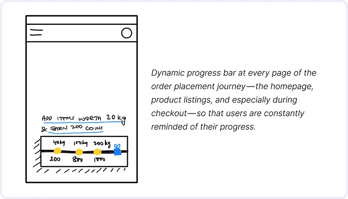
Leveraging the Endowment Effect — also known as divestiture aversion, is the tendency for people to place a higher value on an object they own than on the same object when they don’t own it. This was pivotal in shaping the dynamic progress bar. This feature makes the rewards tangible throughout the user’s journey, driving deeper commitment to complete their milestones.
Problem: “Nudge me at the right time”
The lack of visible, incremental progress with how many coins the user has earned meant that the rewards system felt abstract and disconnected from the ordering process.
Proposed Solutions:
• Dynamic Progress Bar:
Integrate Updates Throughout the Journey by showing the dynamic progress bar at every page of the order placement journey — the homepage, product listings, and especially during checkout — so that users are constantly reminded of their progress. The visual indicator not only shows the current progress but also calculates the value achieved — displaying messages like “Add 40kg more to unlock 200 coins.”
• Complementary Principles:
Combined the Endowment Effect with the Peak-End Rule by ensuring that the visual “peak” moments (e.g., crossing 150kg) are celebrated with a mini pop-up message like “Almost there! Just 50kg more for maximum savings!” or a celebratory animation. This reinforces the positive emotional association with progress.
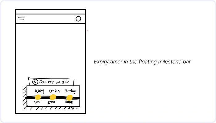
Creating Urgency: Leveraging the Scarcity Principle and Loss Aversion
Without urgency, the endowment effect could potentially weaken — users will not feel compelled to complete partially earned rewards.
The scarcity principle is a psychological concept that states people tend to place a higher value on things that are limited in supply or difficult to obtain.
Loss aversion is a cognitive bias that describes the tendency for people to feel the negative impact of a loss more strongly than the positive impact of a gain of equal magnitude.
Problem: “I’ll hit the target tomorrow”
Even with visible milestones, users like Pushpa have a tendency to delay bulk orders, treating earning coins as a “someday” goal rather than an urgent incentive to place the order.
Proposed Solutions:
• Add a 24-hour expiry timer to the floating milestone bar (e.g., “Earn ₹200 by ordering 200kg in 24h!”).
• Make the timer an animated counter
• Add emojis like 🔥 or ⚠️ to create the urgency
Final Designs: Transforming Rewards into Results
The revamped rewards system at Ninjacart achieved measurable success. Here’s how the metrics reflect this transformation for the first month post release:
Adoption
35% increase in rewards adoption.
52% of these users achieved targets week-over-week.
Order Tonnage
8% increase in average order tonnage on a daily basis.
For confidentiality reasons I have omitted the actual values of metrics.
Like this project
Posted May 14, 2025
Revamped Ninjacart's rewards system, boosting its adoption by 35% and order tonnage by 8%.