Designing for Bharat: A Field Guide to Inclusive UX
Radhika Mehta
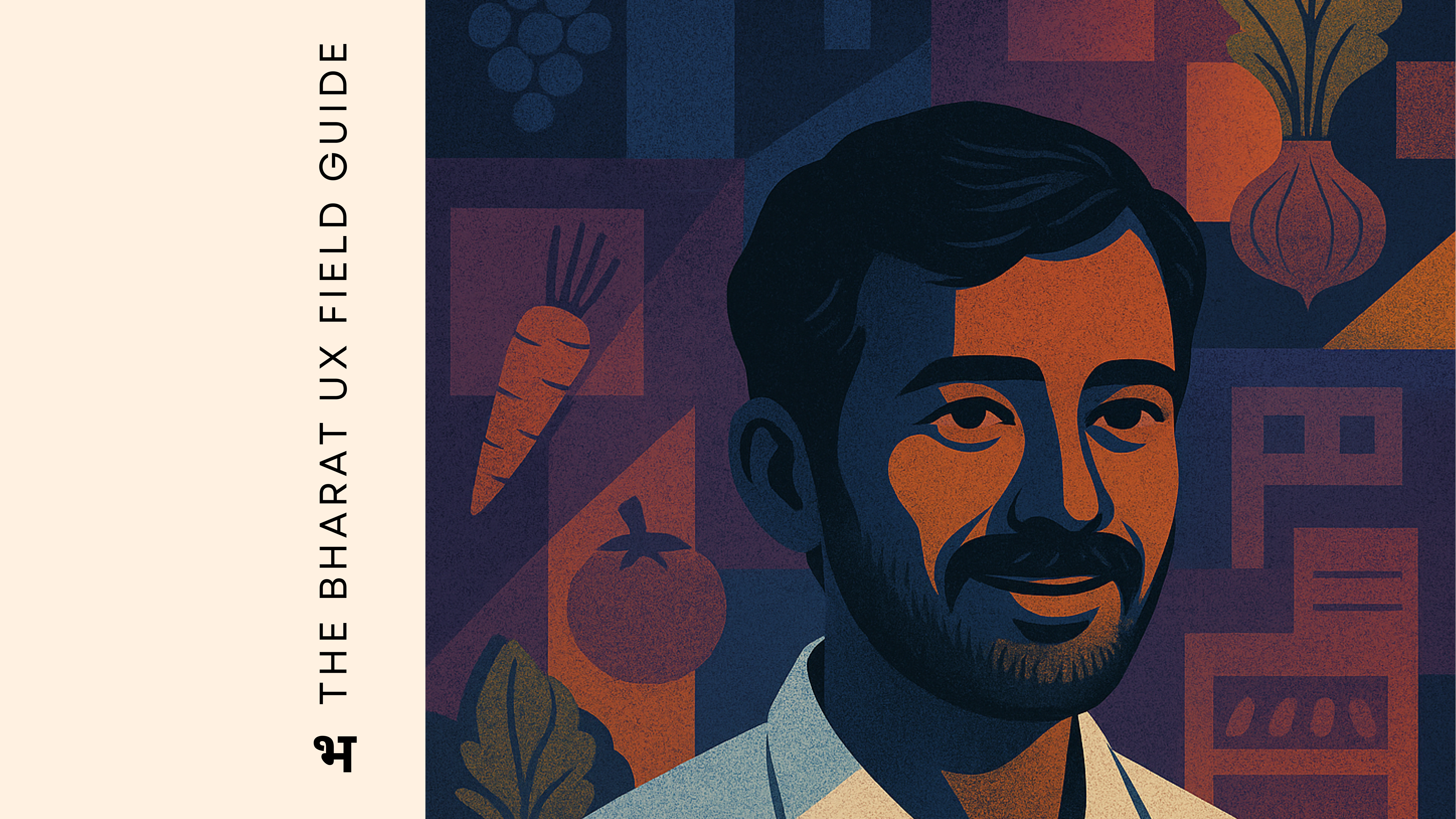
Designing for Bharat: A Field Guide to Inclusive UX in Rural Agri-Tech Ecosystems in India
10 min read
Apr 21, 2025
A field guide for practitioners designing or researching for low to medium tech users in Agri Tech ecosystems.
Why I wrote this Field Guide
🔗Link to the Field Guide: The Bharat UX Field Guide ✅
When I first stepped into the world of rural Agri-Tech, I carried with me frameworks, checklists, and a solid HCI vocabulary. But nothing prepared me for what truly mattered: listening, observing, and unlearning.
I still remember one interaction that shifted everything. During a usability test, I asked a shop owner if he understood a part of the interface. He looked at me and said:
“I have built this business from the ground up. You think I can’t use your simple app?”
That moment stayed with me. It wasn’t just about tech literacy. It was about my assumptions. I realised, I was unintentionally questioning their caliber — framing them as “users” instead of what they really are: entrepreneurs, strategists, decision-makers. It changed the way I interviewed, observed, and designed. I didn’t just show up with prototypes now, I started showing up with patience, time, and sometimes, just a cup of chai. I learned to sit in their shops, watch without interrupting, and understand before offering solutions. My HCI background taught me what to do — but these experiences taught me how to do it with respect.
This field guide is my personal chronicle — a collection of insights, lessons, and reflections born from countless conversations, field visits, and failed prototypes. It’s an outcome of trial and error, late-night brainstorming, and a growing conviction that technology must be as resilient and adaptable as the people it aims to serve.
I don’t know if I’ve had a breakthrough yet. I’m still figuring a lot of this out. But I wrote this for designers who, like me, once felt lost. This is your starting point. Build on it. Question it. Add to it.
As Krishnamurti once said:
“To observe without evaluating is the highest form of human intelligence.”
And maybe, that’s where good design really begins…
Learning from those who came before
Books, papers, and borrowed wisdom: what the reading taught me before I stepped into the field.
Diving into rural Agri-Tech design demanded that I re-examine and expand my academic foundations. Real-world challenges such as limited connectivity, low literacy, and resource constraints called for design approaches grounded in robust research and practical experience. Here’s how a few key publications that helped shape my design process:
1. Participatory Design in Rural Contexts: Engaging Low-Tech Users
A foundational work is Participatory Design: Principles and Practices by Schuler and Namioka. This seminal book stresses the value of iterative co-creation with community members. Rather than imposing pre-built solutions, I learned to work hand-in-hand with kirana shop owners and agri traders to build interfaces that truly reflect their needs. Explore more on Link: MIT Press - Design Issues
Key Insights:
Iterative Co-Creation: Engaging users from the start helped refine prototypes and foster genuine ownership of the design.
Empowering Collaboration: The process transformed routine interviews into dynamic sessions of shared problem-solving.
2. Offline First: Principles and Practices for Low Connectivity Environments
In rural settings, consistent internet access isn’t a luxury — it’s a challenge. A detailed guide on Progressive Web Apps by Addy Osmani, available through Google Developers, lays the groundwork for building offline-capable applications. This resource underscores the importance of local caching, progressive synchronisation, and robust error handling to ensure that technology remains dependable even in low-connectivity zones.
Key Insights:
Resilient Design: Embracing offline-first strategies ensures that digital tools support users in environments where connectivity can be sporadic.
Practical Implementation: Techniques like local caching build trust and reliability, vital for users who depend on uninterrupted service.
3. Inclusive Design for Low-Tech Environments: Challenges and Opportunities
The Inclusive Design Toolkit from the Inclusive Design Research Centre, along with the Co-Design Inclusive Design Toolkit, is a game-changer. These resources provide practical methods for addressing the unique usability challenges in low-resource settings. More importantly, they emphasise that effective design is not just about meeting accessibility standards — it’s about crafting experiences that are intuitive, clear, and deeply contextual.
Link: Inclusive Design Institute
Key Insights:
Community-led co-design: By involving community members directly in the design process, we can uncover nuances that traditional research might miss. When users are active collaborators rather than passive recipients, their lived experiences help steer the design towards solutions that are both innovative and grounded in reality. This collaborative process fosters trust and ensures that the final product resonates with the unique needs and habits of the community.
Link: Co design
4. Video Training for Agricultural Knowledge: Bridging Gender Gaps in Rural Uganda
Another influential piece of research is the paper, The Ability of Video Training to Reduce Agricultural Knowledge Gaps Between Men and Women in Rural Uganda. This study demonstrated how well-crafted video training modules can effectively bridge information disparities — particularly across gender lines — in rural agricultural communities.
[Link: Publication Link]
Key Insights:
Multimedia Engagement: The use of video training highlighted the importance of visual content in communicating complex concepts, an insight that has informed how I approach instructional design for low-tech interfaces.
Reducing Knowledge Gaps: By showing that technology can be a powerful equaliser, this work underscored the potential of digital tools to address both educational and operational challenges in rural settings.
Field Research Methodologies
When I first started visiting the shops and marketplaces that our users operated in, I quickly realised that this wasn’t going to be the kind of research you could conduct from behind a screen. The complexity of their workflows, the richness of their environment, and the nuances in how they used (or didn’t use) digital tools — all of it demanded presence.
Over the course of several visits, I experimented with a few different methods — some taught in textbooks, others I figured out on the fly. Here’s what worked, what evolved, and why each played a unique role in building this field guide.
A little context about the personas I generally met:
Kirana Owners: These are small-scale grocery shopkeepers — often family-run — who manage everything from inventory to customer relationships. Their stores are the backbone of daily life in many towns and villages. They value speed, familiarity, and tools that fit within their existing habits, not around them.
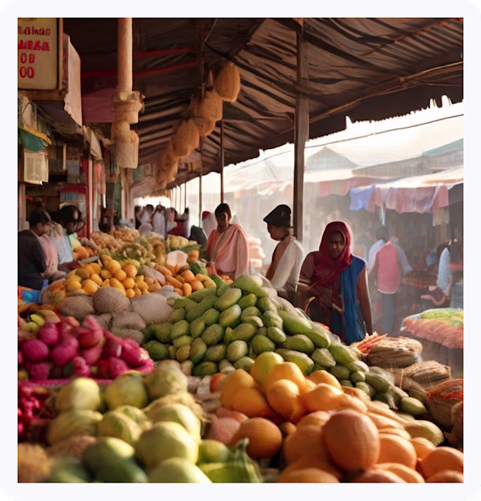
Agri Traders: Typically operate in larger, more networked environments like Mandis (Fruits and Vegetable Markets). They facilitate procurement and distribution between farmers and retailers. Tech for them needs to support coordination, speed in decision-making, and often function in poor connectivity zones.
1. Contextual Inquiry
Instead of traditional interviews, I’d spend time simply watching them work. No questions. Just observing.
At a kirana shop, that meant seeing how quickly the shopkeeper managed customers, managed inventory, handled payments and received goods — all without “standard” tech tools. For agri traders, I’d walk with them through mandi markets, watching them negotiate prices, check crop quality, or coordinate loading and transportation.
What I learned:
Most of their decision-making happens rapidly and instinctively.
If a tech intervention slows them down or introduces friction, it’s instantly discarded.
Trust in a tool grows only if it aligns with their natural workflow — not the other way around.
Their process without digital intervention— raw and unfiltered.
2. Co-Design Workshops (Informal but Intentional)
Formal co-design workshops weren’t always possible in their settings — but I adapted the spirit of it. Sitting with a few users, I’d bring paper sketches or flows and prototypes and ask them to show me how they’d do it.
What I learned:
Empowering users to be a part of the design process made the sessions collaborative rather than evaluative and revealed insights normal questions wouldn’t.
Lesser probability of offending users with your questions
3. Ethnographic Observation (Conversations over Chai)
Not every insight comes from a usability test. Some came while sipping tea with shop owners, or even helping arrange stock in their shelves.
What I learned:
What users value and how their cultural belief moulded usage patterns
Their existing mental models and belief systems for tech
How they explain things to others — an important cue for designing better communications on the platform.
Unexpected depth: These sessions often revealed issues such as mistrust in service reliability or confusion about the app’s value proposition. It became a lens to uncover and potentially solve deeper product and service-level challenges.
Design Patterns: What Works, What Doesn’t
This is where I try and articulate some core design principles that emerged from my research. These are not best practices, but practical, lived insights — shaped by real-world constraints and user behaviours.
1. WhatsApp as the Operating System:
In many rural and semi-urban settings, WhatsApp isn’t just a messaging app — it’s the default way to communicate and conduct business. Studies show that 30–35% of Indians prefer WhatsApp for banking tasks, with 25–40% of these users coming from beyond major urban centers. Banks like ICICI and Tata Capital have embraced this behavior by integrating WhatsApp into their loan processes, cutting approval times by 30% and significantly improving user satisfaction. For our kirana owners and agri traders, this platform aligns perfectly with their existing habits of sending product updates, orders, and inquiries via WhatsApp.
Patterns Across Products I have worked on:
Fintech: 100% of users preferred WhatsApp notifications over in-app alerts.
E-commerce: Users consistently told us that they keep track of daily offers through WhatsApp in other e-commerce apps
UX Pattern Insight:
Whatsapp for Notifications: Allow users to receive notifications directly within WhatsApp, making it more convenient for them to interact with the app.
Whatsapp for User Communities: Create WhatsApp groups for users to connect, share experiences, and get support from peers.
Knowledge Base Integration: Link users to relevant articles or FAQs from the knowledge base directly within WhatsApp.
2. Trusted Advisor Integration:
Users often rely on a trusted person — such as a peer or Chartered Accountant — to navigate complex decisions. They rarely use critical finance apps without someone by their side.
UX Pattern Insight:
Co-design sessions with CHs to build hybrid human-tech systems (e.g., WhatsApp-CH support). Incorporate a service layer that connects users with a financial advisor or support representative. This could be through live chat, callback options, or scheduled consultation features. Leveraging this trusted human touch can bridge the gap between digital tools and the personal guidance users value.
3. Preservation of Familiar App Usage Patterns:
These users have developed digital habits that feel as natural as a well-worn routine. They know exactly where to tap and how to navigate without even thinking about it. Altering these familiar flows, can cause unexpected confusion, disrupting the intuitive behaviour they’ve built up over months or even years.
Patterns Across Products I have worked on:
E-commerce: Users were so used to accessing the product catalogue through a button style entry point that the introduction of the
Mandi News: 0.5% date-picker usage due to mismatched harvest cycle terminology
4. The Bottom Nav Bar? It Might As Well Not Exist
Over multiple field testings, I noticed something subtle but consistent: many users completely ignored the bottom navigation bar. It wasn’t that they didn’t see it — it just didn’t register as the place to act. Their attention naturally gravitated to buttons placed higher on the screen or embedded within the content itself. For them, in-flow actions felt more intuitive.
It made me realise that UI conventions we take for granted aren’t always universal — and in some contexts, they’re invisible.
5. Banners as Billboards, Not Buttons
When users saw banners at the top of the screen, they paused — read them like headlines — but rarely, if ever, tapped on them. To them, these weren’t interactive elements but more like digital posters meant for announcements. It was a clear cue: if we want banners to drive action, they need to look and feel like buttons, not just floating notices.
UX Pattern Insight: Banners as Digital Bulletin Boards
To many users, banners aren’t clickable prompts — they’re more like digital bulletin boards. They glance at them for quick info, much like handwritten signs outside a shop. Instead of pushing for clicks, we can lean into this behaviour: use banners to flash relevant updates or deals, letting users discover more through familiar paths like WhatsApp or word of mouth.
The challenge? These patterns are hard to measure. Click-through rates won’t capture their true influence. We might need new ways to track downstream actions and awareness sparked indirectly by these glanceable cues.
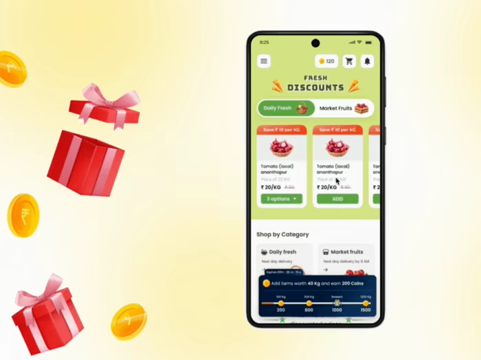
6. Simplifying Language
Phrases like “Save ₹10/kg” didn’t land well during testing — users either overlooked it or misunderstood it. The concept of “saving” felt abstract. But when we reframed it as “₹10 less per kg” or simply highlighted the discounted price upfront, it clicked instantly.
UX Pattern Insight:
Clear, literal, actionable phrasing works better than marketing lingo. In price-sensitive markets, simplicity builds trust.
Introducing: The Bharat UX Field Guide
🔗Link to the Field Guide: The Bharat UX Field Guide ✅
This field guide is something I initially designed just for myself — a structured companion to help me navigate the often-messy landscape of designing for Bharat. It started as a few worksheets and scribbles. But with every visit to a mandi, every chai-break conversation with a shopkeeper, every encounter with offline-led ingenuity — I felt the need to shape it into something more intentional.
What you’ll find inside is a living, evolving collection of UX research methodologies tailored specifically for semi-urban and rural Indian contexts. From culturally anchored planning tools like festival calendars and local partner coordination templates, to behavior-first recruitment matrices and co-design prompts — this guide is designed to help anyone conducting research for digital tools in analog-digital ecosystems.
It’s not just a playbook — it’s a mindset shift. One that centers the rhythms, constraints, and innovations that define Bharat’s everyday life.
I haven’t tried every method in this guide yet, but I intend to. It reflects not only what I’ve done so far, but what I aspire to practice, refine, and evolve as I grow deeper into this work.
I’m still learning. Many of the methods are yet to be fully tested, and I welcome your input. If you’re a designer, researcher, product thinker — working for a similar user base — try the guide out. Tell me what resonated. What didn’t. What we could build better, together.
Like this project
Posted May 14, 2025
Created a field guide for inclusive UX in rural Agri-Tech ecosystems.
Likes
0
Views
1
Timeline
Dec 24, 2024 - Apr 14, 2025