UI Design and Design System for gambling supervision authority
A safe space, self-exclusion from gambling
Overview
Role: UI / UX Designer
Tools: Adobe XD
Gambling and betting can easily change our way of live and become a habit that’s too hard to quit. When we decide it’s time to stop altogether, or take a break, it’s essential that we don’t feel shamed or discouraged when doing so. Therefore, Denmark’s gambling supervision authority needed help redesigning their page for ROFUS, a project that lets people self-exclude temporarily or permanently from gambling.
I was one of the designers working on the academic project, in which the finished products were a design system and a landing page prototype for ROFUS.
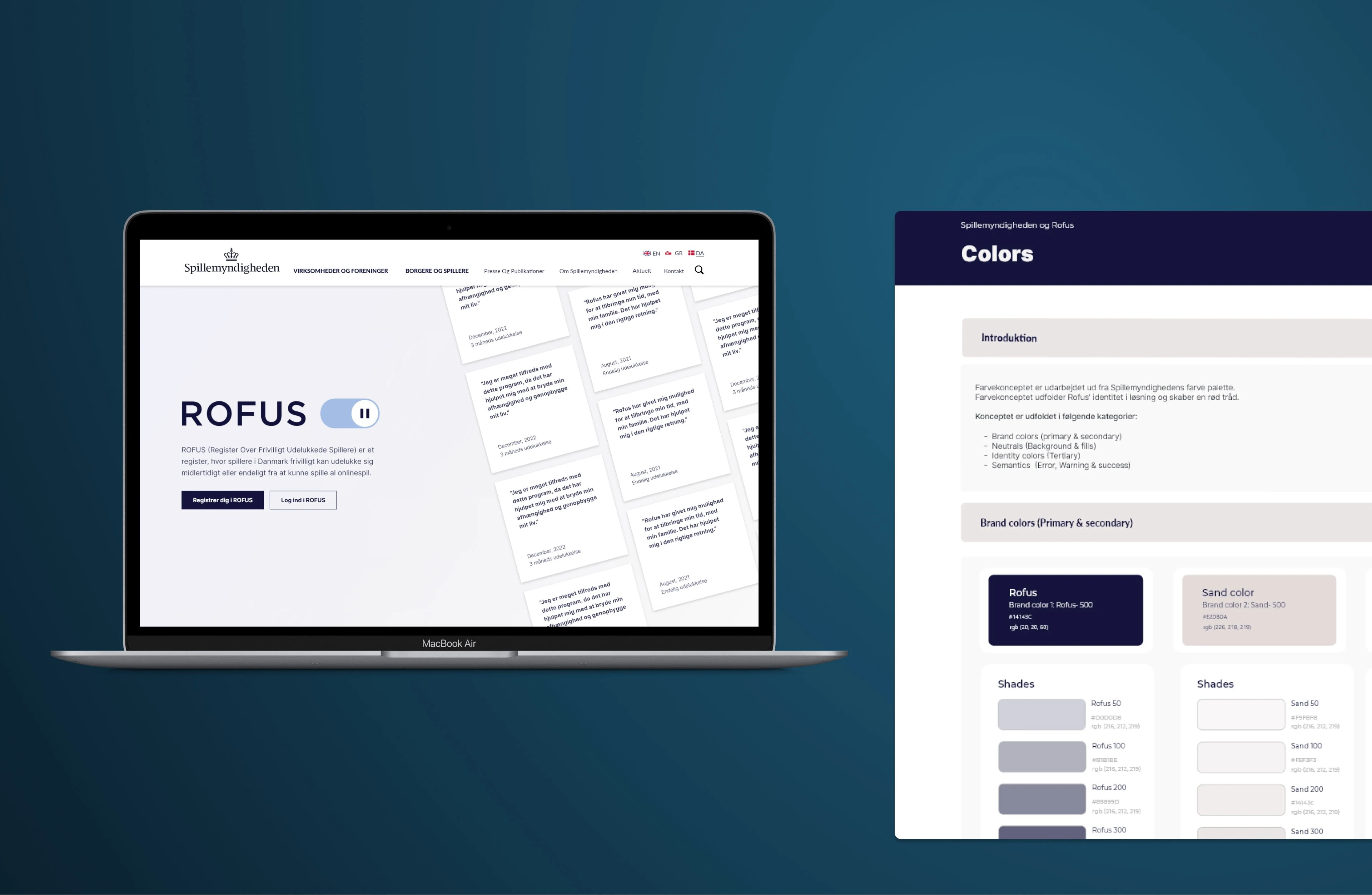
Website landing page and design system
The Problem
The current design of the project's page doesn't provide a safe space for the target audience to reflect and take a break from gambling. Instead, it's overwhelming and text-heavy, making it harder for users to navigate and join the program. Denmark's gambling supervision authority asked for a more user-friendly design that would be more welcoming and allow for better communication with users.
Denmark’s gambling supervision authority asked for a more user friendly design, which would be more welcoming and allow for better communication with users
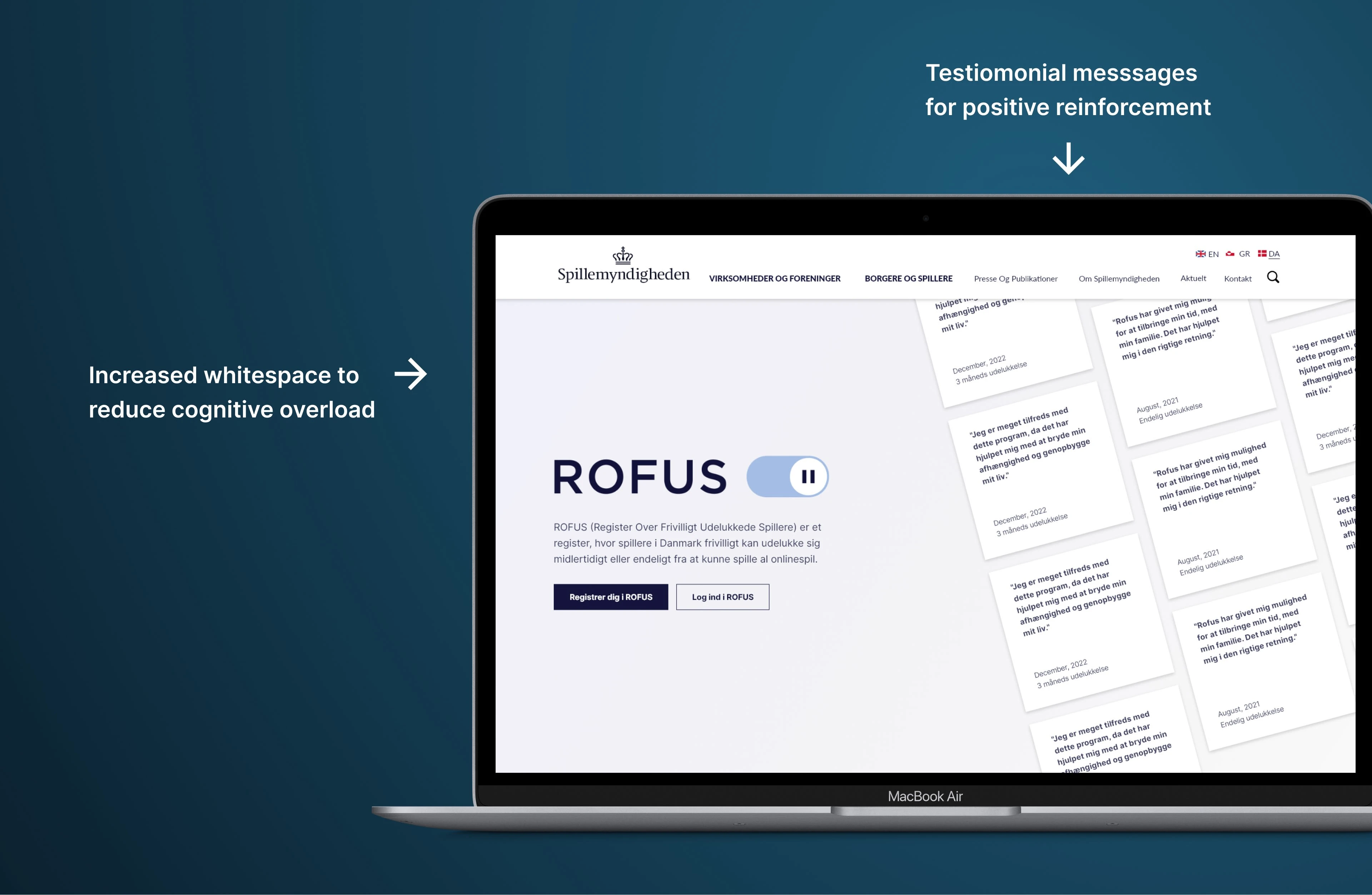
Hero section feature preview
Goals
🧒 User: Having a safe space, that aids in taking a break from gambling
🏢 Business: Attracting more users and encouraging them to join the programme
📦 Product: Decreasing bounce rate and engaging more users
The most challenging part of meeting these goals was the redesign itself, as the site's information couldn't be reduced, and the project's design manual set restrictions on the visual elements on the pages, such as colors, imagery, and illustrations. The site would need to communicate the same information but in a more meaningful way to lead to more users joining the program with a great understanding of what they're signing up for.
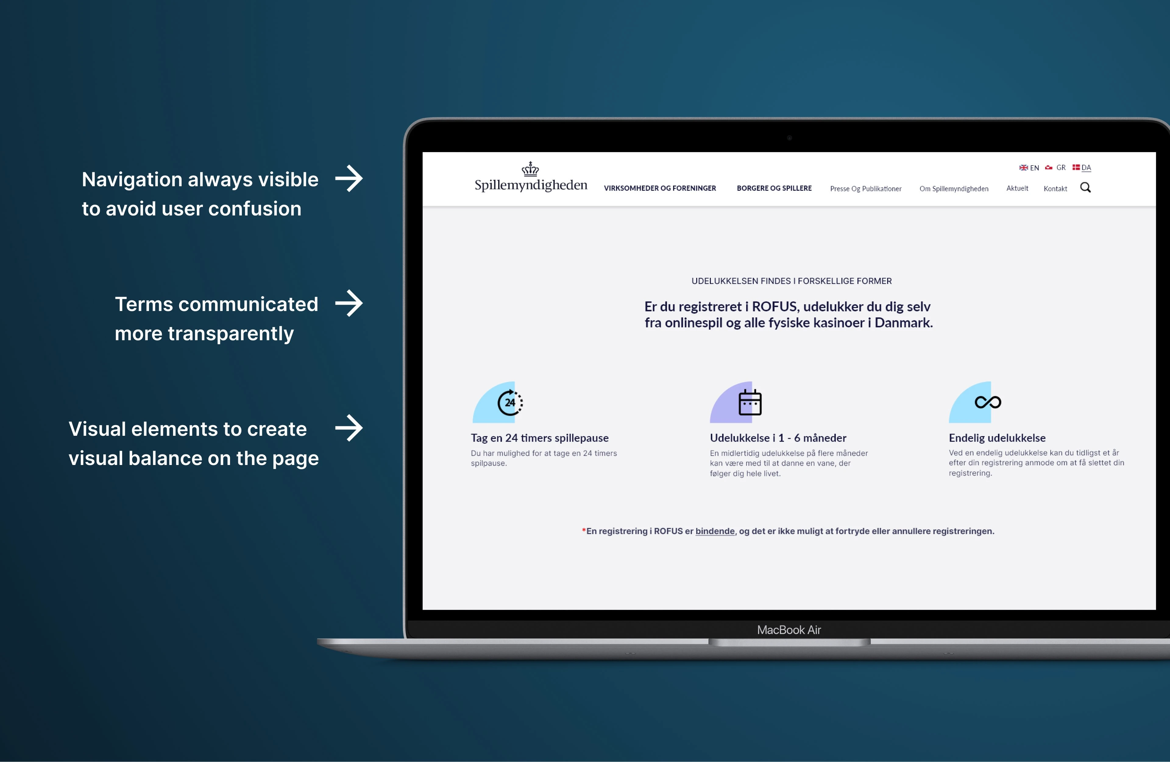
Feature overview
Research
The correct target audience had to be tested to gain meaningful insights. Over 90% of the users found the page hard to navigate, and most participants commented on how the page's flow did not feel logical. Furthermore, users had trouble finding information about how they could change the duration of the self-exclusion, which is one of the key values of ROFUS, as the program's length can't be altered.
Think aloud testing showed that the site's design felt intimidating for the users, as its colors closely resemble those of police uniforms. This means that the site needed a complete redesign, which consists of restructuring content and an updated visual expression. To make the site feel welcoming and natural, four rounds of user testing were conducted to help match the users' mental models. These tests also allowed for user input and data on their feelings by applying facial expression detection tools. The tests showed that reducing elements in the hero area led to a better time to first fixation.
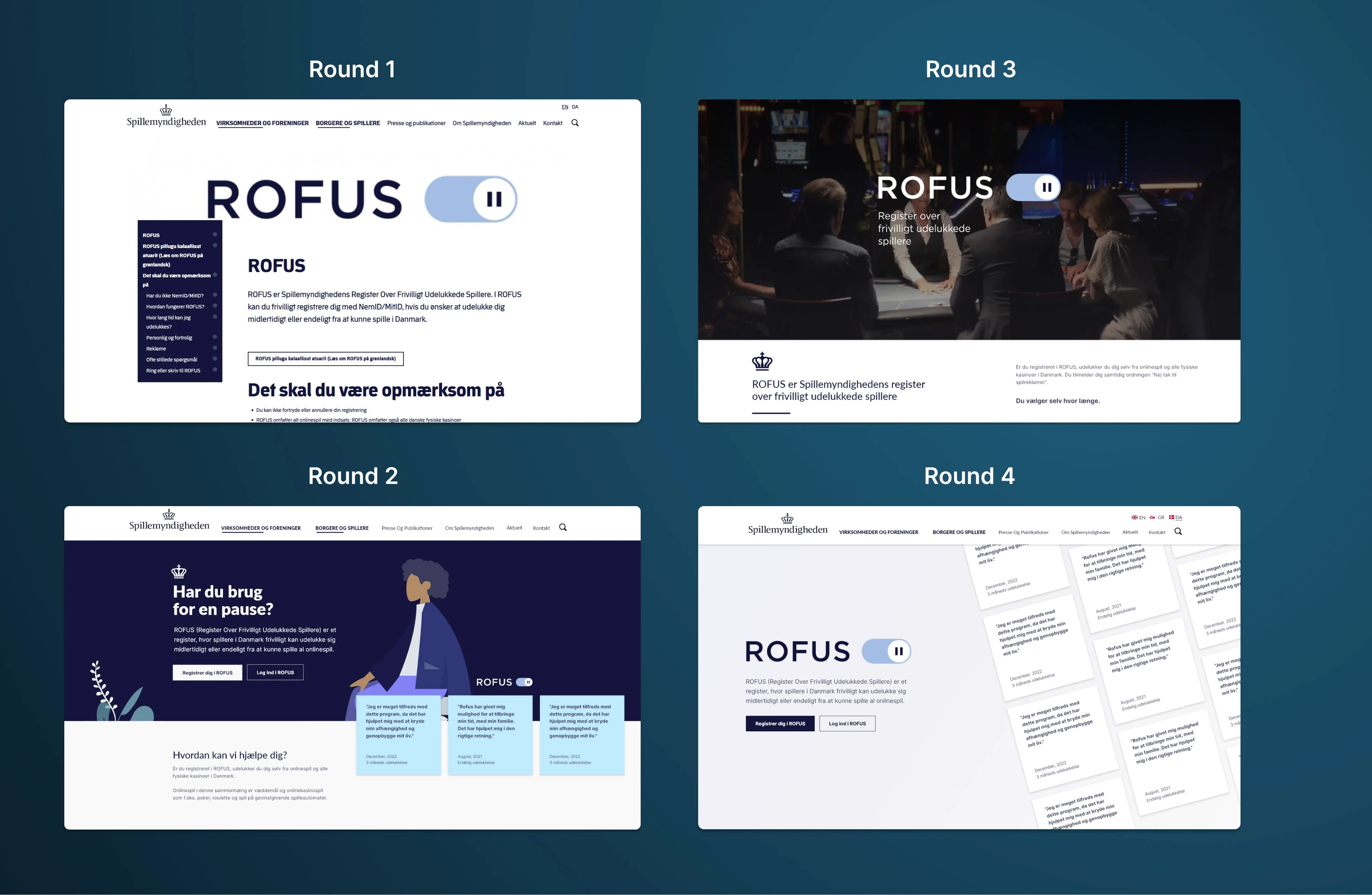
Testing round
The product
The redesign places the registration in the hero section, paired with anonymous testimonials by previous members who rated the product highly. This change allows users to register more easily and have a better understanding of the program.
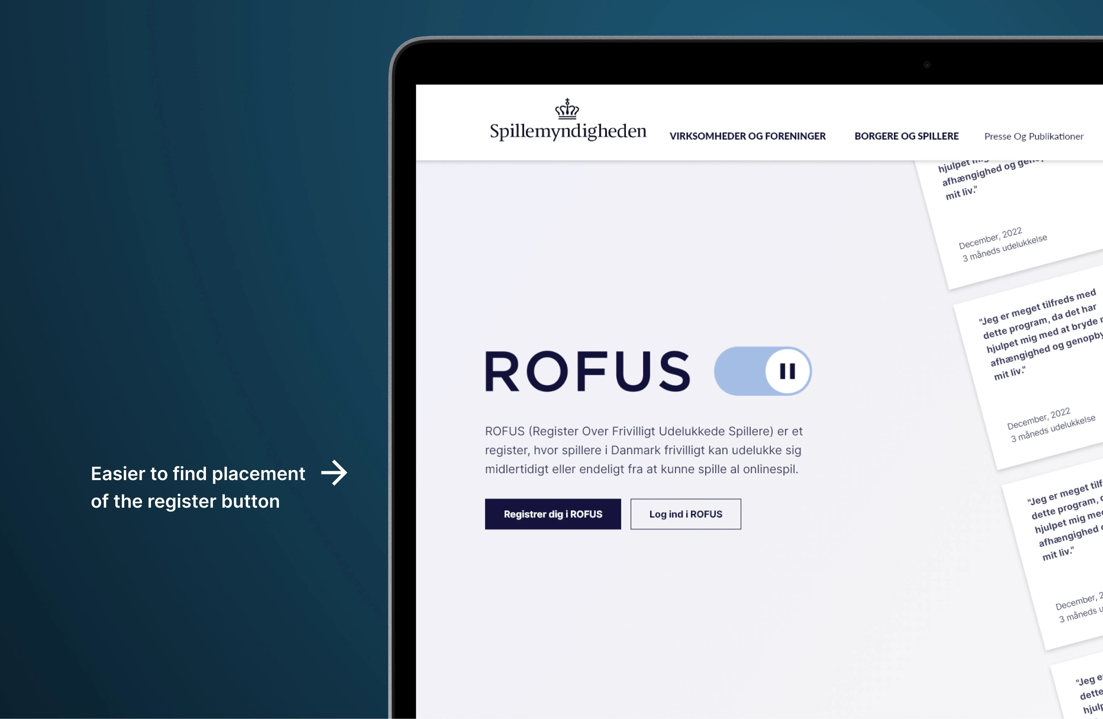
Direct access to registration
The design highlights key areas by applying more whitespace and illustrations, which help the user understand the content more quickly. These illustrations attract the user's attention and help them discover information about ROFUS. The site's content has been restructured to make the sections more distinct, and the flow of the site has been altered to help users learn about the program and guide them in becoming a part of it.
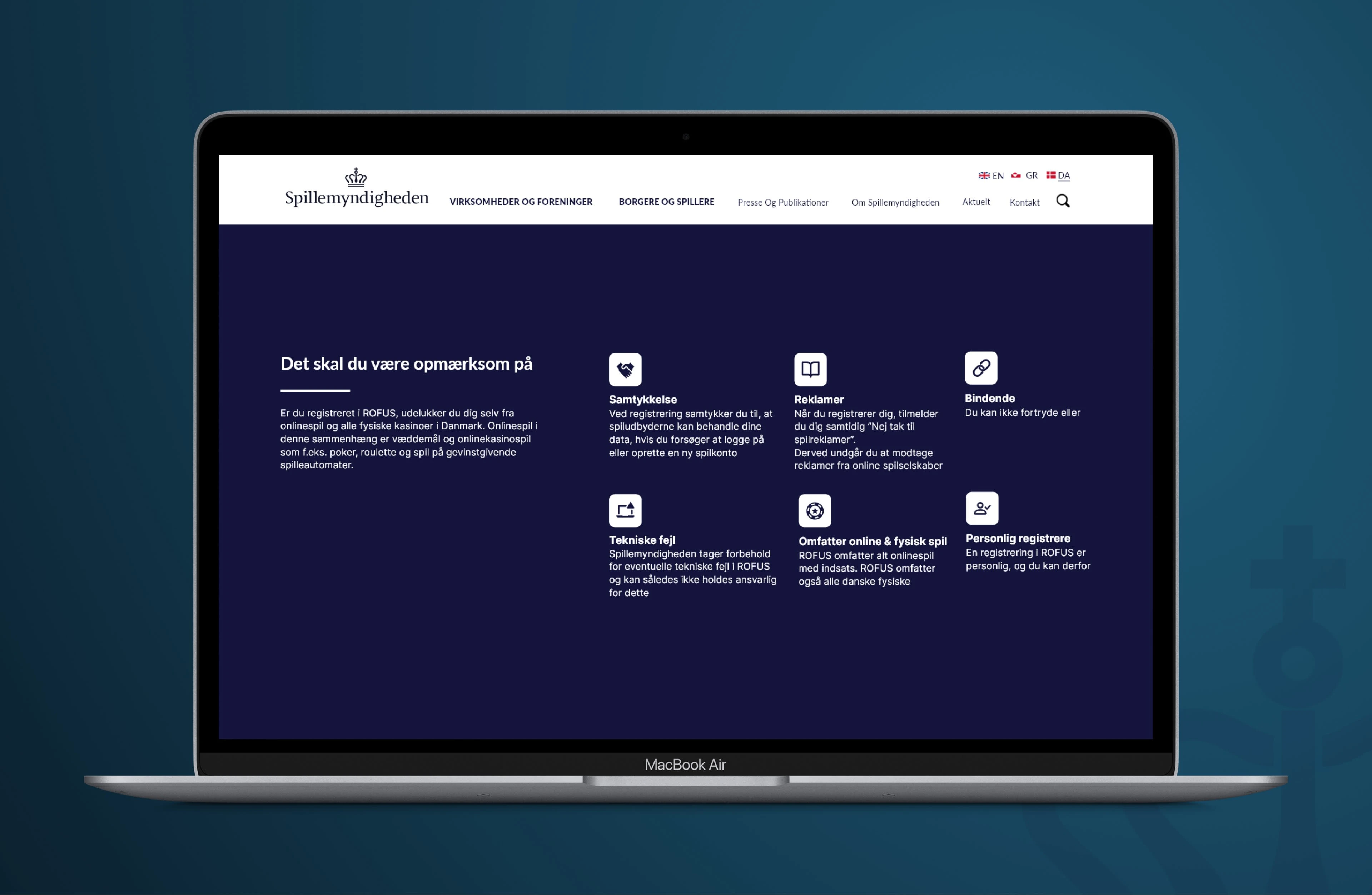
Improved navigability
Results
The finished prototype was met with positive reactions by the user test participants and the client. The product is meant to spark new ideas, which the client could borrow when the actual development of the new design takes place. To measure the success of the design, it would be important to subject it to A/B and preference testing, which would yield data on user engagement and bounce rates.
Like this project
Posted Jun 4, 2023
Designed an interface and user experience that lets people safely take a break from gambling without feeling judged or ashamed.
Likes
0
Views
20

