OKRA Jewelry - Brand Identity

Hannah Anaele
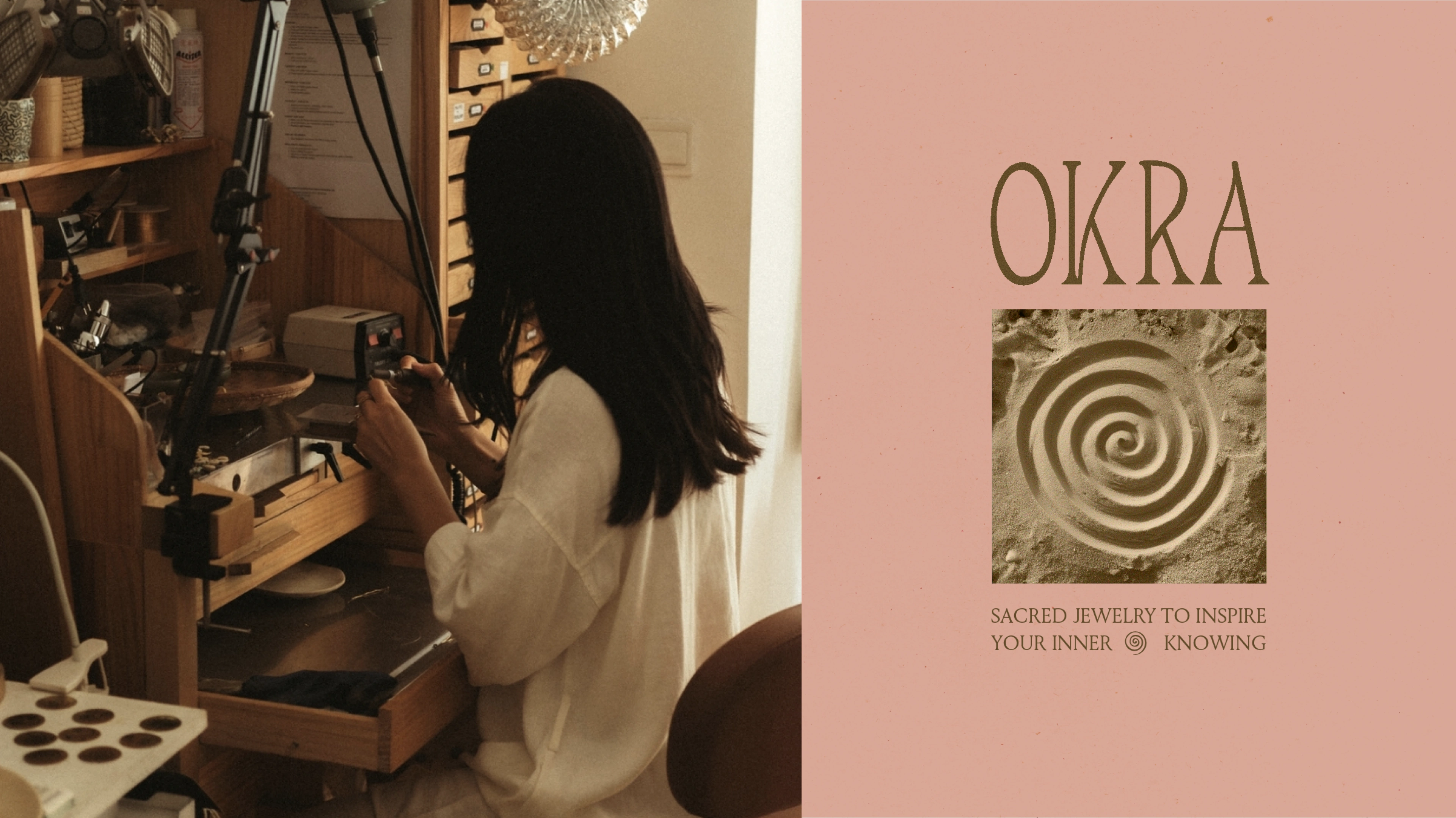
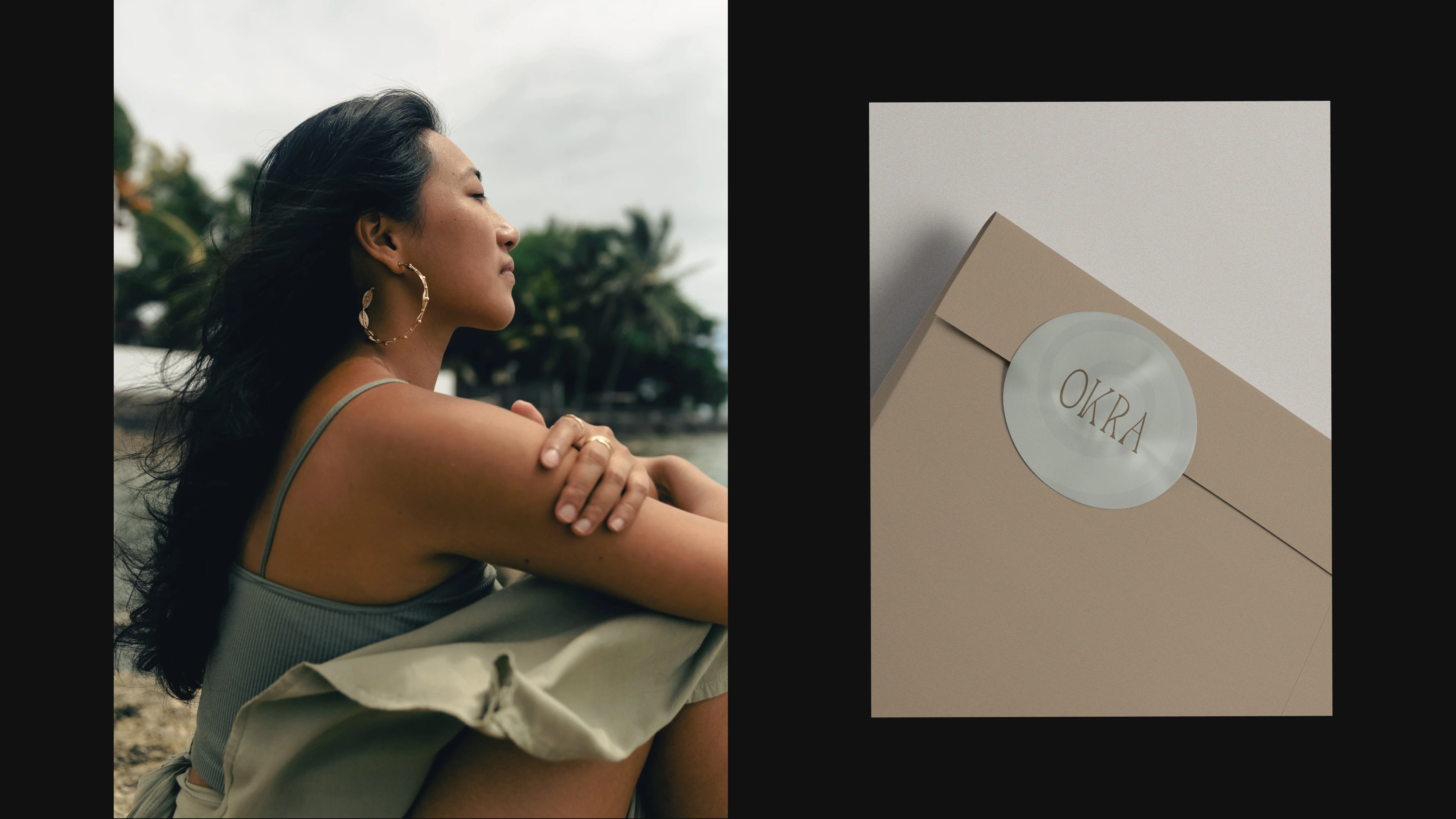
OKRA Logo
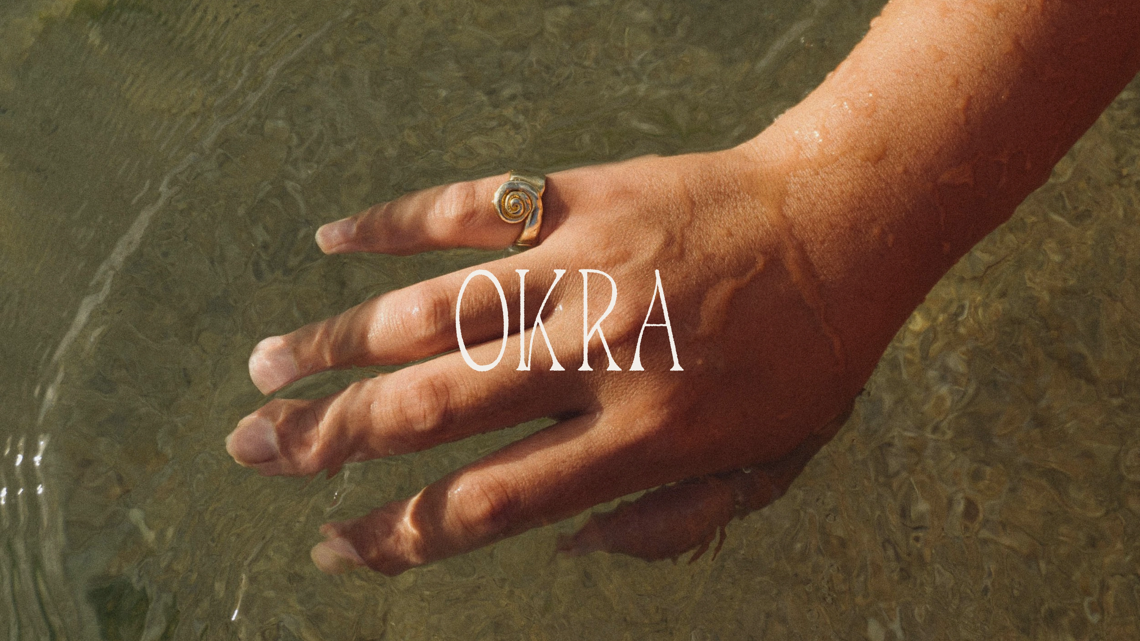
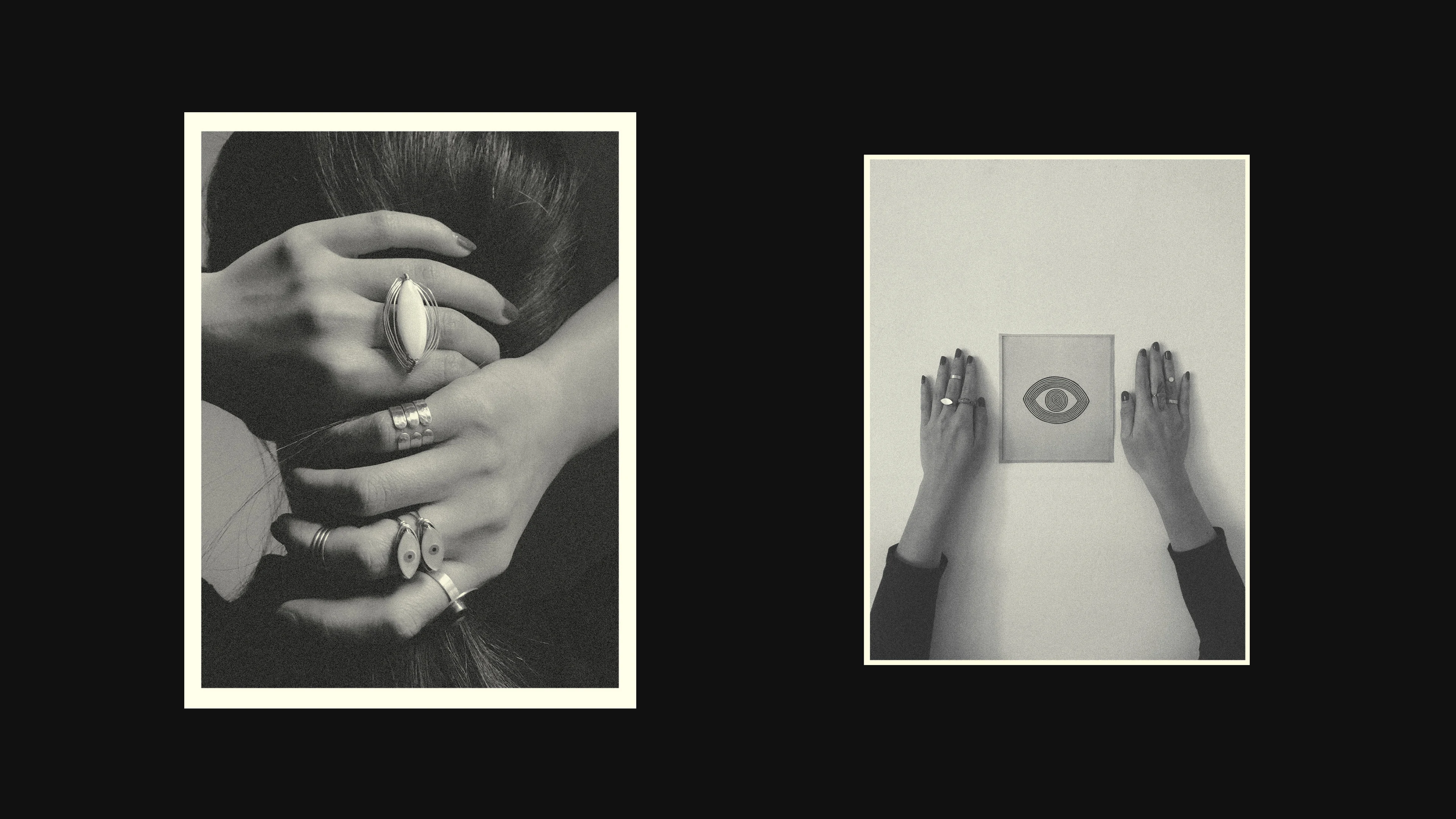
OKRA is a jewelry studio originally founded on the beautiful island of Mauritius, now proudly based in Shanghai. Okra was formed not just to be an adornment but to be worn as symbols of awareness and self-worth. Sacred talismans that could be passed on and tell a story for a lifetime.
The refresh of the logo is to represent modernity and elegance, whilst also reflecting the earthy textures of the island with a rustic feel to the logo's finish. The brown and sage green resemble the stone & waters that surround the island, leaving the pink blush to add a touch of femininity and softness to the overall feel of OKRA.
In conclusion OKRA is a brand that makes anyone who encounters the brand, feel a sense of peace and serenity, making it okay to slow down & live intentionally.
Okra Logo and Spiral Symbol
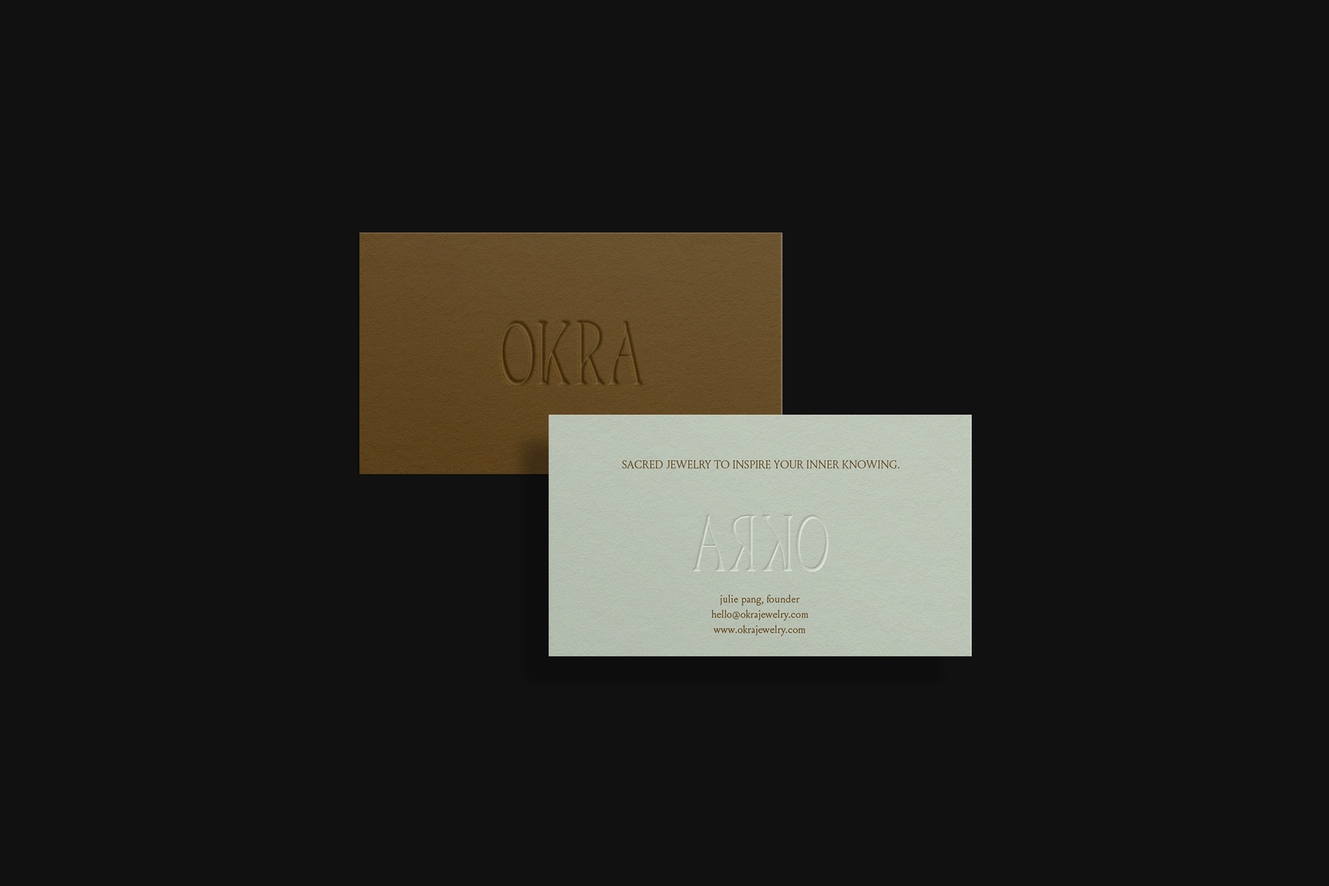
Business Cards

Tagline

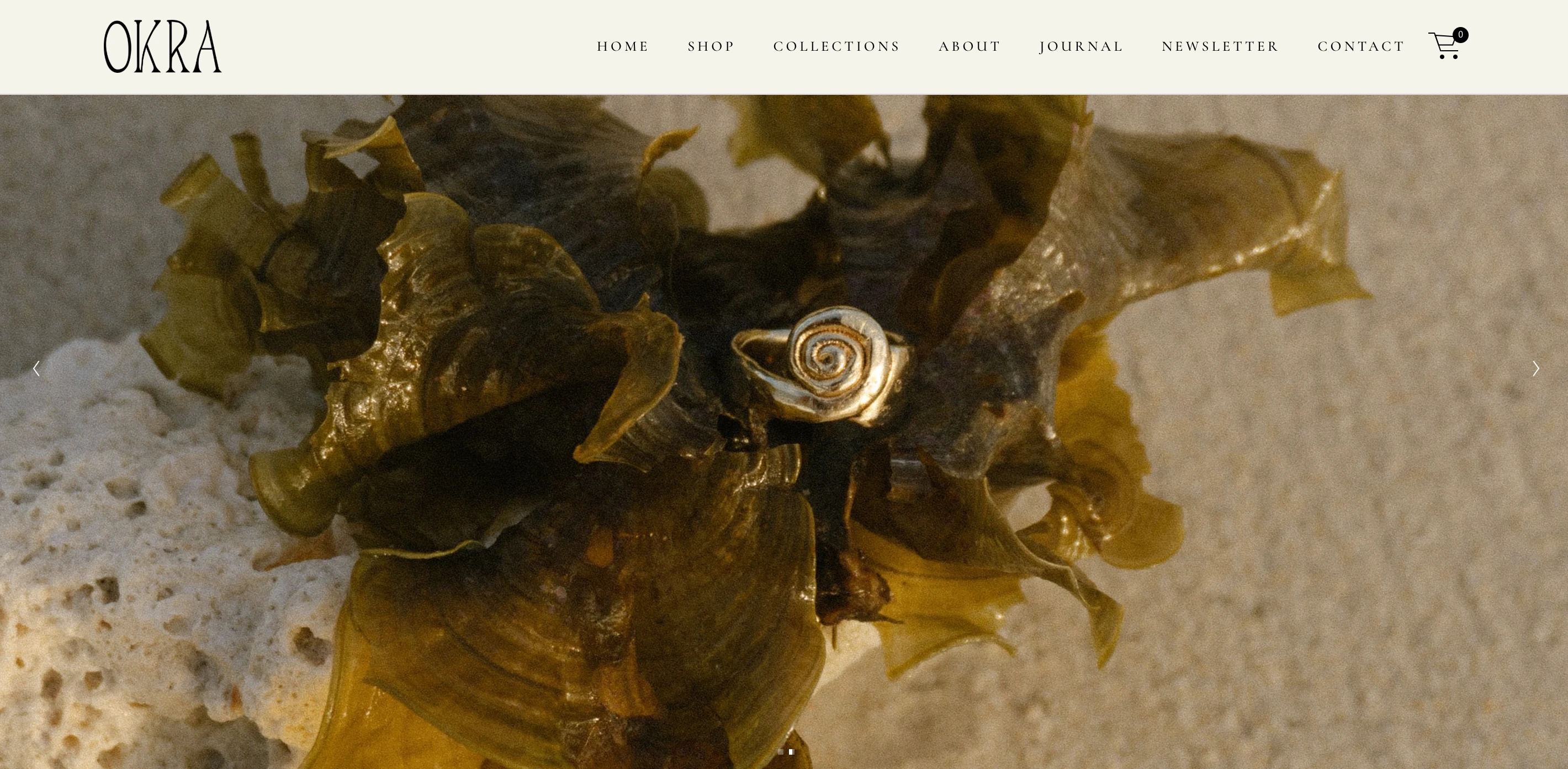
Logo Application on Desktop View
Like this project
Posted Dec 5, 2024
Logo design for Okra Jewelry.
Likes
0
Views
7