Charge

Lee Allan
The brief
Charge promises three things: clean energy, bold flavour, zero sugar. Functional products usually pick a side, candy or supplement. Charge had to be neither: confident enough to sit beside an energy drink, clean enough to trust at a desk.
I took on the identity, guidelines, packaging, retail, social and the brand film.
The approach
I reduced the brand to three pillars, Energy. Focus. Go., and made one rule out of them: every piece of communication delivers at least one.
The voice runs on four guardrails. Motivating, not pushy. Playful, not childish. Clean, not clinical. Real, not robotic.
The system follows the same discipline. One wordmark, one layout, one colour per flavour. The pack does the talking.
The work
Logo
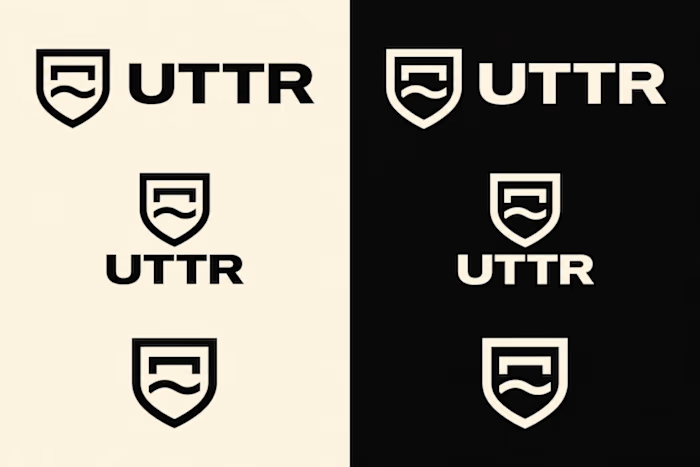
A condensed wordmark with a bolt cut through the A. The bolt is the only flourish in the whole system.
Colour system
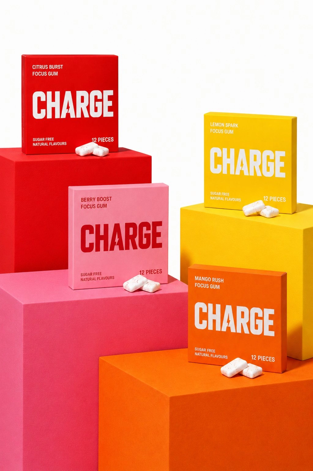
Energy Red #FF2D20 leads. Each flavour owns one colour at full strength: Pulse Orange #FF6B00 for Mango Rush, Spark Yellow #FFEA00 for Lemon Spark, Focus Pink #FFB6C1 for Berry Boost. Pure White #FFFFFF and Deep Black #111111 handle space and contrast.
Typography
Charge Bold, built on Oswald, for headlines. Condensed, upper case, short lines, full stops, no fuss. The tagline runs in wide tracking. Body copy is Inter Tight.
Packaging and retail
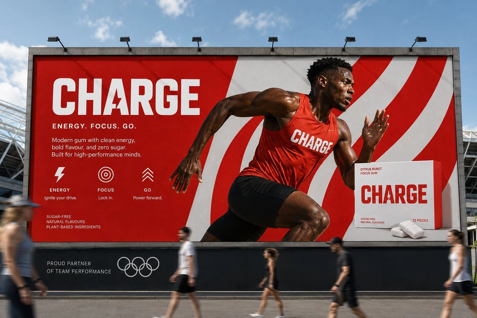
Red first, headline big, bolt close by. The layout never moves, so the colour is the only thing you need to find your flavour.
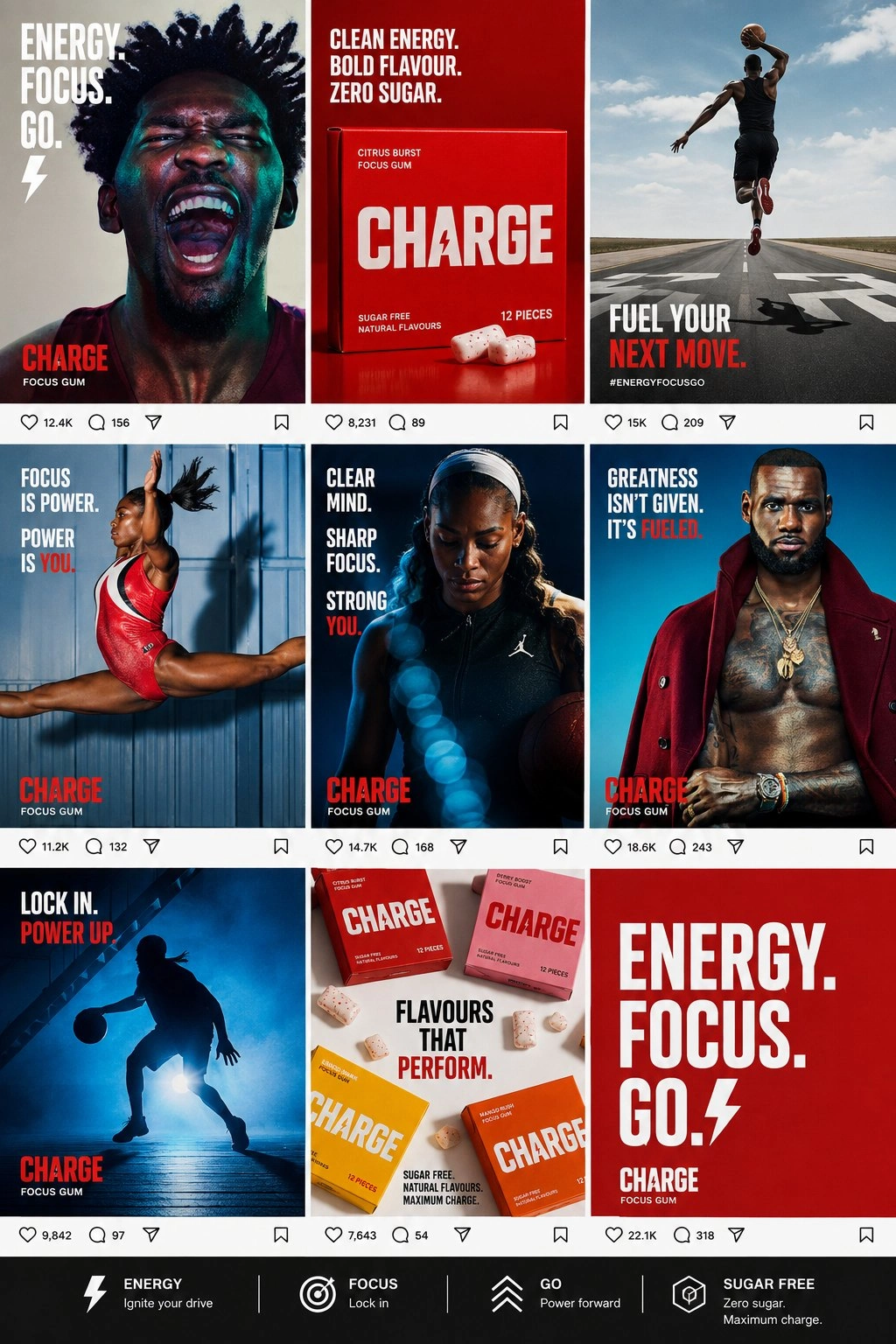
Brand film and social
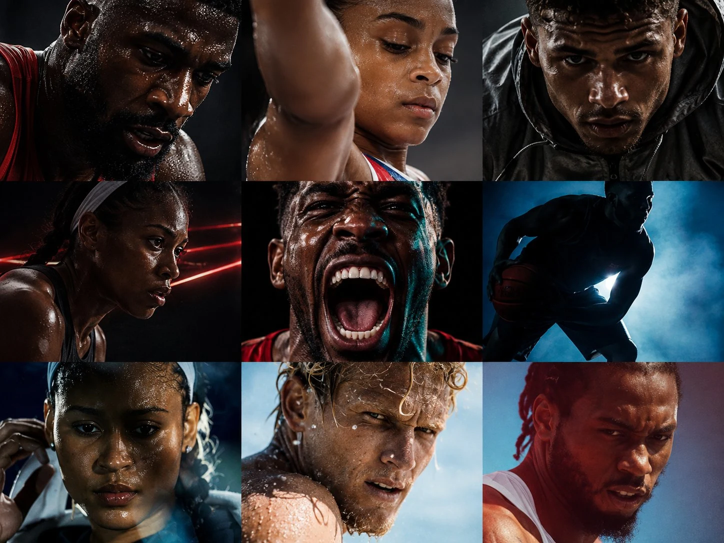
The same system in motion: bold, confident, relentless.
The result
Everything runs on one system, so a single pack on a shelf reads as clearly as a billboard.
Project
Charge
Year
2026
Scope
Brand identity, guidelines, packaging, retail, social, brand film
Industry
Consumer goods
Like this project
Posted Nov 4, 2026
Identity, packaging and retail system for an energy product, plus social and a brand film tied to a single visual system.
Likes
0
Views
0
Tags