UTTR

Lee Allan
The brief
Outerwear is a wall of mountain logos and performance claims. UTTR needed to feel calm and certain instead: a parka you’d trust in sleet, from a brand that doesn’t have to shout about it.
I took on the identity, guidelines, campaign, film and website.
The approach
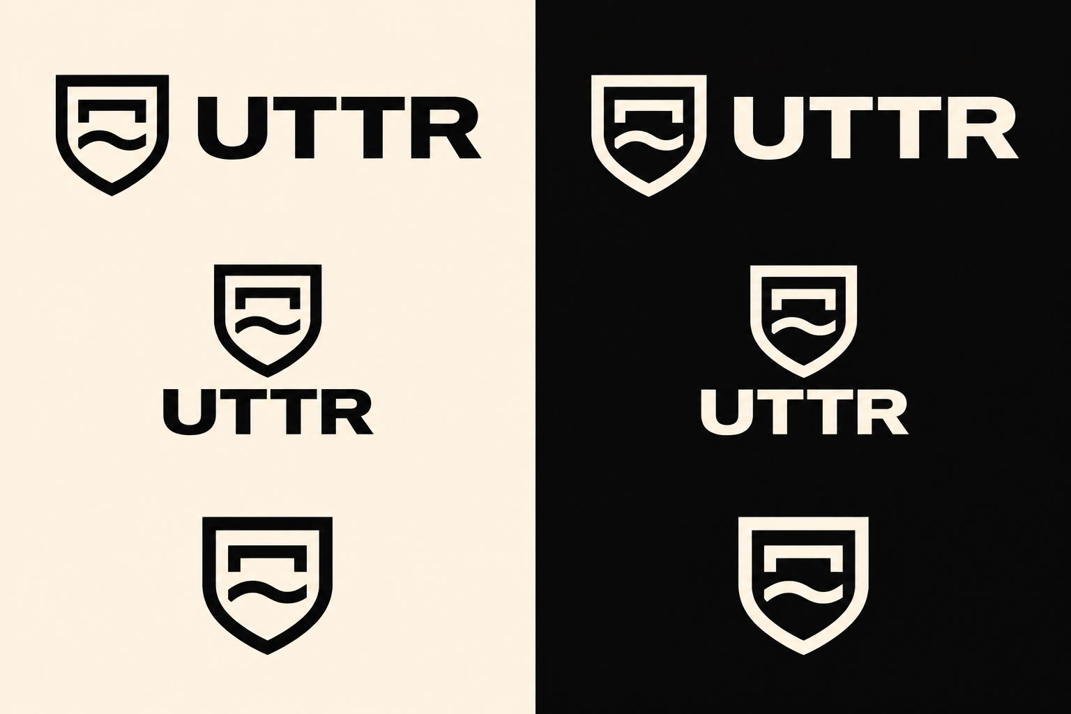
The name comes from the otter, an animal at home in cold water. I drew that once: a shield holding a roof, with a single line of water just beneath it.
Everything around the mark stays stone. Six colours taken from the weather, a heavy grotesk for the wordmark, a mono for the line, and models who stand still while the world moves around them.
The work
Mark and lockups
Roof and water share one stroke; the shield runs lighter so the glyph leads. Horizontal, stacked and mark-alone lockups, in one colour only, with a heavier master below 28 px.
Colour system
Bone #F3F1EC and Arctic Black #141516 lead. Glacier Grey #DCDFE0, Iron Slate #4A4C4E and Nordic Sand #C9B897 carry the rest. Fjord Blue #3B4F5C is the one cool note: the water.
Typography
Inter Tight Bold for the wordmark and headlines. JetBrains Mono in tracked capitals for the line, labels and specs.
Voice
Say less. Taped seams. Two-way zip. Nothing extra. Every piece signs off UTTR / OUTSIDE, ALWAYS.
The film
Thirty seconds in a working limestone quarry. Machines cut, pour and haul while the three models never move. The cut tightens on the beat, whip pans carry the second half, and the mark closes alone on black.
Campaign
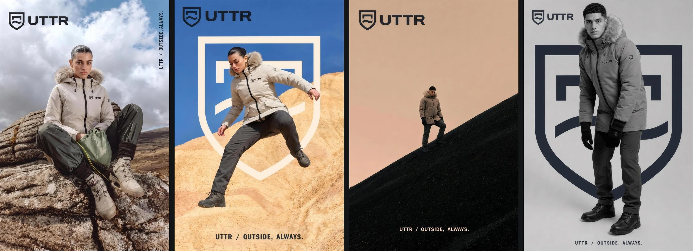
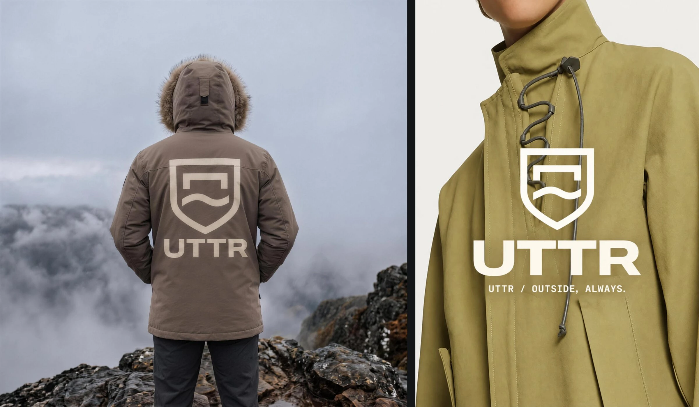
Lockup top left, the line at the foot or up the right edge. The giant shield sits behind the subject, never over a face.
On the garment
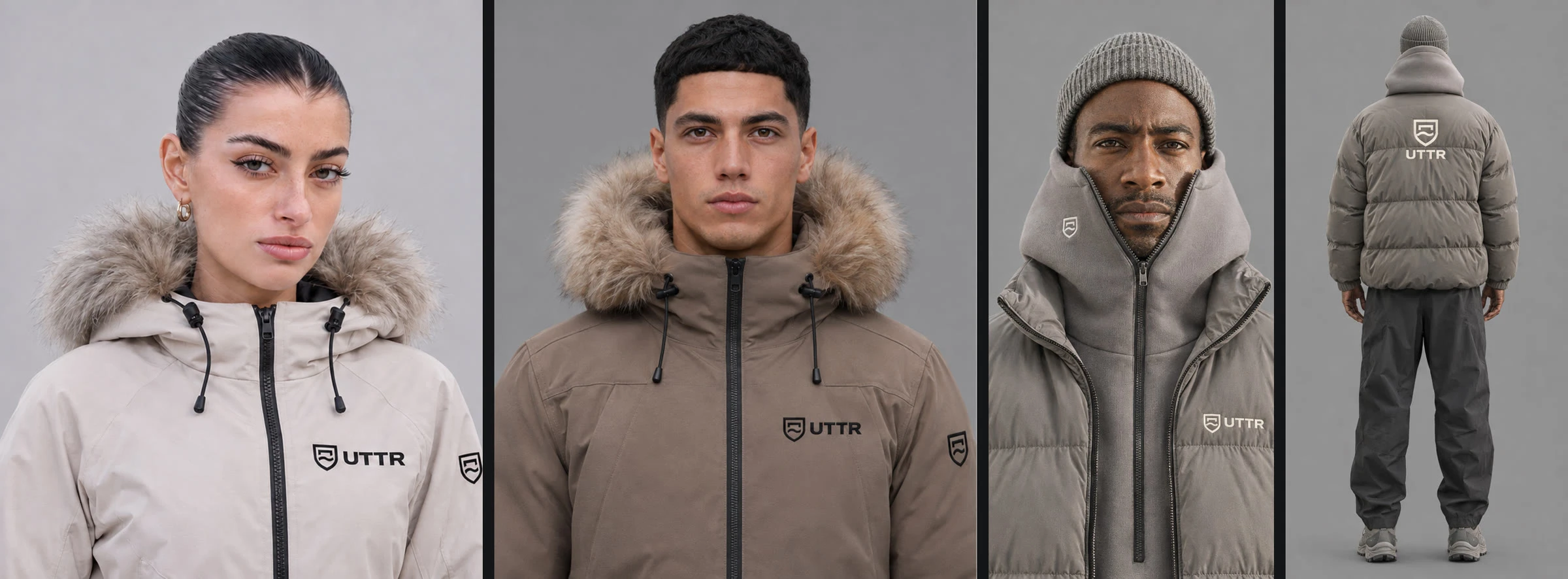
Horizontal lockup on the left chest, the mark alone on the sleeve, the stacked lockup large on the back. Black on light shells, Bone on dark.
Website
The quarry film runs under the homepage. Product comes first, then the mark, then the campaign, and the page closes on the wordmark at full width in Fjord Blue.
The result
One idea that holds from a 16 px favicon to a full-size poster. The mark reads as a woven label on a sleeve and as a stage behind a model, and the grade, the stillness and the stone tie the film, the posters and the site into one world.
Project
UTTR
Year
2026
Scope
Brand identity, guidelines, campaign, film, web design
Industry
Outerwear and apparel
Like this project
Posted Nov 4, 2026
Calm, weather-driven identity and campaign for outerwear with a short film and integrated website.
Likes
0
Views
0
Tags