Built with Framer
Website redesign for meinGPT AI Platform
Ekta Bhoraniya
Repositioning meinGPT from AI Studio to AI Platform
How a strategic website redesign clarified positioning, improved trust, and increased engagement across the funnel.
meinGPT had evolved from an AI consulting business into a full-fledged AI platform for German SMEs.
The problem was that the website still reflected the old company.
Visitors were landing on the site, but many struggled to understand:
What meinGPT actually was
Whether it was a service or a software platform
Why they should trust it with company data
How they could get started
This wasn't a visual design problem.
It was a positioning, information architecture, and conversion problem.
My Role: Product Designer & Framer Developer
Timeline: Sep 2025 - Nov 2025
Tools: Figma, Framer, Plausible
The problem
Visitors came, didn't get it, and left
The old site described meinGPT as an "AI services studio that also has a product." That's a confusing positioning and visitors showed it. Bounce rate sat at 70%, session time was under 90 seconds, and the pricing and pilot pages barely got traffic because users weren't getting far enough to care.
The product had moved on. meinGPT was now clearly a platform - multi-model, German-hosted, GDPR-native, built for SME teams. The website just hadn't caught up.
The real question wasn't "how do we look better?" It was: how do we make a German SME decision-maker understand in 10 seconds what meinGPT is, trust it, and take a next step?
Starting With Data
Before touching any designs, I reviewed user behavior and analytics.
A few patterns stood out:
Organic search was the largest acquisition channel
Product-focused blog content generated significant traffic
Pricing consistently ranked among the most visited pages
Most visitors were evaluating solutions rather than casually browsing
Desktop usage dominated, indicating a primarily B2B audience
This completely changed how I approached the redesign.
Users weren't looking for inspiration.
They were looking for confidence.
They needed answers to questions like:
Is this secure?
Is this GDPR compliant?
Does it integrate with our tools?
Can we trust this company?
How much does it cost?
How quickly can we get started?
Design thinking
Five questions I kept coming back to
Every design decision was filtered through the same lens: does this help a skeptical German SME owner take one step closer to buying?
1. Will the user understand what this is?
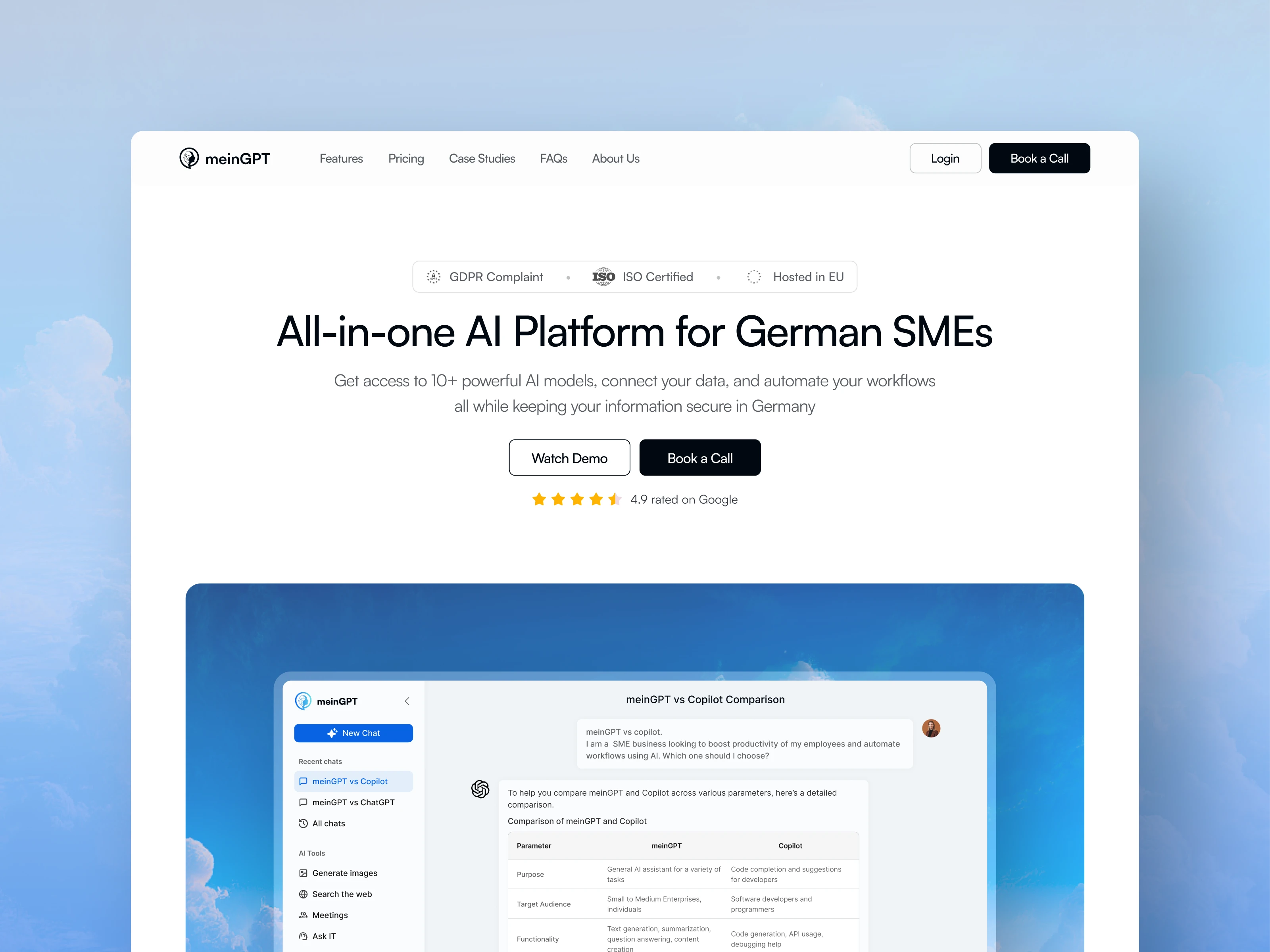
Positioning is the first UX problem. If the hero can't answer "what is this and who is it for" in one scan, nothing else matters. We tested multiple headline framings and landed on "All-in-one AI Platform for German SMEs" — specific, unambiguous, self-qualifying.
2. How do we build trust fast?
German B2B buyers are skeptical by default. GDPR compliance, ISO certification, and EU hosting aren't nice-to-haves — they're table stakes for the audience. We moved these signals to the top of the page, above the fold, before any feature claim.
3. How does the funnel actually flow?
We mapped the journey: awareness → curiosity → consideration → commitment. The old IA had pricing buried with no path to it from the hero. We rebuilt the nav and page sequence to mirror that decision journey, with clear next-step CTAs at each stage.
4. What will users think when they see X?
We pressure-tested every section by asking: what does a CFO think when they see this? What does an IT lead think? A CEO who's never heard of meinGPT? This kept us honest about jargon, feature-dumping, and sections that only made sense if you already understood the product.
5. Is this beautiful and is it working?
Beautiful without conversion is a vanity project. Working without beauty erodes trust. The goal was both — a site that signals quality at a glance and systematically moves people toward a demo or call.
Process
How the work was structured
1. Audit & positioning
Analytics deep-dive, bounce analysis, top pages. Defined the new positioning north star.
2. IA & content strategy
Rebuilt navigation, page hierarchy, and CTA flow. Planned DE/EN content in parallel.
3. Design exploration
Explored multiple visual directions: enterprise-focused, conversion-first, complete overhaul.
4. Ship & measure
Rolled out iteratively. Tracked weekly cohorts in Plausible against prior period.
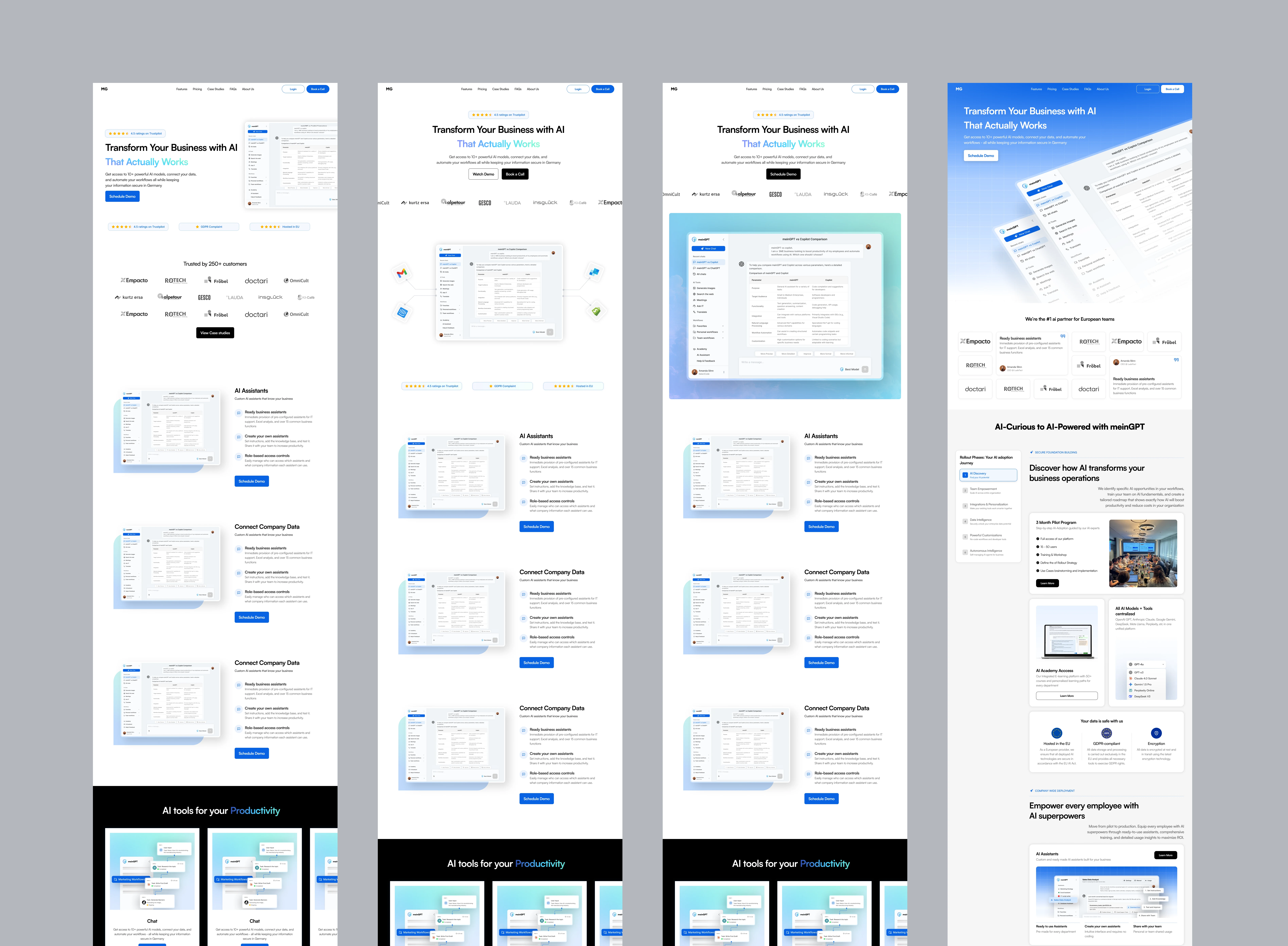
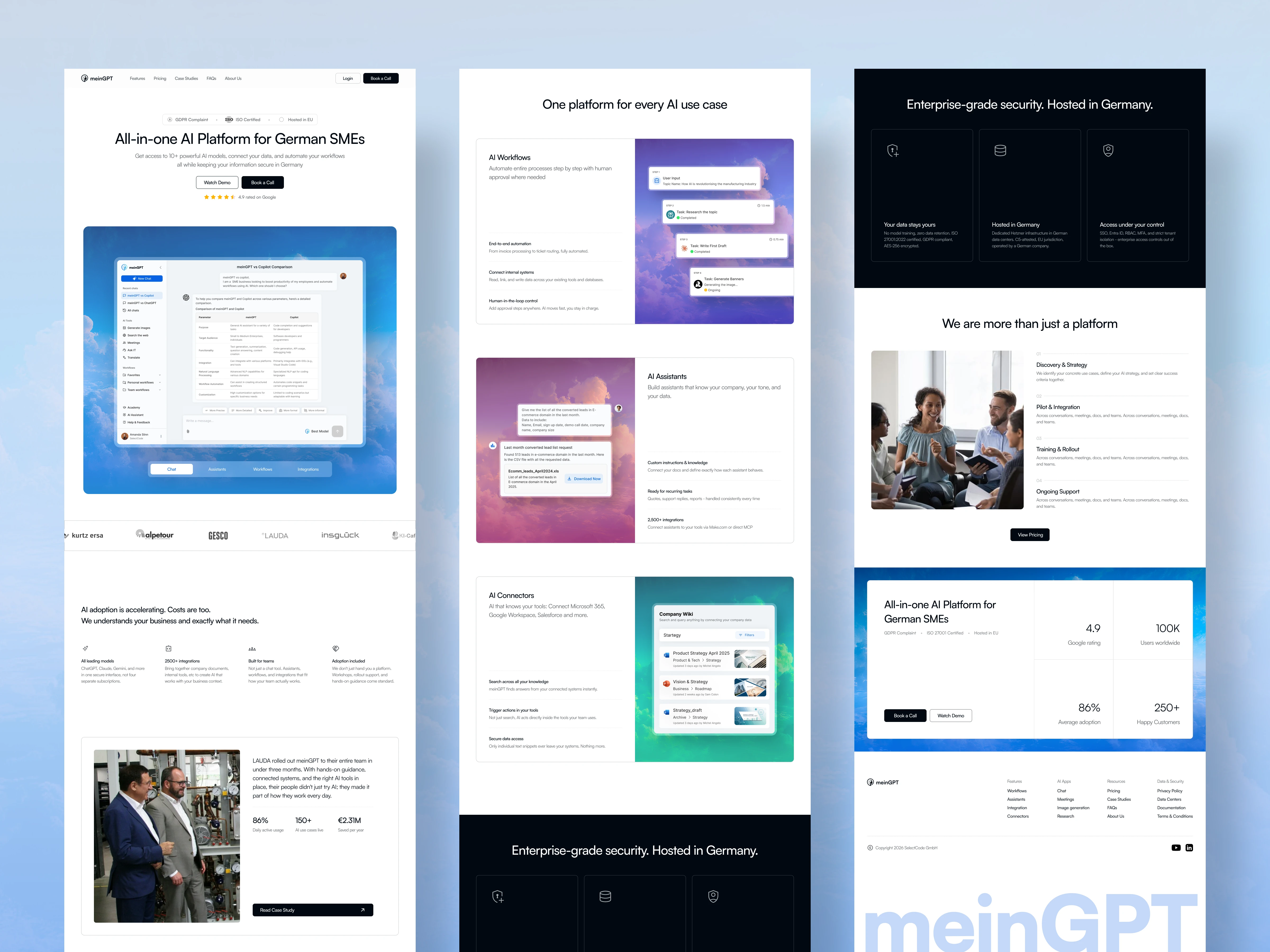
The final direction balanced enterprise trust with product-led storytelling, allowing the platform itself to become the hero.
Final Designs
Here is the link to figma file:
Results
The numbers tell the story
Comparing the Oct 2024 to Sep 2025 and Sep 2025 to May 2026 period:
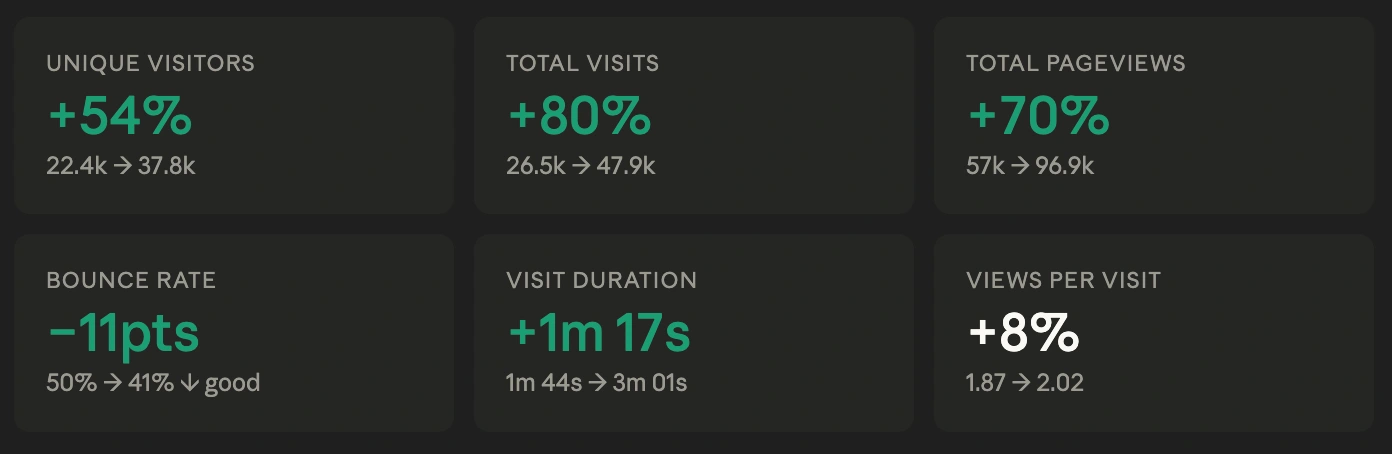
The visit duration jump from 1m 44s to 3m 01s is the signal I'm proudest of. It means people found the site worth reading - the positioning landed, the content built curiosity, and the IA gave them somewhere to go next. Traffic is easy to buy. Time is earned.
Additional outcomes
Clearer platform positioning
Improved discoverability of pricing and pilot program
Better engagement with product pages
Consistent experience across German and English audiences
Unified design system across the website
Insights
What this project taught me
Positioning before pixels
The biggest design leverage was fixing the headline. Every visual decision downstream was easier once we had a clear positioning sentence to design around.
IA is conversion design
Restructuring the nav and page hierarchy had more impact on bounce rate than any visual change. Where you put things is a UX decision, not a content one.
Trust signals are UX
For a German B2B audience, GDPR/ISO/EU hosting above the fold isn't badge-collecting, it's removing the biggest objection before it forms.
Bilingual is a product decision
Adding German wasn't a translation task. It required rethinking content hierarchy, CTA phrasing, and which proof points land differently for local audiences.
This project reinforced a belief I bring into every redesign:
Good design isn't about making things look different. It's about making them easier to understand, trust, and act on.
The biggest wins didn't come from visual changes.
They came from improving positioning, reducing cognitive load, strengthening trust signals, and designing around how people actually make decisions.
The UI simply made those decisions visible.
Like this project
Posted Jun 30, 2026
Redesigned meinGPT - AI platform's website for better positioning and trust, increasing engagement. Result: +54% visitors, -11pt bounce rate.
Likes
2
Views
8
Timeline
Sep 1, 2025 - Nov 30, 2025
Clients
SelectCode