Built with Framer
Branding & Website for MijnVeiligePraktijk

Chris Nijhof


Check out the final website! 👆
Introduction
In the beginning of 2025 we had the chance to completely brand a new ICT solution package for Westers, a dutch ICT company. The solution "Mijn Veilige Praktijk" (meaning My Safe Healthcare practice) offers is a so called; Security Baseline" where they take care of ICT security regulations for your company.
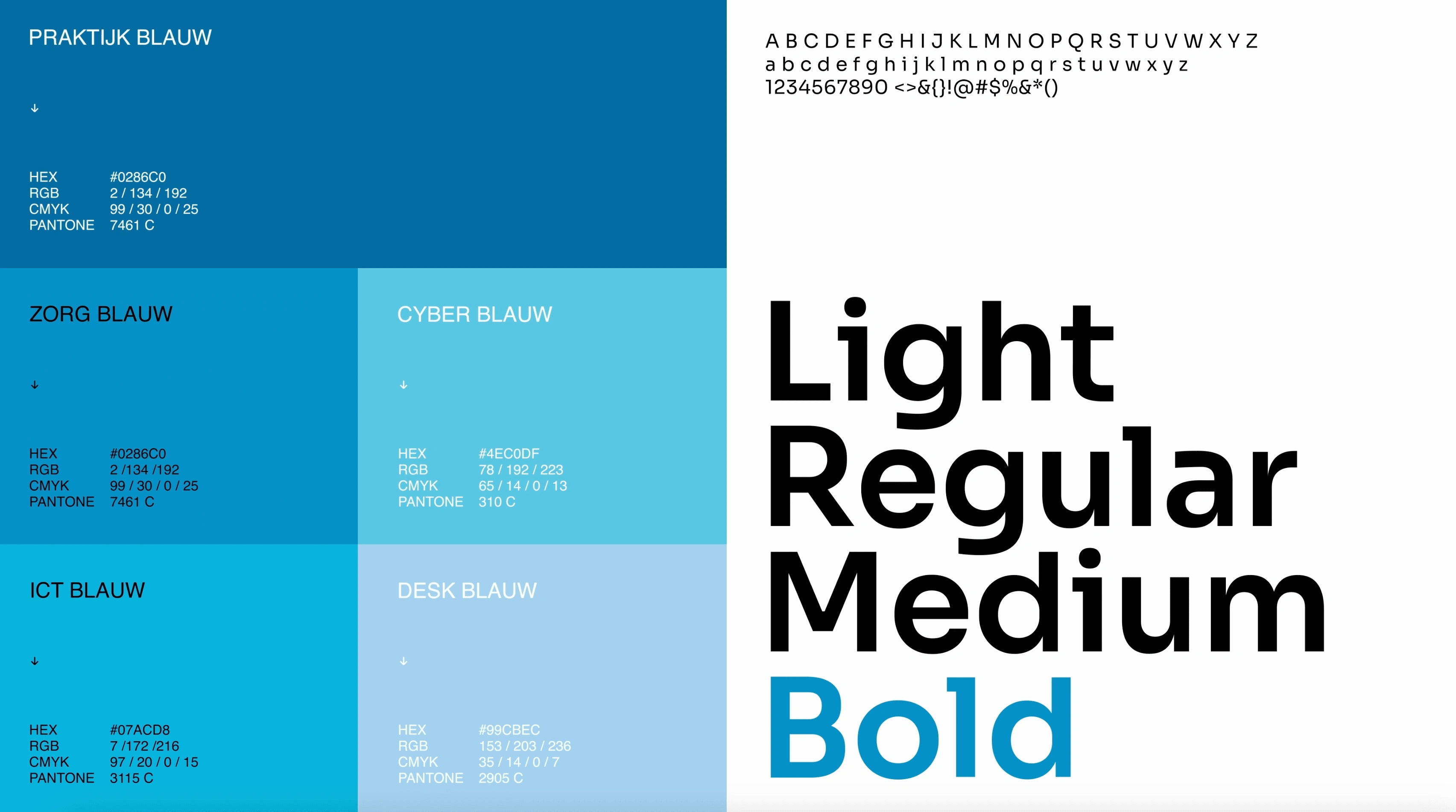
The brand needed to radiate trust, healthcare and safety making blue a perfect match for the colours. Westers also runs with different blue colours, so this was a perfect connection!
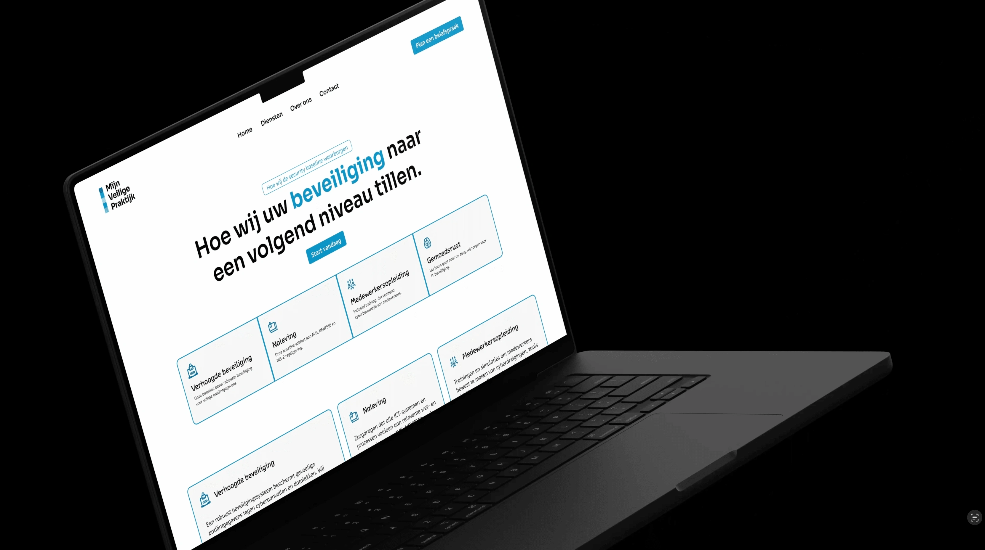
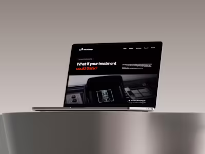
Website Project
For the website, we wanted to create a clean, straightforward website using modern design. In the Netherlands (and healthcare in general) you're already 2 steps ahead when you work with modern and unique design. The website was designed in Figma and developed in Framer. We used new interfacial trends such as a Bento grid that you see a lot in modern webdesign.
The design is SEO optimised running over 1k visitors in the first month without any digital marketing. Feel free to check the website down here!
👉 You can check the website at www.mijnveiligepraktijk.nl
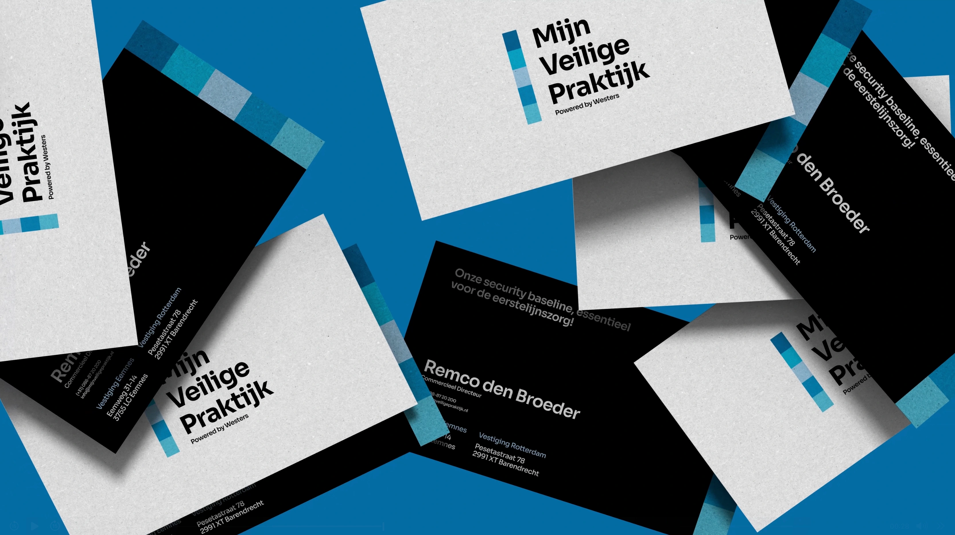
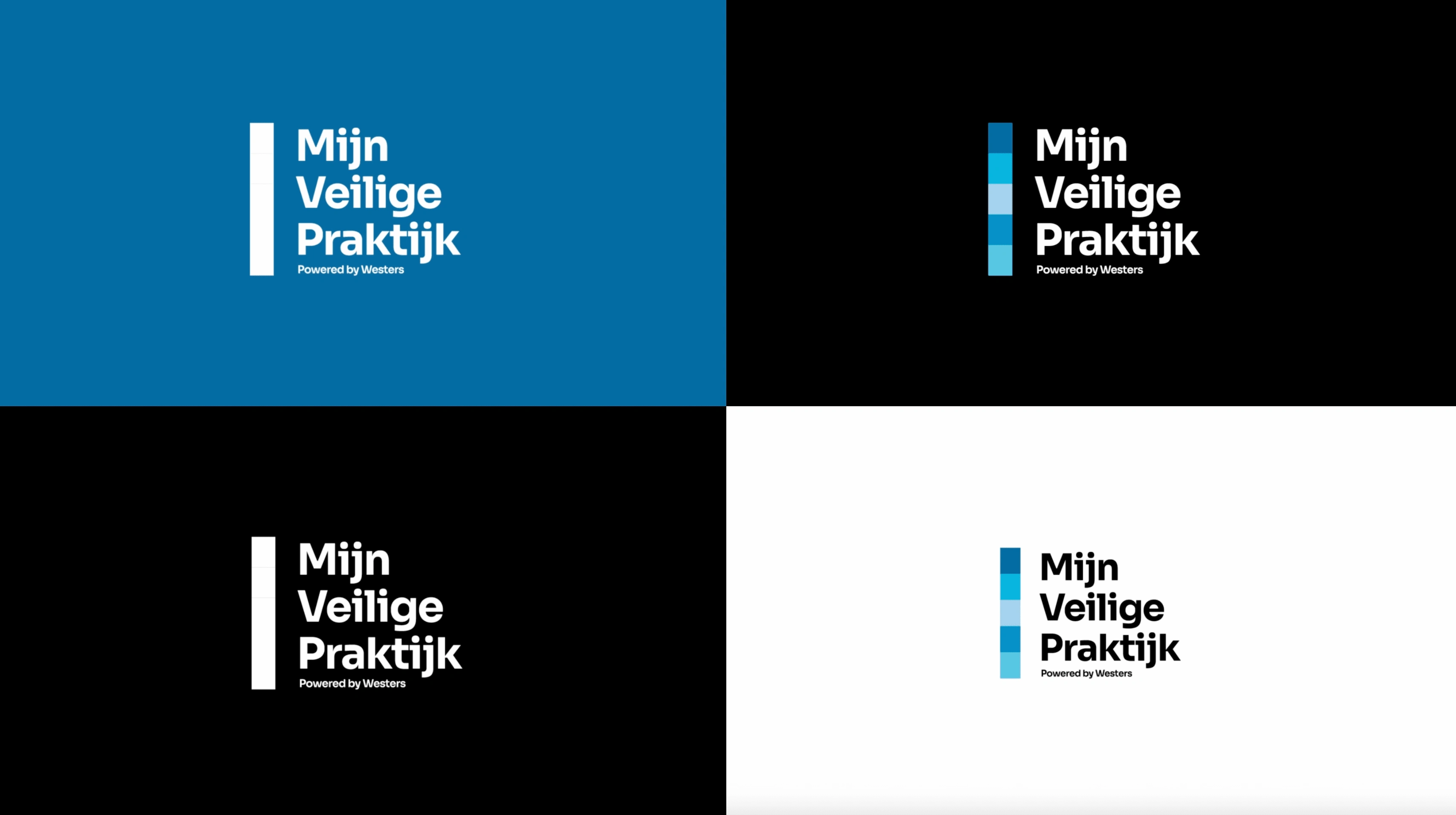
Branding
For this project, we focused on crafting a bold yet professional identity that reflects trust, security, and modernity. In the healthcare sector, having a well-defined brand isn’t just a luxury—it’s essential. With Mijn Veilige Praktijk, we wanted to create a strong, recognizable brand that instantly communicates reliability and innovation.
The branding process started with defining a sleek, minimalistic visual style. We developed a design language based on a structured color palette of blues, representing security and trust, combined with a clean typographic approach that ensures clarity. The logo and brand elements were carefully designed to feel contemporary while maintaining a sense of professionalism.
For the business cards, we played with contrast—mixing textured, off-white backgrounds with deep black elements, ensuring a premium yet accessible feel. Subtle pixel-like gradients reinforce the company’s connection to digital security, while the structured layout makes key information instantly digestible.
The result? A branding system that stands out in the industry while remaining highly functional across print and digital applications. Just like with the website, we made sure every element was aligned with modern design trends, giving the company an immediate edge in a market where visual identity often feels outdated.
Want to see it in action? Check out the full brand roll-out on their website.
👉 You can check the website at www.mijnveiligepraktijk.nl
Conclusion
MijnVeiligePraktijk now have a branding that they can work with for the upcoming years. It's a modern branding, that goes with time including a modern website.
Review from the client:
"Visinex created a wonderful branding that puts us as a high end brand in the ICT scene. We're looking forward to running with this for the coming years!"
Are you also looking for put your company in the market confidently? Let's work together and create a timeless brand!
📩 Feel free to send me a message on Contra or hit me on hello@visinex.nl
Thank you!
Like this project
Posted Mar 7, 2025
A bold, modern brand identity for Mijn Veilige Praktijk, combining sleek design with trust and security including a high-end website!
Likes
1
Views
15
Timeline
Jan 1, 2025 - Feb 20, 2025