Playstore Screens - Pragyan Shukla - Product Designer
Introduction
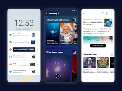
Dailyhunt, a news and content platform with over 300 million users across India, revamped its UI, making existing Play Store screenshots outdated. This misalignment with guidelines prompted an urgent need for new screens.
Visually appealing Play Store screenshots help convince the users to download your app.
Understanding the user
We need to understand where the user is coming from to nudge them into downloading the app from the Play Store.
What makes them click?
Essentially two factors:
Need
Curiosity
That’s how we can broadly classify our users into two categories
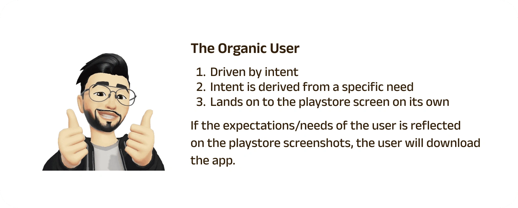
Just ensure your app's key features are clearly conveyed via Play Store screenshots.
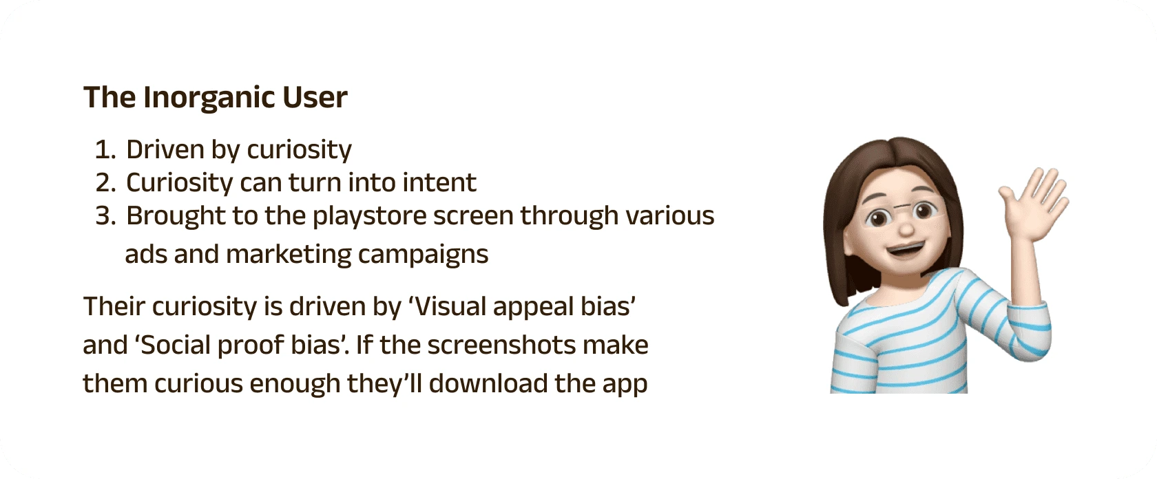
Your Play Store screenshots should craft a beautiful visual story that nudges the user to download the app.
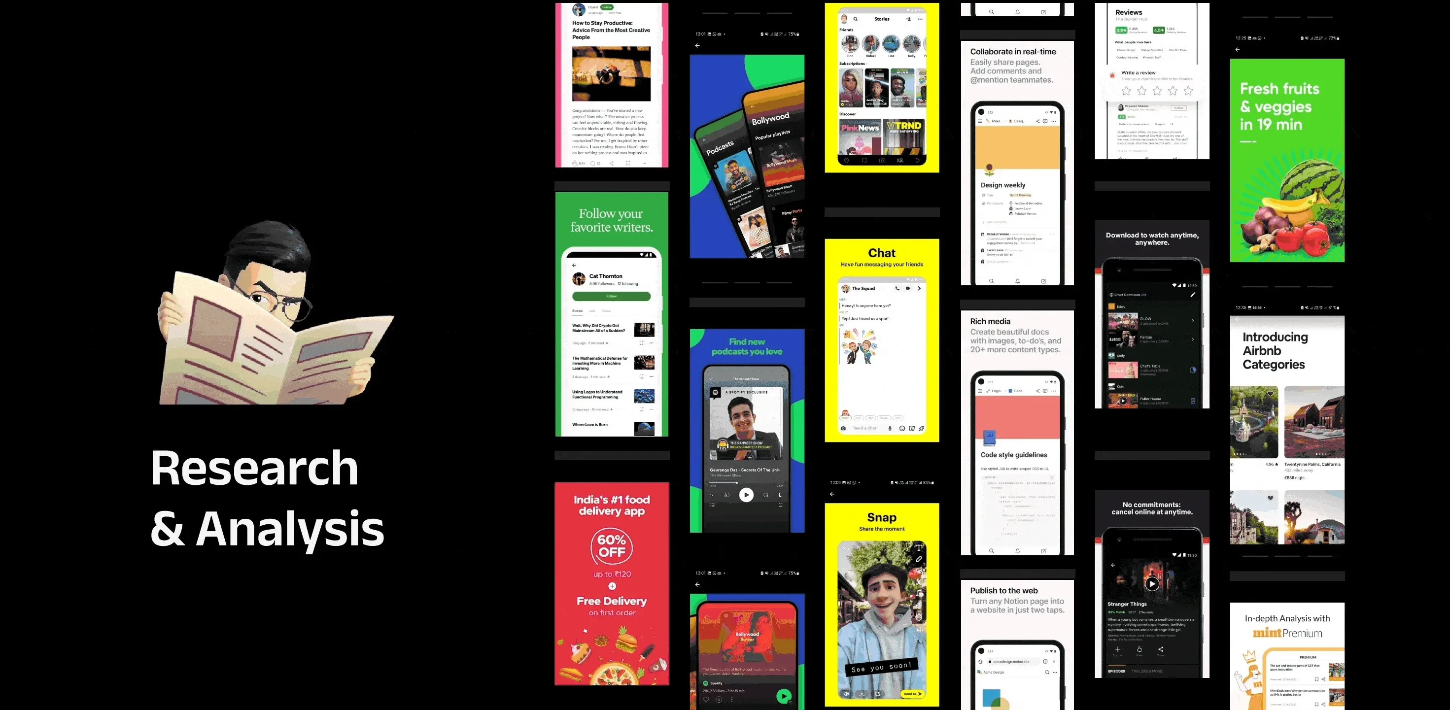
To fully utilize the potential of screenshots following points were explored:
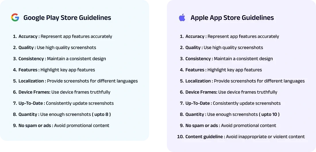
Current guidelines for Google Play Store and Apple’s App Store
Best practices used by our competitors and other top-rated apps
Insights that can be derived from competitors and other top-rated apps
Competitor research
Over 40 competitor and top-rated apps were analyzed along with some secondary research on the best and most common practices for Play Store screenshots, and these were the insights we got:
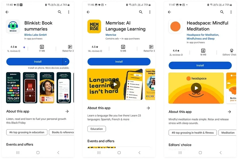
Visitors spend an average of 7 seconds on the store listing page to decide whether they want to download the app.
Around 50% of users make their decisions based on first impressions.
60% of visitors don’t scroll beyond the fold of each product page.
Less than 10% of the users enlarge a screenshot.
Screenshots can be uploaded in 3 different dimensions

Most apps prefer portrait screenshots to convey value efficiently in the initial view. Landscape orientation is common for promotional videos.
To ensure readability in minimized views, keep font size and text length appropriate, as fewer users tend to enlarge screenshots.
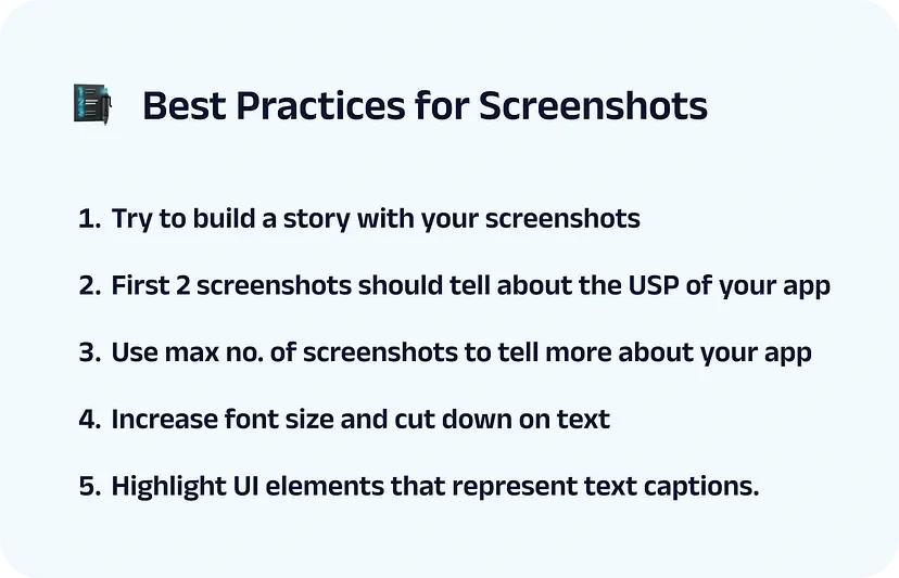
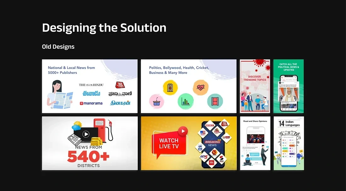
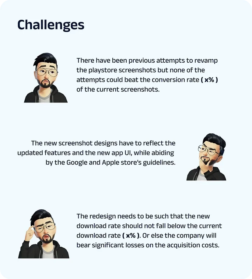
From all the insights and best practices we’ve gathered from the research it becomes evident that the old screenshot designs fall short in many areas, such as:
Poor visual appeal
The first 2 screens are landscape hence taking most of the real estate for the first fold( users will only see 1.5 screens unless they scroll which they rarely do )
Inconsistent design
Outdated representation of certain features and UI
Unclear story narrative
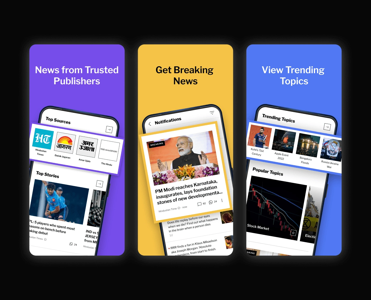
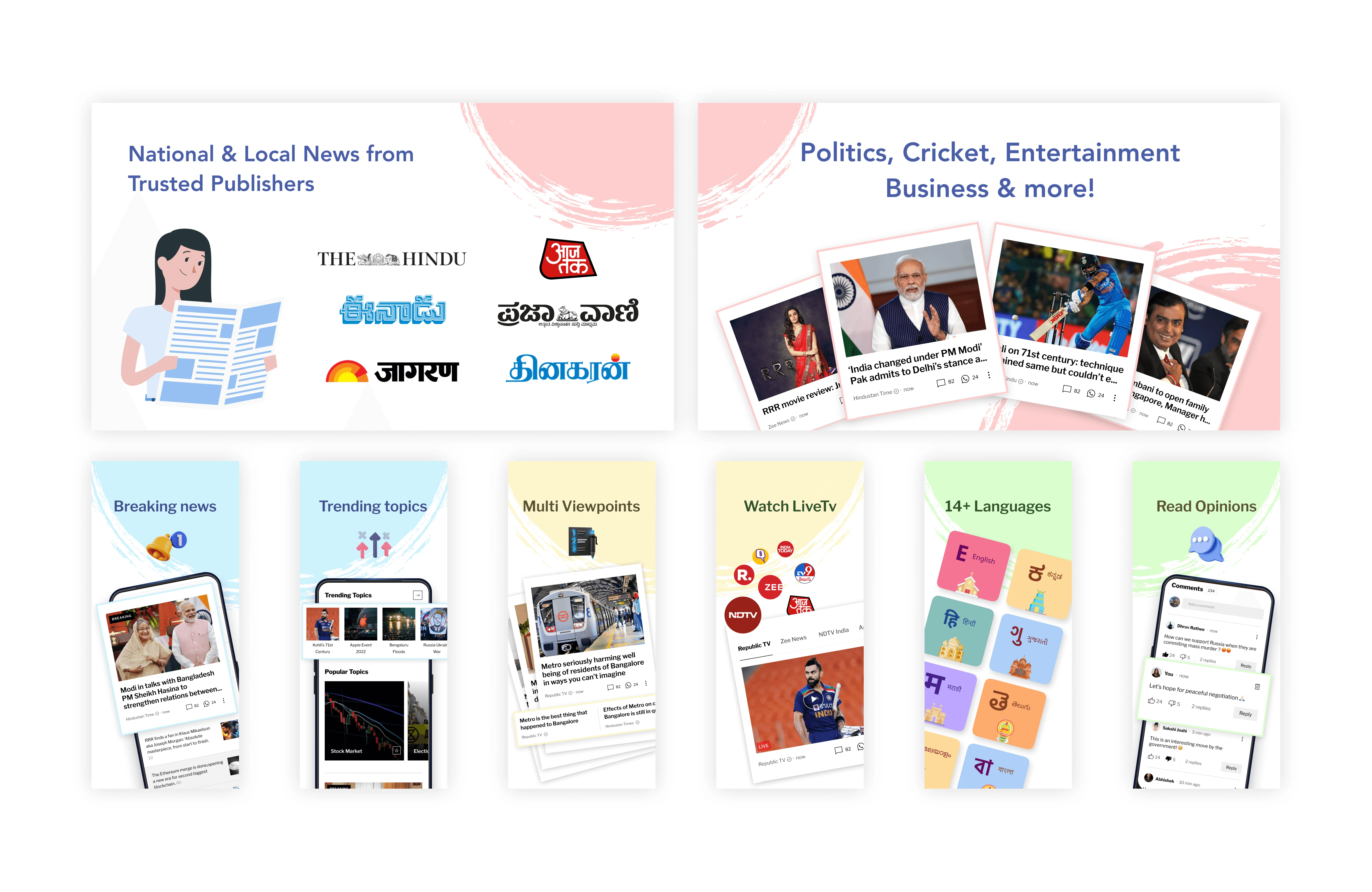
In previous redesigns, none surpassed the x% download rate. Surprisingly, this screen set achieved our best app download rate. The effectiveness was unclear, and experimenting posed risks in acquisition costs. So, we opted for the Iterative Delta approach.
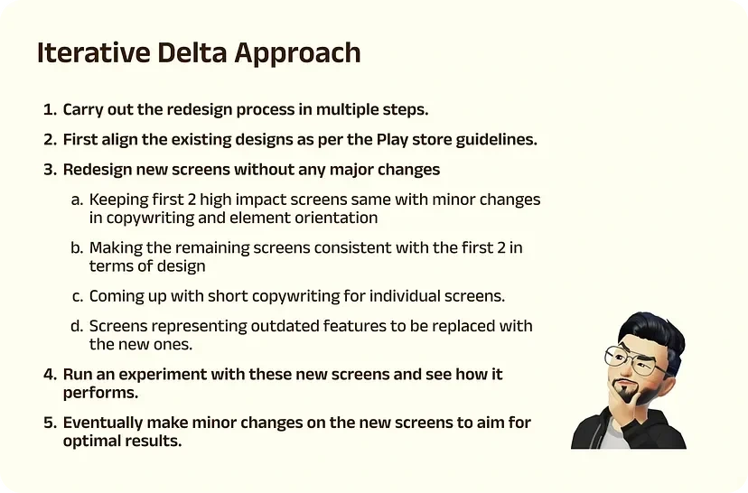
And this is what the iterated screens looked like
Experimentation
An experiment on the Google Play Store console ran for 2 weeks, comparing new screens to existing ones (x% conversion rate). Results showed the new screens performed between x% to x+2%, validating the designs. This success set a new benchmark, prompting the next phase of iterations, which included the following changes.
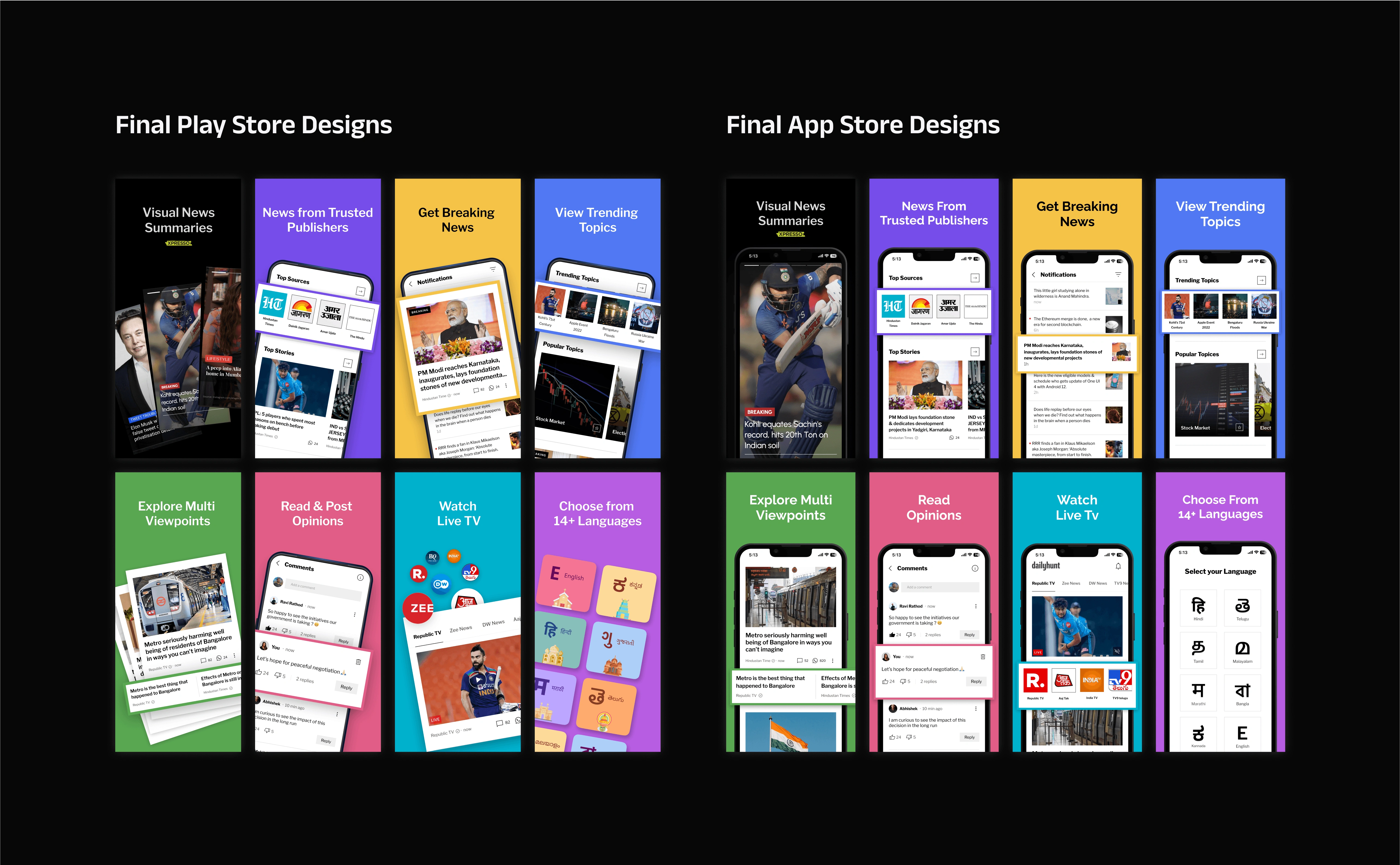
Make the Play Store screens a bit more vibrant, to incorporate the colors of the Dailyhunt logo.
Replacing the first screen with a new screen that promoted Xpresso ( a new feature that we were trying to push in the market )
The first two screens are to be made cohesive with the remaining screens in terms of design layout.
Rework on copywriting and font size
After considering these points the final version of the screenshots was crafted. Link here
Results
Key learnings.
As I delved deeper, the project proved challenging despite its seeming simplicity.
It's best to use a progressive iterative approach in projects with potential financial risks rather than making drastic changes from the start.
Ensuring accurate screen dimensions, while being cautious of Google and Apple's technical guidelines.
Be cautious of the news displayed on the app's screens, as it caters to a diverse audience. Controversial news or publicly disliked figures can deter users from downloading the app. So, ensure that the content is appropriate for all users.
Choosing the right value proposition to be displayed on the screens
Copywriting should be simple enough to cater to a diverse audience.
Ensuring that the users can easily understand the value prop without enlarging the screen
Like this project
Posted Mar 18, 2024
Revamping Dailyhunt’s playstore screens to increase conversion rate and reduce acquisition cost.


